Rolling label row
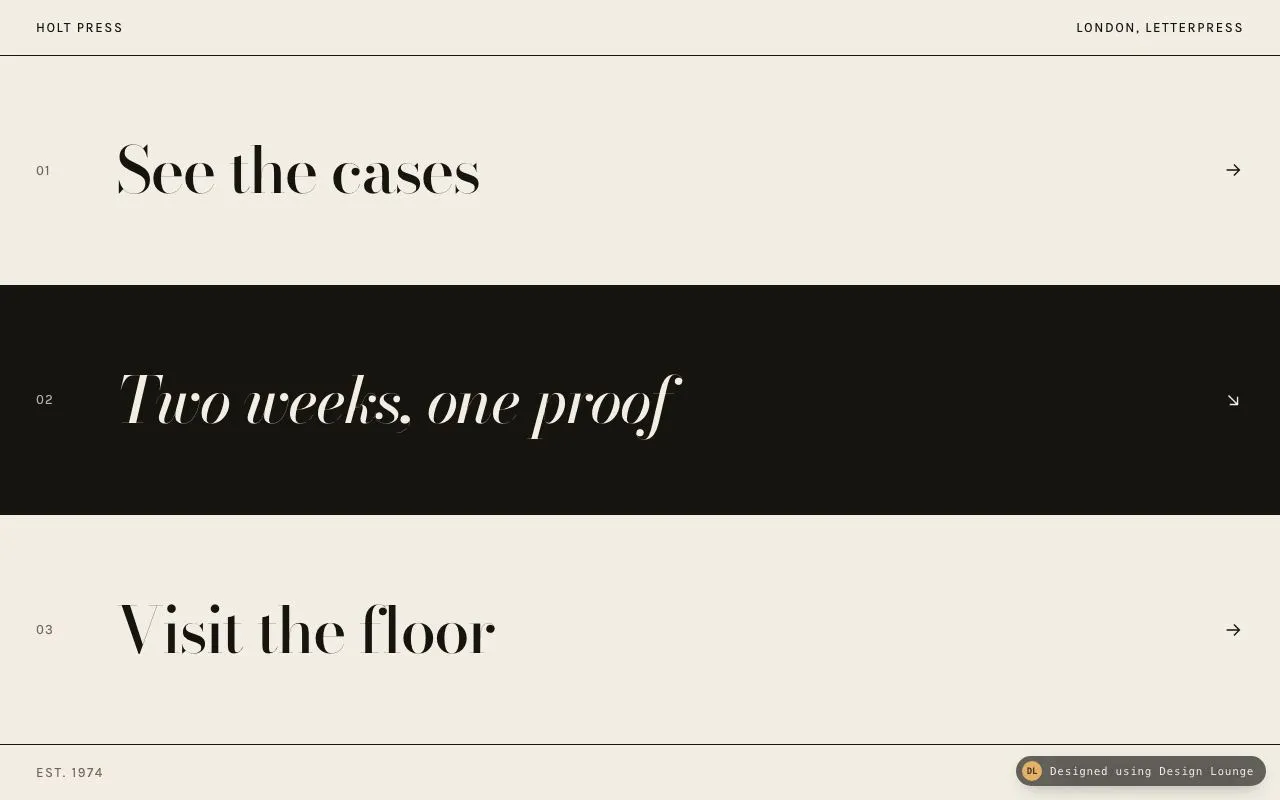
Three full-width rows. Hover, focus, or a click rolls the label up to a second line and turns the row black.
Components
Three full-width rows. Hover, focus, or a click rolls the label up to a second line and turns the row black.
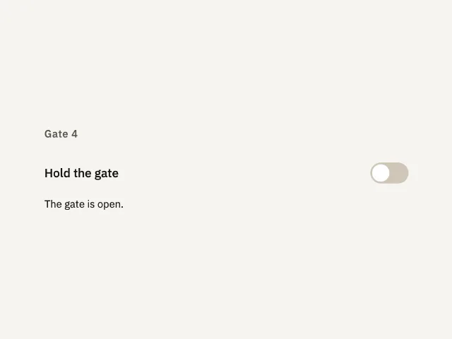
One setting, Hold the gate. It starts off, the gate stays open, and turning it on says the gate is held.
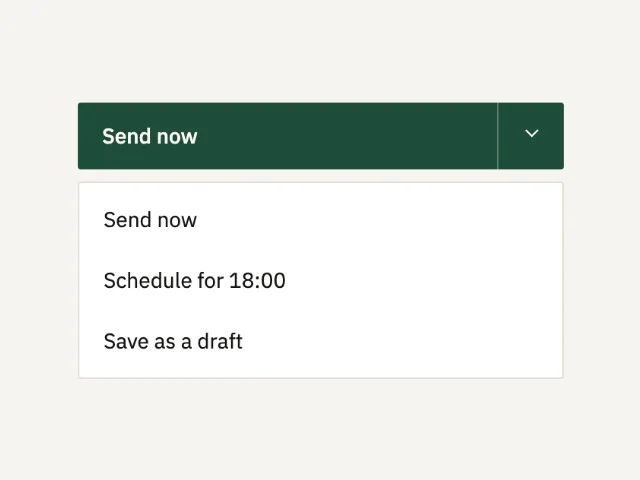
One primary action and a 44px chevron that opens three related ways to send the same note.
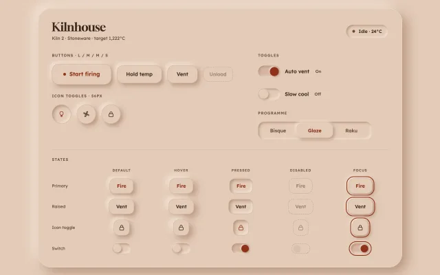
Neumorphic buttons, icon toggles, switches and a segmented control on a clay surface, with AA text, a hairline edge and colour as the second state signal.
Shred draft cuts a note into strips that fall. Restore brings the note back.
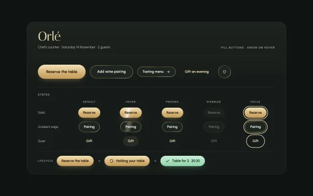
Champagne pill buttons on green-black: a light sheen sweeps across on hover, a conic gradient border turns, and async pills go loading then success.
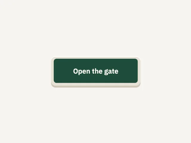
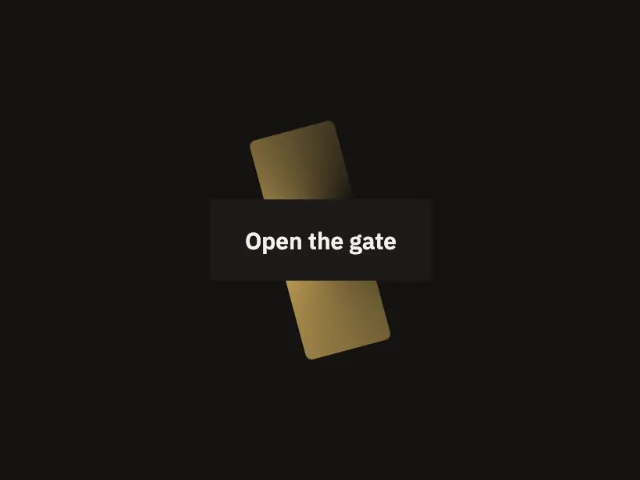
Open the gate sits in a recessed well. Press and the button drops 4px. Click says the gate opened.
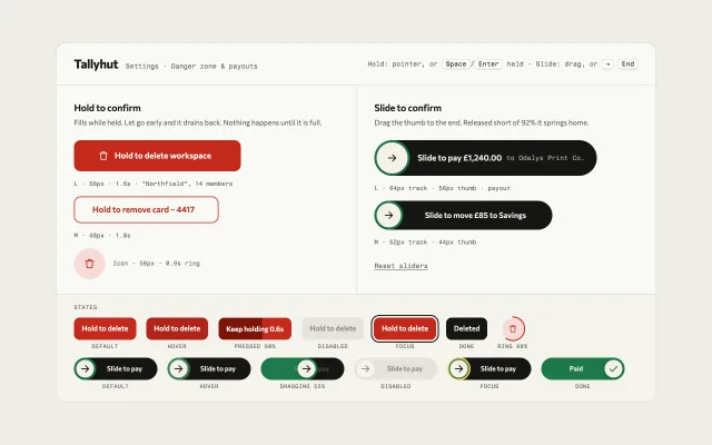
Hold-to-delete buttons that fill while held and drain on release, plus slide-to-pay tracks that spring home short of 92%, all with keyboard paths.
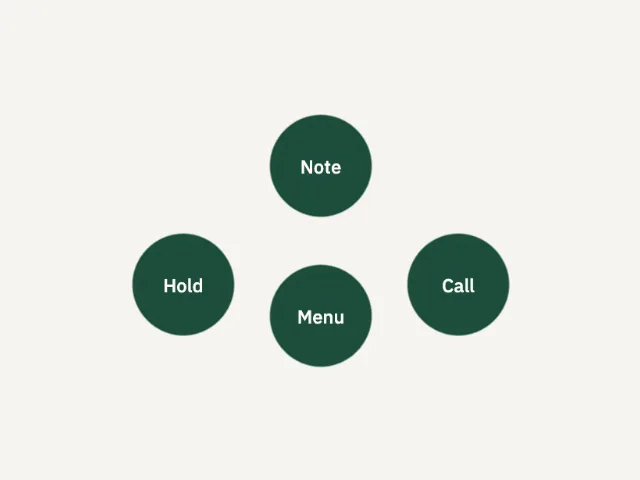
A green menu blob starts open. Hold, Note, and Call sit out on the goo. The menu button pulls them back.
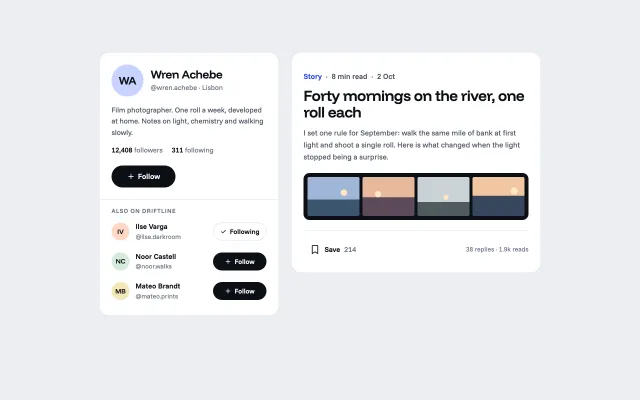
A set of social buttons: Follow morphs to Following and shows Unfollow only on a later hover, a bell appears after follow, and Save fills its ribbon and shows an undo toast.
A gold edge travels around Open the gate. Click says the gate opened on this page.
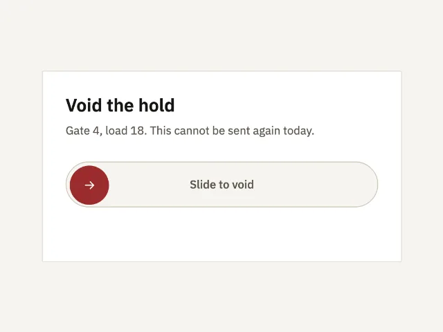
A 56px track. The thumb must travel to the end before a hold is voided. A short drag snaps back.
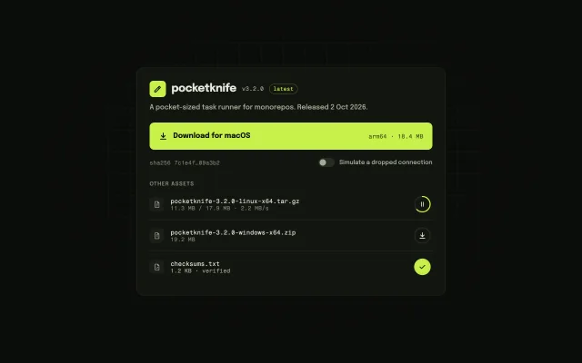
A download button that becomes a live progress bar with size, speed and time left, pause and resume, a drawn check on done, and resumable retry. Asset rows use rings.
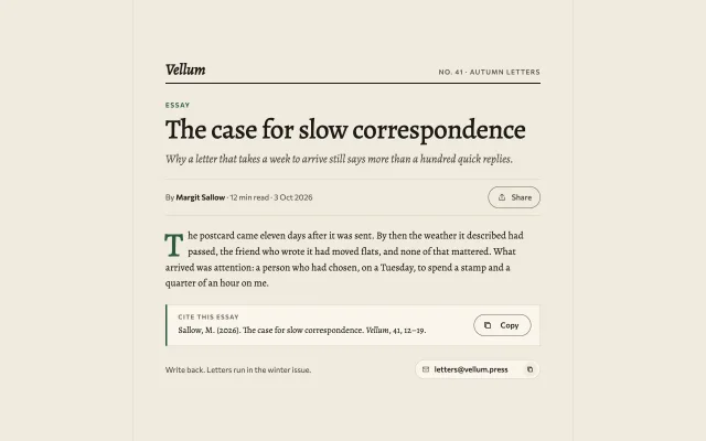
A copy-citation button with a copy-to-check morph and tooltip, a Share button that opens a compact keyboard-ready menu, and an email chip that copies on click.
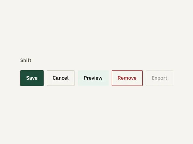
Save is the one solid button. Cancel is outline, Preview is soft, Remove is outline in danger, and Export is disabled.
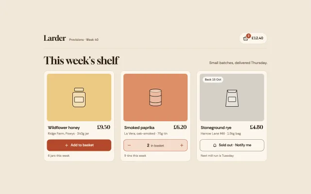
An add-to-basket button that shows an adding state, flies the product to the cart icon, bumps the badge and turns into a quantity stepper. Sold out offers notify.
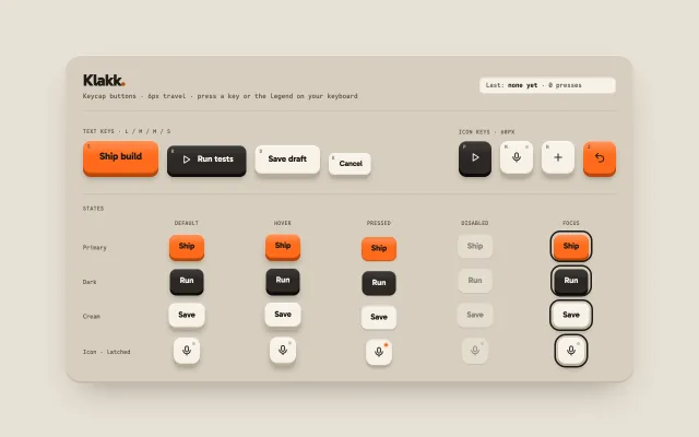
Chunky keycap buttons with a solid bottom edge that physically sink 6px on press, latching icon keys, and keyboard legends that press them too.
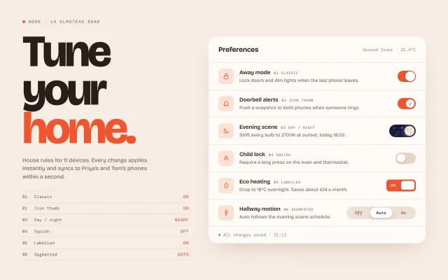
Six toggle temperaments (classic, icon thumb, day/night, squish, labelled, segmented) in a smart-home preferences card with a live status index.
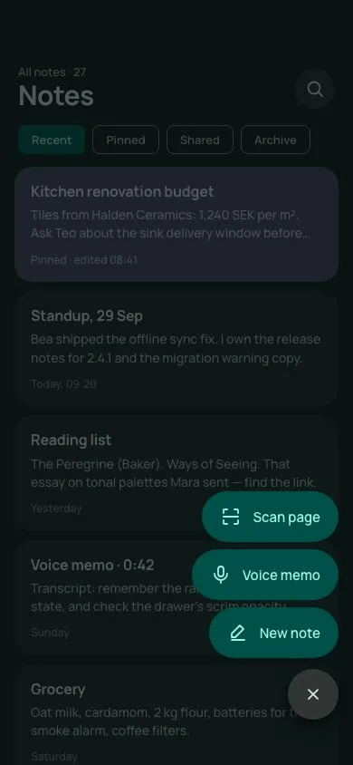
A dark-tonal Material 3 Expressive FAB that rotates its plus 45°, rounds to a circle and unfurls three labelled pill actions with a 40ms stagger behind a scrim.
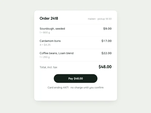
A 220px 'Pay $48.00' button collapses to a 44px spinner in 200ms, draws a checkmark with stroke-dashoffset over 400ms, then expands to a green 140px 'Paid' pill; click again after 2s to replay.
No pieces match those filters. and try again.