Nº 030 of 520
M3 expanding FAB menu
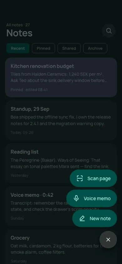
A dark-tonal Material 3 Expressive FAB that rotates its plus 45°, rounds to a circle and unfurls three labelled pill actions with a 40ms stagger behind a scrim.
Preview
Use it
Free to use · credit appreciated1 Once, in your project
npx skills add SusanAcharya/Design-Lounge 2 Then ask
Using the Design Lounge skill, build "M3 expanding FAB menu" (piece m3-fab-menu) in my stack. Match its brief; restyle it onto my product's theme.
No skill? Paste the brief instead. It carries the numbers, tokens and behaviour.
<!-- Design Lounge Nº 030 · "M3 expanding FAB menu" · www.designlounge.live -->

# M3 expanding FAB menu

> **Build brief for a coding agent.** Rebuild this piece in the reader's stack. If they haven't said which stack, ask once, then default to semantic HTML + CSS + a little vanilla JS. Match the numbers below; don't "improve" them.

## What it is

A **FAB menu** for "Tessel", a notes app, in Material 3 Expressive on a dark tonal scheme. The 56px mint FAB sits bottom-right above a list of note cards. Tapping it rotates the plus 45° into a close glyph, morphs the FAB from a 16px-radius square into a circle in the surface colour, drops a tonal scrim over the list, and unfurls three labelled pill actions upward with a 40ms stagger (bottom item first). Tap the scrim, press Esc, or choose an action to close; choosing an action also prepends a note card that drops in. The detail worth copying is the two-speed choreography: items enter on the 500ms emphasized curve but leave on a 220ms accelerate curve, so closing feels like the menu is pulled back into the FAB rather than fading.

## Reference behaviour

1. Initial state (hero): the menu is **already open** — `body.open` in the markup, scrim down, three items unfurled, FAB in its circle/× form, `aria-expanded="true"`. Behind it: top app bar with "All notes · 27" and "Notes" (30px), a round 44px search button; a row of filter chips; a scrolling list of five note cards (one pinned, in the tertiary container colour). FAB at `right:16px; bottom:50px`, 56px. A 32px hint pill "Tap + or press N" (`--surface-high`) sits bottom-left at `left:16px; bottom:62px`, hidden while open.
2. Close it (scrim / Esc / an item), then tap the FAB (or press N) to see the entry: `body.open` is set; `aria-expanded` becomes true. Scrim fades to `rgba(6,20,18,.66)` over 500ms. FAB radius eases 16px→50%, background becomes `--surface-highest`, icon rotates 45° — all 500ms `cubic-bezier(.2,0,0,1)`.
3. The three menu items ("New note" nearest the FAB, then "Voice memo", then "Scan page") rise 20px, scale from .9 to 1 (origin bottom-right) and fade in. Delays: 0ms, 40ms, 80ms from the bottom item up. Each is a 56px pill in `--primary-c` with `--on-primary-c` text and a 24px leading icon.
4. Focus moves to the first (bottom) item. Arrow Up/Down cycles focus through the items; Esc closes and returns focus to the FAB.
5. Tap the scrim or press Esc: items drop back 20px, scale .9 and fade over 220ms `cubic-bezier(.3,0,.8,.15)` with the stagger reversed (top item first); scrim fades over 220ms; FAB returns to a 16px-radius mint square with the plus upright.
6. Choose an action: a new note card titled with the action's kind ("Untitled note", "Voice memo", "Scanned page") is prepended to the list and drops in from −12px / .98 scale over 500ms; the menu closes as in step 5.
7. The hint label fades out while the menu is open.

## Structure

```
390 × 844
┌────────────────────────────────────┐
│ (54px clearance)                   │
│ All notes · 27              (○)44  │  top app bar, 120px incl. clearance
│ Notes                              │  30px/700
│ [Recent][Pinned][Shared][Archive]  │  chips 32px
│ ╭────────────────────────────────╮ │
│ │ Kitchen renovation budget      │ │  pinned card (tertiary container)
│ ╰────────────────────────────────╯ │
│ ╭────────────────────────────────╮ │
│ │ Standup, 29 Sep                │ │  note card 20px radius
│ ╰────────────────────────────────╯ │
│  ...                               │
│ ░░░░░░░░░ scrim when open ░░░░░░░░ │
│                ╭─────────────────╮ │
│                │ ▤  Scan page    │ │  item 3 · delay 80ms
│                ╰─────────────────╯ │

… 204 more lines. Copy or download for the full brief. Loading the source…Brief
244 linesBuild brief for a coding agent. Rebuild this piece in the reader’s stack. If they haven’t said which stack, ask once, then default to semantic HTML + CSS + a little vanilla JS. Match the numbers below; don’t “improve” them.
What it is
A FAB menu for “Tessel”, a notes app, in Material 3 Expressive on a dark tonal scheme. The 56px mint FAB sits bottom-right above a list of note cards. Tapping it rotates the plus 45° into a close glyph, morphs the FAB from a 16px-radius square into a circle in the surface colour, drops a tonal scrim over the list, and unfurls three labelled pill actions upward with a 40ms stagger (bottom item first). Tap the scrim, press Esc, or choose an action to close; choosing an action also prepends a note card that drops in. The detail worth copying is the two-speed choreography: items enter on the 500ms emphasized curve but leave on a 220ms accelerate curve, so closing feels like the menu is pulled back into the FAB rather than fading.
Reference behaviour
- Initial state (hero): the menu is already open —
body.openin the markup, scrim down, three items unfurled, FAB in its circle/× form,aria-expanded="true". Behind it: top app bar with “All notes · 27” and “Notes” (30px), a round 44px search button; a row of filter chips; a scrolling list of five note cards (one pinned, in the tertiary container colour). FAB atright:16px; bottom:50px, 56px. A 32px hint pill “Tap + or press N” (--surface-high) sits bottom-left atleft:16px; bottom:62px, hidden while open. - Close it (scrim / Esc / an item), then tap the FAB (or press N) to see the entry:
body.openis set;aria-expandedbecomes true. Scrim fades torgba(6,20,18,.66)over 500ms. FAB radius eases 16px→50%, background becomes--surface-highest, icon rotates 45° — all 500mscubic-bezier(.2,0,0,1). - The three menu items (“New note” nearest the FAB, then “Voice memo”, then “Scan page”) rise 20px, scale from .9 to 1 (origin bottom-right) and fade in. Delays: 0ms, 40ms, 80ms from the bottom item up. Each is a 56px pill in
--primary-cwith--on-primary-ctext and a 24px leading icon. - Focus moves to the first (bottom) item. Arrow Up/Down cycles focus through the items; Esc closes and returns focus to the FAB.
- Tap the scrim or press Esc: items drop back 20px, scale .9 and fade over 220ms
cubic-bezier(.3,0,.8,.15)with the stagger reversed (top item first); scrim fades over 220ms; FAB returns to a 16px-radius mint square with the plus upright. - Choose an action: a new note card titled with the action’s kind (“Untitled note”, “Voice memo”, “Scanned page”) is prepended to the list and drops in from −12px / .98 scale over 500ms; the menu closes as in step 5.
- The hint label fades out while the menu is open.
Structure
390 × 844
┌────────────────────────────────────┐
│ (54px clearance)                   │
│ All notes · 27              (○)44  │  top app bar, 120px incl. clearance
│ Notes                              │  30px/700
│ [Recent][Pinned][Shared][Archive]  │  chips 32px
│ ╭────────────────────────────────╮ │
│ │ Kitchen renovation budget      │ │  pinned card (tertiary container)
│ ╰────────────────────────────────╯ │
│ ╭────────────────────────────────╮ │
│ │ Standup, 29 Sep                │ │  note card 20px radius
│ ╰────────────────────────────────╯ │
│  ...                               │
│ ░░░░░░░░░ scrim when open ░░░░░░░░ │
│                ╭─────────────────╮ │
│                │ ▤  Scan page    │ │  item 3 · delay 80ms
│                ╰─────────────────╯ │
│                ╭─────────────────╮ │
│                │ ♪  Voice memo   │ │  item 2 · delay 40ms
│                ╰─────────────────╯ │
│                ╭─────────────────╮ │
│                │ ✎  New note     │ │  item 1 · delay 0ms   (8px gaps)
│                ╰─────────────────╯ │
│ (Tap + or press N)        ┌────┐   │  hint pill 32px · 12px gap
│                           │ +  │56 │  FAB, right 16, bottom 50
│ (34px clearance)          └────┘   │
└────────────────────────────────────┘
<header class="top">— label +<h1>, round search<button>..chips— decorative filter row (aria-hidden).<main id="list" aria-live="polite">—<article class="note">cards,overflow:auto, 120px bottom padding.<button class="scrim" tabindex="-1" aria-label="Close menu">— absolutely positionedinset:0, below the FAB wrapper in stacking order..fabwrap— absolute,right:16px; bottom:50px, flex column,align-items:flex-end, 12px gap. Contains<ul role="menu">of three<li role="none"><button role="menuitem">and the<button class="fab" aria-haspopup="menu" aria-expanded aria-controls>.
Sample content (note cards, top to bottom):
| Title | Body (clamped to 2 lines) | Meta | Style |
|---|---|---|---|
| Kitchen renovation budget | Tiles from Halden Ceramics: 1,240 SEK per m². Ask Teo about the sink delivery window before Friday. | Pinned · edited 08:41 | pinned (tertiary) |
| Standup, 29 Sep | Bea shipped the offline sync fix. I own the release notes for 2.4.1 and the migration warning copy. | Today, 09:20 | default |
| Reading list | The Peregrine (Baker). Ways of Seeing. That essay on tonal palettes Mara sent — find the link. | Yesterday | default |
| Voice memo · 0:42 | Transcript: remember the rail card needs a badge state, and check the drawer’s scrim opacity against the spec. | Sunday | default |
| Grocery | Oat milk, cardamom, 2 kg flour, batteries for the smoke alarm, coffee filters. | Saturday | default |
Chips: Recent (selected), Pinned, Shared, Archive. Menu items and the card title they create: “New note” → “Untitled note”; “Voice memo” → “Voice memo”; “Scan page” → “Scanned page”. A created card’s body reads “Created from the FAB menu. Start typing to replace this line.” with meta “Just now”.
Tokens
:root {
  /* tonal surfaces — cool dark */
  --surface: #101413;
  --surface-low: #181c1b;
  --surface-c: #1c2120;         /* note cards */
  --surface-high: #262b2a;      /* icon buttons */
  --surface-highest: #313635;   /* FAB while open */
  --on-surface: #e0e3e1;
  --on-surface-v: #a9b4b0;
  --outline: #6f7a77;

  /* primary — mint */
  --primary: #7fd8c6;           /* FAB closed */
  --on-primary: #003730;
  --primary-c: #00504a;         /* menu items, active chip */
  --on-primary-c: #9ff3e1;
  --primary-c-hover: #0a5f58;

  /* tertiary — pinned card */
  --tertiary-c: #4b3f5c;
  --on-tertiary-c: #e8dcff;

  --scrim: rgba(6, 20, 18, .66);

  /* type */
  --font: "Manrope", system-ui, sans-serif;
  --fs-h1: 30px; --fs-card: 16px; --fs-body: 15px; --fs-small: 14px; --fs-meta: 12px;

  /* shape */
  --fab: 56px;
  --r-fab: 16px;
  --r-card: 20px;
  --r-chip: 8px;
  --r-pill: 999px;

  /* spacing */
  --s-2: 8px; --s-3: 12px; --s-4: 16px; --s-5: 20px;
  --menu-gap: 8px;             /* between items */
  --fab-gap: 12px;             /* items to FAB */
  --item-rise: 20px;

  /* elevation */
  --shadow-3: 0 8px 20px rgba(0,0,0,.45), 0 2px 6px rgba(0,0,0,.3);

  /* motion */
  --t-micro: 160ms;
  --t-big: 500ms;
  --t-fade-in: 350ms;
  --t-exit: 220ms;
  --stagger: 40ms;
  --ease-emph: cubic-bezier(.2, 0, 0, 1);
  --ease-exit: cubic-bezier(.3, 0, .8, .15);
}
Typography
| Role | Family | Size | Weight | Line-height | Tracking | Case |
|---|---|---|---|---|---|---|
| Page title | Manrope | 30px | 700 | 1 | −0.02em | sentence |
| Top label | Manrope | 13px | 500 | 1.4 | 0 | sentence |
| Chip | Manrope | 13px | 600 | 1 | 0 | sentence |
| Note title | Manrope | 16px | 700 | 1.3 | −0.01em | sentence |
| Note body | Manrope | 14px | 500 | 1.45 | 0 | sentence |
| Note meta | Manrope | 12px | 600 | 1.4 | 0 | sentence |
| Menu item | Manrope | 15px | 600 | 1 | 0 | sentence |
| Hint | Manrope | 12px | 600 | 1.4 | 0 | sentence |
Motion
| Element | Trigger | Property | From → To | Duration | Easing | Delay |
|---|---|---|---|---|---|---|
.scrim | open | opacity | 0 → 1 | 500ms | --ease-emph | 0 |
.scrim | close | opacity | 1 → 0 | 220ms | --ease-exit | 0 |
.fab | open | border-radius, background | 16px, mint → 50%, surface-highest | 500ms / 160ms | --ease-emph | 0 |
.fab svg | open | rotate | 0 → 45° | 500ms | --ease-emph | 0 |
| menu item (enter) | open | opacity / transform | 0, translateY(20px) scale(.9) → 1, none | 350ms / 500ms | --ease-emph | 0 / 40 / 80ms, bottom item first |
| menu item (exit) | close | opacity, transform | 1, none → 0, translateY(20px) scale(.9) | 220ms | --ease-exit | 0 / 40 / 80ms, top item first |
.note.new | create | opacity, transform | 0, translateY(−12px) scale(.98) → 1, none | 500ms | --ease-emph | 0 |
.fab:active | press | scale | 1 → .94 | 160ms | --ease-emph | 0 |
.hint | open | opacity | 1 → 0 | 160ms | linear | 0 |
Reduced motion: all durations and delays 1ms/0ms. The menu still appears and disappears; the plus still ends rotated (state must remain legible).
States
- Closed: FAB
--primaryfill, 16px radius, plus upright; itemsopacity:0; pointer-events:none; scrimpointer-events:none. - Open:
body.open; FAB--surface-highestfill, circle, plus at 45° (reads as ×); items visible; scrim interactive. - Item hover: background
--primary-c-hover(#0a5f58). - Item focus-visible / FAB focus-visible: 3px
--primaryoutline, 3px offset. - FAB pressed: scale .94.
- Chip selected:
--primary-cfill,--on-primary-ctext, no border. - Pinned card:
--tertiary-cbackground,--on-tertiary-ctext, body at 80% and meta at 60% opacity.
Accessibility
- FAB:
<button aria-haspopup="menu" aria-expanded aria-controls="menu" aria-label="Create">. - Menu:
<ul role="menu" aria-label="Create">, items<button role="menuitem">inside<li role="none">. - Keyboard: N opens (when closed); Esc closes and returns focus to the FAB; Arrow Up / Arrow Down cycle focus through items; Enter/Space activates. On open, focus moves to the first item (the one nearest the FAB).
- The scrim is a
<button tabindex="-1">so it is clickable but not in the tab order; itsaria-labelis “Close menu”. - The list is
aria-live="polite"so a created note is announced. - Contrast:
--on-primary-c(#9ff3e1) on--primary-c(#00504a) 9.1:1;--on-surface-von--surface-c8.6:1;--on-primaryon--primary9.9:1. - Hit targets: FAB 56px, items 56px tall, search button 44px.
Responsive rules
- 390 wide: as specified.
- 360 wide: unchanged; items are content-width pills so they never overflow.
- ≥ 600 wide: keep the FAB anchored to the viewport’s bottom-right with 24px insets; the list caps at 560px.
- Very short viewports (< 600px tall): reduce
--fab-gapto 8px and the item rise to 12px so all three items stay within the viewport.
Acceptance checklist
- FAB is 56px,
#7FD8C6, 16px radius when closed; becomes a#313635circle with the plus rotated 45° when open. - Opening uses 500ms
cubic-bezier(.2,0,0,1); closing uses 220mscubic-bezier(.3,0,.8,.15). - Three items enter with delays 0/40/80ms starting from the item nearest the FAB; they exit with the order reversed.
- Items are 56px pills in
#00504Awith#9FF3E1text, 8px apart, 12px above the FAB, right-aligned to the FAB’s right edge. - Scrim is
rgba(6,20,18,.66)and closes the menu on tap. - Esc closes the menu and returns focus to the FAB; N opens it.
- Arrow keys cycle focus through the three items while open.
-
aria-expandedon the FAB mirrors the state. - Choosing an item prepends a note card that drops in from −12px over 500ms and closes the menu.
- FAB bottom edge is 50px from the viewport bottom (34px clearance + 16px inset).
- First frame shows the menu open; no interaction is needed to see the unfurled state.
- Focus rings are visible on the FAB, items and search button.
- Reduced motion: the menu still opens and closes; no delays remain.
Implementation notes
Two-speed stagger with reversed order. Set exit delays in the base rule and enter delays in the .open rule, so the item nearest the FAB leads on open and trails on close:
.menu button { opacity:0; transform:translateY(20px) scale(.9); transform-origin:right bottom; pointer-events:none;
  transition: opacity 220ms var(--ease-exit), transform 220ms var(--ease-exit); }
.open .menu button { opacity:1; transform:none; pointer-events:auto;
  transition: opacity 350ms var(--ease-emph), transform 500ms var(--ease-emph); }
/* enter: bottom-most first */
.open .menu li:nth-child(3) button { transition-delay:0ms }
.open .menu li:nth-child(2) button { transition-delay:40ms }
.open .menu li:nth-child(1) button { transition-delay:80ms }
/* exit: top-most first */
.menu li:nth-child(1) button { transition-delay:0ms }
.menu li:nth-child(2) button { transition-delay:40ms }
.menu li:nth-child(3) button { transition-delay:80ms }
The FAB morphs, it doesn’t swap icons. One plus glyph, rotated:
.fab { border-radius:16px; transition: border-radius 500ms var(--ease-emph), background 160ms; }
.fab svg { transition: transform 500ms var(--ease-emph); }
.open .fab { border-radius:50%; background:var(--surface-highest); color:var(--on-surface); }
.open .fab svg { transform: rotate(45deg); }
Focus management — move focus into the menu on open, back to the FAB on close:
function setOpen(o) {
  body.classList.toggle('open', o);
  fab.setAttribute('aria-expanded', String(o));
  if (o) items[items.length - 1].focus(); else fab.focus();
}
Common mistakes: putting the scrim above the FAB wrapper in z-order (the FAB must stay tappable to close); using display:none for the closed items (kills the exit animation and the stagger); animating the whole <ul> instead of each item.
Details
- Palette
- Type
- Manrope
- Motion
- Rich motion
- Build
- One session
- Tags
Studied
UseArticleLet the visitor press the controls and watch the card change. Thick black edges and hard shadows keep it friendly.
All sources