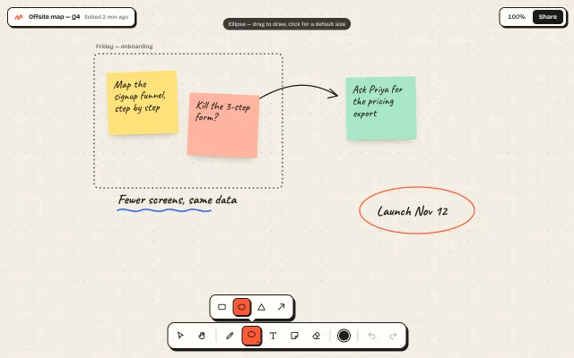
Whiteboard tool dock
A floating hard-shadow tool dock for a whiteboard: exclusive tools, a nested shapes flyout, colour swatches, working undo/redo, and a two-row collapse on phones.
Components
A floating hard-shadow tool dock for a whiteboard: exclusive tools, a nested shapes flyout, colour swatches, working undo/redo, and a two-row collapse on phones.
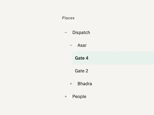
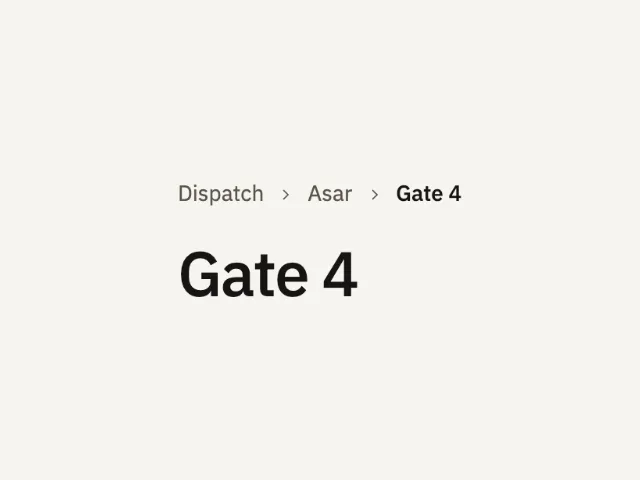
A place tree. Dispatch and Asar start open, Gate 4 is current, and Bhadra and People start closed. A click opens a branch or moves the current page.
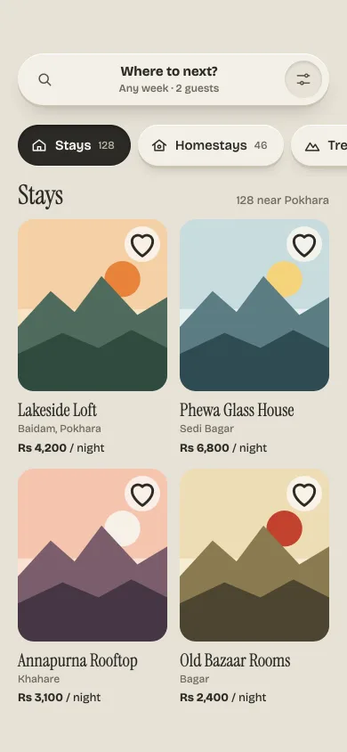
Clay-raised category chips that press down like keys, a dark well that stretches and springs to the chosen tab, and skeleton cards that hand over to listings.
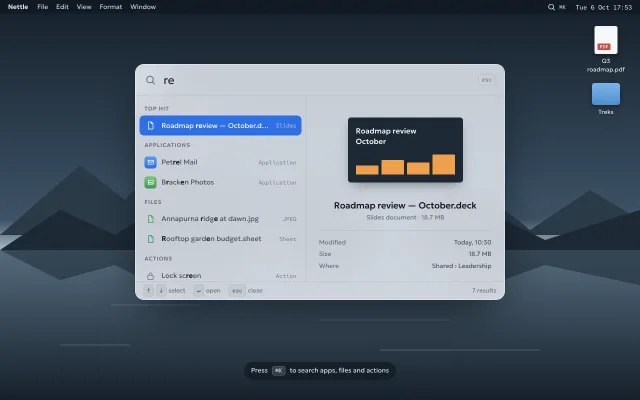
A frosted, desktop-OS spotlight bar on ⌘K: fuzzy results grouped as top hit, apps, files and actions, inline calculator, and a live preview pane.
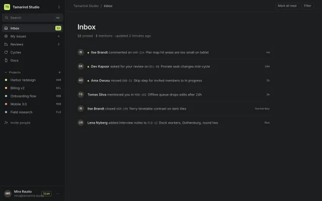
A 260px dark app sidebar: workspace switcher popover, ⌘K search, counted inbox items, a collapsing Projects group and a pinned user row with plan badge.
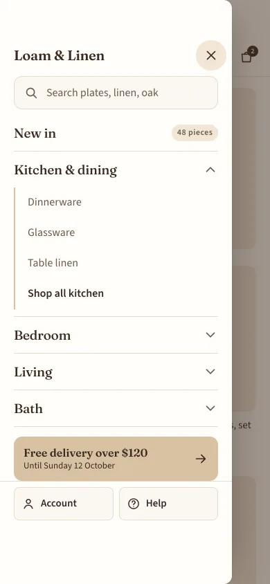
An 86%-wide shop menu drawer from the left with search, one-open-at-a-time accordion sections, a promo row and account and help pinned at the bottom.
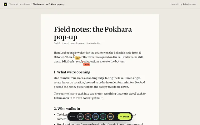
A dark pill dock of collaborator avatars over a shared doc: live named cursors drift through the text, clicking a face follows them, and Invite adds a pending seat.
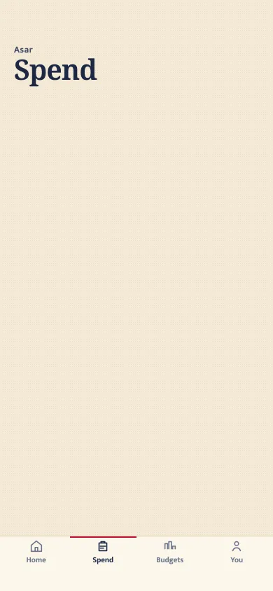
A four-item phone tab bar with a hairline and a top mark. No glass, no blur, no floating capsule.
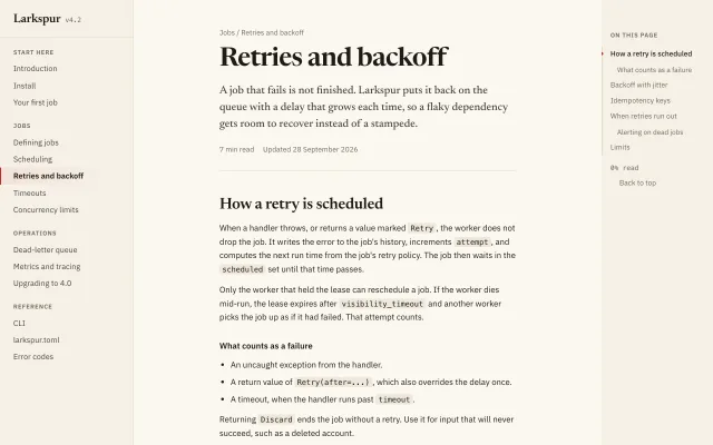
An editorial docs layout: 240px grouped nav, a 68ch serif-headed article, and a 200px On this page list with scrollspy and a red progress line.
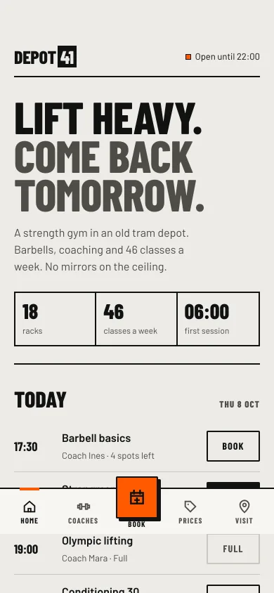
A five-item bottom bar for a phone website with a raised square Book action, a scroll-linked active state, and hide-on-scroll-down that returns on scroll up.
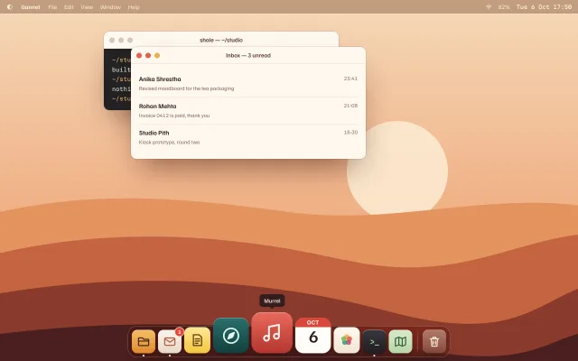
A desktop-OS dock whose icons swell by pointer distance on a cosine curve, with tooltips, a two-hop launch bounce, running dots and arrow-key navigation.
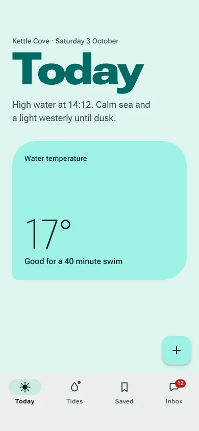
An Android Material 3 Expressive bottom bar: four destinations, a 64x32 pill that stretches in, filled active icons, a dot and a 12 badge, and a FAB above.
Dispatch, Asar, then Gate 4 as the current page. The current crumb is text. The earlier crumbs are links. A click names what opened.
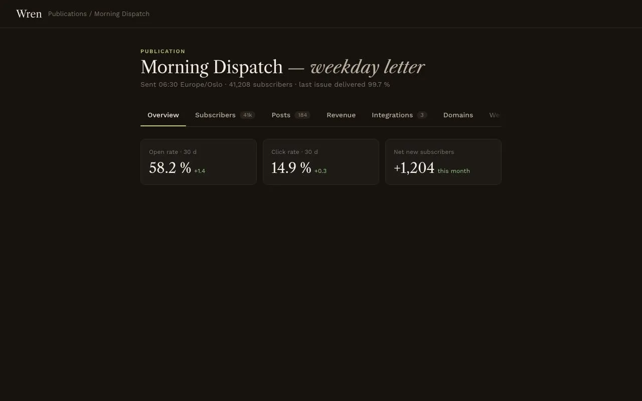
Nine scrollable tabs whose 2px underline stretches to span old and new tab, then settles (180ms + 200ms), with a panel crossfade and fade masks at the strip's overflow edges.
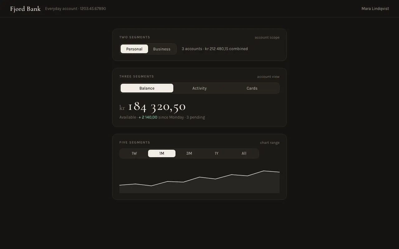
Segmented controls in 2, 3 and 5-segment variants: an ivory pill slides between options over 260ms with a mid-travel squash, arrow keys move selection, and each switches a content panel.
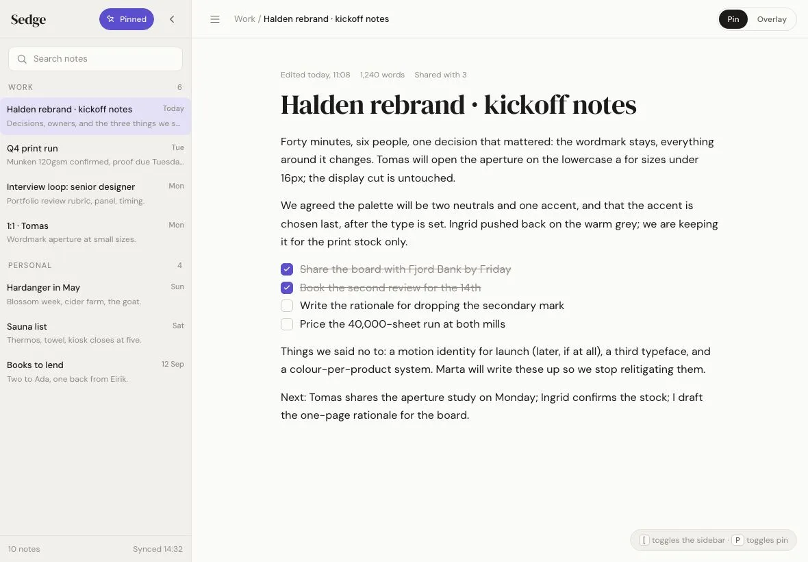
A 280px notes sidebar on a 1180×820 tablet that either overlays the page with a scrim and shadow or pins so the content reflows; a pin toggle switches modes with one 320ms transition.
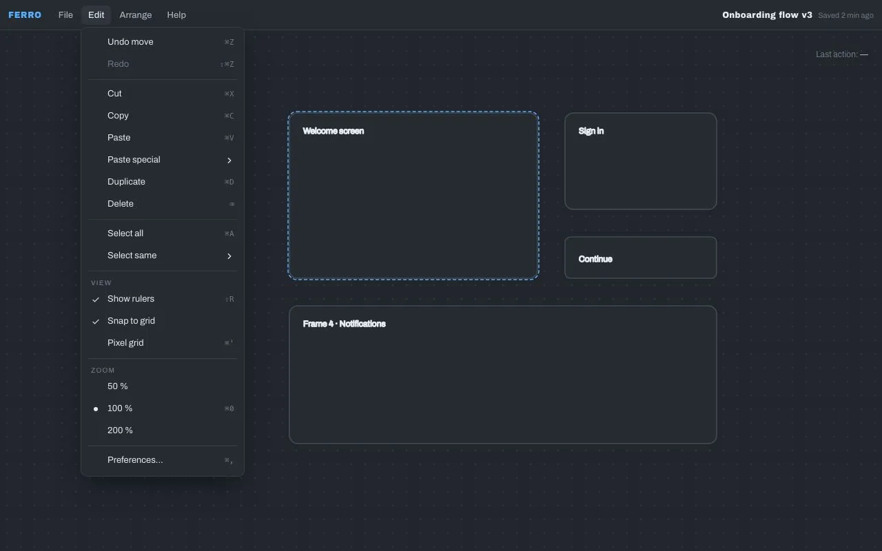
An application menubar with click-to-open menus, hover submenus guarded by a safe-triangle delay, check and radio items, a shortcuts column and complete keyboard support including typeahead.
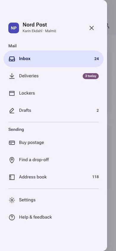
A 360px Material 3 Expressive modal drawer that slides in under a scrim from a top-app-bar hamburger, with full-width tonal pill for the active item, section headers, dividers and badges.
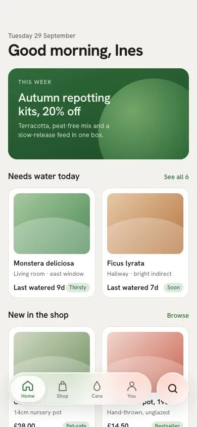
An inset Liquid-glass tab capsule with four tabs and a separate round search island; a glass lens squashes and slides between tabs while content scrolls under it.
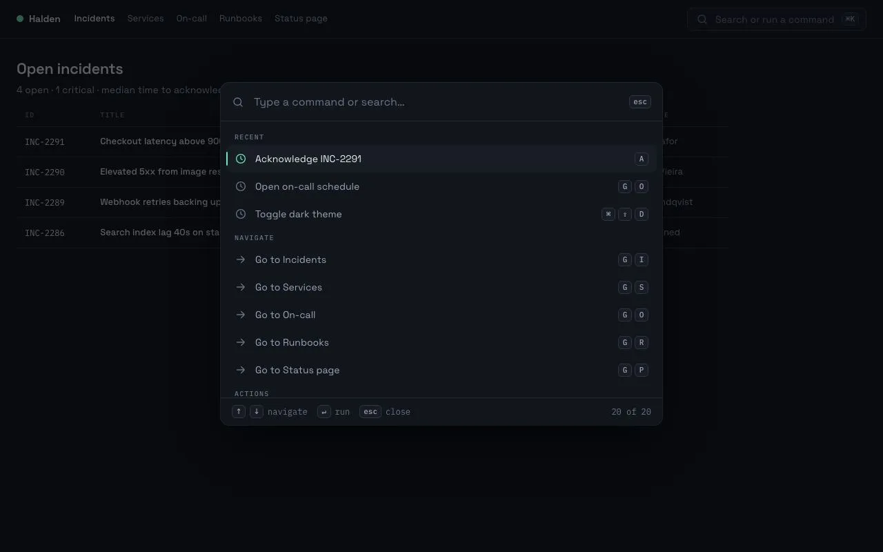
A ⌘K command palette that opens with a 200ms scale-and-fade, fuzzy-filters 20 grouped commands, and is fully driven from the keyboard with shortcut hints on the right.
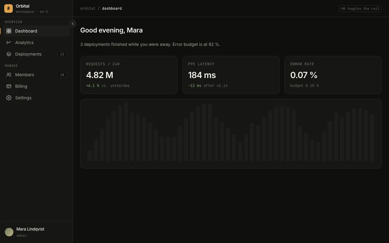
A 240px app sidebar that collapses to a 64px icon rail with hover tooltips, an accent active-route bar and a ⌘B shortcut.
No pieces match those filters. and try again.