Nº 007 of 520
Collapsing sidebar rail
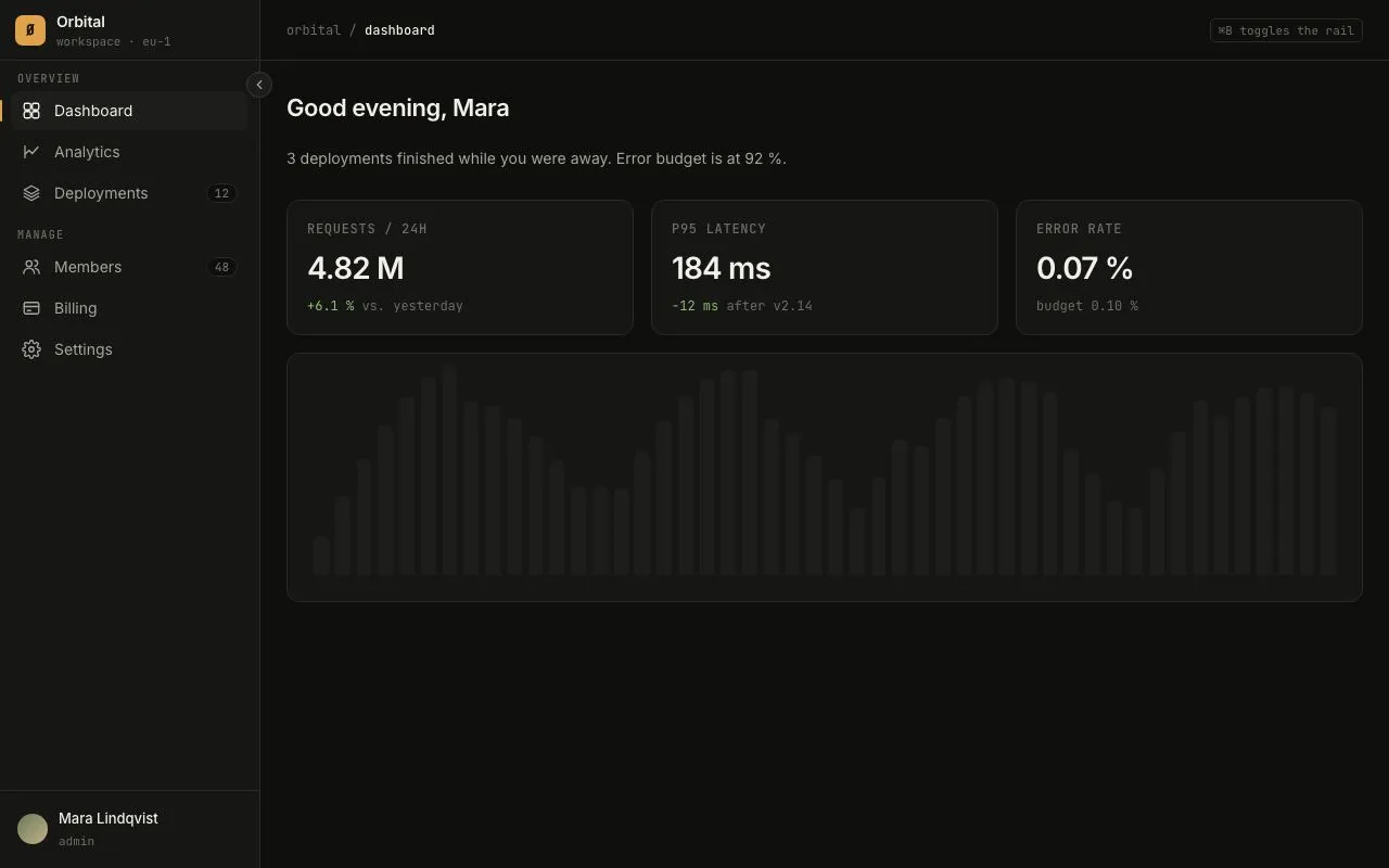
A 240px app sidebar that collapses to a 64px icon rail with hover tooltips, an accent active-route bar and a ⌘B shortcut.
Preview
Use it
Free to use · credit appreciated1 Once, in your project
npx skills add SusanAcharya/Design-Lounge 2 Then ask
Using the Design Lounge skill, build "Collapsing sidebar rail" (piece collapsing-sidebar-rail) in my stack. Match its brief; restyle it onto my product's theme.
No skill? Paste the brief instead. It carries the numbers, tokens and behaviour.
<!-- Design Lounge Nº 007 · "Collapsing sidebar rail" · www.designlounge.live -->

# Collapsing sidebar rail

> **Build brief for a coding agent.** Rebuild this piece in the reader's stack. If they haven't said which stack, ask once, then default to semantic HTML + CSS + a little vanilla JS. Match the numbers below; don't "improve" them.

## What it is

A left-hand navigation sidebar for a dashboard-style web app. It has two widths: **open** (240px, icon + label + count badges) and **rail** (64px, icons only, labels become tooltips). A small round toggle button sits on the sidebar's outer edge; ⌘B / Ctrl+B also toggles. The width animates, labels fade and slide out slightly ahead of the width change so nothing wraps mid-transition. The active route is marked by a 2px amber bar hugging the left edge, not by a filled pill. The feeling is quiet, dense, engineered: a tool you live in for hours.

## Reference behaviour

1. Initial state: sidebar is open at 240px. First nav item ("Dashboard") is the current route. Main content shows a greeting, three stat cards and a bar chart.
2. Hover any nav link: background changes to `--panel-2`, text becomes full `--ink`. No movement.
3. Click the round toggle on the sidebar's right edge (24px, straddling the border at `right:-12px; top:66px`): the sidebar shrinks to 64px over 320ms; labels, group headings and count badges disappear (opacity 0 + 6px leftward slide over 160ms, starting immediately); the chevron inside the toggle rotates 180°. Main content expands to fill the freed space.
4. In rail state, hovering or keyboard-focusing a nav link shows a tooltip to the right of the rail: dark pill (`--ink` background, `--bg` text, 12px/500), 10px from the rail edge, with a 4px caret. It fades in and slides 4px over 160ms.
5. Pressing ⌘B (macOS) or Ctrl+B (elsewhere) toggles the state exactly like the button.
6. Click the toggle again: sidebar returns to 240px; labels fade in after the width starts growing.
7. The toggle's `aria-expanded` mirrors the state; its `title` reads "Collapse sidebar (⌘B)" or "Expand sidebar (⌘B)".
8. Hovering a bar in the chart tints it amber and shows its value in a native tooltip.

## Structure

```
1280 × 800
┌──────────┬────────────────────────────────────────────────────────────┐
│ brand 56 │ topbar 56 ─ breadcrumb · · · · · · · · · · · · · ⌘B hint │
│──────────┼────────────────────────────────────────────────────────────┤
│ OVERVIEW │  h1 greeting                                               │
│ ▌Dashbrd │  subtitle                                                  │
│  Analytc │ ┌──────────┐ ┌──────────┐ ┌──────────┐                     │
│  Deploy12│ │ stat     │ │ stat     │ │ stat     │                     │
│ MANAGE   │ └──────────┘ └──────────┘ └──────────┘                     │
│  Members │ ┌────────────────────────────────────────┐                 │
│  Billing │ │ bar chart (48 bars)                    │                 │
│  Settngs │ └────────────────────────────────────────┘                 │
│          │                                                            │
│ user row │                                                            │
└──────────┴────────────────────────────────────────────────────────────┘
  240 → 64   (toggle sits at x = sidebar width − 12, y = 66)

… 144 more lines. Copy or download for the full brief. Loading the source…Brief
184 linesBuild brief for a coding agent. Rebuild this piece in the reader’s stack. If they haven’t said which stack, ask once, then default to semantic HTML + CSS + a little vanilla JS. Match the numbers below; don’t “improve” them.
What it is
A left-hand navigation sidebar for a dashboard-style web app. It has two widths: open (240px, icon + label + count badges) and rail (64px, icons only, labels become tooltips). A small round toggle button sits on the sidebar’s outer edge; ⌘B / Ctrl+B also toggles. The width animates, labels fade and slide out slightly ahead of the width change so nothing wraps mid-transition. The active route is marked by a 2px amber bar hugging the left edge, not by a filled pill. The feeling is quiet, dense, engineered: a tool you live in for hours.
Reference behaviour
- Initial state: sidebar is open at 240px. First nav item (“Dashboard”) is the current route. Main content shows a greeting, three stat cards and a bar chart.
- Hover any nav link: background changes to
--panel-2, text becomes full--ink. No movement. - Click the round toggle on the sidebar’s right edge (24px, straddling the border at
right:-12px; top:66px): the sidebar shrinks to 64px over 320ms; labels, group headings and count badges disappear (opacity 0 + 6px leftward slide over 160ms, starting immediately); the chevron inside the toggle rotates 180°. Main content expands to fill the freed space. - In rail state, hovering or keyboard-focusing a nav link shows a tooltip to the right of the rail: dark pill (
--inkbackground,--bgtext, 12px/500), 10px from the rail edge, with a 4px caret. It fades in and slides 4px over 160ms. - Pressing ⌘B (macOS) or Ctrl+B (elsewhere) toggles the state exactly like the button.
- Click the toggle again: sidebar returns to 240px; labels fade in after the width starts growing.
- The toggle’s
aria-expandedmirrors the state; itstitlereads “Collapse sidebar (⌘B)” or “Expand sidebar (⌘B)”. - Hovering a bar in the chart tints it amber and shows its value in a native tooltip.
Structure
1280 × 800
┌──────────┬────────────────────────────────────────────────────────────┐
│ brand 56 │ topbar 56 ─ breadcrumb · · · · · · · · · · · · · ⌘B hint │
│──────────┼────────────────────────────────────────────────────────────┤
│ OVERVIEW │  h1 greeting                                               │
│ ▌Dashbrd │  subtitle                                                  │
│  Analytc │ ┌──────────┐ ┌──────────┐ ┌──────────┐                     │
│  Deploy12│ │ stat     │ │ stat     │ │ stat     │                     │
│ MANAGE   │ └──────────┘ └──────────┘ └──────────┘                     │
│  Members │ ┌────────────────────────────────────────┐                 │
│  Billing │ │ bar chart (48 bars)                    │                 │
│  Settngs │ └────────────────────────────────────────┘                 │
│          │                                                            │
│ user row │                                                            │
└──────────┴────────────────────────────────────────────────────────────┘
  240 → 64   (toggle sits at x = sidebar width − 12, y = 66)
<aside class="side" aria-label="Primary">— flex column,widthtransitions..brand56px tall: 28px rounded-square mark with a single glyph, product name (14/600), sub-line in mono 11px.<button class="toggle" aria-expanded aria-controls="side">absolutely positioned on the aside.- One
.groupper section:<h6>mono uppercase heading +<ul class="nav">of<a>links. Each link: 18px SVG icon,.labelspan, optional.countbadge,.tiptooltip span. .spacer(flex 1) then.footwith the user row.
<main>— flex 1,min-width:0..top56px bar with breadcrumb and shortcut hint..contentis a 3-column grid of.cards; the chart card spans all three.
Tokens
:root {
  /* colour — warm near-black surfaces, one amber accent */
  --bg: #0f0f0e;          /* page */
  --panel: #161615;       /* sidebar + cards */
  --panel-2: #1d1d1b;     /* hover / active surface */
  --line: #2a2a27;        /* hairlines */
  --line-strong: #3a3a36; /* toggle border */
  --ink: #f2f0ea;         /* primary text */
  --ink-2: #a8a69e;       /* secondary text */
  --ink-3: #6f6e68;       /* tertiary / mono meta */
  --accent: #e0a34b;      /* active bar, toggle hover, bar hover */
  --accent-ink: #1a1400;  /* text on accent */
  --positive: #8fbf7a;    /* deltas */

  /* type */
  --font: "Inter", system-ui, sans-serif;
  --mono: "JetBrains Mono", ui-monospace, monospace;

  /* layout */
  --w-open: 240px;
  --w-rail: 64px;
  --bar-h: 56px;          /* brand + topbar height */
  --r: 8px;               /* nav item radius */
  --r-card: 12px;

  /* motion */
  --t-fast: 160ms;
  --t-layout: 320ms;
  --ease: cubic-bezier(.2, .7, .2, 1);
  --ease-out: cubic-bezier(.16, 1, .3, 1);
}
Typography
| Role | Family | Size | Weight | Line-height | Tracking | Case |
|---|---|---|---|---|---|---|
| Body / nav | Inter | 14px | 400 | 1.45 | 0 | sentence |
| Brand name | Inter | 14px | 600 | 1.2 | −0.01em | sentence |
| Group heading | JetBrains Mono | 10px | 500 | 1 | +0.12em | UPPERCASE |
| Count badge | JetBrains Mono | 11px | 500 | 1.4 | 0 | numerals |
| Tooltip | Inter | 12px | 500 | 1.3 | 0 | sentence |
| Page title | Inter | 22px | 600 | 1.2 | −0.02em | sentence |
| Stat value | Inter | 28px | 600 | 1.1 | −0.03em | numerals |
| Card label | JetBrains Mono | 12px | 500 | 1.3 | +0.06em | UPPERCASE |
Motion
| Element | Trigger | Property | From → To | Duration | Easing | Notes |
|---|---|---|---|---|---|---|
.side | toggle | width | 240px ↔ 64px | 320ms | --ease | main reflows via flex |
.label, headings | toggle | opacity, translateX | 1,0 → 0,−6px | 160ms | --ease | starts at t=0, so labels are gone before width crosses 160px |
.toggle svg | toggle | rotate | 0 → 180° | 320ms | --ease | same clock as width |
.tip | hover/focus in rail | opacity, translateX | 0,−4px → 1,0 | 160ms | --ease | only when .rail present |
| nav link background | hover | background-color | transparent → --panel-2 | 0 | — | instant; no transition on colour |
.bar | hover | background | --panel-2 → --accent | 160ms | --ease |
Reduced motion: set all transition-duration to 1ms. State changes still happen, instantly.
States
- Hover (nav link): background
--panel-2, colour--ink. - Focus-visible (nav link): two-ring box-shadow
0 0 0 2px var(--bg), 0 0 0 4px var(--accent). No outline. - Current route:
aria-current="page", colour--ink, background--panel-2, plus a 2px × (height − 16px) amber bar atleft:-10px(i.e., on the group’s padding edge). - Toggle hover: fill
--accent, icon--accent-ink, border--accent. - Toggle focus-visible: 2px amber outline, 2px offset.
- Rail state:
.countbadges aredisplay:none; group headings opacity 0 but keep their 10px height so items don’t jump.
Accessibility
<aside aria-label="Primary">wraps navigation; use<nav>inside if the framework prefers.- Toggle is a real
<button>witharia-expandedandaria-controlspointing at the aside’s id. - Tooltips are visually-only duplicates of the label; the
.labelspan stays in the DOM (opacity 0), so screen readers still read the link name. Do notdisplay:nonethe label. - Keyboard: Tab moves through toggle → links → user row. ⌘B / Ctrl+B toggles;
preventDefaultso the browser’s bookmark shortcut doesn’t fire. - Contrast:
--ink-2on--panelis 7.9:1;--ink-3is used only for meta text ≥ 11px mono (4.6:1). - Hit targets: nav rows 36px tall, toggle 24px visual but give it a 40px invisible hit area with
::afterif the design system requires it.
Responsive rules
- ≥ 1280: as specified.
- 1024–1279: default to the rail state on load; the stat grid stays 3 columns.
- 768–1023: rail state; stat grid 2 columns; chart spans both.
- < 768: sidebar becomes an off-canvas drawer opened by a menu button in the topbar (240px, slides in over 240ms with a
rgba(0,0,0,.5)scrim). The rail state does not exist below 768.
Acceptance checklist
- Open width is exactly 240px and rail width exactly 64px.
- Width animates over 320ms with
cubic-bezier(.2,.7,.2,1); labels fade over 160ms starting at the same instant. - No label text wraps or overflows at any moment during the transition (use
white-space: nowrap+overflow: hidden). - The toggle straddles the sidebar border (
right: -12px) and rotates its chevron 180° in rail state. - ⌘B on macOS / Ctrl+B elsewhere toggles the state and does not open the bookmarks bar.
-
aria-expandedon the toggle flips with the state. - In rail state, hovering and keyboard-focusing a link shows the tooltip to the right.
- The active route has a 2px amber bar on the left, not a filled pill.
- Focus rings are visible on every link and on the toggle.
- With
prefers-reduced-motion: reduce, toggling is instantaneous but complete. - Main content reflows to use the freed space (no fixed left margin).
- Body text contrast ≥ 4.5:1 on all surfaces.
Implementation notes
Labels must leave before the width crosses them. Transition the label on a shorter clock than the width and start both at once:
.side { width: var(--w-open); transition: width var(--t-layout) var(--ease); }
.side.rail { width: var(--w-rail); }
.label { transition: opacity var(--t-fast) var(--ease), transform var(--t-fast) var(--ease); }
.rail .label { opacity: 0; transform: translateX(-6px); pointer-events: none; }
Tooltips only in rail state, positioned off the link, not the aside (the aside has overflow visible, so nothing clips):
.tip { position: absolute; left: calc(100% + 10px); top: 50%;
       transform: translate(-4px, -50%); opacity: 0; pointer-events: none; }
.rail .nav a:hover .tip, .rail .nav a:focus-visible .tip { opacity: 1; transform: translate(0, -50%); }
Keyboard shortcut — guard both modifiers and stop the browser default:
addEventListener('keydown', (e) => {
  if ((e.metaKey || e.ctrlKey) && e.key.toLowerCase() === 'b') { e.preventDefault(); toggle.click(); }
});
Common mistakes: animating margin-left on main instead of letting flex reflow; hiding labels with display:none (breaks screen readers and kills the fade); forgetting min-width:0 on <main> so the chart overflows.
Details
- Palette
- Type
- Inter · JetBrains Mono
- Motion
- Subtle motion
- Build
- One session
- Tags
Studied
Tailwind CSS docsPut each instruction next to its code. Draw the grid with thin lines and let the empty sides carry a faint hatch.
All sourcesOn the shelves