Nº 545 of 605
ASCII design language kit
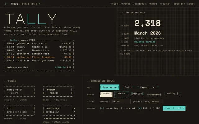
A kit for a ledger app drawn in printable ASCII: a 1ch x 22px grid, 1x/2x/4x type, four frame styles, bracket buttons in every state, a # block chart.
Preview
Use it
Free to use · credit appreciated1 Once, in your project · Node 22.20+
npx skills add SusanAcharya/Design-Lounge 2 Then ask
Using the Design Lounge skill, build "ASCII design language kit" (piece ascii-style) in my stack. Match its brief; restyle it onto my product's theme.
No skill? Paste the brief instead. It carries the numbers, tokens and behaviour.
<!-- Design Lounge Nº 545 · "ASCII design language kit" · www.designlounge.live -->

# ASCII design language kit

> **Build brief for a coding agent.** Rebuild this piece in the reader's stack. If they haven't said which stack, ask once, then default to semantic HTML + CSS + a little vanilla JS. Match the numbers below; don't "improve" them.

## What it is

A kit sheet for "Tally", an invented ledger you keep in a text file, that teaches an ASCII interface language. Everything sits on one cell, 1ch wide and 22px tall, on a warm espresso ground. Frames, buttons, checkboxes, the switch and a monthly spend chart are drawn with the 95 printable ASCII characters only, so the kit holds in any monospace font. Where the terminal kit in this library is green-black with box-drawing titles, this one is warm, uses no box-drawing at all, and shows each control in every state side by side. The detail worth copying: type sizes are exactly 1x, 2x and 4x of 14px with line heights 22, 44 and 88, so a display numeral covers a whole block of cells and the grid never drifts.

## Reference behaviour

1. Initial state at 1280 × 800: a 48px header with a dashed bottom rule; a 12-column sheet with 1px `--grid` gutters. Row one: the composition (7 columns) with a 96px Major Mono "tally" wordmark (the two `l`s cyan), a two-line intro and a 50-column ASCII ledger; and the type specimen (5 columns) set over a visible 1ch × 22px grid.
2. Row two: four frames (single, double, rounded, shadow) in a 2 × 2 grid, and the controls panel with four labelled rows: rest, states, fields, choices.
3. The states row shows hover, focus, active, disabled and loading as static specimens; the loading specimen cycles `-` `\` `|` `/` every 140ms ("saving -").
4. Click `[ Save entry ]`: its label reads "Saved 03-14" for 1600ms, then returns.
5. Type in the amount field: any value that is not up to 6 digits with up to 2 decimals turns the dashed border red and shows `! amount like 41.20` beside the fields (polite live region). A valid value clears it. Focus turns the border solid cyan.
6. Click a checkbox or radio label: `[ ]` ↔ `[x]`, `( )` → `(*)`, marks in cyan.
7. Click the switch `< on  |  off >`: `aria-checked` flips, the fill goes from cyan to the cell colour and the label reads `< off |  on  >`.
8. Hover a chart column: that column turns cyan, the rest return to `--ink-2`, and the readout reads e.g. `hover a column · Dec 2025  2,940.00 over` ("over" in red when the month is above 2,000). March 2026 is selected on load.
9. Row four: four grammar cards (One cell, 95 glyphs, Brackets act, One signal).

## Structure

```
1280 wide (page scrolls; first 800px = header + row 1 + top of row 2)
+--------------------------------------------------------------------------------+
| t  Tally / ascii kit 1.4             /type /frames /controls /chart /colour   grid 1ch x 22px | 48
+----------------------------------------------+---------------------------------+
| TALLY  (96px Major Mono, ll cyan)            | -- TYPE ON THE GRID  (grid bg)  |
| intro 56ch                                   | x4 56/88   2,318                |
| .-- tally / march 2026 ------------------.   | x2 28/44   March 2026           |
| | 03-02  groceries  Lidl Leith    - 41.20 |  | x1 14/22   Lidl Leith, ...      |
| | ... 6 rows, row 03-14 amber             |  | x1 bold    balance carried      |
| | balance carried          2,318.44 EUR   |  | label 12   EUR · 31 days ...    |
| '----------------------------------------'   | note                            |
+-----------------------+------------------------+--------------------------------+
| -- FRAMES             | -- BUTTONS AND INPUTS                                  |
| +-----+  +=====+      | rest    [ Save entry ] [ Split ] [ Export .txt ]       |
| |     |  ||   ||      | states  [ hover ] [ focus ] [[active]] [ locked ] [ saving - ] |

… 182 more lines. Copy or download for the full brief. Loading the source…Brief
222 linesBuild brief for a coding agent. Rebuild this piece in the reader’s stack. If they haven’t said which stack, ask once, then default to semantic HTML + CSS + a little vanilla JS. Match the numbers below; don’t “improve” them.
What it is
A kit sheet for “Tally”, an invented ledger you keep in a text file, that teaches an ASCII interface language. Everything sits on one cell, 1ch wide and 22px tall, on a warm espresso ground. Frames, buttons, checkboxes, the switch and a monthly spend chart are drawn with the 95 printable ASCII characters only, so the kit holds in any monospace font. Where the terminal kit in this library is green-black with box-drawing titles, this one is warm, uses no box-drawing at all, and shows each control in every state side by side. The detail worth copying: type sizes are exactly 1x, 2x and 4x of 14px with line heights 22, 44 and 88, so a display numeral covers a whole block of cells and the grid never drifts.
Reference behaviour
- Initial state at 1280 × 800: a 48px header with a dashed bottom rule; a 12-column sheet with 1px
--gridgutters. Row one: the composition (7 columns) with a 96px Major Mono “tally” wordmark (the twols cyan), a two-line intro and a 50-column ASCII ledger; and the type specimen (5 columns) set over a visible 1ch × 22px grid. - Row two: four frames (single, double, rounded, shadow) in a 2 × 2 grid, and the controls panel with four labelled rows: rest, states, fields, choices.
- The states row shows hover, focus, active, disabled and loading as static specimens; the loading specimen cycles
-\|/every 140ms (“saving -”). - Click
[ Save entry ]: its label reads “Saved 03-14” for 1600ms, then returns. - Type in the amount field: any value that is not up to 6 digits with up to 2 decimals turns the dashed border red and shows
! amount like 41.20beside the fields (polite live region). A valid value clears it. Focus turns the border solid cyan. - Click a checkbox or radio label:
[ ]↔[x],( )→(*), marks in cyan. - Click the switch
< on | off >:aria-checkedflips, the fill goes from cyan to the cell colour and the label reads< off | on >. - Hover a chart column: that column turns cyan, the rest return to
--ink-2, and the readout reads e.g.hover a column · Dec 2025 2,940.00 over(“over” in red when the month is above 2,000). March 2026 is selected on load. - Row four: four grammar cards (One cell, 95 glyphs, Brackets act, One signal).
Structure
1280 wide (page scrolls; first 800px = header + row 1 + top of row 2)
+--------------------------------------------------------------------------------+
| t  Tally / ascii kit 1.4             /type /frames /controls /chart /colour   grid 1ch x 22px | 48
+----------------------------------------------+---------------------------------+
| TALLY  (96px Major Mono, ll cyan)            | -- TYPE ON THE GRID  (grid bg)  |
| intro 56ch                                   | x4 56/88   2,318                |
| .-- tally / march 2026 ------------------.   | x2 28/44   March 2026           |
| | 03-02  groceries  Lidl Leith    - 41.20 |  | x1 14/22   Lidl Leith, ...      |
| | ... 6 rows, row 03-14 amber             |  | x1 bold    balance carried      |
| | balance carried          2,318.44 EUR   |  | label 12   EUR · 31 days ...    |
| '----------------------------------------'   | note                            |
+-----------------------+------------------------+--------------------------------+
| -- FRAMES             | -- BUTTONS AND INPUTS                                  |
| +-----+  +=====+      | rest    [ Save entry ] [ Split ] [ Export .txt ]       |
| |     |  ||   ||      | states  [ hover ] [ focus ] [[active]] [ locked ] [ saving - ] |
| .-----.  +-----+#     | fields  amount> [41.20   ]  payee> [who, where]        |
| '-----'   ######      | choices [x] recurring [ ] shared (*) EUR ( ) GBP < on | off > |
+-----------------------+--------------------------------------------------------+
| -- COLOUR ROLES       | -- BLOCK CHART, SPEND PER MONTH                        |
| ###### Ink    #EFE6D2 | 3,000 |            :::                                 |
| ...6 roles            | 1,500 | ::: ### ### ### ...                  ###       |
|                       |     0 +- - - - - - - - - - - - - - - - - - - - -        |
|                       |        A  M  J  J  A  S  O  N  D  J  F  M              |
+-----------+-----------+-----------+-----------+--------------------------------+
| One cell  | 95 glyphs | Brackets act | One signal                              |
+--------------------------------------------------------------------------------+
spans: hero 7 / spec 5 / frames 5 / controls 7 / colour 5 / chart 7 / rules 12
<header class="top">: mark (Major Monot, cyan,aria-hidden), brand,<nav>of five anchors (each with a/prefix in--line), a grid note.<main class="sheet">:display: grid; grid-template-columns: repeat(12, minmax(0,1fr)); gap: 1px; background: var(--grid); each<section class="cellx">hasbackground: var(--bg); padding: 22px 3ch.- Section labels are
<h2 class="lbl">: Space Mono 700 12px, uppercase, 0.12em tracking,--prefix in--line. No numbers. - Frames are
<pre data-frame data-w>whose text is rows split by|; a script draws the border (see Implementation notes) and setsrole="img". - Controls: real
<button>s,<input>s inside<label class="fld">, checkboxes and radios hidden at 0 × 0 with a.gspan that draws the glyph, a<button role="switch">. - Chart:
.barsflex row 198px tall (18 rows × 11px) with a left axis; each.colholds a<pre>of<span>###</span>rows;.monthsrow below;.readoutlive region.
Tokens
:root {
  /* colour: warm espresso ground, cream ink, one cyan signal, two money states */
  --bg: #1a1612;        /* page and cells */
  --cell: #211c17;      /* field and switch-off fill */
  --grid: #2e2720;      /* 1px gutters and the type grid */
  --ink: #efe6d2;       /* text, frames, hover fill (14.5:1) */
  --ink-2: #b3a68f;     /* labels, axes, unselected marks (7.5:1) */
  --line: #8c806b;      /* dashed rules, field borders, label dashes (4.6:1) */
  --cyan: #63d2c6;      /* the one signal: primary, selected, focus (9.9:1) */
  --cyan-ink: #0c1a18;  /* text on cyan */
  --amber: #f2a65a;     /* near budget */
  --red: #ff8a7a;       /* over budget, field error */

  /* type */
  --mono: "Space Mono", ui-monospace, Menlo, monospace;
  --disp: "Major Mono Display", "Space Mono", monospace;
  --fs: 14px; --lh: 22px;                 /* the cell */
  --fs-x2: 28px; --lh-x2: 44px;
  --fs-x4: 56px; --lh-x4: 88px;
  --fs-label: 12px;
  --fs-word: clamp(48px, 7.4vw, 96px);
  --chart-row: 11px;                      /* half a line, 18 rows = 198px */

  /* layout */
  --header-h: 48px;
  --cell-pad: 22px 3ch;
  --gap: 1ch;  --gap-2: 2ch;
  --control-h: 36px; --field-h: 32px;
  --radius: 0;

  /* motion */
  --t-micro: 120ms;
  --spin-step: 140ms;
  --saved-hold: 1600ms;
  --ease: cubic-bezier(.2, .7, .2, 1);

  /* focus */
  --focus: 1px dashed var(--cyan); --focus-offset: 3px;
}
Typography
| Role | Family | Size / line | Weight | Case, tracking | Colour |
|---|---|---|---|---|---|
| Wordmark | Major Mono Display | clamp(48px, 7.4vw, 96px) / 1 | 400 | as typed, -0.02em | --ink, ll cyan |
| Display numeral (x4) | Space Mono | 56 / 88 | 700 | 0 | --ink |
| Heading (x2) | Space Mono | 28 / 44 | 700 | 0 | --ink |
| Body, ledger, controls (x1) | Space Mono | 14 / 22 | 400 | 0 | --ink |
| Emphasis (x1 bold) | Space Mono | 14 / 22 | 700 | 0 | --cyan |
| Section label | Space Mono | 12 / 22 | 700 | uppercase, 0.12em | --ink-2 |
| Captions, axis, hex | Space Mono | 12 / 22 | 400 | 0 | --ink-2 |
Set font-variant-ligatures: none. Major Mono Display is for the wordmark and the header mark only; never set data in it.
Motion
| Thing | Trigger | Change | Timing | Reduced motion |
|---|---|---|---|---|
| Button hover | pointer | background → --ink, text → --bg | 120ms --ease | 1ms |
| Button press | :active | translateY(1px) | instant | same |
| Loading spinner | always | glyph `- \ | /` | 140ms per frame |
| Save confirmation | click | label → “Saved 03-14” → back | hold 1600ms | same (it is content) |
| Chart column | hover | colour --ink-2 → --cyan | instant | same |
| Switch | click | fill and label swap | instant | same |
Nothing eases in or slides. Change is a glyph swap or a fill swap, as it would be in a character cell display.
States
- Button rest: text
--ink, brackets--cyan, no border, 36px tall. Primary:--cyanfill,--cyan-inktext 700, brackets in--cyan-ink. - Hover:
--inkfill,--bgtext, brackets--bg. Primary hover also goes to--ink. - Focus-visible:
1px dashed --cyan, 3px offset, on every control. - Active: brackets double,
[[active]], and 1px down. - Disabled: text and brackets
--ink-2, line-through,cursor: not-allowed. - Loading:
[ saving - ]with the last glyph cycling. - Field rest:
--cellfill, 1px dashed--lineborder, 32px tall, cyan caret. Focus: border solid--cyan. Error: border--red, message! amount like 41.20in red 12px. - Checkbox:
[ ]--ink-2→[x]--cyan. Radio:( )→(*). - Switch on: cyan fill,
< on | off >. Off:--cellfill, dashed--lineborder,< off | on >in--ink-2. - Chart column selected:
###rows in cyan; readout bold--ink; months over 2,000 add “over” in--red. - Ledger row near budget: whole row amber (03-14 eating out).
Accessibility
- Frames, the ledger and the chart are
role="img"with anaria-labelthat says what they show; frames take their label from their rows. Chart columns and colour swatches arearia-hidden. - The chart readout is
aria-live="polite"; give each columntabindex="0"and the same handler onfocusin production so keyboard users can read months. - Checkboxes and radios are native inputs at 0 × 0 inside
<label>; Space and arrow keys work; focus draws the dashed ring on the glyph span. - The switch is
<button role="switch" aria-checked>; Space and Enter toggle it. - The amount field has
aria-describedbypointing at the error span, andaria-invalidmirrors its state. - The state specimens (hover, focus, active, loading) are
aria-hiddenspans so they are not mistaken for live buttons; the disabled one is a real disabled button. - Contrast on
--bg:--ink14.5:1,--ink-27.5:1,--cyan9.9:1,--amber8.9:1,--red7.9:1;--cyan-inkon--cyan9.8:1. Field borders--line4.4:1 against--cell, so form controls clear 3:1.
Responsive rules
- ≥ 1280: spans as drawn (7/5, 5/7, 5/7, 12).
- 1000–1279: same spans; the ledger may clip at its right edge inside
overflow: hidden, so keep it at 50 columns or fewer. - < 1000: every section spans 12; grammar cards become 2 × 2.
- < 640: header nav and the
grid 1ch x 22pxlabel hide (mono glyphs are a little wider on Linux, and the label pushed the row past 390); cell padding22px 16px; ledger 10.5px / 17px so 50 columns fit 358px; x4 specimen drops to 42 / 66; frames stack to one column; grammar cards stack; chart columns drop to 9px glyphs with 2px gaps and a 5ch axis. At 390 nothing scrolls sideways.
Acceptance checklist
Always
- Every glyph in frames, controls and the chart is in U+0020–U+007E.
- Type sizes are 1x, 2x, 4x of the body size with line heights 1x, 2x, 4x of 22px;
border-radiusis 0 everywhere. - Four frame styles are drawn by one function from a style table (corners, horizontal, vertical); the shadow frame adds
#on the right and a#row below, offset 1 cell. - Buttons render as
[ Label ]with brackets in the signal colour; hover inverts to ink; disabled is line-through. - Each control state (rest, hover, focus, active, disabled, loading) is shown side by side.
- Checkboxes
[ ]/[x], radios( )/(*)are native inputs and work with keyboard. - The switch is
role="switch"and flipsaria-checkedand its label. - Form controls keep ≥ 3:1 edges (dashed
--lineborder on--cell). - Chart bars are rows of
###in 11px rows; one column is selected; hover moves the selection and updates a live readout. - At 390 wide there is no sideways scroll and no chart column is narrower than its glyphs.
This demo
- Wordmark “tally” in Major Mono Display at 96px with “ll” in
#63D2C6. - Ledger is 50 columns, six entries, row 03-14 in amber, balance
2,318.44 EURin cyan. - Chart covers Apr 2025 to Mar 2026, peak 2,940 in December, March 2026 selected.
- Amount validation message reads
! amount like 41.20.
Implementation notes
One function draws every frame. Keep frames as data and let code count the columns; hand-typed frames are always one dash short.
const sets = { single: ['+','+','+','+','-','|'], double: ['+','+','+','+','=','||'],
               round: ['.','.',"'","'",'-','|'], shadow: ['+','+','+','+','-','|'] };
function frame(kind, w, rows) {
  const [tl, tr, bl, br, h, v] = sets[kind], inner = w - 2 * v.length;
  const pad = s => (' ' + s).padEnd(inner).slice(0, inner);
  let out = [tl + h.repeat(w - 2) + tr, ...rows.map(r => v + pad(r) + v), bl + h.repeat(w - 2) + br];
  if (kind === 'shadow') out = out.map((l, i) => i ? l + '#' : l + ' ').concat(' ' + '#'.repeat(w));
  return out.join('\n');
}
A visible cell grid behind the specimen with two 1px gradients sized in ch, so the grid follows the font:
.spec { background-color: var(--bg);
  background-image: linear-gradient(var(--grid) 1px, transparent 1px),
                    linear-gradient(90deg, var(--grid) 1px, transparent 1px);
  background-size: 1ch 22px; background-position: -1px 21px; }
Block chart rows as spans. Build each bar from the top: one partial row (::: above half a cell, ... above 15%), then full ### rows. Wrap each row in a span; a single text node of ###\n### counts as one narrow element full of words and fails phone layout checks.
const n = v / 3000 * 18, full = Math.floor(n), part = n - full;
pre.innerHTML = (part > .15 ? [part > .5 ? ':::' : '...'] : [])
  .concat(Array(full).fill('###')).map(r => '<span>' + r + '</span>').join('\n');
Common mistakes: putting a background colour in a non-final layer of a multi-layer background shorthand (the whole declaration is dropped); using │ or █ (missing from Google Fonts subsets, they fall back and tear); setting the field edge only on border-bottom (control-edge checks read the top border too).
Details
- Palette
- Type
- Space Mono · Major Mono Display
- Motion
- Subtle motion
- Build
- One session
- Tags
Similar
ASCII art homepage
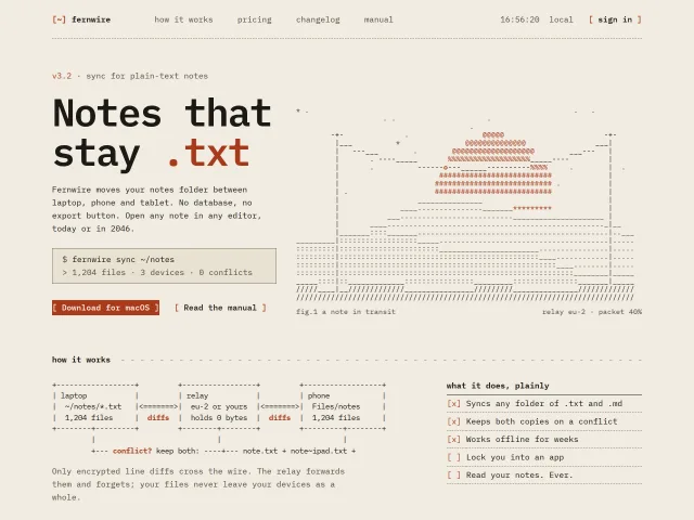
A homepage drawn in 7-bit ASCII on a monospace grid: a generated sunset with a packet on a wire, a typing command line, bracket buttons that go solid.
Terminal UI style sheet
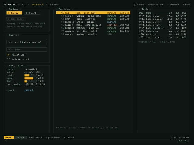
A monospace 1ch-grid style sheet for a terminal-style ops UI: box-drawing panel titles, bracketed buttons, key-value rows, an amber-highlighted list, a table, a status line and a : command input.
Pixel arcade design language kit
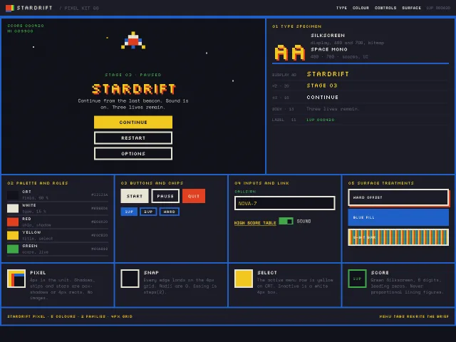
An 8-bit pause-menu kit: 4px grid, Silkscreen display, Space Mono scores, hard NES-like colours, CSS box-shadow sprites, and a Stardrift start screen.
Luxe serif design style
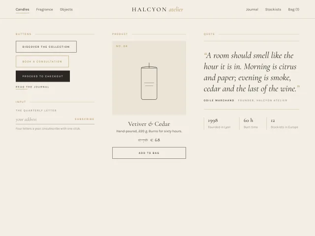
High-contrast Cormorant Garamond with Karla small caps, hairline gold rules, cream and charcoal surfaces and centre-out underlines; a nav, four buttons, a newsletter input, a product card and a quote.
Cyber HUD design language kit
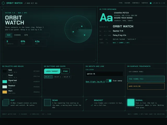
A near-black ops HUD kit: cut corners, scanlines, signal teal on void, Chakra Petch titles, Share Tech Mono readouts, and a Sector 7-K nav console.
Text scramble reveal
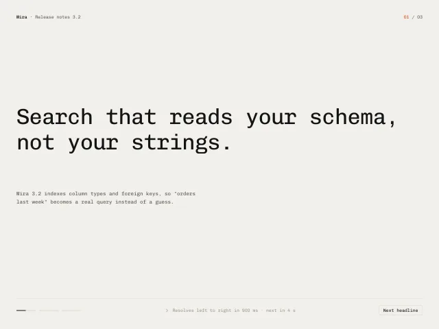
A 64px monospace headline resolves from random glyphs to its final text left to right in 900ms; three headlines cycle every 4s with a progress dash per headline; click or Space skips.