Nº 467 of 677
Vertical label service columns
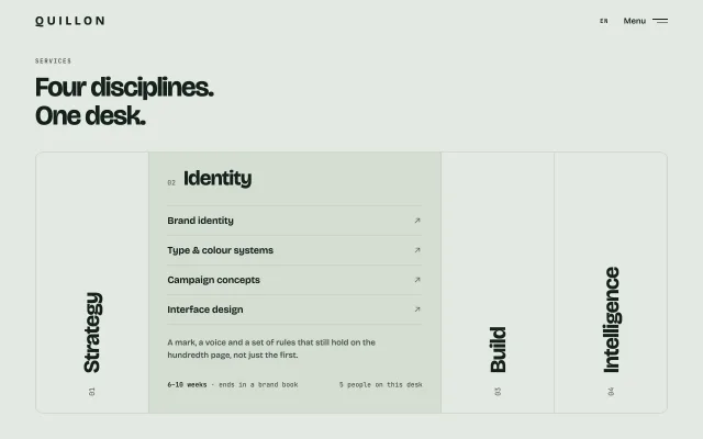
Four tall columns with rotated service names. Hover, click or Enter widens one into a list of services with arrows; the others stay as labels.
Preview
Use it
Free to use · credit appreciated1 Once, in your project · Node 22.20+
npx skills add SusanAcharya/Design-Lounge 2 Then ask
Using the Design Lounge skill, build "Vertical label service columns" (piece features-vertical-label-columns) in my stack. Match its brief; restyle it onto my product's theme.
No skill? Paste the brief instead. It carries the numbers, tokens and behaviour.
<!-- Design Lounge Nº 467 · "Vertical label service columns" · www.designlounge.live -->

# Vertical label service columns

> **Build brief for a coding agent.** Rebuild this piece in the reader's stack. If they haven't said which stack, ask once, then default to semantic HTML + CSS + a little vanilla JS. Match the numbers below; don't "improve" them.

## What it is

Studied from moremedia.at: the services block where each discipline is a tall column with its name set vertically, and pointing at one widens it into a list of what that discipline includes. This rebuild is for **Quillon**, a fictional brand and web studio, on a cool sage page with deep green ink instead of warm white. It is a horizontal accordion: one column is always open (2.6× the width of the others, a slightly darker fill), and the closed ones are rotated 40px labels with a mono number under them. The detail worth copying is that the closed state still reads as a strong typographic composition, so the section looks finished before anyone touches it.

## Reference behaviour

1. First frame: 76px header (tracked caps wordmark "QUILLON", "EN", "Menu" with a two-line icon). Eyebrow "SERVICES", then "Four disciplines. / One desk." at 50px.
2. A 476px-tall box, 64px side margins, 1px border, 14px radius, split into four columns by 1px rules: Strategy 01, Identity 02, Build 03, Intelligence 04.
3. Identity starts open: fill `#D4DDD2`, width ≈ 2.6× a closed column. Its panel shows "02 Identity" (38px), four service rows with ↗ arrows, a 15px description, and a mono footer "6–10 weeks · ends in a brand book" / "5 people on this desk".
4. Closed columns show the name rotated to read bottom-to-top, 40px Bricolage 700, bottom-aligned 30px from the floor, with the number 26px under it.
5. Pointer enters a closed column (fine pointers only): after a 90ms intent delay it opens; the open one closes. Widths animate with `flex-grow` over 640ms expo out. Leaving the box keeps the last one open.
6. Opening: the vertical label and number fade out (250ms); the panel fades in after a 200ms delay (380ms) and its title rises 10px.
7. Click (or tap) a closed column: it opens immediately. Enter/Space on its button opens it and moves focus to its first service link.
8. Hover a service row: text slides 6px right, arrow turns vermilion and nudges 2px up-right.
9. Hover a closed column (before it opens): its label nudges 6px.
10. Reduced motion: widths and fades switch instantly.

## Structure

```
1280 × 800
┌────────────────────────────────────────────────────────────────────────┐
│ QUILLON                                              EN   Menu ═══     │ 76
│ SERVICES                                                               │
│ Four disciplines.                                       (50px)         │
│ One desk.                                                              │
│ ┌──────────┬─────────────────────────────┬──────────┬──────────┐       │
│ │          │ 02 Identity                 │          │          │       │
│ │          │ ─────────────────────────── │          │          │       │
│ │          │ Brand identity           ↗  │          │    I     │       │
│ │    S     │ Type & colour systems    ↗  │          │    n     │  476  │
│ │    t     │ Campaign concepts        ↗  │    B     │    t…    │       │
│ │    r…    │ Interface design         ↗  │    u…    │          │       │
│ │          │ A mark, a voice and …       │          │          │       │

… 161 more lines. Copy or download for the full brief. Loading the source…Brief
201 linesBuild brief for a coding agent. Rebuild this piece in the reader’s stack. If they haven’t said which stack, ask once, then default to semantic HTML + CSS + a little vanilla JS. Match the numbers below; don’t “improve” them.
What it is
Studied from moremedia.at: the services block where each discipline is a tall column with its name set vertically, and pointing at one widens it into a list of what that discipline includes. This rebuild is for Quillon, a fictional brand and web studio, on a cool sage page with deep green ink instead of warm white. It is a horizontal accordion: one column is always open (2.6× the width of the others, a slightly darker fill), and the closed ones are rotated 40px labels with a mono number under them. The detail worth copying is that the closed state still reads as a strong typographic composition, so the section looks finished before anyone touches it.
Reference behaviour
- First frame: 76px header (tracked caps wordmark “QUILLON”, “EN”, “Menu” with a two-line icon). Eyebrow “SERVICES”, then “Four disciplines. / One desk.” at 50px.
- A 476px-tall box, 64px side margins, 1px border, 14px radius, split into four columns by 1px rules: Strategy 01, Identity 02, Build 03, Intelligence 04.
- Identity starts open: fill
#D4DDD2, width ≈ 2.6× a closed column. Its panel shows “02 Identity” (38px), four service rows with ↗ arrows, a 15px description, and a mono footer “6–10 weeks · ends in a brand book” / “5 people on this desk”. - Closed columns show the name rotated to read bottom-to-top, 40px Bricolage 700, bottom-aligned 30px from the floor, with the number 26px under it.
- Pointer enters a closed column (fine pointers only): after a 90ms intent delay it opens; the open one closes. Widths animate with
flex-growover 640ms expo out. Leaving the box keeps the last one open. - Opening: the vertical label and number fade out (250ms); the panel fades in after a 200ms delay (380ms) and its title rises 10px.
- Click (or tap) a closed column: it opens immediately. Enter/Space on its button opens it and moves focus to its first service link.
- Hover a service row: text slides 6px right, arrow turns vermilion and nudges 2px up-right.
- Hover a closed column (before it opens): its label nudges 6px.
- Reduced motion: widths and fades switch instantly.
Structure
1280 × 800
┌────────────────────────────────────────────────────────────────────────┐
│ QUILLON                                              EN   Menu ═══     │ 76
│ SERVICES                                                               │
│ Four disciplines.                                       (50px)         │
│ One desk.                                                              │
│ ┌──────────┬─────────────────────────────┬──────────┬──────────┐       │
│ │          │ 02 Identity                 │          │          │       │
│ │          │ ─────────────────────────── │          │          │       │
│ │          │ Brand identity           ↗  │          │    I     │       │
│ │    S     │ Type & colour systems    ↗  │          │    n     │  476  │
│ │    t     │ Campaign concepts        ↗  │    B     │    t…    │       │
│ │    r…    │ Interface design         ↗  │    u…    │          │       │
│ │          │ A mark, a voice and …       │          │          │       │
│ │   01     │ 6–10 weeks · …   5 people…  │   03     │   04     │       │
│ └──────────┴─────────────────────────────┴──────────┴──────────┘       │
│  64                                                            64      │
└────────────────────────────────────────────────────────────────────────┘header: wordmark link,.rightwith language tag and abutton.menu.section.intro:.eyebrow,h1.div.cols(flex row). Eacharticle.colholds:button.tab[aria-expanded][aria-controls]filling the column, containing.vlabeland.num.div.panel[role=region][aria-label]absolutely filling the column:h2(withsmallnumber),ulof four links,p.desc,p.foot. Closed panels areinert.
- Panels have
min-width: 400pxso text never reflows while the column is still growing; the column’soverflowclips it.
Tokens
:root {
  --page: #e4e9e2;    /* cool sage page */
  --open: #d4ddd2;    /* fill of the open column */
  --line: #bfcabd;    /* box border, column rules, row rules */
  --ink: #13201a;     /* deep green-black */
  --ink-2: #44524a;   /* eyebrow, description, footer */
  --ink-3: #57645c;   /* numbers, idle arrows */
  --accent: #d8432a;  /* arrow hover, focus ring */

  --sans: "Bricolage Grotesque", system-ui, sans-serif;
  --mono: "JetBrains Mono", ui-monospace, monospace;

  --pad-x: 64px;
  --box-h: 476px;
  --radius: 14px;
  --grow-open: 2.6;
  --row-h: 54px;

  --ease: cubic-bezier(0.2, 0.7, 0.2, 1);
  --expo: cubic-bezier(0.16, 1, 0.3, 1);
  --t-grow: 640ms;
}
Typography
| Role | Family | Size | Weight | Line-height | Tracking | Notes |
|---|---|---|---|---|---|---|
| Wordmark | Bricolage Grotesque, opsz 24 | 22px | 700 | 1 | 0.26em | UPPER |
| Header links | Bricolage Grotesque | 15px | 500 | 1 | 0 | — |
| Lang / eyebrow | JetBrains Mono | 11px | 500 | 1 | 0.10 / 0.16em | UPPER |
| H1 | Bricolage Grotesque, opsz 96 | 50px | 700 | 1.04 | −0.035em | two lines |
| Vertical label | Bricolage Grotesque, opsz 72 | 40px | 700 | 1 | −0.03em | writing-mode: vertical-rl + rotate 180° |
| Column number | JetBrains Mono | 13px | 400 | 1 | 0 | vertical too |
| Panel title | Bricolage Grotesque, opsz 72 | 38px | 700 | 1 | −0.03em | number 12px mono before it |
| Service row | Bricolage Grotesque | 18px | 600 | 1 | −0.01em | 54px rows |
| Description | Bricolage Grotesque | 15px | 400 | 1.5 | 0 | max 40ch |
| Footer | JetBrains Mono | 12px | 400 / 500 | 1.5 | 0 | — |
Motion
| Thing | Trigger | Property | From → To | Duration | Easing | Delay | Reduced motion |
|---|---|---|---|---|---|---|---|
| Column | open/close | flex-grow | 1 ↔ 2.6 | 640ms | expo out | — | instant |
| Column | open/close | background | page ↔ --open | 300ms | standard | — | instant |
| Label + number | open | opacity | 1 → 0 | 250ms | standard | — | instant |
| Panel | open | opacity | 0 → 1 | 380ms | standard | 200ms | instant |
| Panel | close | opacity | 1 → 0 | 200ms | standard | — | instant |
| Panel title | open | translateY | 10px → 0 | 500ms | expo out | 200ms | none |
| Closed label | hover | translateY | 0 → 6px | 400ms | expo out | — | none |
| Row text | hover/focus | translateX | 0 → 6px | 250ms | expo out | — | none |
| Row arrow | hover/focus | translate, colour | 0 → (2px, −2px), --ink-3 → --accent | 250ms | expo out | — | colour only |
Hover-to-open waits 90ms so sweeping the pointer across the box does not open every column on the way.
States
- Closed column: page background, vertical label and number visible, panel
inertand invisible. - Closed column hover: label nudges 6px; after 90ms the column opens.
- Open column:
--openfill,aria-expanded="true", panel visible and interactive, its tab ignores pointer events. - Tab focus-visible: 2px accent ring inset 6px, 10px radius, drawn inside the column.
- Row link focus-visible: 2px accent ring inset 2px; same slide and arrow treatment as hover.
- Exactly one column is open at all times. There is no all-closed state.
Accessibility
- Each column trigger is a real
<button>witharia-expandedandaria-controlspointing at its panel. Its accessible name is the label plus number (“Strategy 01”). - Panels are
role="region"witharia-label. Closed panels areinert, so their links are skipped by Tab and screen readers. - Keyboard: Tab moves across the four triggers, then into the open panel’s links. Enter/Space on a trigger opens it and focuses its first link.
- Hover-to-open only runs on
(hover: hover) and (pointer: fine). Touch uses tap. - Arrows are
aria-hidden; the row text is the link name. - Contrast:
#13201Aon#E4E9E2≈ 14:1,#44524Aon#D4DDD2≈ 6:1,#57645Con#E4E9E2≈ 5:1. - Trigger hit areas are the full column (≥ 200×476px). Rows are 54px tall.
Responsive rules
- ≥ 1280: as specified.
- 1024–1100: header, intro and box margins 32px. Vertical labels 32px.
- 768–1023: same; “Intelligence” still fits vertically at 476px.
- < 760: the box becomes a vertical accordion. Each closed column is a 64px row with “01 Strategy” set horizontally (24px). The open one hides its trigger row and shows the panel in flow (title 26px, rows 48px, footer stacked). Language tag hides.
- At 375px: no horizontal scroll.
Acceptance checklist
Always
- Four columns in a bordered, rounded box, separated by 1px rules.
- Closed columns show the name rotated to read bottom-to-top, with the number under it, bottom-aligned.
- Exactly one column is open on load and at all times.
- Opening animates width (flex-grow), not by swapping layouts.
- Panel content fades in after the width starts moving and does not reflow while growing.
- Triggers are buttons with
aria-expanded; closed panels areinert. - Enter/Space opens and moves focus to the first link.
- Hover-to-open has an intent delay and is limited to fine pointers.
- One accent colour, only on arrow hover and focus.
- Below 760px it becomes a vertical accordion with no horizontal scroll.
This demo
- Columns: Strategy 01, Identity 02, Build 03, Intelligence 04; Identity open at load.
- H1 “Four disciplines. / One desk.” at 50px Bricolage Grotesque 700.
- Open grow 2.6, 640ms expo out; box 476px tall, 14px radius.
- Page
#E4E9E2, open fill#D4DDD2, accent#D8432A.
Implementation notes
Vertical type that reads upward. writing-mode: vertical-rl alone reads top-to-bottom; rotate it 180° so it reads from the floor up, like a book spine on a shelf.
.vlabel { writing-mode: vertical-rl; transform: rotate(180deg);
  font: 700 40px/1 var(--sans); letter-spacing: -.03em; white-space: nowrap; }
.tab { position: absolute; inset: 0; display: flex; flex-direction: column;
  align-items: center; justify-content: flex-end; gap: 26px; padding-bottom: 30px; }
Grow by flex, fade by delay. Animate flex-grow from 1 to 2.6. Keep the panel at a fixed min-width so its text does not rewrap every frame, and delay its fade so it appears into space that already exists.
.col { flex: 1 1 0; min-width: 0; transition: flex-grow 640ms var(--expo); }
.col.open { flex-grow: 2.6; background: var(--open); }
.panel { position: absolute; inset: 0; min-width: 400px; opacity: 0; visibility: hidden;
  transition: opacity .2s, visibility 0s .2s; }
.col.open .panel { opacity: 1; visibility: visible; transition: opacity .38s .2s, visibility 0s .2s; }
Single source of open state.
function open(col, focusPanel) {
  cols.forEach(c => {
    const on = c === col;
    c.classList.toggle('open', on);
    c.querySelector('.tab').setAttribute('aria-expanded', String(on));
    c.querySelector('.panel').inert = !on;
  });
  if (focusPanel) col.querySelector('.panel a').focus({ preventScroll: true });
}
Common mistakes: collapsing everything on mouseleave (the box flickers to four equal columns); animating width in px so the columns stop summing to the box; letting closed panels stay tabbable; rotating the label with transform: rotate(-90deg) on a horizontal element, which keeps its horizontal layout width and breaks the column; opening on hover for touch devices.
Details
- Palette
- Type
- Bricolage Grotesque · JetBrains Mono
- Motion
- Subtle motion
- Stack
- Plain HTML, CSS and vanilla JS. No framework or packages, so nothing to clash with your versions.
- Build
- One session
- Tags
Similar
Outline name marquee
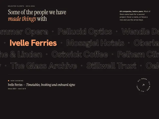
Four rows of huge outlined client names drift in alternating directions. Hover or arrow to a name to fill it and caption the project; a ring badge spins.
FAQ two-column search
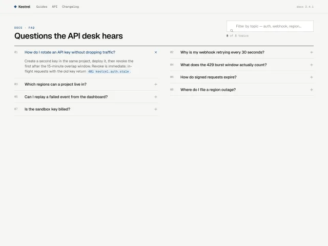
A Kestrel docs FAQ: eight accordion rows in two columns, a 44px search field that filters them, and an empty state when nothing hits.
Live checkout bento
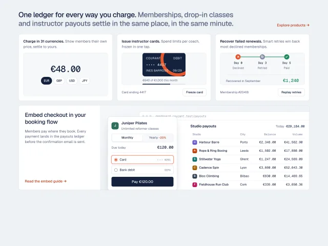
A product bento where every cell is working UI: a currency switcher, a freezable issued card, a retry timeline, and a checkout that posts its payment into a payouts ledger.
Accordion with media swap
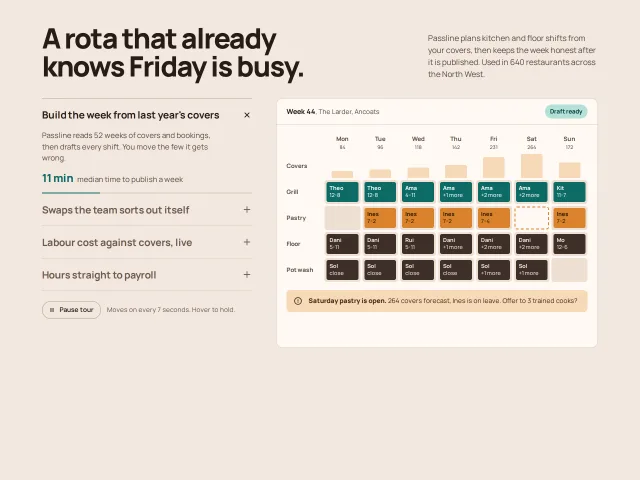
Four features in a vertical accordion; opening one crossfades a drawn product screen on the right, and a 7s progress bar advances the tour until you hover.
Giant numeral steps
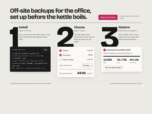
How it works in three steps: 250px numerals on hairline columns, each tucked behind a real artefact: a terminal, a priced form, a restore result.
Enterprise sitemap footer
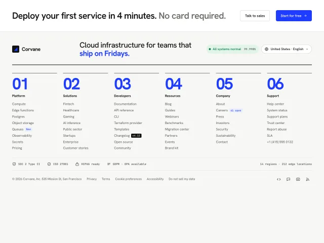
A dense six-column Swiss sitemap footer with giant index numerals, a live status pill with a 90-day uptime card, and a region and language popover.