Nº 569 of 605
Three-step wizard dialog
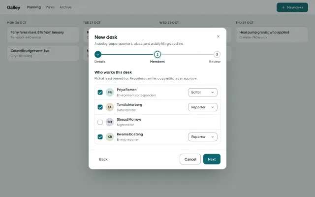
A 560px creation wizard in one modal: details, members, review, with a step track, per-step validation and a panel height that animates between steps.
Preview
Use it
Free to use · credit appreciated1 Once, in your project · Node 22.20+
npx skills add SusanAcharya/Design-Lounge 2 Then ask
Using the Design Lounge skill, build "Three-step wizard dialog" (piece dialog-wizard-steps) in my stack. Match its brief; restyle it onto my product's theme.
No skill? Paste the brief instead. It carries the numbers, tokens and behaviour.
<!-- Design Lounge Nº 569 · "Three-step wizard dialog" · www.designlounge.live -->

# Three-step wizard dialog

> **Build brief for a coding agent.** Rebuild this piece in the reader's stack. If they haven't said which stack, ask once, then default to semantic HTML + CSS + a little vanilla JS. Match the numbers below; don't "improve" them.

## What it is

A creation wizard that lives inside one modal instead of taking over the page. In a newsroom planning tool called Galley, "New desk" opens a 560px dialog with three steps: Details (name, beat chips, timezone, filing deadline), Members (people with a checkbox and a per-person role), and Review (a summary with an Edit link per row). A three-dot track shows progress, every step validates before Next lets you on, and the dialog's height animates between steps so the footer glides rather than jumps. The detail worth copying is that height animation: measure, pin, release, so a 334px step can become a 285px step over 360ms with the panels sliding 24px past each other.

## Reference behaviour

1. Initial state: the dialog is open over the dimmed planning board (scrim `rgba(19,32,28,.42)`), on step 2, Members. Step 1 shows a filled teal dot with a check, step 2 is the current dot (teal ring plus a 4px `--accent-soft` halo), step 3 is an empty grey dot. The track is filled to 50%.
2. Members shows four people. Three are checked; checked rows show a 118 × 34px role select, unchecked rows hide theirs (`visibility: hidden`, so rows keep their height). Priya Raman is Editor.
3. Next validates the current step.
   - Details: name must be at least 3 characters after trim, and a timezone must be chosen. Failure sets `aria-invalid` on the name, shows a red message under it ("Give the desk a name of at least 3 characters.") and focuses the field.
   - Members: at least one checked person must be Editor. Failure shows "Someone has to approve copy. Make one person an Editor." under the list.
   - Typing in the name, or changing any checkbox, clears that step's message.
4. A valid Next moves forward: the old panel fades and slides 24px left, the new one fades in from 24px right, the stage height animates from the old panel's height to the new one, the track fill moves to 0%, 50% or 100%, and focus moves to the first control of the new panel. Back does the mirror image.
5. Review builds three rows from the answers: Desk (name, beats), Deadline (17:30 daily, Europe/London), Members (3 people, "Priya (editor), Tom (reporter), Kwame (reporter)"). Each row's Edit jumps straight to that step.
6. On Review the primary reads "Create desk". Pressing it shows a confirmation panel ("Climate and energy is ready", "3 people were added. Their first deadline is today at 17:30."), hides Back and Cancel, and the primary becomes "Open desk", which closes the dialog.
7. Escape, the close button and Cancel close at any step. Focus returns to the "New desk" button in the top bar, which reopens the wizard at step 1.

## Structure

```
1280 × 800
┌────────────────────────────────────────────────────────────────────────┐
│ Galley  Planning Wires Archive                         [+ New desk]   │ 60
├────────────────────────────────────────────────────────────────────────┤
│ MON 26 OCT      TUE 27 OCT      WED 28 OCT      THU 29 OCT             │
│ [story]  ┌──────────────── dialog 560 ─────────────────┐ [story]       │
│ [story]  │ New desk                                  [x]│               │
│          │ A desk groups reporters, a beat and ...      │               │
│          │ (✓)────────────────(2)─────────────────( 3 ) │ track 2px     │
│          │ Details          Members           Review    │               │
│          │ ┌ stage (height animates) ─────────────────┐ │               │
│          │ │ Who works this desk                      │ │               │
│          │ │ [✓] (PR) Priya Raman        [Editor   v] │ │ rows 56px     │
│          │ │ [✓] (TA) Tom Achterberg     [Reporter v] │ │               │

… 170 more lines. Copy or download for the full brief. Loading the source…Brief
210 linesBuild brief for a coding agent. Rebuild this piece in the reader’s stack. If they haven’t said which stack, ask once, then default to semantic HTML + CSS + a little vanilla JS. Match the numbers below; don’t “improve” them.
What it is
A creation wizard that lives inside one modal instead of taking over the page. In a newsroom planning tool called Galley, “New desk” opens a 560px dialog with three steps: Details (name, beat chips, timezone, filing deadline), Members (people with a checkbox and a per-person role), and Review (a summary with an Edit link per row). A three-dot track shows progress, every step validates before Next lets you on, and the dialog’s height animates between steps so the footer glides rather than jumps. The detail worth copying is that height animation: measure, pin, release, so a 334px step can become a 285px step over 360ms with the panels sliding 24px past each other.
Reference behaviour
- Initial state: the dialog is open over the dimmed planning board (scrim
rgba(19,32,28,.42)), on step 2, Members. Step 1 shows a filled teal dot with a check, step 2 is the current dot (teal ring plus a 4px--accent-softhalo), step 3 is an empty grey dot. The track is filled to 50%. - Members shows four people. Three are checked; checked rows show a 118 × 34px role select, unchecked rows hide theirs (
visibility: hidden, so rows keep their height). Priya Raman is Editor. - Next validates the current step.
- Details: name must be at least 3 characters after trim, and a timezone must be chosen. Failure sets
aria-invalidon the name, shows a red message under it (“Give the desk a name of at least 3 characters.”) and focuses the field. - Members: at least one checked person must be Editor. Failure shows “Someone has to approve copy. Make one person an Editor.” under the list.
- Typing in the name, or changing any checkbox, clears that step’s message.
- Details: name must be at least 3 characters after trim, and a timezone must be chosen. Failure sets
- A valid Next moves forward: the old panel fades and slides 24px left, the new one fades in from 24px right, the stage height animates from the old panel’s height to the new one, the track fill moves to 0%, 50% or 100%, and focus moves to the first control of the new panel. Back does the mirror image.
- Review builds three rows from the answers: Desk (name, beats), Deadline (17:30 daily, Europe/London), Members (3 people, “Priya (editor), Tom (reporter), Kwame (reporter)”). Each row’s Edit jumps straight to that step.
- On Review the primary reads “Create desk”. Pressing it shows a confirmation panel (“Climate and energy is ready”, “3 people were added. Their first deadline is today at 17:30.”), hides Back and Cancel, and the primary becomes “Open desk”, which closes the dialog.
- Escape, the close button and Cancel close at any step. Focus returns to the “New desk” button in the top bar, which reopens the wizard at step 1.
Structure
1280 × 800
┌────────────────────────────────────────────────────────────────────────┐
│ Galley  Planning Wires Archive                         [+ New desk]   │ 60
├────────────────────────────────────────────────────────────────────────┤
│ MON 26 OCT      TUE 27 OCT      WED 28 OCT      THU 29 OCT             │
│ [story]  ┌──────────────── dialog 560 ─────────────────┐ [story]       │
│ [story]  │ New desk                                  [x]│               │
│          │ A desk groups reporters, a beat and ...      │               │
│          │ (✓)────────────────(2)─────────────────( 3 ) │ track 2px     │
│          │ Details          Members           Review    │               │
│          │ ┌ stage (height animates) ─────────────────┐ │               │
│          │ │ Who works this desk                      │ │               │
│          │ │ [✓] (PR) Priya Raman        [Editor   v] │ │ rows 56px     │
│          │ │ [✓] (TA) Tom Achterberg     [Reporter v] │ │               │
│          │ │ [ ] (SM) Sinead Morrow                   │ │               │
│          │ │ [✓] (KB) Kwame Boateng      [Reporter v] │ │               │
│          │ └──────────────────────────────────────────┘ │               │
│          │──────────────────────────────────────────────│               │
│          │ Back                       [Cancel] [Next]   │ footer        │
│          └──────────────────────────────────────────────┘               │
└────────────────────────────────────────────────────────────────────────┘
<header class="top">with the wordmark, nav and the#openprimary.<main class="board">is a 4-column grid of day columns with story cards.<dialog aria-labelledby="wt">opened withshowModal(), a flex column withoverflow: hidden..hd:<h2 id="wt" tabindex="-1">, a one-line description, a 34px close button..stepwrap: an absolutely positioned 2px.track(left and right 14px, top 13px, so it runs dot centre to dot centre) with a fill<i>, and<ol class="steps">of three<li>: a 28px.dot(numeral or check) above a label. The first aligns left, the second centre, the third right. The current item hasaria-current="step"..stage:position: relative; overflow: hidden, holding four<section class="panel">(details, members, review, created). Inactive panels keephiddenbut are styleddisplay:block; position:absolute; visibility:hiddenso they can animate out..ft: Back (ghost), spacer, Cancel (outline), Next (primary).
Tokens
:root {
  /* surfaces, cool sage-grey */
  --bg: #e9eeec;          /* page */
  --surface: #ffffff;     /* dialog, cards, controls */
  --sunk: #f4f7f6;        /* hover fill */
  --line: #dbe2df;        /* hairlines */
  --line-2: #c5cfcb;      /* track, empty dot */
  --edge: #7f8f89;        /* control borders, 3.39:1 on white */
  /* ink */
  --ink: #13201c;         /* 16.79:1 */
  --ink-2: #44534e;       /* 8.10:1 */
  --ink-3: #5f6e69;       /* 5.36:1 */
  /* accent, deep teal */
  --accent: #0d6670;      /* primary fill, done dots, track; white on it 6.66:1 */
  --accent-hover: #0a535b;
  --accent-ink: #ffffff;
  --accent-soft: #e1efee; /* halo, selected chip */
  --error: #b0362b;       /* 6.16:1 on white */
  --scrim: rgba(19,32,28,.42);
  /* type */
  --font: "Plus Jakarta Sans", system-ui, sans-serif;
  --num: var(--font);     /* same family, tabular numerals for step dots */
  /* size */
  --w: 560px;
  --r: 16px;
  --r-ctl: 10px;
  --h-ctl: 42px;
  --shadow: 0 1px 2px rgba(19,32,28,.08), 0 36px 72px -28px rgba(19,32,28,.45);
  /* motion */
  --t-micro: 160ms;
  --t-step: 360ms;
  --t-open: 320ms;
  --ease: cubic-bezier(.2,.7,.2,1);
  --ease-out: cubic-bezier(.16,1,.3,1);
  --ease-sheet: cubic-bezier(.32,.72,0,1);
}
Typography
| Role | Family | Size | Weight | Line-height | Tracking | Case |
|---|---|---|---|---|---|---|
| Wordmark | Plus Jakarta Sans | 18px | 800 | 1 | -0.03em | title |
| Dialog title | Plus Jakarta Sans | 20px | 700 | 1.3 | -0.02em | sentence |
| Panel heading | Plus Jakarta Sans | 15px | 700 | 1.4 | 0 | sentence |
| Body, helper | Plus Jakarta Sans | 13–13.5px | 400 | 1.5 | 0 | sentence |
| Field label | Plus Jakarta Sans | 12.5px | 600 | 1.4 | 0 | sentence |
| Control text | Plus Jakarta Sans | 14px | 500 | 1 | 0 | sentence |
| Step label | Plus Jakarta Sans | 13px | 600 | 1.4 | 0 | title |
| Step numeral | Plus Jakarta Sans | 13px | 700 | 1 | 0, tabular | numerals |
| Day heading | Plus Jakarta Sans | 11.5px | 700 | 1 | 0.07em | UPPERCASE |
| Error | Plus Jakarta Sans | 12.5px | 600 | 1.4 | 0 | sentence |
Motion
| Element | Trigger | Property | From → To | Duration | Easing |
|---|---|---|---|---|---|
| dialog | open | opacity, translateY | 0, 10px → 1, 0 | 320ms | --ease / --ease-out |
| backdrop | open | background | transparent → --scrim | 320ms | --ease |
.stage | step change | height | old panel px → new panel px | 360ms | --ease |
| leaving panel | step change | opacity, translateX, visibility | 1, 0 → 0, ∓24px | 360ms | --ease-out |
| entering panel | step change | opacity, translateX | 0, ±24px → 1, 0 | 360ms | --ease-out |
.track i | step change | width | 0 / 50 / 100% | 360ms | --ease |
.dot | step change | background, border, halo | grey → teal | 160ms | --ease |
| sheet (< 640px) | open | translateY | 100% → 0 | 320ms | --ease-sheet |
Forward moves slide left, Back slides right (the class .left on panels before the current one sets the exit direction). Reduced motion: every transition drops to 1ms; the height still changes, instantly.
States
- Step dot: upcoming (white,
--line-2border,--ink-3numeral), current (teal border and numeral, 4px--accent-softhalo, label--ink), done (teal fill, white check, label--ink-2). - Beat chip: 34px pill,
--edgeborder; checked fills--accent-softwith teal border and--accent-hovertext; focus-visible ring on the visible pill. - Member row: unchecked hides its select with
visibilityso the row height holds at 56px. - Field: hover border
--ink-3; focus teal border plus 3px--accent-softring; invalid border--errorwith the message directly below. - Buttons: primary hovers to
--accent-hover; outline and ghost fill--sunk. Back is hidden (visibility) on step 1 and on the created panel; Cancel is removed on the created panel. - Focus-visible: 2px teal outline, 2px offset, on every control.
Accessibility
showModal()makes the board inert; Tab stays in the dialog; Escape closes.- On open, focus goes to the title (
tabindex="-1", no outline) so the step is read in context; on each step change it moves to the first control of the new panel. - The step list is an
<ol aria-label="Progress">witharia-current="step"on the current item; numerals and checks are decorative, the label carries the name. - Error messages are
role="alert"and the name field points to its message witharia-describedby. - Every role select has an
aria-labelnaming the person (“Role for Priya Raman”); every checkbox is labelled “Add Priya Raman”. - Contrast: all text passes 4.5:1 (figures in Tokens). Control borders
--edgeare 3.39:1 on white. - Buttons are 42px tall on desktop and 46px in the phone sheet; checkboxes have a 20px box inside a 56px row.
Responsive rules
- ≥ 1280: as specified.
- 1024: unchanged; the board keeps 4 columns.
- < 900: board 2 columns; top-bar nav hidden.
- < 640: board 1 column at 16px padding. The dialog becomes a bottom sheet: full width, radius
20px 20px 0 0,max-height: calc(100dvh - 20px), rising on--ease-sheet. Side padding 16px. The timezone and deadline pair stacks. Review rows put the label on its own line above value and Edit. The stage scrolls vertically if a step is taller than the sheet.
Acceptance checklist
Always
- One
<dialog>holds every step; the page behind never changes. - The track runs from the first dot’s centre to the last dot’s centre and fills 0 / 50 / 100%.
- Next validates the current step and refuses to move with an inline, announced message.
- The stage height animates between steps over 360ms and releases back to
autoontransitionend. - Panels slide 24px in the direction of travel and cross-fade; Back reverses the direction.
- Review rows each have an Edit that jumps to their step.
- Focus moves to the new step’s first control on every step change; Escape closes and focus returns to the opener.
- Below 640px the dialog is a full-width bottom sheet and nothing scrolls sideways at 390px.
- Reduced motion keeps every state change and removes the movement.
This demo
- First frame is step 2, Members, with Priya Raman as Editor and three of four people checked.
- Removing every Editor and pressing Next shows “Someone has to approve copy. Make one person an Editor.”
- Review reads “17:30 daily” over “Europe/London”; the primary reads “Create desk”, then “Open desk”.
Implementation notes
Animate height without measuring every frame. Pin the current height, swap panels, read the new one, set it, and let CSS run. Release on transitionend so later content changes are not clipped.
const h0 = stage.offsetHeight;
panels.forEach((p, i) => { p.hidden = i !== to; p.classList.toggle('left', i < to); });
const h1 = panels[to].offsetHeight;
stage.style.height = h0 + 'px'; void stage.offsetHeight; stage.style.height = h1 + 'px';
stage.addEventListener('transitionend', (e) => {
  if (e.target === stage && e.propertyName === 'height') stage.style.height = '';
});
Keep hidden panels animatable. Override the UA display: none and let visibility carry the exit so the outgoing panel fades before it disappears.
.panel { transition: opacity 360ms var(--ease), transform 360ms var(--ease-out), visibility 360ms; }
.panel[hidden] { display: block; position: absolute; inset: 0 0 auto;
  visibility: hidden; opacity: 0; transform: translateX(24px); }
.panel.left[hidden] { transform: translateX(-24px); }
A track that meets the dots. Put the bar behind the list, inset by the dot radius, and align the three items left, centre and right so 50% lands on the middle dot.
.track { position: absolute; left: 14px; right: 14px; top: 13px; height: 2px; background: var(--line-2); }
.steps li:nth-child(2) { align-items: center; }
.steps li:last-child { align-items: flex-end; }
Common mistakes: validating on blur and blocking the user mid-typing; labelling steps “Step 1, Step 2” instead of their verbs or nouns; using display: none on unchecked role selects so rows jump 6px; animating max-height with a guessed value, which eases badly and clips tall steps.
Details
- Palette
- Type
- Plus Jakarta Sans
- Motion
- Subtle motion
- Build
- One session
- Tags
Similar
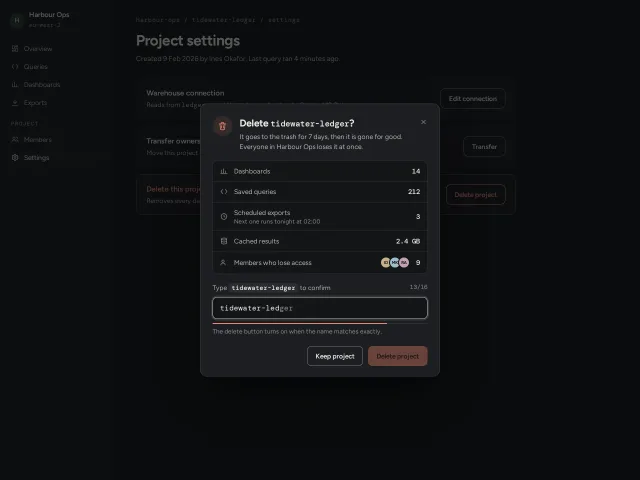
Type-to-confirm delete dialog
A destructive confirm that lists what will be lost with counts, enables Delete only when the project name is typed exactly, and shakes on a wrong character.
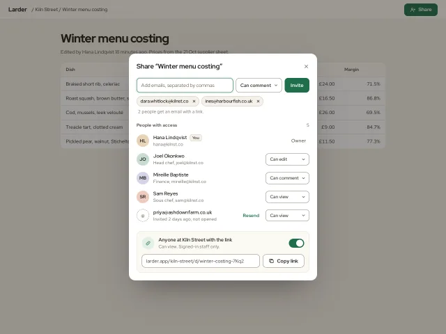
Share and invite dialog
A 540px share dialog: email chips with live validation, a role per person, pending invites with Resend, and a link-access switch with Copy link.
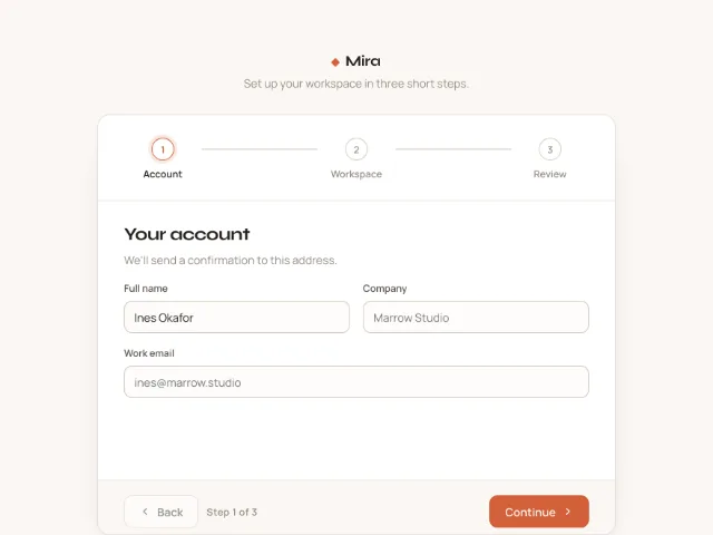
Multi-step form stepper
A three-step workspace setup with a horizontal stepper whose connectors fill on completion, direction-aware 40px slide transitions, validation on Continue and a review step with Edit links.
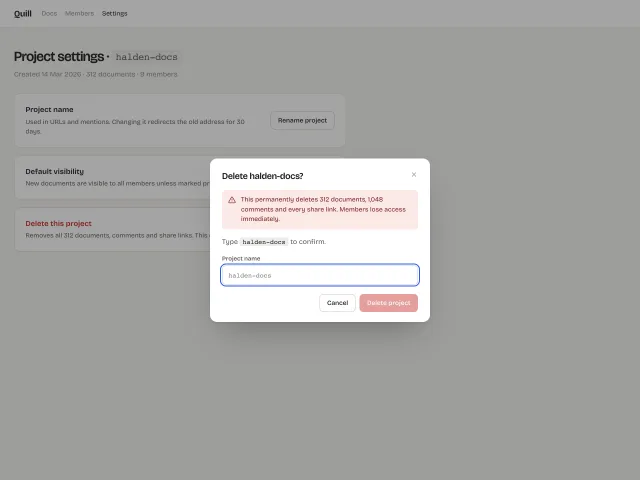
Modal dialog with focus trap
Native <dialog> modals that open with a 240ms scale .96→1 and scrim fade, trap focus, close on Esc or scrim click, plus a destructive variant gated by a type-to-confirm input.
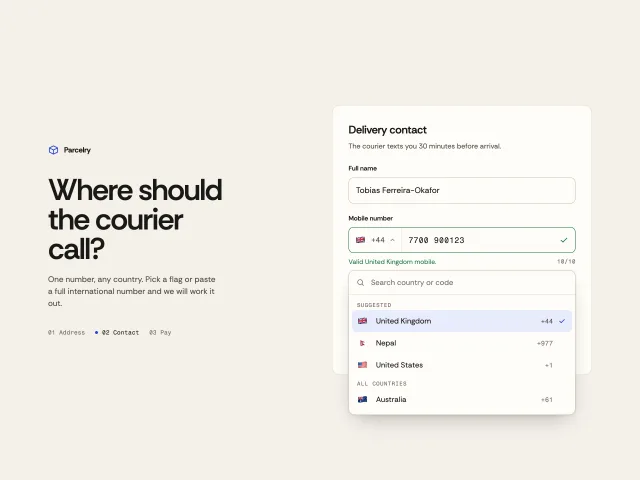
Phone input with country picker
A phone field with a searchable flag-and-dial-code picker, live formatting per country, paste detection of +codes, and digit-count validation.
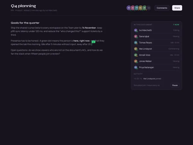
Avatar stack with presence
Overlapping initials avatars with a +N overflow chip, hover fans them apart, pulsing green presence dots, name/status tooltips, and a simulated join or leave every 4s.