Nº 537 of 543
Tactile settings panel
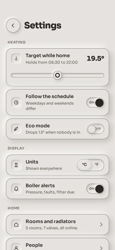
A phone settings screen in monochrome neumorphism: raised rows on one putty surface, inset switches whose knob fills ink when on, a slider in a well, and a segmented control, all edged for 3:1.
Preview
Use it
Free to use · credit appreciated1 Once, in your project · Node 22.20+
npx skills add SusanAcharya/Design-Lounge 2 Then ask
Using the Design Lounge skill, build "Tactile settings panel" (piece settings-tactile-panel) in my stack. Match its brief; restyle it onto my product's theme.
No skill? Paste the brief instead. It carries the numbers, tokens and behaviour.
<!-- Design Lounge Nº 537 · "Tactile settings panel" · www.designlounge.live -->

# Tactile settings panel

> **Build brief for a coding agent.** Rebuild this piece in the reader's stack. If they haven't said which stack, ask once, then default to semantic HTML + CSS + a little vanilla JS. Match the numbers below; don't "improve" them. When a kit is locked, map the surface and inks onto the theme tokens and keep the two shadow tokens and the 1px edge: the edge is what keeps neumorphism legible.

## What it is

The settings screen of Warm, a fictional heating app, in monochrome neumorphism. There is one colour, a warm putty `#e6e3df`, and everything is either raised out of it (an outer pair of shadows: light from the top left, shade to the bottom right) or pressed into it (the same pair, inset). Rows are raised 64px cards with a 20px radius; inside each, an icon sits in a small well, and the control is a switch whose track is a well and whose knob is raised. Turning a switch on slides the knob 26px and fills it ink, so the state is visible without reading depth. A range slider for the target temperature runs in a well with a raised knob that has an ink ring; a segmented control for units is a well with the pressed option raised. The detail worth copying is the 1px edge: every control and row has a `#7d7770` hairline, which is 3.5:1 against the surface, so the boundaries pass non-text contrast even where the shadows wash out.

## Reference behaviour

1. First frame: a raised round Back button and "Settings" at the top (62px top padding for the status bar). Three groups: Heating (Target while home 19.5° with a slider, Follow the schedule on, Eco mode off), Display (Units °C | °F, Boiler alerts on), Home (two link rows with chevrons).
2. Drag the slider: the value updates live ("19.5°" in 0.5 steps from 15 to 24) and `aria-valuetext` follows. The knob is a raised 30px disc with an ink ring; the track is a 14px well.
3. Tap a switch: the knob slides 26px over 240ms and turns ink; the small ON/OFF word inside the track swaps sides. Tap again to turn off.
4. Tap °F: the pressed segment is raised and ink; the temperature reads in Fahrenheit (67°). °C returns it.
5. Press a link row or the Back button: it goes from raised to pressed (the well) while held, with no other change.
6. The list scrolls inside the frame; the header stays. Nothing animates on load.

## Structure

```
390 × 844, surface #E6E3DF everywhere (no second background)
top  62/20/10    (◯ back 48)  Settings 30/800
scroll, padding 14/20/40, groups gap 22, rows gap 10
HEATING  12/600 caps
┌ row tall, 20 r, raised ─────────────────────────────┐
│ [well ic 36] Target while home              19.5°   │
│              Holds from 06:30 to 22:00              │
│   (═══════════●══════════════)  slider, well track   │
├ row 64, raised ─────────────────────────────────────┤
│ [ic] Follow the schedule                  (ON  ●)   │  switch 60 × 34, well; knob 26 raised
│      Weekdays and weekends differ                   │
├ row ────────────────────────────────────────────────┤
│ [ic] Eco mode                             (○  OFF)  │
└─────────────────────────────────────────────────────┘
DISPLAY
│ [ic] Units  Shown everywhere         ( °C | °F )    │  segmented: well, pressed option raised
│ [ic] Boiler alerts                        (ON  ●)   │
HOME

… 126 more lines. Copy or download for the full brief. Loading the source…Brief
166 linesBuild brief for a coding agent. Rebuild this piece in the reader’s stack. If they haven’t said which stack, ask once, then default to semantic HTML + CSS + a little vanilla JS. Match the numbers below; don’t “improve” them. When a kit is locked, map the surface and inks onto the theme tokens and keep the two shadow tokens and the 1px edge: the edge is what keeps neumorphism legible.
What it is
The settings screen of Warm, a fictional heating app, in monochrome neumorphism. There is one colour, a warm putty #e6e3df, and everything is either raised out of it (an outer pair of shadows: light from the top left, shade to the bottom right) or pressed into it (the same pair, inset). Rows are raised 64px cards with a 20px radius; inside each, an icon sits in a small well, and the control is a switch whose track is a well and whose knob is raised. Turning a switch on slides the knob 26px and fills it ink, so the state is visible without reading depth. A range slider for the target temperature runs in a well with a raised knob that has an ink ring; a segmented control for units is a well with the pressed option raised. The detail worth copying is the 1px edge: every control and row has a #7d7770 hairline, which is 3.5:1 against the surface, so the boundaries pass non-text contrast even where the shadows wash out.
Reference behaviour
- First frame: a raised round Back button and “Settings” at the top (62px top padding for the status bar). Three groups: Heating (Target while home 19.5° with a slider, Follow the schedule on, Eco mode off), Display (Units °C | °F, Boiler alerts on), Home (two link rows with chevrons).
- Drag the slider: the value updates live (“19.5°” in 0.5 steps from 15 to 24) and
aria-valuetextfollows. The knob is a raised 30px disc with an ink ring; the track is a 14px well. - Tap a switch: the knob slides 26px over 240ms and turns ink; the small ON/OFF word inside the track swaps sides. Tap again to turn off.
- Tap °F: the pressed segment is raised and ink; the temperature reads in Fahrenheit (67°). °C returns it.
- Press a link row or the Back button: it goes from raised to pressed (the well) while held, with no other change.
- The list scrolls inside the frame; the header stays. Nothing animates on load.
Structure
390 × 844, surface #E6E3DF everywhere (no second background)
top  62/20/10    (◯ back 48)  Settings 30/800
scroll, padding 14/20/40, groups gap 22, rows gap 10
HEATING  12/600 caps
┌ row tall, 20 r, raised ─────────────────────────────┐
│ [well ic 36] Target while home              19.5°   │
│              Holds from 06:30 to 22:00              │
│   (═══════════●══════════════)  slider, well track   │
├ row 64, raised ─────────────────────────────────────┤
│ [ic] Follow the schedule                  (ON  ●)   │  switch 60 × 34, well; knob 26 raised
│      Weekdays and weekends differ                   │
├ row ────────────────────────────────────────────────┤
│ [ic] Eco mode                             (○  OFF)  │
└─────────────────────────────────────────────────────┘
DISPLAY
│ [ic] Units  Shown everywhere         ( °C | °F )    │  segmented: well, pressed option raised
│ [ic] Boiler alerts                        (ON  ●)   │
HOME
│ [ic] Rooms and radiators  5 rooms, 7 valves…    ›   │  button rows
│ [ic] People Mira, Tej and one guest key › │header.top→button.back[aria-label],h1.main.scroll→ threesection.group[aria-labelledby], each anh2then rows.- A row is
div.row(orbutton.row.linkfor navigation) →span.ic(well,aria-hiddenSVG),div.t(btitle,spancaption), then the control:button.sw[role=switch][aria-checked][aria-labelledby]with aspan.labON/OFF; ordiv.seg[role=group]ofaria-pressedbuttons; orinput[type=range][aria-labelledby][aria-valuetext]indiv.slideunder aspan.val[aria-live].
Tokens
:root {
  --surface: #e6e3df;   /* the only ground */
  --ink: #2a2622;  --ink-2: #56514b;  --ink-3: #625c56;
  --edge: #7d7770;      /* 1px hairline, 3.5:1 on the surface */
  --light: rgba(255,255,255,.85);
  --shade: rgba(74,66,58,.22);
  --raise:    8px  8px 18px var(--shade), -8px -8px 18px var(--light);   /* rows */
  --raise-sm: 4px  4px 10px var(--shade), -4px -4px 10px var(--light);   /* knobs, back button, pressed segment */
  --well:     inset 6px 6px 12px var(--shade), inset -6px -6px 12px var(--light);  /* a held row */
  --well-sm:  inset 3px 3px 7px var(--shade), inset -3px -3px 7px var(--light);   /* icon wells, tracks, segments */

  --sans: "Sora", system-ui, sans-serif;
  --r: 20px;  --r-card: 24px;
  --row-h: 64px;  --sw-w: 60px;  --sw-h: 34px;  --sw-knob: 26px;  --thumb: 30px;
  --t-micro: 200ms;  --t-knob: 240ms;
  --ease: cubic-bezier(.2, .7, .2, 1);
}
Typography
| Role | Family | Size | Weight | Line-height | Tracking | Case |
|---|---|---|---|---|---|---|
| Title | Sora | 30px | 800 | 1 | −0.03em | sentence |
| Value | Sora | 22px | 800 | 1 | −0.02em | tabular numerals |
| Row title | Sora | 16px | 600 | 1.3 | 0 | sentence |
| Row caption | Sora | 13px | 400 | 1.4 | 0 | sentence, --ink-2 |
| Segment | Sora | 13px | 600 | 1 | 0 | as written |
| Group label | Sora | 12px | 600 | 1 | +0.06em | UPPERCASE, --ink-3 |
| Switch word | Sora | 10px | 600 | 1 | +0.06em | ON / OFF, --ink-3 off, --ink on |
Motion
| Element | Trigger | Property | From → To | Duration | Easing |
|---|---|---|---|---|---|
.sw::after (knob) | toggle | transform, background | 0, surface → translateX(26px), --ink | 240ms / 200ms | --ease |
.seg button | press | box-shadow, color | none, --ink-2 → --raise-sm, --ink | 200ms | --ease |
.row.link, .back | :active | box-shadow | --raise → --well | 0 (instant) | – |
| slider value | input | text | live | 0 | – |
Reduced motion: transitions 1ms; the knob still moves, instantly.
States
- Row: raised, 1px edge. Link row held: the well. Focus-visible: 2px ink outline at 3px offset.
- Switch off: well track, knob at left in the surface colour with an edge, the word OFF at the right in
--ink-3. On: knob at right filled--ink, the word ON at the left in--ink. - Segment: unpressed flat in
--ink-2; pressed raised in--ink. - Slider: well track, raised knob with a 3px ink ring inside a surface ring; the value beside the title is live.
- Icon well: a 36px square well with a 12px radius; the icon is
currentColorink.
Accessibility
- Switches are
role="switch"witharia-checked, labelled by the row title; Space toggles. The ON/OFF word is visual only (pointer-events none) and is in addition to the knob’s position and colour. - The slider is a native
input[type=range]witharia-labelledbyandaria-valuetext(“19.5 degrees”), so arrow keys and screen readers work without extra code; the visible value isaria-live="polite". - Segments are buttons with
aria-pressedin arole="group"labelled “Units”. - Link rows are
<button>s containing the whole row, with the chevron decorative. - Contrast:
--ink11.7:1,--ink-26.1:1,--ink-34.9:1 on the surface; the--edgehairline 3.5:1 (non-text); the knob when on is--inkon the surface, 11.7:1. - Hit targets: rows 64px, switches 60×34 inside a 64px row, back 48px, slider thumb 30px on a 40px-tall strip, segments 30px tall inside a 40px well. Nothing relies on shadow alone.
Responsive rules
- 390 wide: as drawn. 360 wide: row padding 12px, caption may wrap to two lines.
- 430 wide: the same; rows stretch.
- Tablet or desktop: the list is a 560px column, centred, same rows. Do not spread rows wider than 640px; the shadows stop reading as depth.
- Dark pair: invert the surface to a dark putty and swap the shade/light strengths (shade
rgba(0,0,0,.45), lightrgba(255,255,255,.06)); the knob-on colour becomes the light ink.
Acceptance checklist
Always
- One surface colour for the page, rows and controls; depth comes only from the two shadow tokens (
--raiseouter,--wellinset) and their small variants. - Every row and control has a 1px edge that measures at least 3:1 against the surface; the shadow is never the only boundary.
- Switches are
role="switch"; on = knob moved 26px and filled with the ink, plus the ON word. - The slider is a native range input in a well track with a raised knob, with
aria-valuetextand a live visible value. - The segmented control is a well whose pressed option is raised.
- Pressing a link row or the back button shows the well while held.
- Rows are at least 64px tall; cards and rows use 20 to 24px radii; only knobs, switches and the back button are round.
- Reduced motion: 1ms transitions.
This demo
- App “Warm”: Target while home 19.5° (15 to 24 in 0.5 steps), Follow the schedule on, Eco mode off, Units °C | °F, Boiler alerts on, Rooms and radiators, People.
- °F shows the same target as 67°.
Implementation notes
Two tokens, one surface. Every depth is one of these; never a third shadow colour:
.row { background: var(--surface); border: 1px solid var(--edge); border-radius: var(--r); box-shadow: var(--raise); }
.ic, .sw, .seg, .slide input { box-shadow: var(--well-sm); border: 1px solid var(--edge); }
The switch is a well with a raised pseudo-element knob:
.sw { position: relative; width: 60px; height: 34px; border-radius: 999px; box-shadow: var(--well-sm); }
.sw::after { content: ""; position: absolute; top: 3px; left: 3px; width: 26px; height: 26px; border-radius: 50%;
  background: var(--surface); border: 1px solid var(--edge); box-shadow: var(--raise-sm);
  transition: transform var(--t-knob) var(--ease), background var(--t-micro) var(--ease); }
.sw[aria-checked="true"]::after { transform: translateX(26px); background: var(--ink); border-color: var(--ink); }
The slider thumb draws its ring with stacked inset shadows, so it needs no extra markup:
input[type=range]::-webkit-slider-thumb { -webkit-appearance: none; width: 30px; height: 30px; border-radius: 50%;
  background: var(--surface); border: 1px solid var(--edge);
  box-shadow: var(--raise-sm), inset 0 0 0 6px var(--surface), inset 0 0 0 9px var(--ink); }
Common mistakes: dropping the hairline because “the shadow shows the edge” (it fails 3:1 on most screens); a coloured accent sneaking in for the on state (use the ink); a page background that differs from the row surface (the light-from-top-left story breaks); shadows so soft the knob disappears on a dim display.
Details
- Palette
- Type
- Sora
- Motion
- Subtle motion
- Build
- One session
- Tags
Similar
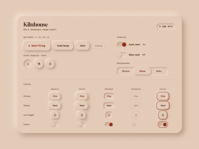
Soft inset clay buttons
Neumorphic buttons, icon toggles, switches and a segmented control on a clay surface, with AA text, a hairline edge and colour as the second state signal.
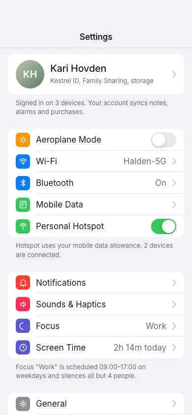
Grouped settings list
An iOS-style settings screen: inset grouped sections with 44px rows, coloured icon squares, 51×31 spring toggles with a stretching knob, chevron rows with values, footers and a profile row.
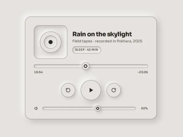
Tactile media controls
A neumorphic player card: a drawn disc in a well, a scrubber with a raised ink-ringed knob, an 80px play button that stays pressed while playing, and a volume well, on one putty with 3:1 edges.