Nº 009 of 520
Date range picker
A two-month calendar popover with a presets column, start/end pills, hover-previewed ranges and full arrow-key navigation across month boundaries.
Preview
Use it
Free to use · credit appreciated1 Once, in your project
npx skills add SusanAcharya/Design-Lounge 2 Then ask
Using the Design Lounge skill, build "Date range picker" (piece date-range-picker) in my stack. Match its brief; restyle it onto my product's theme.
No skill? Paste the brief instead. It carries the numbers, tokens and behaviour.
<!-- Design Lounge Nº 009 · "Date range picker" · www.designlounge.live -->

# Date range picker

> **Build brief for a coding agent.** Rebuild this piece in the reader's stack. If they haven't said which stack, ask once, then default to semantic HTML + CSS + a little vanilla JS. Match the numbers below; don't "improve" them.

## What it is

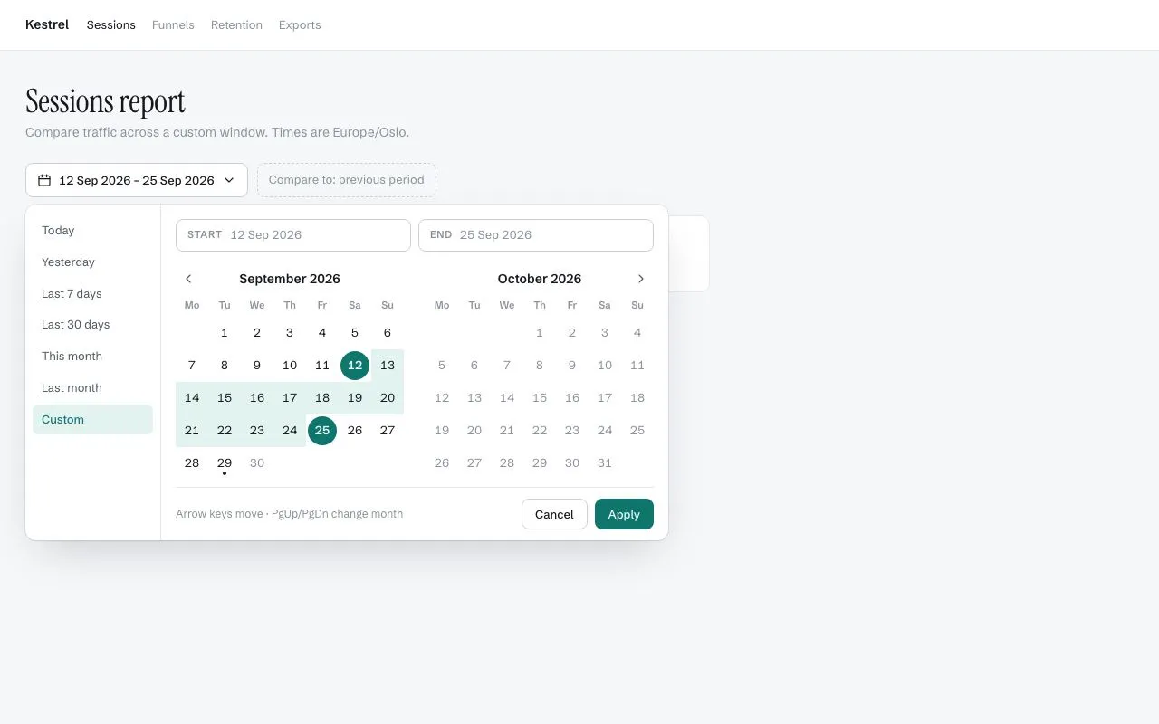
A date-range picker for an analytics report ("Kestrel · Sessions report"). A trigger button shows the applied range; beneath it a popover holds a 150px presets column (Today … Last month, Custom) and two side-by-side months of 36px day cells. Clicking a day sets the start; moving the mouse then previews the range as a pale teal band until the second click sets the end. Start and end days are teal circles that cap a rounded band; two pills above the calendars name the start and end and highlight whichever is being chosen. Every key you'd expect works: arrows move by day and week, Home/End to the week edges, PgUp/PgDn across months, Enter picks, Esc cancels. Cool white, hairlines, one teal.

## Reference behaviour

1. Initial state: popover is **open** below the trigger, which reads "12 Sep 2026 – 25 Sep 2026" with `aria-expanded="true"`. September and October 2026 are shown; 12 Sep is the `start` circle, 25 Sep the `end` circle, days between carry the `--range` band; "Custom" preset is pressed. 29 Sep (today) has a 4px dot under its number; days after today are `--ink-3`. Focus is on 12 Sep (the only day with `tabindex="0"`).
2. Click a day (say 3 Oct): it becomes the new start; the end clears; the End pill gets the active ring (`--accent` border + 3px `--range` halo) meaning "now choose the end". Start pill text updates to "3 Oct 2026", End shows "—". Preset resets to Custom.
3. Move the mouse over 17 Oct: cells 4–16 Oct get the band and 17 Oct renders as a provisional `end` circle. Leave the calendar: preview clears.
4. Click 17 Oct: end set; band and circles are final. Click a day *before* the start while choosing the end: the two swap (the clicked day becomes start, the previous start becomes end).
5. Click "Last 7 days": start 23 Sep, end 29 Sep; the view jumps so the start's month is on the left; the preset shows pressed. "This month" → 1–30 Sep; "Last month" → 1–31 Aug (view shifts to Aug/Sep); "Today"/"Yesterday" set a one-day range (a single full circle, `start.end` class).
6. ‹ › in the month headers (only the outer two are visible) shift both months by one and keep focus on the arrow.
7. Keyboard on a day: ← → ±1 day, ↑ ↓ ±7, Home/End first/last day of that week (Mon–Sun), PgUp/PgDn same day previous/next month. If the target day is outside the visible two months the view shifts so it is visible. While choosing an end, keyboard movement previews the range exactly like hover. Enter or Space picks.
8. Apply: writes the range to the trigger label, closes the popover (180ms fade/scale) and returns focus to the trigger. Cancel or Esc: reverts to the last applied range and closes. The trigger toggles the popover; opening focuses the start day.
9. Below the bar, four stat tiles (Sessions 184,220 etc.) sit as page context; they do not change.

## Structure

```
1280 × 800
┌──────────────────────────────────────────────────────────────────────────┐
│ Kestrel   Sessions  Funnels  Retention  Exports                          │ 56
├──────────────────────────────────────────────────────────────────────────┤
│  Sessions report  (Instrument Serif 36)                                  │
│  Compare traffic across a custom window. Times are Europe/Oslo.          │
│  [▦ 12 Sep 2026 – 25 Sep 2026 ▾]  ⌜Compare to: previous period⌟         │ trigger 38
│  ┌───────────┬──────────────────────────────────────────────────────┐    │ popover top 46
│  │ Today     │ ┌ START 12 Sep 2026 ┐ ┌ END 25 Sep 2026 ┐             │    │ pills 36
│  │ Yesterday │ ‹ September 2026        October 2026 ›               │    │ month header 32
│  │ Last 7 d  │ Mo Tu We Th Fr Sa Su    Mo Tu We Th Fr Sa Su         │    │ dow 11px
│  │ Last 30 d │     1  2  3  4  5  6              1  2  3  4         │    │ cells 36×36
│  │ This month│  7  8  9 10 11 (12▓▓▓ …                              │    │ 7 × 36 = 252 each
│  │ Last month│ ▓▓▓▓▓▓▓▓▓▓▓▓▓▓▓▓25)                                  │    │ gap 24 between
│  │ [Custom]  │ …                                                    │    │

… 195 more lines. Copy or download for the full brief. Loading the source…Brief
235 linesBuild brief for a coding agent. Rebuild this piece in the reader’s stack. If they haven’t said which stack, ask once, then default to semantic HTML + CSS + a little vanilla JS. Match the numbers below; don’t “improve” them.
What it is
A date-range picker for an analytics report (“Kestrel · Sessions report”). A trigger button shows the applied range; beneath it a popover holds a 150px presets column (Today … Last month, Custom) and two side-by-side months of 36px day cells. Clicking a day sets the start; moving the mouse then previews the range as a pale teal band until the second click sets the end. Start and end days are teal circles that cap a rounded band; two pills above the calendars name the start and end and highlight whichever is being chosen. Every key you’d expect works: arrows move by day and week, Home/End to the week edges, PgUp/PgDn across months, Enter picks, Esc cancels. Cool white, hairlines, one teal.
Reference behaviour
- Initial state: popover is open below the trigger, which reads “12 Sep 2026 – 25 Sep 2026” with
aria-expanded="true". September and October 2026 are shown; 12 Sep is thestartcircle, 25 Sep theendcircle, days between carry the--rangeband; “Custom” preset is pressed. 29 Sep (today) has a 4px dot under its number; days after today are--ink-3. Focus is on 12 Sep (the only day withtabindex="0"). - Click a day (say 3 Oct): it becomes the new start; the end clears; the End pill gets the active ring (
--accentborder + 3px--rangehalo) meaning “now choose the end”. Start pill text updates to “3 Oct 2026”, End shows ”—”. Preset resets to Custom. - Move the mouse over 17 Oct: cells 4–16 Oct get the band and 17 Oct renders as a provisional
endcircle. Leave the calendar: preview clears. - Click 17 Oct: end set; band and circles are final. Click a day before the start while choosing the end: the two swap (the clicked day becomes start, the previous start becomes end).
- Click “Last 7 days”: start 23 Sep, end 29 Sep; the view jumps so the start’s month is on the left; the preset shows pressed. “This month” → 1–30 Sep; “Last month” → 1–31 Aug (view shifts to Aug/Sep); “Today”/“Yesterday” set a one-day range (a single full circle,
start.endclass). - ‹ › in the month headers (only the outer two are visible) shift both months by one and keep focus on the arrow.
- Keyboard on a day: ← → ±1 day, ↑ ↓ ±7, Home/End first/last day of that week (Mon–Sun), PgUp/PgDn same day previous/next month. If the target day is outside the visible two months the view shifts so it is visible. While choosing an end, keyboard movement previews the range exactly like hover. Enter or Space picks.
- Apply: writes the range to the trigger label, closes the popover (180ms fade/scale) and returns focus to the trigger. Cancel or Esc: reverts to the last applied range and closes. The trigger toggles the popover; opening focuses the start day.
- Below the bar, four stat tiles (Sessions 184,220 etc.) sit as page context; they do not change.
Structure
1280 × 800
┌──────────────────────────────────────────────────────────────────────────┐
│ Kestrel   Sessions  Funnels  Retention  Exports                          │ 56
├──────────────────────────────────────────────────────────────────────────┤
│  Sessions report  (Instrument Serif 36)                                  │
│  Compare traffic across a custom window. Times are Europe/Oslo.          │
│  [▦ 12 Sep 2026 – 25 Sep 2026 ▾]  ⌜Compare to: previous period⌟         │ trigger 38
│  ┌───────────┬──────────────────────────────────────────────────────┐    │ popover top 46
│  │ Today     │ ┌ START 12 Sep 2026 ┐ ┌ END 25 Sep 2026 ┐             │    │ pills 36
│  │ Yesterday │ ‹ September 2026        October 2026 ›               │    │ month header 32
│  │ Last 7 d  │ Mo Tu We Th Fr Sa Su    Mo Tu We Th Fr Sa Su         │    │ dow 11px
│  │ Last 30 d │     1  2  3  4  5  6              1  2  3  4         │    │ cells 36×36
│  │ This month│  7  8  9 10 11 (12▓▓▓ …                              │    │ 7 × 36 = 252 each
│  │ Last month│ ▓▓▓▓▓▓▓▓▓▓▓▓▓▓▓▓25)                                  │    │ gap 24 between
│  │ [Custom]  │ …                                                    │    │
│  │   150     │ hint · · · · · · · · · · · · ·  [Cancel] [Apply]     │    │ foot 34
│  └───────────┴──────────────────────────────────────────────────────┘    │
│  ┌ Sessions ┐ ┌ Unique visitors ┐ ┌ Avg. duration ┐ ┌ Bounce rate ┐      │ stats 180 each
└──────────────────────────────────────────────────────────────────────────┘.bar—position:relativerow holding the trigger, a dashed “Compare to” ghost chip, and the popover.<button class="trig" aria-haspopup="dialog" aria-expanded aria-controls="pop">— 38px, calendar icon,.vlabel with tabular numerals, chevron.<div class="pop" role="dialog" aria-label="Choose a date range" aria-modal="false">— absolutetop:46px; left:0, flex, 12px radius, shadow0 1px 2px rgba(20,23,28,.05), 0 20px 48px -16px rgba(20,23,28,.22), 0 0 0 1px --line..presets— 150px, right hairline, padding12px 8px; seven<button class="pre" data-p aria-pressed>..cal— padding16px 16px 12px..pills— two.pill(flex 1, 36px,--line-2border, 8px radius; uppercase 11px label + value)..months— flex, 24px gap; two.month(role="group" aria-label="September 2026"), each 252px:.mhheader (nav buttons 28px, month name 14/600),.dowrow,.grid(grid-template-columns: repeat(7, 36px); grid-auto-rows: 36px) of leading<span>blanks then<button class="d" data-t tabindex>days..foot— top hairline, hint text left, Cancel + Apply (34px) right.
.stats— grid of four 180px tiles.
Week starts Monday. Fixed “today” for the demo: 29 Sep 2026.
Presets (today = 29 Sep 2026)
| Preset | Start | End | View (left month) |
|---|---|---|---|
| Today | 29 Sep 2026 | 29 Sep 2026 | Sep 2026 |
| Yesterday | 28 Sep 2026 | 28 Sep 2026 | Sep 2026 |
| Last 7 days | 23 Sep 2026 | 29 Sep 2026 | Sep 2026 |
| Last 30 days | 31 Aug 2026 | 29 Sep 2026 | Aug 2026 |
| This month | 1 Sep 2026 | 30 Sep 2026 | Sep 2026 |
| Last month | 1 Aug 2026 | 31 Aug 2026 | Aug 2026 |
| Custom | unchanged | unchanged | unchanged; pressed automatically after any manual click |
“Last N days” is inclusive of today: start = today − (N − 1) days. After a preset, focusT = start, so Tab lands on the start day.
Grid rendering rules
- Leading blanks =
(firstDayOfMonth.getDay() + 6) % 7(Monday-first). - Days in month =
new Date(y, m + 1, 0).getDate(). - Each cell’s
data-tis the local-midnight timestamp+new Date(y, m, d); comparisons use these integers only. - Class assignment per cell:
todayift === ts(TODAY);outift > ts(TODAY);startift === lo;endift === hi;iniflo < t < hi;aria-pressed="true"on start/end. - Preview:
hi = end ? ts(end) : (hover && start && hover > ts(start) ? hover : null)— a hover before the start shows no band. - Month header arrows: the left month renders only ‹, the right month only ›; the hidden one keeps
visibility:hiddenso headers stay centred.
Tokens
:root {
  /* colour — cool white, one teal */
  --bg: #f6f7f9;          /* page */
  --panel: #ffffff;       /* header, popover, tiles, trigger */
  --hover: #eef0f3;       /* day hover disc, preset hover, nav hover */
  --line: #e4e7ec;        /* hairlines, ring */
  --line-2: #cbd0d8;      /* trigger/pill/button borders */
  --ink: #14171c;
  --ink-2: #4e5561;       /* presets, nav arrows */
  --ink-3: #8a919d;       /* dow, pill labels, future days, hints */
  --accent: #0f766e;      /* start/end discs, pressed preset text, primary */
  --accent-hover: #0c5f59;
  --accent-ink: #f0fdfa;
  --range: #e3f3f0;       /* in-range band, pressed preset bg, pill halo */
  --range-2: #c9e8e2;     /* reserved: hovered in-range */

  /* type */
  --font: "Schibsted Grotesk", system-ui, sans-serif;
  --serif: "Instrument Serif", Georgia, serif;

  /* layout */
  --cell: 36px;
  --presets-w: 150px;
  --month-gap: 24px;
  --pop-top: 46px;
  --r: 8px;
  --r-pop: 12px;
  --shadow: 0 1px 2px rgba(20,23,28,.05), 0 20px 48px -16px rgba(20,23,28,.22), 0 0 0 1px var(--line);

  /* motion */
  --t-fast: 120ms;
  --t-open: 180ms;
  --ease: cubic-bezier(.2, .7, .2, 1);
  --ease-out: cubic-bezier(.16, 1, .3, 1);
}
Typography
| Role | Family | Size | Weight | Line-height | Tracking | Notes |
|---|---|---|---|---|---|---|
| Page title | Instrument Serif | 36px | 400 | 1.1 | −0.01em | |
| Body | Schibsted Grotesk | 14px | 400 | 1.45 | 0 | |
| Trigger label | Schibsted Grotesk | 13px | 500 | 38px height | 0 | tabular-nums |
| Preset | Schibsted Grotesk | 13px | 400 | 1.4 | 0 | pressed: 500, --accent |
| Pill label | Schibsted Grotesk | 11px | 600 | 1 | +0.06em | UPPERCASE --ink-3 |
| Pill value | Schibsted Grotesk | 13px | 400 | 1 | 0 | tabular-nums |
| Month name | Schibsted Grotesk | 14px | 600 | 1 | 0 | |
| Day-of-week | Schibsted Grotesk | 11px | 600 | 1.4 | 0 | --ink-3, centred |
| Day number | Schibsted Grotesk | 13px | 400 | 1 | 0 | start/end: 600 --accent-ink |
| Hint | Schibsted Grotesk | 12px | 400 | 1.4 | 0 | --ink-3 |
| Stat value | Schibsted Grotesk | 22px | 600 | 1.2 | −0.02em | tabular-nums |
Motion
| Element | Trigger | Property | From → To | Duration | Easing | Notes |
|---|---|---|---|---|---|---|
.pop | open | opacity, transform | 0, scale(.97) translateY(-4px) → 1, none | 180ms | opacity --ease, transform --ease-out | transform-origin: top left |
.pop | close | reverse | 180ms | same | visibility delayed 180ms | |
| day disc | hover | background | transparent → --hover | 0 | — | instant; discs are ::before inset 2px |
| range band | hover/keys | class toggles | re-render | 0 | — | no transition: previews must track the pointer exactly |
| pills | state | border, box-shadow | instant | 0 | — |
Reduced motion: popover open/close 1ms. Nothing else animates.
States
- Day default:
--ink, no background. Hover:::beforedisc--hover(inset 2px). Future (after today):--ink-3. Today: 4px dot incurrentColor5px from the bottom. - Start / End:
::beforedisc--accent, text--accent-ink600,aria-pressed="true". Cell getsborder-radius: 18px 0 0 18px(start) or0 18px 18px 0(end) so the band caps cleanly; a one-day range is a full circle. - In range: cell background
--range, no radius. - Provisional end (hover/keyboard preview): rendered exactly like End.
- Day focus-visible: 2px
--accentoutline, offset −2px, 50% radius. - Preset pressed: background
--range, colour--accent, weight 500. Hover:--hover. - Pill active: border
--accent,box-shadow: 0 0 0 3px var(--range). Start pill is active when no start is set; End pill when a start is set and no end. - Nav hidden: the inner two arrows keep their space (
visibility:hidden) so month names stay centred. - Apply disabled: when only a start is set, Apply does nothing (optionally set
disabled).
Accessibility
- Trigger:
aria-haspopup="dialog" aria-expanded aria-controls. Popover:role="dialog" aria-labelnon-modal (aria-modal="false") — the page stays reachable. - Each month:
role="group" aria-label="September 2026". Each day: a<button>witharia-label="12 Sep 2026"andaria-pressedon start/end. Roving tabindex: exactly one day hastabindex="0"(the last focused/selected day). - Keys inside the grid: ← → ↑ ↓ Home End PgUp PgDn Enter Space as listed above; Esc anywhere in the popover cancels; Tab order is presets → pills (static) → visible nav arrow → focused day → next month’s arrow → Cancel → Apply.
- Cross-month movement re-renders and re-focuses the target day; the view shifts so the focused day is always visible.
- Contrast:
--inkon--range15:1;--accent-inkon--accent6.1:1;--ink-3on white 3.6:1 — used for non-essential 11–12px labels and future days (which are still selectable); darken to#6b7280if strict AA is required. - Hit targets: 36px cells; 38px trigger; 34px footer buttons; 28px nav arrows (give them a 36px hit area on touch).
Responsive rules
- ≥ 1280: as specified (popover 150 + 2×252 + 24 + 32 padding ≈ 710px wide).
- 1024–1279: unchanged.
- 768–1023: presets column collapses into a horizontal chip row above the pills; popover width ≈ 560px.
- < 640: popover becomes a bottom sheet (
position:fixed; inset:auto 0 0 0, 16px top radius); one month at a time with ‹ › both visible; cells 40px; Apply/Cancel full-width.
Acceptance checklist
- Day cells are 36×36 in a 7-column grid; two months side by side with a 24px gap; presets column 150px.
- Popover opens 46px below the trigger’s top with the listed shadow and 12px radius, animating 180ms from
scale(.97) translateY(-4px). - Page loads with the popover open, 12–25 Sep 2026 selected, “Custom” pressed and focus on 12 Sep.
- Start/End are teal discs inset 2px; in-range cells are
#e3f3f0; the band is capped with 18px radii at both ends; a single-day range is a full circle. - After a first click, hovering previews the band and a provisional end; leaving the grid clears the preview.
- Clicking a day earlier than the start (while choosing the end) swaps start and end.
- Presets set the documented ranges and shift the view so the start’s month is on the left; Last month shows Aug + Sep.
- ← → ↑ ↓ Home End PgUp PgDn move focus (and preview while choosing an end) including across the visible boundary, which shifts the months.
- Exactly one day has
tabindex="0"at any time. - Apply updates the trigger text and closes; Cancel/Esc revert to the applied range and close; focus returns to the trigger.
- Today (29 Sep 2026) shows a 4px dot; later days are
#8a919dbut clickable. - Every day button has an
aria-labelwith the full date; months arerole="group"with labels.
Implementation notes
Render from state, every time. Keep { base, start, end, hover, focusT } and rebuild both grids on any change; 84 buttons is cheap and it makes hover-preview a two-line feature:
const lo = start ? ts(start) : null;
const hi = end ? ts(end) : (hover && start && hover > ts(start) ? hover : null);   // preview
// per day t:
if (t === lo) b.classList.add('start');
if (t === hi) b.classList.add('end');
if (lo !== null && hi !== null && t > lo && t < hi) b.classList.add('in');
b.tabIndex = t === focusT ? 0 : -1;                                                 // roving tabindex
Discs and bands on one element — the band is the button’s own background (square, with capped ends on start/end) and the disc is a ::before inset 2px, so the band never shows outside the circle:
.d { all: unset; display: grid; place-items: center; position: relative; isolation: isolate; }
.d::before { content: ""; position: absolute; inset: 2px; border-radius: 50%; z-index: -1; }
.d.in { background: var(--range); }
.d.start { border-radius: 18px 0 0 18px; }  .d.end { border-radius: 0 18px 18px 0; }
.d.start.end { border-radius: 18px; }
.d.start::before, .d.end::before { background: var(--accent); }
Focus across month boundaries — compute the target timestamp, shift base if it falls outside the two visible months, re-render, then focus the button by its data-t:
function focusDate(t) {
  const d = new Date(t), m0 = base.getFullYear() * 12 + base.getMonth(), m = d.getFullYear() * 12 + d.getMonth();
  if (m < m0) base = new Date(d.getFullYear(), d.getMonth(), 1);
  else if (m > m0 + 1) base = new Date(d.getFullYear(), d.getMonth() - 1, 1);
  focusT = t; render();
  months.querySelector(`[data-t="${t}"]`)?.focus();
}
Common mistakes: using mouseenter on cells (misses the initial cell after a re-render — use delegated mouseover); using UTC timestamps for day math across DST (build dates with new Date(y, m, d) and compare day-start timestamps); giving every day tabindex="0" (84 tab stops); animating the band (it lags the pointer).
Details
- Palette
- Type
- Schibsted Grotesk · Instrument Serif
- Motion
- Subtle motion
- Build
- Multi-step
- Tags
On the shelves