Nº 597 of 605
Scroll exploding product grid
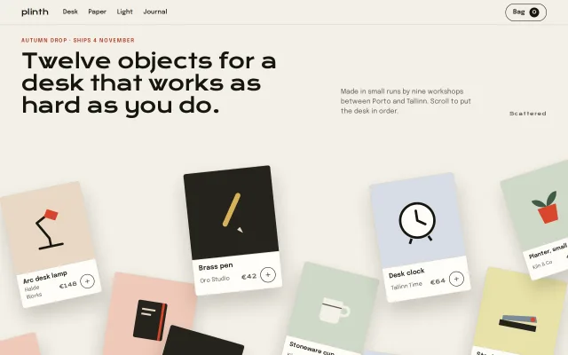
Twelve product cards lie scattered and tilted under the headline, then fly into a tidy 6 x 2 grid as the pinned section scrolls, and scatter again on the way back.
Preview
Use it
Free to use · credit appreciated1 Once, in your project · Node 22.20+
npx skills add SusanAcharya/Design-Lounge 2 Then ask
Using the Design Lounge skill, build "Scroll exploding product grid" (piece scroll-exploding-grid) in my stack. Match its brief; restyle it onto my product's theme.
No skill? Paste the brief instead. It carries the numbers, tokens and behaviour.
<!-- Design Lounge Nº 597 · "Scroll exploding product grid" · www.designlounge.live -->

# Scroll exploding product grid

> **Build brief for a coding agent.** Rebuild this piece in the reader's stack. If they haven't said which stack, ask once, then default to semantic HTML + CSS + a little vanilla JS. Match the numbers below; don't "improve" them.

## What it is

The landing block of a product drop for a fictional desk-goods shop, Plinth Supply: twelve objects (lamp, notebook, pen, cup, clock, stapler and so on), each a card with a drawn product on a tinted ground, a name, a maker, a price and an add button. On load the cards lie scattered across the lower two thirds of the screen, tilted −18° to +16° and slightly scaled, like a pile tipped onto a desk under the headline. The section is pinned for 260vh; as you scroll, the cards fly into a 6-column, 2-row grid, staggered left to right and row by row, their shadows shrinking as they land. Scrolling back scatters them again. The detail worth copying: the scatter is a composed layout (target points as fractions of the stage), converted to per-card pixel offsets by measuring each card's grid slot once, so the pile looks art-directed at any width while CSS does all the motion from one `--t`.

## Reference behaviour

1. Initial frame (1280×800): 56px nav ("plinth" in Krona One, Desk/Paper/Light/Journal, and an outlined "Bag 0" pill). Under it, the kicker "Autumn drop · Ships 4 November" in red caps, the 46px Krona One headline "Twelve objects for a desk that works as hard as you do.", a 15px note on the right ("Made in small runs by nine workshops between Porto and Tallinn. Scroll to put the desk in order.") and a small status "Scattered". Below, the twelve cards scattered and overlapping, several running off the bottom and side edges; shadows deep (22px offset, 40px blur, 20% alpha).
2. Scroll through the 260vh section: `--t` goes 0 → 1 (view timeline, `contain 0%` → `contain 100%`); the stage stays pinned.
3. Each card has a delay `dl = (i mod 6) × 0.045 + floor(i / 6) × 0.07` (0 to 0.295). Its progress `e = clamp(0, (t − dl) / 0.46, 1)`, eased out as `q = e(2 − e)`, and the remaining scatter `u = 1 − q` scales its offset, rotation, scale delta and shadow.
4. By `t ≈ 0.76` every card is in its slot; the grid then holds for the rest of the pin. The status reads "Gathering N%" while moving and "In order" at the end.
5. Hover a card: it lifts 4px (240ms). Its `+` button (32px, 1.5px ink ring) fills ink on hover; click toggles it to a red filled state with the plus rotated 45° into an ×, and the Bag count goes up or down with a 360ms bump on the badge.
6. After the pin, the page continues with a ruled band: "Everything in the drop ships in one box, wrapped in its own offcuts." and delivery copy.
7. Scrolling back up runs the same mapping in reverse; the cards explode back to their composed scatter.
8. On resize (and after web fonts load) the scatter offsets are re-measured so the pile keeps its composition.
9. Without scroll-timeline support, JS writes `--t` from the section's rect on scroll; everything else is the same CSS.

## Structure

```
1280 × 800
┌──────────────────────────────────────────────────────────────────────┐
│ plinth  Desk Paper Light Journal                          ( Bag ⓪ )  │ 56
├──────────────────────────────────────────────────────────────────────┤
│ AUTUMN DROP · SHIPS 4 NOVEMBER                                       │ stage: sticky, 100vh
│ Twelve objects for a                      Made in small runs …       │ padding 28 48 40
│ desk that works as hard as you do.                        Scattered  │ gap 24
│ ┌────┐┌────┐┌────┐┌────┐┌────┐┌────┐                                 │
│ │ ph ││    ││    ││    ││    ││    │  6 cols, gap 16, rows 1fr       │
│ │name││    ││    ││    ││    ││    │  (~184 × 256 at 1280)           │
│ └────┘└────┘└────┘└────┘└────┘└────┘                                 │
│ ┌────┐┌────┐┌────┐┌────┐┌────┐┌────┐                                 │
│ └────┘└────┘└────┘└────┘└────┘└────┘                                 │
└──────────────────────────────────────────────────────────────────────┘
section .drop height 260vh; stage overflow hidden (scattered cards are cropped)

… 169 more lines. Copy or download for the full brief. Loading the source…Brief
209 linesBuild brief for a coding agent. Rebuild this piece in the reader’s stack. If they haven’t said which stack, ask once, then default to semantic HTML + CSS + a little vanilla JS. Match the numbers below; don’t “improve” them.
What it is
The landing block of a product drop for a fictional desk-goods shop, Plinth Supply: twelve objects (lamp, notebook, pen, cup, clock, stapler and so on), each a card with a drawn product on a tinted ground, a name, a maker, a price and an add button. On load the cards lie scattered across the lower two thirds of the screen, tilted −18° to +16° and slightly scaled, like a pile tipped onto a desk under the headline. The section is pinned for 260vh; as you scroll, the cards fly into a 6-column, 2-row grid, staggered left to right and row by row, their shadows shrinking as they land. Scrolling back scatters them again. The detail worth copying: the scatter is a composed layout (target points as fractions of the stage), converted to per-card pixel offsets by measuring each card’s grid slot once, so the pile looks art-directed at any width while CSS does all the motion from one --t.
Reference behaviour
- Initial frame (1280×800): 56px nav (“plinth” in Krona One, Desk/Paper/Light/Journal, and an outlined “Bag 0” pill). Under it, the kicker “Autumn drop · Ships 4 November” in red caps, the 46px Krona One headline “Twelve objects for a desk that works as hard as you do.”, a 15px note on the right (“Made in small runs by nine workshops between Porto and Tallinn. Scroll to put the desk in order.”) and a small status “Scattered”. Below, the twelve cards scattered and overlapping, several running off the bottom and side edges; shadows deep (22px offset, 40px blur, 20% alpha).
- Scroll through the 260vh section:
--tgoes 0 → 1 (view timeline,contain 0%→contain 100%); the stage stays pinned. - Each card has a delay
dl = (i mod 6) × 0.045 + floor(i / 6) × 0.07(0 to 0.295). Its progresse = clamp(0, (t − dl) / 0.46, 1), eased out asq = e(2 − e), and the remaining scatteru = 1 − qscales its offset, rotation, scale delta and shadow. - By
t ≈ 0.76every card is in its slot; the grid then holds for the rest of the pin. The status reads “Gathering N%” while moving and “In order” at the end. - Hover a card: it lifts 4px (240ms). Its
+button (32px, 1.5px ink ring) fills ink on hover; click toggles it to a red filled state with the plus rotated 45° into an ×, and the Bag count goes up or down with a 360ms bump on the badge. - After the pin, the page continues with a ruled band: “Everything in the drop ships in one box, wrapped in its own offcuts.” and delivery copy.
- Scrolling back up runs the same mapping in reverse; the cards explode back to their composed scatter.
- On resize (and after web fonts load) the scatter offsets are re-measured so the pile keeps its composition.
- Without scroll-timeline support, JS writes
--tfrom the section’s rect on scroll; everything else is the same CSS.
Structure
1280 × 800
┌──────────────────────────────────────────────────────────────────────┐
│ plinth  Desk Paper Light Journal                          ( Bag ⓪ )  │ 56
├──────────────────────────────────────────────────────────────────────┤
│ AUTUMN DROP · SHIPS 4 NOVEMBER                                       │ stage: sticky, 100vh
│ Twelve objects for a                      Made in small runs …       │ padding 28 48 40
│ desk that works as hard as you do.                        Scattered  │ gap 24
│ ┌────┐┌────┐┌────┐┌────┐┌────┐┌────┐                                 │
│ │ ph ││    ││    ││    ││    ││    │  6 cols, gap 16, rows 1fr       │
│ │name││    ││    ││    ││    ││    │  (~184 × 256 at 1280)           │
│ └────┘└────┘└────┘└────┘└────┘└────┘                                 │
│ ┌────┐┌────┐┌────┐┌────┐┌────┐┌────┐                                 │
│ └────┘└────┘└────┘└────┘└────┘└────┘                                 │
└──────────────────────────────────────────────────────────────────────┘
section .drop height 260vh; stage overflow hidden (scattered cards are cropped)
Composed scatter (centre x, centre y as fractions of the stage, rotation, scale), in card order: (.09,.62,−12°,1) (.26,.88,9°,1.05) (.41,.58,−6°,1.08) (.58,.84,14°,.95) (.74,.60,−9°,1.05) (.91,.86,11°,1) (.02,1.04,−15°,.95) (.17,1.12,6°,1) (.50,1.10,−13°,.9) (.70,1.10,8°,1.05) (.97,.55,−18°,.92) (.34,1.02,16°,.95). Every point sits below y 0.5 so no card ever crosses the headline.
<header class="nav">with brand,<nav aria-label="Shop">, and<button class="bag" aria-live="polite">.<section class="drop" aria-labelledby>→.stage→.head(kicker +<h1>, note, status) and<ul class="grid">of twelve<li class="cell">→<article class="card">.- Card:
.ph(tinted ground--g, inline SVG product,aria-hidden),.metagrid: name across the top, maker left, price +<button class="add" aria-pressed>right. - Per card inline custom properties:
--dx --dy(px, from JS),--r(deg),--z(scale),--dl(delay),--i(stacking order),--g(ground),--mdx --mdy(mobile offsets).
Tokens
@property --t { syntax: '<number>'; inherits: true; initial-value: 0; }
:root {
  /* colour */
  --paper: #f3f0e8;      /* page */
  --card: #fffdf8;       /* card body */
  --ink: #17160f;        /* text, rings, badge */
  --dim: #5e5a4f;        /* maker, notes */
  --line: #d9d3c5;       /* card border, rules */
  --acc: #d8452b;        /* pressed add, product details */
  --acc-text: #b3361f;   /* red text on paper */
  --acc-ink: #1d0b06;    /* icon on red */
  /* product grounds */
  --sand: #e9d8c4; --sage: #cfd8c8; --fog: #d7dde6; --clay: #f0c9b8; --pollen: #e8e2a8; --soot: #25231d;

  --krona: "Krona One", system-ui, sans-serif;
  --sans: "Epilogue", system-ui, sans-serif;

  /* layout */
  --nav-h: 56px; --cols: 6; --gap: 16px; --radius: 6px; --add: 32px; --drop-h: 260vh;
  --pad-x: 48px;

  /* motion */
  --span: .46;            /* each card's share of t */
  --stagger-col: .045; --stagger-row: .07;
  --shadow-scatter: 0 22px 40px rgba(40, 30, 15, .2);
  --shadow-rest: 0 1px 2px rgba(40, 30, 15, .06);
  --ease: cubic-bezier(.2, .7, .2, 1);
  --ease-out: cubic-bezier(.16, 1, .3, 1);
  --t-lift: 240ms; --t-bump: 360ms; --t-fill: 160ms;
}
Typography
| Role | Family | Size | Weight | Line-height | Tracking | Case |
|---|---|---|---|---|---|---|
| Headline | Krona One | clamp(28px, 3.6vw, 46px) | 400 | 1.08 | −0.03em | sentence |
| Brand | Krona One | 17px | 400 | 1 | −0.02em | lowercase |
| Price, badge, status | Krona One | 11–12px | 400 | 1 | 0 / +0.04em | numerals |
| Closing line | Krona One | 28px | 400 | 1.15 | −0.02em | sentence |
| Kicker | Epilogue | 12px | 600 | 1.45 | +0.14em | UPPERCASE |
| Body, note | Epilogue | 15px | 400 | 1.45 | 0 | sentence |
| Card name | Epilogue | 14px | 600 | 1.25 | 0 | sentence, ellipsis |
| Maker | Epilogue | 12px | 400 | 1.45 | 0 | sentence |
| Nav, pill | Epilogue | 14px | 500–600 | 1 | 0 | sentence |
Krona One is very wide: keep it for the headline, brand and numbers; never for running text.
Motion
| Element | Driver | Property | From → To | Timing | Easing |
|---|---|---|---|---|---|
.drop | view() contain 0–100% | --t | 0 → 1 | whole pin | linear |
.card | --t | translate | (dx, dy) → 0 | t from dl to dl + 0.46 | ease-out quad in calc |
.card | --t | rotate | r → 0 | same | same |
.card | --t | scale | z → 1 | same | same |
.card | --t | box-shadow | 22/40px @ 20% → 1/2px @ 6% | same | same |
.card | hover | translate (individual property) | 0 → −4px | 240ms | --ease |
.add | hover / press | background; icon rotate | ink fill; 0 → 45° | 160ms; 240ms | --ease; --ease-out |
.bag b | add/remove | scale | 1 → 1.35 → 1 | 360ms | --ease-out |
Mobile .card | own cell’s view timeline | translate, rotate | (±36px, 70–130px), r → none | entry 0% → entry 100% | linear |
The hover lift uses the individual translate property so it composes with the scroll-driven transform instead of replacing it.
Reduced motion: no pin and no scroll motion; the grid is simply laid out (rows 270px), cards at rest with the small rest shadow, the badge bump and icon rotation are off. The add button still toggles state.
States
- Scattered (t = 0): composed pile, deep shadows, status “Scattered”.
- Gathering: status “Gathering N%” (N = t / 0.75).
- In order: status “In order”, shadows at rest.
- Card hover: lifted 4px.
- Add idle / hover / pressed: ink ring / ink fill with paper icon / red fill with the plus turned into a cross,
aria-pressed="true". - Bag: count badge (22px ink circle);
aria-label“Bag, N items”. - Focus-visible: 2px red outline, 3px offset.
Accessibility
- The grid is a
<ul>of<article>cards; each product name is text, the drawing isaria-hidden. - Add buttons are toggles with
aria-pressedand anaria-label“Addto bag”. - The Bag button is
aria-live="polite"so the count change is announced. - The scatter never changes DOM order; Tab follows the grid order whether the cards are scattered or not.
- Contrast: ink on card 17.8:1; maker on card 6.8:1; note on paper 6.0:1; red kicker
#b3361fon paper 5.3:1. Add rings are solid ink (well above 3:1). - Hit targets: add buttons are 32px inside a card that is itself not a control; on touch screens give the button a 40px hit area with padding.
Responsive rules
- ≥ 1280: as specified, 6 × 2.
- 1024–1279: 6 columns still fit (cards ~150px); the headline clamps down.
- 820–1023: switch to 4 columns × 3 rows and lower the stage padding to 32px; scatter points stay the same fractions.
- < 820: no pin. Nav links hide. The head stacks; status hides. Grid is 2 columns, 230px rows, gap 12. Each cell declares
view-timeline: --cell, and its card lands from a small offset (±36px across, 70/100/130px down, its scatter rotation) overentry 0% → entry 100%. The stage clips sideways overflow so nothing scrolls horizontally at 390px.
Acceptance checklist
Always
- Section pins for 260vh; one registered
--tdrives every card. - Each card’s offset, rotation, scale and shadow all scale by the same eased remainder
u. - Stagger runs left to right, then row two, so the grid fills like reading order.
- Scatter offsets are measured from each card’s real slot and recomputed on resize and after fonts load.
- No scatter point lies above half the stage height; the headline is never covered.
- Hover lift composes with the scroll transform (individual
translateproperty). - Add toggles
aria-pressed, updates the Bag count, and announces it. - Reduced motion shows the finished grid with no pin.
- Nothing scrolls sideways at 390px.
This demo
- Twelve products from €18 (A5 dot-grid book) to €148 (Arc desk lamp), nine makers.
- Headline “Twelve objects for a desk that works as hard as you do.” in Krona One.
- Grounds drawn from sand, sage, fog, clay, pollen and two soot tiles.
- Status text moves through Scattered, Gathering N%, In order.
Implementation notes
One clock, per-card arithmetic. Each card reads the section’s --t and its own delay:
.card {
  --e: clamp(0, calc((var(--t) - var(--dl)) / .46), 1);
  --u: calc(1 - var(--e) * (2 - var(--e)));          /* ease-out remainder */
  transform: translate(calc(var(--dx) * var(--u)), calc(var(--dy) * var(--u)))
             rotate(calc(var(--r) * var(--u))) scale(calc(1 + (var(--z) - 1) * var(--u)));
  box-shadow: 0 calc(var(--u) * 22px + 1px) calc(var(--u) * 40px + 2px)
              rgba(40, 30, 15, calc(.06 + var(--u) * .14));
}
.cell:hover .card { translate: 0 -4px; }   /* composes with transform */
Measure the slot, aim at the composition:
const layout = () => {
  const s = stage.getBoundingClientRect();
  cards.forEach((c, i) => {
    c.style.transform = 'none';                       // measure the slot, not the scatter
    const r = c.getBoundingClientRect();
    c.style.setProperty('--dx', S[i][0] * s.width - (r.left - s.left + r.width / 2) + 'px');
    c.style.setProperty('--dy', S[i][1] * s.height - (r.top - s.top + r.height / 2) + 'px');
    c.style.transform = '';
  });
};
Pin with sticky and a view timeline:
.drop { height: 260vh; animation: gather linear both;
        animation-timeline: view(); animation-range: contain 0% contain 100%; }
@keyframes gather { from { --t: 0 } to { --t: 1 } }
.stage { position: sticky; top: 0; height: 100vh; overflow: hidden; }
Common mistakes: random offsets on every load (the pile looks like a bug, not a composition); measuring while a transform is applied (offsets double); animating top/left (layout thrash with twelve cards); letting scattered cards widen the page on phones (clip the stage’s x overflow).
Details
- Palette
- Type
- Krona One · Epilogue
- Motion
- Rich motion
- Build
- One session
- Tags
Studied
WickretLet the big words move. Letters can break apart and come back as new words.
All sourcesSimilar
Stacking cards on scroll
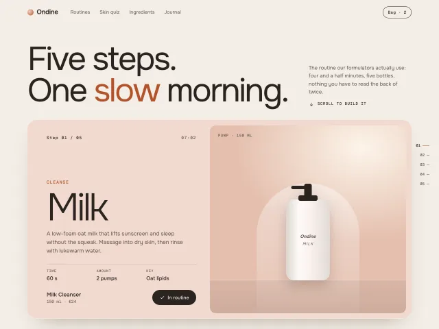
Five pastel step cards stick to the top and pile up as you scroll, each earlier card scaling down 3.5% per layer and dimming under the next.
Staggered list reveal
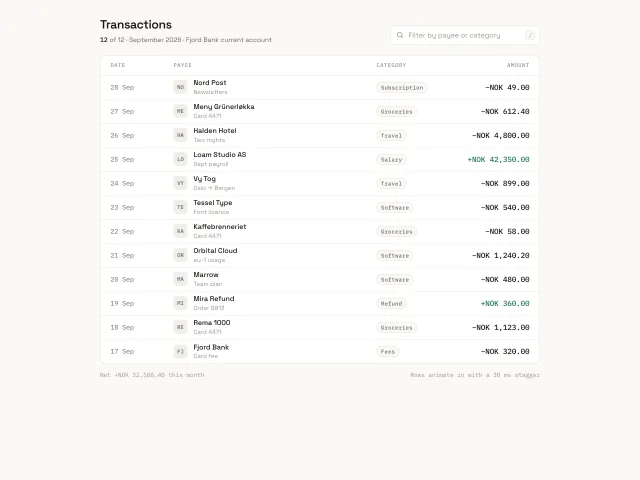
Twelve transaction rows slide up 14px and fade in with a 30ms stagger and expo-out easing on load; a filter input animates leaving rows out (180ms) before re-staggering the survivors.
Spotlight hover grid
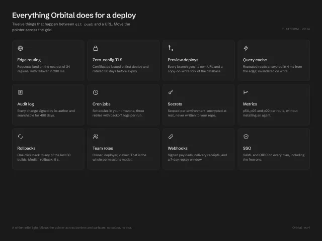
A 4×3 grid of feature cards where a white radial light follows the pointer across card borders (1px mask-composited ring) and surfaces (6% wash); white-on-charcoal, no colour, no blur.
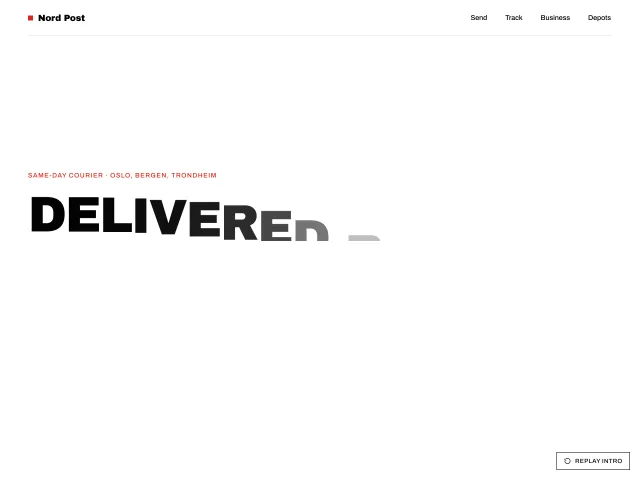
Logo draw site intro
A black-and-white site intro: an SVG monogram strokes itself in over 900ms, fills red, then two panels split to reveal a 100px headline whose letters stagger up; a Replay control re-runs it.
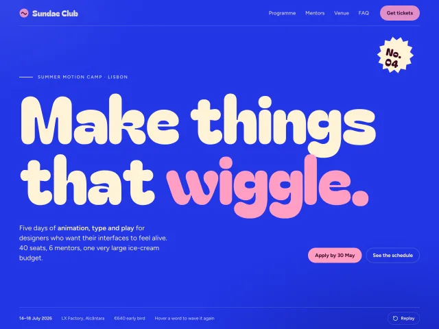
Split letter wave
A 192px hero headline whose letters rise in a staggered wave with springy overshoot; hovering any word makes just that word hop again.
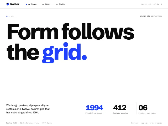
Page transition tile wipe
Nav clicks cover the page with a 6×4 grid of cobalt tiles that spin in on a diagonal, swap the page, spin out the same way, then the new title rises line by line.