Nº 019 of 520
Full-screen mobile menu
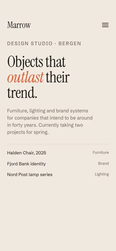
A hamburger that morphs into an X while the page fades, the background shifts from cream to navy and five 64px serif links rise in with a 55ms stagger, plus a small-links row and a language switch.
Preview
Use it
Free to use · credit appreciated1 Once, in your project
npx skills add SusanAcharya/Design-Lounge 2 Then ask
Using the Design Lounge skill, build "Full-screen mobile menu" (piece mobile-fullscreen-menu) in my stack. Match its brief; restyle it onto my product's theme.
No skill? Paste the brief instead. It carries the numbers, tokens and behaviour.
<!-- Design Lounge Nº 019 · "Full-screen mobile menu" · www.designlounge.live -->

# Full-screen mobile menu

> **Build brief for a coding agent.** Rebuild this piece in the reader's stack. If they haven't said which stack, ask once, then default to semantic HTML + CSS + a little vanilla JS. Match the numbers below; don't "improve" them.

## What it is

A full-screen navigation for a design studio's mobile site ("Marrow"). The header stays put while everything else changes: the three-line hamburger folds into an X, the page body colour animates from warm cream to deep navy, the underlying page fades and shrinks 2%, and five oversized Instrument Serif links slide up out of clipped rows one after another. Below them a row of small utility links and a pill-shaped language switch fade in last. The detail worth copying is that nothing is a separate panel; the page itself becomes the menu by changing colour, so there is no sheet edge and no scrim.

## Reference behaviour

1. Initial state: cream page. Header row (60px, starting at 54px from the top) holds the wordmark "Marrow" (30px serif) on the left and a 44px hamburger on the right. Below: a kicker, a 52px serif headline with an orange italic word, one paragraph and a three-row "Selected work" list.
2. Tap the hamburger: `body` gets `.open`. Over 420ms the background goes `#efe9df → #14213d` and text goes dark → cream. Over 240ms the top and bottom hamburger lines move to the middle (`top: 21px`) and rotate ±45°; the middle line fades and shrinks to 20% width over 160ms.
3. Simultaneously the page content fades to 0 and scales to .98 over 420ms and becomes `inert`.
4. Menu links (Work, Studio, Journal, Shop, Contact; 64px serif, superscript counts on Work and Journal) rise from `translateY(110%)` to `0` over 520ms `--ease-out`, each delayed 55ms more than the last (55, 110, 165, 220, 275ms). Each `<li>` has `overflow: hidden` so the link appears to rise out of the row.
5. The footer block (small links row + language switch) fades in and rises 12px over 420ms with a 330ms delay.
6. Focus moves to the first menu link 120ms after opening. Escape or the X closes the menu; focus returns to the hamburger.
7. Tap a menu link: the menu closes (demo has no routing).
8. Tap EN / NO / DE: the white thumb slides to the pressed segment over 240ms with the sheet easing; `aria-pressed` updates.
9. Closing reverses everything with the same durations and no stagger; the menu becomes `visibility: hidden` after the 520ms link transition ends.

## Structure

```
390 × 844 (54px status reserve above, 80px browser bar below)
┌──────────────────────────────────────┐
│ Marrow                          (=)    │ fixed header, top 54, h 60
├──────────────────────────────────────┤ closed:          │ open:
│ DESIGN STUDIO · BERGEN               │                  │  Work ²⁴
│ Objects that                         │ h1 52px serif    │  Studio
│ outlast their                        │                  │  Journal ⁰³
│ trend.                               │                  │  Shop
│ paragraph (≤ 30ch)                   │                  │  Contact
│ ──────────────────────────           │                  │
│ Halden Chair, 2025       Furniture   │ work list        │  ─────────────────────
│ Fjord Bank identity      Brand       │                  │  Careers  Press kit  Newsletter  Privacy
│ Nord Post lamp series    Lighting    │                  │  LANGUAGE        ( EN | NO | DE )
│                                      │                  │
│            (80px reserve)            │                  │

… 178 more lines. Copy or download for the full brief. Loading the source…Brief
218 linesBuild brief for a coding agent. Rebuild this piece in the reader’s stack. If they haven’t said which stack, ask once, then default to semantic HTML + CSS + a little vanilla JS. Match the numbers below; don’t “improve” them.
What it is
A full-screen navigation for a design studio’s mobile site (“Marrow”). The header stays put while everything else changes: the three-line hamburger folds into an X, the page body colour animates from warm cream to deep navy, the underlying page fades and shrinks 2%, and five oversized Instrument Serif links slide up out of clipped rows one after another. Below them a row of small utility links and a pill-shaped language switch fade in last. The detail worth copying is that nothing is a separate panel; the page itself becomes the menu by changing colour, so there is no sheet edge and no scrim.
Reference behaviour
- Initial state: cream page. Header row (60px, starting at 54px from the top) holds the wordmark “Marrow” (30px serif) on the left and a 44px hamburger on the right. Below: a kicker, a 52px serif headline with an orange italic word, one paragraph and a three-row “Selected work” list.
- Tap the hamburger:
bodygets.open. Over 420ms the background goes#efe9df → #14213dand text goes dark → cream. Over 240ms the top and bottom hamburger lines move to the middle (top: 21px) and rotate ±45°; the middle line fades and shrinks to 20% width over 160ms. - Simultaneously the page content fades to 0 and scales to .98 over 420ms and becomes
inert. - Menu links (Work, Studio, Journal, Shop, Contact; 64px serif, superscript counts on Work and Journal) rise from
translateY(110%)to0over 520ms--ease-out, each delayed 55ms more than the last (55, 110, 165, 220, 275ms). Each<li>hasoverflow: hiddenso the link appears to rise out of the row. - The footer block (small links row + language switch) fades in and rises 12px over 420ms with a 330ms delay.
- Focus moves to the first menu link 120ms after opening. Escape or the X closes the menu; focus returns to the hamburger.
- Tap a menu link: the menu closes (demo has no routing).
- Tap EN / NO / DE: the white thumb slides to the pressed segment over 240ms with the sheet easing;
aria-pressedupdates. - Closing reverses everything with the same durations and no stagger; the menu becomes
visibility: hiddenafter the 520ms link transition ends.
Structure
390 × 844 (54px status reserve above, 80px browser bar below)
┌──────────────────────────────────────┐
│ Marrow                          (=)    │ fixed header, top 54, h 60
├──────────────────────────────────────┤ closed:          │ open:
│ DESIGN STUDIO · BERGEN               │                  │  Work ²⁴
│ Objects that                         │ h1 52px serif    │  Studio
│ outlast their                        │                  │  Journal ⁰³
│ trend.                               │                  │  Shop
│ paragraph (≤ 30ch)                   │                  │  Contact
│ ──────────────────────────           │                  │
│ Halden Chair, 2025       Furniture   │ work list        │  ─────────────────────
│ Fjord Bank identity      Brand       │                  │  Careers  Press kit  Newsletter  Privacy
│ Nord Post lamp series    Lighting    │                  │  LANGUAGE        ( EN | NO | DE )
│                                      │                  │
│            (80px reserve)            │                  │
└──────────────────────────────────────┘
gutter 24px both states · links 64/1.08, gap 4 · switch 3×52×34 in a 1px pill
<header class="bar">— fixed attop: 54px,z-index: 20; contains<a class="wordmark">and<button class="burger" aria-expanded aria-controls="menu">with three<span>lines.<main class="page">— absolutely positioned, padded54 + 60 + 24pxat the top and 80px at the bottom; the page content. Getsinertwhile the menu is open.<nav class="menu" aria-label="Main menu">— fixed, full-screen,z-index: 10, flex column, same paddings (+28px top). Contains<ul class="links">and.foot(.smalllinks row +.langrow with the.seggroup of three<button aria-pressed>and one.thumbdiv).
Content
- Wordmark: “Marrow”.
- Page: kicker “Design studio · Bergen”; h1 “Objects that outlast their trend.”; paragraph “Furniture, lighting and brand systems for companies that intend to be around in forty years. Currently taking two projects for spring.”
- Selected work rows: “Halden Chair, 2025 — Furniture”, “Fjord Bank identity — Brand”, “Nord Post lamp series — Lighting”.
- Menu links: “Work” (sup 24), “Studio”, “Journal” (sup 03), “Shop”, “Contact”.
- Small links: “Careers”, “Press kit”, “Newsletter”, “Privacy”.
- Language row: label “Language”; segments “EN” (pressed), “NO”, “DE” with matching
langattributes.
Tokens
:root {
  /* colour — cream page, navy menu, one orange accent */
  --bg: #efe9df;            /* page background (closed) */
  --bg-menu: #14213d;       /* page background (open) */
  --ink: #1c1a17;           /* text (closed) */
  --ink-2: #6b655b;         /* secondary text (closed) */
  --ink-menu: #efe9df;      /* text (open), switch thumb */
  --ink-menu-2: #8d9ab8;    /* small links, superscripts, unpressed segments */
  --line: #d9d1c3;          /* hairline (closed) */
  --line-menu: #2b3a5c;     /* hairline + switch border (open) */
  --accent: #e4572e;        /* italic word, link hover */

  /* type */
  --serif: "Instrument Serif", Georgia, serif;
  --sans: "Schibsted Grotesk", system-ui, sans-serif;

  /* layout */
  --safe-top: 54px;
  --safe-bottom: 80px;
  --gutter: 24px;
  --bar-h: 60px;
  --burger: 44px;
  --line-w: 22px;
  --link-size: 64px;
  --seg-w: 52px;
  --seg-h: 34px;
  --r-pill: 999px;

  /* motion */
  --t-fast: 160ms;          /* middle line fade, colour hovers */
  --t-morph: 240ms;         /* hamburger lines, switch thumb */
  --t-bg: 420ms;            /* background, page fade, footer */
  --t-link: 520ms;          /* link rise */
  --stagger: 55ms;
  --ease: cubic-bezier(.2, .7, .2, 1);
  --ease-out: cubic-bezier(.16, 1, .3, 1);
  --ease-sheet: cubic-bezier(.32, .72, 0, 1);
}
Typography
| Role | Family | Size | Weight | Line-height | Tracking | Case |
|---|---|---|---|---|---|---|
| Body | Schibsted Grotesk | 15px | 400 | 1.5 | 0 | sentence |
| Wordmark | Instrument Serif | 30px | 400 | 1 | −0.01em | sentence |
| Kicker | Schibsted Grotesk | 12px | 500 | 1 | +0.14em | UPPERCASE |
| Page h1 | Instrument Serif | 52px | 400 (em italic) | 1 | −0.02em | sentence |
| Page paragraph | Schibsted Grotesk | 16px | 400 | 1.5 | 0 | sentence |
| Work list | Schibsted Grotesk | 15px / meta 13px | 400 | 1.4 | 0 | sentence |
| Menu link | Instrument Serif | 64px | 400 | 1.08 | −0.025em | sentence |
| Link superscript | Schibsted Grotesk | 12px | 500 | 1 | +0.06em | numerals |
| Small links | Schibsted Grotesk | 14px | 400 | 1.4 | 0 | sentence |
| Language label | Schibsted Grotesk | 12px | 400 | 1 | +0.10em | UPPERCASE |
| Segment button | Schibsted Grotesk | 13px | 500 | 1 | 0 | UPPERCASE |
Motion
| Element | Trigger | Property | From → To | Duration | Easing | Delay |
|---|---|---|---|---|---|---|
body | open | background, color | #efe9df/#1c1a17 → #14213d/#efe9df | 420ms | --ease | 0 |
| burger line 1 / 3 | open | top, rotate | 15px/27px → 21px, 0 → ±45° | 240ms | --ease | 0 |
| burger line 2 | open | opacity, scaleX | 1, 1 → 0, .2 | 160ms | --ease | 0 |
.page | open | opacity, scale | 1, 1 → 0, .98 | 420ms | --ease | 0 |
.links a (n = 1…5) | open | translateY, opacity | 110%, 0 → 0, 1 | 520ms / 160ms | --ease-out / linear | n × 55ms |
.foot | open | opacity, translateY | 0, 12px → 1, 0 | 420ms | --ease / --ease-out | 330ms |
.menu | close | visibility | visible → hidden | 0ms | — | 520ms |
.seg .thumb | segment tap | translateX | 0 → 52px × index | 240ms | --ease-sheet | 0 |
| link colour | hover/focus | color | --ink-menu → --accent | 160ms | linear | 0 |
Reduced motion: all durations 1ms and all delays 0; the colour change and X still happen. Do not remove the visibility toggle.
States
- Closed:
bodywithout.open; menuvisibility: hidden; page interactive. - Open:
body.open; hamburgeraria-expanded="true",aria-label="Close menu"; pageinert, opacity 0. - Hamburger focus-visible: 2px
currentColoroutline, 2px offset, on the 44px circle. - Menu link hover / focus-visible: colour
--accent; focus-visible also underlines with 2px thickness and 8px offset. - Small link hover / focus-visible: colour
--ink-menu, underline 4px offset. - Segment pressed:
aria-pressed="true", text--bg-menuon the cream thumb; unpressed text--ink-menu-2. - Segment focus-visible: 2px
--ink-menuoutline.
Accessibility
- The toggle is a
<button>witharia-expanded,aria-controls="menu"and anaria-labelthat flips between “Open menu” and “Close menu”. - The menu is a
<nav aria-label="Main menu">containing a real<ul>of links;visibility: hiddenwhen closed removes it from the tab order and the accessibility tree. - The page content receives the
inertattribute while the menu is open so Tab cannot reach it and screen readers skip it. - Focus management: first link receives focus 120ms after open (after the row has started rising); on close, focus returns to the toggle. Escape closes.
- Language switch is
role="group" aria-label="Language"of three buttons witharia-pressed; each carries alangattribute matching its code. - Superscript counts are
<sup>inside the link so they are read as part of the link name (“Work 24”). - Hit targets: hamburger 44px, menu links ≥ 44px rows, small links 40px tall, segments 52×34 inside a 40px-tall pill.
- Contrast: cream on navy 12.8:1;
--ink-menu-2on navy 5.1:1;--ink-2on cream 5.0:1;--accenton navy 4.6:1 (used only for 64px links).
Responsive rules
- 390 (reference): links 64px; five rows plus the footer fit in the 622px between the header and the bottom reserve.
- 360 wide: links 56px, gutter 20px, wordmark 28px.
- Height < 720: links 52px and gap 0 so the footer stays above the reserve; if it still overflows, the
.menuscrolls (overflow-y: auto) and the footer is no longermargin-top: auto. - ≥ 600 wide: cap the link column at 560px centred; the colour shift still applies to the whole viewport.
Acceptance checklist
- Header is fixed at
top: 54px, 60px tall; the hamburger is a 44px button with three 22×2px lines attop15/21/27px. - Opening moves lines 1 and 3 to
top: 21pxand rotates them +45°/−45° over 240ms; line 2 fades out over 160ms. -
bodybackground transitions#efe9df → #14213dover 420ms withcubic-bezier(.2,.7,.2,1). - Page content fades to 0, scales to .98 and is
inertwhile open. - Five links are Instrument Serif 64px, line-height 1.08, and rise from
translateY(110%)insideoverflow: hiddenrows over 520ms with a 55ms stagger. - Footer block appears 330ms after open with a 12px rise.
- Escape closes the menu and returns focus to the hamburger; opening moves focus to the first link.
- The menu is
visibility: hiddenwhen closed, delayed by 520ms on close so links finish leaving. - Language thumb slides 52px per segment over 240ms
cubic-bezier(.32,.72,0,1);aria-pressedfollows. - Nothing fixed occupies the top 54px or bottom 80px; the menu’s bottom padding is 80px.
- Reduced motion: no stagger, ≤ 1ms transitions, all states still reachable.
Implementation notes
Rise-out-of-row links. Clip at the <li>, translate the <a>, and put the stagger only on the open selector so closing is simultaneous:
.links li { overflow: hidden; }
.links a { display: flex; transform: translateY(110%); opacity: 0;
           transition: transform var(--t-link) var(--ease-out), opacity var(--t-fast) linear; }
.open .links a { transform: none; opacity: 1; }
.open .links li:nth-child(1) a { transition-delay: calc(var(--stagger) * 1); }
.open .links li:nth-child(2) a { transition-delay: calc(var(--stagger) * 2); }
/* … up to 5 */
Hamburger to X with only top, transform and opacity, so the morph is a single 240ms clock:
.burger span { position: absolute; left: 11px; width: 22px; height: 2px; background: currentColor;
               transition: transform var(--t-morph) var(--ease), top var(--t-morph) var(--ease), opacity var(--t-fast); }
.burger span:nth-child(1) { top: 15px } .burger span:nth-child(2) { top: 21px } .burger span:nth-child(3) { top: 27px }
.open .burger span:nth-child(1) { top: 21px; transform: rotate(45deg); }
.open .burger span:nth-child(2) { opacity: 0; transform: scaleX(.2); }
.open .burger span:nth-child(3) { top: 21px; transform: rotate(-45deg); }
Visibility timing and focus. Hide with visibility (delayed on close, immediate on open) and move focus after the first link has begun to rise:
function setOpen(o) {
  body.classList.toggle('open', o);
  burger.setAttribute('aria-expanded', String(o));
  burger.setAttribute('aria-label', o ? 'Close menu' : 'Open menu');
  page.toggleAttribute('inert', o);
  if (o) setTimeout(() => menu.querySelector('a').focus({ preventScroll: true }), 120);
  else burger.focus({ preventScroll: true });
}
Common mistakes: animating height or clip-path on the whole menu (kills the per-link stagger); leaving the page focusable behind the menu; applying the stagger to closing too (it looks broken); using display:none on the menu (no exit animation, and visibility with a delay is what keeps it out of the tab order).
Details
- Palette
- Type
- Instrument Serif · Schibsted Grotesk
- Motion
- Rich motion
- Build
- One session
- Tags
Studied
Lama LamaA tiny nav bar can carry the voice. Change its one line for each section.
All sourcesOn the shelves