Nº 535 of 543
Card grid with sticker filters
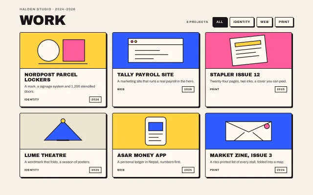
Six bordered work cards in a 3×2 grid, each with a flat colour band and a drawn mark; hover pushes a card into its shadow, and pressed filter tags hide the rest with a 160ms fade.
Preview
Use it
Free to use · credit appreciated1 Once, in your project · Node 22.20+
npx skills add SusanAcharya/Design-Lounge 2 Then ask
Using the Design Lounge skill, build "Card grid with sticker filters" (piece card-grid-brutal) in my stack. Match its brief; restyle it onto my product's theme.
No skill? Paste the brief instead. It carries the numbers, tokens and behaviour.
<!-- Design Lounge Nº 535 · "Card grid with sticker filters" · www.designlounge.live -->

# Card grid with sticker filters

> **Build brief for a coding agent.** Rebuild this piece in the reader's stack. If they haven't said which stack, ask once, then default to semantic HTML + CSS + a little vanilla JS. Match the numbers below; don't "improve" them. When a kit is locked, map the colours onto the kit tokens and keep the 2px ink borders and the hard 0-blur shadows. The drawn marks are placeholders for this product's own work.

## What it is

The work grid of Halden Studio, a fictional design studio, in a neo-brutalist system. A 56px uppercase title with a kicker sits left; a live count and four filter tags sit right. Six cards fill a three-column grid: each is a bordered box with a 4px hard shadow, a 148px flat colour band (yellow, blue, pink or cream) holding one drawn mark in ink, then a title, one sentence, and a meta row with the category and a bordered year tag. Hovering a card pushes it into its shadow, the same rule as every button in the family, so the whole page has one idea of "pressable". Pressing a filter tag turns it ink-on-cream, fades the other cards out over 160ms, removes them from the grid so the rest close up, and updates the count. The detail worth copying is that the cards' colour comes only from their bands: the body is always cream, so six loud cards still read as one set.

## Reference behaviour

1. First frame: "HALDEN STUDIO · 2024-2026 / WORK", count "6 projects", tags All (pressed), Identity, Web, Print. Six cards: Nordpost parcel lockers (yellow, identity, 2026), Tally payroll site (blue, web, 2026), Stapler issue 12 (pink, print, 2025), Lume theatre (cream, identity, 2025), Asar money app (yellow, web, 2025), Market zine issue 3 (blue, print, 2024).
2. Hover a card: it translates (4px, 4px) and its shadow collapses to 0 in 120ms. Leave: back.
3. Hover a tag: it moves (3px, 3px) into its 3px shadow. Press a tag: `aria-pressed="true"` on it and false on the others; it fills ink with cream text.
4. Press "Identity": the four non-identity cards fade to 0 over 160ms, then are set `hidden`, so the two identity cards sit side by side in the first row. The count reads "2 projects".
5. Press "All": every card returns (`hidden` removed, opacity back to 1 over 160ms).
6. If a filter matches nothing, a dashed bordered line "Nothing in that category yet." shows under the grid.
7. Nothing animates on load.

## Structure

```
1280 × 800, bg #F6F1E4, wrap max 1200, padding 32/40
┌ head ───────────────────────────────────────────────────────────────────────────┐
│ HALDEN STUDIO · 2024-2026                 6 PROJECTS [All][Identity][Web][Print]│
│ WORK 56/.95                                                                     │
├ grid 3 × 1fr, gap 24 ───────────────────────────────────────────────────────────┤
│ ┌ band yellow 148 ─┐  ┌ band blue ───────┐  ┌ band pink ───────┐                │
│ │   (drawn mark)   │  │   (drawn mark)   │  │   (drawn mark)   │                │
│ ├──────────────────┤  ├──────────────────┤  ├──────────────────┤                │
│ │ NORDPOST PARCEL… │  │ TALLY PAYROLL…   │  │ STAPLER ISSUE 12 │  4px shadows   │
│ │ one sentence     │  │ one sentence     │  │ one sentence     │                │
│ │ IDENTITY   [2026]│  │ WEB        [2026]│  │ PRINT      [2025]│                │
│ └──────────────────┘  └──────────────────┘  └──────────────────┘                │
│ (second row: cream, yellow, blue)                                               │
└─────────────────────────────────────────────────────────────────────────────────┘
```

- `main.wrap` → `div.head` (`h1` with `small`, `div.filters[role=group]` with `span.count[aria-live]` and four `button.tag[aria-pressed][data-f]`), `div.grid#grid`, `p.empty`.

… 115 more lines. Copy or download for the full brief. Loading the source…Brief
155 linesBuild brief for a coding agent. Rebuild this piece in the reader’s stack. If they haven’t said which stack, ask once, then default to semantic HTML + CSS + a little vanilla JS. Match the numbers below; don’t “improve” them. When a kit is locked, map the colours onto the kit tokens and keep the 2px ink borders and the hard 0-blur shadows. The drawn marks are placeholders for this product’s own work.
What it is
The work grid of Halden Studio, a fictional design studio, in a neo-brutalist system. A 56px uppercase title with a kicker sits left; a live count and four filter tags sit right. Six cards fill a three-column grid: each is a bordered box with a 4px hard shadow, a 148px flat colour band (yellow, blue, pink or cream) holding one drawn mark in ink, then a title, one sentence, and a meta row with the category and a bordered year tag. Hovering a card pushes it into its shadow, the same rule as every button in the family, so the whole page has one idea of “pressable”. Pressing a filter tag turns it ink-on-cream, fades the other cards out over 160ms, removes them from the grid so the rest close up, and updates the count. The detail worth copying is that the cards’ colour comes only from their bands: the body is always cream, so six loud cards still read as one set.
Reference behaviour
- First frame: “HALDEN STUDIO · 2024-2026 / WORK”, count “6 projects”, tags All (pressed), Identity, Web, Print. Six cards: Nordpost parcel lockers (yellow, identity, 2026), Tally payroll site (blue, web, 2026), Stapler issue 12 (pink, print, 2025), Lume theatre (cream, identity, 2025), Asar money app (yellow, web, 2025), Market zine issue 3 (blue, print, 2024).
- Hover a card: it translates (4px, 4px) and its shadow collapses to 0 in 120ms. Leave: back.
- Hover a tag: it moves (3px, 3px) into its 3px shadow. Press a tag:
aria-pressed="true"on it and false on the others; it fills ink with cream text. - Press “Identity”: the four non-identity cards fade to 0 over 160ms, then are set
hidden, so the two identity cards sit side by side in the first row. The count reads “2 projects”. - Press “All”: every card returns (
hiddenremoved, opacity back to 1 over 160ms). - If a filter matches nothing, a dashed bordered line “Nothing in that category yet.” shows under the grid.
- Nothing animates on load.
Structure
1280 × 800, bg #F6F1E4, wrap max 1200, padding 32/40
┌ head ───────────────────────────────────────────────────────────────────────────┐
│ HALDEN STUDIO · 2024-2026                 6 PROJECTS [All][Identity][Web][Print]│
│ WORK 56/.95                                                                     │
├ grid 3 × 1fr, gap 24 ───────────────────────────────────────────────────────────┤
│ ┌ band yellow 148 ─┐  ┌ band blue ───────┐  ┌ band pink ───────┐                │
│ │   (drawn mark)   │  │   (drawn mark)   │  │   (drawn mark)   │                │
│ ├──────────────────┤  ├──────────────────┤  ├──────────────────┤                │
│ │ NORDPOST PARCEL… │  │ TALLY PAYROLL…   │  │ STAPLER ISSUE 12 │  4px shadows   │
│ │ one sentence     │  │ one sentence     │  │ one sentence     │                │
│ │ IDENTITY   [2026]│  │ WEB        [2026]│  │ PRINT      [2025]│                │
│ └──────────────────┘  └──────────────────┘  └──────────────────┘                │
│ (second row: cream, yellow, blue)                                               │
└─────────────────────────────────────────────────────────────────────────────────┘main.wrap→div.head(h1withsmall,div.filters[role=group]withspan.count[aria-live]and fourbutton.tag[aria-pressed][data-f]),div.grid#grid,p.empty.- Each
a.card[data-k](colour classy,b,porc) →div.art[aria-hidden]with an inline SVG,div.body(h2,p,div.metawith two spans).
Tokens
:root {
  --bg: #f6f1e4;  --surface: #fffaf0;  --surface-2: #ece4d0;
  --ink: #17151a;  --ink-2: #4a4650;  --ink-3: #76717d;
  --yellow: #ffd23f;  --blue: #2f5bff;  --blue-ink: #fffdf8;  --pink: #ff5c9a;

  --display: "Archivo Black", Impact, sans-serif;
  --sans: "Archivo", system-ui, sans-serif;

  --bw: 2px;  --off: 4px;  --off-tag: 3px;
  --r: 4px;  --r-card: 6px;
  --band-h: 148px;  --gap: 24px;  --tag-h: 40px;

  --t-micro: 120ms;  --t-hide: 160ms;
  --ease: cubic-bezier(.2, .7, .2, 1);
}
Typography
| Role | Family | Size | Weight | Line-height | Tracking | Case |
|---|---|---|---|---|---|---|
| Title | Archivo Black | 56px | 400 | 0.95 | −0.02em | UPPERCASE |
| Card title | Archivo Black | 20px | 400 | 1.05 | −0.01em | UPPERCASE |
| Kicker | Archivo | 13px | 700 | 1 | +0.12em | UPPERCASE, --ink-3 |
| Card sentence | Archivo | 14px | 500 | 1.5 | 0 | sentence, --ink-2 |
| Filter tag | Archivo | 13px | 700 | 1 | +0.06em | UPPERCASE |
| Count | Archivo | 12px | 700 | 1 | +0.1em | UPPERCASE, --ink-2 |
| Meta, year tag | Archivo | 11px | 700 | 1 | +0.1em | UPPERCASE |
| Empty line | Archivo | 16px | 700 | 1.5 | 0 | sentence |
Motion
| Element | Trigger | Property | From → To | Duration | Easing |
|---|---|---|---|---|---|
.card | hover | transform, box-shadow | none, 4px 4px 0 → translate(4px,4px), 0 0 0 | 120ms | --ease |
.tag | hover | transform, box-shadow | none, 3px 3px 0 → translate(3px,3px), 0 0 0 | 120ms | --ease |
.card.out | filter | opacity | 1 → 0, then hidden | 160ms | --ease |
.card returning | filter | opacity | 0 → 1 after hidden is removed | 160ms | --ease |
Reduced motion: transitions 1ms, and filtered cards are hidden at once instead of after the fade.
States
- Card default: cream body, coloured band, 4px shadow. Hover: pushed into the shadow. Focus-visible: 2px blue outline at 3px offset.
- Tag default: cream, 3px shadow. Pressed:
--inkfill,--bgtext, shadow unchanged. Hover: pushed. - Count: “N projects”, or “1 project”; live region.
- Empty: a dashed 2px ink border box with one sentence, only when no card matches.
Accessibility
- Filters are buttons with
aria-pressedinside arole="group"labelled “Filter the work”; the count isaria-live="polite"so the result of a press is announced. - Cards are links; the title is real text in an
h2; the drawn mark isaria-hiddenand the band colour carries no meaning on its own (the category is written in the meta row). - Hidden cards use the
hiddenattribute, so they leave the tab order and the accessibility tree. - Contrast: ink on cream 15.2:1;
--bgon--ink15.2:1 (pressed tag);--ink-2on--surface9.1:1;--ink-3kicker on cream 4.9:1. - Hit targets: tags 40px tall; cards are whole-link targets; the push is 4px, within vestibular guidance.
Responsive rules
- ≥ 1280: three columns, gap 24, band 148px; two rows fit in 800px.
- 1024–1279: three columns, gap 20, band 132px, title 48px.
- 768–1023: two columns; the head stacks (title, then filters).
- < 640: one column, padding 20px, title 40px, filters scroll horizontally in one row (
overflow-x: auto, no wrap), band 160px. Shadow offsets stay 4px / 3px.
Acceptance checklist
Always
- Every card and tag has a 2px
--inkborder; shadows are hard with no blur: 4px on cards, 3px on tags; cards use the family card radius, tags the family radius. - Card bodies are always
--surface; colour appears only in the band, from a set of at most three accent fills plus cream. - Hovering a card translates it exactly (4px, 4px) and collapses its shadow on the same 120ms clock.
- Filter tags use
aria-pressed; exactly one is pressed; the pressed tag is ink-on-cream. - Filtering fades non-matching cards out over 160ms, then hides them so the grid closes up; the live count updates; an empty result shows the dashed line.
- The category is written in each card’s meta row, not carried by colour alone.
- Focus rings are visible on tags and cards, outside the shadows.
- Reduced motion: 1ms transitions, cards hide at once.
This demo
- Six cards for Halden Studio with the titles, categories and years above; the count starts at “6 projects”.
- Tags All, Identity, Web, Print; Identity leaves Nordpost and Lume; Print leaves Stapler issue 12 and Market zine.
Implementation notes
One push for cards and buttons alike:
.card { border: var(--bw) solid var(--ink); box-shadow: var(--off) var(--off) 0 var(--ink);
  transition: transform var(--t-micro) var(--ease), box-shadow var(--t-micro) var(--ease), opacity var(--t-hide) var(--ease); }
.card:hover { transform: translate(var(--off), var(--off)); box-shadow: 0 0 0 var(--ink); }
.card.out { opacity: 0; pointer-events: none; }
.card[hidden] { display: none; }
Fade, then hide, so the grid closes up after the fade and not during it:
cards.forEach((c) => {
  const show = f === 'all' || c.dataset.k === f;
  if (show) { c.hidden = false; requestAnimationFrame(() => c.classList.remove('out')); }
  else { c.classList.add('out'); reduce ? (c.hidden = true) : setTimeout(() => { if (c.classList.contains('out')) c.hidden = true; }, 160); }
});
count.textContent = n + (n === 1 ? ' project' : ' projects');
The drawn marks are three or four shapes in one inline SVG per card, ink strokes at 3px on the band colour. Replace them with the product’s real images; keep the band as a flat fill behind a cut-out, not a photo with a tint.
Common mistakes: colouring the card body as well as the band (then six cards shout at each other); a blurred hover shadow; display: none during the fade (the fade never shows); a grid that leaves a gap where a hidden card was (use hidden, not visibility); a tag row that wraps to three lines on a phone instead of scrolling.
Details
- Palette
- Type
- Archivo Black · Archivo
- Motion
- Subtle motion
- Build
- Quick build
- Tags
Similar
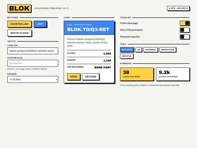
Neo-brutalist design style
Thick 2.5px black borders, hard 4px 4px 0 offset shadows, flat yellow and blue fills, and hover that moves the element into its shadow; buttons, inputs, a card, toggles and tags.
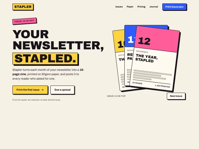
Hero with a fanned issue stack
A neo-brutalist hero: a 76px uppercase headline with one word in a yellow block, two hard-shadow buttons, and three bordered issue covers that fan out on hover and rotate on a Next button.
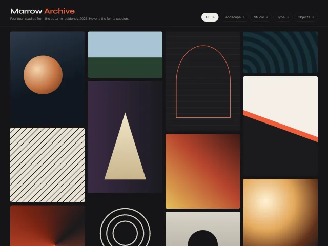
Masonry gallery with captions
A 4-column CSS-columns masonry of 14 CSS-painted tiles; hover slides a caption bar up from the bottom, and a chip row filters by series with a fade.