Nº 075 of 520
Terminal UI style sheet
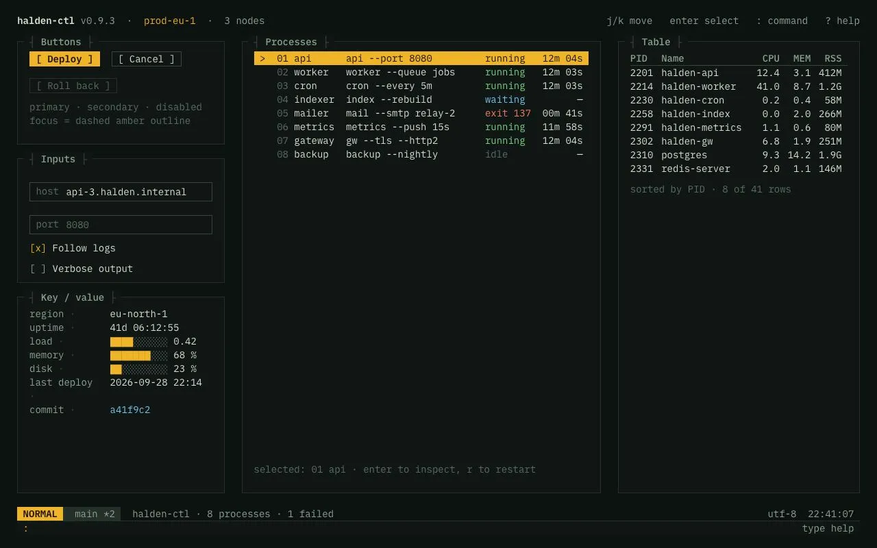
A monospace 1ch-grid style sheet for a terminal-style ops UI: box-drawing panel titles, bracketed buttons, key-value rows, an amber-highlighted list, a table, a status line and a : command input.
Preview
Use it
Free to use · credit appreciated1 Once, in your project
npx skills add SusanAcharya/Design-Lounge 2 Then ask
Using the Design Lounge skill, build "Terminal UI style sheet" (piece terminal-ui-style) in my stack. Match its brief; restyle it onto my product's theme.
No skill? Paste the brief instead. It carries the numbers, tokens and behaviour.
<!-- Design Lounge Nº 075 · "Terminal UI style sheet" · www.designlounge.live -->

# Terminal UI style sheet

> **Build brief for a coding agent.** Rebuild this piece in the reader's stack. If they haven't said which stack, ask once, then default to semantic HTML + CSS + a little vanilla JS. Match the numbers below; don't "improve" them.

## What it is

A one-screen style sheet for an operations console ("halden-ctl") that behaves like a full-screen terminal program: every measurement is in `ch` or line-heights, the type is IBM Plex Mono at 14/20 throughout, panels are 1px boxes with titles that break the border using box-drawing characters ("┤ Buttons ├"), buttons are wrapped in square brackets, checkboxes are `[x]`, and the selected list row is a solid amber bar with a `>` marker. A vim-style status line (mode block, branch, summary, encoding, clock) and a `:` command input close the screen. It demonstrates buttons, inputs, a list, key-value rows, a table and the command line in that one language. The thing worth copying is the discipline: one font, one size, one accent, zero radii, and a grid you can count in characters.

## Reference behaviour

1. Initial state: top line with the product name, environment in amber and node count; three columns of boxed panels; row 01 ("api") selected in the Processes list; status line reads `NORMAL  main *2  halden-ctl · 8 processes · 1 failed … utf-8 22:41:07`; the command line shows `:` and a dim "type help".
2. Hover a button: border brightens to `--ink-2`; the primary lightens to `#F7C454`. Press: the button shifts down 1px. The disabled button ("Roll back") is dimmed with `cursor: not-allowed`.
3. Tab into a text field: the field gets a 1px dashed amber outline at 2px offset; the caret is amber. Selecting text anywhere shows amber selection with dark text.
4. Click a checkbox label: `[ ]` becomes `[x]` in amber.
5. Press `j` / `↓` or `k` / `↑` (when no input is focused): the selection moves down/up through the process list, wrapping at the ends; the selected row turns amber with `> ` before it; the hint under the list updates ("selected: 03 cron · …"). Clicking a row also selects it.
6. Press `Enter`: the command output reads "inspect <name> → pid <n>". Press `r`: "restarted <name>". Press `?`: a key legend.
7. Press `:`: the command input is focused and the mode block changes to `COMMAND`. Type `help`, `status`, `restart worker` or `clear` and press Enter: the output line shows the response; unknown input shows "unknown command: …". `Escape` blurs the input and the mode returns to `NORMAL`.
8. Hover a table row: the row's cells take the `--line` background.

## Structure

```
1280 × 800  (body padding 20px 3ch; font 14/20; 1ch ≈ 8.4px → ~152 columns)
 halden-ctl v0.9.3 · prod-eu-1 · 3 nodes                 j/k move  enter select  : command  ? help
 ┤ Buttons ├──────────────┐ ┤ Processes ├──────────────────────────┐ ┤ Table ├──────────────────┐
 │ [ Deploy ] [ Cancel ]  │ │ > 01 api      api --port 8080 running │ │ PID  Name   CPU MEM RSS │
 │ [ Roll back ]          │ │   02 worker   worker --queue…  running │ │ 2201 halden-api …       │
 │ primary · secondary …  │ │   03 cron     …                        │ │ …                       │
 ├────────────────────────┤ │   04 indexer  …               waiting  │ │                         │
 ┤ Inputs ├───────────────┐ │   05 mailer   …               exit 137 │ │ sorted by PID · 8 of 41 │
 │ │ host api-3.halden… │ │ │   …                                    │ │                         │
 │ │ port 8080          │ │ │                                        │ │                         │
 │ [x] Follow logs        │ │                                        │ │                         │
 ├────────────────────────┤ │                                        │ │                         │
 ┤ Key / value ├──────────┐ │                                        │ │                         │
 │ region ·  eu-north-1   │ │ selected: 01 api · enter to inspect…   │ │                         │
 │ load   ·  ████░░░░ 0.42│ └────────────────────────────────────────┘ └─────────────────────────┘
 NORMAL  main *2  halden-ctl · 8 processes · 1 failed                              utf-8  22:41:07

… 170 more lines. Copy or download for the full brief. Loading the source…Brief
210 linesBuild brief for a coding agent. Rebuild this piece in the reader’s stack. If they haven’t said which stack, ask once, then default to semantic HTML + CSS + a little vanilla JS. Match the numbers below; don’t “improve” them.
What it is
A one-screen style sheet for an operations console (“halden-ctl”) that behaves like a full-screen terminal program: every measurement is in ch or line-heights, the type is IBM Plex Mono at 14/20 throughout, panels are 1px boxes with titles that break the border using box-drawing characters (”┤ Buttons ├”), buttons are wrapped in square brackets, checkboxes are [x], and the selected list row is a solid amber bar with a > marker. A vim-style status line (mode block, branch, summary, encoding, clock) and a : command input close the screen. It demonstrates buttons, inputs, a list, key-value rows, a table and the command line in that one language. The thing worth copying is the discipline: one font, one size, one accent, zero radii, and a grid you can count in characters.
Reference behaviour
- Initial state: top line with the product name, environment in amber and node count; three columns of boxed panels; row 01 (“api”) selected in the Processes list; status line reads
NORMAL main *2 halden-ctl · 8 processes · 1 failed … utf-8 22:41:07; the command line shows:and a dim “type help”. - Hover a button: border brightens to
--ink-2; the primary lightens to#F7C454. Press: the button shifts down 1px. The disabled button (“Roll back”) is dimmed withcursor: not-allowed. - Tab into a text field: the field gets a 1px dashed amber outline at 2px offset; the caret is amber. Selecting text anywhere shows amber selection with dark text.
- Click a checkbox label:
[ ]becomes[x]in amber. - Press
j/↓ork/↑(when no input is focused): the selection moves down/up through the process list, wrapping at the ends; the selected row turns amber with>before it; the hint under the list updates (“selected: 03 cron · …”). Clicking a row also selects it. - Press
Enter: the command output reads “inspect→ pid ”. Press r: “restarted”. Press ?: a key legend. - Press
:: the command input is focused and the mode block changes toCOMMAND. Typehelp,status,restart workerorclearand press Enter: the output line shows the response; unknown input shows “unknown command: …”.Escapeblurs the input and the mode returns toNORMAL. - Hover a table row: the row’s cells take the
--linebackground.
Structure
1280 × 800  (body padding 20px 3ch; font 14/20; 1ch ≈ 8.4px → ~152 columns)
 halden-ctl v0.9.3 · prod-eu-1 · 3 nodes                 j/k move  enter select  : command  ? help
 ┤ Buttons ├──────────────┐ ┤ Processes ├──────────────────────────┐ ┤ Table ├──────────────────┐
 │ [ Deploy ] [ Cancel ]  │ │ > 01 api      api --port 8080 running │ │ PID  Name   CPU MEM RSS │
 │ [ Roll back ]          │ │   02 worker   worker --queue…  running │ │ 2201 halden-api …       │
 │ primary · secondary …  │ │   03 cron     …                        │ │ …                       │
 ├────────────────────────┤ │   04 indexer  …               waiting  │ │                         │
 ┤ Inputs ├───────────────┐ │   05 mailer   …               exit 137 │ │ sorted by PID · 8 of 41 │
 │ │ host api-3.halden… │ │ │   …                                    │ │                         │
 │ │ port 8080          │ │ │                                        │ │                         │
 │ [x] Follow logs        │ │                                        │ │                         │
 ├────────────────────────┤ │                                        │ │                         │
 ┤ Key / value ├──────────┐ │                                        │ │                         │
 │ region ·  eu-north-1   │ │ selected: 01 api · enter to inspect…   │ │                         │
 │ load   ·  ████░░░░ 0.42│ └────────────────────────────────────────┘ └─────────────────────────┘
 NORMAL  main *2  halden-ctl · 8 processes · 1 failed                              utf-8  22:41:07
 :                                                                                       type help
columns: 36ch | 1fr | 42ch, 3ch gaps, one line-height between stacked boxes<body>:display: grid; grid-template-rows: 20px 1fr 40px; padding: 20px 3ch; gap: 20px 0.<header class="top">: two spans,white-space: pre.<main class="grid">: three.colflex columns. Each.boxis a<section>with an absolutely positioned<h2>whose::before/::afterare ”┤ ” and ” ├”.- Buttons:
.btnsrow of<button class="btn">(::before”[ ”,::after” ]”), then a.hint. - Inputs: two
<label class="field">(key span +<input>), two<label class="chk">(hidden native checkbox +.bxspan rendering[ ]/[x]). - Key / value:
<dl class="kv">in a12ch 1frgrid; bars are text (█and░). - Processes:
<ul role="listbox" tabindex="0">of<li role="option" aria-selected>; each row is a grid2ch 2ch 8ch minmax(0, 1fr) 8ch 8ch: marker, index, name, command (ellipsised), state, age. - Table:
<table>with<thead>; numeric columns right-aligned; 1px--line-2rule under the header only.
- Buttons:
<footer>:.statusgrid (auto auto 1fr auto auto) and.cmdrow (:prompt,<input>, output span).
Tokens
:root {
  /* colour — green-black terminal, sage text, amber accent, ANSI-ish semantics */
  --bg: #0c1210;
  --panel: #0f1614;        /* box fill, title backplate */
  --line: #243029;         /* box border, hover rows, branch block */
  --line-2: #37473d;       /* control borders, table header rule, title brackets */
  --ink: #d7e3d5;          /* primary text */
  --ink-2: #8fa394;        /* labels, headers, hints in boxes */
  --ink-3: #5c6f63;        /* dim: indices, empty bars, placeholders, disabled */
  --amber: #f0b429;        /* selection, primary button, mode block, caret, focus */
  --amber-hover: #f7c454;
  --amber-ink: #1a1200;    /* text on amber */
  --green: #7fd18a;        /* running */
  --red: #f07f6a;          /* failed */
  --blue: #7cc4f0;         /* info, commit hash */

  /* type — one family, one size */
  --mono: "IBM Plex Mono", ui-monospace, monospace;
  --fs: 14px; --lh: 20px;
  --w-regular: 400; --w-medium: 500; --w-bold: 600;

  /* grid — everything in ch and line-heights */
  --page-pad: var(--lh) 3ch; --col-gap: 3ch; --row-gap: var(--lh);
  --cols: 36ch 1fr 42ch;
  --box-pad: calc(var(--lh) / 2 + 4px) 2ch calc(var(--lh) / 2);
  --control-h: calc(var(--lh) + 4px);
  --kv-key: 12ch; --list-cols: 2ch 2ch 8ch minmax(0, 1fr) 8ch 8ch; --bar-cells: 10;
  --radius: 0;

  /* focus */
  --focus: 1px dashed var(--amber); --focus-offset: 2px;

  /* motion */
  --t-micro: 100ms;
  --ease: cubic-bezier(.2, .7, .2, 1);
}
Typography
Every element is IBM Plex Mono 14px / 20px, font-variant-ligatures: none, letter-spacing 0. Only weight and colour vary.
| Role | Weight | Colour | Notes |
|---|---|---|---|
| Product name | 600 | --ink | top line |
| Environment | 400 | --amber | top line |
| Panel title | 500 | --ink-2 | brackets ┤ ├ in --line-2, backplate --panel |
| Button label | 400 (primary 600) | --ink / --amber-ink | wrapped in [ and ] |
| Field key | 400 | --ink-3 | e.g. “host” |
| Field value / input | 400 | --ink | caret --amber |
| Checkbox glyph | 400 | --ink-2 / --amber when checked | [ ] / [x] |
| Key (dl dt) | 400 | --ink-2 | followed by · in --line-2 |
| Value (dl dd) | 400 | --ink | bars: filled █ in --amber, empty ░ in --ink-3 |
| List index | 400 | --ink-3 | two digits |
| List state | 400 | --green / --blue / --red / --ink-3 | running / waiting / exit / idle |
| Table header | 500 | --ink-2 | 1px --line-2 bottom rule |
| Table cell | 400 | --ink | numbers right-aligned |
| Hint | 400 | --ink-3 | white-space: pre-line |
| Status mode | 600 | --amber-ink on --amber | NORMAL / COMMAND |
| Status branch | 400 | --ink-2 on --line | |
| Command prompt | 400 | --amber | : |
| Command output | 400 | --ink-2 |
Motion
Motion is none by design. The only transitions are 100ms colour changes on buttons (background, color, border-color) and a 1px translateY on :active. Selection, focus and mode changes are instant. Under prefers-reduced-motion the 100ms transitions become 1ms.
States
- Button rest: 1px
--line-2border, no fill,[ label ]. Hover: border--ink-2. Active:translateY(1px). Primary:--amberfill,--amber-inktext, weight 600; hover--amber-hover. Disabled: text--ink-3, border--line,cursor: not-allowed, no hover change. - Focus-visible (everything):
outline: 1px dashed --amber; outline-offset: 2px— on buttons, fields (:focus-within), the checkbox glyph (via the hidden input’s:focus-visible ~ .bx), the listbox and the command row. - Field: 1px
--line-2border,2px 1chpadding; placeholder--ink-3. - Checkbox checked:
[x]in--amber. - List row rest: two-space marker, transparent. Hover:
--linebackground. Selected:--amberbackground,--amber-inktext (all semantic colours inherit), marker>. - Table row hover: cells
--linebackground. - Status mode:
NORMAL(amber block) ↔COMMANDwhile the command input is focused. - Command output: response text, “unknown command: …”, or empty after
clear.
Accessibility
- The process list is
role="listbox"withtabindex="0"; rows arerole="option"witharia-selected. Arrow keys and j/k move the selection; the hint text under the list mirrors the selection for screen readers (make itaria-live="polite"in production). - Checkboxes are real
<input type="checkbox">inside<label>; the native box is visually hidden (opacity 0, 0×0) and the[x]glyph is CSS-generated, so they remain keyboard-toggleable with Space. - Text fields have
aria-labels (host, port); the command input hasaria-label="Command"andautocomplete="off". - Global shortcuts ignore keystrokes while any input is focused;
Escapereturns to normal mode. - Contrast:
--inkon--bg13.9:1;--ink-2on--panel6.2:1;--ink-3on--panel3.2:1 (dim text — indices, hints, empty bars; treat as decorative or raise to--ink-2for AA);--amber-inkon--amber10.7:1;--green,--blue,--redon--panelall ≥ 6:1. - Box titles are
<h2>s; the box-drawing brackets are generated content and ignored by most screen readers. Buttons’[ ]are also generated content.
Responsive rules
-
1100: three columns
36ch 1fr 42ch; the middle column absorbs the difference and commands ellipsise. - 768–1100: two columns (
1fr 1fr); the Table column spans both below; the page scrolls. - < 640: single column in DOM order; status line wraps to two rows (mode + branch, then summary); the table gets
overflow-x: auto.
Acceptance checklist
- One font family (IBM Plex Mono), one size (14px) and one line-height (20px) everywhere; no other font sizes exist in the CSS.
- All horizontal measurements are in
chand all vertical ones in multiples of the 20px line-height;border-radiusis 0 everywhere. - Panel titles break the top border and read ”┤ Title ├” with the brackets in
--line-2and the word in--ink-2on a--panelbackplate. - Buttons render as
[ Label ]using generated content; primary is amber-filled; disabled usescursor: not-allowed. - Checkboxes render as
[ ]/[x]and toggle with click and Space. - j / k / arrow keys move the list selection with wrap-around; the selected row is a solid amber bar with a
>marker and dark text. -
:focuses the command input and switches the mode block toCOMMAND;Escapereturns toNORMAL. -
help,status,restart <name>andclearproduce the specified outputs; anything else shows “unknown command: …”. -
::selectionis amber with--amber-inktext. - Every interactive element shows a 1px dashed amber focus outline at 2px offset.
- Table numeric columns are right-aligned; only the header has a rule; rows highlight on hover.
- Key-value bars are text glyphs (
█/░) totalling 10 cells, filled cells in amber. - Page fits 1280 × 800 with no scrollbars.
Implementation notes
Titles that break the border. Position the heading on the top edge and give it the panel colour so it “cuts” the 1px line; the brackets are generated content:
.box { border: 1px solid var(--line); position: relative; background: var(--panel);
       padding: calc(var(--lh) / 2 + 4px) 2ch calc(var(--lh) / 2); }
.box > h2 { position: absolute; top: calc(var(--lh) / -2); left: 1ch; margin: 0; padding: 0 1ch;
            font: 500 var(--fs) / var(--lh) var(--mono); color: var(--ink-2); background: var(--panel); }
.box > h2::before { content: "┤ "; color: var(--line-2); }
.box > h2::after  { content: " ├"; color: var(--line-2); }
Bracketed buttons and glyph checkboxes — keep native semantics, replace only the paint:
.btn::before { content: "[ "; } .btn::after { content: " ]"; }
.chk input { position: absolute; opacity: 0; width: 0; height: 0; }
.chk .bx::before { content: "[ ]"; color: var(--ink-2); white-space: pre; }
.chk input:checked ~ .bx::before { content: "[x]"; color: var(--amber); }
.chk input:focus-visible ~ .bx { outline: var(--focus); outline-offset: var(--focus-offset); }
Global keys that stay out of inputs:
addEventListener('keydown', e => {
  if (e.target === cmd) { if (e.key === 'Escape') { cmd.blur(); mode.textContent = 'NORMAL'; } return; }
  if (e.target.matches('input')) return;
  if (e.key === 'j' || e.key === 'ArrowDown') { e.preventDefault(); select(i + 1); }
  else if (e.key === 'k' || e.key === 'ArrowUp') { e.preventDefault(); select(i - 1); }
  else if (e.key === ':') { e.preventDefault(); cmd.focus(); mode.textContent = 'COMMAND'; }
});
function select(n) { i = (n + items.length) % items.length;
  items.forEach((li, k) => li.setAttribute('aria-selected', String(k === i)));
  items[i].scrollIntoView({ block: 'nearest' }); }
Common mistakes: forgetting font-variant-ligatures: none (Plex Mono ligates -> and => and breaks the ch grid); leaving generated ::before markers out of the row’s grid-template-columns (the columns shift by one cell); using px padding inside boxes so text rows drift off the 20px rhythm; styling :focus instead of :focus-visible on the listbox (mouse clicks then show the dashed outline).
Details
- Palette
- Type
- IBM Plex Mono
- Motion
- Static
- Build
- One session
- Tags
On the shelves