Nº 086 of 520
Shared element expand
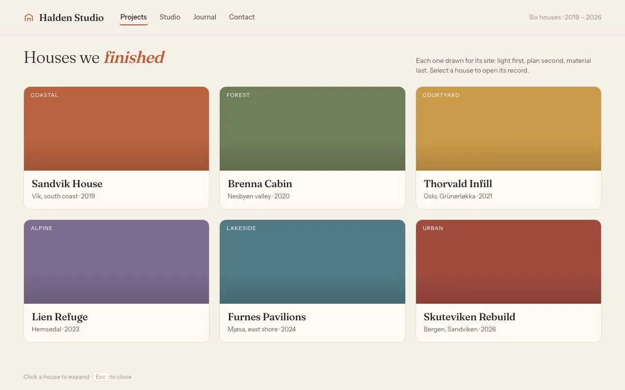
Six project cards; clicking one FLIP-animates it (transform + border-radius, 420ms expo-out) into a full detail dialog while the rest fade, and Esc reverses it.
Preview
Use it
Free to use · credit appreciated1 Once, in your project
npx skills add SusanAcharya/Design-Lounge 2 Then ask
Using the Design Lounge skill, build "Shared element expand" (piece shared-element-expand) in my stack. Match its brief; restyle it onto my product's theme.
No skill? Paste the brief instead. It carries the numbers, tokens and behaviour.
<!-- Design Lounge Nº 086 · "Shared element expand" · www.designlounge.live -->

# Shared element expand

> **Build brief for a coding agent.** Rebuild this piece in the reader's stack. If they haven't said which stack, ask once, then default to semantic HTML + CSS + a little vanilla JS. Match the numbers below; don't "improve" them.

## What it is

A 3 × 2 grid of project cards for an architecture studio's portfolio page. Clicking a card does not open a new panel: the card *itself* appears to grow into a 1040 × 688 detail dialog using the FLIP technique (First, Last, Invert, Play) — one Web Animations call on `transform` and `border-radius`, 420ms, expo-out. The other five cards and the page header fade to 18 % / 35 % so the expanded element owns the frame. Esc, the close button, or a click outside reverses the same animation back into the grid slot. The palette is warm paper with one terracotta accent; titles are a light-weight serif. The detail worth copying is that the reverse animation is computed from the live rects, so it always lands exactly on the card even if the page has resized.

## Reference behaviour

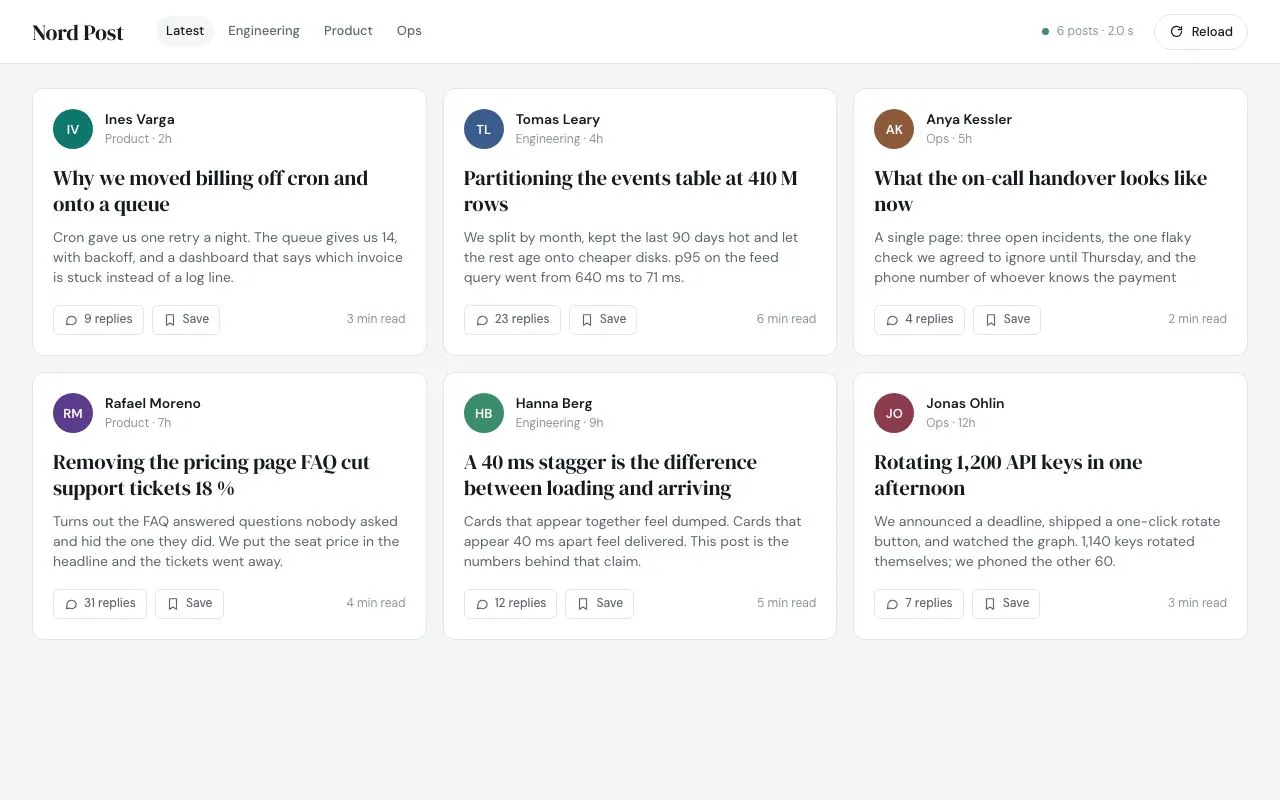
1. Initial state: header (72px) with brand, four nav links ("Projects" is current), and a right-aligned meta line. Below, an h1 "Houses we *finished*" with a 380px-wide lede, then six cards in a 3-column grid with 20px gaps. Each card: a 172px flat colour swatch with an uppercase tag top-left, then a serif title (21px) and a "location · year" caption.
2. Hover a card: it lifts 2px (`translateY(-2px)`) and gains a soft shadow, 160ms.
3. Click a card: the hidden detail dialog is filled with that card's data and its `--c` swatch colour, then shown at its final fixed position (`inset: 56px 120px`). The dialog is immediately transformed to overlay the card's rect (translate + non-uniform scale, radius corrected so it still reads as 14px on screen) and animates to identity over 420ms `cubic-bezier(.16,1,.3,1)`. The source card becomes `visibility: hidden` for the duration.
4. While the dialog grows: the other five cards fade to opacity 0.18 and the header and lede to 0.35 (320ms). The dialog's body copy (paragraphs, facts list, CTA) fades in over 260ms after a 200ms delay, so text never appears stretched mid-scale.
5. When the open animation finishes, focus moves to the round close button in the hero's top-right.
6. Press Esc, click the close button, or click outside the dialog: the body copy fades out in 120ms, the fade-outs on the grid reverse, and the dialog animates from identity back to the card's *current* rect over 420ms with the same easing. On finish the dialog is hidden, the source card is made visible again and refocused.
7. Clicks during an in-flight animation are ignored (a guard flag), so double-clicks cannot leave the UI half-open.
8. With `prefers-reduced-motion: reduce`, all durations are 1ms: the dialog appears and disappears in place.

## Structure

```
1280 × 800
┌──────────────────────────────────────────────────────────────────────┐
│ header 72  ⌂ Halden Studio   Projects Studio Journal Contact   meta  │
├──────────────────────────────────────────────────────────────────────┤
│ 28px                                                                 │
│ h1 Houses we finished                        lede (380px) ─────────  │
│ 22px                                                                 │
│ ┌──────────────┐ ┌──────────────┐ ┌──────────────┐  x=48, 3 cols    │
│ │ swatch 172   │ │ swatch 172   │ │ swatch 172   │  gap 20           │
│ │ title / cap  │ │ title / cap  │ │ title / cap  │  card ≈ 381×254   │
│ └──────────────┘ └──────────────┘ └──────────────┘                   │
│ ┌──────────────┐ ┌──────────────┐ ┌──────────────┐                   │
│ │              │ │              │ │              │                   │
│ └──────────────┘ └──────────────┘ └──────────────┘                   │
│ hint: Click a house to expand · Esc to close                         │
└──────────────────────────────────────────────────────────────────────┘

… 178 more lines. Copy or download for the full brief. Loading the source…Brief
218 linesBuild brief for a coding agent. Rebuild this piece in the reader’s stack. If they haven’t said which stack, ask once, then default to semantic HTML + CSS + a little vanilla JS. Match the numbers below; don’t “improve” them.
What it is
A 3 × 2 grid of project cards for an architecture studio’s portfolio page. Clicking a card does not open a new panel: the card itself appears to grow into a 1040 × 688 detail dialog using the FLIP technique (First, Last, Invert, Play) — one Web Animations call on transform and border-radius, 420ms, expo-out. The other five cards and the page header fade to 18 % / 35 % so the expanded element owns the frame. Esc, the close button, or a click outside reverses the same animation back into the grid slot. The palette is warm paper with one terracotta accent; titles are a light-weight serif. The detail worth copying is that the reverse animation is computed from the live rects, so it always lands exactly on the card even if the page has resized.
Reference behaviour
- Initial state: header (72px) with brand, four nav links (“Projects” is current), and a right-aligned meta line. Below, an h1 “Houses we finished” with a 380px-wide lede, then six cards in a 3-column grid with 20px gaps. Each card: a 172px flat colour swatch with an uppercase tag top-left, then a serif title (21px) and a “location · year” caption.
- Hover a card: it lifts 2px (
translateY(-2px)) and gains a soft shadow, 160ms. - Click a card: the hidden detail dialog is filled with that card’s data and its
--cswatch colour, then shown at its final fixed position (inset: 56px 120px). The dialog is immediately transformed to overlay the card’s rect (translate + non-uniform scale, radius corrected so it still reads as 14px on screen) and animates to identity over 420mscubic-bezier(.16,1,.3,1). The source card becomesvisibility: hiddenfor the duration. - While the dialog grows: the other five cards fade to opacity 0.18 and the header and lede to 0.35 (320ms). The dialog’s body copy (paragraphs, facts list, CTA) fades in over 260ms after a 200ms delay, so text never appears stretched mid-scale.
- When the open animation finishes, focus moves to the round close button in the hero’s top-right.
- Press Esc, click the close button, or click outside the dialog: the body copy fades out in 120ms, the fade-outs on the grid reverse, and the dialog animates from identity back to the card’s current rect over 420ms with the same easing. On finish the dialog is hidden, the source card is made visible again and refocused.
- Clicks during an in-flight animation are ignored (a guard flag), so double-clicks cannot leave the UI half-open.
- With
prefers-reduced-motion: reduce, all durations are 1ms: the dialog appears and disappears in place.
Structure
1280 × 800
┌──────────────────────────────────────────────────────────────────────┐
│ header 72  ⌂ Halden Studio   Projects Studio Journal Contact   meta  │
├──────────────────────────────────────────────────────────────────────┤
│ 28px                                                                 │
│ h1 Houses we finished                        lede (380px) ─────────  │
│ 22px                                                                 │
│ ┌──────────────┐ ┌──────────────┐ ┌──────────────┐  x=48, 3 cols    │
│ │ swatch 172   │ │ swatch 172   │ │ swatch 172   │  gap 20           │
│ │ title / cap  │ │ title / cap  │ │ title / cap  │  card ≈ 381×254   │
│ └──────────────┘ └──────────────┘ └──────────────┘                   │
│ ┌──────────────┐ ┌──────────────┐ ┌──────────────┐                   │
│ │              │ │              │ │              │                   │
│ └──────────────┘ └──────────────┘ └──────────────┘                   │
│ hint: Click a house to expand · Esc to close                         │
└──────────────────────────────────────────────────────────────────────┘
        dialog when open: fixed, inset 56px 120px → 1040 × 688
        ┌───────────────────────────────────────────┐
        │ hero 300  (swatch colour, tag, 46px title)  ⊗ close 40 │
        │ body: 1.4fr copy │ 1fr <dl> facts + CTA     │
└───────────────────────────────────────────┘<header>—.brand(22px SVG house glyph + serif name),<nav aria-label="Primary">of<a>,.meta-linepushed right withmargin-left: auto.<main>—.lede(flex,justify-content: space-between) then.grid..grid—<button class="card" style="--c:#…" data-tag data-loc data-year data-area data-mat data-lede data-body>; inside.swatch > band.meta > h2 + span. All copy for the dialog lives on the card’sdata-*attributes.<section class="detail" role="dialog" aria-modal="true" aria-labelledby="dtitle" hidden>—.hero(tag,h2#dtitle,.closebutton) then.body(copy column +<dl>with four pairs and a.ctabutton)..hint— fixed bottom-left helper text with<kbd>Esc</kbd>.
Tokens
:root {
  /* colour — warm paper, one terracotta accent */
  --bg: #f6f1e8;          /* page */
  --card: #fffbf4;        /* card + dialog surface */
  --line: #e6dccb;        /* hairlines, card border */
  --ink: #221d18;         /* primary text */
  --ink-2: #6b5f52;       /* secondary text, nav */
  --ink-3: #9a8d7d;       /* meta, hints, dt labels */
  --accent: #c4552d;      /* h1 emphasis, focus rings, CTA, brand glyph */
  --accent-ink: #fff6ef;  /* text on accent */
  /* per-card swatch colours (set inline as --c) */
  --c-coastal: #b8623f; --c-forest: #6e7d5a; --c-courtyard: #c99a4a;
  --c-alpine: #7a6b8f;  --c-lake: #4f7a86;   --c-urban: #a04a3e;

  /* type */
  --serif: "Fraunces", Georgia, serif;
  --sans: "Instrument Sans", system-ui, sans-serif;

  /* layout */
  --gap: 20px;
  --pad-x: 48px;
  --header-h: 72px;
  --swatch-h: 172px;
  --hero-h: 300px;
  --dialog-inset: 56px 120px;
  --r-card: 14px;
  --r-detail: 20px;
  --r-close: 50%;
  --shadow: 0 24px 60px -20px rgba(60,40,20,.35), 0 1px 0 rgba(60,40,20,.06);
  --shadow-hover: 0 10px 24px -14px rgba(60,40,20,.4);

  /* motion */
  --t-flip: 420ms;
  --t-fade: 320ms;
  --t-body-in: 260ms;  --t-body-delay: 200ms;  --t-body-out: 120ms;
  --t-micro: 160ms;
  --ease-out: cubic-bezier(.16, 1, .3, 1);   /* the FLIP */
  --ease: cubic-bezier(.2, .7, .2, 1);       /* everything else */
}
Typography
| Role | Family | Size | Weight | Line-height | Tracking | Case |
|---|---|---|---|---|---|---|
| Body | Instrument Sans | 14px | 400 | 1.5 | 0 | sentence |
| Brand | Fraunces | 20px | 500 | 1 | −0.01em | sentence |
| Nav link | Instrument Sans | 14px | 500 | 1.5 | 0 | sentence |
| Page h1 | Fraunces | 34px | 300 (em 500 italic) | 1.05 | −0.02em | sentence |
| Lede | Instrument Sans | 13.5px | 400 | 1.5 | 0 | sentence |
| Swatch tag | Instrument Sans | 11px | 500 | 1 | +0.08em | UPPERCASE |
| Card title | Fraunces | 21px | 500 | 1.15 | −0.015em | sentence |
| Card caption | Instrument Sans | 13px | 400 | 1.5 | 0 | sentence |
| Dialog title | Fraunces | 46px | 300 | 1 | −0.025em | sentence |
| Dialog lede | Fraunces | 22px | 300 | 1.35 | −0.01em | sentence |
| Dialog body | Instrument Sans | 15px | 400 | 1.6 | 0 | sentence |
dt label | Instrument Sans | 11px | 600 | 1.5 | +0.04em | UPPERCASE |
| CTA | Instrument Sans | 13px | 600 | 1 | 0 | sentence |
| Hint | Instrument Sans | 12px | 400 | 1.5 | +0.02em | sentence |
Use the Fraunces variable axes opsz 9..144, wght 300 & 500 from Google Fonts; Instrument Sans at 400/500/600.
Motion
| Element | Trigger | Property | From → To | Duration | Easing | Delay |
|---|---|---|---|---|---|---|
.detail (open) | card click | transform, border-radius | card rect (translate + scale, radius 14/s) → none, 20px | 420ms | --ease-out | 0 |
.detail (close) | Esc / close | transform, border-radius | none, 20px → card rect | 420ms | --ease-out | 0 |
.card:not(.src) | open / close | opacity | 1 ↔ 0.18 | 320ms | --ease | 0 |
header, .lede | open / close | opacity | 1 ↔ 0.35 | 320ms | --ease | 0 |
.detail .body (in) | open | opacity | 0 → 1 | 260ms | --ease | 200ms |
.detail .body (out) | close | opacity | 1 → 0 | 120ms | --ease | 0 |
.card hover | hover | transform, box-shadow | none → translateY(−2px), --shadow-hover | 160ms | --ease | 0 |
.close hover | hover | background | rgba(255,255,255,.9) → #fff | 160ms | --ease | 0 |
Reduced motion: * { transition-duration: 1ms !important; animation-duration: 1ms !important } and pass duration: 1 to the Web Animations call. The state machine (hidden → open → hidden) is unchanged.
States
- Card hover: lifts 2px, shadow
--shadow-hover. Cursor pointer. - Card focus-visible:
outline: 2px solid var(--accent); outline-offset: 3px. - Card
.src(its dialog is open):visibility: hidden— keeps its grid slot so the layout does not reflow. - Card dimmed (another card open): opacity 0.18, no pointer feedback needed because the outside-click handler closes the dialog first.
- Nav current:
aria-current="page", ink colour,box-shadow: inset 0 -2px 0 var(--accent). - Dialog open:
body.is-open; dialoghiddenremoved;aria-modal="true". - Close button: 40px circle,
rgba(255,255,255,.9)on the hero colour; hover #fff; focus-visible accent ring. - CTA: pill,
--accentbackground,--accent-inktext; focus-visible accent ring offset 3px. - Animating: a module-level
animreference is non-null; clicks and Esc are ignored untilonfinish.
Accessibility
- Cards are
<button>elements (not divs with click handlers), so Enter/Space open them and they appear in the tab order. - The dialog is
role="dialog" aria-modal="true" aria-labelledby="dtitle". It ishiddenwhen closed, so it is out of the accessibility tree. - On open-finish, focus moves to the close button; on close-finish, focus returns to the originating card.
- Esc closes from anywhere in the document. Tab inside the dialog cycles close button → CTA; add a focus trap if your framework has one, otherwise the outside-click handler and Esc are sufficient for this piece.
- Contrast:
--ink-2on--cardis 5.6:1;--ink-3is used only at ≥ 11px for meta and hints. Hero text is white over a bottom gradientrgba(0,0,0,.42)on every swatch colour — verify ≥ 4.5:1 for the tag (85 % opacity) on the lightest swatch (#c99a4a). - Hit targets: cards ≈ 381 × 254px; close button 40 × 40px; nav links have 6px vertical padding.
Responsive rules
- ≥ 1280: as specified (
inset: 56px 120pxdialog; 3-column grid). - 1024–1279: dialog
inset: 40px 64px; grid stays 3 columns; swatch height 148px. - 768–1023: grid 2 columns; dialog
inset: 32px; hero 240px; dialog body becomes one column (copy above facts). - < 640: grid 1 column; dialog
inset: 0withborder-radius: 0as the “last” state (the FLIP still works — the radius keyframe just ends at 0); hero 200px; hint hidden.
Acceptance checklist
- Grid is 3 × 2 with 20px gaps and 48px side padding at 1280px wide; card swatches are 172px tall.
- Clicking a card animates the dialog from the card’s exact rect to
inset: 56px 120pxover 420ms withcubic-bezier(.16,1,.3,1). - The animated keyframe uses
transform: translate() scale()withtransform-origin: 0 0and a correctedborder-radius(14px ÷ scale) so corners look constant. - The source card is
visibility: hidden(notdisplay: none) while its dialog is open; the grid does not reflow. - Other cards fade to 0.18 and header/lede to 0.35 over 320ms in both directions.
- Dialog body copy fades in after a 200ms delay and never shows scaled/stretched text.
- Esc, the close button, and clicking outside all reverse the animation into the card’s current rect (resize the window while open and confirm it still lands).
- Focus goes to the close button on open-finish and back to the card on close-finish.
- Repeated clicks during the 420ms are ignored; the UI never gets stuck half-open.
- Cards, nav links, close and CTA all show a 2px accent focus ring with 3px offset.
-
prefers-reduced-motion: reducecollapses every duration to 1ms with no missing state. - No images are used; each card’s colour comes from an inline
--ccustom property that the dialog copies.
Implementation notes
FLIP with one Web Animations call. Measure the card (first), show the dialog at its final CSS position and measure it (last), then animate from the inverted delta to identity. Keep transform-origin: 0 0 so translate and scale compose from the top-left.
function frames(from, to) {
  const sx = from.width / to.width, sy = from.height / to.height;
  return [
    { transform: `translate(${from.left - to.left}px, ${from.top - to.top}px) scale(${sx}, ${sy})`,
      borderRadius: `${14 / sx}px / ${14 / sy}px` },   // 14px on screen while scaled
    { transform: 'none', borderRadius: '20px' }
  ];
}
const first = card.getBoundingClientRect();
detail.hidden = false; card.classList.add('src'); document.body.classList.add('is-open');
const last = detail.getBoundingClientRect();
anim = detail.animate(frames(first, last), { duration: 420, easing: 'cubic-bezier(.16,1,.3,1)', fill: 'forwards' });
anim.onfinish = () => { anim = null; closeBtn.focus(); };
Reverse from live rects, not stored ones. On close, re-measure both boxes and play the same keyframes reversed, then hide only in onfinish:
const last = detail.getBoundingClientRect(), first = src.getBoundingClientRect();
document.body.classList.remove('is-open');
anim = detail.animate(frames(first, last).reverse(), { duration: 420, easing: EASE, fill: 'forwards' });
anim.onfinish = () => { detail.hidden = true; src.classList.remove('src'); src.focus(); src = anim = null; };
Mask the non-uniform scale. The scale is ~2.7 × 2.7 but not equal on both axes, so text inside would look stretched for the first ~150ms. Keep only the hero colour and title in the dialog during the flip and fade the body in late:
.detail .body { opacity: 0; transition: opacity 120ms var(--ease); }
.is-open .body { opacity: 1; transition: opacity 260ms var(--ease) 200ms; }
Common mistakes: measuring the dialog while it is still display: none (rect is 0 × 0 → division by zero); forgetting fill: 'forwards' so the dialog snaps to identity before onfinish; using display: none on the source card so the grid reflows and the return target moves; leaving the is-open class on <body> when the close animation is interrupted.
Details
- Palette
- Type
- Fraunces · Instrument Sans
- Motion
- Rich motion
- Build
- One session
- Tags
On the shelves