Nº 491 of 520
Large text layout rules
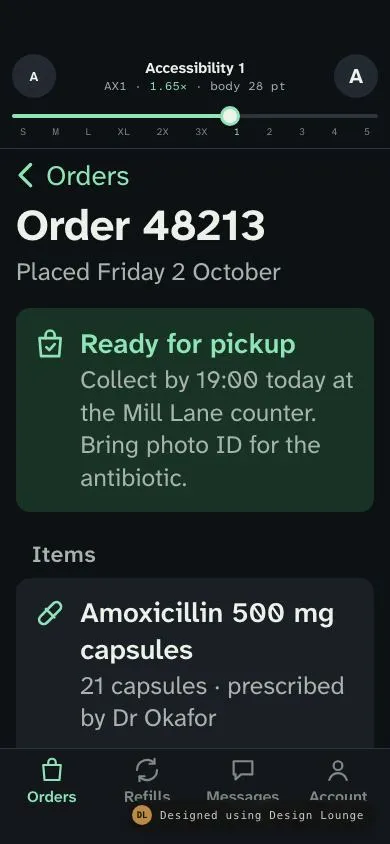
One phone order screen stepped from Small to Accessibility 5. Rows grow, two-column rows stack, icons hold the first line, tab labels never truncate.
Preview
Use it
Free to use · credit appreciated1 Once, in your project
npx skills add SusanAcharya/Design-Lounge 2 Then ask
Using the Design Lounge skill, build "Large text layout rules" (piece phone-large-text-layout) in my stack. Match its brief; restyle it onto my product's theme.
No skill? Paste the brief instead. It carries the numbers, tokens and behaviour.
<!-- Design Lounge Nº 491 · "Large text layout rules" · www.designlounge.live -->

# Large text layout rules

> **Build brief for a coding agent.** Rebuild this piece in the reader's stack. If they haven't said which stack, ask once, then default to semantic HTML + CSS + a little vanilla JS. Match the numbers below; don't "improve" them. The reflow rules in this brief are meant to be applied to every screen in the product, not only this one.

## What it is

A demonstration of how one phone screen should behave across the whole system text size range. The screen is an order detail from Wrenfield Pharmacy, an invented chain: a status card, three line items with prices, five label and value details, two buttons and a four-tab bar. A control pinned at the top steps the text size through eleven system sizes, Small to Accessibility 5, and shows the size name, the short code, the scale factor and the body point size. As the text grows, rows get taller, two-column rows stack into label above value, leading icons stay locked to the first line of text, buttons stack, insets drop at the biggest sizes, and the tab bar labels wrap instead of turning into "...". Nothing is ever clipped and nothing scrolls sideways. The language is iOS (grouped insets, back chevron with the parent title, large title), in a dark scheme with one mint accent, set in Atkinson Hyperlegible Next.

## Reference behaviour

1. Initial state: **Accessibility 1** (AX1), factor 1.65×, body 28pt. This is the first size at which the stacked layout applies, so the first frame shows the point.
2. The control at the top: a 44px "A" button (smaller), the readout, a 44px "A" button (larger), a range slider with eleven stops, and tick labels `S M L XL 2X 3X 1 2 3 4 5` with the AX1 tick in mint.
3. The readout: line 1 is the size name ("Accessibility 1"), line 2 is mono: "AX1 · 1.65× · body 28 pt". The factor is body size ÷ 17, to two decimals.
4. Smaller and larger buttons step one size; they disable at the ends. The slider supports drag, click and arrow keys. Each change applies at once (no animated font size).
5. **Small to XXXL (factor 0.88 to 1.35)**: standard layout. Detail rows are label left, value right on one line. Item prices sit right of the item text. The two buttons sit side by side.
6. **AX1 and up (factor ≥ 1.65)**: detail rows stack, label above value, both left aligned, label one step smaller. Prices drop under the item text, indented to the text's start. Buttons stack full width.
7. **AX3 and up (factor ≥ 2.35)**: grouped sections lose their 16px side inset and 14px corners and run edge to edge, which returns 32px of line length.
8. Leading icons grow with the text to a cap of 2× (44px box) and stay vertically centred on the **first line** of the row's headline, at every size.
9. Tab bar labels grow with the text to a cap of 1.45× (11px → 16px). They may wrap to two lines; they never ellipsize. The bar grows taller to fit.
10. At AX1 and up, press and hold a tab for 450ms: a 200px large content viewer appears in the centre with the tab's icon at 64px and its label at 28px. Slide to another tab and the viewer updates. Release over a tab to select it. A short tap selects normally at every size.
11. At AX1 and up, the footnote under the buttons changes to "At this size, press and hold a tab to see its label large."
12. "Show pickup code" toggles to "Code 7 3 1 9" and back. The screen scrolls vertically; at AX5 it is roughly four screens long.

## Structure

```
390 × 844 at Large (default)                 at Accessibility 1+
┌──────────────────────────────────────┐     ┌──────────────────────────────────────┐
│ 54 safe area                         │     │ control (never scales)               │
│ (A)    Large (default)          (A)  │ 44  │──────────────────────────────────────│
│        L · 1.00× · body 17 pt        │     │ ‹ Orders                             │
│ ━━━━━━━━●──────────────────────      │ 24  │ Order 48213                          │
│ S M L XL 2X 3X 1 2 3 4 5             │     │ ╭──────────────────────────────────╮ │
│──────────────────────────────────────│     │ │ ▣ Ready for pickup  ← icon on    │ │
│ ‹ Orders                             │ 44  │ │   Collect by 19:00…   line 1     │ │
│ Order 48213              large title │     │ ╰──────────────────────────────────╯ │
│ Placed Friday 2 October              │     │ ╭──────────────────────────────────╮ │
│ ╭ ▣ Ready for pickup ──────────────╮ │     │ │ ⊘ Amoxicillin 500 mg             │ │

… 221 more lines. Copy or download for the full brief. Loading the source…Brief
261 linesBuild brief for a coding agent. Rebuild this piece in the reader’s stack. If they haven’t said which stack, ask once, then default to semantic HTML + CSS + a little vanilla JS. Match the numbers below; don’t “improve” them. The reflow rules in this brief are meant to be applied to every screen in the product, not only this one.
What it is
A demonstration of how one phone screen should behave across the whole system text size range. The screen is an order detail from Wrenfield Pharmacy, an invented chain: a status card, three line items with prices, five label and value details, two buttons and a four-tab bar. A control pinned at the top steps the text size through eleven system sizes, Small to Accessibility 5, and shows the size name, the short code, the scale factor and the body point size. As the text grows, rows get taller, two-column rows stack into label above value, leading icons stay locked to the first line of text, buttons stack, insets drop at the biggest sizes, and the tab bar labels wrap instead of turning into ”…”. Nothing is ever clipped and nothing scrolls sideways. The language is iOS (grouped insets, back chevron with the parent title, large title), in a dark scheme with one mint accent, set in Atkinson Hyperlegible Next.
Reference behaviour
- Initial state: Accessibility 1 (AX1), factor 1.65×, body 28pt. This is the first size at which the stacked layout applies, so the first frame shows the point.
- The control at the top: a 44px “A” button (smaller), the readout, a 44px “A” button (larger), a range slider with eleven stops, and tick labels
S M L XL 2X 3X 1 2 3 4 5with the AX1 tick in mint. - The readout: line 1 is the size name (“Accessibility 1”), line 2 is mono: “AX1 · 1.65× · body 28 pt”. The factor is body size ÷ 17, to two decimals.
- Smaller and larger buttons step one size; they disable at the ends. The slider supports drag, click and arrow keys. Each change applies at once (no animated font size).
- Small to XXXL (factor 0.88 to 1.35): standard layout. Detail rows are label left, value right on one line. Item prices sit right of the item text. The two buttons sit side by side.
- AX1 and up (factor ≥ 1.65): detail rows stack, label above value, both left aligned, label one step smaller. Prices drop under the item text, indented to the text’s start. Buttons stack full width.
- AX3 and up (factor ≥ 2.35): grouped sections lose their 16px side inset and 14px corners and run edge to edge, which returns 32px of line length.
- Leading icons grow with the text to a cap of 2× (44px box) and stay vertically centred on the first line of the row’s headline, at every size.
- Tab bar labels grow with the text to a cap of 1.45× (11px → 16px). They may wrap to two lines; they never ellipsize. The bar grows taller to fit.
- At AX1 and up, press and hold a tab for 450ms: a 200px large content viewer appears in the centre with the tab’s icon at 64px and its label at 28px. Slide to another tab and the viewer updates. Release over a tab to select it. A short tap selects normally at every size.
- At AX1 and up, the footnote under the buttons changes to “At this size, press and hold a tab to see its label large.”
- “Show pickup code” toggles to “Code 7 3 1 9” and back. The screen scrolls vertically; at AX5 it is roughly four screens long.
Structure
390 × 844 at Large (default)                 at Accessibility 1+
┌──────────────────────────────────────┐     ┌──────────────────────────────────────┐
│ 54 safe area                         │     │ control (never scales)               │
│ (A)    Large (default)          (A)  │ 44  │──────────────────────────────────────│
│        L · 1.00× · body 17 pt        │     │ ‹ Orders                             │
│ ━━━━━━━━●──────────────────────      │ 24  │ Order 48213                          │
│ S M L XL 2X 3X 1 2 3 4 5             │     │ ╭──────────────────────────────────╮ │
│──────────────────────────────────────│     │ │ ▣ Ready for pickup  ← icon on    │ │
│ ‹ Orders                             │ 44  │ │   Collect by 19:00…   line 1     │ │
│ Order 48213              large title │     │ ╰──────────────────────────────────╯ │
│ Placed Friday 2 October              │     │ ╭──────────────────────────────────╮ │
│ ╭ ▣ Ready for pickup ──────────────╮ │     │ │ ⊘ Amoxicillin 500 mg             │ │
│ │   Collect by 19:00 today…        │ │     │ │   capsules                       │ │
│ ╰──────────────────────────────────╯ │     │ │   21 capsules · Dr Okafor        │ │
│   Items                              │     │ │   £9.90            ← price drops │ │
│ ╭ ⊘ Amoxicillin 500 mg…    £9.90 ──╮ │     │ ├──────────────────────────────────┤ │
│ │ ⊖ Cetirizine 10 mg…      £3.40   │ │     │ │ Pickup              ← label      │ │
│ │ ▯ Saline nasal spray     £1.00   │ │     │ │ Mill Lane, counter 2 ← value     │ │
│ ╰──────────────────────────────────╯ │     │ ╰──────────────────────────────────╯ │
│   Details                            │     │ ( Show pickup code               )   │
│ ╭ Pickup       Mill Lane, counter 2 ╮│     │ ( Get directions                 )   │
│ │ …4 more rows…                     ││     │                                      │
│ ╰───────────────────────────────────╯│     │                                      │
│ ( Show pickup code )( Get directions)│     │                                      │
│ [Orders][Refills][Messages][Account] │ 49+ │ [Orders][Refills][Messages][Account] │ grows
│ 34 home indicator                    │     │ 34                                   │
└──────────────────────────────────────┘ └──────────────────────────────────────┘bodyis a flex column of exactly three children: the controlsection, the scrollingmain, the tabnav. No fixed positioning, so a taller tab bar simply takes space frommain.mainhasoverflow-y: auto; overflow-x: hidden,hyphens: auto,overflow-wrap: break-word.- Status card and item rows:
.row > .ic + .txt (.hl + .sup) (+ .price). - Details: a
dlwhere each.row.kvwraps onedt.kand onedd.v. - The control is demo scaffolding. In a product the size comes from the OS (Dynamic Type, Android font scale, or browser zoom), and there is no control.
Tokens
:root {
  --bg: #0e1114;          /* screen */
  --group: #1a1f25;       /* grouped section */
  --raised: #232930;      /* control buttons, secondary button */
  --ink: #eef1ea;
  --ink-2: #a9b3ad;       /* labels, secondary text */
  --ink-3: #7f8a84;       /* footnote, idle tabs */
  --line: #2d343c;        /* hairlines */
  --accent: #8fe3b5;      /* mint: links, icons, primary */
  --on-accent: #0b1f14;
  --accent-soft: #183326; /* status card */

  --sans: "Atkinson Hyperlegible Next", system-ui, sans-serif;
  --mono: "Atkinson Hyperlegible Mono", ui-monospace, monospace;

  /* the size step: script writes these five */
  --f: 1.65;              /* body / 17 */
  --body: 28px;
  --sub: 25px;
  --foot: 23px;
  --title: 44px;

  /* derived, capped */
  --ic: calc(22px * min(var(--f), 2));      /* leading icon box */
  --tab: calc(11px * min(var(--f), 1.45));  /* tab label */
  --pad: calc(11px * min(var(--f), 1.6));   /* row vertical padding */
  --inset: 16px;                            /* 0px at AX3+ */

  --row-min: 44px;
  --radius-group: 14px;
  --radius-btn: 14px;
  --ease: cubic-bezier(.2, .7, .2, 1);
}
Size table
The demo’s own table, modelled on the iOS Dynamic Type steps. Every text style reads one of these columns; none are computed from a single multiplier except the capped tokens above.
| Step | Code | Body | Subhead | Footnote | Large title | Factor |
|---|---|---|---|---|---|---|
| Small | S | 15 | 13 | 12 | 32 | 0.88 |
| Medium | M | 16 | 14 | 12 | 33 | 0.94 |
| Large (default) | L | 17 | 15 | 13 | 34 | 1.00 |
| Extra Large | XL | 19 | 17 | 15 | 36 | 1.12 |
| Extra Extra Large | XXL | 21 | 19 | 17 | 38 | 1.24 |
| Extra Extra Extra Large | XXXL | 23 | 21 | 19 | 40 | 1.35 |
| Accessibility 1 | AX1 | 28 | 25 | 23 | 44 | 1.65 |
| Accessibility 2 | AX2 | 33 | 30 | 27 | 48 | 1.94 |
| Accessibility 3 | AX3 | 40 | 36 | 33 | 52 | 2.35 |
| Accessibility 4 | AX4 | 47 | 42 | 38 | 56 | 2.76 |
| Accessibility 5 | AX5 | 53 | 49 | 44 | 60 | 3.12 |
Typography
| Role | Family | Size | Line height | Weight | Colour |
|---|---|---|---|---|---|
| Large title | Atkinson Hyperlegible Next | --title | 1.15 | 700, -0.01em | --ink |
| Back link | same | --body | 1.25 | 400 | --accent |
| Row headline | same | --body | 1.3 | 600 | --ink |
| Row supporting | same | --sub | 1.3 | 400 | --ink-2 |
| Detail label | same | --body, AX1+ --sub | 1.3 | 400 | --ink-2 |
| Detail value | same | --body | 1.3 | 400, total 700 | --ink |
| Price | same, tabular figures | --body | 1.3 | 400 | --ink |
| Section header | same | --foot | 1.3 | 600 | --ink-2 |
| Button | same | --body | 1.25 | 600 | per button |
| Footnote | same | --foot | 1.35 | 400 | --ink-3 |
| Order code | Atkinson Hyperlegible Mono | --body | 1.3 | 400 | --ink |
| Tab label | Atkinson Hyperlegible Next | --tab | 1.15 | 600 | --ink-3, current --accent |
| Control readout | Next 15/20 700, Mono 12/16 | fixed | fixed | --ink, factor --accent |
Line heights are unitless so they scale with the text. Never set a line height in px on scaling text.
Motion
None on the reflow. Changing size re-lays out instantly; animating font-size would reflow every frame and make the text unreadable mid-change.
| Thing | Trigger | Change | Duration | Reduced motion |
|---|---|---|---|---|
| Size step | button, slider, keys | variables and classes swap | instant | same |
| Control buttons | hover / press | background lighten / scale 0.94 | 160ms --ease | 1ms |
| Buttons | press | scale 0.98 | 160ms | 1ms |
| Large content viewer | hold 450ms | opacity 0 → 1, scale .92 → 1 | 200ms | 1ms |
States
- Standard sizes (S to XXXL): two-column rows, prices right, buttons in a row, 16px insets.
- Accessibility sizes (AX1 to AX5):
.axonhtml. Stacked rows, prices below, buttons stacked, large content viewer enabled. - AX3 to AX5:
.ax3onhtml. Insets 0, group corners 0. - Smaller button disabled at Small, larger disabled at AX5: 35% opacity, no press scale.
- Tab current: mint icon and label,
aria-current="page". - Pickup code shown: primary button reads “Code 7 3 1 9”.
- Focus-visible: 2px mint outline, 2px offset, everywhere including the slider.
- Empty / error: not part of this screen. Apply the same rules to their text: an empty state message is body text and wraps; its button follows the button rule.
Accessibility
- This piece is the accessibility rule set. The rest of this section covers the demo’s own controls.
- The control is a
sectionlabelled “Demo text size control”. The slider isinput type=rangewitharia-label="Text size"andaria-valuetextlike “Accessibility 1, 1.65 times”. The step buttons are labelled “Smaller text” and “Larger text”. A polite status region announces the new size name after a button press. - Every interactive row and button keeps
min-height: 44pxat the smallest size and grows from there. - The tab bar is a
navlabelled “Sections” witharia-current. Labels are real text, never only icons, at every size. - The large content viewer is
aria-hidden; it is a visual aid. Screen reader users already hear the full label. - Contrast on
#0e1114:--inkabove 15:1,--ink-2above 8:1,--ink-3above 5:1, mint above 11:1. On--groupall still pass 4.5:1. - Do not cap body text. The only capped things are icons (2×), row padding (1.6×) and tab labels (1.45×), and the tab cap is backed by the large content viewer.
Responsive rules
These are the reflow rules. Apply them to any screen.
- Rows grow; nothing has a fixed height. Rows use
min-height: 44pxand vertical padding11px × min(f, 1.6). Neverheight, nevermax-height, neveroverflow: hiddenon anything containing text. Line height is unitless (1.3 body, 1.15 titles). - Two-column rows stack at AX1. Below AX1, label left and value right on one line (
display:flex; flex-wrap:wrap; column-gap:16px, valuemargin-left:auto; text-align:right). If the pair does not fit,flex-wrapdrops the value to the next line, still right aligned. At AX1 and up, switch toflex-direction: column: label first at the subhead size in secondary ink, value under it at body size, both left aligned, 2px gap. - Trailing values in list rows drop below at AX1. A price or count that sits right of a multi-line text block moves under it (
flex-basis: 100%), indented by icon width + gap so it lines up with the text. - Leading icons hold the first line. The icon box is
width: --icandheight: body × 1.3(one line of the headline). Align the row toflex-start, centre the glyph inside the box. The icon never centres on the whole row. Icons scale with text up to 2×. - Hairlines start at the text. Separators begin at
16px + icon + 12pxso they keep pointing at the text column as icons grow. - Side-by-side buttons stack at AX1, full width, 12px gap, text centred and allowed to wrap.
- Insets drop at AX3. Grouped sections go edge to edge (
margin-inline: 0, radius 0). Inner 16px padding stays. - Long words break, they don’t overflow.
hyphens: autowithlangset,overflow-wrap: break-wordon body text,overflow-wrap: anywhereon codes and identifiers. Neverwhite-space: nowrapon content. - Tab labels never truncate. Size
11px × min(f, 1.45),white-space: normal, notext-overflow,hyphens: manual. Two lines are allowed; the bar grows. At AX sizes add a large content viewer on long press. - Only the vertical axis scrolls.
overflow-x: hiddenon the scroller is a safety net, not a fix: checkscrollWidth ≤ innerWidthat every step. - Headers and nav titles wrap. The large title and the back label wrap to two lines rather than shrinking or truncating.
- At 360 wide, the same thresholds apply; at AX5 the item names hyphenate. At tablet width, keep these rules but cap the content column at 640px.
Acceptance checklist
Always
- Every text style comes from a size table with eleven steps, Small to Accessibility 5.
- No text container has a fixed height,
max-height,nowraporoverflow: hidden. - Label and value rows sit side by side below AX1 and stack (label above value, left aligned) from AX1.
- Trailing prices or counts drop under the text from AX1, aligned to the text start.
- Leading icons are centred on the first line of the headline at every step, capped at 2×.
- Side-by-side buttons stack from AX1.
- Grouped insets drop to 0 from AX3.
- Tab labels never show ”…”; they wrap and the bar grows; large content viewer on long press at AX sizes.
-
document.documentElement.scrollWidth ≤ innerWidthat every step. - Every target at least 44px tall at the smallest size.
This demo
- Starts at Accessibility 1, 1.65×, body 28pt.
- Readout format “AX1 · 1.65× · body 28 pt” in Atkinson Hyperlegible Mono.
- Order 48213 from Wrenfield Pharmacy: three items, five details, total £14.30.
- Tabs: Orders, Refills, Messages, Account.
- Dark scheme
#0e1114with mint#8fe3b5.
Implementation notes
One switch, set from the OS. In the demo, script writes five variables and two classes. In a product, map the OS size to the same table (iOS UIContentSizeCategory, Android fontScale, web rem with a root size), then use the same classes:
function set(i) {
  const [name, code, body, sub, foot, title] = S[i], f = body / 17, st = document.documentElement.style;
  st.setProperty('--f', f.toFixed(3));
  st.setProperty('--body', body + 'px'); st.setProperty('--sub', sub + 'px');
  st.setProperty('--foot', foot + 'px'); st.setProperty('--title', title + 'px');
  document.documentElement.classList.toggle('ax', i >= 6);   // AX1+
  document.documentElement.classList.toggle('ax3', i >= 8);  // AX3+
}
The two-column row. One block of CSS handles both modes and the in-between wrap:
.kv { display: flex; flex-wrap: wrap; column-gap: 16px; row-gap: 2px; align-items: baseline; }
.kv .k { flex: 0 1 auto; color: var(--ink-2); }
.kv .v { flex: 0 1 auto; margin-left: auto; text-align: right; }
.ax .kv { flex-direction: column; align-items: stretch; }
.ax .kv .k { font-size: var(--sub); }
.ax .kv .v { margin-left: 0; text-align: left; }
Icon on the first line. Size the box to one line of the headline, not to the row:
.row { display: flex; align-items: flex-start; gap: 12px; }
.ic { flex: none; width: var(--ic); height: calc(var(--body) * 1.3); display: flex; align-items: center; justify-content: center; }
.ic svg { width: var(--ic); height: var(--ic); }
If the headline uses a different size from body, use that size here. height: 1lh on the icon box does the same in browsers that support the lh unit.
Common mistakes:
- Scaling with
transform: scaleor zoom; that clips and blurs instead of reflowing. text-overflow: ellipsison tab labels “to keep the bar neat”.align-items: centeron rows, which floats the icon to the middle of a five-line paragraph.- Right-aligned values at AX sizes, which leave one word per line against the right edge.
- Capping body text at XXXL because the design “breaks”. Fix the layout instead.
- Fixed-height buttons, which cut the second line of a wrapped label.
- Testing only at the default and the largest size. Check every step; XXXL and AX1 are where most layouts break.
Details
- Palette
- Type
- Atkinson Hyperlegible Next · Atkinson Hyperlegible Mono
- Motion
- Static
- Build
- One session
- Tags
Studied
Tailwind CSS docsPut each instruction next to its code. Draw the grid with thin lines and let the empty sides carry a faint hatch.
All sourcesOn the shelves