Nº 046 of 520
One-page mobile checkout
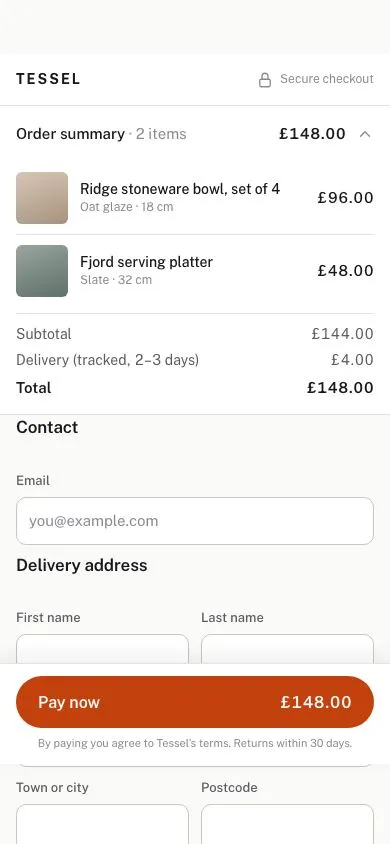
A 390px single-page checkout: collapsible order summary, address form with correct input types and autocomplete, payment radio cards, inline validation and a sticky Pay button carrying the total.
Preview
Use it
Free to use · credit appreciated1 Once, in your project
npx skills add SusanAcharya/Design-Lounge 2 Then ask
Using the Design Lounge skill, build "One-page mobile checkout" (piece mobile-one-page-checkout) in my stack. Match its brief; restyle it onto my product's theme.
No skill? Paste the brief instead. It carries the numbers, tokens and behaviour.
<!-- Design Lounge Nº 046 · "One-page mobile checkout" · www.designlounge.live -->

# One-page mobile checkout

> **Build brief for a coding agent.** Rebuild this piece in the reader's stack. If they haven't said which stack, ask once, then default to semantic HTML + CSS + a little vanilla JS. Match the numbers below; don't "improve" them.

## What it is

A complete mobile checkout for a fictional homeware shop ("Tessel") on one scrolling page: a collapsible order summary pinned at the top, a contact + delivery address form whose inputs use the right `type`, `inputmode` and `autocomplete` tokens so browsers autofill it in one tap, three payment-method radio cards, and a fixed Pay button that carries the total. Validation is inline and calm: fields are only marked after you leave them, green hairlines confirm good input, and a submit with errors scrolls to the first one and reports the count in a toast. One family (Public Sans) at four weights; one terracotta accent used for the selected card and the Pay button only.

## Reference behaviour

1. Initial state: header "TESSEL · Secure checkout", order summary **open** showing two items and the totals (£148.00), then Contact, Delivery address and Payment fieldsets. "Debit or credit card" is pre-selected and its card-number fields are visible. The Pay bar sits at `bottom: 80px` with "Pay now" left and "£148.00" right.
2. Tap the summary row: the body collapses; the chevron rotates 180° over 280ms. The total stays visible in the collapsed row. Tap again to reopen (the body fades in with a 4px rise).
3. Focus an input: border becomes `--ink` and a 3px `rgba(24,24,27,.10)` ring appears. No label movement.
4. Leave a required input empty (blur): the field turns invalid — border and 12px message in `--error`, background `--error-soft`, message row fades in over 160ms. Typing in it re-validates on every keystroke; once valid, the error clears and the border turns `--ok` green.
5. Choose "Device wallet" or "Pay by bank": the selected card gets an accent border + inset ring + `--accent-soft` fill, the radio dot scales in over 160ms, and the card-number fields hide (their `required` flag is removed). Choosing "Debit or credit card" shows them again with a fade.
6. Tap "Pay now" with errors: every visible required field is validated, a toast at the top reads "3 fields need attention", the first invalid field receives focus and scrolls to the vertical centre.
7. Tap "Pay now" with everything valid: the button turns `--ink` and reads "Processing" for 1200ms, then turns `--ok` green and reads "Order placed · tap to reset".
8. Tap the green button: the form resets to the initial state (replay).

## Structure

```
390 × 844 (54px status reserve above, 80px browser bar below)
┌──────────────────────────────────────┐
│ TESSEL         (lock) Secure checkout│ header 52
├──────────────────────────────────────┤
│ Order summary · 2 items   £148.00 ⌄ │ <details> summary row 56
│ ┌──┐ Ridge stoneware bowl…   £96.00 │ items: 52px thumb grid
│ └──┘ Oat glaze · 18 cm              │
│ ┌──┐ Fjord serving platter   £48.00 │
│ ── Subtotal £144 · Delivery £4      │
│    Total £148.00                     │
├──────────────────────────────────────┤
│ Contact                              │ legend 17/600
│ [ Email                            ] │ 48px inputs
│ Delivery address                     │
│ [ First name    ] [ Last name      ] │ 2-col grid, 12 gap
│ [ Address                          ] │

… 207 more lines. Copy or download for the full brief. Loading the source…Brief
247 linesBuild brief for a coding agent. Rebuild this piece in the reader’s stack. If they haven’t said which stack, ask once, then default to semantic HTML + CSS + a little vanilla JS. Match the numbers below; don’t “improve” them.
What it is
A complete mobile checkout for a fictional homeware shop (“Tessel”) on one scrolling page: a collapsible order summary pinned at the top, a contact + delivery address form whose inputs use the right type, inputmode and autocomplete tokens so browsers autofill it in one tap, three payment-method radio cards, and a fixed Pay button that carries the total. Validation is inline and calm: fields are only marked after you leave them, green hairlines confirm good input, and a submit with errors scrolls to the first one and reports the count in a toast. One family (Public Sans) at four weights; one terracotta accent used for the selected card and the Pay button only.
Reference behaviour
- Initial state: header “TESSEL · Secure checkout”, order summary open showing two items and the totals (£148.00), then Contact, Delivery address and Payment fieldsets. “Debit or credit card” is pre-selected and its card-number fields are visible. The Pay bar sits at
bottom: 80pxwith “Pay now” left and “£148.00” right. - Tap the summary row: the body collapses; the chevron rotates 180° over 280ms. The total stays visible in the collapsed row. Tap again to reopen (the body fades in with a 4px rise).
- Focus an input: border becomes
--inkand a 3pxrgba(24,24,27,.10)ring appears. No label movement. - Leave a required input empty (blur): the field turns invalid — border and 12px message in
--error, background--error-soft, message row fades in over 160ms. Typing in it re-validates on every keystroke; once valid, the error clears and the border turns--okgreen. - Choose “Device wallet” or “Pay by bank”: the selected card gets an accent border + inset ring +
--accent-softfill, the radio dot scales in over 160ms, and the card-number fields hide (theirrequiredflag is removed). Choosing “Debit or credit card” shows them again with a fade. - Tap “Pay now” with errors: every visible required field is validated, a toast at the top reads “3 fields need attention”, the first invalid field receives focus and scrolls to the vertical centre.
- Tap “Pay now” with everything valid: the button turns
--inkand reads “Processing” for 1200ms, then turns--okgreen and reads “Order placed · tap to reset”. - Tap the green button: the form resets to the initial state (replay).
Structure
390 × 844 (54px status reserve above, 80px browser bar below)
┌──────────────────────────────────────┐
│ TESSEL         (lock) Secure checkout│ header 52
├──────────────────────────────────────┤
│ Order summary · 2 items   £148.00 ⌄ │ <details> summary row 56
│ ┌──┐ Ridge stoneware bowl…   £96.00 │ items: 52px thumb grid
│ └──┘ Oat glaze · 18 cm              │
│ ┌──┐ Fjord serving platter   £48.00 │
│ ── Subtotal £144 · Delivery £4      │
│    Total £148.00                     │
├──────────────────────────────────────┤
│ Contact                              │ legend 17/600
│ [ Email                            ] │ 48px inputs
│ Delivery address                     │
│ [ First name    ] [ Last name      ] │ 2-col grid, 12 gap
│ [ Address                          ] │
│ [ Town or city  ] [ Postcode       ] │
│ [ Country ⌄                        ] │
│ [ Phone (for the courier)          ] │
│ Payment                              │
│ ( ) CARD  Debit or credit card       │ radio cards 56px
│ ( ) PAY   Device wallet              │
│ ( ) BANK  Pay by bank                │
│ [ Card number                      ] │ shown for card only
│ [ Expiry        ] [ Security code  ] │
├──────────────────────────────────────┤
│ [ Pay now                  £148.00 ] │ fixed bar, bottom: 80
│   By paying you agree to…            │
└──────────────────────────────────────┘<header>— brand span + lock icon label.margin-top: 54px.<main>→<details class="summary" open>with<summary>(label, total, chevron SVG) and.body(two.itemgrids of52px 1fr auto, then.totals).<form novalidate>with three<fieldset>s, each with a<legend>. Inputs sit in.fwrappers (label,input,.msg[role=alert]), laid out in a two-column.grid;.fullspans both columns.- Payment:
<div role="radiogroup">of.cardblocks: visually hidden<input type="radio">+<label>containing.radiodot,.icscheme chip and.txt.#cardfieldsbelow toggles with.on. <div class="bar">(fixed) holds<button type="submit" form="form">and a 11px note.<div class="toast" role="status" aria-live="polite">fixed attop: 62px.
Content
- Header: “TESSEL” and “Secure checkout” with a lock icon.
- Items: “Ridge stoneware bowl, set of 4” · “Oat glaze · 18 cm” · £96.00 (tan gradient thumb); “Fjord serving platter” · “Slate · 32 cm” · £48.00 (slate gradient thumb).
- Totals: Subtotal £144.00 · Delivery (tracked, 2–3 days) £4.00 · Total £148.00.
- Legends: “Contact”, “Delivery address”, “Payment”.
- Fields in order: Email · First name · Last name · Address (“House number and street”) · Town or city · Postcode (UK pattern
[A-Za-z]{1,2}\d[A-Za-z\d]? ?\d[A-Za-z]{2}) · Country (United Kingdom, Ireland, Netherlands, Denmark) · Phone “(for the courier)” optional. - Payment cards: “Debit or credit card — Visa, Mastercard, Amex” (chip CARD, default) · “Device wallet — Confirm with your fingerprint or face” (chip PAY) · “Pay by bank — Approve in your banking app” (chip BANK).
- Card fields: Card number (
[\d ]{16,19}), Expiry (“MM / YY”,(0[1-9]|1[0-2]) ?/ ?\d{2}), Security code (\d{3,4}, maxlength 4). - Error messages: “Enter a valid email address”, “Required”, “Enter your street address”, “Enter a UK postcode”, “Enter the 16-digit card number”, “MM / YY”, “3 or 4 digits”.
- Bar: “Pay now” + “£148.00”; note “By paying you agree to Tessel’s terms. Returns within 30 days.”
- Button states: “Processing”, “Order placed · tap to reset”. Toast: “n field(s) need(s) attention”.
Tokens
:root {
  /* colour — cool paper neutrals, terracotta accent, one error red */
  --bg: #fafaf9;
  --surface: #ffffff;       /* header, inputs, cards, bar */
  --surface-2: #f4f4f2;     /* scheme chips */
  --line: #e4e3df;          /* hairlines */
  --line-strong: #c8c6bf;   /* input + card borders */
  --ink: #18181b;
  --ink-2: #5b5b60;         /* labels, totals */
  --ink-3: #8a8a90;         /* meta, placeholders */
  --accent: #c2410c;        /* selected card, pay button */
  --accent-2: #a3360a;      /* pay hover */
  --accent-ink: #ffffff;
  --accent-soft: #fdeee6;   /* selected card fill */
  --error: #b42318;
  --error-soft: #fdecea;
  --ok: #1f7a4d;            /* valid border, done button */

  /* type */
  --font: "Public Sans", system-ui, sans-serif;

  /* layout */
  --safe-top: 54px;
  --safe-bottom: 80px;
  --gutter: 16px;
  --input-h: 48px;
  --card-h: 56px;
  --r: 10px;                /* inputs, cards, toast */
  --r-sm: 6px;              /* thumbnails */
  --r-pill: 999px;          /* pay button */
  --shadow-bar: 0 -6px 20px rgba(24, 24, 27, .08);
  --ring-focus: 0 0 0 3px rgba(24, 24, 27, .10);
  --ring-error: 0 0 0 3px rgba(180, 35, 24, .15);

  /* motion */
  --t-fast: 160ms;
  --t-layout: 280ms;
  --t-process: 1200ms;
  --ease: cubic-bezier(.2, .7, .2, 1);
  --ease-out: cubic-bezier(.16, 1, .3, 1);
}
Typography
| Role | Family | Size | Weight | Line-height | Tracking | Case |
|---|---|---|---|---|---|---|
| Body / inputs | Public Sans | 15px | 400 | 1.45 | 0 | sentence |
| Brand | Public Sans | 14px | 700 | 1 | +0.14em | UPPERCASE |
| Legend | Public Sans | 17px | 600 | 1.3 | −0.01em | sentence |
| Field label | Public Sans | 13px | 500 | 1.3 | 0 | sentence |
| Error message | Public Sans | 12px | 400 | 1.3 | 0 | sentence |
| Summary row | Public Sans | 15px | 500 (total 600) | 1.3 | 0 | sentence |
| Item name | Public Sans | 14px | 500 | 1.35 | 0 | sentence |
| Item meta, note | Public Sans | 12px / 11px | 400 | 1.4 | 0 | sentence |
| Scheme chip | Public Sans | 9px | 700 | 1 | +0.06em | UPPERCASE |
| Pay button | Public Sans | 16px | 600 | 1 | 0 | sentence |
All prices use font-variant-numeric: tabular-nums.
Motion
| Element | Trigger | Property | From → To | Duration | Easing | Notes |
|---|---|---|---|---|---|---|
| summary chevron | details toggle | rotate | 0 → 180° | 280ms | --ease-out | |
summary .body | open | opacity, translateY | 0, −4px → 1, 0 | 280ms | --ease-out | @keyframes fade |
| input border/ring | focus | border-color, box-shadow | --line-strong → --ink, ring | 160ms | linear (colour) | |
.msg | field becomes invalid | opacity, translateY | 0, −4px → 1, 0 | 160ms | --ease | |
radio dot ::after | checked | scale | 0 → 1 | 160ms | --ease-out | |
| card border/fill | checked | border, background | --line-strong → --accent, white → --accent-soft | 160ms | linear | |
#cardfields | scheme = card | opacity, translateY | 0, −4px → 1, 0 | 280ms | --ease-out | display toggles first |
| pay button | submit valid | background | --accent → --ink → --ok | 160ms each, 1200ms apart | linear | |
| pay button | active | scale | 1 → .985 | 160ms | --ease | |
| toast | invalid submit | opacity, translateY | 0, −12px → 1, 0 | 280ms | --ease-out | auto-hides after 2600ms |
Reduced motion: all durations 1ms; the 1200ms processing delay stays (it is feedback, not decoration).
States
- Input default: 48px tall, 1px
--line-strongborder,--surfacebackground, radius 10px. - Input focus: border
--ink,box-shadow: var(--ring-focus), no outline. - Input invalid (
.f.invalid,aria-invalid="true"): border--error, background--error-soft, message shown; focus ring becomes--ring-error. - Input valid with content (
.f.valid): border--ok. - Radio card default / checked: see Motion; checked adds
box-shadow: inset 0 0 0 1px var(--accent)so the border reads as 2px without layout shift. - Radio card focus-visible: 2px
--accentoutline, 2px offset, applied to the label viainput:focus-visible + label. - Pay button: default
--accent; hover--accent-2;.busy→--inkandpointer-events: none;.done→--ok. - Summary collapsed: body removed from flow (native
<details>), total still in the summary row.
Accessibility
- Every input has a visible
<label for>;placeholderis never the only label. Fieldsets have<legend>s. - Input attributes: email →
type=email inputmode=email autocomplete=email; names →autocomplete="shipping given-name" / "shipping family-name"; address →shipping address-line1,shipping address-level2,shipping postal-code,shipping country; phone →type=tel inputmode=tel autocomplete=tel; card →cc-number,cc-exp,cc-cscwithinputmode=numeric. novalidateon the form so the native bubbles do not fire; validity is still read withcheckValidity()and mirrored toaria-invalid.- Error messages are
role="alert"spans that become visible when the field is invalid; they sit directly after the input in DOM order. - Payment radios are real
<input type=radio>in arole="radiogroup"; arrow keys move selection natively. - Toast uses
role="status" aria-live="polite". - The Pay button is
type="submit"withform="form"so Enter in any field submits. - Hit targets: inputs 48px, radio cards 56px, Pay 52px, summary row 56px.
- Contrast:
--ink-2on white 6.9:1;--ink-33.9:1 used only for 11–12px meta and placeholders;--accent-inkon--accent5.4:1;--erroron--error-soft6.2:1.
Responsive rules
- 390 (reference): two-column grid for name, city/postcode and expiry/CVC.
- 360 wide: same grid; legend 16px; scheme chips shrink to 32×22.
- ≥ 600: centre a 560px column; the bar keeps a full-width background but its button is capped at 560px and centred;
--safe-bottom: 0. - Landscape (height < 500): the bar’s note is hidden so the button plus 12px padding is the whole bar.
Acceptance checklist
- Order summary is a native
<details open>; its chevron rotates 180° over 280ms and the total stays visible when collapsed. - Every input carries the listed
type,inputmodeandautocompletevalues; browser autofill populates the whole address. - Inputs are 48px tall with a 10px radius and show a 3px focus ring without an outline.
- Blurring an empty required field marks it invalid (red border, soft red fill, 12px message with icon); typing a valid value clears it and turns the border green.
- Selecting a payment card animates its radio dot (scale 0 → 1, 160ms) and fills the card with
#fdeee6+ accent border. - Card-number fields are shown only for the card scheme and lose
requiredwhen hidden. - Submitting with errors shows a toast naming the count, focuses the first invalid field and scrolls it to centre.
- Submitting valid data shows “Processing” on a
--inkbutton for 1200ms, then “Order placed” on--ok. - Tapping the done button resets the form to its initial state.
- The Pay bar is fixed at
bottom: 80px, the main content has enough bottom padding (80px + 92px) that the last field can scroll clear of it. - Nothing fixed sits in the top 54px or bottom 80px; the toast starts at 62px.
- Keyboard-only: Tab reaches every field, radio and the Pay button; focus is visible everywhere.
Implementation notes
Validate only visible required fields (hidden card fields must not block wallet or bank payments), and mark invalid only after blur or submit, never on first keystroke:
const fields = () => [...form.querySelectorAll('input[required]')].filter(i => i.offsetParent !== null);
function check(i, show) {
  const ok = i.checkValidity(), f = i.closest('.f');
  if (show || f.classList.contains('invalid')) f.classList.toggle('invalid', !ok);
  f.classList.toggle('valid', ok && i.value.length > 0);
  i.setAttribute('aria-invalid', String(!ok));
  return ok;
}
form.addEventListener('focusout', e => { if (e.target.matches('input[required]')) check(e.target, true); });
form.addEventListener('input',    e => { if (e.target.matches('input[required]')) check(e.target, false); });
Radio cards without extra JS. Hide the input but keep it focusable, then style the sibling label from :checked and :focus-visible:
.card input { position: absolute; opacity: 0; width: 1px; height: 1px; }
.card input:checked + label { border-color: var(--accent); background: var(--accent-soft);
                              box-shadow: inset 0 0 0 1px var(--accent); }
.card input:focus-visible + label { outline: 2px solid var(--accent); outline-offset: 2px; }
.card .radio::after { content: ""; width: 10px; height: 10px; border-radius: 50%;
                      background: var(--accent); transform: scale(0);
                      transition: transform var(--t-fast) var(--ease-out); }
.card input:checked + label .radio::after { transform: scale(1); }
Toggle card fields’ required when the scheme changes, otherwise checkValidity() fails on hidden inputs:
form.addEventListener('change', e => {
  if (e.target.name !== 'pay') return;
  const on = e.target.value === 'card';
  cardfields.classList.toggle('on', on);
  cardfields.querySelectorAll('input').forEach(i => i.required = on);
});
Common mistakes: using a data: SVG for the select chevron (blocked in strict CSP sandboxes; use an absolutely positioned inline SVG); display:none on the radio input (removes it from the tab order); forgetting novalidate so the browser’s own bubbles appear over your inline messages; putting the Pay button outside the form without the form attribute.
Details
- Palette
- Type
- Public Sans
- Motion
- Subtle motion
- Build
- One session
- Tags
On the shelves