Nº 591 of 605
Product launch email
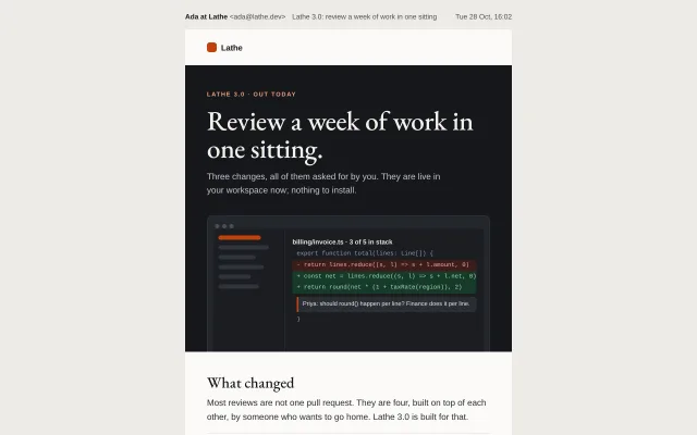
A launch email for an invented code-review tool: dark hero with a drawn product shot, three changes with tiny visuals, one orange button and a reply-to-me sign-off.
Preview
Use it
Free to use · credit appreciated1 Once, in your project · Node 22.20+
npx skills add SusanAcharya/Design-Lounge 2 Then ask
Using the Design Lounge skill, build "Product launch email" (piece email-product-launch) in my stack. Match its brief; restyle it onto my product's theme.
No skill? Paste the brief instead. It carries the numbers, tokens and behaviour.
<!-- Design Lounge Nº 591 · "Product launch email" · www.designlounge.live -->

# Product launch email

> **Build brief for a coding agent.** Rebuild this piece in the reader's stack. If they haven't said which stack, ask once, then default to semantic HTML + CSS + a little vanilla JS. Match the numbers below; don't "improve" them.

## What it is

The "it's out" email for version 3.0 of an invented code-review tool called Lathe, written and signed by a cofounder. A near-black hero band carries a Garamond headline ("Review a week of work in one sitting.") and a drawn product window showing a diff with one inline comment; under it, three changes, each with a 96 × 72 visual that explains it at a glance; one burnt-orange button; and a sign-off that asks the reader to reply, with the founder's initials and name. It is built as a real 600px table email and shown on a warm grey ground under a viewer strip (sender, subject, time). The detail worth copying is restraint: one button, one accent colour, three changes, and a human sign-off instead of a social icon row.

## Reference behaviour

1. Viewer strip: "Ada at Lathe <ada@lathe.dev> · Lathe 3.0: review a week of work in one sitting · Tue 28 Oct, 16:02". Under it the 600px email on `#fbfaf7`, centred on `#ecebe7`; the page scrolls vertically.
2. Hidden preheader: "Stacked reviews, a phone app that is not an afterthought, and diffs that open in 0.4 seconds."
3. First 800px: logo row, the dark hero (kicker, 50px headline, 16px paragraph) and the product shot, which bleeds off the bottom of the hero band with square bottom corners.
4. "What changed" intro, then three rows separated by hairlines: Stacked reviews, Review from your phone, Faster by half. Each row: a 96 × 72 visual tile on the left, a 21px Garamond title and a 15px paragraph with one bold phrase.
5. One button, "Open Lathe 3.0", with a 13px line under it pointing to the changelog.
6. A sign-off block: the reply invitation, then a 48px initials disc "AL" and "Ada Lindqvist / Cofounder, Lathe".
7. Footer: why the reader gets this, Email preferences, "Unsubscribe from product news" and the postal address.
8. Below 640px the column goes full width, gutters 20px, headline 38px, the product shot's sidebar narrows to 72px, the button becomes full width.
9. `prefers-color-scheme: dark` swaps the body to `#17181b`; the hero is already dark and does not change.
10. Nothing animates.

## Structure

```
1280 × 800, page scrolls
             ┌ viewer strip: sender · subject · date ─────────────────┐
             ┌──────────────────────── 600 ──────────────────────────┐
             │ ■ Lathe                                    logo 24/40 │
             │█████████████████ hero #15171B 44/40/0 ████████████████│
             │█ LATHE 3.0 · OUT TODAY  (11 caps, #F3A37A)            █│
             │█ Review a week of work in one sitting. (Garamond 50)  █│
             │█ paragraph 16/1.55 #C4C6CC, max 440                   █│
             │█ ┌ product shot 520 wide, r10 top ───────────────────┐█│
             │█ │ ● ● ●                                            │█│
             │█ │ side 128 │ billing/invoice.ts · diff · comment   │█│
             │█ └──────────┴──────────────────────────────────────┘█│
             │ What changed (Garamond 28) + intro                    │ 40/40/8
             │ [96×72] Stacked reviews / copy                        │ rows 22 tall pad,

… 153 more lines. Copy or download for the full brief. Loading the source…Brief
193 linesBuild brief for a coding agent. Rebuild this piece in the reader’s stack. If they haven’t said which stack, ask once, then default to semantic HTML + CSS + a little vanilla JS. Match the numbers below; don’t “improve” them.
What it is
The “it’s out” email for version 3.0 of an invented code-review tool called Lathe, written and signed by a cofounder. A near-black hero band carries a Garamond headline (“Review a week of work in one sitting.”) and a drawn product window showing a diff with one inline comment; under it, three changes, each with a 96 × 72 visual that explains it at a glance; one burnt-orange button; and a sign-off that asks the reader to reply, with the founder’s initials and name. It is built as a real 600px table email and shown on a warm grey ground under a viewer strip (sender, subject, time). The detail worth copying is restraint: one button, one accent colour, three changes, and a human sign-off instead of a social icon row.
Reference behaviour
- Viewer strip: “Ada at Lathe ada@lathe.dev · Lathe 3.0: review a week of work in one sitting · Tue 28 Oct, 16:02”. Under it the 600px email on
#fbfaf7, centred on#ecebe7; the page scrolls vertically. - Hidden preheader: “Stacked reviews, a phone app that is not an afterthought, and diffs that open in 0.4 seconds.”
- First 800px: logo row, the dark hero (kicker, 50px headline, 16px paragraph) and the product shot, which bleeds off the bottom of the hero band with square bottom corners.
- “What changed” intro, then three rows separated by hairlines: Stacked reviews, Review from your phone, Faster by half. Each row: a 96 × 72 visual tile on the left, a 21px Garamond title and a 15px paragraph with one bold phrase.
- One button, “Open Lathe 3.0”, with a 13px line under it pointing to the changelog.
- A sign-off block: the reply invitation, then a 48px initials disc “AL” and “Ada Lindqvist / Cofounder, Lathe”.
- Footer: why the reader gets this, Email preferences, “Unsubscribe from product news” and the postal address.
- Below 640px the column goes full width, gutters 20px, headline 38px, the product shot’s sidebar narrows to 72px, the button becomes full width.
prefers-color-scheme: darkswaps the body to#17181b; the hero is already dark and does not change.- Nothing animates.
Structure
1280 × 800, page scrolls
             ┌ viewer strip: sender · subject · date ─────────────────┐
             ┌──────────────────────── 600 ──────────────────────────┐
             │ ■ Lathe                                    logo 24/40 │
             │█████████████████ hero #15171B 44/40/0 ████████████████│
             │█ LATHE 3.0 · OUT TODAY  (11 caps, #F3A37A)            █│
             │█ Review a week of work in one sitting. (Garamond 50)  █│
             │█ paragraph 16/1.55 #C4C6CC, max 440                   █│
             │█ ┌ product shot 520 wide, r10 top ───────────────────┐█│
             │█ │ ● ● ●                                            │█│
             │█ │ side 128 │ billing/invoice.ts · diff · comment   │█│
             │█ └──────────┴──────────────────────────────────────┘█│
             │ What changed (Garamond 28) + intro                    │ 40/40/8
             │ [96×72] Stacked reviews / copy                        │ rows 22 tall pad,
             │ [96×72] Review from your phone / copy                 │ 1px #E2E0DA tops
             │ [96×72] Faster by half / copy                         │
             │ [ Open Lathe 3.0 ]  changelog line                    │ 30/40/8
             │ ───────────────────────────────────────────────────── │
             │ reply note · (AL) Ada Lindqvist, Cofounder            │ 30/40/40
             │ ░ footer #F1EFEA ░                                    │
└───────────────────────────────────────────────────────┘- Outer presentation table, centred cell, hidden preheader,
.wraptable (width="600"). - Rows:
.logo,.hero(kicker<span>,<h1>,<p>,.shot),.intro(<h2>+ text),.chs(inner table, three.chrows:.viscell +.txcell with<h3>and<p>),.cta,.note(inner table with the reply text and a 2-cell signature table),.foot. - Product shot in the demo: a
role="img"block of nested tables: window dots, a 128px sidebar of bars (first one orange), a monospace diff with one red and two green lines and a comment with a 3px orange left rule. In production, export it as one 1040 × 520 PNG atwidth="520"with thatalttext. - Change visuals in the demo are absolutely positioned spans in a 96 × 72 tile; in production export each as a 192 × 144 PNG.
Tokens
:root {
  /* light body */
  --ground: #ecebe7;     /* behind the email */
  --paper: #fbfaf7;      /* email body */
  --ink: #17181b;        /* headings, bold phrases */
  --text: #2c2d31;       /* intro, reply note */
  --text-2: #45474d;     /* change copy */
  --muted: #5a5c62;      /* small lines under button, signature role */
  --line: #e2e0da;       /* hairlines, tile borders */
  --tile: #f0eee8;       /* change visual tiles */
  --foot: #f1efea;  --foot-text: #55575c;

  /* hero (same in both schemes) */
  --hero: #15171b;  --hero-ink: #f4f2ec;  --hero-text: #c4c6cc;  --hero-kick: #f3a37a;
  --win: #24272d;  --win-line: #33363d;  --app: #1b1d22;  --app-line: #2c2f36;  --bar: #2f333b;
  --code: #9aa0aa;  --add-bg: #173a2a;  --add: #9fe0b8;  --del-bg: #3d1d1b;  --del: #f0aaa2;  --comment: #2a2d34;

  /* accent */
  --accent: #c2410c;  --on-accent: #ffffff;
  --green: #2f7d4f;  --red: #b4372f;   /* tiny visuals only */
  --avatar: #2c3e50;

  /* dark body */
  --d-ground: #0e0f11;  --d-paper: #17181b;  --d-text: #d8d9dd;  --d-muted: #b4b6bc;  --d-line: #2c2e33;  --d-tile: #202227;  --d-foot: #121316;

  /* type */
  --display: "EB Garamond", Georgia, "Times New Roman", serif;
  --sans: Helvetica, Arial, sans-serif;      /* every paragraph, button, label */
  --mono: Menlo, Consolas, "Courier New", monospace;

  /* sizes */
  --col: 600px;  --gutter: 40px;  --gutter-m: 20px;
  --r-btn: 8px;  --r-tile: 8px;  --r-shot: 10px;
  --btn-pad: 17px 28px;
}
Web-safe fallback stack for EB Garamond: "EB Garamond", Georgia, "Times New Roman", serif. Body stack is already web-safe: Helvetica, Arial, sans-serif.
Typography
| Role | Family | Size | Weight | Line-height | Tracking | Case |
|---|---|---|---|---|---|---|
| Logo | Helvetica/Arial | 15px | 700 | 1 | −0.01em | Title |
| Kicker | Helvetica/Arial | 11px | 700 | 1 | +0.16em | UPPERCASE |
| Hero headline | EB Garamond → Georgia | 50px (38 mobile) | 500 | 1.02 | −0.015em | sentence, ends with a full stop |
| Hero paragraph | Helvetica/Arial | 16px | 400 | 1.55 | 0 | sentence |
| Section title | EB Garamond | 28px | 500 | 1.15 | 0 | sentence |
| Change title | EB Garamond | 21px | 600 | 1.2 | 0 | sentence |
| Body / change copy | Helvetica/Arial | 15–16px | 400 (bold phrase 700) | 1.55–1.6 | 0 | sentence |
| Button | Helvetica/Arial | 16px | 700 | 1 | 0 | sentence |
| Signature name | EB Garamond | 21px | 500 italic | 1.2 | 0 | Name |
| Diff | Menlo/Consolas | 11px | 400 | 1.9 | 0 | code |
| Footer | Helvetica/Arial | 12px | 400 | 1.6 | 0 | sentence |
Motion
None. The piece declares motion: none. No GIF, no CSS animation; a launch email that moves tends to be clipped by clients and costs trust. If a team insists, use a single 3-frame GIF in place of the product shot and keep its first frame complete.
States
- Button:
#c2410cfill, white 16px/700 text, 8px radius,17px 28pxpadding, built as a padded<a>(in production wrap it in a one-cell table withbgcolor="#c2410c"so Outlook paints the fill). Full width below 640px. - Links: footer links underlined in ink; there are no other text links in the body, on purpose.
- Focus-visible (web view): 2px orange outline, 3px offset.
- Dark mode: body, rules, tiles and footer swap to the dark set; the hero and button keep their colours.
- Images off (production): the hero cell keeps
#15171band shows the shot’salttext in#c4c6cc; the change tiles show#f0eee8boxes with alt text.
Accessibility
role="presentation"on all layout tables; real heading order<h1>hero,<h2>“What changed”,<h3>per change.- The product shot has
role="img"(analtin production) describing what it shows; the 96 × 72 tiles arearia-hidden(decorative, the copy carries the meaning). - One call to action, labelled with the action and the product (“Open Lathe 3.0”), at least 50px tall.
- Contrast: white on
#c2410c5.2:1; hero paragraph 10.5:1 and kicker 8.8:1 on#15171b; change copy 8.9:1 and muted 6.4:1 on paper; footer 6.3:1. Dark body: muted#b4b6bcon#17181b8.8:1. Diff text 6.4:1, added lines 8.3:1, removed lines 7.9:1. - The unsubscribe link names what it unsubscribes from (“product news”), so readers are not afraid it will close their account.
Responsive rules
- ≥ 1280, 1024, 768: 600px column, centred, 48px of ground below.
- < 640: column 100%, gutters 20px, headline 38px, viewer strip wraps, product-shot sidebar 72px, change visual column 100px with 6px text padding, button
display:blockand centred text. - Clients without media-query support keep the 600px layout, which is readable on a phone when zoomed.
Acceptance checklist
Always
- 600px presentation-table email with a hidden preheader as the first text.
- Exactly one button in the body, in the one accent colour.
- The hero is a dark band with a product image that bleeds to the band’s bottom edge.
- Each change is one row: a 96 × 72 visual, a serif title, two lines of sans copy with one bold phrase.
- The sign-off asks for a reply and is signed by a named person with an initials disc.
- Display type uses a web font with a Georgia fallback; all body text is Helvetica/Arial.
- Footer has the reason for the email, preferences, a specific unsubscribe and a postal address.
- Below 640px the button is full width and gutters are 20px.
- Dark mode changes the body and keeps the hero and button.
- Text contrast is at least 4.5:1 in both schemes.
This demo
- Kicker “Lathe 3.0 · out today”, headline “Review a week of work in one sitting.”
- Changes: “Stacked reviews” (12 dependent pull requests), “Review from your phone” (swipe right to approve), “Faster by half” (0.4 seconds, down from 0.9).
- Button “Open Lathe 3.0”; line “Already on 3.0? The full changelog has 41 smaller fixes.”
- Signed “Ada Lindqvist, Cofounder, Lathe”; address “22 Ropewalk Lane, Bristol BS1 6QD”.
Implementation notes
A button Outlook will paint. Padding on an <a> is ignored by Outlook for Windows; put the fill on a table cell too:
<table role="presentation" cellpadding="0" cellspacing="0"><tr>
  <td bgcolor="#c2410c" style="border-radius:8px">
    <a href="…" style="display:inline-block;padding:17px 28px;font:700 16px/1 Helvetica,Arial,sans-serif;color:#ffffff;text-decoration:none;border-radius:8px">Open Lathe 3.0</a>
  </td>
</tr></table>
Bleeding the product shot out of the hero. Give the hero cell no bottom padding and the image square bottom corners, so the shot appears to sit on the band’s edge:
.hero { background:#15171b; padding:44px 40px 0; }
.shot { margin-top:32px; border-radius:10px 10px 0 0; border:1px solid #33363d; border-bottom:0; }
Dark mode only for the parts that are light. The hero is already dark, so the dark set touches only paper, text, rules, tiles and footer:
@media (prefers-color-scheme: dark) {
  .wrap { background:#17181b !important; }
  .intro, .note p { color:#d8d9dd !important; }
  .ch td, .note td.box { border-color:#2c2e33 !important; }
}
Common mistakes: three buttons (“Read more”, “Watch video”, “Upgrade”), which split the click; a “noreply@” sender under a sign-off that asks for replies; a feature grid of icon, title and sentence where a small drawing of the change would explain it; setting body text in the display serif, which falls back to Times New Roman in Outlook.
Details
- Palette
- Type
- EB Garamond · Helvetica
- Motion
- Static
- Build
- One session
- Tags
Similar
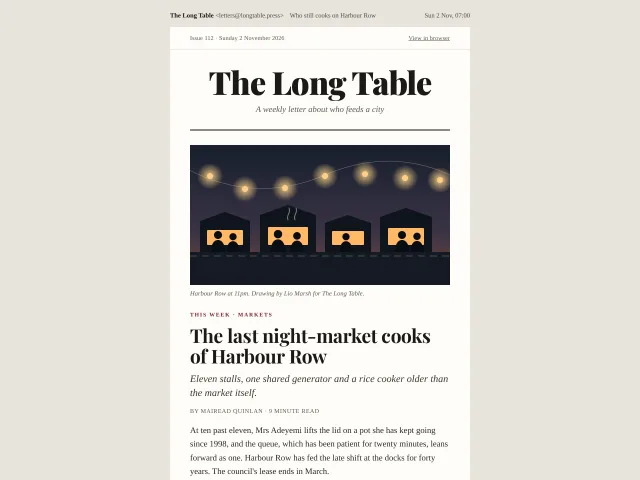
Editorial newsletter email
A weekly editorial newsletter as a real 600px table email: Playfair masthead, a drawn lead image, three short items, a pull quote and a footer, with a dark-mode set.
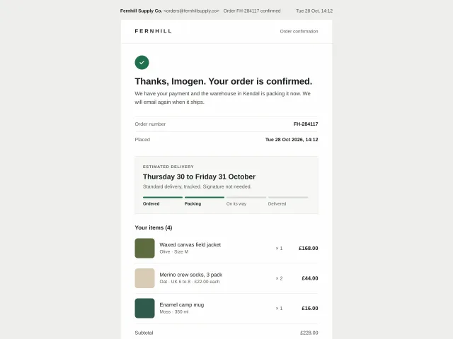
Receipt email
A plain, trustworthy order receipt as a 600px table email: confirmation, order number, delivery estimate with steps, line items, totals with VAT, payment, address and help.
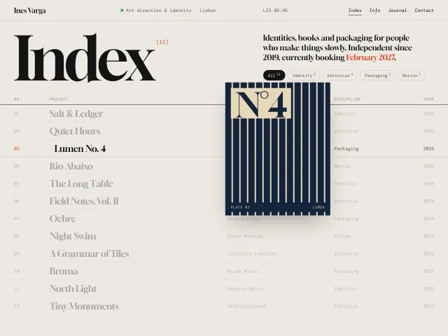
Portfolio index with hover preview
An art director's project index: a 12-column table of work where hovering a row floats an art-directed plate that trails the cursor with lag and tilt.
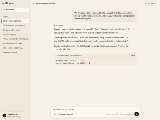
AI chat workspace
A warm paper AI assistant: history sidebar, a serif answer that streams in with a Stop button, numbered citations that open a sources panel, and a composer.
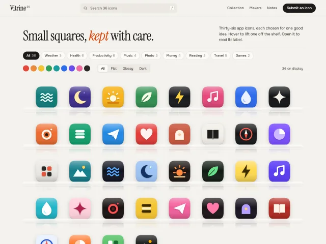
App icon shelf gallery
A museum-style gallery of 36 SVG app icons on frosted glass shelves, with category, colour and finish filters and a detail sheet with a palette strip.
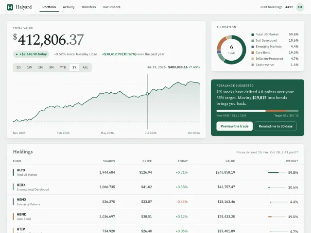
Portfolio dashboard
A calm investing dashboard: a 64px serif total, range tabs over a scrubbable value chart, an allocation ring, a rebalance card and a holdings table.