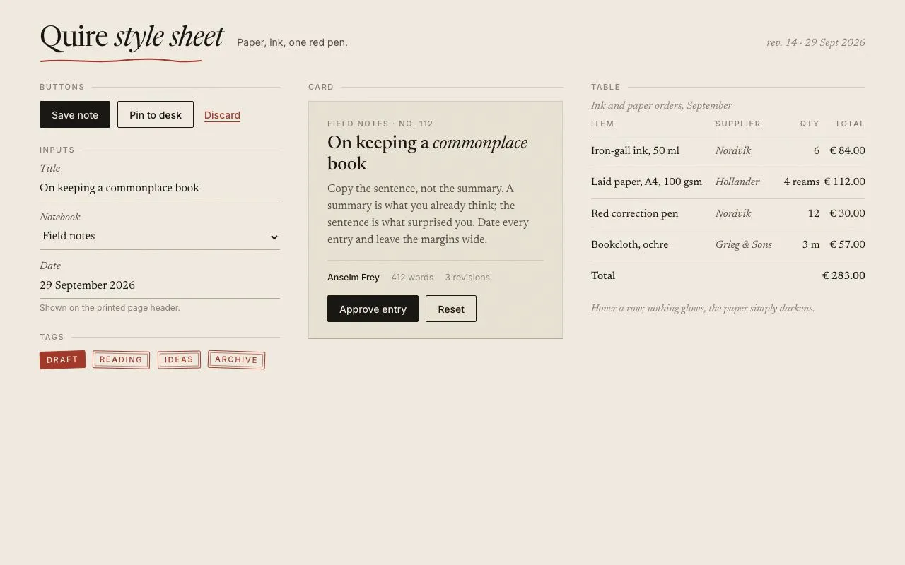
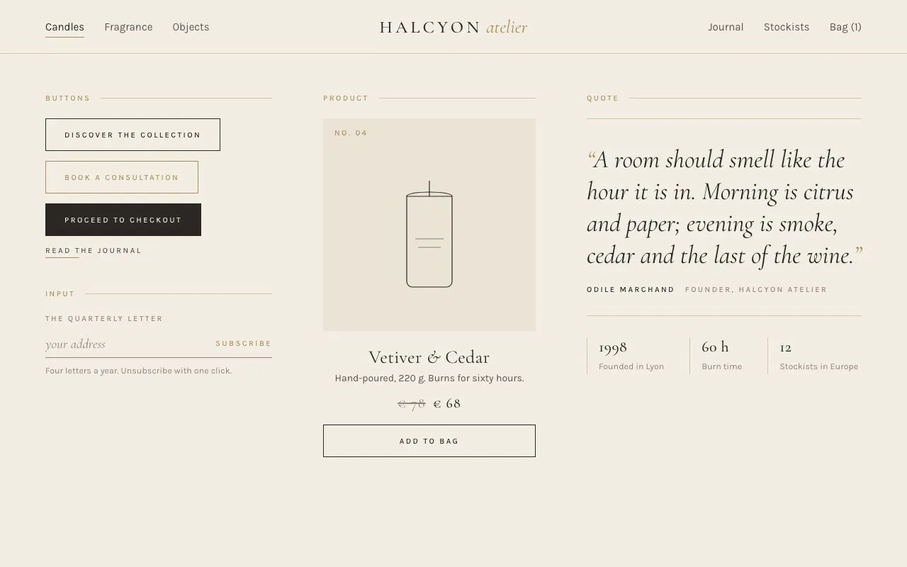
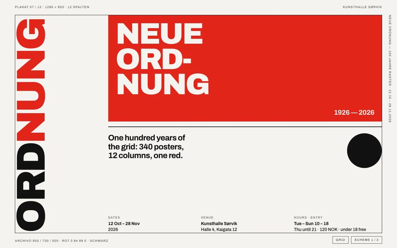
Nº 039 of 520
Neo-brutalist design style
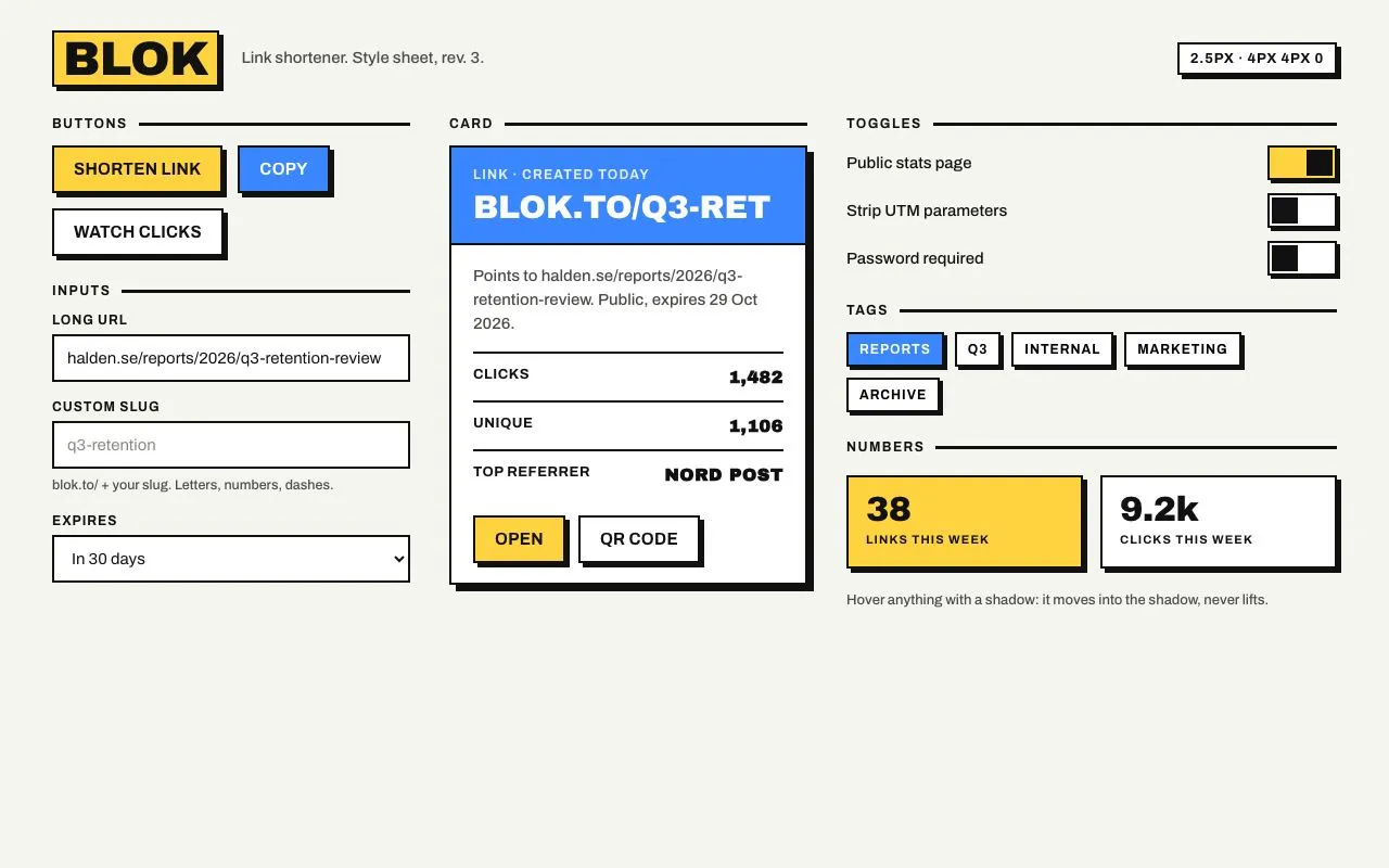
Thick 2.5px black borders, hard 4px 4px 0 offset shadows, flat yellow and blue fills, and hover that moves the element into its shadow; buttons, inputs, a card, toggles and tags.
Preview
Use it
Free to use · credit appreciated1 Once, in your project
npx skills add SusanAcharya/Design-Lounge 2 Then ask
Using the Design Lounge skill, build "Neo-brutalist design style" (piece neo-brutalist-style) in my stack. Match its brief; restyle it onto my product's theme.
No skill? Paste the brief instead. It carries the numbers, tokens and behaviour.
<!-- Design Lounge Nº 039 · "Neo-brutalist design style" · www.designlounge.live -->

# Neo-brutalist design style

> **Build brief for a coding agent.** Rebuild this piece in the reader's stack. If they haven't said which stack, ask once, then default to semantic HTML + CSS + a little vanilla JS. Match the numbers below; don't "improve" them.

## What it is

A component style sheet for a link shortener ("Blok") in a neo-brutalist language: every interactive element has a 2.5px black border, zero radius and a hard offset shadow (`4px 4px 0 0 #111`) instead of any blur. Fills are flat: paper-white, one yellow, one blue, and black for pressed states. The only motion is the defining one: on hover the element translates by exactly its shadow offset while the shadow collapses to zero, so it reads as being pushed *into* the page rather than lifted off it. Type is Archivo Black for display numbers and the card band, Archivo for everything else, uppercase and tracked for labels. The detail worth copying is the paired transform/shadow transition: both must use the same 120ms clock or the element appears to slide off its shadow.

## Reference behaviour

1. Initial state: title "BLOK" in a yellow bordered block, a tagline, a mono-ish token badge at the right ("2.5px · 4px 4px 0"). Three columns: Buttons + Inputs (330px), Card (330px), Toggles + Tags + Numbers (rest).
2. Hover any `.btn`: `transform: translate(4px, 4px)`, shadow `0 0 0 0`. Active: same plus grey (`--grey`) fill. Release: returns over 120ms.
3. "Watch clicks" toggles `aria-pressed`; pressed = black fill with white text.
4. Focus an input: it moves up-left by 4px and gains a blue `4px 4px 0` shadow (the opposite of the button, so text fields "rise" for typing).
5. Tags have a 3px shadow; hover pushes them 3px; pressed = blue fill, white text. Click toggles.
6. Toggles are 64×32 bordered rectangles with a 24px black square knob; on = yellow track, knob translated 32px over 160ms. Click toggles `aria-checked`.
7. The card has a 6px shadow; hover pushes it 2px and shrinks the shadow to 4px (a gentler version of the button rule, since the whole card isn't a control).
8. Nothing animates on load. All state changes are instant except the transform/shadow pairs and the knob slide.

## Structure

```
1280 × 800   (padding 28 48)
┌──────────────────────────────────────────────────────────────────────────┐
│ [BLOK]  Link shortener. Style sheet, rev. 3.           [2.5PX · 4PX 4PX 0]│
├──── 330 ─────────────┬──── 330 ─────────────┬──── 1fr ───────────────────┤
│ BUTTONS ━━━━━━━━━━━  │ CARD ━━━━━━━━━━━━━━  │ TOGGLES ━━━━━━━━━━━━━━━━━  │
│ [SHORTEN LINK][COPY] │ ┏━━━━━━━━━━━━━━━━━┓  │ Public stats page   [■   ] │
│ [WATCH CLICKS]       │ ┃ LINK · CREATED  ┃  │ Strip UTM…          [   ■] │
│ INPUTS ━━━━━━━━━━━━  │ ┃ BLOK.TO/Q3-RET  ┃  │ Password required   [   ■] │
│ LONG URL             │ ┣━━━━━━━━━━━━━━━━━┫  │ TAGS ━━━━━━━━━━━━━━━━━━━━  │
│ ┏━━━━━━━━━━━━━━━━┓   │ ┃ Points to …     ┃  │ [REPORTS][Q3][INTERNAL]…   │
│ CUSTOM SLUG          │ ┃ CLICKS    1,482 ┃  │ NUMBERS ━━━━━━━━━━━━━━━━━  │
│ ┏━━━━━━━━━━━━━━━━┓   │ ┃ UNIQUE    1,106 ┃  │ ┏━━━━━━━━┓ ┏━━━━━━━━┓      │
│ EXPIRES              │ ┃ TOP REF.  Nord… ┃  │ ┃ 38     ┃ ┃ 9.2k   ┃      │
│ ┏━━━━━━━━━━━━━━━━┓   │ ┃ [OPEN][QR CODE] ┃  │ ┗━━━━━━━━┛ ┗━━━━━━━━┛      │
│                      │ ┗━━━━━━━━━━━━━━━━━┛  │ Hover anything with a…     │
└──────────────────────┴──────────────────────┴────────────────────────────┘

… 153 more lines. Copy or download for the full brief. Loading the source…Brief
193 linesBuild brief for a coding agent. Rebuild this piece in the reader’s stack. If they haven’t said which stack, ask once, then default to semantic HTML + CSS + a little vanilla JS. Match the numbers below; don’t “improve” them.
What it is
A component style sheet for a link shortener (“Blok”) in a neo-brutalist language: every interactive element has a 2.5px black border, zero radius and a hard offset shadow (4px 4px 0 0 #111) instead of any blur. Fills are flat: paper-white, one yellow, one blue, and black for pressed states. The only motion is the defining one: on hover the element translates by exactly its shadow offset while the shadow collapses to zero, so it reads as being pushed into the page rather than lifted off it. Type is Archivo Black for display numbers and the card band, Archivo for everything else, uppercase and tracked for labels. The detail worth copying is the paired transform/shadow transition: both must use the same 120ms clock or the element appears to slide off its shadow.
Reference behaviour
- Initial state: title “BLOK” in a yellow bordered block, a tagline, a mono-ish token badge at the right (“2.5px · 4px 4px 0”). Three columns: Buttons + Inputs (330px), Card (330px), Toggles + Tags + Numbers (rest).
- Hover any
.btn:transform: translate(4px, 4px), shadow0 0 0 0. Active: same plus grey (--grey) fill. Release: returns over 120ms. - “Watch clicks” toggles
aria-pressed; pressed = black fill with white text. - Focus an input: it moves up-left by 4px and gains a blue
4px 4px 0shadow (the opposite of the button, so text fields “rise” for typing). - Tags have a 3px shadow; hover pushes them 3px; pressed = blue fill, white text. Click toggles.
- Toggles are 64×32 bordered rectangles with a 24px black square knob; on = yellow track, knob translated 32px over 160ms. Click toggles
aria-checked. - The card has a 6px shadow; hover pushes it 2px and shrinks the shadow to 4px (a gentler version of the button rule, since the whole card isn’t a control).
- Nothing animates on load. All state changes are instant except the transform/shadow pairs and the knob slide.
Structure
1280 × 800   (padding 28 48)
┌──────────────────────────────────────────────────────────────────────────┐
│ [BLOK]  Link shortener. Style sheet, rev. 3.           [2.5PX · 4PX 4PX 0]│
├──── 330 ─────────────┬──── 330 ─────────────┬──── 1fr ───────────────────┤
│ BUTTONS ━━━━━━━━━━━  │ CARD ━━━━━━━━━━━━━━  │ TOGGLES ━━━━━━━━━━━━━━━━━  │
│ [SHORTEN LINK][COPY] │ ┏━━━━━━━━━━━━━━━━━┓  │ Public stats page   [■   ] │
│ [WATCH CLICKS]       │ ┃ LINK · CREATED  ┃  │ Strip UTM…          [   ■] │
│ INPUTS ━━━━━━━━━━━━  │ ┃ BLOK.TO/Q3-RET  ┃  │ Password required   [   ■] │
│ LONG URL             │ ┣━━━━━━━━━━━━━━━━━┫  │ TAGS ━━━━━━━━━━━━━━━━━━━━  │
│ ┏━━━━━━━━━━━━━━━━┓   │ ┃ Points to …     ┃  │ [REPORTS][Q3][INTERNAL]…   │
│ CUSTOM SLUG          │ ┃ CLICKS    1,482 ┃  │ NUMBERS ━━━━━━━━━━━━━━━━━  │
│ ┏━━━━━━━━━━━━━━━━┓   │ ┃ UNIQUE    1,106 ┃  │ ┏━━━━━━━━┓ ┏━━━━━━━━┓      │
│ EXPIRES              │ ┃ TOP REF.  Nord… ┃  │ ┃ 38     ┃ ┃ 9.2k   ┃      │
│ ┏━━━━━━━━━━━━━━━━┓   │ ┃ [OPEN][QR CODE] ┃  │ ┗━━━━━━━━┛ ┗━━━━━━━━┛      │
│                      │ ┗━━━━━━━━━━━━━━━━━┛  │ Hover anything with a…     │
└──────────────────────┴──────────────────────┴────────────────────────────┘
<header class="top">→<h1><span>(bordered yellow block),<p>,.vbadge..gridthree columns; each<section>has an<h6>whose::afteris a 2.5px black rule..btnvariants: default (white),.y(yellow),.b(blue, white text),[aria-pressed="true"](black)..fld→ uppercase<label>,<input>/<select>44px, optional<small>.<article class="card">→.band(blue) +.bodywith.rows and.actbuttons..tgrows:<label for>+<button class="sw" role="switch" aria-checked>..tagbuttons witharia-pressed;.stattwo bordered tiles.
Tokens
:root {
  /* colour — flat, no tints */
  --bg: #f5f5f0;            /* page */
  --white: #ffffff;         /* default fills */
  --black: #111111;         /* borders, shadows, text, pressed fill */
  --yellow: #ffd23f;        /* primary fill, toggle on, stat tile */
  --blue: #3a86ff;          /* secondary fill, card band, focus */
  --blue-ink: #ffffff;      /* text on blue */
  --grey: #d9d9d2;          /* active (pressed-down) fill */
  --ink-2: #4a4a46;         /* secondary text */

  /* type */
  --display: "Archivo Black", Impact, sans-serif;
  --sans: "Archivo", system-ui, sans-serif;

  /* structure */
  --bw: 2.5px;              /* border weight everywhere */
  --off: 4px;               /* shadow offset for controls */
  --off-sm: 3px;            /* tags, toggles */
  --off-lg: 6px;            /* card at rest */
  --shadow: var(--off) var(--off) 0 0 var(--black);
  --r: 0px;                 /* no radius, ever */
  --btn-h: 44px;
  --input-h: 44px;
  --sw-w: 64px;  --sw-h: 32px;  --sw-knob: 24px;

  /* motion */
  --t-micro: 120ms;
  --t-knob: 160ms;
  --ease: cubic-bezier(.2, .7, .2, 1);
}
Typography
| Role | Family | Size | Weight | Line-height | Tracking | Case |
|---|---|---|---|---|---|---|
| Page title | Archivo Black | 44px | 400 | 1 | −0.01em | UPPERCASE in a bordered block |
| Card band | Archivo Black | 30px | 400 | 1 | −0.01em | UPPERCASE |
| Stat value | Archivo Black | 32px | 400 | 1 | −0.02em | numerals |
| Row value | Archivo Black | 16px | 400 | 1 | 0 | |
| Body | Archivo | 15px | 400/500 | 1.45 | 0 | sentence |
| Button | Archivo | 15px | 700 | 1 | +0.02em | UPPERCASE |
| Section label | Archivo | 12px | 700 | 1 | +0.12em | UPPERCASE, 2.5px rule after |
| Field label | Archivo | 12px | 700 | 1 | +0.08em | UPPERCASE |
| Tag | Archivo | 12px | 700 | 1 | +0.08em | UPPERCASE |
| Row label | Archivo | 13px | 700 | 1 | +0.04em | UPPERCASE |
| Stat label / badge | Archivo | 11–13px | 700 | 1 | +0.06–0.1em | UPPERCASE |
| Helper | Archivo | 12.5px | 500 | 1.45 | 0 | sentence --ink-2 |
Motion
| Element | Trigger | Property | From → To | Duration | Easing |
|---|---|---|---|---|---|
.btn | hover | transform, box-shadow | none, 4px 4px 0 → translate(4px,4px), 0 0 0 | 120ms | --ease |
.btn | active | background | fill → --grey (plus hover transform) | 120ms | --ease |
.tag | hover | transform, box-shadow | none, 3px 3px 0 → translate(3px,3px), 0 0 0 | 120ms | --ease |
.card | hover | transform, box-shadow | none, 6px 6px 0 → translate(2px,2px), 4px 4px 0 | 120ms | --ease |
| input/select | focus | transform, box-shadow | none, none → translate(−4px,−4px), 4px 4px 0 var(--blue) | 120ms | --ease |
.sw::after | toggle | translateX | 0 → 32px | 160ms | --ease |
.sw | toggle | background | white → yellow | 120ms | --ease |
Reduced motion: all transitions 1ms; the states are the same.
States
- Button default: white fill, black border, black text, 4px shadow.
- Button yellow / blue:
--yellowfill /--bluefill with white text. - Button hover: pushed into shadow. Active: pushed +
--grey. Pressed (aria-pressed): black fill, white text, shadow unchanged. - Button focus-visible: 2.5px
--blueoutline at 3px offset (outside the shadow). - Input default: white, black border, no shadow. Focus: raised 4px up-left with a blue 4px shadow. Placeholder:
#8a8a84. - Toggle off: white track, knob left. On: yellow track, knob right. Track keeps a 3px shadow; it does not move.
- Tag default: white, 3px shadow. Pressed: blue fill, white text.
- Card: white, 6px shadow; band blue with a 2.5px bottom border; rows separated by 2.5px black rules.
- Stat tiles: yellow (first) and white (second), 4px shadow, no hover.
Accessibility
- Toggle buttons use
aria-pressed; switches userole="switch"+aria-checkedand a visible<label for>. - Every control has a 2.5px blue focus ring offset 3px so it clears the black shadow; the hover push must not be the only focus cue.
- Contrast: black on yellow 12.9:1; white on
--blue3.6:1 — acceptable for 15px/700 uppercase button text (large-text rule) but do not use blue fills for body-size text; black on white 18:1;--ink-2on--bg8.5:1. - Keyboard: Tab through buttons → inputs → select → card buttons → toggles → tags. Space/Enter activate; switches toggle on Space.
- Hit targets: buttons and inputs 44px; toggles 64×32 with the label as extra clickable area; tags 30px tall (bump to 36px on touch).
- Motion is small (≤ 4px), so the hover push is safe under vestibular guidelines, but still shorten to 1ms for reduced motion.
Responsive rules
- ≥ 1280: three columns 330 / 330 / 1fr.
- 1024–1279: 300 / 300 / 1fr; title 36px.
- 768–1023: two columns; the third column wraps beneath spanning both.
- < 640: one column, padding 20px; buttons full width and stacked with 14px gap; shadow offsets stay 4px (do not scale them down; they are the style).
Acceptance checklist
- Every bordered element uses a 2.5px
#111111border andborder-radius: 0. - Control shadows are
4px 4px 0 0 #111(tags/toggles 3px, card 6px) with no blur and no alpha. - Hovering a button translates it exactly (4px, 4px) and collapses the shadow to 0 on the same 120ms clock.
- Active buttons additionally fill
--grey; pressed (aria-pressed) buttons fill black with white text. - Inputs on focus move (−4px, −4px) and gain a blue 4px offset shadow.
- Toggles are 64×32 with a 24px black square knob that slides 32px over 160ms; on = yellow track.
- Tags toggle
aria-pressedand turn blue when pressed. - Only two chromatic fills exist (yellow, blue) plus black/white/grey.
- Display numbers and the card band are Archivo Black; all labels are uppercase Archivo 700.
- Focus rings are blue, 2.5px, offset 3px, visible on every control.
- No gradients, no radius, no blurred shadows anywhere on the page.
Implementation notes
The push. Transform and shadow must move together; define the offset once:
.btn { border: var(--bw) solid var(--black); box-shadow: var(--off) var(--off) 0 0 var(--black);
  transition: transform var(--t-micro) var(--ease), box-shadow var(--t-micro) var(--ease); }
.btn:hover, .btn:active { transform: translate(var(--off), var(--off)); box-shadow: 0 0 0 0 var(--black); }
.btn:active { background: var(--grey); }
Inputs rise, buttons sink. Same offsets, opposite sign, blue shadow to mark the caret’s home:
.fld input:focus-visible { transform: translate(calc(var(--off) * -1), calc(var(--off) * -1));
  box-shadow: var(--off) var(--off) 0 0 var(--blue); outline: none; }
Square toggle with a pseudo-element knob (no inner markup):
.sw { width: 64px; height: 32px; border: var(--bw) solid var(--black); position: relative; background: var(--white); }
.sw::after { content: ""; position: absolute; top: 2px; left: 2px; width: 24px; height: 24px; background: var(--black);
  transition: transform var(--t-knob) var(--ease); }
.sw[aria-checked="true"] { background: var(--yellow); }
.sw[aria-checked="true"]::after { transform: translateX(32px); }
Common mistakes: animating the shadow to a blurred zero (0 0 8px) so it fades instead of collapsing; adding 2–4px radii “to soften”; using semi-transparent black for shadows (they must be opaque); letting the focus ring sit inside the shadow where it disappears against black.
Details
- Palette
- Type
- Archivo Black · Archivo
- Motion
- Subtle motion
- Build
- Quick build
- Tags
On the shelves