Nº 527 of 528
Confidence and one other option
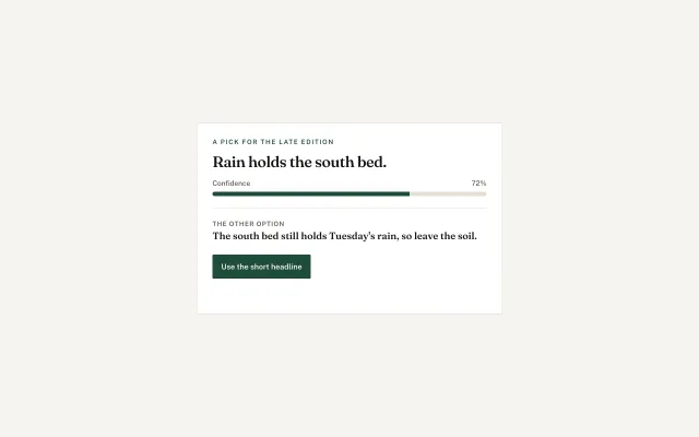
The short headline sits on a 72% bar. The long headline is the other option. Using either says which is in the edition.
Preview
Use it
Free to use · credit appreciated1 Once, in your project
npx skills add SusanAcharya/Design-Lounge 2 Then ask
Using the Design Lounge skill, build "Confidence and one other option" (piece card-confidence-pick) in my stack. Match its brief; restyle it onto my product's theme.
No skill? Paste the brief instead. It carries the numbers, tokens and behaviour.
<!-- Design Lounge Nº 527 · "Confidence and one other option" · www.designlounge.live -->

# Confidence and one other option

> **Build brief for a coding agent.** Rebuild this piece in the reader's stack. If they haven't said which stack, ask once, then default to semantic HTML + CSS + a little vanilla JS. Match the numbers below; don't "improve" them. When a kit is locked, the bar and the filled button use `--primary`. This demo uses the numbers below.

## What it is

One suggestion on Late, an evening paper. The agent prefers the short headline and says so with a 72% bar, not a ring and not a donut. The long headline is on the card from the first frame, under a hairline, labelled as the other option. Neither is chosen yet. Use the short headline writes that the short one is in the edition. The other option writes that the long one is. The bar does not move. Confidence belongs to the suggestion, not to the click. A yes/no before a send is `agent-approval-card`. A sentence the person rewrites in place is `selection-rewrite`. A paragraph that quotes a source is `cited-answer`.

## Reference behaviour

1. Kicker: "A pick for the late edition". Heading: "Rain holds the south bed."
2. The meter reads Confidence on the left and 72% on the right. The fill is 72% of an 8px track.
3. Under the hairline, the other option reads "The south bed still holds Tuesday's rain, so leave the soil."
4. Both controls are `aria-pressed="false"`. The status line is empty.
5. Use the short headline sets that button to pressed, the other option to not pressed, and the status to "The short headline is in the edition."
6. The other option sets itself to pressed, the short button to not pressed, and the status to "The long headline is in the edition."
7. A pressed other option gets the soft fill `#e7f2ec` and 8px of padding so the row is obviously the one in use. The short button stays filled `#1f4d3a` either way. Its pressed state is `aria-pressed`, not a second colour.
8. Clicking the chosen control again leaves it chosen. There is no empty state after the first click.
9. The 72% label and the bar width do not change.

## Structure

```
article.card  560px, padding 28px
  p.kicker
  h1                         the recommended headline
  div.meter
    div.meter-top            Confidence · 72%
    div.track  height 8px
      div.fill width 72%
  div.line                   1px
  button.other
    small                    The other option
    b                        the long headline
  div.acts
    button.use               44px, filled
  p.status role=status
```

… 127 more lines. Copy or download for the full brief. Loading the source…Brief
167 linesBuild brief for a coding agent. Rebuild this piece in the reader’s stack. If they haven’t said which stack, ask once, then default to semantic HTML + CSS + a little vanilla JS. Match the numbers below; don’t “improve” them. When a kit is locked, the bar and the filled button use
--primary. This demo uses the numbers below.
What it is
One suggestion on Late, an evening paper. The agent prefers the short headline and says so with a 72% bar, not a ring and not a donut. The long headline is on the card from the first frame, under a hairline, labelled as the other option. Neither is chosen yet. Use the short headline writes that the short one is in the edition. The other option writes that the long one is. The bar does not move. Confidence belongs to the suggestion, not to the click. A yes/no before a send is agent-approval-card. A sentence the person rewrites in place is selection-rewrite. A paragraph that quotes a source is cited-answer.
Reference behaviour
- Kicker: “A pick for the late edition”. Heading: “Rain holds the south bed.”
- The meter reads Confidence on the left and 72% on the right. The fill is 72% of an 8px track.
- Under the hairline, the other option reads “The south bed still holds Tuesday’s rain, so leave the soil.”
- Both controls are
aria-pressed="false". The status line is empty. - Use the short headline sets that button to pressed, the other option to not pressed, and the status to “The short headline is in the edition.”
- The other option sets itself to pressed, the short button to not pressed, and the status to “The long headline is in the edition.”
- A pressed other option gets the soft fill
#e7f2ecand 8px of padding so the row is obviously the one in use. The short button stays filled#1f4d3aeither way. Its pressed state isaria-pressed, not a second colour. - Clicking the chosen control again leaves it chosen. There is no empty state after the first click.
- The 72% label and the bar width do not change.
Structure
article.card  560px, padding 28px
  p.kicker
  h1                         the recommended headline
  div.meter
    div.meter-top            Confidence · 72%
    div.track  height 8px
      div.fill width 72%
  div.line                   1px
  button.other
    small                    The other option
    b                        the long headline
  div.acts
    button.use               44px, filled
p.status role=status- The recommended headline is the
h1. The long headline is inside its button, not a second heading. - The track is
aria-hidden. The 72% text is the confidence. Do not add a second graphic. - One card. No list of five suggestions.
Tokens
:root {
  --bg: #f6f4ef;
  --surface: #ffffff;
  --ink: #161513;
  --ink-2: #5c564e;
  --line: #e4dfd4;
  --bar: #1f4d3a;
  --track: #e4dfd4;
  --soft: #e7f2ec;
  --serif: "Fraunces", Georgia, serif;
  --sans: "Public Sans", system-ui, sans-serif;
  --radius: 2px;
}
The track is a pill. The card and Use this button use --radius.
Typography
| Role | Family | Size | Weight | Line | Tracking |
|---|---|---|---|---|---|
| Kicker | Public Sans | 12px | 600 | 1 | 0.14em, uppercase |
| Short headline | Fraunces | 28px | 560 | 1.15 | -0.02em |
| Meter label | Public Sans | 13px | 500 | 1 | 0 |
| Other label | Public Sans | 12px | 600 | 1 | 0.08em, uppercase |
| Long headline | Fraunces | 18px | 560 | 1.3 | 0 |
| Use button | Public Sans | 14px | 600 | 1 | 0 |
| Status | Public Sans | 14px | 400 | 1.4 | 0 |
The short headline is larger than the long one. That size is the recommendation. Do not make them equal.
Motion
| Thing | Trigger | From | To | Duration | Reduced motion |
|---|---|---|---|---|---|
| Status | a choice | empty | one sentence | none | instant |
| Other row | chosen | transparent | #e7f2ec | none | instant |
The bar does not animate from 0 to 72 on load. It is 72% in the first frame.
States
- Unchosen: both
aria-pressed="false", status empty, other row transparent. - Short chosen: Use button
aria-pressed="true", status names the short headline. The button fill stays#1f4d3aand the label stays#f6f4ef. Do not paint the label#1f4d3aor it disappears. - Long chosen: other button
aria-pressed="true", soft fill, its headline text#1f4d3a, status names the long headline. The Use button returns toaria-pressed="false"but keeps its fill, because it is still the agent’s recommendation. - Focus-visible: 2px
#1f4d3aoutline, offset 3px, on both controls. - Hover does not move the bar.
Accessibility
- One
h1, the recommended headline. - The meter text “Confidence” and “72%” are visible. The track is decorative.
- Both choices are buttons. The other option’s accessible name is the small label plus the long headline, in that order.
- Status is
role="status". - Focus order: the other option, then Use the short headline. The heading is not a control.
- Do not use a slider for the confidence. The person cannot drag 72%.
- Contrast:
#161513on white,#f6f4efon#1f4d3a,#1f4d3aon#e7f2ec. - Hit targets: the Use button is 44px. The other option is the full width of the card and at least 44px with its two lines.
Responsive rules
- ≥1280: the card stays 560px, centred.
- 768: same card, page padding 24px.
- <640: the card is
width: calc(100% - 32px). The short headline drops to 24px. The Use button becomeswidth: 100%. The bar stays 8px and 72% of the track, which is now the card’s inner width. - A second alternative does not fit this card. If a product has three, this is the wrong piece. Say so and keep two.
Acceptance checklist
Always
- The recommendation and exactly one other option are both visible before a click.
- Confidence is a horizontal bar with a percent, not a ring.
- Choosing either option writes one sentence and sets
aria-pressedon that option only. - The bar width stays on the recommendation after either click.
- The filled button’s label stays light on the dark fill when it is pressed.
- The first frame has nothing chosen.
- There is no third option and no donut.
This demo
- Short headline is “Rain holds the south bed.”
- The bar is 72%.
- The other line is “The south bed still holds Tuesday’s rain, so leave the soil.”
- Short status is “The short headline is in the edition.”
- Long status is “The long headline is in the edition.”
Implementation notes
The bar is a width. Do not bind it to the pressed state:
.fill { width: 72%; height: 100%; background: #1f4d3a; }
.track { height: 8px; background: #e4dfd4; border-radius: 999px; overflow: hidden; }
One function sets the pair of pressed values. Clicking the current choice calls it again with the same side, so the status does not clear:
function pick(which) {
  const shortOn = which === 'short';
  use.setAttribute('aria-pressed', shortOn ? 'true' : 'false');
  long.setAttribute('aria-pressed', shortOn ? 'false' : 'true');
  status.textContent = shortOn
    ? 'The short headline is in the edition.'
    : 'The long headline is in the edition.';
}
Common mistakes:
- Hiding the other option behind a disclosure. It is on the card so the person can see the trade before they commit.
- Moving the 72% onto whichever line was clicked. That number is the agent’s, and it stays on the short headline.
- Painting pressed text the same green as the button fill.
- A ring or a pie. A ranking of amounts is
chart-rank-spend. A split of one total ischart-share-bar. This meter is neither.
Details
- Palette
- Type
- Fraunces · Public Sans
- Motion
- Static
- Build
- Quick build
- Tags
Studied
Icon MuseumLet the icons be the only colour. Give each one a shelf, a lift on hover, and a quiet label.
All sourcesSimilar
Agent approval card
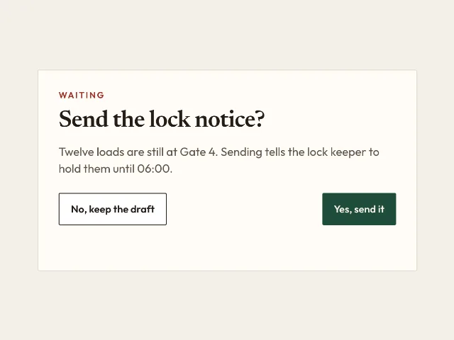
A notice stays a draft until Yes. No keeps it. The card says which, and nothing sends itself.
Cited answer
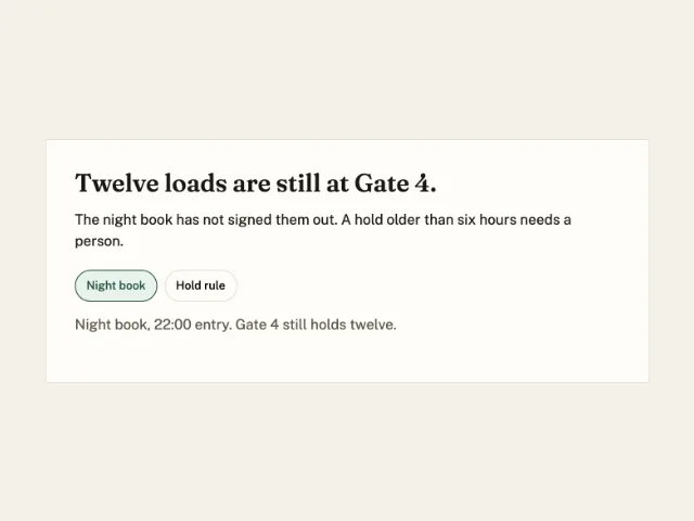
A sentence about Gate 4. Night book starts pressed and shows its line. Hold rule swaps the quote.
Rewrite the selected sentence
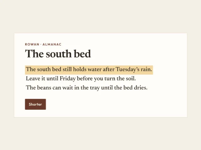
Three sentences. The first is marked. Shorter replaces it. Restore puts it back. The other two can be marked the same way.