Nº 601 of 605
Lamp configurator with materials
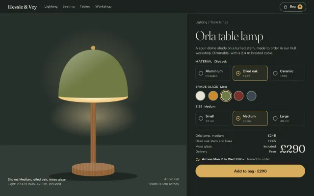
A product page for an SVG table lamp: material, glaze and size radio groups redraw it, with a live price breakdown, delivery window and add to bag.
Preview
Use it
Free to use · credit appreciated1 Once, in your project · Node 22.20+
npx skills add SusanAcharya/Design-Lounge 2 Then ask
Using the Design Lounge skill, build "Lamp configurator with materials" (piece product-configurator-material) in my stack. Match its brief; restyle it onto my product's theme.
No skill? Paste the brief instead. It carries the numbers, tokens and behaviour.
<!-- Design Lounge Nº 601 · "Lamp configurator with materials" · www.designlounge.live -->

# Lamp configurator with materials

> **Build brief for a coding agent.** Rebuild this piece in the reader's stack. If they haven't said which stack, ask once, then default to semantic HTML + CSS + a little vanilla JS. Match the numbers below; don't "improve" them.

## What it is

The product page for the Orla table lamp from Hessle & Vey, an invented lighting workshop. The left two thirds is a dim green room with a table edge, and the lamp is drawn in SVG: a dome shade with a lit underside, a stem and a turned base. Three real radio groups on the right (Material, Shade glaze, Size) redraw the lamp in place. They swap the stem and base fill between brushed aluminium, oak grain and glazed ceramic, recolour the shade, and scale the whole lamp from its foot. A price breakdown, a total in 44px Fraunces, a delivery window that depends on the material, and a brass "Add to bag" pill follow the choices. The detail worth copying: every picker is a native `<input type="radio">` with `appearance:none`, styled on the input itself with a 2px `#8D978F` edge, so arrow keys, form semantics and the 3:1 edge all come free.

## Reference behaviour

1. Initial state: Medium, Oiled oak, Moss. The lamp is drawn at scale 1, the total reads £290 (245 + 45 + 0, delivery free), delivery reads "Arrives Mon 9 to Wed 11 Nov · turned to order", and the button reads "Add to bag · £290".
2. Material cards (Aluminium Included, Oiled oak +£45, Ceramic +£60): choosing one changes the stem and base fill over 420ms, the legend value, the breakdown row, the delivery line and the caption. The chosen card gets a brass border and an 8% brass wash.
3. Shade glaze swatches (Chalk, Ochre, Moss, Oxblood +£15, Slate): choosing one recolours the shade path over 420ms and updates the legend value ("Shade glaze Oxblood") and the glaze row. The chosen swatch has an ink border and a 2px brass ring 3px outside it.
4. Size (Small 33 cm £185, Medium 41 cm £245, Large 48 cm £320): the lamp scales from its foot to .8, 1 or 1.16 over 420ms on expo-out, and the dimensions note bottom right updates ("41 cm tall / Shade 30 cm across").
5. Every change re-renders the breakdown (lamp and size, material, glaze, delivery), the total and the button label. The total ticks: it fades up from 20% opacity and 6px lower over 360ms.
6. Delivery is £9.50 below a £250 subtotal and Free from £250. Small, aluminium, chalk costs £194.50.
7. Arrow keys move within each group and wrap (native radio behaviour); Tab moves between groups.
8. "Add to bag" increments the bag count in the header, sets the bag's `aria-label` to "Bag, 1 item", turns the button ink with the label "Added to bag", and announces "Orla table lamp, Medium, added to bag". Any later change resets the button to "Add to bag · £…".

## Structure

```
1280 × 800
┌──────────────────────────────────────────────────────────────────────────┐
│ Hessle & Vey   Lighting Seating Tables Workshop              (Bag ●0)   │ 56
├────────────────────────────────────────────┬─────────────────────────────┤
│ stage (1fr = 760)                          │ panel 520, padding 26/36    │
│   warm light pool at 50% 34%               │ Lighting / Table lamps      │
│            ●                               │ Orla table lamp   52/300    │
│        ╭───────╮  shade (glaze)            │ lede, 420 max               │
│       ╱         ╲                          │ MATERIAL  [○ Alu][◉ Oak][○ Cer]│
│       ‾‾‾‾‾‾‾‾‾‾‾ lit underside            │ SHADE GLAZE ● ● ◉ ● ●  40px  │
│            ┃   stem (material)             │ SIZE      [○ S][◉ M][○ L]   │
│ ───────────┃──────── table edge at 72%     │ ─────────────────────────── │
│         ▁▁▁┻▁▁▁ base (material)            │ breakdown dl      £290 44px │
│ Shown: Medium…                 41 cm tall  │ [van] Arrives Mon 9 to Wed 11│
│ Light: 2700 K…        Shade 30 cm across   │ [   Add to bag · £290   ] 52│
└────────────────────────────────────────────┴─────────────────────────────┘

… 155 more lines. Copy or download for the full brief. Loading the source…Brief
195 linesBuild brief for a coding agent. Rebuild this piece in the reader’s stack. If they haven’t said which stack, ask once, then default to semantic HTML + CSS + a little vanilla JS. Match the numbers below; don’t “improve” them.
What it is
The product page for the Orla table lamp from Hessle & Vey, an invented lighting workshop. The left two thirds is a dim green room with a table edge, and the lamp is drawn in SVG: a dome shade with a lit underside, a stem and a turned base. Three real radio groups on the right (Material, Shade glaze, Size) redraw the lamp in place. They swap the stem and base fill between brushed aluminium, oak grain and glazed ceramic, recolour the shade, and scale the whole lamp from its foot. A price breakdown, a total in 44px Fraunces, a delivery window that depends on the material, and a brass “Add to bag” pill follow the choices. The detail worth copying: every picker is a native <input type="radio"> with appearance:none, styled on the input itself with a 2px #8D978F edge, so arrow keys, form semantics and the 3:1 edge all come free.
Reference behaviour
- Initial state: Medium, Oiled oak, Moss. The lamp is drawn at scale 1, the total reads £290 (245 + 45 + 0, delivery free), delivery reads “Arrives Mon 9 to Wed 11 Nov · turned to order”, and the button reads “Add to bag · £290”.
- Material cards (Aluminium Included, Oiled oak +£45, Ceramic +£60): choosing one changes the stem and base fill over 420ms, the legend value, the breakdown row, the delivery line and the caption. The chosen card gets a brass border and an 8% brass wash.
- Shade glaze swatches (Chalk, Ochre, Moss, Oxblood +£15, Slate): choosing one recolours the shade path over 420ms and updates the legend value (“Shade glaze Oxblood”) and the glaze row. The chosen swatch has an ink border and a 2px brass ring 3px outside it.
- Size (Small 33 cm £185, Medium 41 cm £245, Large 48 cm £320): the lamp scales from its foot to .8, 1 or 1.16 over 420ms on expo-out, and the dimensions note bottom right updates (“41 cm tall / Shade 30 cm across”).
- Every change re-renders the breakdown (lamp and size, material, glaze, delivery), the total and the button label. The total ticks: it fades up from 20% opacity and 6px lower over 360ms.
- Delivery is £9.50 below a £250 subtotal and Free from £250. Small, aluminium, chalk costs £194.50.
- Arrow keys move within each group and wrap (native radio behaviour); Tab moves between groups.
- “Add to bag” increments the bag count in the header, sets the bag’s
aria-labelto “Bag, 1 item”, turns the button ink with the label “Added to bag”, and announces “Orla table lamp, Medium, added to bag”. Any later change resets the button to “Add to bag · £…”.
Structure
1280 × 800
┌──────────────────────────────────────────────────────────────────────────┐
│ Hessle & Vey   Lighting Seating Tables Workshop              (Bag ●0)   │ 56
├────────────────────────────────────────────┬─────────────────────────────┤
│ stage (1fr = 760)                          │ panel 520, padding 26/36    │
│   warm light pool at 50% 34%               │ Lighting / Table lamps      │
│            ●                               │ Orla table lamp   52/300    │
│        ╭───────╮  shade (glaze)            │ lede, 420 max               │
│       ╱         ╲                          │ MATERIAL  [○ Alu][◉ Oak][○ Cer]│
│       ‾‾‾‾‾‾‾‾‾‾‾ lit underside            │ SHADE GLAZE ● ● ◉ ● ●  40px  │
│            ┃   stem (material)             │ SIZE      [○ S][◉ M][○ L]   │
│ ───────────┃──────── table edge at 72%     │ ─────────────────────────── │
│         ▁▁▁┻▁▁▁ base (material)            │ breakdown dl      £290 44px │
│ Shown: Medium…                 41 cm tall  │ [van] Arrives Mon 9 to Wed 11│
│ Light: 2700 K…        Shade 30 cm across   │ [   Add to bag · £290   ] 52│
└────────────────────────────────────────────┴─────────────────────────────┘
([van] in the wireframe is an 18px inline SVG truck icon in --brass.)
<header class="top">: serif wordmark,<nav aria-label="Shop">witharia-currenton Lighting, a bag<button>with a 1px edge and a brass count badge.<section class="stage" aria-label="Preview">: the SVG (viewBox="0 0 400 520",height:84%, anchoredbottom:8%, centred), the caption<p id="shown">(the SVG’saria-labelledby), and the dimensions note.<section class="panel" aria-labelledby="t">: crumb,h1, lede, three<fieldset>s each with a<legend>holding the group name and the chosen value, then.sumwith the breakdown<dl>, the total (aria-live="polite"), the delivery line and the add button.- SVG layers, back to front: floor shadow (unscaled), then
<g id="lamp">with the light pool, stem rect (18×268), base path (144×18 cylinder with a 12% white top), the lit underside ellipse, the shade path, a white highlight copy of the shade, and the 7px finial.
Tokens
:root {
  /* room and surfaces */
  --bg: #1b221f;          /* page, panel, header */
  --stage: #27302b;       /* wall, top 72% of the stage */
  --stage-2: #313b35;     /* table surface, bottom 28% */
  --line: #36403a;        /* hairlines, resting card border */
  --edge: #8d978f;        /* 2px radio and swatch edge, bag edge: 5.4:1 on --bg */
  /* ink */
  --ink: #efeae0;         /* text, chosen swatch border, done button */
  --ink-2: #c4c2b8;       /* lede, legends, breakdown labels */
  --ink-3: #a5a69c;       /* crumb, option sub-labels */
  --brass: #d9ad5f;       /* the one accent: chosen state, button, focus */
  --brass-hover: #e4bb72;
  --brass-ink: #1f1708;   /* text on brass */
  --glow: #ffe2a8;        /* light pool, lit underside */
  /* materials (SVG paint servers) */
  --alu: #7c8285 / #e2e4e2 / #6f7477;     /* horizontal 3-stop gradient */
  --oak: #9a6a3e, grain #7d522c;          /* 10×40 pattern, two wavy strokes */
  --ceramic: #bdb4a2 / #f3eee3 / #b3aa98; /* horizontal 3-stop gradient */
  /* glazes */
  --chalk: #e7e1d4; --ochre: #c98b2e; --moss: #6e7a45; --oxblood: #7a2f2a; --slate: #3a4652;
  /* type */
  --serif: "Fraunces", Georgia, serif;
  --sans: "Albert Sans", system-ui, sans-serif;
  --fs-title: 52px; --fs-total: 44px; --fs-body: 15px; --fs-ui: 14px; --fs-small: 13px; --fs-legend: 12px;
  /* space and shape */
  --panel-w: 520px; --pad: 26px 36px 24px; --stack: 16px;
  --r: 10px; --r-pill: 999px;
  --swatch: 40px; --dot: 18px; --button-h: 52px;
  /* motion */
  --ease: cubic-bezier(.2,.7,.2,1);
  --out: cubic-bezier(.16,1,.3,1);
  --t: 180ms; --t-lay: 420ms; --t-tick: 360ms;
}
Typography
| Role | Family | Size | Weight | Line-height | Tracking | Case |
|---|---|---|---|---|---|---|
| Product title | Fraunces (opsz 144) | 52px | 300 | 1 | −0.02em | sentence |
| Total | Fraunces | 44px | 400 | 1 | −0.02em | tabular |
| Wordmark | Fraunces | 20px | 500 | 1 | −0.01em | as set |
| Legend | Albert Sans | 12px | 700 | 1.45 | +0.08em | UPPERCASE |
| Legend value | Albert Sans | 12px | 500 | 1.45 | 0 | sentence |
| Option name | Albert Sans | 14px | 600 | 1.2 | 0 | sentence |
| Option sub-label | Albert Sans | 12px | 400 | 1.45 | 0 | sentence |
| Lede, breakdown | Albert Sans | 14px / 13px | 400 | 1.45 | 0 | sentence |
| Button | Albert Sans | 16px | 700 | 1 | 0 | sentence |
Motion
| Element | Trigger | Property | From → To | Duration | Easing |
|---|---|---|---|---|---|
#lamp group | size change | transform | scale(.8 / 1 / 1.16), origin 200 500 | 420ms | --out |
| Shade, stem, base | glaze or material | fill | old → new | 420ms | --ease |
| Total | any change | opacity, translateY | .2, 6px → 1, 0 | 360ms | --out |
| Option card | hover, checked | border, background | --line → --edge / --brass | 180ms | --ease |
| Radio dot | checked | inset box-shadow | none → 4px gap + 9px brass | 180ms | --ease |
| Swatch | hover | scale | 1 → 1.06 | 180ms | --ease |
| Add button | active | scale | 1 → .98 | 180ms | --ease |
Reduced motion: all durations 1ms and the total does not tick. Gradient fills on SVG do not interpolate in most engines; the swap is instant there, which is fine.
States
- Radio dot rest: 18px circle, 2px
--edgeborder, transparent fill. Checked: border--brass, inner 9px brass dot made with two inset shadows. Focus-visible: 2px brass outline, 3px offset. - Option card: 1px
--line; hover--edge; checked (:has(:checked))--brassborder andrgba(217,173,95,.08)wash. - Swatch: 2px
--edgeborder over the glaze fill; checked: border--inkand a 2px brass outline at 3px offset; focus-visible: 2px ink outline. - Add button: brass, hover
--brass-hover, active scale .98, done:--inkfill with “Added to bag”. - Delivery: in stock (aluminium), turned to order (oak), thrown and fired to order (ceramic).
Accessibility
- Each group is a
<fieldset>with a<legend>; the legend’s value span repeats the choice for sighted users. - Material and size inputs are wrapped by their
<label>, so the whole card is the hit area (about 60px tall). Swatches are bare inputs witharia-label(“Oxblood, plus 15 pounds”). - Native radio keyboard: arrows move and select, wrapping at the ends; Tab enters the checked one.
- The edge contrast lives on the input element itself:
--edgeon--bgis 5.4:1, so a checker that measures the control (not its card) passes. The chalk swatch, near-white on dark, still shows its edge. - The SVG is
role="img"labelled by the caption, which always states size, material and glaze. - Total is
aria-live="polite"; the add confirmation goes to a separate polite live region. - Contrast:
--ink-3on--bg6.6:1;--brass-inkon--brass8.5:1.
Responsive rules
- ≥ 1280: stage 1fr, panel 520px.
- 1024–1100: panel 460px.
- 860–1023: as above; option cards may wrap their sub-labels.
- < 860 (390 phones): one column. Header hides the nav. Stage 400px tall, SVG at 76% height anchored 17% from the bottom, caption at 16px/14px; the dimensions note hides. Option cards stay three across but stack the dot above the text (10px padding). Title 40px.
Acceptance checklist
Always
- Every picker is a native
input type="radio"in a named group inside afieldsetwith alegend. - The ≥ 3:1 edge (2px) is on the input element, not on its label or card.
- Arrow keys change the choice in each group and the product redraws.
- The product drawing changes material fill, shade colour and scale from one render function.
- The breakdown lists base, material, glaze and delivery, and always sums to the total.
- Delivery window text changes with the material.
- Add to bag updates the header count, its
aria-label, and a live region. - No horizontal scroll at 390; reduced motion removes the scale and tick animation.
This demo
- Default is Medium, Oiled oak, Moss at £290 with free delivery.
- Small, Aluminium, Chalk shows £185 and Delivery £9.50, total £194.50.
- Large, Ceramic, Oxblood shows £320 + £60 + £15 = £395 and “Arrives Wed 18 to Mon 23 Nov”.
- Lamp scales are .8, 1 and 1.16 from the foot (200, 500 in SVG units).
Implementation notes
- Style the radio itself.
appearance:nonekeeps the input focusable, checkable and arrow-key driven, and lets the edge sit on the element a checker measures. The checked dot is two inset shadows, so no pseudo-element is needed (inputs cannot have one in most engines).
input[type=radio] { appearance: none; margin: 0; flex: none; cursor: pointer; }
.dot { width: 18px; height: 18px; border-radius: 50%;
  border: 2px solid var(--edge); background: transparent; }
.dot:checked { border-color: var(--brass);
  box-shadow: inset 0 0 0 4px var(--bg), inset 0 0 0 9px var(--brass); }
.chip { width: 40px; height: 40px; border-radius: 50%; border: 2px solid var(--edge); }
.chip:checked { border-color: var(--ink); outline: 2px solid var(--brass); outline-offset: 3px; }
.opt:has(:checked) { border-color: var(--brass); background: rgba(217,173,95,.08); }- One render from the checked inputs. Keep prices and copy on
data-*attributes and read the whole state on everychange, so the drawing, breakdown and button can never disagree.
function render() {
  const m = q('mat'), c = q('col'), s = q('size');
  const sub = +s.dataset.p + +m.dataset.p + +c.dataset.p;
  const del = sub >= 250 ? 0 : 9.5;
  shade.setAttribute('fill', c.value);
  stemAndBase.forEach(e => e.setAttribute('fill', FILL[m.value]));
  lamp.style.transform = `scale(${s.value})`;
  total.textContent = money(sub + del);
}
document.addEventListener('change', e => e.target.matches('input[type=radio]') && render());- Scale from the foot. Set
transform-origin: 200px 500pxon the SVG group (the base centre in viewBox units) and keep the floor shadow outside the group, or a large lamp floats above the table. Re-trigger the total’s tick by removing the class, readingoffsetWidth, and adding it again; skip it on the first render.
Details
- Palette
- Type
- Fraunces · Albert Sans
- Motion
- Subtle motion
- Build
- One session
- Tags
Similar
Luxe product detail
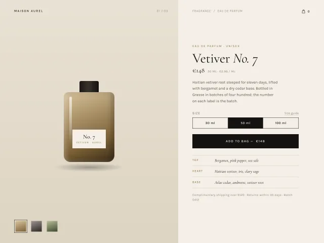
Fragrance product page: CSS-only bottle with three glass variants, Cormorant serif name, a size radio with a sliding black indicator, and an Add to bag button that morphs to a gold Added state.
3D product turn hero
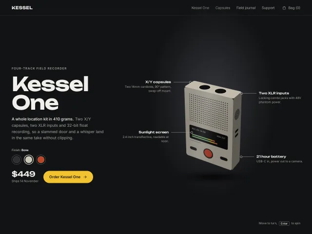
A shop hero for an invented field recorder built from six CSS 3D faces that turns toward the pointer on a spring, shades each face from one light, and pins four spec callouts.
Swiss grid pricing
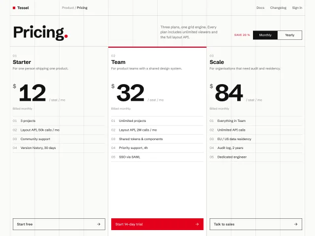
Pricing page on a visible 12-column hairline grid: three tiers in strict 4-column blocks, numbered features, red accent, and a monthly/yearly switch that tweens the prices.
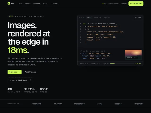
Dark devtool landing page
A full landing page for an edge image API: lime-on-graphite, tabbed curl/Node/Python samples with copy, a hairline feature grid, giant latency numerals and pricing.
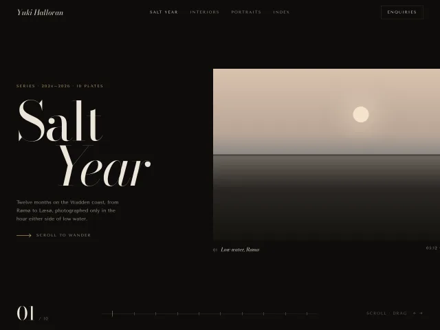
Photographer horizontal gallery
A 10-plate Wadden-coast series that scrolls sideways: 500px CSS photographs, 9% lerp drag, a 10-tick scrub bar and a 01/10 index.
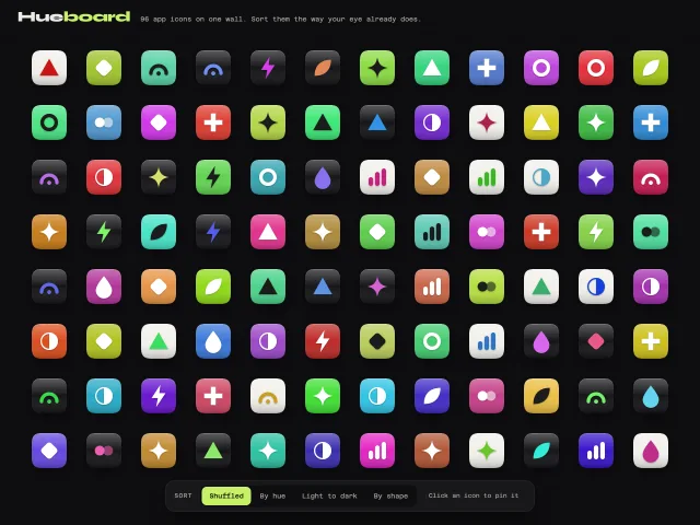
App icon colour wall
A dark edge-to-edge wall of 96 SVG app icons that re-sorts by hue, lightness or shape with a FLIP animation, hover names and a pinned colour readout.