Nº 568 of 605
Type-to-confirm delete dialog
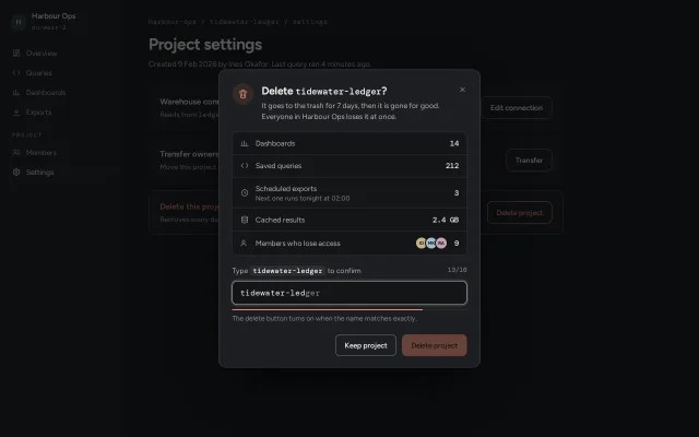
A destructive confirm that lists what will be lost with counts, enables Delete only when the project name is typed exactly, and shakes on a wrong character.
Preview
Use it
Free to use · credit appreciated1 Once, in your project · Node 22.20+
npx skills add SusanAcharya/Design-Lounge 2 Then ask
Using the Design Lounge skill, build "Type-to-confirm delete dialog" (piece dialog-type-to-confirm) in my stack. Match its brief; restyle it onto my product's theme.
No skill? Paste the brief instead. It carries the numbers, tokens and behaviour.
<!-- Design Lounge Nº 568 · "Type-to-confirm delete dialog" · www.designlounge.live -->

# Type-to-confirm delete dialog

> **Build brief for a coding agent.** Rebuild this piece in the reader's stack. If they haven't said which stack, ask once, then default to semantic HTML + CSS + a little vanilla JS. Match the numbers below; don't "improve" them.

## What it is

The last gate before deleting a project in a data console. A 480px modal over the project's settings page names the project in mono, then lists exactly what goes with it as an inventory with counts (14 dashboards, 212 saved queries, 3 scheduled exports, 2.4 GB of cache, 9 members). The Delete button stays disabled until the project name is typed exactly. The input shows the name as ghost text that the user types over, a 2px meter fills with each correct character, and the field shakes once the moment a character goes wrong. The danger colour is a calm clay (`#d9785f`) with dark ink on it, not a siren red: the dialog should feel serious, not panicked. The detail worth copying is the ghost-text input: the user can see where they are in the name and which character broke.

## Reference behaviour

1. Initial state: the dialog is already open over a dimmed settings page (scrim `rgba(8,9,10,.66)`). The input holds `tidewater-led`, the ghost shows the remaining `ger`, the meter is at 13/16 and Delete is disabled.
2. Each keystroke compares the value with `tidewater-ledger` character by character. The correct prefix length drives the meter width (`prefix / 16 × 100%`) and the counter `13/16` in the label row.
3. Ghost text: an overlay with the same font, padding and border box as the input shows the typed characters transparent and the rest of the name in `--ink-3`. Typed characters show through from the input in `--ink`.
4. First wrong character: the field border and a 3px ring turn clay, the ghost hides, the hint reads "Character 14 does not match. Names are lowercase with hyphens." and the field shakes once (360ms). Typing more wrong characters at the same position does not shake again; a new first-wrong position does.
5. Exact match: border turns sage `#9cc59a`, meter turns sage at 100%, hint reads "Name matches. Deleting is now possible.", Delete becomes enabled.
6. Enter or clicking Delete with a mismatch shakes the field and keeps focus in the input. Nothing else happens.
7. Delete with a match: a 14px spinner appears in the button, the label changes to "Deleting", and after 900ms the dialog closes. A toast rises at the bottom: "`tidewater-ledger` is in the trash until 4 Nov." with a Restore button, which receives focus.
8. "Keep project", the close button, Escape and a click on the scrim all close without deleting; focus returns to the page's "Delete project" button.
9. Reopen: the outlined "Delete project" button in the danger-zone card opens the dialog again with an empty input.

## Structure

```
1280 × 800
┌──────────┬──────────────────────────────────────────────────────────────┐
│ side 224 │ crumb (mono)        harbour-ops / tidewater-ledger / settings│
│ ws chip  │ h1 Project settings 30px                                     │
│ Overview │ ┌────────── card ──────┌──────── dialog 480 ────────┐──────┐ │
│ Queries  │ │ Warehouse connection │ (o) Delete tidewater-ledger? [x] │ │
│ Dashbds  │ └──────────────────────│     It goes to the trash...    │──┘ │
│ Exports  │ ┌──────────────────────│ ┌ loss list ───────────────┐   │──┐ │
│ PROJECT  │ │ Transfer ownership   │ │ Dashboards            14 │   │  │ │
│ Members  │ └──────────────────────│ │ Saved queries        212 │   │──┘ │
│▌Settings │ ┌── danger card ───────│ │ Scheduled exports      3 │   │──┐ │
│          │ │ Delete this project  │ │ Cached results    2.4 GB │   │  │ │
│          │ └──────────────────────│ │ Members  (o)(o)(o)     9 │   │──┘ │
│          │                        │ └──────────────────────────┘   │    │
│          │                        │ Type [tidewater-ledger]   13/16│    │

… 180 more lines. Copy or download for the full brief. Loading the source…Brief
220 linesBuild brief for a coding agent. Rebuild this piece in the reader’s stack. If they haven’t said which stack, ask once, then default to semantic HTML + CSS + a little vanilla JS. Match the numbers below; don’t “improve” them.
What it is
The last gate before deleting a project in a data console. A 480px modal over the project’s settings page names the project in mono, then lists exactly what goes with it as an inventory with counts (14 dashboards, 212 saved queries, 3 scheduled exports, 2.4 GB of cache, 9 members). The Delete button stays disabled until the project name is typed exactly. The input shows the name as ghost text that the user types over, a 2px meter fills with each correct character, and the field shakes once the moment a character goes wrong. The danger colour is a calm clay (#d9785f) with dark ink on it, not a siren red: the dialog should feel serious, not panicked. The detail worth copying is the ghost-text input: the user can see where they are in the name and which character broke.
Reference behaviour
- Initial state: the dialog is already open over a dimmed settings page (scrim
rgba(8,9,10,.66)). The input holdstidewater-led, the ghost shows the remainingger, the meter is at 13/16 and Delete is disabled. - Each keystroke compares the value with
tidewater-ledgercharacter by character. The correct prefix length drives the meter width (prefix / 16 × 100%) and the counter13/16in the label row. - Ghost text: an overlay with the same font, padding and border box as the input shows the typed characters transparent and the rest of the name in
--ink-3. Typed characters show through from the input in--ink. - First wrong character: the field border and a 3px ring turn clay, the ghost hides, the hint reads “Character 14 does not match. Names are lowercase with hyphens.” and the field shakes once (360ms). Typing more wrong characters at the same position does not shake again; a new first-wrong position does.
- Exact match: border turns sage
#9cc59a, meter turns sage at 100%, hint reads “Name matches. Deleting is now possible.”, Delete becomes enabled. - Enter or clicking Delete with a mismatch shakes the field and keeps focus in the input. Nothing else happens.
- Delete with a match: a 14px spinner appears in the button, the label changes to “Deleting”, and after 900ms the dialog closes. A toast rises at the bottom: “
tidewater-ledgeris in the trash until 4 Nov.” with a Restore button, which receives focus. - “Keep project”, the close button, Escape and a click on the scrim all close without deleting; focus returns to the page’s “Delete project” button.
- Reopen: the outlined “Delete project” button in the danger-zone card opens the dialog again with an empty input.
Structure
1280 × 800
┌──────────┬──────────────────────────────────────────────────────────────┐
│ side 224 │ crumb (mono)        harbour-ops / tidewater-ledger / settings│
│ ws chip  │ h1 Project settings 30px                                     │
│ Overview │ ┌────────── card ──────┌──────── dialog 480 ────────┐──────┐ │
│ Queries  │ │ Warehouse connection │ (o) Delete tidewater-ledger? [x] │ │
│ Dashbds  │ └──────────────────────│     It goes to the trash...    │──┘ │
│ Exports  │ ┌──────────────────────│ ┌ loss list ───────────────┐   │──┐ │
│ PROJECT  │ │ Transfer ownership   │ │ Dashboards            14 │   │  │ │
│ Members  │ └──────────────────────│ │ Saved queries        212 │   │──┘ │
│▌Settings │ ┌── danger card ───────│ │ Scheduled exports      3 │   │──┐ │
│          │ │ Delete this project  │ │ Cached results    2.4 GB │   │  │ │
│          │ └──────────────────────│ │ Members  (o)(o)(o)     9 │   │──┘ │
│          │                        │ └──────────────────────────┘   │    │
│          │                        │ Type [tidewater-ledger]   13/16│    │
│          │                        │ [tidewater-led|ger           ] │    │
│          │                        │ ━━━━━━━━━━━━━━━━━━━━━━━──────  │    │
│          │                        │ hint                           │    │
│          │                        │        [Keep project] [Delete] │    │
│          │                        └────────────────────────────────┘    │
└──────────┴──────────────────────────────────────────────────────────────┘- App shell:
<nav class="side" aria-label="Project">(224px) and<main>with three.cardrows, the last bordered in--danger-line. <dialog aria-labelledby aria-describedby>opened withshowModal(), containing<form method="dialog" novalidate>..hd: 40px round glyph (trash icon on--danger-soft),<h2>with the name in<code>,<p id="dd">consequence line, 32px close button.<ul class="loss" aria-label="What will be deleted">: five<li>rows, 16px icon + label + optional<small>+ mono count in<b>.- Confirm block:
<label for>row with the name in a<code>chip and an<output>counter,.field(ghost span + input, both absolutely positioned in a 44px box), 2px.meter,<p class="hint" aria-live="polite">. .acts: “Keep project” (outline) then “Delete project” (clay fill,disabled).
.toast role="status"fixed at bottom centre, outside the dialog.
Tokens
:root {
  /* surfaces, graphite with a faint warm bias */
  --bg: #111214;          /* page */
  --panel: #17181b;       /* sidebar, cards */
  --raise: #1d1f22;       /* dialog, toast */
  --well: #141518;        /* loss list, input */
  --line: #2a2c30;        /* hairlines */
  --line-2: #3a3d42;      /* dialog border */
  --edge: #70757c;        /* control borders, 3.56:1 on --raise */
  /* ink */
  --ink: #eeece6;         /* 13.98:1 on --raise */
  --ink-2: #b4b5b2;       /* 8.02:1 */
  --ink-3: #8c8e90;       /* 5.02:1, ghost text and meta */
  /* danger, calm clay */
  --danger: #e2876f;      /* text and icons, 6.24:1 on --raise */
  --danger-fill: #d9785f; /* button fill */
  --danger-hover: #e48d76;
  --danger-ink: #1b0d09;  /* text on fill, 6.14:1 */
  --danger-soft: rgba(226,135,111,.12);
  --danger-line: rgba(226,135,111,.34);
  --ok: #9cc59a;          /* exact match */
  --focus: #e9e3cf;
  --scrim: rgba(8,9,10,.66);
  /* type */
  --font: "Figtree", system-ui, sans-serif;
  --mono: "DM Mono", ui-monospace, monospace;
  /* size */
  --w: 480px;
  --r: 14px;              /* dialog */
  --r-ctl: 9px;           /* buttons, input */
  --h-ctl: 40px;
  --shadow: 0 1px 0 rgba(255,255,255,.04) inset, 0 40px 80px -24px rgba(0,0,0,.7);
  /* motion */
  --t-micro: 160ms;
  --t-open: 320ms;
  --t-shake: 360ms;
  --ease: cubic-bezier(.2,.7,.2,1);
  --ease-out: cubic-bezier(.16,1,.3,1);
  --ease-sheet: cubic-bezier(.32,.72,0,1);
}
Typography
| Role | Family | Size | Weight | Line-height | Tracking | Case |
|---|---|---|---|---|---|---|
| Page h1 | Figtree | 30px | 650 | 1.2 | -0.025em | sentence |
| Dialog title | Figtree | 20px | 650 | 1.25 | -0.02em | sentence |
| Name in title | DM Mono | 17px | 500 | 1.25 | -0.01em | lowercase |
| Body, loss labels | Figtree | 13.5px | 400 | 1.5 | 0 | sentence |
| Loss sub-line | Figtree | 12px | 400 | 1.35 | 0 | sentence |
| Loss counts | DM Mono | 14px | 500 | 1.5 | 0, tabular | numerals |
| Confirm input, ghost | DM Mono | 15px | 400 | 42px | 0.01em | lowercase |
| Counter, crumb | DM Mono | 12px | 400 | 1.4 | 0 | numerals |
| Hint | Figtree | 12.5px | 400 | 1.45 | 0 | sentence |
| Buttons | Figtree | 13.5px | 600 | 1 | 0 | sentence |
Motion
| Element | Trigger | Property | From → To | Duration | Easing |
|---|---|---|---|---|---|
| dialog | open | opacity, transform | 0, translateY(8px) scale(.98) → 1, none | 320ms | --ease / --ease-out |
| backdrop | open | background | transparent → --scrim | 320ms | --ease |
.field | first wrong character, or submit while wrong | translateX | 0, -7, 6, -4, 2, 0 px | 360ms | --ease |
.meter i | input | width, background | prefix % ; clay → sage | 160ms | --ease |
| input | state | border-color, box-shadow | edge → clay or sage | 160ms | --ease |
| sheet (< 640px) | open | transform | translateY(100%) → 0 | 320ms | --ease-sheet |
| toast | after delete | opacity, translateY | 0, 16px → 1, 0 | 320ms | --ease-out |
| spinner | deleting | rotate | 0 → 1turn | 700ms loop | linear (spinner only) |
Open and close use @starting-style plus transition-behavior: allow-discrete on display and overlay, so no JS timing is needed. Reduced motion: all transitions and animations drop to 1ms and the shake runs once at 1ms, so the state changes (ring colour, hint text) carry the message on their own.
States
- Empty: ghost shows the full name in
--ink-3, meter 0, counter0/16, hint “The delete button turns on when the name matches exactly.” - Typing, correct prefix: typed characters in
--ink, ghost continues the rest, meter clay. - Mismatch: border
--danger, ring0 0 0 3px var(--danger-soft), ghost hidden, hint in--dangernaming the character position. - Match: border and meter
--ok, Delete enabled. - Disabled Delete: opacity .4,
cursor: not-allowed, still focusable only when enabled. - Deleting: spinner visible, label “Deleting”, repeated submits ignored.
- Hover: outline buttons fill
--raise; Delete fill lightens to--danger-hover; close button fills--line. - Focus-visible: 2px
--focusoutline, 2px offset on every button; the input shows a 3pxrgba(233,227,207,.12)ring and an--ink-2border instead of an outline.
Accessibility
showModal()makes the page inert, so Tab cycles inside the dialog: close, input, Keep project, Delete (when enabled).- Escape closes (native
cancel). Scrim click closes. Focus returns to the opener, or to Restore after a delete. - The input is labelled by the visible
<label for="name">, which includes the name;aria-describedby="hint"ties the live hint to it. The hint isaria-live="polite"so “Character 14 does not match” is announced. - The ghost span and counter are
aria-hidden. The name chip in the label hasuser-select: allso one click selects it for copying. autocomplete="off",spellcheck="false",autocapitalize="off"on the input.- Contrast: all text passes 4.5:1 on its surface (figures in Tokens). Control borders
--edgeare 3.56:1 on the dialog and 3.93:1 on the well. - Buttons are 40px tall on desktop and 46px full-width on the phone sheet.
Responsive rules
- ≥ 1280: as specified, dialog centred at 480px.
- 1024: unchanged.
- < 860: sidebar hidden, cards stack their button under the text, h1 24px, page padding 24px 20px.
- < 640: the dialog becomes a bottom sheet: full width,
margin: auto 0 0, radius18px 18px 0 0, top border only, rises fromtranslateY(100%)on--ease-sheet. Padding 20px 16px 28px. Buttons stack full width at 46px, Delete above Keep project. The label row may wrap.
Acceptance checklist
Always
- The dialog opens with
showModal(), traps Tab, closes on Escape and on a scrim click, and returns focus to its opener. - The destructive button is disabled until the typed value equals the name exactly (case and hyphens included).
- The loss list shows every kind of thing deleted with a count in a tabular mono face, right-aligned.
- The ghost overlay lines up with the input text to the pixel: same font, size, letter-spacing, padding and border width.
- The field shakes once per new first-wrong position, and again on submit while wrong.
- The hint is a polite live region and names the character position that broke.
- Danger text and fills pass 4.5:1; control borders pass 3:1.
- Below 640px the dialog is a full-width bottom sheet with stacked 46px buttons and no sideways scroll at 390px.
- Reduced motion removes the rise and shake but keeps every colour and text change.
This demo
- Title reads “Delete tidewater-ledger?” with the name in DM Mono 17px.
- Counts read 14, 212, 3, 2.4 GB and 9, with “Next one runs tonight at 02:00” under exports.
- First frame shows
tidewater-ledtyped,geras ghost, counter13/16. - After deleting, a toast says the project is in the trash until 4 Nov with a Restore button.
Implementation notes
Ghost text over a real input. Stack a span and the input in the same box; the span paints the typed part transparent so only the remainder shows. Hide the ghost when the prefix breaks.
.field { position: relative; height: 44px; }
.field input, .ghost { position: absolute; inset: 0; margin: 0; padding: 0 14px;
  font: 15px/42px var(--mono); letter-spacing: .01em; border-radius: 9px; white-space: pre; }
.ghost { border: 1px solid transparent; color: var(--ink-3); pointer-events: none; z-index: 1; }
.ghost s { text-decoration: none; color: transparent; }
Prefix compare and shake once per break. Count the matching prefix, then only shake when the break position changes. Restart a CSS animation by removing the class and forcing a reflow.
let ok = 0; while (ok < v.length && v[ok] === NAME[ok]) ok++;
const bad = ok < v.length;
ghost.innerHTML = '<s>' + esc(v) + '</s>' + (bad ? '' : esc(NAME.slice(v.length)));
if (bad && lastBad !== ok) { field.classList.remove('shake'); void field.offsetWidth; field.classList.add('shake'); }
lastBad = bad ? ok : -1;
go.disabled = v !== NAME;
Sheet on phones with the same element. Change the margin and transform only; do not build a second component.
@media (max-width: 640px) {
  dialog { width: 100%; max-width: 100%; margin: auto 0 0; border-radius: 18px 18px 0 0;
           transform: translateY(100%); }
  dialog[open] { transform: none; }
  @starting-style { dialog[open] { transform: translateY(100%); } }
}
Common mistakes: comparing with trim() or toLowerCase() (the point is an exact match); a red #ff0000 fill with white text, which shouts and fails contrast; letting the ghost use a different font size from the input so it drifts after eight characters; disabling the button with pointer-events: none, which also kills the shake on click.
Details
- Palette
- Type
- Figtree · DM Mono
- Motion
- Subtle motion
- Build
- One session
- Tags
Similar
Modal dialog with focus trap
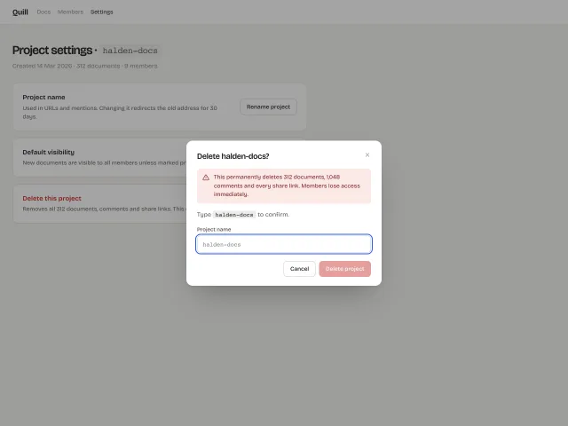
Native <dialog> modals that open with a 240ms scale .96→1 and scrim fade, trap focus, close on Esc or scrim click, plus a destructive variant gated by a type-to-confirm input.
Command palette
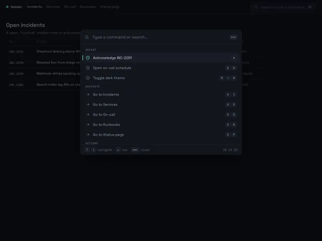
A ⌘K command palette that opens with a 200ms scale-and-fade, fuzzy-filters 20 grouped commands, and is fully driven from the keyboard with shortcut hints on the right.
Drag to confirm
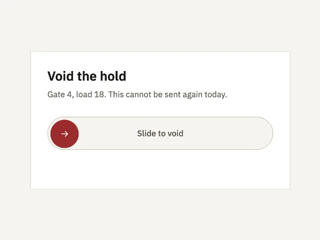
A 56px track. The thumb must travel to the end before a hold is voided. A short drag snaps back.
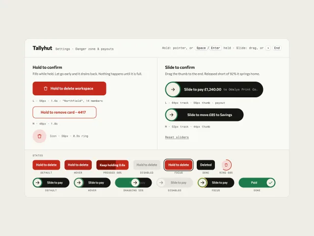
Hold and slide to confirm
Hold-to-delete buttons that fill while held and drain on release, plus slide-to-pay tracks that spring home short of 92%, all with keyboard paths.
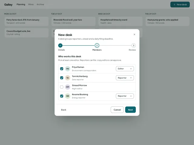
Three-step wizard dialog
A 560px creation wizard in one modal: details, members, review, with a step track, per-step validation and a panel height that animates between steps.
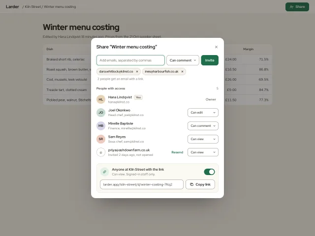
Share and invite dialog
A 540px share dialog: email chips with live validation, a role per person, pending invites with Resend, and a link-access switch with Copy link.