Nº 038 of 520
Multi-step form stepper
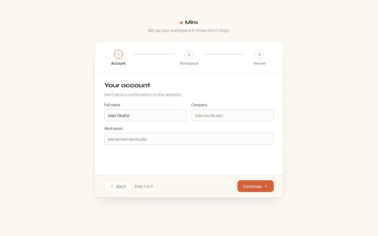
A three-step workspace setup with a horizontal stepper whose connectors fill on completion, direction-aware 40px slide transitions, validation on Continue and a review step with Edit links.
Preview
Use it
Free to use · credit appreciated1 Once, in your project
npx skills add SusanAcharya/Design-Lounge 2 Then ask
Using the Design Lounge skill, build "Multi-step form stepper" (piece multi-step-form-stepper) in my stack. Match its brief; restyle it onto my product's theme.
No skill? Paste the brief instead. It carries the numbers, tokens and behaviour.
<!-- Design Lounge Nº 038 · "Multi-step form stepper" · www.designlounge.live -->

# Multi-step form stepper

> **Build brief for a coding agent.** Rebuild this piece in the reader's stack. If they haven't said which stack, ask once, then default to semantic HTML + CSS + a little vanilla JS. Match the numbers below; don't "improve" them.

## What it is

A 640px setup card for a fictional SaaS ("Mira") that collects an account, a workspace and then shows a review before creating it. Three numbered 28px dots sit across the top joined by 2px connector tracks; when a step completes, its dot fills terracotta with a check and the connector after it fills left-to-right over 320ms. The step panels slide horizontally: going forward the old panel exits 40px to the left and the new one enters from 40px right; going back the directions reverse. Continue validates the current step before moving; the review step lists every answer with an Edit link that jumps back to the right step. Warm off-white, one accent, no shadows heavier than a whisper.

## Reference behaviour

1. Initial state: card centred with 64px above it; brand "Mira" and a lead line. Stepper shows **1 Account** current (accent ring + 4px `--accent-soft` halo), 2 Workspace and 3 Review upcoming (grey ring). Panel 1 is visible: Full name (pre-filled "Ines Okafor"), Company (empty), Work email (empty). Footer: Back (disabled), "Step 1 of 3", Continue.
2. Click Continue with Company empty: Company gets `aria-invalid="true"`, a red border with a 3px `#f6e0dc` halo, and the message "Company is required." appears beneath it; focus moves to the first invalid field. No slide.
3. Type in an invalid field: its error clears immediately on `input`.
4. Enter "x" in Work email and Continue: "Enter a valid email address." (regex `^[^\s@]+@[^\s@]+\.[^\s@]+$`).
5. With valid fields, Continue: panel 1 slides to `translateX(-40px)` and fades out; panel 2 arrives from `translateX(40px)` — both 320ms. Dot 1 fills accent with a check; connector 1 fills over 320ms; dot 2 becomes current. Footer reads "Step 2 of 3", Back enables. After the slide (330ms) focus lands on the first field of the new panel.
6. Panel 2: Workspace name (pre-filled "marrow"), Data region select (Frankfurt, Dublin, Oregon, Singapore), Team size radio segment (Just me / 2–10 / 11–50 / 50+; 2–10 checked). Continue → panel 3 (Review) with Continue relabelled "Create workspace".
7. Review lists six rows (Full name, Company, Work email, Workspace name, Data region, Team size) each with an accent **Edit** link. Clicking Edit on a row goes to that row's step; the slide runs in the backward direction (panels to the right of the target enter from the left... i.e. current panel exits to the right, target enters from the left).
8. Back: same backward slide; connectors un-fill (scaleX 0) and dots revert.
9. Create workspace: a fourth "finish" panel slides in — 56px accent circle with a check, "Workspace created", "marrow.mira.app is ready in Frankfurt." and a "Start over" link. The footer is hidden. Start over returns to step 1 with the backward slide.

## Structure

```
1280 × 800
┌──────────────────────────────────────────────────────────────────────────┐
│                              ◆ Mira                                      │ 64 top pad
│                    Set up your workspace in three short steps.          │
│              ┌────────────────── 640 ──────────────────┐                 │
│              │  (1)────────────(2)────────────(3)      │ stepper 28/32/24│
│              │ Account       Workspace      Review     │ dots 28, 96 wide│
│              ├────────────────────────────────────────┤ hairline        │
│              │ Your account                            │ panel 344 tall  │
│              │ We'll send a confirmation…              │ pad 28/32       │
│              │ ┌ Full name ─────┐ ┌ Company ────────┐  │ 2-col, 16 gap   │
│              │ │ Ines Okafor    │ │ Marrow Studio   │  │ inputs 40       │
│              │ └────────────────┘ └─────────────────┘  │                 │
│              │ ┌ Work email ─────────────────────────┐ │                 │
│              │ │ ines@marrow.studio                  │ │                 │

… 209 more lines. Copy or download for the full brief. Loading the source…Brief
249 linesBuild brief for a coding agent. Rebuild this piece in the reader’s stack. If they haven’t said which stack, ask once, then default to semantic HTML + CSS + a little vanilla JS. Match the numbers below; don’t “improve” them.
What it is
A 640px setup card for a fictional SaaS (“Mira”) that collects an account, a workspace and then shows a review before creating it. Three numbered 28px dots sit across the top joined by 2px connector tracks; when a step completes, its dot fills terracotta with a check and the connector after it fills left-to-right over 320ms. The step panels slide horizontally: going forward the old panel exits 40px to the left and the new one enters from 40px right; going back the directions reverse. Continue validates the current step before moving; the review step lists every answer with an Edit link that jumps back to the right step. Warm off-white, one accent, no shadows heavier than a whisper.
Reference behaviour
- Initial state: card centred with 64px above it; brand “Mira” and a lead line. Stepper shows 1 Account current (accent ring + 4px
--accent-softhalo), 2 Workspace and 3 Review upcoming (grey ring). Panel 1 is visible: Full name (pre-filled “Ines Okafor”), Company (empty), Work email (empty). Footer: Back (disabled), “Step 1 of 3”, Continue. - Click Continue with Company empty: Company gets
aria-invalid="true", a red border with a 3px#f6e0dchalo, and the message “Company is required.” appears beneath it; focus moves to the first invalid field. No slide. - Type in an invalid field: its error clears immediately on
input. - Enter “x” in Work email and Continue: “Enter a valid email address.” (regex
^[^\s@]+@[^\s@]+\.[^\s@]+$). - With valid fields, Continue: panel 1 slides to
translateX(-40px)and fades out; panel 2 arrives fromtranslateX(40px)— both 320ms. Dot 1 fills accent with a check; connector 1 fills over 320ms; dot 2 becomes current. Footer reads “Step 2 of 3”, Back enables. After the slide (330ms) focus lands on the first field of the new panel. - Panel 2: Workspace name (pre-filled “marrow”), Data region select (Frankfurt, Dublin, Oregon, Singapore), Team size radio segment (Just me / 2–10 / 11–50 / 50+; 2–10 checked). Continue → panel 3 (Review) with Continue relabelled “Create workspace”.
- Review lists six rows (Full name, Company, Work email, Workspace name, Data region, Team size) each with an accent Edit link. Clicking Edit on a row goes to that row’s step; the slide runs in the backward direction (panels to the right of the target enter from the left… i.e. current panel exits to the right, target enters from the left).
- Back: same backward slide; connectors un-fill (scaleX 0) and dots revert.
- Create workspace: a fourth “finish” panel slides in — 56px accent circle with a check, “Workspace created”, “marrow.mira.app is ready in Frankfurt.” and a “Start over” link. The footer is hidden. Start over returns to step 1 with the backward slide.
Structure
1280 × 800
┌──────────────────────────────────────────────────────────────────────────┐
│                              ◆ Mira                                      │ 64 top pad
│                    Set up your workspace in three short steps.          │
│              ┌────────────────── 640 ──────────────────┐                 │
│              │  (1)────────────(2)────────────(3)      │ stepper 28/32/24│
│              │ Account       Workspace      Review     │ dots 28, 96 wide│
│              ├────────────────────────────────────────┤ hairline        │
│              │ Your account                            │ panel 344 tall  │
│              │ We'll send a confirmation…              │ pad 28/32       │
│              │ ┌ Full name ─────┐ ┌ Company ────────┐  │ 2-col, 16 gap   │
│              │ │ Ines Okafor    │ │ Marrow Studio   │  │ inputs 40       │
│              │ └────────────────┘ └─────────────────┘  │                 │
│              │ ┌ Work email ─────────────────────────┐ │                 │
│              │ │ ines@marrow.studio                  │ │                 │
│              │ └─────────────────────────────────────┘ │                 │
│              ├────────────────────────────────────────┤ hairline        │
│              │ [‹ Back]  STEP 1 OF 3        [Continue ›]│ footer 18/32    │
│              └────────────────────────────────────────┘                 │
└──────────────────────────────────────────────────────────────────────────┘
<form class="card" novalidate>— 640px, white, 1px--lineborder, 16px radius,overflow:hidden, shadow0 1px 2px rgba(34,30,27,.04), 0 24px 48px -24px rgba(34,30,27,.18).<ol class="steps" aria-label="Progress">— flex, padding28px 32px 24px, bottom hairline. Children alternate<li class="step" data-i>(96px wide column:.dot+<b>label) and<li class="conn" aria-hidden><i></i></li>(flex 1, 2px tall,margin-top:13pxso it centres on the dot)..panels—position:relative; height:344px; overflow:hidden. Four<section class="panel" data-pos="left|on|right" aria-labelledby>: absoluteinset:0, padding28px 32px, flex column, 16px gap.- Fields:
<label class="f">Label<input …><span class="msg" aria-live="polite"></span></label>; two-column rows use.two(grid 1fr 1fr, 16px gap). Radio segment:<fieldset><legend>+.segof hidden radios with sibling labels. - Review:
<ul class="review">of<li>with grid140px 1fr auto. - Finish panel:
.finishcentred content.
- Fields:
.foot— flex, padding18px 32px, top hairline,--bgbackground: Back button, step counter, primary submit button (margin-left:auto).
Fields and validation
| Step | Field | Control | Initial value | Rule | Message |
|---|---|---|---|---|---|
| 1 | Full name | input[name=name] required | “Ines Okafor” | non-empty after trim | “Full name is required.” |
| 1 | Company | input[name=company] required | "" (placeholder “Marrow Studio”) | non-empty | “Company is required.” |
| 1 | Work email | input[type=email][name=email] required | "" (placeholder “ines@marrow.studio”) | non-empty, then ^[^\s@]+@[^\s@]+\.[^\s@]+$ | “Work email is required.” / “Enter a valid email address.” |
| 2 | Workspace name | input[name=ws] required | “marrow” | non-empty | “Workspace name is required.” |
| 2 | Data region | select[name=region] | Frankfurt (eu-central) | always valid; options Dublin (eu-west), Oregon (us-west), Singapore (ap-south) | — |
| 2 | Team size | radio name=size | “2–10” | always valid (Just me / 2–10 / 11–50 / 50+) | — |
Validation runs only for input[required] inside the current panel; the select and radios are never invalid. Messages are set on the sibling .msg span (12px 500 --err), which is display:none when empty so the layout doesn’t shift for valid fields.
Review rows
| Row label | Source field | Edit → step |
|---|---|---|
| Full name | name | 1 |
| Company | company | 1 |
| Work email | 1 | |
| Workspace name | ws | 2 |
| Data region | region | 2 |
| Team size | size | 2 |
Values come from new FormData(form) at the moment step 3 opens; an empty value renders as ”—”. The finish message is ${ws}.mira.app is ready in ${region.split(' ')[0]}. (e.g. “marrow.mira.app is ready in Frankfurt.”).
Tokens
:root {
  /* colour — warm off-white, one terracotta accent */
  --bg: #fbf8f4;          /* page + footer */
  --panel: #ffffff;       /* card, dots */
  --field: #fdfcfa;       /* input background */
  --line: #e8e1d8;        /* hairlines, connector track */
  --line-2: #d3c9bc;      /* input + upcoming dot border */
  --ink: #221e1b;
  --ink-2: #5f5750;       /* labels, done step labels */
  --ink-3: #948a80;       /* upcoming labels, lead, counter */
  --accent: #d2603a;      /* current ring, done fill, connector fill, primary */
  --accent-hover: #b9502c;
  --accent-ink: #fff8f3;
  --accent-soft: #fbe9e1; /* halos, checked segment */
  --err: #b8321f;
  --err-soft: #f6e0dc;
  --ok: #2f7a4a;          /* reserved */

  /* type */
  --display: "Syne", system-ui, sans-serif;
  --font: "Manrope", system-ui, sans-serif;

  /* layout */
  --w: 640px;
  --dot: 28px;
  --step-w: 96px;
  --panel-h: 344px;
  --input-h: 40px;
  --r: 10px;              /* inputs, buttons */
  --r-card: 16px;
  --slide: 40px;          /* panel travel */
  --shadow: 0 1px 2px rgba(34,30,27,.04), 0 24px 48px -24px rgba(34,30,27,.18);

  /* motion */
  --t-fast: 140ms;        /* dot colour, borders */
  --t-slide: 320ms;
  --t-fill: 320ms;        /* connector */
  --focus-delay: 330ms;   /* focus after slide */
  --ease: cubic-bezier(.2, .7, .2, 1);
  --ease-out: cubic-bezier(.16, 1, .3, 1);
}
Typography
| Role | Family | Size | Weight | Line-height | Tracking | Notes |
|---|---|---|---|---|---|---|
| Brand | Syne | 18px | 700 | 1 | −0.02em | 8px rotated-square accent glyph before |
| Panel heading | Syne | 22px | 700 | 1.2 | −0.02em | |
| Lead / helper | Manrope | 14px | 400 | 1.5 | 0 | --ink-3 |
| Field label | Manrope | 12px | 600 | 1.3 | 0 | --ink-2 |
| Input text | Manrope | 14px | 400 | 40px height | 0 | |
| Error message | Manrope | 12px | 500 | 1.3 | 0 | --err |
| Step label | Manrope | 12px | 600 | 1.3 | 0 | --ink-3 → --ink current → --ink-2 done |
| Dot number | Manrope | 12px | 600 | 1 | 0 | |
| Step counter | Manrope | 12px | 600 | 1 | +0.04em | --ink-3 |
| Buttons | Manrope | 14px | 600 | 40px height | 0 | |
| Review label | Manrope | 12px | 600 | 1.3 | 0 | --ink-3; value 13px 400 --ink |
Motion
| Element | Trigger | Property | From → To | Duration | Easing | Notes |
|---|---|---|---|---|---|---|
| outgoing panel | forward | transform, opacity | none, 1 → translateX(-40px), 0 | 320ms | transform --ease-out, opacity --ease | visibility hidden after |
| incoming panel | forward | transform, opacity | translateX(40px), 0 → none, 1 | 320ms | same | starts simultaneously |
| panels | backward | same, mirrored | current → +40px; target from −40px | 320ms | same | direction falls out of data-pos |
.conn i | step completes | transform scaleX | 0 → 1 (origin left) | 320ms | --ease | reverses on Back |
.dot | state change | background, border, colour, box-shadow | per state | 140ms | --ease | |
| input | focus / invalid | border-color, box-shadow | --line-2 → --accent + 3px halo | 140ms | linear (default) | |
| focus move | after slide | — | first field of new panel | 330ms delay | — | so focus doesn’t drag the panel |
Reduced motion: all durations 1ms (panels swap in place; connectors fill instantly). Keep the 330ms focus delay at ~1ms too if you gate it on the same media query.
States
- Step upcoming: dot white with 1.5px
--line-2border, number--ink-3; label--ink-3. - Step current: dot border
--accent, number--accent,box-shadow: 0 0 0 4px var(--accent-soft); label--ink;aria-current="step". - Step done: dot filled
--accent, check icon in--accent-ink(number hidden); label--ink-2; connector after it filled. - Input default:
--fieldbackground,--line-2border, 10px radius. Hover: border--ink-3. Focus-visible: border--accent+ 3px--accent-softhalo. Invalid: border--err+ 3px--err-softhalo, message visible. - Segment radio checked: border + text
--accent, background--accent-soft. Focus-visible: 3px--accent-softhalo on the label. - Back disabled: opacity .45, default cursor.
- Primary button:
--accent; hover--accent-hover; focus-visible 2px accent outline offset 2px. - Edit link:
--accent12/600; hover underline; focus-visible 2px outline. - Finish: footer
visibility:hidden; panel content centred.
Accessibility
- The stepper is an
<ol aria-label="Progress">; the current step hasaria-current="step". Dots arearia-hidden(the label carries the name); connectors arearia-hidden. - Each panel is a
<section aria-labelledby>its heading. Inactive panels arevisibility:hiddenso their fields leave the tab order. - Validation:
novalidateon the form, custom messages in a<span aria-live="polite">inside the label so they are announced and associated;aria-invalidtoggled on the input; first invalid field receives focus. - Keyboard: Tab through fields; Enter in any field submits the form (Continue); Back is a
type="button"; radios move with arrow keys natively; Edit links are real links witharia-label="Edit company"etc. - Focus management: after each slide, focus the first input/select (or the first link on Review) after 330ms.
- Contrast:
--ink-2on white 7.6:1;--ink-3on white 3.5:1 — used only for 12px 600 labels and helper text, never for values;--accent-inkon--accent4.6:1. - Hit targets: inputs and buttons 40px; segment options 40px; dots are non-interactive.
Responsive rules
- ≥ 1280: as specified.
- 1024–1279: unchanged.
- 768–1023: card
width: min(640px, calc(100vw − 48px)); step columns shrink to 80px. - < 640: card full-width with 16px margins, radius 12px;
.twobecomes one column;--panel-hgrows to 420px (or switch panels toposition:staticand animateheightwith a measured value); stepper labels hide except the current one, which renders inline next to its dot; footer buttons stretch to equal widths.
Acceptance checklist
- Card is 640px, 16px radius, 1px
#e8e1d8border; stepper padding28px 32px 24px; panel area 344px tall. - Dots are 28px; the current dot has an accent ring and a 4px
#fbe9e1halo; done dots fill#d2603awith a check. - Connector tracks are 2px
#e8e1d8; the accent fill scales from 0 to 1 (origin left) over 320ms on step completion and back on Back. - Forward: outgoing panel to −40px, incoming from +40px; backward mirrors; both 320ms
cubic-bezier(.16,1,.3,1)with an opacity crossfade. - Continue with empty Company shows “Company is required.” and focuses that field; no slide occurs.
- Invalid email shows “Enter a valid email address.”; typing clears the error.
- Review step lists six rows with the entered values and an Edit link per row; Edit jumps to the correct step with the backward slide.
- Footer counter reads “Step N of 3”; Back is disabled on step 1; the submit button reads “Create workspace” on step 3.
- Finish panel hides the footer and offers “Start over”, which returns to step 1.
- Focus lands on the new panel’s first field ~330ms after each transition.
- Inactive panels are
visibility:hidden(not reachable by Tab). -
aria-current="step"moves with the current step;aria-invalidtoggles on fields. - Reduced motion: transitions collapse to 1ms; everything still works.
Implementation notes
Direction-aware slides with one attribute. Don’t track “direction” — derive each panel’s position from its index relative to the current step. Panels left of the current one park at −40px, right of it at +40px; a change of cur moves the two affected panels in opposite, correct directions automatically:
.panel { position: absolute; inset: 0; opacity: 0; visibility: hidden;
         transition: transform 320ms var(--ease-out), opacity 320ms var(--ease); }
.panel[data-pos="left"]  { transform: translateX(-40px); }
.panel[data-pos="right"] { transform: translateX(40px); }
.panel[data-pos="on"]    { transform: none; opacity: 1; visibility: visible; }
function go(i) {
cur = i;
panels.forEach((p, k) => p.dataset.pos = k < i ? 'left' : k > i ? 'right' : 'on');
steps.forEach((s, k) => { s.classList.toggle('done', k < i); s.classList.toggle('current', k === i);
s.setAttribute('aria-current', k === i ? 'step' : 'false'); });
conns.forEach((c, k) => c.classList.toggle('done', k < i));
setTimeout(() => panels[i].querySelector('input:not([type=radio]),select,a')?.focus(), 330);
}Validate only the visible panel, focus the first failure, and clear on input:
function validate(i) {
  let first = null;
  panels[i].querySelectorAll('input[required]').forEach(el => {
    const v = el.value.trim(); let m = '';
    if (!v) m = LABEL[el.name] + ' is required.';
    else if (el.type === 'email' && !/^[^\s@]+@[^\s@]+\.[^\s@]+$/.test(v)) m = 'Enter a valid email address.';
    el.setAttribute('aria-invalid', String(!!m));
    el.parentElement.querySelector('.msg').textContent = m;
    if (m && !first) first = el;
  });
  if (first) first.focus();
  return !first;
}
Common mistakes: focusing the new panel’s field immediately (the browser scrolls the still-translated panel and the slide jumps); using display:none for parked panels (no transition); animating the connector’s width instead of scaleX; forgetting novalidate (native bubbles fight your messages).
Details
- Palette
- Type
- Syne · Manrope
- Motion
- Subtle motion
- Build
- One session
- Tags
On the shelves