Nº 357 of 520
Plain list empty
An empty runs list: a heading, one sentence, and one button. No illustration, no second action, no joke.
Preview
Use it
Free to use · credit appreciated1 Once, in your project
npx skills add SusanAcharya/Design-Lounge 2 Then ask
Using the Design Lounge skill, build "Plain list empty" (piece list-empty-plain) in my stack. Match its brief; restyle it onto my product's theme.
No skill? Paste the brief instead. It carries the numbers, tokens and behaviour.
<!-- Design Lounge Nº 357 · "Plain list empty" · www.designlounge.live -->

# Plain list empty

> **Build brief for a coding agent.** Rebuild this piece in the reader's stack. If they haven't said which stack, ask once, then default to semantic HTML + CSS + a little vanilla JS. Match the numbers below; don't "improve" them. When a kit is locked, map colours onto the kit tokens. Keep one button.

## What it is

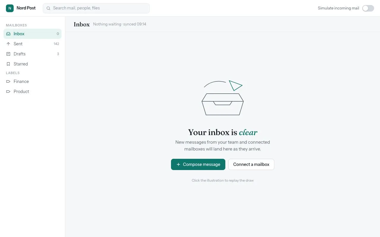
The empty state of a runs list in an ops tool. A 64px header says Runs. The rest of the page is paper, and the message sits in the centre of that space: "No runs today", one sentence, and a single primary button, New run. There is no drawing, no inbox tray, and no second button. New run changes its label to "Run opened" and disables. Use this when a table or a list has zero rows. Use the illustrated empty only when the product is a consumer inbox and that piece was named.

## Reference behaviour

1. First frame is the empty message, centred. The header is already there.
2. New run sets its text to "Run opened" and disables. Opacity follows the disabled attribute, about 0.55.
3. It does not insert a row. The empty copy stays.
4. No motion.
5. Focus ring 2px `--focus`, offset 2px.
6. The message block is at most 360px wide and centre-aligned.
7. One button. Do not add "Learn more".

## Structure

```
header 64px: Runs
well, grid place-items center
block max-width 360, text-align center
h2, sentence, button
```

- The header is a real `header`. The title is an `h1` even at 20px, because the page has one title.
- The empty heading is an `h2`.

## Tokens

```css
:root {
  --bg: #f6f4ef;
  --surface: #ffffff;
  --ink: #161513;
  --ink-2: #5a554c;

… 116 more lines. Copy or download for the full brief. Loading the source…Brief
156 linesBuild brief for a coding agent. Rebuild this piece in the reader’s stack. If they haven’t said which stack, ask once, then default to semantic HTML + CSS + a little vanilla JS. Match the numbers below; don’t “improve” them. When a kit is locked, map colours onto the kit tokens. Keep one button.
What it is
The empty state of a runs list in an ops tool. A 64px header says Runs. The rest of the page is paper, and the message sits in the centre of that space: “No runs today”, one sentence, and a single primary button, New run. There is no drawing, no inbox tray, and no second button. New run changes its label to “Run opened” and disables. Use this when a table or a list has zero rows. Use the illustrated empty only when the product is a consumer inbox and that piece was named.
Reference behaviour
- First frame is the empty message, centred. The header is already there.
- New run sets its text to “Run opened” and disables. Opacity follows the disabled attribute, about 0.55.
- It does not insert a row. The empty copy stays.
- No motion.
- Focus ring 2px
--focus, offset 2px. - The message block is at most 360px wide and centre-aligned.
- One button. Do not add “Learn more”.
Structure
header 64px: Runs
well, grid place-items center
block max-width 360, text-align center
h2, sentence, button- The header is a real
header. The title is anh1even at 20px, because the page has one title. - The empty heading is an
h2.
Tokens
:root {
  --bg: #f6f4ef;
  --surface: #ffffff;
  --ink: #161513;
  --ink-2: #5a554c;
  --line: #e4dfd4;
  --primary: #1f4d3a;
  --primary-ink: #f6f4ef;
  --focus: #1f4d3a;
  --font-text: "IBM Plex Sans", system-ui, sans-serif;
  --radius: 2px;
}
Typography
- Header title: IBM Plex Sans 500, 20px.
- Empty heading: 28px, weight 500, tracking -0.02em. The screen title is 20px. The empty heading is the answer, so it is the larger type.
- Sentence: 14px,
--ink-2, margin 0 0 18px. - Button: 14px, weight 500, height 36px, radius 2px, fill
#1f4d3a, ink#f6f4ef. - One face. No italic display word.
Motion
None. Reduced motion changes nothing.
States
- Button “New run”, enabled.
- Button “Run opened”, disabled.
- The heading and sentence do not change.
Accessibility
- The empty heading is text, not an image.
- The button has a visible label.
- Header and empty region are in the document, not a dialog.
- Contrast of
#5a554con#f6f4efmust stay at or above 4.5. If a locked theme’s--ink-2fails, use that theme’s--ink. - Button height 36px on web. On a phone rebuild, use 44px.
Responsive rules
- At 1280 the header padding is 0 32px and the message is centred in the remaining height.
- At 768 the same centring holds.
- Below 640 the message padding is 20px and the button can be full width of the 360px block.
Acceptance checklist
- Header reads Runs and is 64px tall.
- Heading is “No runs today”.
- Sentence is “The yard is clear. A new load shows up in this list.”
- One button, “New run”.
- The button becomes “Run opened” and disables.
- No illustration, no second button, no emoji.
- The block is centred and max 360px.
- One typeface, IBM Plex Sans.
- Radius on the button is 2px.
Implementation notes
Do not mount a table with zero rows and a sentence inside the first cell. The empty state replaces the list.
Rebuild order:
- Page
#f6f4ef. Header white, 64px, bottom rule#e4dfd4. - Header padding 0 32px. Title 20px weight 500.
- The well is
flex: 1anddisplay: grid; place-items: center. - Block max-width 360px,
text-align: center. - Heading 28px, margin 0 0 8px. The 20px screen title stays smaller.
- Sentence colour
#5a554c, margin 0 0 18px. - Button height 36, padding 0 14px, radius 2, no border.
- Disabled opacity 0.55.
- Do not add a search field to this screen.
- Do not add a sidebar. The header is the chrome.
Copy you keep:
- Title “Runs”.
- Heading “No runs today”.
- Sentence “The yard is clear. A new load shows up in this list.”
- Button “New run” then “Run opened”.
- Fill
#1f4d3a, label#f6f4ef. - Block width 360px.
- Header height 64px.
- No count badge in the header.
- No illustration path.
- No link under the button.
Common mistakes:
- A line drawing of a box or a tray. That is the other empty piece.
- Two buttons.
- “Oops” or “Nothing here yet!” with a bang.
- An italic word in a serif.
- Centring the header title. The header title stays at the start.
- Replacing the whole page with a 404.
- Adding a row when the button is pressed.
- A dashed border around the message.
Where it sits in a product:
- Use it when the list request succeeded and the count is zero.
- Do not use it when the request failed. That is the retry banner.
- The header of the product stays. Only the list region is replaced.
- Filters that hide every row can reuse this block, with the same heading.
- Do not put the empty block inside a table row.
- The button is the primary of that view. Remove any other primary.
- On a phone, the block stays centred between the header and the tab bar.
- Padding around the block is the well, not a card with a shadow.
- Do not add a help link, a docs URL, or an email address.
- The illustrated inbox empty is a different piece. Do not merge them.
- The page background stays
#f6f4ef. Do not put the message on a gray card. - The header rule is 1px
#e4dfd4. - There is no count of zero in the header.
- There is no avatar, icon, or arrow on the button.
- Body text is 14px. Do not bump the sentence to 18px.
Details
- Palette
- Type
- IBM Plex Sans
- Motion
- Static
- Build
- Quick build
- Tags
On the shelves