Nº 029 of 520
Luxe serif design style
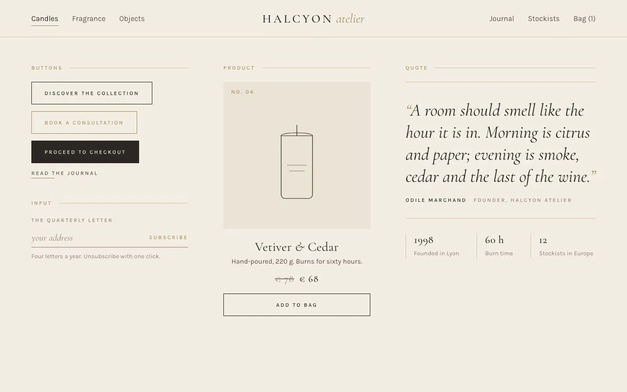
High-contrast Cormorant Garamond with Karla small caps, hairline gold rules, cream and charcoal surfaces and centre-out underlines; a nav, four buttons, a newsletter input, a product card and a quote.
Preview
Use it
Free to use · credit appreciated1 Once, in your project
npx skills add SusanAcharya/Design-Lounge 2 Then ask
Using the Design Lounge skill, build "Luxe serif design style" (piece luxe-serif-style) in my stack. Match its brief; restyle it onto my product's theme.
No skill? Paste the brief instead. It carries the numbers, tokens and behaviour.
<!-- Design Lounge Nº 029 · "Luxe serif design style" · www.designlounge.live -->

# Luxe serif design style

> **Build brief for a coding agent.** Rebuild this piece in the reader's stack. If they haven't said which stack, ask once, then default to semantic HTML + CSS + a little vanilla JS. Match the numbers below; don't "improve" them.

## What it is

A style sheet for a small fragrance house ("Halcyon Atelier") in a luxe register: a cream page, charcoal type, and gold used only as a 1px hairline or a small-caps label, never as a fill except when a button is hovered. Headings are Cormorant Garamond at large sizes with true italics; every label is Karla 11px uppercase with 0.22em tracking. Whitespace does the structural work: 72px column gaps, 44px between sections, 76px nav. Motion is limited to three quiet moves: nav underlines that grow from the centre, buttons that fill from the left edge, and a candle that lifts 6px and lights on hover. The detail worth copying is the button fill: a `::before` layer scaled from 0 → 1 on the x-axis so the fill *wipes* rather than fades.

## Reference behaviour

1. Initial state: nav with three links left (Candles current), the brand centred ("HALCYON" spaced caps + italic "atelier" in gold), three links right. Below: Buttons + Input (320px), Product (300px), Quote (rest).
2. Hover a nav link: a 1px gold underline grows from the centre to full width over 320ms; text darkens to `--charcoal`. The current link shows the full underline at rest.
3. Hover the outlined button: a charcoal layer wipes in from the left over 260ms; text becomes cream. The gold-outlined variant wipes gold. The solid charcoal variant wipes gold and its text becomes charcoal. The text-link variant's gold underline grows from 35 % to 100 %.
4. Focus the newsletter input: the hairline under the row turns gold and thickens to 2px; the "Subscribe" label to its right is gold small caps.
5. Hover the product card: the picture area darkens one step (`--cream-2` → `--cream-3`), the candle drawing rises 6px over 600ms, and a gold flame fades in over 260ms.
6. Click "Add to bag": the button turns solid charcoal, its label becomes "Added — view bag", `aria-pressed="true"`. Click again to revert.
7. The quote sits between two gold hairlines; nothing on it moves. Three "fine print" figures under it are separated by gold hairlines on their left.
8. Nothing animates on load.

## Structure

```
1280 × 800
┌──────────────────────────────────────────────────────────────────────────┐
│ Candles  Fragrance  Objects        HALCYON atelier      Journal  Stockists  Bag (1) │ nav 76
├──── gold hairline ───────────────────────────────────────────────────────┤
│ 320                     │ 300                  │ 1fr                     │
│ BUTTONS ─ ─ ─ ─ ─ ─ ─   │ PRODUCT ─ ─ ─ ─ ─ ─  │ QUOTE ─ ─ ─ ─ ─ ─ ─ ─   │
│ [ DISCOVER THE COLLECTION ]  │ ┌ pic 300×300 ─────┐ │ ────────────────────── │
│ [ BOOK A CONSULTATION ] gold │ │ NO. 04           │ │ “A room should smell   │
│ [ PROCEED TO CHECKOUT ] solid│ │      ▯ candle    │ │ like the hour it is    │
│  READ THE JOURNAL  ── link   │ │                  │ │ in…”  (36px italic)    │
│                          │ └──────────────────┘ │ ODILE MARCHAND  Founder │
│ INPUT ─ ─ ─ ─ ─ ─ ─ ─   │ Vetiver & Cedar (26) │ ────────────────────── │
│ THE QUARTERLY LETTER     │ Hand-poured, 220 g…  │ 1998 │ 60 h │ 12       │
│ your address   SUBSCRIBE │ €78  € 68            │                         │
│ ───────────────────────  │ [ ADD TO BAG ]       │                         │
└──────────────────────────┴──────────────────────┴─────────────────────────┘

… 155 more lines. Copy or download for the full brief. Loading the source…Brief
195 linesBuild brief for a coding agent. Rebuild this piece in the reader’s stack. If they haven’t said which stack, ask once, then default to semantic HTML + CSS + a little vanilla JS. Match the numbers below; don’t “improve” them.
What it is
A style sheet for a small fragrance house (“Halcyon Atelier”) in a luxe register: a cream page, charcoal type, and gold used only as a 1px hairline or a small-caps label, never as a fill except when a button is hovered. Headings are Cormorant Garamond at large sizes with true italics; every label is Karla 11px uppercase with 0.22em tracking. Whitespace does the structural work: 72px column gaps, 44px between sections, 76px nav. Motion is limited to three quiet moves: nav underlines that grow from the centre, buttons that fill from the left edge, and a candle that lifts 6px and lights on hover. The detail worth copying is the button fill: a ::before layer scaled from 0 → 1 on the x-axis so the fill wipes rather than fades.
Reference behaviour
- Initial state: nav with three links left (Candles current), the brand centred (“HALCYON” spaced caps + italic “atelier” in gold), three links right. Below: Buttons + Input (320px), Product (300px), Quote (rest).
- Hover a nav link: a 1px gold underline grows from the centre to full width over 320ms; text darkens to
--charcoal. The current link shows the full underline at rest. - Hover the outlined button: a charcoal layer wipes in from the left over 260ms; text becomes cream. The gold-outlined variant wipes gold. The solid charcoal variant wipes gold and its text becomes charcoal. The text-link variant’s gold underline grows from 35 % to 100 %.
- Focus the newsletter input: the hairline under the row turns gold and thickens to 2px; the “Subscribe” label to its right is gold small caps.
- Hover the product card: the picture area darkens one step (
--cream-2→--cream-3), the candle drawing rises 6px over 600ms, and a gold flame fades in over 260ms. - Click “Add to bag”: the button turns solid charcoal, its label becomes “Added — view bag”,
aria-pressed="true". Click again to revert. - The quote sits between two gold hairlines; nothing on it moves. Three “fine print” figures under it are separated by gold hairlines on their left.
- Nothing animates on load.
Structure
1280 × 800
┌──────────────────────────────────────────────────────────────────────────┐
│ Candles  Fragrance  Objects        HALCYON atelier      Journal  Stockists  Bag (1) │ nav 76
├──── gold hairline ───────────────────────────────────────────────────────┤
│ 320                     │ 300                  │ 1fr                     │
│ BUTTONS ─ ─ ─ ─ ─ ─ ─   │ PRODUCT ─ ─ ─ ─ ─ ─  │ QUOTE ─ ─ ─ ─ ─ ─ ─ ─   │
│ [ DISCOVER THE COLLECTION ]  │ ┌ pic 300×300 ─────┐ │ ────────────────────── │
│ [ BOOK A CONSULTATION ] gold │ │ NO. 04           │ │ “A room should smell   │
│ [ PROCEED TO CHECKOUT ] solid│ │      ▯ candle    │ │ like the hour it is    │
│  READ THE JOURNAL  ── link   │ │                  │ │ in…”  (36px italic)    │
│                          │ └──────────────────┘ │ ODILE MARCHAND  Founder │
│ INPUT ─ ─ ─ ─ ─ ─ ─ ─   │ Vetiver & Cedar (26) │ ────────────────────── │
│ THE QUARTERLY LETTER     │ Hand-poured, 220 g…  │ 1998 │ 60 h │ 12       │
│ your address   SUBSCRIBE │ €78  € 68            │                         │
│ ───────────────────────  │ [ ADD TO BAG ]       │                         │
└──────────────────────────┴──────────────────────┴─────────────────────────┘<nav>is a 3-column grid1fr auto 1fr;<ul>s left and right,.brandcentred..gridthree columns320px 300px 1fr, gap 72px, padding56px 64px 0.- Section labels
<h6 class="sc">end in a gold hairline via::after. .btn(outlined),.btn.gold,.btn.solid,.btn.link; each label wrapped in<span>so it sits above the::beforefill..fld→<label class="sc">,.row(flex, hairline bottom) with<input type="email">+<button class="sc">,<small>.<article class="product">→.pic(300px tall,<svg>candle with a.flamepath,.nolabel),<h3>,.desc,.price(struck old price + new),.btn[aria-pressed]..quote→<blockquote>with<p>and<footer>;.finethree figure blocks.
Tokens
:root {
  /* colour — cream, charcoal, gold; gold is a line, not a fill */
  --cream: #f3eee4;          /* page */
  --cream-2: #eae3d6;        /* product picture */
  --cream-3: #e2dacb;        /* picture on hover */
  --charcoal: #2a2724;       /* text, solid button */
  --charcoal-2: #5a544d;     /* nav links, descriptions */
  --charcoal-3: #8d867c;     /* labels, placeholders, struck price */
  --gold: #b08d57;
  --gold-line: rgba(176, 141, 87, .45);   /* hairlines */
  --gold-soft: rgba(176, 141, 87, .12);

  /* type */
  --serif: "Cormorant Garamond", Georgia, serif;
  --sans: "Karla", system-ui, sans-serif;
  --track-caps: .22em;

  /* structure */
  --hair: 1px;
  --r: 0px;
  --nav-h: 76px;
  --btn-h: 46px;
  --input-h: 40px;
  --pic-h: 300px;
  --gap-col: 72px;
  --gap-section: 44px;

  /* motion */
  --t-micro: 200ms;
  --t-line: 320ms;           /* underline grow */
  --t-fill: 260ms;           /* button wipe */
  --t-lift: 600ms;           /* candle rise */
  --ease: cubic-bezier(.2, .7, .2, 1);
  --ease-out: cubic-bezier(.16, 1, .3, 1);
}
Typography
| Role | Family | Size | Weight | Line-height | Tracking | Case |
|---|---|---|---|---|---|---|
Small caps label (.sc) | Karla | 11px | 500 | 1 | +0.22em | UPPERCASE — used for section labels, buttons, input label, subscribe, quote attribution, “No. 04” |
| Nav link | Karla | 15px | 400 | 1.6 | 0 | sentence |
| Brand | Cormorant Garamond | 24px | 500 | 1 | +0.18em | UPPERCASE; “atelier” italic 26px, 400, no tracking, gold |
| Body / helper | Karla | 15px / 12.5px | 400 | 1.6 | 0 | sentence |
| Input value | Cormorant Garamond | 19px | 400 | 1 | 0 | italic |
| Product title | Cormorant Garamond | 26px | 400 | 1.15 | +0.01em | title; ampersand italic |
| Price | Cormorant Garamond | 20px | 500 | 1 | +0.06em | numerals; old price struck, 400, --charcoal-3 |
| Quote | Cormorant Garamond | 36px | 400 | 1.25 | −0.005em | italic; gold curly quotes via ::before/::after |
| Fine figure | Cormorant Garamond | 22px | 500 | 1 | +0.02em | numerals |
Only two colours ever carry text: charcoal (three steps) and gold. Cream text appears only on hovered/solid buttons.
Motion
| Element | Trigger | Property | From → To | Duration | Easing |
|---|---|---|---|---|---|
nav a::after | hover/focus | left, right | 50 %, 50 % → 0, 0 | 320ms | --ease |
.btn::before | hover | scaleX | 0 → 1 (origin left) | 260ms | --ease-out |
.btn | hover | color, border-color | charcoal → cream (or gold variants) | 260ms | --ease |
.btn.link span::after | hover | scaleX | .35 → 1 (origin left) | 320ms | --ease |
.fld .row | focus-within | border-color, box-shadow | --charcoal-3 → --gold + 1px | 200ms | --ease |
.pic | card hover | background | --cream-2 → --cream-3 | 200ms | --ease |
.pic svg | card hover | translateY | 0 → −6px | 600ms | --ease-out |
.flame | card hover | opacity | 0 → 1 | 260ms | --ease |
Reduced motion: all transitions 1ms. Nothing loops or plays on load.
States
- Nav link:
--charcoal-2; hover/current--charcoalwith full gold underline; focus-visible uses the same underline (no outline box). - Outlined button: transparent, 1px charcoal border; hover charcoal fill + cream text; focus-visible 1px gold outline at 4px offset.
- Gold button: gold border and text; hover gold fill + cream text.
- Solid button: charcoal fill, cream text; hover gold fill, charcoal text, gold border.
- Link button: no border,
--charcoal-2, 35 % gold underline; hover full underline,--charcoal. - Input: hairline
--charcoal-3; focus-within gold hairline + 1px gold shadow (2px total); placeholder--charcoal-3italic. - Product hover: as in Motion. Added (
aria-pressed="true"): button gains.solid, label “Added — view bag”. - Quote: static.
Accessibility
<nav aria-label="Primary">witharia-current="page"on Candles.- The brand is text, not an image; the italic word is inside an
<i>purely for style. - Buttons wrap their label in a
<span>above the fill layer; the fill is::before, so accessible names are unaffected. - Newsletter input has a visible
<label for>andautocomplete="email"; the Subscribe control is a real<button type="button">. - “Add to bag” uses
aria-pressedand changes its visible text. - Contrast:
--charcoalon--cream12.4:1;--charcoal-26.4:1;--charcoal-33.6:1 — used only for 11px tracked uppercase labels and helper text;--goldon cream is 3.0:1, so gold is never used for body copy, only for 11px caps labels, hairlines and the 26px italic brand word. Cream on charcoal 12.4:1; cream on gold 3.3:1 (large uppercase 11px/500 with 0.22em tracking — bump to 12px if your policy needs 4.5:1 on hover). - Focus rings are gold hairlines offset 4px (buttons) or the underline (nav). Ensure both are visible against cream.
- Hit targets: buttons 46px; nav links 15px text with 6px vertical padding (27px) — extend with
padding: 14px 0in production.
Responsive rules
- ≥ 1280: as specified.
- 1024–1279: column gap 48px; quote 30px.
- 768–1023: two columns (buttons+input | product); quote spans below; nav links collapse to a single left list with the brand right-aligned.
- < 640: one column; nav stacks the brand above the links; buttons full width; picture 240px tall; quote 26px.
Acceptance checklist
- Gold appears only as 1px hairlines, 11px caps labels, the brand’s italic word and hovered/solid-button fills.
- All labels use Karla 11px, weight 500, uppercase, 0.22em tracking.
- Nav underline is 1px gold and grows from the centre over 320ms; the current link is underlined at rest.
- Button hover fills via a
::beforelayer scaled on X from the left over 260ms; text colour changes on the same clock. - The solid button’s hover fill is gold with charcoal text.
- Input is underline-only; focus-within turns the line gold and thickens to 2px.
- Product hover darkens the picture one step, lifts the drawing 6px over 600ms and reveals the gold flame.
- “Add to bag” toggles
aria-pressed, label and solid style. - Quote is 36px italic Cormorant between two gold hairlines with gold quotation marks.
- No box shadows, no radii, no gradients anywhere.
- Reduced motion: all transitions 1ms.
Implementation notes
Centre-out underline using left/right instead of transform so it works at any width:
nav a { position: relative; padding: 6px 0; }
nav a::after { content: ""; position: absolute; left: 50%; right: 50%; bottom: 0; height: var(--hair);
  background: var(--gold); transition: left var(--t-line) var(--ease), right var(--t-line) var(--ease); }
nav a:hover::after, nav a:focus-visible::after, nav a[aria-current]::after { left: 0; right: 0; }
Wipe fill — the label must sit above the pseudo-element:
.btn { position: relative; overflow: hidden; background: transparent; border: var(--hair) solid var(--charcoal);
  transition: color var(--t-fill) var(--ease); }
.btn::before { content: ""; position: absolute; inset: 0; background: var(--charcoal);
  transform: scaleX(0); transform-origin: left; transition: transform var(--t-fill) var(--ease-out); }
.btn span { position: relative; z-index: 1; }
.btn:hover { color: var(--cream); }
.btn:hover::before { transform: scaleX(1); }
Hairline focus on a composed input: put the border on the wrapper and use :focus-within, so the Subscribe button and the field share one line: .row:focus-within { border-color: var(--gold); box-shadow: 0 1px 0 var(--gold); }.
Common mistakes: using gold as a text colour at body size (fails contrast); giving buttons a radius or a shadow; fading the fill with opacity instead of wiping it; tracking the serif headings (only the sans caps and the brand are tracked).
Details
- Palette
- Type
- Cormorant Garamond · Karla
- Motion
- Subtle motion
- Build
- One session
- Tags
On the shelves