Nº 048 of 520
Orbit dots loader family
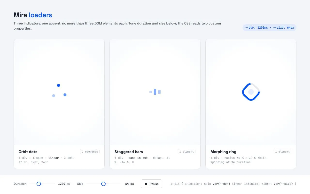
Three pure-CSS loading indicators side by side (orbit dots, staggered bars, morphing ring), each ≤ 3 DOM elements, driven by two custom properties with live duration and size sliders.
Preview
Use it
Free to use · credit appreciated1 Once, in your project
npx skills add SusanAcharya/Design-Lounge 2 Then ask
Using the Design Lounge skill, build "Orbit dots loader family" (piece orbit-dots-loader) in my stack. Match its brief; restyle it onto my product's theme.
No skill? Paste the brief instead. It carries the numbers, tokens and behaviour.
<!-- Design Lounge Nº 048 · "Orbit dots loader family" · www.designlounge.live -->

# Orbit dots loader family

> **Build brief for a coding agent.** Rebuild this piece in the reader's stack. If they haven't said which stack, ask once, then default to semantic HTML + CSS + a little vanilla JS. Match the numbers below; don't "improve" them.

## What it is

A specimen page for a product's ("Mira") loading indicators: three indicators in three cards, all in one electric blue on white, each built from at most three DOM elements (pseudo-elements do the rest) and animated with CSS only. **Orbit dots** — three dots at 0°, 120°, 240° at decreasing opacity, spinning linearly. **Staggered bars** — three vertical bars scaling in height with negative animation delays so the wave is already in motion on first paint. **Morphing ring** — a thick ring whose radius morphs between a circle and a rounded square while rotating at half speed, with a faint core pulsing inside. Two sliders (duration 600–2400ms, size 32–96px) write `--dur` and `--size` on `:root`; nothing else changes, which is the point: the loaders are parametric.

## Reference behaviour

1. Initial state: header with title and a mono badge reading `--dur: 1200ms · --size: 64px`; three cards, each with a centred loader on a soft radial white stage, a name, a mono description and an element-count chip; a footer bar with the two sliders, a Pause button and a one-line code hint. All three loaders are already mid-cycle (negative delays), so there is no "start-up" frame.
2. Drag Duration: every loader's cycle time changes immediately (the ring's spin is always 2 × duration); the output reads e.g. "900 ms" and the badge updates.
3. Drag Size: loaders scale from 32px to 96px; dot size, bar width and ring thickness scale proportionally because they are all expressed as fractions of `--size`.
4. Click Pause: `aria-pressed` becomes true, the button inverts (ink fill) and reads "Resume"; all animations freeze in place via `animation-play-state: paused`. Click again to resume from the same frame.
5. Hover a card: border darkens from `--line` to `--line-2`. Hover a slider thumb: it scales 1.15.
6. Keyboard: Tab reaches the two sliders (arrow keys step 100ms / 4px) and the Pause button (Space toggles).
7. Under `prefers-reduced-motion: reduce`, all three loaders stop moving and instead fade between 45 % and 100 % opacity over 2.4s.

## Structure

```
1280 × 800
┌─────────────────────────────────────────────────────────────────────────┐
│ 56  Mira loaders                                 --dur: 1200ms · --size │ header
│     Three indicators, one accent…                                       │
│ ┌────────────────────┐ ┌────────────────────┐ ┌────────────────────┐    │
│ │                    │ │                    │ │                    │    │
│ │       ·  ●         │ │       ▌▐▌          │ │        ◯           │    │ stage (flex 1)
│ │      ·             │ │                    │ │                    │    │
│ │────────────────────│ │────────────────────│ │────────────────────│    │ hairline
│ │ Orbit dots  2 elem │ │ Staggered  1 elem  │ │ Morphing   1 elem  │    │ info
│ │ 1 div + 1 span…    │ │ 1 div · ease-in-out│ │ 1 div · radius…    │    │
│ └────────────────────┘ └────────────────────┘ └────────────────────┘    │
├─────────────────────────────────────────────────────────────────────────┤
│ Duration ──●────── 1200 ms   Size ────●──── 64 px   [❚❚ Pause]  .orbit… │ footer
└─────────────────────────────────────────────────────────────────────────┘
cards: 3 equal columns, 20px gap, 24px 56px section padding; card radius 14px
```

… 162 more lines. Copy or download for the full brief. Loading the source…Brief
202 linesBuild brief for a coding agent. Rebuild this piece in the reader’s stack. If they haven’t said which stack, ask once, then default to semantic HTML + CSS + a little vanilla JS. Match the numbers below; don’t “improve” them.
What it is
A specimen page for a product’s (“Mira”) loading indicators: three indicators in three cards, all in one electric blue on white, each built from at most three DOM elements (pseudo-elements do the rest) and animated with CSS only. Orbit dots — three dots at 0°, 120°, 240° at decreasing opacity, spinning linearly. Staggered bars — three vertical bars scaling in height with negative animation delays so the wave is already in motion on first paint. Morphing ring — a thick ring whose radius morphs between a circle and a rounded square while rotating at half speed, with a faint core pulsing inside. Two sliders (duration 600–2400ms, size 32–96px) write --dur and --size on :root; nothing else changes, which is the point: the loaders are parametric.
Reference behaviour
- Initial state: header with title and a mono badge reading
--dur: 1200ms · --size: 64px; three cards, each with a centred loader on a soft radial white stage, a name, a mono description and an element-count chip; a footer bar with the two sliders, a Pause button and a one-line code hint. All three loaders are already mid-cycle (negative delays), so there is no “start-up” frame. - Drag Duration: every loader’s cycle time changes immediately (the ring’s spin is always 2 × duration); the output reads e.g. “900 ms” and the badge updates.
- Drag Size: loaders scale from 32px to 96px; dot size, bar width and ring thickness scale proportionally because they are all expressed as fractions of
--size. - Click Pause:
aria-pressedbecomes true, the button inverts (ink fill) and reads “Resume”; all animations freeze in place viaanimation-play-state: paused. Click again to resume from the same frame. - Hover a card: border darkens from
--lineto--line-2. Hover a slider thumb: it scales 1.15. - Keyboard: Tab reaches the two sliders (arrow keys step 100ms / 4px) and the Pause button (Space toggles).
- Under
prefers-reduced-motion: reduce, all three loaders stop moving and instead fade between 45 % and 100 % opacity over 2.4s.
Structure
1280 × 800
┌─────────────────────────────────────────────────────────────────────────┐
│ 56  Mira loaders                                 --dur: 1200ms · --size │ header
│     Three indicators, one accent…                                       │
│ ┌────────────────────┐ ┌────────────────────┐ ┌────────────────────┐    │
│ │                    │ │                    │ │                    │    │
│ │       ·  ●         │ │       ▌▐▌          │ │        ◯           │    │ stage (flex 1)
│ │      ·             │ │                    │ │                    │    │
│ │────────────────────│ │────────────────────│ │────────────────────│    │ hairline
│ │ Orbit dots  2 elem │ │ Staggered  1 elem  │ │ Morphing   1 elem  │    │ info
│ │ 1 div + 1 span…    │ │ 1 div · ease-in-out│ │ 1 div · radius…    │    │
│ └────────────────────┘ └────────────────────┘ └────────────────────┘    │
├─────────────────────────────────────────────────────────────────────────┤
│ Duration ──●────── 1200 ms   Size ────●──── 64 px   [❚❚ Pause]  .orbit… │ footer
└─────────────────────────────────────────────────────────────────────────┘
cards: 3 equal columns, 20px gap, 24px 56px section padding; card radius 14px<body>:grid-template-rows: auto 1fr auto.<header>:<h1>+<p>,.badgeat right.<section class="row" aria-label="Loader gallery">: three<article class="card">, each.stage(display: grid; place-items: center) +.info(<h2>,<p>,.nchip).- Loaders:
<div class="orbit" role="status" aria-label="Loading"><span></span></div>;<div class="bars" role="status" aria-label="Loading"></div>;<div class="ring" role="status" aria-label="Loading"></div>. <footer class="controls">: two.ctlgroups (<label>,<input type="range">,<output>),<button class="btn" aria-pressed>,.codehint.
Tokens
:root {
  /* colour — cool light, white cards, electric blue */
  --bg: #f2f4f7;           /* page */
  --card: #ffffff;         /* cards, footer, slider thumb */
  --stage-edge: #f7f9fc;   /* radial edge behind loaders */
  --line: #dfe3ea;         /* hairlines, chip border */
  --line-2: #c7cdd8;       /* hovered card, button border */
  --ink: #0f172a;
  --ink-2: #4b5565;        /* descriptions */
  --ink-3: #8a94a6;        /* mono meta, chips */
  --accent: #0055ff;       /* loaders, thumb ring, badge text */
  --accent-soft: #e0eaff;  /* badge background */
  --track: #e6e9ef;        /* slider track, ring gap */

  /* type */
  --font: "Space Grotesk", system-ui, sans-serif;
  --mono: "JetBrains Mono", ui-monospace, monospace;
  --fs-h1: 28px; --fs-h2: 16px; --fs-body: 15px; --fs-sub: 14px; --fs-ctl: 13px; --fs-mono: 12px; --fs-chip: 11px;

  /* loader parameters (the only two the sliders write) */
  --dur: 1200ms;   /* range 600–2400, step 100 */
  --size: 64px;    /* range 32–96, step 4 */
  /* derived fractions of --size */
  --dot: .18; --orbit-radius: .42; --bar-w: .16; --bar-gap: .28; --ring-stroke: .11; --core-inset: 18%;

  /* layout */
  --gutter: 56px; --gap: 20px; --r: 14px; --r-btn: 8px; --thumb: 18px; --track-h: 3px;

  /* motion */
  --t-micro: 140ms;
  --ease: cubic-bezier(.2, .7, .2, 1);
  --ease-loader: cubic-bezier(.45, 0, .55, 1);   /* symmetric ease-in-out for cyclic motion */
}
Typography
| Role | Family | Size | Weight | Line-height | Tracking | Case |
|---|---|---|---|---|---|---|
| Title | Space Grotesk | 28px | 600 | 1.2 | −0.02em | sentence; second word --accent |
| Subtitle | Space Grotesk | 14px | 500 | 1.5 | 0 | --ink-2 |
| Card name | Space Grotesk | 16px | 600 | 1.3 | −0.01em | sentence |
| Card meta | JetBrains Mono | 12px | 400 | 1.5 | 0 | --ink-3; emphasised tokens 500 --ink-2 |
| Element chip | JetBrains Mono | 11px | 500 | 1 | 0 | 1px --line border, 6px radius |
| Badge | JetBrains Mono | 12px | 500 | 1 | 0 | --accent on --accent-soft, pill |
| Control label | Space Grotesk | 13px | 500 | 1 | 0 | --ink-2 |
| Control output | JetBrains Mono | 12px | 500 | 1 | 0 | right-aligned, min 6ch |
| Button | Space Grotesk | 13px | 500 | 1 | 0 | 36px tall |
| Code hint | JetBrains Mono | 12px | 400 | 1 | 0 | --ink-3, var() tokens --ink-2 |
Motion
| Loader / element | Keyframes | Duration | Easing | Delay | Iteration |
|---|---|---|---|---|---|
.orbit | spin: rotate 0 → 360° | --dur | linear | 0 | infinite |
.bars (middle) | bar: scaleY .35 / opacity .45 → 1 / 1 at 40 % → back | --dur | --ease-loader | calc(var(--dur) * -.16) | infinite |
.bars::before | bar | --dur | --ease-loader | calc(var(--dur) * -.32) | infinite |
.bars::after | bar | --dur | --ease-loader | 0 | infinite |
.ring | morph: border-radius 50 % → 22 % → 50 %; plus spin | --dur / calc(var(--dur) * 2) | --ease-loader / linear | 0 | infinite |
.ring::before | core: opacity 0 / scale .4 → .2 / 1 → back | --dur | --ease-loader | 0 | infinite |
| Slider thumb | hover scale 1 → 1.15 | 140ms | --ease | — | — |
| Card border | hover --line → --line-2 | 140ms | linear | — | — |
| Pause | animation-play-state: paused on every descendant of .stage | instant | — | — | — |
Reduced motion: replace every loader animation with calm (opacity .45 ↔ 1, 2.4s ease-in-out, infinite) and remove the ring’s transform. The loaders stay visible and still read as “busy”.
States
- Loader running: as above. Paused: frozen frame; the Pause button shows
aria-pressed="true", ink fill, white text, label “Resume”. - Card hover: border
--line-2. - Slider: 3px
--tracktrack; 18px white thumb with a 2px--accentring; hover scales 1.15; focus-visible 2px--accentoutline at 4px offset. - Button hover: border and text
--accent. Focus-visible: 2px--accentoutline, 2px offset. - Output values: always ”
ms” / ” px” with a space before the unit. - No error or empty states; the loaders are the loading state.
Accessibility
- Each loader is
role="status"witharia-label="Loading"; in a product, replace the label with what is loading (“Loading invoices”) and remove the element when done — do not leaverole="status"nodes around. - Sliders are native
<input type="range">with<label for>and an<output>bound by proximity (addfor="dur"on the output if your framework supports it). Arrow keys step by thestepvalue; Home/End jump to bounds. - Pause is a real toggle button with
aria-pressed; it is the reduced-motion escape hatch for users without the OS setting. - Contrast:
--ink-2on white 8.4:1;--ink-3on white 3.5:1 (mono meta only, 11–12px);--accenton white 5.9:1; loader shapes are non-text and exceed 3:1 against the stage. - The badge and code hint are informational; both are plain text.
- Reduced motion is honoured automatically and Pause remains available.
Responsive rules
- ≥ 1280: three cards in a row; footer controls in one row.
- 1024–1279: same; gutters 32px; footer wraps into two rows (sliders, then button + hint).
- 768–1023: three cards still fit (each ≈ 220px); the code hint hides.
- < 768: cards stack vertically and the page scrolls; sliders full width; badge hidden.
Acceptance checklist
- Each loader uses at most 3 DOM elements: orbit =
div+span, bars =div, ring =div; all remaining shapes are::before/::after. - Every dimension inside a loader is a fraction of
--size(dot .18, orbit radius .42, bar width .16, bar gap .28, ring stroke .11). - Every animation duration is
var(--dur)orcalc(var(--dur) * 2); changing the slider changes all three loaders at once. - Bars use negative delays (−32 %, −16 %, 0 of
--dur) so the first paint is already mid-wave. - Orbit dots have opacities 1, .65, .3 at 0°, 120°, 240° and spin linearly.
- The ring’s
border-right-coloris--track, its radius morphs 50 % ↔ 22 % over--dur, and it spins over 2 ×--dur. - Pause freezes all loaders in place and resumes from the same frame; the button toggles
aria-pressedand its label. - Duration slider spans 600–2400 step 100; size slider spans 32–96 step 4; outputs and the badge update on
input. - Sliders and the button have visible focus styles.
- Under reduced motion no element rotates, scales or morphs; each loader pulses opacity only.
- Page fits 1280 × 800 without scrolling.
Implementation notes
Parametric shapes. Never write a pixel inside a loader; derive everything from --size so the slider scales the whole figure:
.orbit { width: var(--size); height: var(--size); position: relative;
         animation: spin var(--dur) linear infinite; }
.orbit::before, .orbit::after, .orbit span {
  content: ""; position: absolute; left: 50%; top: 50%;
  width: calc(var(--size) * .18); height: calc(var(--size) * .18);
  margin: calc(var(--size) * -.09) 0 0 calc(var(--size) * -.09);
  border-radius: 50%; background: var(--accent); }
.orbit::before { transform: rotate(0deg)   translate(calc(var(--size) * .42)); }
.orbit::after  { transform: rotate(120deg) translate(calc(var(--size) * .42)); opacity: .65; }
.orbit span    { transform: rotate(240deg) translate(calc(var(--size) * .42)); opacity: .3; }
Negative delays for the bars — the element itself is the middle bar; ::before and ::after sit 28 % of --size to either side:
.bars { width: calc(var(--size) * .16); height: var(--size); background: var(--accent);
        border-radius: calc(var(--size) * .08); position: relative;
        animation: bar var(--dur) var(--ease-loader) calc(var(--dur) * -.16) infinite; }
.bars::before, .bars::after { content: ""; position: absolute; top: 0; width: 100%; height: 100%;
        border-radius: inherit; background: var(--accent); animation: bar var(--dur) var(--ease-loader) infinite; }
.bars::before { left: calc(var(--size) * -.28); animation-delay: calc(var(--dur) * -.32); }
.bars::after  { left: calc(var(--size) *  .28); }
@keyframes bar { 0%, 100% { transform: scaleY(.35); opacity: .45; } 40% { transform: scaleY(1); opacity: 1; } }
Sliders write custom properties, nothing else:
function apply() {
  root.style.setProperty('--dur', dur.value + 'ms');
  root.style.setProperty('--size', size.value + 'px');
  durOut.value = dur.value + ' ms'; sizeOut.value = size.value + ' px';
}
dur.addEventListener('input', apply); size.addEventListener('input', apply);
Common mistakes: changing --dur restarts the animation in some browsers — acceptable for a loader, but do not try to “fix” it with JS; using ease on cyclic motion (it hitches at the loop point — use a symmetric bezier); forgetting transform-origin: center on the bars (scaleY grows from the top); pausing by removing the animation (it resets to frame 0 instead of freezing).
Details
- Palette
- Type
- Space Grotesk · JetBrains Mono
- Motion
- Rich motion
- Build
- Quick build
- Tags
On the shelves