Nº 037 of 520
Modal dialog with focus trap
Native <dialog> modals that open with a 240ms scale .96→1 and scrim fade, trap focus, close on Esc or scrim click, plus a destructive variant gated by a type-to-confirm input.
Preview
Use it
Free to use · credit appreciated1 Once, in your project
npx skills add SusanAcharya/Design-Lounge 2 Then ask
Using the Design Lounge skill, build "Modal dialog with focus trap" (piece modal-dialog-focus-trap) in my stack. Match its brief; restyle it onto my product's theme.
No skill? Paste the brief instead. It carries the numbers, tokens and behaviour.
<!-- Design Lounge Nº 037 · "Modal dialog with focus trap" · www.designlounge.live -->

# Modal dialog with focus trap

> **Build brief for a coding agent.** Rebuild this piece in the reader's stack. If they haven't said which stack, ask once, then default to semantic HTML + CSS + a little vanilla JS. Match the numbers below; don't "improve" them.

## What it is

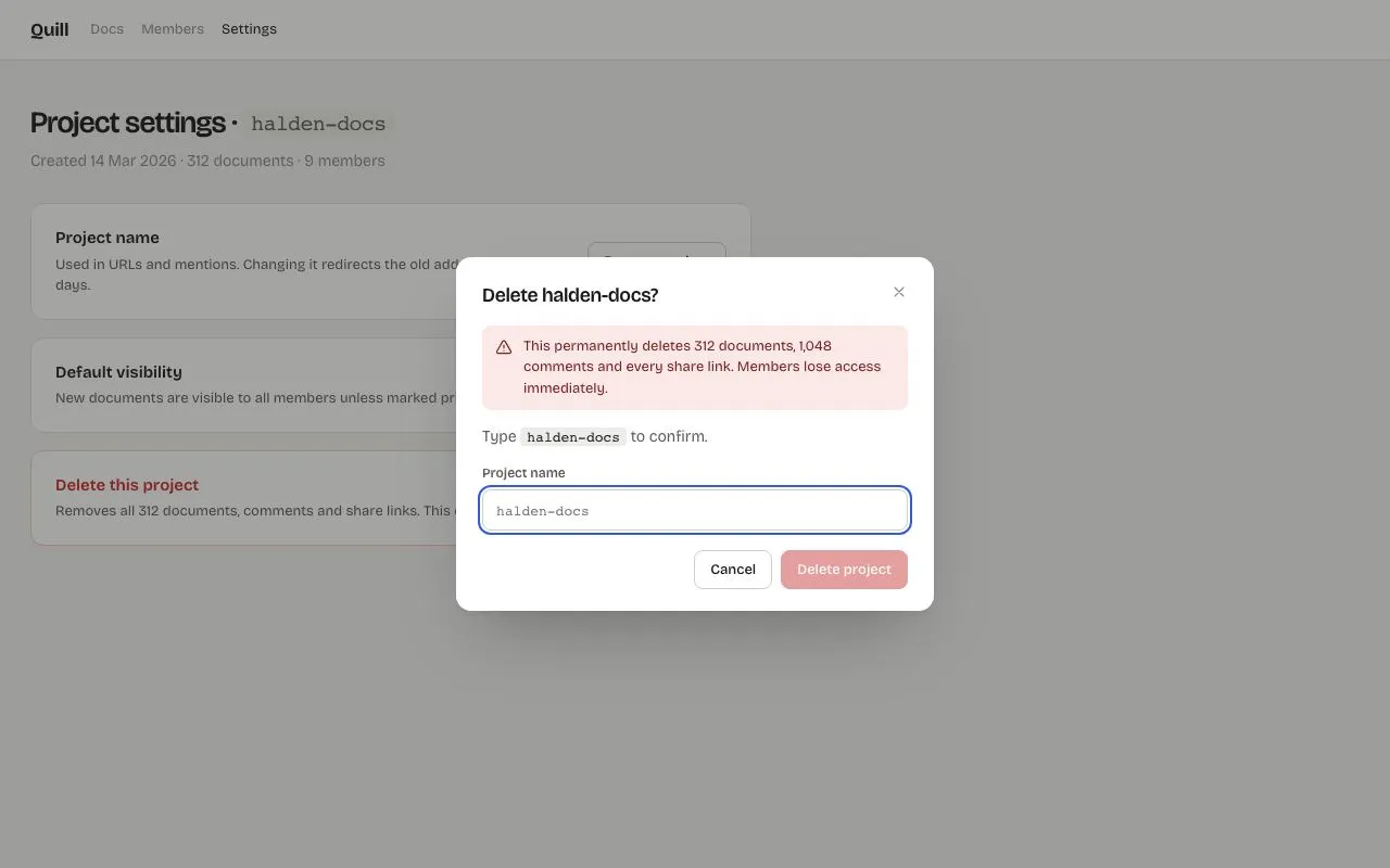
Two modal dialogs on a project-settings page for a docs product ("Quill"), built on the native `<dialog>` element and `showModal()` so the focus trap, Esc handling, inertness of the page and focus return come from the platform rather than a library. Both open in 240ms — the panel scales from 0.96 to 1 on an expo-out curve while the backdrop fades to a 40% ink scrim — using `@starting-style` and `transition-behavior: allow-discrete` so the *close* animates too. The first is a plain form ("Rename project"). The second is a destructive confirm: a red warning strip, the instruction "Type `halden-docs` to confirm", a mono input, and a red Delete button that stays disabled until the typed value matches exactly. One family, Bricolage Grotesque, at three optical sizes.

## Reference behaviour

1. Initial state: the **Delete** dialog is already open over the page (page dimmed by the scrim). Focus is in the empty confirmation input (it has `autofocus`); "Delete project" is disabled at 45% opacity. Behind: the settings page with the project name `halden-docs` in a code chip, three cards (Project name → Rename; Default visibility → Change; a red-bordered "Delete this project" card → Delete project).
2. Type anything other than `halden-docs`: the button remains disabled. Type exactly `halden-docs`: the button enables and the input's border turns `--danger`. Deleting a character disables it again.
3. Press Enter in the input while the button is disabled: nothing happens (the form's submit is prevented). Press Enter when enabled or click Delete: the dialog closes with `returnValue="delete"` (240ms reverse animation) and the page's live status line reads "**halden-docs** was deleted. It can be restored from the trash for 14 days."
4. Esc: closes with `returnValue="cancel"` (native `cancel` event). Clicking the scrim (anywhere outside the panel): closes the same way. Cancel and the × button: same. Focus returns to the button that opened the dialog.
5. Tab inside an open dialog cycles only through its controls (× → input → Cancel → Delete → ×). Page content behind is inert — not clickable, not focusable, not read by AT.
6. Click "Rename project": the Rename dialog opens with the input pre-filled with the current name and selected/focused. Save closes with `returnValue="save"` and rewrites the code chip and status line ("Renamed to **new-name**. The old address redirects until 29 Oct 2026."). The input has `pattern="[a-z0-9-]+"` and `required`; native validation blocks Save otherwise.
7. Reopening the Delete dialog always resets the input to empty and the button to disabled.

## Structure

```
1280 × 800
┌──────────────────────────────────────────────────────────────────────────┐
│ Quill   Docs  Members  Settings                                          │ 56
├──────────────────────────────────────────────────────────────────────────┤
│ Project settings · [halden-docs]                                         │ h1 28
│ Created 14 Mar 2026 · 312 documents · 9 members                          │
│ ┌ Project name ──────────────────────────────── [Rename project] ┐       │ card
│ ┌ Default visibility ────────────────────────────────── [Change] ┐       │
│ ┌ Delete this project (red) ─────────────────────── [Delete project] ┐   │ danger card
│ status line (aria-live)                                                  │
│                                                                          │
│                     ┌──────────── 440 ────────────┐                      │ dialog centred
│                     │ Delete halden-docs?        × │ 22/24 padding       │
│                     │ ┌ ⚠ This permanently deletes…┐│ warn strip          │
│                     │ Type `halden-docs` to confirm │                      │
│                     │ PROJECT NAME                  │                      │
│                     │ ┌───────────────────────────┐ │ input 38, mono      │

… 190 more lines. Copy or download for the full brief. Loading the source…Brief
230 linesBuild brief for a coding agent. Rebuild this piece in the reader’s stack. If they haven’t said which stack, ask once, then default to semantic HTML + CSS + a little vanilla JS. Match the numbers below; don’t “improve” them.
What it is
Two modal dialogs on a project-settings page for a docs product (“Quill”), built on the native <dialog> element and showModal() so the focus trap, Esc handling, inertness of the page and focus return come from the platform rather than a library. Both open in 240ms — the panel scales from 0.96 to 1 on an expo-out curve while the backdrop fades to a 40% ink scrim — using @starting-style and transition-behavior: allow-discrete so the close animates too. The first is a plain form (“Rename project”). The second is a destructive confirm: a red warning strip, the instruction “Type halden-docs to confirm”, a mono input, and a red Delete button that stays disabled until the typed value matches exactly. One family, Bricolage Grotesque, at three optical sizes.
Reference behaviour
- Initial state: the Delete dialog is already open over the page (page dimmed by the scrim). Focus is in the empty confirmation input (it has
autofocus); “Delete project” is disabled at 45% opacity. Behind: the settings page with the project namehalden-docsin a code chip, three cards (Project name → Rename; Default visibility → Change; a red-bordered “Delete this project” card → Delete project). - Type anything other than
halden-docs: the button remains disabled. Type exactlyhalden-docs: the button enables and the input’s border turns--danger. Deleting a character disables it again. - Press Enter in the input while the button is disabled: nothing happens (the form’s submit is prevented). Press Enter when enabled or click Delete: the dialog closes with
returnValue="delete"(240ms reverse animation) and the page’s live status line reads “halden-docs was deleted. It can be restored from the trash for 14 days.” - Esc: closes with
returnValue="cancel"(nativecancelevent). Clicking the scrim (anywhere outside the panel): closes the same way. Cancel and the × button: same. Focus returns to the button that opened the dialog. - Tab inside an open dialog cycles only through its controls (× → input → Cancel → Delete → ×). Page content behind is inert — not clickable, not focusable, not read by AT.
- Click “Rename project”: the Rename dialog opens with the input pre-filled with the current name and selected/focused. Save closes with
returnValue="save"and rewrites the code chip and status line (“Renamed to new-name. The old address redirects until 29 Oct 2026.”). The input haspattern="[a-z0-9-]+"andrequired; native validation blocks Save otherwise. - Reopening the Delete dialog always resets the input to empty and the button to disabled.
Structure
1280 × 800
┌──────────────────────────────────────────────────────────────────────────┐
│ Quill   Docs  Members  Settings                                          │ 56
├──────────────────────────────────────────────────────────────────────────┤
│ Project settings · [halden-docs]                                         │ h1 28
│ Created 14 Mar 2026 · 312 documents · 9 members                          │
│ ┌ Project name ──────────────────────────────── [Rename project] ┐       │ card
│ ┌ Default visibility ────────────────────────────────── [Change] ┐       │
│ ┌ Delete this project (red) ─────────────────────── [Delete project] ┐   │ danger card
│ status line (aria-live)                                                  │
│                                                                          │
│                     ┌──────────── 440 ────────────┐                      │ dialog centred
│                     │ Delete halden-docs?        × │ 22/24 padding       │
│                     │ ┌ ⚠ This permanently deletes…┐│ warn strip          │
│                     │ Type `halden-docs` to confirm │                      │
│                     │ PROJECT NAME                  │                      │
│                     │ ┌───────────────────────────┐ │ input 38, mono      │
│                     │ └───────────────────────────┘ │                      │
│                     │             [Cancel] [Delete project] │ 36 buttons  │
│                     └─────────────────────────────┘                      │
│      backdrop rgba(27,27,26,.4)                                          │
└──────────────────────────────────────────────────────────────────────────┘
<header class="top">,<main>with<h1>(name in<code id="pname">),.sub, three.cards (.rowcflex rows: text left, button right; the last has.danger), and<p class="status" aria-live="polite">.<dialog id="rename" aria-labelledby="rt">→<form method="dialog" class="dlg">:<header>(h2 + ×data-close), helper<p>,<label>New name <input autofocus pattern required></label>,.acts(Canceldata-close, Savetype=submit value="save").<dialog id="delete" aria-labelledby="dt" aria-describedby="dd">→<form method="dialog" class="dlg confirm">: header,.warnstrip (id="dd", icon + text), instruction<p>with<code>,<label>Project name <input id="confirmName" autofocus placeholder="halden-docs" aria-describedby="dd"></label>,.acts(Cancel, Deletetype=submit value="delete" disabled).dialogiswidth: min(440px, 100vw − 32px), no border, no padding (padding lives on the form so scrim clicks can be detected bye.target === dialog), 14px radius, shadow0 2px 4px rgba(27,27,26,.06), 0 32px 64px -24px rgba(27,27,26,.35).
Copy and return values
| Dialog | Heading | Body | Field | Buttons (left → right) | returnValue |
|---|---|---|---|---|---|
| Rename | “Rename project” | “Lowercase letters, numbers and hyphens. The old name keeps redirecting for 30 days.” | New name — prefilled with current name; pattern="[a-z0-9-]+" required | Cancel · Save name (primary) | cancel / save |
| Delete | “Delete halden-docs?” | Warning strip: “This permanently deletes 312 documents, 1,048 comments and every share link. Members lose access immediately.” then “Type halden-docs to confirm.” | Project name — empty, mono, placeholder “halden-docs” | Cancel · Delete project (danger, disabled until match) | cancel / delete |
Status line after actions: Rename → “Renamed to {name}. The old address redirects until 29 Oct 2026.” Delete → “{name} was deleted. It can be restored from the trash for 14 days.”
Settings page cards
| Card | Copy | Button |
|---|---|---|
| Project name | “Used in URLs and mentions. Changing it redirects the old address for 30 days.” | Rename project |
| Default visibility | “New documents are visible to all members unless marked private.” | Change |
| Delete this project | “Removes all 312 documents, comments and share links. This cannot be undone.” | Delete project (danger) |
Page subtitle: “Created 14 Mar 2026 · 312 documents · 9 members”. Header nav: Docs, Members, Settings (current).
Tokens
:root {
  /* colour — warm-grey light, blue for primary, red only for destruction */
  --bg: #f4f4f2;
  --panel: #ffffff;       /* header, cards, dialog */
  --hover: #ececea;       /* button hover, code chips */
  --line: #e3e3df;        /* hairlines, card borders */
  --line-2: #cfcfca;      /* input + secondary button borders */
  --ink: #1b1b1a;
  --ink-2: #5b5b58;       /* body copy, labels */
  --ink-3: #8a8a86;       /* meta, × icon */
  --accent: #2f5bea;      /* primary button, focus rings */
  --accent-hover: #2449c2;
  --accent-ink: #ffffff;
  --danger: #c62828;      /* delete button, matched input border, danger h2 */
  --danger-hover: #a51f1f;
  --danger-soft: #fbe9e7; /* warning strip */
  --danger-text: #7a1f1f; /* warning strip text */
  --danger-border: #f1c9c5;
  --danger-ink: #ffffff;
  --scrim: rgba(27, 27, 26, .4);

  /* type */
  --font: "Bricolage Grotesque", system-ui, sans-serif;
  --mono: ui-monospace, "SF Mono", Menlo, monospace;

  /* layout */
  --w: 440px;
  --r: 14px;              /* dialog */
  --r-card: 12px;
  --r-btn: 8px;           /* buttons, inputs */
  --dlg-pad: 22px 24px 20px;
  --btn-h: 36px;
  --input-h: 38px;
  --shadow: 0 2px 4px rgba(27,27,26,.06), 0 32px 64px -24px rgba(27,27,26,.35);

  /* motion */
  --t-fast: 120ms;
  --t-open: 240ms;
  --ease: cubic-bezier(.2, .7, .2, 1);
  --ease-out: cubic-bezier(.16, 1, .3, 1);
}
Typography
| Role | Family | Size | Weight | Line-height | Tracking | opsz |
|---|---|---|---|---|---|---|
| Body | Bricolage Grotesque | 14px | 400 | 1.5 | 0 | 14 |
| Brand | Bricolage Grotesque | 17px | 700 | 1 | −0.02em | 14 |
| Page h1 | Bricolage Grotesque | 28px | 600 | 1.2 | −0.025em | 96 |
| Name code chip | system mono | 20px | 500 | 1 | 0 | — |
| Card h2 | Bricolage Grotesque | 15px | 600 | 1.3 | 0 | 14 |
| Card copy / meta | Bricolage Grotesque | 13px | 400 | 1.5 | 0 | 14 |
| Dialog h2 | Bricolage Grotesque | 18px | 600 | 1.3 | −0.02em | 40 |
| Dialog copy | Bricolage Grotesque | 14px | 400 | 1.5 | 0 | 14 |
| Warning strip | Bricolage Grotesque | 13px | 400 | 1.5 | 0 | 14 |
| Field label | Bricolage Grotesque | 12px | 600 | 1.3 | 0 | 14 |
| Confirm input | system mono | 13px | 400 | 38px height | 0 | — |
| Buttons | Bricolage Grotesque | 13px | 500 | 36px height | 0 | 14 |
Motion
| Element | Trigger | Property | From → To | Duration | Easing | Notes |
|---|---|---|---|---|---|---|
dialog | showModal() | opacity, transform | 0, scale(.96) → 1, none | 240ms | opacity --ease, transform --ease-out | via @starting-style { dialog[open] {…} } |
dialog | close() | opacity, transform | 1, none → 0, scale(.96) | 240ms | same | needs transition: overlay 240ms allow-discrete, display 240ms allow-discrete |
dialog::backdrop | open / close | background | rgba(27,27,26,0) ↔ rgba(27,27,26,.4) | 240ms | --ease | same @starting-style + allow-discrete pattern |
| buttons | hover | background | per state | 0 | — | instant |
| confirm input | match | border-color | --line-2 → --danger | 0 | — | instant; it is a state, not a flourish |
Reduced motion: all transitions 1ms; dialogs appear and disappear instantly.
States
- Delete button disabled: opacity .45,
cursor: not-allowed,disabledattribute. Enabled:--dangerfill; hover--danger-hover. - Confirm input: default
--line-2border; hover--ink-3; focus-visible 2px--accentoutline offset 2px;.ok(matched) border--danger. - Secondary button: white,
--line-2border; hover--hover. Primary:--accent; hover--accent-hover. - × button: 28×28,
--ink-3; hover--hoverbackground +--ink; focus-visible accent outline. - Danger card: border
--danger-border; h2--danger. - Page while dialog open: inert (native); scrim
--scrim. - Status line: empty by default (
min-height: 20pxso the layout doesn’t jump); bold name after an action.
Accessibility
- Use
<dialog>+showModal(). This gives: focus trap,Esc→cancelevent → close, top-layer rendering, page inertness, and focus return to the opener. Do not re-implement any of these. - Label the dialog:
aria-labelledbypointing at its<h2>; the destructive one alsoaria-describedbythe warning strip. The confirm input repeatsaria-describedby="dd"so the consequence is read when the field gets focus. autofocuson the input inside each dialog so focus lands in the field, not on the × button.<form method="dialog">+ buttonvalues →dialog.returnValuetells you which action closed it; handle everything in thecloseevent.- Enter in the confirm input must not delete while the button is disabled: prevent the form’s
submitwhendoDelete.disabled. - Scrim click: because the dialog has
padding:0and the form fills it,e.target === dialogis only true for clicks on the backdrop. - Status line is
aria-live="polite". - Contrast:
--ink-2on white 7.5:1; warning text#7a1f1fon--danger-soft7.9:1; white on--danger5.9:1; white on--accent5.4:1. - Hit targets: buttons 36px, input 38px, × 28px (grow to 40px on touch).
Responsive rules
- ≥ 1280: as specified.
- 1024–1279: unchanged.
- 768–1023: settings cards stack their button under the text; dialog unchanged.
- < 640: dialog width
calc(100vw − 32px);.actsbuttons stretch to equal widths; dialogmargin-top: auto; margin-bottom: 16pxif you want it to sit low like a sheet — keep the same animation.
Acceptance checklist
- Dialogs are native
<dialog>elements opened withshowModal(); no custom focus-trap code exists. - Opening animates opacity 0 → 1 and
scale(.96)→ 1 over 240ms; the backdrop fades torgba(27,27,26,.4)in the same 240ms. - Closing animates in reverse (verify
display/overlaytransitions withallow-discrete). - The Delete dialog is open on first paint with focus in the confirm input and Delete disabled.
- Typing exactly
halden-docsenables Delete and turns the input border#c62828; any other value disables it. - Enter with a disabled Delete does nothing; Enter when enabled deletes and closes.
- Esc, scrim click, × and Cancel all close with
returnValue="cancel"and cause no page change. - After closing, focus returns to the button that opened the dialog.
- Tab cannot reach page content while a dialog is open.
- Rename pre-fills the current name, validates
[a-z0-9-]+, and Save rewrites the code chip and the status line. - Dialog is
min(440px, 100vw − 32px)wide, 14px radius, with the two-layer shadow; padding22px 24px 20pxon the form. - The warning strip is
#fbe9e7with#7a1f1ftext and a triangle icon.
Implementation notes
Animate both directions of a native dialog — entry via @starting-style, exit via discrete transitions on display and overlay:
dialog { opacity: 0; transform: scale(.96);
  transition: opacity 240ms var(--ease), transform 240ms var(--ease-out),
              overlay 240ms allow-discrete, display 240ms allow-discrete; }
dialog[open] { opacity: 1; transform: none; }
@starting-style { dialog[open] { opacity: 0; transform: scale(.96); } }

dialog::backdrop { background: rgba(27,27,26,0);
  transition: background 240ms var(--ease), overlay 240ms allow-discrete, display 240ms allow-discrete; }
dialog[open]::backdrop { background: var(--scrim); }
@starting-style { dialog[open]::backdrop { background: rgba(27,27,26,0); } }
Type-to-confirm gate — compare against the live project name, and block Enter while disabled:
confirmName.addEventListener('input', () => {
  const ok = confirmName.value.trim() === pname.textContent;
  doDelete.disabled = !ok; confirmName.classList.toggle('ok', ok);
});
form.addEventListener('submit', e => { if (doDelete.disabled) e.preventDefault(); });
del.addEventListener('close', () => { if (del.returnValue === 'delete') { /* perform delete */ } });
Scrim click — only possible because the <dialog> itself has no padding:
dialog.addEventListener('click', e => { if (e.target === dialog) dialog.close('cancel'); });Common mistakes: padding the <dialog> (then clicks in the padding read as scrim clicks); using open attribute / show() instead of showModal() (no trap, no inertness, no top layer); calling close() from Esc yourself (the native cancel already does it — double close events); forgetting to reset the confirm input on reopen.
Details
- Palette
- Type
- Bricolage Grotesque
- Motion
- Subtle motion
- Build
- Quick build
- Tags
On the shelves