Nº 069 of 677
Swiss grid pricing
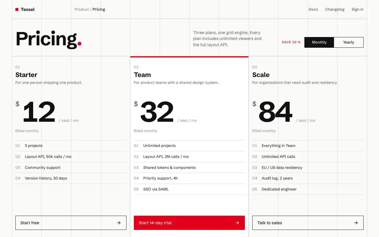
Pricing page on a visible 12-column hairline grid: three tiers in strict 4-column blocks, numbered features, red accent, and a monthly/yearly switch that tweens the prices.
Preview
Use it
Free to use · credit appreciated1 Once, in your project · Node 22.20+
npx skills add SusanAcharya/Design-Lounge 2 Then ask
Using the Design Lounge skill, build "Swiss grid pricing" (piece swiss-grid-pricing) in my stack. Match its brief; restyle it onto my product's theme.
No skill? Paste the brief instead. It carries the numbers, tokens and behaviour.
<!-- Design Lounge Nº 069 · "Swiss grid pricing" · www.designlounge.live -->

# Swiss grid pricing

> **Build brief for a coding agent.** Rebuild this piece in the reader's stack. If they haven't said which stack, ask once, then default to semantic HTML + CSS + a little vanilla JS. Match the numbers below; don't "improve" them.

## What it is

The pricing page for *Tessel*, a layout-engine SaaS. A 12-column grid is drawn as 1px hairlines across the content area (40px page margins, so each column is 100px at 1280). Everything snaps to it: a 64px header, an intro band with a 64px "Pricing." title, a 200px two-state switch, and three tiers each spanning exactly four columns. Prices are 96px tabular numerals; features are numbered `01`–`05` in a grey column. One red is used for the title's full stop, the "Save 20 %" caption, the highlighted tier's 4px top bar and its CTA. The detail worth copying is the switch: its black thumb slides across while every price counts from monthly to yearly over 420ms, so the page feels recalculated rather than swapped.

## Reference behaviour

1. Initial state: switch is on "Monthly" (`aria-checked="false"`), prices read $12 / $32 / $84, the "billed" line under each reads "Billed monthly". The middle tier ("Team") is highlighted: white background, 4px red top bar, red filled CTA.
2. Hover a nav link: colour `--ink-2` → `--ink`, 140ms. No underline.
3. Click the switch (or press Space/Enter while focused): the black thumb translates from the left half to the right half over 260ms with expo-out easing; label colours swap (the label under the thumb becomes `--bg`) over 140ms.
4. Simultaneously, each `.amt` tweens from its current value to the yearly value (12→9, 32→26, 84→68) over 420ms with cubic ease-out, rounding to integers each frame. The billed line changes instantly to "Billed **$108** yearly" (108 / 312 / 816).
5. Click again: thumb returns, prices tween back up, billed line returns to "Billed monthly".
6. Hover an outlined CTA: fills `--ink`, text `--bg`. Hover the red CTA: fills `--ink`. Arrow does not move.
7. Focus-visible on any control: 2px red outline, 3px offset.
8. Reduced motion: the thumb still moves (1ms), prices set instantly without tweening.

## Structure

```
1280 × 800   ·  40px margins  ·  12 hairline columns of 100px inside .page
┌─┬─┬─┬─┬─┬─┬─┬─┬─┬─┬─┬─┐
│■Tessel │ Product / Pricing        │           Docs Changelog Sign in │ 64  header
├─┴─┴─┴─┴─┴─┴─┼─┴─┴─┼─┴─┴─┤
│ Pricing.                    │ lede 30ch │ SAVE 20 % [Monthly│Yearly] │ ~130 intro
│ (64px, cols 1–6)            │ cols 7–9  │ cols 10–12                 │
├─┬─┬─┬─┬─┬─┬─┬─┬─┬─┬─┬─┤
│ 01 Starter      ║ 02 Team  (red top bar, white bg) ║ 03 Scale        │
│ For one person… ║ For product teams…              ║ For organisations│
│ $ 12 /seat/mo   ║ $ 32 /seat/mo                   ║ $ 84 /seat/mo    │ 96px numerals
│ Billed monthly  ║ Billed monthly                  ║ Billed monthly   │
│ 01 3 projects   ║ 01 Unlimited projects           ║ 01 Everything…   │ 13px rows, 1px rules
│ 02 …            ║ …                               ║ …                │
│ [Start free  →] ║ [Start 14-day trial →] (red)    ║ [Talk to sales →]│ 48px CTAs
└─┴─┴─┴─┴─┴─┴─┴─┴─┴─┴─┴─┘
   cols 1–4            cols 5–8                          cols 9–12

… 169 more lines. Copy or download for the full brief. Loading the source…Brief
209 linesBuild brief for a coding agent. Rebuild this piece in the reader’s stack. If they haven’t said which stack, ask once, then default to semantic HTML + CSS + a little vanilla JS. Match the numbers below; don’t “improve” them.
What it is
The pricing page for Tessel, a layout-engine SaaS. A 12-column grid is drawn as 1px hairlines across the content area (40px page margins, so each column is 100px at 1280). Everything snaps to it: a 64px header, an intro band with a 64px “Pricing.” title, a 200px two-state switch, and three tiers each spanning exactly four columns. Prices are 96px tabular numerals; features are numbered 01–05 in a grey column. One red is used for the title’s full stop, the “Save 20 %” caption, the highlighted tier’s 4px top bar and its CTA. The detail worth copying is the switch: its black thumb slides across while every price counts from monthly to yearly over 420ms, so the page feels recalculated rather than swapped.
Reference behaviour
- Initial state: switch is on “Monthly” (
aria-checked="false"), prices read $12 / $32 / $84, the “billed” line under each reads “Billed monthly”. The middle tier (“Team”) is highlighted: white background, 4px red top bar, red filled CTA. - Hover a nav link: colour
--ink-2→--ink, 140ms. No underline. - Click the switch (or press Space/Enter while focused): the black thumb translates from the left half to the right half over 260ms with expo-out easing; label colours swap (the label under the thumb becomes
--bg) over 140ms. - Simultaneously, each
.amttweens from its current value to the yearly value (12→9, 32→26, 84→68) over 420ms with cubic ease-out, rounding to integers each frame. The billed line changes instantly to “Billed $108 yearly” (108 / 312 / 816). - Click again: thumb returns, prices tween back up, billed line returns to “Billed monthly”.
- Hover an outlined CTA: fills
--ink, text--bg. Hover the red CTA: fills--ink. Arrow does not move. - Focus-visible on any control: 2px red outline, 3px offset.
- Reduced motion: the thumb still moves (1ms), prices set instantly without tweening.
Structure
1280 × 800   ·  40px margins  ·  12 hairline columns of 100px inside .page
┌─┬─┬─┬─┬─┬─┬─┬─┬─┬─┬─┬─┐
│■Tessel │ Product / Pricing        │           Docs Changelog Sign in │ 64  header
├─┴─┴─┴─┴─┴─┴─┼─┴─┴─┼─┴─┴─┤
│ Pricing.                    │ lede 30ch │ SAVE 20 % [Monthly│Yearly] │ ~130 intro
│ (64px, cols 1–6)            │ cols 7–9  │ cols 10–12                 │
├─┬─┬─┬─┬─┬─┬─┬─┬─┬─┬─┬─┤
│ 01 Starter      ║ 02 Team  (red top bar, white bg) ║ 03 Scale        │
│ For one person… ║ For product teams…              ║ For organisations│
│ $ 12 /seat/mo   ║ $ 32 /seat/mo                   ║ $ 84 /seat/mo    │ 96px numerals
│ Billed monthly  ║ Billed monthly                  ║ Billed monthly   │
│ 01 3 projects   ║ 01 Unlimited projects           ║ 01 Everything…   │ 13px rows, 1px rules
│ 02 …            ║ …                               ║ …                │
│ [Start free  →] ║ [Start 14-day trial →] (red)    ║ [Talk to sales →]│ 48px CTAs
└─┴─┴─┴─┴─┴─┴─┴─┴─┴─┴─┴─┘
cols 1–4 cols 5–8 cols 9–12.page—margin: 0 40px,position: relative;.page::beforepaints the 12 hairlines (linear-gradientsizedcalc(100%/12) 100%,repeat-x) plus a 1px right border for the 13th line.<header>— 12-col grid, 64px, 1px--line-2bottom rule. Brand (cols 1–2, with a 10px red square), breadcrumb (3–6),<nav>(9–12, right-aligned).<section class="intro">— 12-col grid,padding: 36px 0 28px, bottom rule.<h1>cols 1–6,.ledecols 7–9,.switchcols 10–12 containing the caption and the<button role="switch">.<section class="tiers" aria-live="polite">— 12-col grid; each<article class="tier">isgrid-column: span 4with a 1px right rule (none on the last). Inside:.no,<h2>,.for,.price(currency,.amt, per-unit),.billed,<ol class="feat">,.cta.
Tokens
:root {
  /* colour — cool off-white, near-black, one red */
  --bg:      #fafaf8;  /* page, thumb-covered label text */
  --tier-hi: #ffffff;  /* highlighted tier surface */
  --ink:     #111111;  /* text, switch thumb, outlined buttons */
  --ink-2:   #5c5c58;  /* lede, tier descriptions, currency sign */
  --ink-3:   #8a8a85;  /* breadcrumb, feature numbers, per-unit, billed line */
  --line:    #dcdcd7;  /* grid hairlines, feature rules */
  --line-2:  #c3c3bd;  /* section and tier dividers */
  --red:     #e2001a;  /* accent */
  --red-ink: #ffffff;  /* text on red */

  /* type — one family, two optical roles */
  --sans: "Schibsted Grotesk", Helvetica, Arial, sans-serif;
  --fs-title: 64px;
  --fs-price: 96px;    /* 72 ≤1100 */

  /* layout */
  --margin: 40px;      /* 24 ≤1100 */
  --cols: 12;
  --head-h: 64px;
  --cell-pad: 12px;
  --switch-w: 200px;
  --switch-h: 36px;
  --cta-h: 48px;
  --radius: 0;

  /* motion */
  --t-micro: 140ms;
  --t-toggle: 260ms;
  --t-count: 420ms;
  --ease: cubic-bezier(.2, .7, .2, 1);
  --expo: cubic-bezier(.16, 1, .3, 1);
}
Typography
| Role | Family | Size | Weight | Line-height | Tracking | Notes |
|---|---|---|---|---|---|---|
| Page title | Schibsted Grotesk | 64px | 700 | 0.95 | −0.03em | full stop in --red |
| Lede | Schibsted Grotesk | 14px | 400 | 1.45 | 0 | max 30ch, --ink-2 |
| Header / nav | Schibsted Grotesk | 13px | 500 | 1 | 0 | brand 15px/700 |
| Save caption | Schibsted Grotesk | 11px | 500 | 1 | +0.08em | UPPERCASE, --red |
| Switch labels | Schibsted Grotesk | 13px | 500 | 1 | 0 | |
| Tier number | Schibsted Grotesk | 12px | 400 | 1 | +0.06em | tabular, --ink-3 |
| Tier name | Schibsted Grotesk | 22px | 700 | 1.1 | −0.02em | |
| Tier description | Schibsted Grotesk | 13px | 400 | 1.45 | 0 | min-height: 38px so prices align |
| Currency | Schibsted Grotesk | 24px | 500 | 1 | 0 | --ink-2, 10px top offset |
| Price | Schibsted Grotesk | 96px | 700 | 1 | −0.05em | font-variant-numeric: tabular-nums; min-width: 2ch |
| Per-unit | Schibsted Grotesk | 13px | 400 | 1 | 0 | --ink-3, baseline-aligned via margin-top:auto; padding-bottom:12px |
| Billed line | Schibsted Grotesk | 12px | 400 | 1.3 | 0 | amount 500/--ink |
| Feature rows | Schibsted Grotesk | 13px | 400 | 1.35 | 0 | number column 32px, --ink-3 |
| CTA | Schibsted Grotesk | 14px | 500 | 1 | +0.01em |
Motion
| Element | Trigger | Property | From → To | Duration | Easing | Notes |
|---|---|---|---|---|---|---|
.tog::before (thumb) | switch click | transform | translateX(0) ↔ translateX(100%) | 260ms | --expo | thumb is 50% wide |
.tog span | switch click | color | --ink ↔ --bg | 140ms | --ease | label under thumb inverts |
.amt | switch click | textContent | 12→9, 32→26, 84→68 (and back) | 420ms | cubic ease-out 1-(1-t)^3 | rAF loop, Math.round per frame |
.billed | switch click | innerHTML | swap | 0 | — | instant on purpose |
.cta | hover | background, color, border-color | see States | 140ms | --ease | |
nav a | hover | color | --ink-2 → --ink | 140ms | --ease |
Reduced motion: all transitions 1ms; the tween function short-circuits and sets the final number immediately.
States
- Switch off (monthly): thumb left, “Monthly” label in
--bg, “Yearly” in--ink.aria-checked="false". - Switch on (yearly): thumb right, labels inverted,
aria-checked="true". - Switch focus-visible: 2px
--redoutline at 3px offset (outside the 1px black border). - Tier default: transparent surface, 1px
--line-2right rule, outlined CTA. - Tier highlighted (
.hi):#ffffffsurface, 4px--redbar across the top edge, red filled CTA. - CTA hover (outlined): fill
--ink, text--bg. - CTA hover (red): fill and border
--ink, text stays white. - CTA active: no extra state; the hover fill is the pressed look.
- Tween in progress: numbers pass through intermediate integers;
min-width: 2chprevents the row from reflowing when 84 becomes 9.
Accessibility
- The toggle is a
<button role="switch" aria-checked aria-label="Bill yearly">. Space and Enter both activate it natively. Do not build it from a checkbox unless you also style the native focus ring. - The tiers section carries
aria-live="polite"so a screen reader announces the new prices after the switch; keep the tween short enough (420ms) that the announcement matches the settled value. - Each tier is an
<article>with an<h2>; features are an<ol>so the01–05numbering is semantic (the visible numbers are text, so either hide them from AT witharia-hiddenor drop the<b>and uselist-style: decimal-leading-zerowith a 32pxpadding-left). - Keyboard order: brand → nav (3) → switch → CTA 1 → CTA 2 → CTA 3. Feature lists are not focusable.
- Contrast:
--ink-2on--bg7.0:1;--ink-3on--bg3.6:1, used only for 12–13px secondary labels; raise to#6f6f6a(5.0:1) if AA is required on every line. Red on white is 5.1:1 for the caption. White on red CTA text is 5.1:1. - Hit targets: switch 200 × 36, CTAs 48px tall, full column width.
Responsive rules
- ≥ 1280: as specified; columns are 100px.
- 1024–1279:
--margin: 24px,--fs-price: 72px, title 52px. Grid stays at 12 columns (≈ 81px each); tiers still span 4. - 768–1023: hairline grid hidden; intro stacks (title full width, lede below, switch below that, left-aligned); tiers become a single column scrolling list with 1px bottom rules; nav and breadcrumb hidden.
- < 640: price 56px, tier padding 20px 16px, CTA full width. Switch stays 200px.
Acceptance checklist
- Content area has 40px side margins and thirteen 1px
#dcdcd7vertical hairlines (twelve columns) spanning its full height. - Header is 64px; brand occupies cols 1–2 with a 10px red square; nav is right-aligned in cols 9–12.
- Title is 64px/700, tracking −0.03em, with only the full stop in
#e2001a. - Switch is 200 × 36, 1px black border, no radius; thumb is a 50%-wide black block that translates 100% over 260ms
cubic-bezier(.16,1,.3,1). - Switching to yearly tweens 12→9, 32→26, 84→68 over 420ms with cubic ease-out; switching back tweens up.
- Billed line reads “Billed monthly” or “Billed $108 / $312 / $816 yearly” with the amount in
#111weight 500. - Prices are 96px, weight 700, tabular numerals; layout does not shift width during the tween.
- Three tiers each span exactly four grid columns with 1px
#c3c3bdrules between them. - Middle tier has a
#ffffffsurface, a 4px red top bar and a red CTA; the other CTAs are outlined. - Features are numbered
01–05in a 32px grey column with 1px rules between rows. -
aria-checkedflips with each click; Space/Enter toggle the switch when focused. - Focus ring is 2px red at 3px offset on the switch, nav links and CTAs.
- Under reduced motion the prices change instantly.
Implementation notes
Twelve hairlines with one gradient. Size the gradient tile to one column and repeat horizontally; the 13th line is a border so it lands exactly on the right edge:
.page { position: relative; margin: 0 var(--margin); }
.page::before { content: ""; position: absolute; inset: 0; pointer-events: none;
  background: linear-gradient(to right, var(--line) 1px, transparent 1px) 0 0 / calc(100% / var(--cols)) 100% repeat-x;
  border-right: 1px solid var(--line); }
header, .intro, .tiers { position: relative; }   /* paint above the hairlines */
Integer tween with a reduced-motion short-circuit:
const reduce = matchMedia('(prefers-reduced-motion: reduce)').matches;
const easeOut = t => 1 - Math.pow(1 - t, 3);
function tween(el, to) {
  const from = Number(el.textContent) || 0;
  if (from === to || reduce) { el.textContent = to; return; }
  const t0 = performance.now(), d = 420;
  (function step(now) {
    const p = Math.min(1, (now - t0) / d);
    el.textContent = Math.round(from + (to - from) * easeOut(p));
    if (p < 1) requestAnimationFrame(step);
  })(t0);
}
Store both values on the element (data-m="32" data-y="26") so the switch handler is one line per element.
Switch thumb as a pseudo-element — labels sit above it with z-index: 1 and only change colour:
.tog { position: relative; display: grid; grid-template-columns: 1fr 1fr; }
.tog::before { content: ""; position: absolute; top: 0; left: 0; width: 50%; height: 100%;
  background: var(--ink); transition: transform var(--t-toggle) var(--expo); }
.tog[aria-checked="true"]::before { transform: translateX(100%); }
.tog[aria-checked="false"] span:first-child, .tog[aria-checked="true"] span:last-child { color: var(--bg); }
Common mistakes: rounding the switch or the buttons (the grid reads as Swiss only with square corners); letting the price column reflow when digits change (tabular numerals plus min-width: 2ch); animating the thumb’s left instead of transform; forgetting to reset .for heights so the three prices sit on the same baseline.
Details
- Palette
- Type
- Schibsted Grotesk
- Motion
- Subtle motion
- Stack
- Plain HTML, CSS and vanilla JS. No framework or packages, so nothing to clash with your versions.
- Build
- One session
- Tags
On the shelves
Similar
Architect index with plan drawings
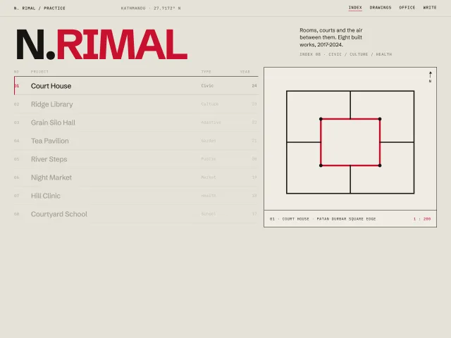
A Swiss architect index: 120px wordmark, an 8-row 12-column project list, and a sticky right panel that crossfades a geometric plan on hover.
Settings page with sticky nav
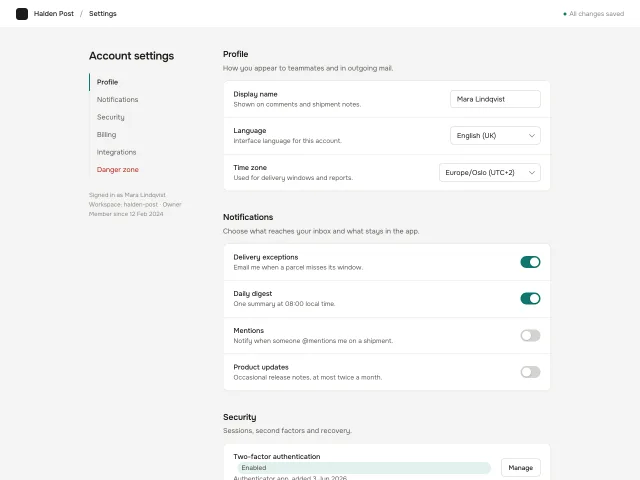
Account settings: a 220px sticky section nav with scroll-spy highlight beside a 720px column of grouped setting cards with switches, selects, text inputs and an armed danger zone.
Agency landing with case wall
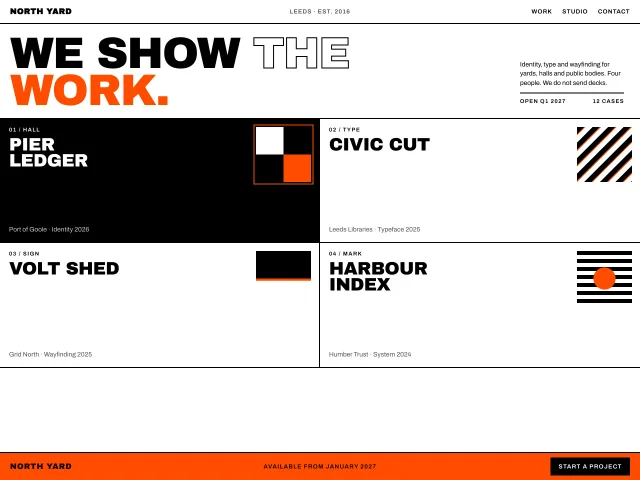
North Yard: an 88px lockup, a hard-edged 2×2 case wall that inverts on hover, and a sticky 56px orange CTA bar.
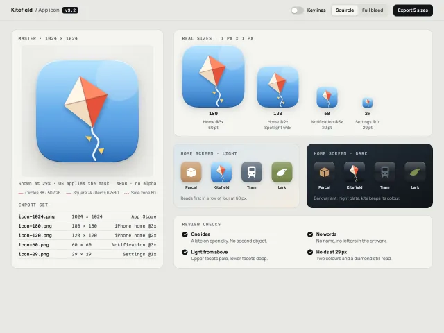
App icon spec sheet
One app icon as a review page: a 1024 master with a keyline overlay and mask toggle, real-pixel sizes, light and dark home screens, and the export set.
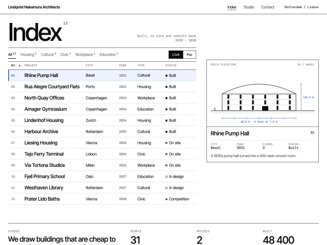
Architecture studio index
A Swiss studio index: sortable, filterable project table whose selected row drives a true-scale SVG elevation that slides to follow it, plus a map view.
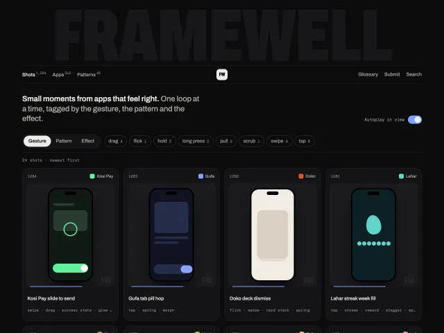
Dark motion shot gallery
A dark gallery of phone-shot cards that loop when in view or hovered, filtered by gesture, pattern and effect, with a shot viewer and a giant faint wordmark.