Nº 002 of 520
Avatar stack with presence
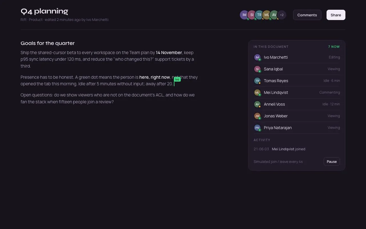
Overlapping initials avatars with a +N overflow chip, hover fans them apart, pulsing green presence dots, name/status tooltips, and a simulated join or leave every 4s.
Preview
Use it
Free to use · credit appreciated1 Once, in your project
npx skills add SusanAcharya/Design-Lounge 2 Then ask
Using the Design Lounge skill, build "Avatar stack with presence" (piece avatar-stack-presence) in my stack. Match its brief; restyle it onto my product's theme.
No skill? Paste the brief instead. It carries the numbers, tokens and behaviour.
<!-- Design Lounge Nº 002 · "Avatar stack with presence" · www.designlounge.live -->

# Avatar stack with presence

> **Build brief for a coding agent.** Rebuild this piece in the reader's stack. If they haven't said which stack, ask once, then default to semantic HTML + CSS + a little vanilla JS. Match the numbers below; don't "improve" them.

## What it is

The "who's here" stack in the header of a collaborative document ("Rift"). Up to five 36px avatars overlap by 10px, each an initials pair on its own muted tint with a 2px page-coloured ring; a sixth chip reads "+N" for the overflow. Hovering (or focusing into) the stack fans the avatars apart to a 6px gap so each one is readable; hovering one avatar lifts it 2px and shows a dark tooltip with the name and status. A 10px presence dot sits at the bottom-right of each avatar: green for active (with a calm 2s expanding ring), amber for idle, grey for away. A timer simulates someone joining or leaving every 4s so the pop-in, shrink-out and overflow count can be seen; a Pause button stops it. The detail worth copying is that the fan-out is a `margin-left` transition on the avatars, driven by `:hover` and `:focus-within` on the container, so keyboard users get the same expansion.

## Reference behaviour

1. Initial state: header (104px) with the title "Q4 planning", meta line, and on the right the stack (5 avatars + "+2"), a "Comments" button and a solid "Share" button. Below: document text with a green collaborator caret labelled "Ivo", and a 340px presence panel listing all 7 people with status, an activity log, and the pause control.
2. Hover the stack: every avatar's `margin-left` transitions from −10px to 6px over 240ms. Moving out reverses it.
3. Hover or focus one avatar: it rises 2px, comes to the top of the stack, and a tooltip appears 10px below it (name in 12px/500, status in 11px), fading in and settling 4px over 160ms with a 4px caret.
4. Hover "+2": its tooltip lists the overflow names on separate lines.
5. Active avatars show a green dot with a ring that expands from scale 1 to 2 while fading over 2000ms, looping. Idle dots are amber, away grey, no ring.
6. Every 4000ms the simulation steps: on odd ticks someone from the away pool joins (inserted at the front with a 280ms spring pop from scale .4); on even ticks someone other than the first person leaves (if visible, shrinks to scale 0 and width 0 over 240ms before removal). The "+N" chip, the "N now" count and the people list update; the activity log gets a timestamped line at the top and keeps five.
7. Pause toggles `aria-pressed` and stops the timer; Resume restarts it.
8. Keyboard: Tab into the stack fans it open (via `:focus-within`); each avatar is a button with a tooltip on focus.

## Structure

```
1280 × 800   (padding 0 72)
┌──────────────────────────────────────────────────────────────────────────┐
│ Q4 planning (26px Syne)             (IM)(SI)(TR)(ML)(AV)(+2)  [Comments] [Share] │ head 104
│ Rift · Product · edited 2 minutes ago                                     │
├──────────────────────────────────────────────────────────────────────────┤
│ Goals for the quarter                        ┌ panel 340 ─────────────┐  │
│ Ship the shared-cursor beta to every…        │ IN THIS DOCUMENT  5 now│  │
│                                              │ (IM) Ivo Marchetti  Editing │
│ Presence has to be honest. A green dot…|Ivo  │ (SI) Sana Iqbal     Viewing │
│                                              │ (TR) Tomas Reyes    Idle · 6 min │
│ Open questions: do we show viewers…          │ …                      │  │
│                                              │ ACTIVITY               │  │
│                                              │ 09:14:02  Mei … joined │  │
│                                              │ Simulated every 4s [Pause] │
│                                              └────────────────────────┘  │
└──────────────────────────────────────────────────────────────────────────┘

… 161 more lines. Copy or download for the full brief. Loading the source…Brief
201 linesBuild brief for a coding agent. Rebuild this piece in the reader’s stack. If they haven’t said which stack, ask once, then default to semantic HTML + CSS + a little vanilla JS. Match the numbers below; don’t “improve” them.
What it is
The “who’s here” stack in the header of a collaborative document (“Rift”). Up to five 36px avatars overlap by 10px, each an initials pair on its own muted tint with a 2px page-coloured ring; a sixth chip reads “+N” for the overflow. Hovering (or focusing into) the stack fans the avatars apart to a 6px gap so each one is readable; hovering one avatar lifts it 2px and shows a dark tooltip with the name and status. A 10px presence dot sits at the bottom-right of each avatar: green for active (with a calm 2s expanding ring), amber for idle, grey for away. A timer simulates someone joining or leaving every 4s so the pop-in, shrink-out and overflow count can be seen; a Pause button stops it. The detail worth copying is that the fan-out is a margin-left transition on the avatars, driven by :hover and :focus-within on the container, so keyboard users get the same expansion.
Reference behaviour
- Initial state: header (104px) with the title “Q4 planning”, meta line, and on the right the stack (5 avatars + “+2”), a “Comments” button and a solid “Share” button. Below: document text with a green collaborator caret labelled “Ivo”, and a 340px presence panel listing all 7 people with status, an activity log, and the pause control.
- Hover the stack: every avatar’s
margin-lefttransitions from −10px to 6px over 240ms. Moving out reverses it. - Hover or focus one avatar: it rises 2px, comes to the top of the stack, and a tooltip appears 10px below it (name in 12px/500, status in 11px), fading in and settling 4px over 160ms with a 4px caret.
- Hover “+2”: its tooltip lists the overflow names on separate lines.
- Active avatars show a green dot with a ring that expands from scale 1 to 2 while fading over 2000ms, looping. Idle dots are amber, away grey, no ring.
- Every 4000ms the simulation steps: on odd ticks someone from the away pool joins (inserted at the front with a 280ms spring pop from scale .4); on even ticks someone other than the first person leaves (if visible, shrinks to scale 0 and width 0 over 240ms before removal). The “+N” chip, the “N now” count and the people list update; the activity log gets a timestamped line at the top and keeps five.
- Pause toggles
aria-pressedand stops the timer; Resume restarts it. - Keyboard: Tab into the stack fans it open (via
:focus-within); each avatar is a button with a tooltip on focus.
Structure
1280 × 800   (padding 0 72)
┌──────────────────────────────────────────────────────────────────────────┐
│ Q4 planning (26px Syne)             (IM)(SI)(TR)(ML)(AV)(+2)  [Comments] [Share] │ head 104
│ Rift · Product · edited 2 minutes ago                                     │
├──────────────────────────────────────────────────────────────────────────┤
│ Goals for the quarter                        ┌ panel 340 ─────────────┐  │
│ Ship the shared-cursor beta to every…        │ IN THIS DOCUMENT  5 now│  │
│                                              │ (IM) Ivo Marchetti  Editing │
│ Presence has to be honest. A green dot…|Ivo  │ (SI) Sana Iqbal     Viewing │
│                                              │ (TR) Tomas Reyes    Idle · 6 min │
│ Open questions: do we show viewers…          │ …                      │  │
│                                              │ ACTIVITY               │  │
│                                              │ 09:14:02  Mei … joined │  │
│                                              │ Simulated every 4s [Pause] │
│                                              └────────────────────────┘  │
└──────────────────────────────────────────────────────────────────────────┘
   stack detail:  ◯◯◯◯◯ +2   (36px, overlap −10)  →  hover: ◯ ◯ ◯ ◯ ◯ +2 (gap 6)
<header class="head">→ title block,.rightwith.stack[role=group][aria-label], two.btns..stack→<button class="av" style="--tint" aria-label="Name, Status">× ≤5, each containing initials text,.pd[data-s]dot and.tip[aria-hidden]; optional<button class="av more">with its own.tip..bodygrid1fr 340px, gap 56px:<main class="doc">paragraphs (one with.cursor),<aside class="panel">with<h3>+<span id=count>,<ul class="people">,<h3>,<ul class="log" aria-live="polite">,.ctlrow with the pause<button aria-pressed>.
Tokens
:root {
  /* colour — deep plum neutrals, green for live presence */
  --bg: #17131d;
  --surface: #201a29;        /* panel, buttons */
  --surface-2: #2a2335;      /* hover, +N chip */
  --line: #2f2739;
  --line-2: #3d3449;         /* button border */
  --ink: #f1ecf7;            /* text, tooltip background */
  --ink-2: #a79db6;
  --ink-3: #6f6580;          /* meta, away dot */
  --live: #3ddc84;           /* active dot, focus ring, caret */
  --idle: #d9a441;
  --away: #6f6580;
  /* avatar tints */
  --t1: #5b4b8a; --t2: #8a4b6b; --t3: #3f6f7a; --t4: #7a6a3f; --t5: #4b6f52; --t6: #8a5a3f; --t7: #4b5b8a;

  /* type */
  --display: "Syne", system-ui, sans-serif;
  --font: "Manrope", system-ui, sans-serif;

  /* layout */
  --av: 36px;
  --av-ring: 2px;            /* border in --bg */
  --overlap: -10px;
  --fan: 6px;
  --dot: 10px;
  --stack-max: 5;
  --tip-gap: 10px;
  --r: 8px;
  --r-lg: 14px;

  /* motion */
  --t-micro: 160ms;
  --t-fan: 240ms;
  --t-pop: 280ms;
  --t-pulse: 2000ms;
  --t-sim: 4000ms;
  --ease: cubic-bezier(.2, .7, .2, 1);
  --ease-out: cubic-bezier(.16, 1, .3, 1);
  --ease-spring: cubic-bezier(.34, 1.56, .64, 1);
}
Typography
| Role | Family | Size | Weight | Line-height | Tracking | Notes |
|---|---|---|---|---|---|---|
| Doc title | Syne | 26px | 700 | 1.1 | −0.02em | |
| Section heading | Syne | 18px | 600 | 1.3 | 0 | |
| Body | Manrope | 15px | 400 | 1.55 | 0 | --ink-2, bold runs --ink 600; max-width 620px |
| Meta line | Manrope | 13px | 400 | 1.55 | 0 | --ink-3 |
| Avatar initials | Manrope | 12px | 600 | 1 | 0 | 10px in the people list (26px avatars) |
| +N chip | Manrope | 11px | 500 | 1 | 0 | --ink-2 on --surface-2 |
| Tooltip | Manrope | 12px / 11px | 500 / 400 | 1.3 | 0 | --bg on --ink; status in #5a5266 |
| Buttons | Manrope | 13px | 600 | 1 | 0 | |
| Panel heading | Manrope | 11px | 600 | 1 | +0.12em | UPPERCASE --ink-3; count in --live |
| People row | Manrope | 14px / 12px | 400 | 1.55 | 0 | name / status |
| Log row | Manrope | 12.5px | 400 | 1.5 | 0 | time tabular in --ink-3 |
| Caret label | Manrope | 10px | 600 | 1 | 0 | --bg on --live |
Motion
| Element | Trigger | Property | From → To | Duration | Easing | Loop |
|---|---|---|---|---|---|---|
.av (in stack) | stack hover / focus-within | margin-left | −10px → 6px (first stays 0) | 240ms | --ease | — |
.av | own hover / focus | translateY, z-index | 0 → −2px; z 3 | 240ms | --ease | — |
.tip | own hover / focus | opacity, translateY | 0, −4px → 1, 0 | 160ms | --ease | — |
.pd[data-s=active]::after | always | scale, opacity | 1, .7 → 2, 0 (holds 0 from 70 %) | 2000ms | --ease-out | infinite |
.av.in | join | scale, opacity | .4, 0 → 1, 1 | 280ms | --ease-spring | — |
.av.out | leave | scale, opacity, width, margin | 1 → 0, 0, 0, 0 | 240ms | --ease | — |
.btn | hover | background | --surface → --surface-2 | 0 | — | — |
Reduced motion: the presence ring is static at 50 % opacity (no pulse); pop/shrink 1ms; fan and tooltip 1ms. The simulation still runs (it is content, not decoration) but can be paused.
States
- Avatar rest: tint fill, 2px
--bgring, initials--ink, overlapped. - Stack hovered / focus-within: fanned (6px gaps).
- Avatar hover / focus-visible: lifted 2px, on top; focus-visible adds a 2px
--liveoutline offset 2px; tooltip shown. - Presence dot:
data-s="active"green + pulsing ring;idleamber;awaygrey. Dot has a 2px--bgring so it reads over any tint. - +N chip:
--surface-2fill,--ink-2text; tooltip lists hidden names. - Joining (
.in) / leaving (.out) as in Motion. - Pause button:
aria-pressed="true"reads “Resume”. - Buttons:
--surfacewith--line-2border; hover--surface-2; primary is--inkfill with--bgtext.
Accessibility
- The stack is
role="group" aria-label="People in this document"; each avatar is a<button aria-label="Name, Status">, so initials and dots need no extra text. The tooltip isaria-hidden(it duplicates the label). - The +N chip’s
aria-labelenumerates the hidden people (“2 more people: Priya Natarajan, Elin Marsh”). - Presence colour is never the only cue: the status word is in the label, in the tooltip and in the people list.
- The activity log is
aria-live="polite"; the count (“5 now”) is not live, to avoid double announcements. - Keyboard: Tab reaches each avatar (which fans the stack via
:focus-within), then the chip, then Comments, Share, and later Pause. Escape is not needed; tooltips follow focus. - Contrast:
--ink-2on--bg8.5:1;--ink-3on--bg3.6:1 (meta ≥ 12.5px only); initials--inkon the darkest tint (--t3) 6.6:1; tooltip--bgon--ink15:1; caret label--bgon--live9.7:1. - Hit targets: avatars 36px (40px with ring and fan gap); Pause 30px tall (raise to 36px on touch).
- Keep
setIntervalat 4000ms; never re-render the whole stack on hover (the fan is CSS only).
Responsive rules
- ≥ 1280: as specified.
- 1024–1279: padding 40px; panel 300px.
- 768–1023: panel moves under the document; the stack shows 4 avatars before the +N chip.
- < 640: header wraps to two rows (title, then stack + Share); the stack shows 3 avatars + chip; tooltips are replaced by the people list (tap the stack to scroll to it); avatars stay 36px.
Acceptance checklist
- Avatars are 36px circles with a 2px ring in
--bg, overlapping by 10px; at most 5 are shown before a “+N” chip. - Hovering or focusing into the stack transitions
margin-leftfrom −10px to 6px over 240ms; the first avatar’s margin stays 0. - Hovering/focusing an avatar lifts it 2px, raises its z-index and shows a tooltip 10px below with name and status.
- Presence dots are 10px with a 2px ring; active dots pulse a ring from scale 1 to 2 over 2s, looping.
- Idle dots are amber, away dots grey, with no pulse.
- Every 4s a join (spring pop, 280ms) or leave (shrink, 240ms) occurs; the chip count, “N now” and the people list update; the log keeps 5 lines.
- The first person (the editor) never leaves.
- Pause stops the interval and toggles
aria-pressed; Resume restarts it. - Each avatar is a
<button>with an accessible name of “Name, Status”; the chip’s name lists the hidden people. - Focus rings (2px
--live) are visible on avatars, chip, buttons and Pause. - Reduced motion: no pulse, 1ms pop/shrink/fan.
- Initials contrast ≥ 4.5:1 on every tint.
Implementation notes
Fan-out is CSS-only and works for keyboard users through :focus-within:
.av { margin-left: var(--overlap); transition: margin var(--t-fan) var(--ease), transform var(--t-fan) var(--ease); }
.av:first-child { margin-left: 0; }
.stack:hover .av, .stack:focus-within .av { margin-left: var(--fan); }
.stack:hover .av:first-child, .stack:focus-within .av:first-child { margin-left: 0; }
.av:hover, .av:focus-visible { transform: translateY(-2px); z-index: 3; }
Pulse ring as a pseudo-element on the dot, so it needs no extra markup and inherits the colour:
.pd[data-s="active"]::after { content: ""; position: absolute; inset: -2px; border-radius: 50%;
  border: 1.5px solid var(--live); animation: pulse var(--t-pulse) var(--ease-out) infinite; }
@keyframes pulse { 0% { transform: scale(1); opacity: .7; } 70%, 100% { transform: scale(2); opacity: 0; } }
Leave before re-render. Animate the visible element out, then mutate state and re-render so the overflow chip recomputes:
el.classList.add('out');
setTimeout(() => { present.splice(i, 1); away.push(p); render(); }, 240);
Common mistakes: fanning with transform (the row width doesn’t grow, so the chip overlaps); putting tooltips inside overflow:hidden containers; rendering the pulse with box-shadow animation (repaints every frame); re-rendering the stack on hover so the fan transition restarts.
Details
- Palette
- Type
- Syne · Manrope
- Motion
- Subtle motion
- Build
- One session
- Tags