Nº 556 of 605
Scroll-driven feature cards
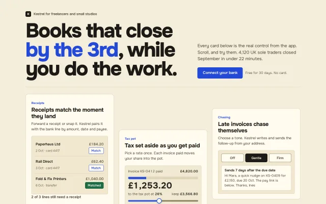
Six feature cards, each a small working control, that rise, untilt and settle as they enter on a CSS view() timeline, with a static fallback.
Preview
Use it
Free to use · credit appreciated1 Once, in your project · Node 22.20+
npx skills add SusanAcharya/Design-Lounge 2 Then ask
Using the Design Lounge skill, build "Scroll-driven feature cards" (piece features-scroll-driven-cards) in my stack. Match its brief; restyle it onto my product's theme.
No skill? Paste the brief instead. It carries the numbers, tokens and behaviour.
<!-- Design Lounge Nº 556 · "Scroll-driven feature cards" · www.designlounge.live -->

# Scroll-driven feature cards

> **Build brief for a coding agent.** Rebuild this piece in the reader's stack. If they haven't said which stack, ask once, then default to semantic HTML + CSS + a little vanilla JS. Match the numbers below; don't "improve" them.

## What it is

The features section of a bookkeeping product for UK freelancers, "Kestrel Books". A heavy 80px headline sits over a three-column, staggered grid of six cards. Each card is a feature told by its own working control (match a receipt, drag a tax-rate slider, pick a reminder tone, tick a month-end list, switch mileage trips, file a VAT return). As each card enters the viewport it rises 140px, untilts from about 3 degrees and grows from 0.92 to 1, driven by scroll position through `animation-timeline: view()`, not by a timer. The detail worth copying: the motion is pure CSS, scrubs backwards when you scroll up, and browsers without scroll timelines simply see the settled cards.

## Reference behaviour

1. Initial state: header (kicker with a 22px "K" mark, 80px headline with "by the 3rd" in cobalt, intro paragraph, "Connect your bank" primary). Below a 1px rule, the first row of three cards is fully settled; column 2 starts 140px lower, column 3 56px lower.
2. Scroll down: each card's animation is tied to its own view progress. Over `entry 0%` to `cover 20%` it goes from `opacity 0, translateY(140px) rotate(var(--tilt)) scale(.92)` to rest. Tilts: column 1 `-3deg`, column 2 `2.5deg`, column 3 `-1.5deg`. Inside each card the `.ui` panel lifts 18px on a slightly later range (`entry 10%` to `cover 26%`), so the control arrives just after its card.
3. Scroll up: the cards un-settle in reverse. Nothing is one-shot.
4. Receipts card: three bank lines. "Match" buttons toggle to green "Matched" (`aria-pressed`); the line under the panel counts down "2 of 3 lines still need a receipt" to "All 3 lines have receipts. Nothing to chase."
5. Tax pot card: invoice £4,820.00; range 15 to 40, default 26. Dragging updates the big amount (£1,253.20 at 26%), the "keep" amount and a 10px split bar width.
6. Chasing card: a three-way segmented radio (Off, Gentle, Firm; Gentle on). Each option rewrites the email preview: Gentle "Sends 7 days after the due date", Firm "Sends 3 days after, then every 7", Off "Reminders off". Left and right arrows move the selection.
7. Month-end card: four checkboxes (three ticked) and a 72px progress ring reading 3/4. Ticking the fourth fills the ring over 400ms and reads 4/4.
8. Mileage card: three calendar trips with switches (38 mi on, 52 mi on, 6 mi off). The claim total is miles × £0.45 (£40.50 initially).
9. VAT card: Box 1 £6,384.00, Box 4 £1,912.36, a dark Box 5 £4,471.64 "to pay by 7 Nov". "File the return" disables itself, reads "Filed" and a status line appears.
10. After the grid, a dark closing band ("October closes in 4 days. Two receipts to go.") with "Close October", then a hairline footer.

## Structure

```
1280 × 800 (section scrolls; total height about 1900)
┌──────────────────────────── wrap 1180 max, padding 44 / 50 ─────────────────────────┐
│ [K] Kestrel for freelancers…                                                         │
│ Books that close                       │ Every card below is the real control…       │
│ by the 3rd, while          (1.55fr)    │ [Connect your bank]  Free for 30 days…  (1fr)│
│ you do the work.  80px                 │                                              │
│──────────────────────────────────── 1px rule ───────────────────────────────────────│
│ ┌ Receipts ──────┐                      ┌ Chasing ──────┐  ← col 3 offset 56         │
│ │ 3 bank lines   │  ┌ Tax pot ──────┐   │ segmented     │                            │
│ │ Match buttons  │  │ slider        │   │ email preview │  ← col 2 offset 140        │
│ └────────────────┘  └───────────────┘   └───────────────┘                            │
│ ┌ Month-end ─────┐  ┌ Mileage ──────┐   ┌ VAT ──────────┐                            │
│ │ ring + 4 ticks │  │ 3 switches    │   │ boxes + file  │                            │
│ └────────────────┘  └───────────────┘   └───────────────┘                            │

… 178 more lines. Copy or download for the full brief. Loading the source…Brief
218 linesBuild brief for a coding agent. Rebuild this piece in the reader’s stack. If they haven’t said which stack, ask once, then default to semantic HTML + CSS + a little vanilla JS. Match the numbers below; don’t “improve” them.
What it is
The features section of a bookkeeping product for UK freelancers, “Kestrel Books”. A heavy 80px headline sits over a three-column, staggered grid of six cards. Each card is a feature told by its own working control (match a receipt, drag a tax-rate slider, pick a reminder tone, tick a month-end list, switch mileage trips, file a VAT return). As each card enters the viewport it rises 140px, untilts from about 3 degrees and grows from 0.92 to 1, driven by scroll position through animation-timeline: view(), not by a timer. The detail worth copying: the motion is pure CSS, scrubs backwards when you scroll up, and browsers without scroll timelines simply see the settled cards.
Reference behaviour
- Initial state: header (kicker with a 22px “K” mark, 80px headline with “by the 3rd” in cobalt, intro paragraph, “Connect your bank” primary). Below a 1px rule, the first row of three cards is fully settled; column 2 starts 140px lower, column 3 56px lower.
- Scroll down: each card’s animation is tied to its own view progress. Over
entry 0%tocover 20%it goes fromopacity 0, translateY(140px) rotate(var(--tilt)) scale(.92)to rest. Tilts: column 1-3deg, column 22.5deg, column 3-1.5deg. Inside each card the.uipanel lifts 18px on a slightly later range (entry 10%tocover 26%), so the control arrives just after its card. - Scroll up: the cards un-settle in reverse. Nothing is one-shot.
- Receipts card: three bank lines. “Match” buttons toggle to green “Matched” (
aria-pressed); the line under the panel counts down “2 of 3 lines still need a receipt” to “All 3 lines have receipts. Nothing to chase.” - Tax pot card: invoice £4,820.00; range 15 to 40, default 26. Dragging updates the big amount (£1,253.20 at 26%), the “keep” amount and a 10px split bar width.
- Chasing card: a three-way segmented radio (Off, Gentle, Firm; Gentle on). Each option rewrites the email preview: Gentle “Sends 7 days after the due date”, Firm “Sends 3 days after, then every 7”, Off “Reminders off”. Left and right arrows move the selection.
- Month-end card: four checkboxes (three ticked) and a 72px progress ring reading 3/4. Ticking the fourth fills the ring over 400ms and reads 4/4.
- Mileage card: three calendar trips with switches (38 mi on, 52 mi on, 6 mi off). The claim total is miles × £0.45 (£40.50 initially).
- VAT card: Box 1 £6,384.00, Box 4 £1,912.36, a dark Box 5 £4,471.64 “to pay by 7 Nov”. “File the return” disables itself, reads “Filed” and a status line appears.
- After the grid, a dark closing band (“October closes in 4 days. Two receipts to go.”) with “Close October”, then a hairline footer.
Structure
1280 × 800 (section scrolls; total height about 1900)
┌──────────────────────────── wrap 1180 max, padding 44 / 50 ─────────────────────────┐
│ [K] Kestrel for freelancers…                                                         │
│ Books that close                       │ Every card below is the real control…       │
│ by the 3rd, while          (1.55fr)    │ [Connect your bank]  Free for 30 days…  (1fr)│
│ you do the work.  80px                 │                                              │
│──────────────────────────────────── 1px rule ───────────────────────────────────────│
│ ┌ Receipts ──────┐                      ┌ Chasing ──────┐  ← col 3 offset 56         │
│ │ 3 bank lines   │  ┌ Tax pot ──────┐   │ segmented     │                            │
│ │ Match buttons  │  │ slider        │   │ email preview │  ← col 2 offset 140        │
│ └────────────────┘  └───────────────┘   └───────────────┘                            │
│ ┌ Month-end ─────┐  ┌ Mileage ──────┐   ┌ VAT ──────────┐                            │
│ │ ring + 4 ticks │  │ 3 switches    │   │ boxes + file  │                            │
│ └────────────────┘  └───────────────┘   └───────────────┘                            │
│ ┌──────────── closing band (ink) ─────────── [Close October] ┐                       │
│ footer hairline: place + price                │  banks + export                      │
└──────────────────────────────────────────────────────────────────────────────────────┘
 column gap 20 · row gap 20 · card padding 22 · inner panel padding 12
<main class="wrap">→<header>(two-column grid,align-items:end) with<h1>and an intro<div>.<section class="grid" aria-label="Kestrel features">holds three.coldivs, each a grid of two<article class="card">.- Card anatomy:
.lbl(feature noun, accent),<h2>, one<p>, then.ui(sunk panel holding the control), optional.statuslive line. - Closing band is a
<section aria-label>that also uses the card settle. - Footer is a plain
divwith two spans.
Tokens
:root {
  /* colour: butter paper, ink, one cobalt accent */
  --bg: #F4EDDA;          /* page */
  --card: #FFFBF0;        /* card face */
  --sunk: #F1E8D0;        /* control panel inside a card */
  --line: #DFD3B4;        /* hairlines and card border */
  --line-2: #B9AB86;      /* control borders, ghost button */
  --ink: #1C1A15;         /* text, dark box, closing band */
  --ink-2: #4F4A3D;       /* body copy */
  --ink-3: #6B6453;       /* meta, 12–13px */
  --accent: #2449D8;      /* primary, slider, ring, switches on */
  --accent-hover: #1A3AB8;
  --accent-ink: #FFFFFF;
  --good: #1D6B43;        /* matched, filed */
  --switch-off: #857A58;  /* switch track off, slider track, segment borders: 3:1 or better */

  /* type */
  --font: "Onest", system-ui, sans-serif;
  --fs-display: clamp(40px, 6.2vw, 80px);
  --fs-h2: 22px;
  --fs-big: 34px;
  --fs-body: 15px;
  --fs-card: 14px;
  --fs-meta: 12px;

  /* space and shape */
  --gap: 20px;
  --pad-card: 22px;
  --r: 10px;
  --r-sm: 6px;
  --offset-col2: 140px;
  --offset-col3: 56px;

  /* motion */
  --t: 160ms;
  --ease: cubic-bezier(.2, .7, .2, 1);
  --expo: cubic-bezier(.16, 1, .3, 1);
  --rise: 140px;
  --tilt-1: -3deg; --tilt-2: 2.5deg; --tilt-3: -1.5deg;
}
Typography
| Role | Family | Size | Weight | Line-height | Tracking | Case |
|---|---|---|---|---|---|---|
| Display headline | Onest | clamp(40px, 6.2vw, 80px) | 800 | 0.94 | -0.045em | sentence |
| Intro | Onest | 17px | 400 | 1.5 | 0 | sentence |
| Card title | Onest | 22px | 700 | 1.15 | -0.02em | sentence |
| Card label | Onest | 12px | 600 | 1.5 | +0.02em | sentence, accent |
| Card body | Onest | 14px | 400 | 1.5 | 0 | sentence |
| Big figure | Onest | 34px | 700 | 1 | -0.03em | tabular numerals |
| Closing line | Onest | clamp(28px, 4vw, 48px) | 800 | 1 | -0.035em | sentence |
| Meta | Onest | 12–13px | 400–600 | 1.4 | 0 | sentence |
One family at two weights carries everything; money always uses font-variant-numeric: tabular-nums.
Motion
| Element | Trigger | Property | From → To | Range / duration | Easing | Reduced motion |
|---|---|---|---|---|---|---|
.card | its own view progress | opacity, transform | 0, translateY(140px) rotate(tilt) scale(.92) → 1, none | entry 0% to cover 20% | --expo as timing function | no animation, static |
.card .ui | its own view progress | opacity, translateY | 0, 18px → 1, 0 | entry 10% to cover 26% | --ease | static |
| split bar | slider input | width | old % → new % | 160ms | --ease | 1ms |
| progress ring | checkbox change | stroke-dashoffset | 188.5 × (1 − n/4) | 400ms | --expo | 1ms |
| switch thumb | change | translateX | 0 → 16px | 160ms | --ease | 1ms |
| buttons | active | translateY | 0 → 1px | 160ms | --ease | 1ms |
The settle lives inside @supports (animation-timeline: view()) and @media (prefers-reduced-motion: no-preference). Without either, cards are simply at rest.
States
- Primary button: cobalt fill, white text, 44px tall; hover
#1A3AB8; active nudges 1px down. Disabled (“Filed”) keeps the label and stops responding. - Ghost button: transparent,
--line-2border; hover fills--sunk. - Match button: outline cobalt on
--card; pressed state fills--goodwith white text and reads “Matched”. - Segmented radio: three separate 34px buttons, 6px apart, each with a 1px
#857A58border on--card(3.5:1); hover--sunk; selected fills--inkwith--bgtext and an ink border. - Checkboxes: custom,
appearance: none, 16px, 1.5px--ink-3border, 4px radius; checked fills cobalt with a white tick. - Slider:
appearance: none, 6px track in#857A58with a cobalt fill up to the value (a--pbackground size), 20px--cardthumb with a 2px cobalt ring. - Switch: off track
#857A58, on track cobalt, white 16px thumb. - Focus-visible: 2px cobalt outline, 2px offset, on every control.
- Done states: receipts status “All 3 lines have receipts. Nothing to chase.”; VAT status “Filed 28 Oct, 14:06…” in
--good.
Accessibility
- Cards are
<article>with an<h2>; the grid section hasaria-label="Kestrel features". - Match buttons use
aria-pressed; mileage switches are<input type="checkbox" role="switch">with anaria-labelnaming the trip. - The tone picker is
role="radiogroup"withrole="radio"buttons andaria-checked; arrow keys move the choice. - The slider has
aria-label="Share set aside for tax, percent". - Receipt status, email preview and VAT status are
aria-live="polite". - The ring SVG is
aria-hidden; the checkboxes carry the state. - Contrast:
--ink-2on--card8.6:1;--ink-3on--sunk4.9:1; white on cobalt 6.6:1; switch-off track 3.5:1 against--sunk. - Scroll motion never hides content from assistive tech: cards are in the DOM and focusable at any scroll position.
Responsive rules
- ≥ 1280: three columns, offsets 140px and 56px, header 1.55fr / 1fr.
- 1024–1279: same; the headline scales with
6.2vw. - 768–1023: two columns; the third column spans both and becomes a two-up row; offsets drop to 0 for column 3.
- < 760: one column, offsets 0, wrap padding 36px 16px, header stacks with 22px gap, closing band stacks with the button under the line. At 390 wide the headline is 40px and nothing scrolls sideways.
Acceptance checklist
Always
- Each feature card holds a working control, not an icon and a sentence.
- Card settle is CSS only, on
animation-timeline: view(), and scrubs backwards when scrolling up. - Settle range is
entry 0%tocover 20%, so the first row is at rest in the first frame. - Without scroll-timeline support, or with reduced motion, every card is fully visible at rest.
- Columns are staggered: column 2 starts 140px lower, column 3 56px lower, on desktop only.
- Every control has a visible 2px focus ring; the radiogroup answers arrow keys.
- At 390 wide: one column, no sideways scroll, headline 40px.
- Body text ≥ 4.5:1 on its surface; every control (checkbox, slider track, switch, segment) has its own ≥ 3:1 border or fill.
This demo
- Headline “Books that close by the 3rd, while you do the work.” with “by the 3rd” in
#2449D8. - Tax slider at 26% shows £1,253.20 set aside and £3,566.80 kept from £4,820.00.
- Mileage total is £40.50 with the 6 mi trip off and rises to £43.20 when it is switched on.
- Month-end ring reads 3/4 and fills to 4/4 when “Mark the month closed” is ticked.
- “File the return” becomes “Filed”, disables, and shows the filed status line.
Implementation notes
The settle, with its fallback. Put the animation inside both guards. The timing function shapes progress along the scroll range, so expo-out makes the card land early and drift to rest.
@keyframes settle {
  from { opacity: 0; transform: translateY(140px) rotate(var(--tilt)) scale(.92); }
  to   { opacity: 1; transform: none; }
}
.card { --tilt: -3deg; transform-origin: 50% 100%; }
.col:nth-child(2) .card { --tilt: 2.5deg; }
.col:nth-child(3) .card { --tilt: -1.5deg; }
@supports (animation-timeline: view()) {
  @media (prefers-reduced-motion: no-preference) {
    .card { animation: settle both var(--expo);
            animation-timeline: view(); animation-range: entry 0% cover 20%; }
    .card .ui { animation: lift both var(--ease);
                animation-timeline: view(); animation-range: entry 10% cover 26%; }
  }
}
Use both fill so the card holds its from-state before entry and its rest state after. Do not set a duration; with a view timeline the range is the duration.
Progress ring from a dash offset. Circumference for r = 30 is 188.5. Rotate the circle −90° so it starts at 12 o’clock.
const n = [...boxes].filter(b => b.checked).length;
ring.setAttribute('stroke-dashoffset', 188.5 * (1 - n / 4));
label.textContent = n + '/4';
Money formatting. One formatter for every figure, so the slider and mileage never show 1253.2.
const gbp = n => '£' + n.toLocaleString('en-GB', { minimumFractionDigits: 2, maximumFractionDigits: 2 });Common mistakes: animating with an IntersectionObserver class toggle (it cannot scrub and fires once); giving the first row a range that leaves it half-faded in the first frame; putting overflow: hidden on the grid, which clips the tilted corners while they settle; staggering the columns on mobile, which leaves holes.
Details
- Palette
- Type
- Onest
- Motion
- Rich motion
- Build
- One session
- Tags
Studied
LinearShow the product doing the work. Fade it at the edges and keep one colour for what matters.
All sourcesSimilar
Sticky scroll feature steps
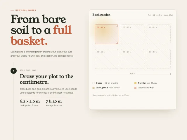
Four Loam garden-planning steps scroll on the left while a 600px plot preview sticks on the right and morphs beds, crops, calendar and harvest tally.
Bento feature grid
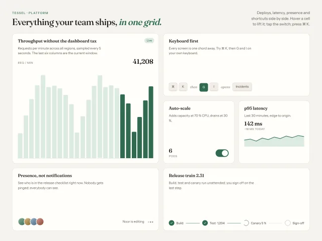
Six feature cells of varied spans on a 4-column grid, each with a small live CSS illustration; hover lifts a cell 2px and brightens its hairline.
Lens card scroll ticker
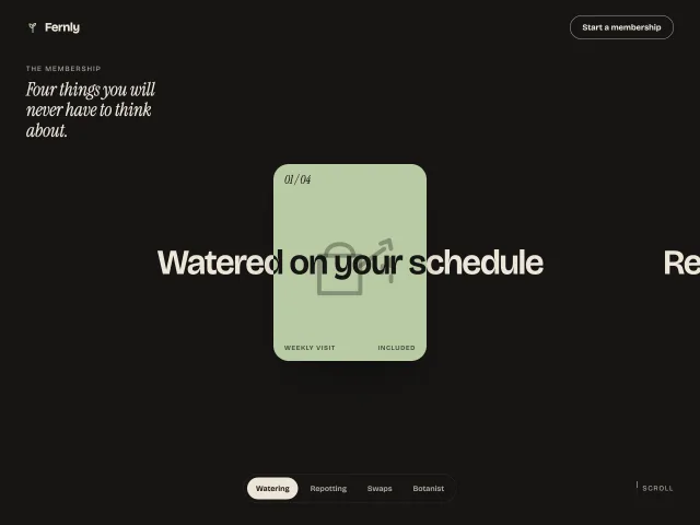
Scroll moves a row of huge benefit lines sideways through a fixed centre card. Inside the card the text turns ink and the card recolours per benefit.
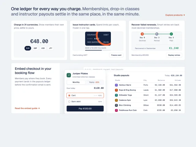
Live checkout bento
A product bento where every cell is working UI: a currency switcher, a freezable issued card, a retry timeline, and a checkout that posts its payment into a payouts ledger.
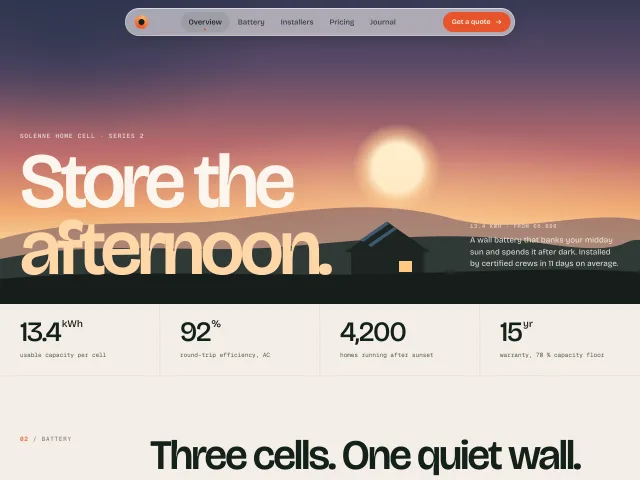
Floating pill navbar
A full-width transparent nav over a dusk hero that shrinks into a 780px frosted pill on scroll, with a sliding active-section capsule.
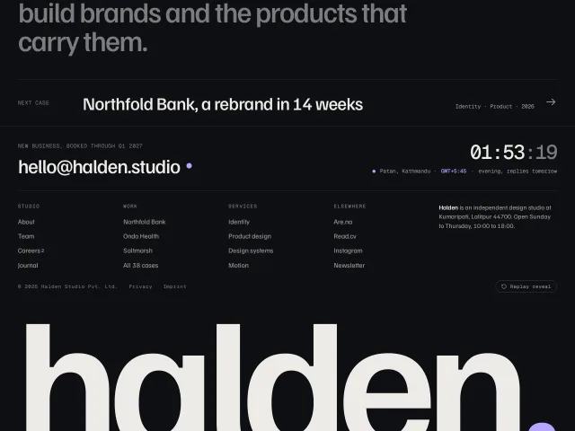
Giant wordmark reveal footer
A dark studio footer whose full-width wordmark rises letter by letter out of the bottom edge as you scroll in, with a sitemap and a live local clock.