Nº 521 of 528
Label that rises in the field
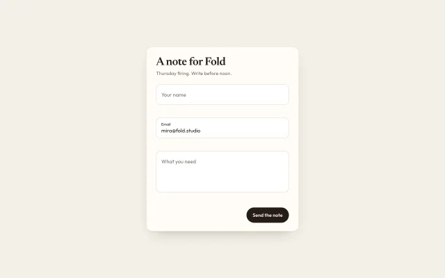
The label sits in the field at 15px, then rises and scales to 11px when the field is focused or already filled.
Preview
Use it
Free to use · credit appreciated1 Once, in your project
npx skills add SusanAcharya/Design-Lounge 2 Then ask
Using the Design Lounge skill, build "Label that rises in the field" (piece field-label-morph) in my stack. Match its brief; restyle it onto my product's theme.
No skill? Paste the brief instead. It carries the numbers, tokens and behaviour.
<!-- Design Lounge Nº 521 · "Label that rises in the field" · www.designlounge.live -->

# Label that rises in the field

> **Build brief for a coding agent.** Rebuild this piece in the reader's stack. If they haven't said which stack, ask once, then default to semantic HTML + CSS + a little vanilla JS. Match the numbers below; don't "improve" them. When a kit is locked, map the colours onto that kit. Keep the rise.

## What it is

A short note form for Fold, a fictional clay studio. The card is 440px on warm paper. Three fields: name, email, and a note. The email starts filled with `mira@fold.studio`, so its label is already raised. The other two labels sit inside the field. Focusing an empty field, or typing in it, moves that label up. This is the field pattern. The map-and-address block in `contact-split-map-form` is a different piece. Use this one when the page is a form and the motion dial is 4 to 7.

## Reference behaviour

1. First frame: name and note are empty, labels inside. Email is filled, label raised. No error is showing. The status line is empty.
2. Focus an empty field. Over 200ms the label moves up 11px and scales to 0.73. The border becomes `#241c16`.
3. Type, then blur. If the value is non-empty after trim, the label stays up. If the value is empty, the label returns inside.
4. Submit with a gap: that field gets a clay-red border and a `#f8ebe8` fill. The alert under it reads "Add a name.", "Add an email.", or "Add a short note."
5. Email without `@` reads "That email needs an @."
6. A valid submit writes "Sent to the Thursday firing." in `#2f6b45` and clears the errors.
7. Reduced motion: the label still ends in the right place. The transition is 1ms.

## Structure

```
440 card, padding 28
heading 32 serif
lede 14
field 58, radius 12
  label absolute
  input
error line 18
field 58 (filled)
error line
field 118 (note)
error line
row: status · button 44
```

- `section.card` holds `h1`, `p.lede`, and `form`.
- Each `.field` is a `div` containing `label[for]` and `input` or `textarea`.
- The error is a sibling `p.err`, not inside the field, so the label's absolute box stays 58px.

… 126 more lines. Copy or download for the full brief. Loading the source…Brief
166 linesBuild brief for a coding agent. Rebuild this piece in the reader’s stack. If they haven’t said which stack, ask once, then default to semantic HTML + CSS + a little vanilla JS. Match the numbers below; don’t “improve” them. When a kit is locked, map the colours onto that kit. Keep the rise.
What it is
A short note form for Fold, a fictional clay studio. The card is 440px on warm paper. Three fields: name, email, and a note. The email starts filled with mira@fold.studio, so its label is already raised. The other two labels sit inside the field. Focusing an empty field, or typing in it, moves that label up. This is the field pattern. The map-and-address block in contact-split-map-form is a different piece. Use this one when the page is a form and the motion dial is 4 to 7.
Reference behaviour
- First frame: name and note are empty, labels inside. Email is filled, label raised. No error is showing. The status line is empty.
- Focus an empty field. Over 200ms the label moves up 11px and scales to 0.73. The border becomes
#241c16. - Type, then blur. If the value is non-empty after trim, the label stays up. If the value is empty, the label returns inside.
- Submit with a gap: that field gets a clay-red border and a
#f8ebe8fill. The alert under it reads “Add a name.”, “Add an email.”, or “Add a short note.” - Email without
@reads “That email needs an @.” - A valid submit writes “Sent to the Thursday firing.” in
#2f6b45and clears the errors. - Reduced motion: the label still ends in the right place. The transition is 1ms.
Structure
440 card, padding 28
heading 32 serif
lede 14
field 58, radius 12
  label absolute
  input
error line 18
field 58 (filled)
error line
field 118 (note)
error line
row: status · button 44section.cardholdsh1,p.lede, andform.- Each
.fieldis adivcontaininglabel[for]andinputortextarea. - The error is a sibling
p.err, not inside the field, so the label’s absolute box stays 58px. - The button is
type="submit".
Tokens
:root {
  --bg: #f3efe6;
  --card: #fffcf7;
  --line: #e4dcd0;
  --ink: #241c16;
  --muted: #7a6e62;
  --accent: #b24a28;
  --danger: #9c2f24;
  --danger-bg: #f8ebe8;
  --ok: #2f6b45;
  --serif: "Newsreader", Georgia, serif;
  --sans: "Outfit", system-ui, sans-serif;
  --ease: cubic-bezier(.2, .7, .2, 1);
  --rise: 200ms;
  --field-h: 58px;
  --note-h: 118px;
  --radius: 12px;
}
Typography
| Role | Family | Size | Weight | Line | Tracking |
|---|---|---|---|---|---|
| Heading | Newsreader | 32px | 600 | 1.05 | -0.02em |
| Lede, status | Outfit | 14px / 13px | 400 | 1.45 | 0 |
| Label at rest | Outfit | 15px | 400 | 1 | 0 |
| Label raised | Outfit | 11px (15 × 0.73) | 400 | 1 | 0 |
| Value | Outfit | 15px | 400 | 1.4 | 0 |
| Button | Outfit | 14px | 600 | 1 | 0 |
| Error | Outfit | 13px | 400 | 1.3 | 0 |
Motion
| Thing | Trigger | Property | From → to | Duration | Easing | Reduced motion |
|---|---|---|---|---|---|---|
| Label | focus, or value becomes non-empty | transform | none → translateY(-11px) scale(0.73) | 200ms | cubic-bezier(.2,.7,.2,1) | 1ms, same end state |
| Label colour | same | color | #7a6e62 → #241c16 | 200ms | same | instant |
| Border | focus-within | border-color | #e4dcd0 → #241c16 | none | — | instant |
The input text does not animate. Do not animate the field’s height.
States
- Rest, empty: label at top 18px, left 14px, 15px,
#7a6e62. Border#e4dcd0. - Rest, filled: label transformed. Value padded so it sits under the label (
padding-top: 22px). - Focus-within: border
#241c16. No extra glow. - Error: border
#9c2f24, background#f8ebe8, label#9c2f24. The alert text is the same red. - Button hover: background
#3a2e24. - Button focus-visible: 2px
#b24a28outline, offset 3px. - Success status:
#2f6b45. The fields stay as they are.
Accessibility
- Every field has a real
label formatching the inputid. The label is not a placeholder. - Errors use
role="alert". The status line usesrole="status". - Submit is a button in the form, so Enter submits.
- Focus order: name, email, note, button.
- Do not remove the outline on the button. The inputs hide the browser outline because the field border is the focus indicator.
- Contrast:
#241c16on#fffcf7passes.#7a6e62on white is for the resting label only, and it becomes#241c16when that field is the one in use. - Hit target: the field is 58px tall. The button is 44px tall.
Responsive rules
- ≥1280: the card stays 440px, centred.
- 768: same card, page padding 24px.
- <640: the card is
width: calc(100% - 32px), heading 28px, button stays 44px. The fields do not sit side by side. - A phone product uses
phone-form-fieldsinstead of this card.
Acceptance checklist
Always
- Empty label sits inside the field. Focus or a non-empty value raises it 11px and scales it to 0.73 in 200ms.
- The label is a
<label for>, not a placeholder attribute. - Blur on an empty field returns the label inside.
- Error border is
#9c2f24with a sentence in the alert under that field. - Button is 44px tall. Fields are 58px, the note 118px.
- Reduced motion keeps the end state and drops the 200ms ease.
- One accent. No gradient, no floating shadow on the label.
This demo
- Heading is “A note for Fold”.
- Email starts as
mira@fold.studiowith the label already raised. - Empty alerts are “Add a name.”, “Add an email.”, “Add a short note.”
- A missing
@reads “That email needs an @.” - Success reads “Sent to the Thursday firing.”
Implementation notes
The raised look is one transform, so it stays on the compositor:
.field label {
  position: absolute;
  left: 14px;
  top: 18px;
  font-size: 15px;
  transform-origin: left center;
  transition: transform 200ms cubic-bezier(.2,.7,.2,1);
}
.field.filled label,
.field:focus-within label {
  transform: translateY(-11px) scale(.73);
}
Toggle .filled from the trimmed value on input, including once at load so a prefilled field does not wait for a keystroke.
Common mistakes:
- Using
placeholderas the label. A placeholder disappears on type and is not a name for the field. - Animating
font-sizeandtopseparately. Scale plus translate is enough, and the raised size is 15 × 0.73 ≈ 11px. - Putting the error inside the relative field. It changes the box the label is positioned against.
- Copying the whole map from
contact-split-map-formwhen the screen is only a form.
Details
- Palette
- Type
- Newsreader · Outfit
- Motion
- Subtle motion
- Build
- Quick build
- Tags
Similar
Split map contact form
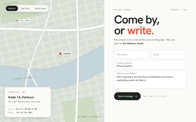
A two-column contact block: a stylised SVG city map whose studio switcher pans to each pin, beside a floating-label form with simulated send.
Phone form fields
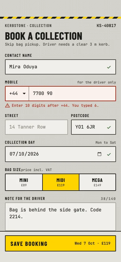
An industrial phone booking form: caps labels, mono values, phone with country code, date, segmented size, counted note, switch, blur validation and an error summary.
Checkbox draw list
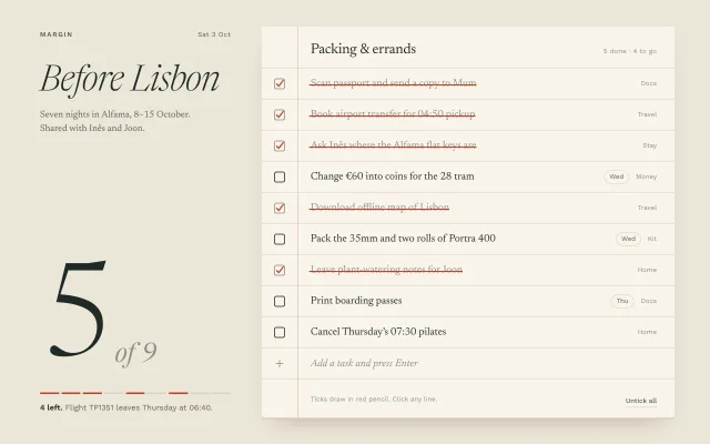
A ruled-paper to-do list where red-pencil checkmarks draw in, strike-throughs sweep across each task, and a 232px serif numeral counts progress.