Nº 023 of 520
Inline form validation
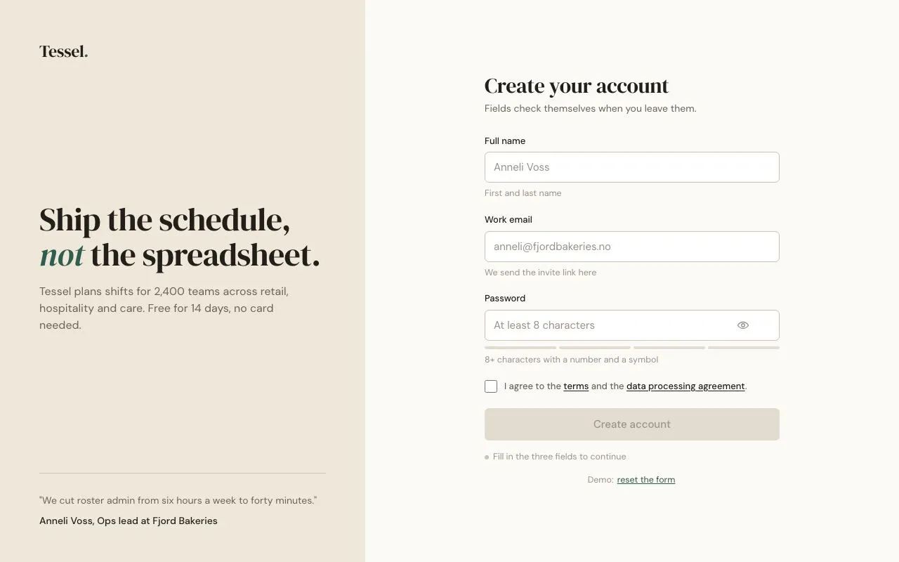
A signup form that validates each field on blur with a 6px shake for errors, a stroke-drawn tick for success, a 4-segment password meter and a submit gated until everything passes.
Preview
Use it
Free to use · credit appreciated1 Once, in your project
npx skills add SusanAcharya/Design-Lounge 2 Then ask
Using the Design Lounge skill, build "Inline form validation" (piece inline-form-validation) in my stack. Match its brief; restyle it onto my product's theme.
No skill? Paste the brief instead. It carries the numbers, tokens and behaviour.
<!-- Design Lounge Nº 023 · "Inline form validation" · www.designlounge.live -->

# Inline form validation

> **Build brief for a coding agent.** Rebuild this piece in the reader's stack. If they haven't said which stack, ask once, then default to semantic HTML + CSS + a little vanilla JS. Match the numbers below; don't "improve" them.

## What it is

A three-field signup form ("Tessel", a shift-planning product) on a split page: a warm sand marketing panel on the left, the form on the right. Each field validates when it loses focus, never while the user is still typing a fresh value. Errors turn the border red, replace the helper line with the error and shake the control 6px; successes draw a tick inside the field and turn the helper green. The password field has a four-segment strength meter that fills as you type. The submit button stays disabled until all three fields pass and the terms box is ticked. A polite live region narrates each outcome. The detail worth copying is the blur-then-live rule: validation is triggered on blur, but once a field has a verdict it re-validates on every keystroke so the error clears the moment it is fixed.

## Reference behaviour

1. Initial state: left panel (520px) with logo "Tessel.", a 46px serif headline with one italic accent word, a paragraph and a customer quote pinned to the bottom. Right: a 420px form, heading "Create your account", lead line, three fields (Full name, Work email, Password), a terms checkbox, a disabled "Create account" button, and a status line reading "Fill in the three fields to continue".
2. Focusing an input: border becomes `--accent`, plus a 3px `--accent-soft` ring.
3. Blurring a field with a value that fails: border `--error` with a 3px `--error-soft` ring, helper text turns `--error` and shows the message, a red X icon appears at the right of the input, the control shakes (−6, +6, −4, +4px over 320ms), `aria-invalid="true"` is set, and the live region announces "<Label>: <message>".
4. Blurring a field that passes: border `--accent`, helper turns `--accent` and reads a short confirmation ("Looks good"), a tick draws itself inside the field over 280ms, and the live region announces "<Label> accepted".
5. Blurring an empty field: neutral (no error, hint restored). Empty is not an error until submit is attempted.
6. Once a field has a verdict (ok or error), every subsequent `input` event re-checks it silently: the border and message update but there is no shake and no announcement.
7. Password rules: score = (length ≥ 8) + (mixed case) + (digit) + (symbol); if length < 8 the score is capped at 1. The meter fills 1/2/3/4 segments in `--weak`/`--fair`/`--good`/`--strong` as the user types. Score ≥ 3 passes.
8. The eye button toggles the password between `type="password"` and `type="text"`, updating `aria-pressed` and its label.
9. The submit button enables only when name, email, password all pass **and** the terms checkbox is checked; when that happens the live region says "All set — press Create account".
10. Submitting: the button label becomes "Creating account…", the fields dim to 50 % opacity, and after 900ms the label becomes a tick + "Account created" and the live region confirms. A small "reset the form" link under the status line restores the initial state.

## Structure

```
1280 × 800
┌─────────────────────────┬───────────────────────────────────────────────┐
│ side 520                │                                               │
│ Tessel.                 │        Create your account (30px serif)       │
│                         │        Fields check themselves when you…      │
│                         │        Full name                              │
│ Ship the schedule,      │        [ input 420×44                  ✓ ]    │
│ not the spreadsheet.    │        helper 12.5px                          │
│ (46px serif)            │        Work email                             │
│ paragraph 16px          │        [ input                          ✗ ]   │
│                         │        error message                          │
│                         │        Password                               │
│                         │        [ input                     (eye) ✓ ]  │
│ ─────────────────────   │        ▮▮▮▯  meter 4 × 4px                    │

… 173 more lines. Copy or download for the full brief. Loading the source…Brief
213 linesBuild brief for a coding agent. Rebuild this piece in the reader’s stack. If they haven’t said which stack, ask once, then default to semantic HTML + CSS + a little vanilla JS. Match the numbers below; don’t “improve” them.
What it is
A three-field signup form (“Tessel”, a shift-planning product) on a split page: a warm sand marketing panel on the left, the form on the right. Each field validates when it loses focus, never while the user is still typing a fresh value. Errors turn the border red, replace the helper line with the error and shake the control 6px; successes draw a tick inside the field and turn the helper green. The password field has a four-segment strength meter that fills as you type. The submit button stays disabled until all three fields pass and the terms box is ticked. A polite live region narrates each outcome. The detail worth copying is the blur-then-live rule: validation is triggered on blur, but once a field has a verdict it re-validates on every keystroke so the error clears the moment it is fixed.
Reference behaviour
- Initial state: left panel (520px) with logo “Tessel.”, a 46px serif headline with one italic accent word, a paragraph and a customer quote pinned to the bottom. Right: a 420px form, heading “Create your account”, lead line, three fields (Full name, Work email, Password), a terms checkbox, a disabled “Create account” button, and a status line reading “Fill in the three fields to continue”.
- Focusing an input: border becomes
--accent, plus a 3px--accent-softring. - Blurring a field with a value that fails: border
--errorwith a 3px--error-softring, helper text turns--errorand shows the message, a red X icon appears at the right of the input, the control shakes (−6, +6, −4, +4px over 320ms),aria-invalid="true"is set, and the live region announces ” - Blurring a field that passes: border
--accent, helper turns--accentand reads a short confirmation (“Looks good”), a tick draws itself inside the field over 280ms, and the live region announces ” - Blurring an empty field: neutral (no error, hint restored). Empty is not an error until submit is attempted.
- Once a field has a verdict (ok or error), every subsequent
inputevent re-checks it silently: the border and message update but there is no shake and no announcement. - Password rules: score = (length ≥ 8) + (mixed case) + (digit) + (symbol); if length < 8 the score is capped at 1. The meter fills 1/2/3/4 segments in
--weak/--fair/--good/--strongas the user types. Score ≥ 3 passes. - The eye button toggles the password between
type="password"andtype="text", updatingaria-pressedand its label. - The submit button enables only when name, email, password all pass and the terms checkbox is checked; when that happens the live region says “All set — press Create account”.
- Submitting: the button label becomes “Creating account…”, the fields dim to 50 % opacity, and after 900ms the label becomes a tick + “Account created” and the live region confirms. A small “reset the form” link under the status line restores the initial state.
Structure
1280 × 800
┌─────────────────────────┬───────────────────────────────────────────────┐
│ side 520                │                                               │
│ Tessel.                 │        Create your account (30px serif)       │
│                         │        Fields check themselves when you…      │
│                         │        Full name                              │
│ Ship the schedule,      │        [ input 420×44                  ✓ ]    │
│ not the spreadsheet.    │        helper 12.5px                          │
│ (46px serif)            │        Work email                             │
│ paragraph 16px          │        [ input                          ✗ ]   │
│                         │        error message                          │
│                         │        Password                               │
│                         │        [ input                     (eye) ✓ ]  │
│ ─────────────────────   │        ▮▮▮▯  meter 4 × 4px                    │
│ "quote…"                │        helper                                 │
│ Anneli Voss, Ops lead   │        ☐ I agree to the terms …               │
│                         │        [        Create account 46px       ]   │
│                         │        • status line (aria-live)              │
└─────────────────────────┴───────────────────────────────────────────────┘<body>is a 2-column grid520px 1fr.<aside class="side">is a flex column;<h1>usesmargin-top:autoto sit vertically centred,.quoteusesmargin-top:autoto pin to the bottom.<form novalidate>420px wide, centred in the right column..field[data-k]→<label for>+.ctl(position:relative) containing<input aria-describedby>and.mark(absolutely positioned SVG with a tick path and an X path) →<span class="msg" id>helper/error line.- Password field adds
<button class="eye" aria-pressed>and.meter[role=meter]with four<i>segments. <label class="check">wraps the checkbox and its text (links inside).<button class="submit" type="submit" disabled>;.live[aria-live=polite][role=status];.resetline with a text button.
Tokens
:root {
  /* colour — warm paper neutrals, deep green success, brick error */
  --bg: #fbfaf7;           /* page */
  --panel: #efe7da;        /* left marketing panel */
  --surface: #ffffff;      /* inputs */
  --line: #e2dbd0;         /* meter empty, disabled button */
  --line-2: #cbc2b4;       /* input border, panel rule */
  --ink: #221e1a;
  --ink-2: #6b6259;        /* lead, quote, checkbox text */
  --ink-3: #9a9188;        /* placeholder, helper, status */
  --accent: #2f5d50;       /* focus, success, submit */
  --accent-hover: #25493f;
  --accent-soft: #e4efe9;  /* focus ring */
  --on-accent: #ffffff;
  --error: #b4432a;
  --error-soft: #f9e9e4;   /* error ring */
  --weak: #c9532f;  --fair: #d9962b;  --good: #7f9a3a;  --strong: #2f5d50;

  /* type */
  --serif: "DM Serif Display", Georgia, serif;
  --sans: "DM Sans", system-ui, sans-serif;

  /* layout */
  --w-side: 520px;
  --w-form: 420px;
  --field-h: 44px;
  --submit-h: 46px;
  --meter-h: 4px;
  --r: 6px;
  --r-lg: 14px;
  --ring: 3px;

  /* motion */
  --t-micro: 160ms;
  --t-shake: 320ms;
  --t-tick: 280ms;
  --t-submit: 900ms;       /* fake request */
  --ease: cubic-bezier(.2, .7, .2, 1);
  --ease-out: cubic-bezier(.16, 1, .3, 1);
}
Typography
| Role | Family | Size | Weight | Line-height | Tracking | Case |
|---|---|---|---|---|---|---|
| Logo | DM Serif Display | 24px | 400 | 1.2 | −0.01em | sentence, italic full stop in accent |
| Panel headline | DM Serif Display | 46px | 400 | 1.08 | −0.015em | sentence, one italic word |
| Panel paragraph | DM Sans | 16px | 400 | 1.5 | 0 | sentence |
| Quote | DM Sans | 14px | 400 | 1.5 | 0 | sentence; attribution 500 |
| Form heading | DM Serif Display | 30px | 400 | 1.15 | −0.01em | sentence |
| Lead | DM Sans | 14px | 400 | 1.5 | 0 | sentence |
| Field label | DM Sans | 13px | 500 | 1.5 | 0 | sentence |
| Input value | DM Sans | 15px | 400 | 1 | 0 | as typed |
| Helper / error | DM Sans | 12.5px | 400 | 1.45 | 0 | sentence |
| Submit | DM Sans | 15px | 500 | 1 | 0 | sentence |
| Status line | DM Sans | 12.5px | 400 | 1.45 | 0 | sentence |
Motion
| Element | Trigger | Property | From → To | Duration | Easing | Reduced motion |
|---|---|---|---|---|---|---|
.field.shake .ctl | blur with error | translateX | 0 → −6 → 6 → −4 → 4 → 0 (at 0/20/40/60/80/100 %) | 320ms | --ease | no shake |
.tick path | field becomes ok | stroke-dashoffset | 1 → 0 (pathLength="1") | 280ms | --ease-out | 1ms |
.x path | field becomes error | opacity | 0 → 1 | 0 | — | — |
| input | focus / verdict | border-color, box-shadow | neutral → accent/error ring | 160ms | --ease | 1ms |
.meter i | typing | background | --line → tier colour | 160ms | --ease | 1ms |
.msg | verdict | color | --ink-3 → accent/error | 160ms | --ease | 1ms |
button.submit | enable / hover / active | background, translateY | disabled grey → accent; 0 → 1px | 160ms | --ease | 1ms |
.field, .check | submit | opacity | 1 → .5 | 160ms | --ease | 1ms |
The shake is re-triggered on every erroring blur by removing the class, forcing a reflow (void el.offsetWidth), then adding it again.
States
- Input default: 1px
--line-2border, white fill, placeholder--ink-3. - Input focus-visible: border
--accent+0 0 0 3px var(--accent-soft). - Field ok: border
--accent, tick visible (drawn), helper text--accent. - Field error: border
--error+0 0 0 3px var(--error-soft), X visible, helper--error,aria-invalid="true". - Field empty after blur: neutral; hint restored.
- Meter:
data-s="0…4"; segments 1..n filled with the tier colour of n (--weakfor 1,--fair2,--good3,--strong4). Empty segments--line. - Eye hover: icon
--ink. Eye pressed:aria-pressed="true", label “Hide password”. - Submit disabled: fill
--line, text--ink-3,cursor:not-allowed, no hover change. - Submit enabled hover:
--accent-hover; active:translateY(1px). - Submitting: label “Creating account…”, button disabled, fields at 50 % opacity and
pointer-events:none. - Done: label tick + “Account created”.
Accessibility
<form novalidate>: native bubbles are suppressed; all messaging is custom and visible.- Each input has a
<label for>,autocomplete(name,email,new-password) andaria-describedbypointing at its helper/error span, so the error is read with the field. aria-invalid="true"is set on error, removed on ok/neutral.- The status line is
role="status" aria-live="polite"; it announces error messages on blur, ” - The strength meter is
role="meter"witharia-valuemin=0,aria-valuemax=4,aria-valuenowupdated on input, and anaria-label. - The eye is a
type="button"witharia-pressedand a label that flips between Show/Hide password. - Keyboard: Tab order is name → email → password → eye → terms → (links) → submit → reset. Enter in any field submits only when the button is enabled.
- Contrast:
--ink-2on--panel6.2:1;--erroron--bg5.1:1;--accenton--bg6.8:1; helper--ink-3on--bgis 3.4:1 and used only for non-essential hint text at 12.5px — swap for--ink-2if your policy requires 4.5:1 on hints. - Hit targets: inputs 44px, submit 46px, eye 28px visual inside a 44px row, checkbox 18px with the whole label row clickable.
Responsive rules
- ≥ 1280: as specified.
- 1024–1279: side panel 400px; headline 38px.
- 768–1023: single column; the side panel becomes a 200px-tall header band with logo + headline only; form width 100 % up to 420px, centred.
- < 640: form padding 20px; headline 30px; the submit button becomes sticky at the bottom with 16px inset; the meter stays 4 segments.
Acceptance checklist
- Validation runs on
blur, not on the first keystrokes; after a verdict exists it re-runs oninputwithout shaking or announcing. - Error shake is a 320ms keyframe reaching ±6px then ±4px, and re-triggers on each erroring blur.
- Success tick is an SVG path with
pathLength="1"drawn over 280ms. - Error state sets
aria-invalid="true"; ok/neutral removes it. - Password score follows the four rules and is capped at 1 below 8 characters; the meter colours are weak/fair/good/strong per tier.
- Submit is
disableduntil all three fields pass and the checkbox is checked. - The live region announces: errors on blur, ”
- Eye button toggles
typeandaria-pressed. - Focus rings are visible on inputs (ring), eye, checkbox, links, submit and reset.
- Under reduced motion there is no shake and the tick appears instantly.
- Input height is 44px; submit 46px; form width 420px; side panel 520px.
- No native validation bubbles appear (
novalidatepresent).
Implementation notes
Blur first, then live. Keep one check(field, announce) function; call it with announce=true on blur and announce=false on input, but only once the field already has a verdict class:
input.addEventListener('blur', () => check(field, true));
input.addEventListener('input', () => {
  if (field.classList.contains('error') || field.classList.contains('ok')) check(field, false);
});
Re-triggering the shake. A class that is already present will not restart its animation; remove it, force layout, add it back:
field.classList.remove('shake');
void field.offsetWidth;          // flush so the browser sees the removal
field.classList.add('shake');
.field.shake .ctl { animation: shake var(--t-shake) var(--ease); }
@keyframes shake {
20% { transform: translateX(-6px); } 40% { transform: translateX(6px); }
60% { transform: translateX(-4px); } 80% { transform: translateX(4px); }
}Meter tiers with attribute selectors avoid JS class juggling: .meter[data-s="2"] i:nth-child(-n+2) { background: var(--fair); } and so on for 1, 3, 4.
Common mistakes: validating on every keystroke from the start (users get yelled at mid-word); using display:none on the helper so the height jumps (keep min-height:18px); disabling the submit without also explaining why in the status line; forgetting novalidate so the browser’s own bubble appears alongside yours.
Details
- Palette
- Type
- DM Serif Display · DM Sans
- Motion
- Subtle motion
- Build
- One session
- Tags
On the shelves