Nº 534 of 543
Signup form that rises to the caret
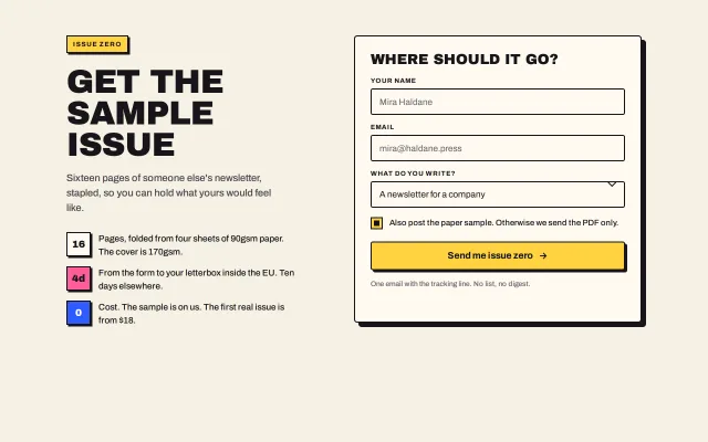
A neo-brutalist signup card: inputs lift up-left into a blue shadow on focus, the button sinks on hover, an ink-bordered error box, and a rotated pink stamp for the done state.
Preview
Use it
Free to use · credit appreciated1 Once, in your project · Node 22.20+
npx skills add SusanAcharya/Design-Lounge 2 Then ask
Using the Design Lounge skill, build "Signup form that rises to the caret" (piece form-brutal-signup) in my stack. Match its brief; restyle it onto my product's theme.
No skill? Paste the brief instead. It carries the numbers, tokens and behaviour.
<!-- Design Lounge Nº 534 · "Signup form that rises to the caret" · www.designlounge.live -->

# Signup form that rises to the caret

> **Build brief for a coding agent.** Rebuild this piece in the reader's stack. If they haven't said which stack, ask once, then default to semantic HTML + CSS + a little vanilla JS. Match the numbers below; don't "improve" them. When a kit is locked, map the colours onto the kit tokens and keep the 2px ink borders and the hard 0-blur shadows.

## What it is

The sample-issue signup for Stapler, a fictional zine printer. Left: a yellow kicker tag, a 60px uppercase headline, a lede and three claims, each led by a 44px bordered tile holding one big figure. Right: a 520px card with an 8px shadow holding a name field, an email field, a select, a drawn checkbox and one yellow button. The form has opposite motions for the two things you touch: an input *rises* 4px up-left and gains a blue shadow when it has focus, as if lifting toward the caret; the button *sinks* into its shadow on hover. A bad email turns the field's border and shadow red and shows an ink-bordered error box; a good submit swaps the form for a pink "YOU'RE IN" stamp that lands at -6°, scaling from 1.6 to 1 in 240ms, with the email written back and a "Send another" button. The detail worth copying is the rise/sink pair, which gives a flat page a clear sense of what is a field and what is an action without a third colour.

## Reference behaviour

1. First frame: kicker "Issue zero", headline "Get the sample issue", lede, three claims (16 pages, 4 days, 0 cost). Card: "Where should it go?", fields Your name, Email (required), What do you write? (select, "A newsletter for a company" selected), a checked checkbox "Also post the paper sample…", button "Send me issue zero", fine print.
2. Focus an input or the select: it translates (−4px, −4px) and gains a `4px 4px 0` blue shadow in 120ms. Blur: back.
3. Submit with an invalid email: the Email field gets a red border and red shadow, `aria-invalid="true"`, and the error box "Write an email with an @ in it…" appears under it (`role="alert"`). Focus moves to the field. Typing an @ clears the error.
4. Submit with a valid email: the form becomes invisible, the done layer shows: the stamp "You're in" animates in, the sentence names the typed email in bold with a 2px underline and says whether the paper copy follows (from the checkbox), and "Send another" takes focus.
5. "Send another": the form resets and returns; focus goes to the name field.
6. The checkbox is a drawn 22px square: checked = yellow fill with a 10px ink square inside.
7. Hover the button: it moves (4px, 4px) and its shadow collapses in 120ms. Active: the same with a `--surface-2` fill.

## Structure

```
1280 × 800, bg #F6F1E4, wrap max 1120, padding 64/40, grid minmax(0,1fr) | 520px, gap 72
┌ copy ───────────────────────────┐  ┌ card 520, 8px shadow, padding 28 ───────────┐
│ [ISSUE ZERO] yellow tag         │  │ WHERE SHOULD IT GO?  26/1                    │
│ GET THE SAMPLE ISSUE  60/.95    │  │ YOUR NAME                                    │
│ lede 18px 40ch                  │  │ ┌──────────────────────────────────────┐ 48  │
│ [16] Pages, folded from…        │  │ EMAIL                                        │
│ [4d] From the form to…  (pink)  │  │ ┌──────────────────────────────────────┐     │
│ [0 ] Cost. The sample…  (blue)  │  │ (error box, red, when bad)                   │
│                                 │  │ WHAT DO YOU WRITE?                           │
│                                 │  │ ┌──────────────────────────────── ⌄ ┐       │
│                                 │  │ [■] Also post the paper sample…              │
│                                 │  │ [ Send me issue zero →        ] 52 yellow    │
│                                 │  │ fine print 13px                              │
└─────────────────────────────────┘  └──────────────────────────────────────────────┘
done layer (same box): [YOU'RE IN] pink stamp -6° · sentence with the email · [Send another]
```

… 134 more lines. Copy or download for the full brief. Loading the source…Brief
174 linesBuild brief for a coding agent. Rebuild this piece in the reader’s stack. If they haven’t said which stack, ask once, then default to semantic HTML + CSS + a little vanilla JS. Match the numbers below; don’t “improve” them. When a kit is locked, map the colours onto the kit tokens and keep the 2px ink borders and the hard 0-blur shadows.
What it is
The sample-issue signup for Stapler, a fictional zine printer. Left: a yellow kicker tag, a 60px uppercase headline, a lede and three claims, each led by a 44px bordered tile holding one big figure. Right: a 520px card with an 8px shadow holding a name field, an email field, a select, a drawn checkbox and one yellow button. The form has opposite motions for the two things you touch: an input rises 4px up-left and gains a blue shadow when it has focus, as if lifting toward the caret; the button sinks into its shadow on hover. A bad email turns the field’s border and shadow red and shows an ink-bordered error box; a good submit swaps the form for a pink “YOU’RE IN” stamp that lands at -6°, scaling from 1.6 to 1 in 240ms, with the email written back and a “Send another” button. The detail worth copying is the rise/sink pair, which gives a flat page a clear sense of what is a field and what is an action without a third colour.
Reference behaviour
- First frame: kicker “Issue zero”, headline “Get the sample issue”, lede, three claims (16 pages, 4 days, 0 cost). Card: “Where should it go?”, fields Your name, Email (required), What do you write? (select, “A newsletter for a company” selected), a checked checkbox “Also post the paper sample…”, button “Send me issue zero”, fine print.
- Focus an input or the select: it translates (−4px, −4px) and gains a
4px 4px 0blue shadow in 120ms. Blur: back. - Submit with an invalid email: the Email field gets a red border and red shadow,
aria-invalid="true", and the error box “Write an email with an @ in it…” appears under it (role="alert"). Focus moves to the field. Typing an @ clears the error. - Submit with a valid email: the form becomes invisible, the done layer shows: the stamp “You’re in” animates in, the sentence names the typed email in bold with a 2px underline and says whether the paper copy follows (from the checkbox), and “Send another” takes focus.
- “Send another”: the form resets and returns; focus goes to the name field.
- The checkbox is a drawn 22px square: checked = yellow fill with a 10px ink square inside.
- Hover the button: it moves (4px, 4px) and its shadow collapses in 120ms. Active: the same with a
--surface-2fill.
Structure
1280 × 800, bg #F6F1E4, wrap max 1120, padding 64/40, grid minmax(0,1fr) | 520px, gap 72
┌ copy ───────────────────────────┐  ┌ card 520, 8px shadow, padding 28 ───────────┐
│ [ISSUE ZERO] yellow tag         │  │ WHERE SHOULD IT GO?  26/1                    │
│ GET THE SAMPLE ISSUE  60/.95    │  │ YOUR NAME                                    │
│ lede 18px 40ch                  │  │ ┌──────────────────────────────────────┐ 48  │
│ [16] Pages, folded from…        │  │ EMAIL                                        │
│ [4d] From the form to…  (pink)  │  │ ┌──────────────────────────────────────┐     │
│ [0 ] Cost. The sample…  (blue)  │  │ (error box, red, when bad)                   │
│                                 │  │ WHAT DO YOU WRITE?                           │
│                                 │  │ ┌──────────────────────────────── ⌄ ┐       │
│                                 │  │ [■] Also post the paper sample…              │
│                                 │  │ [ Send me issue zero →        ] 52 yellow    │
│                                 │  │ fine print 13px                              │
└─────────────────────────────────┘  └──────────────────────────────────────────────┘
done layer (same box): [YOU'RE IN] pink stamp -6° · sentence with the email · [Send another]main.wrap→ copydiv(span.kicker,h1,p.lede,ul.claimswithbtiles) anddiv.card#card.form#form[novalidate]→h2, three.fld(label + input/select; the select’s wrapper draws the chevron with::after),label.chkwith the checkbox,button.btn[type=submit],p.fine.div.done[aria-live=polite]→span.stamp,p#done-msg,button.btn.ghost#again..card.is-donehides the form (visibility: hidden) and shows the layer.
Tokens
:root {
  --bg: #f6f1e4;  --surface: #fffaf0;  --surface-2: #ece4d0;
  --ink: #17151a;  --ink-2: #4a4650;  --ink-3: #76717d;
  --yellow: #ffd23f;  --blue: #2f5bff;  --blue-ink: #fffdf8;  --pink: #ff5c9a;
  --danger: #d8322a;  --danger-soft: #fbe3e0;

  --display: "Archivo Black", Impact, sans-serif;
  --sans: "Archivo", system-ui, sans-serif;

  --bw: 2px;  --off: 4px;  --off-lg: 8px;
  --r: 4px;  --r-card: 6px;                 /* family radii; the tag, checkbox and stamp are 0 */
  --field-h: 48px;  --btn-h: 52px;  --chk: 22px;

  --t-micro: 120ms;  --t-swap: 240ms;
  --ease: cubic-bezier(.2, .7, .2, 1);
  --expo: cubic-bezier(.16, 1, .3, 1);
}
Typography
| Role | Family | Size | Weight | Line-height | Tracking | Case |
|---|---|---|---|---|---|---|
| Headline | Archivo Black | 60px | 400 | 0.95 | −0.02em | UPPERCASE |
| Stamp | Archivo Black | 54px | 400 | 1 | −0.02em | UPPERCASE, --pink, 4px pink border |
| Card title | Archivo Black | 26px | 400 | 1 | −0.01em | UPPERCASE |
| Claim figure | Archivo Black | 18px | 400 | 1 | 0 | in a 44px tile |
| Lede | Archivo | 18px | 500 | 1.5 | 0 | sentence, --ink-2 |
| Done sentence | Archivo | 17px | 500 | 1.5 | 0 | sentence; the email 700 with a 2px underline |
| Button | Archivo | 17px | 700 | 1 | 0 | sentence |
| Field label | Archivo | 12px | 700 | 1 | +0.08em | UPPERCASE |
| Kicker | Archivo | 12px | 700 | 1 | +0.12em | UPPERCASE in a yellow tag |
| Input text | Archivo | 16px | 400 | 1 | 0 | as typed; placeholder --ink-3 |
| Error, fine print | Archivo | 13px | 700 / 500 | 1.5 | 0 | sentence |
Motion
| Element | Trigger | Property | From → To | Duration | Easing |
|---|---|---|---|---|---|
| input, select | focus-visible | transform, box-shadow | none, none → translate(−4px,−4px), 4px 4px 0 var(--blue) | 120ms | --ease |
.btn | hover | transform, box-shadow | none, 4px 4px 0 → translate(4px,4px), 0 0 0 | 120ms | --ease |
.btn | active | background | fill → --surface-2 | 120ms | --ease |
| checkbox | change | background | --surface → --yellow | 120ms | --ease |
.stamp | done | transform, opacity | rotate(−6deg) scale(1.6), 0 → rotate(−6deg) scale(1), 1 | 240ms | --expo |
Reduced motion: transitions and the stamp animation 1ms. The states are identical.
States
- Input default: cream, ink border, no shadow. Focus: raised with a blue shadow. Invalid: red border and red 4px shadow, error box shown,
aria-invalid="true". - Select: same as input, with a drawn chevron at the right (a 9px square rotated 45°, two borders).
- Checkbox off / on: empty square / yellow square with a 10px ink centre.
- Button default / hover / active / focus-visible: yellow, pushed, pushed +
--surface-2, 2px blue outline at 3px offset. - Card done: form invisible, stamp + sentence + ghost button visible. The card keeps its size, so nothing jumps.
Accessibility
- Every field has a visible
<label for>. The email field isrequired,type="email",aria-describedbypoints at the error, which isrole="alert"so it is read when it appears. - The form uses
novalidateand does its own check, so the error style and copy are the same in every browser; keep the native check if you prefer, but then style:user-invalid. - The done layer is
aria-live="polite"; focus moves to “Send another” after a submit, and back to the name field after a reset. - The checkbox is a real
<input type="checkbox">withappearance: none; Space toggles it, and the label is the hit area. - Contrast: ink on cream 15.2:1;
--dangeron--danger-soft5.4:1;--pinkstamp on cream is decoration over a real sentence (not relied on alone);--ink-3placeholder on--surface5.2:1. - Hit targets: fields 48px, button 52px, checkbox 22px with the full label row as target, ghost button 44px.
Responsive rules
- ≥ 1280: two columns, card 520px, headline 60px.
- 1024–1279: card 460px, gap 48, headline 52px.
- 768–1023: one column, the card below the copy, max-width 560px.
- < 640: padding 20px, headline 40px, claims’ tiles 40px, card padding 20px, the stamp 40px. Shadow offsets stay 4px / 8px.
Acceptance checklist
Always
- Every border is 2px
--ink(red on an invalid field); every shadow is hard with no blur; the tag, checkbox and stamp have 0 radius, controls and the card use the family radii. - An input or select with focus rises (−4px, −4px) and shows a blue 4px shadow; the submit button sinks (4px, 4px) on hover.
- An invalid email sets
aria-invalid, shows an alert error box under the field and moves focus there; typing an @ clears it. - A valid submit shows the done layer with the typed email, keeps the card’s size, and moves focus to the reset button; the reset returns the form.
- The checkbox is drawn (22px square, yellow when checked) and is a real input.
- One primary button, full width. The reset button is cream (ghost), not a second yellow.
- Focus rings are visible on every control, outside the shadows.
- Reduced motion: 1ms transitions, no stamp zoom.
This demo
- Copy: “Get the sample issue”, claims 16 / 4d / 0, card title “Where should it go?”, button “Send me issue zero”, stamp “You’re in”.
- The done sentence names the email and adds “The paper copy follows in about four days.” only when the checkbox was on.
Implementation notes
Rise and sink. The same offset, opposite sign, a different shadow colour:
.fld input:focus-visible, .fld select:focus-visible {
  outline: none;
  transform: translate(calc(var(--off) * -1), calc(var(--off) * -1));
  box-shadow: var(--off) var(--off) 0 var(--blue);
}
.btn:hover, .btn:active { transform: translate(var(--off), var(--off)); box-shadow: 0 0 0 var(--ink); }
Validation without a library. One regex, one class, one attribute:
form.addEventListener('submit', (e) => {
  e.preventDefault();
  const ok = /^[^\s@]+@[^\s@]+\.[^\s@]+$/.test(email.value.trim());
  field.classList.toggle('bad', !ok);
  email.setAttribute('aria-invalid', String(!ok));
  if (!ok) { email.focus(); return; }
  card.classList.add('is-done');
  again.focus();
});
The stamp lands rather than fades:
.stamp { transform-origin: left bottom; animation: stamp 240ms cubic-bezier(.16,1,.3,1) both; }
@keyframes stamp { from { transform: rotate(-6deg) scale(1.6); opacity: 0 } to { transform: rotate(-6deg) scale(1); opacity: 1 } }
Common mistakes: a blurred focus glow instead of the hard blue shadow; a native select arrow next to the drawn chevron (set appearance: none); an error colour on the text only, with no box; swapping the card for a shorter one so the page jumps; forgetting to escape the typed email before writing it into the done sentence.
Details
- Palette
- Type
- Archivo Black · Archivo
- Motion
- Subtle motion
- Build
- One session
- Tags
Similar
Neo-brutalist design style
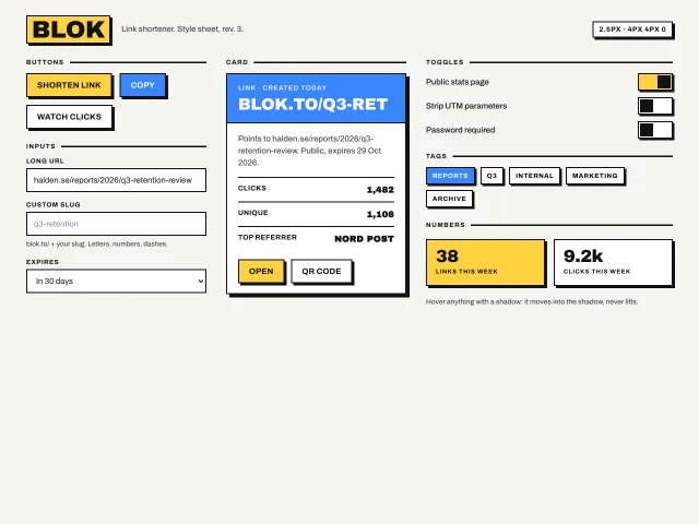
Thick 2.5px black borders, hard 4px 4px 0 offset shadows, flat yellow and blue fills, and hover that moves the element into its shadow; buttons, inputs, a card, toggles and tags.
Hero with a fanned issue stack
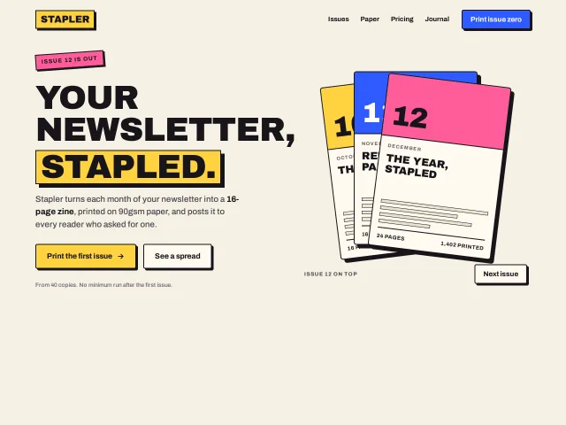
A neo-brutalist hero: a 76px uppercase headline with one word in a yellow block, two hard-shadow buttons, and three bordered issue covers that fan out on hover and rotate on a Next button.
Inline form validation
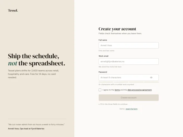
A signup form that validates each field on blur with a 6px shake for errors, a stroke-drawn tick for success, a 4-segment password meter and a submit gated until everything passes.