Nº 031 of 520
M3 Expressive home feed
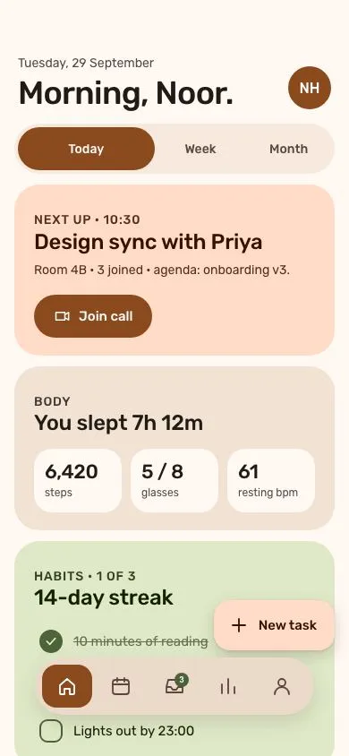
A warm-tonal Material 3 Expressive home: 36px greeting, morphing segmented group with a shape loader, 28px tonal cards, a floating 5-action toolbar and an extended FAB.
Preview
Use it
Free to use · credit appreciated1 Once, in your project
npx skills add SusanAcharya/Design-Lounge 2 Then ask
Using the Design Lounge skill, build "M3 Expressive home feed" (piece m3-expressive-home) in my stack. Match its brief; restyle it onto my product's theme.
No skill? Paste the brief instead. It carries the numbers, tokens and behaviour.
<!-- Design Lounge Nº 031 · "M3 Expressive home feed" · www.designlounge.live -->

# M3 Expressive home feed

> **Build brief for a coding agent.** Rebuild this piece in the reader's stack. If they haven't said which stack, ask once, then default to semantic HTML + CSS + a little vanilla JS. Match the numbers below; don't "improve" them.

## What it is

The home screen of "Mira", a daily planner, in the **Material 3 Expressive** language: warm tonal surfaces instead of hairlines, 28px card radii, a segmented "button group" whose selected segment grows into a full pill, a bottom **floating toolbar** (a detached pill with five icon actions) and an **extended FAB** stacked above it. The feeling is warm and physical: things squash when pressed, shapes morph rather than fade. The detail worth copying is the segmented group: the pressed segment takes 1.7× the flex share and rounds from 16px to a full pill over 500ms with emphasized easing, while a small morphing "loading shape" opens a 44px slot above the cards and the cards dip and return.

## Reference behaviour

1. Initial state: greeting "Morning, Noor." (36px) with the date above it, a 48px avatar button at right. Below: segmented group with **Today** selected, then three tonal cards (primary-container hero, surface-high stats, tertiary-container habits). A floating toolbar pill sits centred 46px from the bottom; an extended FAB "New task" sits at right, 118px from the bottom.
2. Tap **Week** or **Month**: the previously selected segment shrinks back to flex 1 and 16px radius; the tapped one grows to flex 1.7 and 999px radius, fills `--primary`. Both over 500ms `cubic-bezier(.2,0,0,1)`.
3. At the same instant a loader slot expands from 0 to 44px height (500ms, same easing) showing a 22px primary-coloured blob that morphs between three border-radius shapes while rotating 180° (1.2s loop). The card stack fades to opacity 0 and moves down 14px / scales to .98.
4. After 700ms the hero and stats headlines swap to that range's copy ("4 meetings, 2 free afternoons" / "Avg. sleep 6h 48m" for Week; "September: 11 focus days" / "Avg. sleep 7h 02m" for Month), the loader slot collapses and the cards return.
5. Tap any habit row: the 26px checkbox fills `--tertiary`, morphs from 9px radius to a circle, a check scales in from .5; the label strikes through at 60% opacity. Tap again to undo.
6. Tap a toolbar action: it becomes the pressed one — background `--primary`, icon white, radius eases from 999px to 16px (500ms). Only one pressed at a time. Inbox carries a "3" badge.
7. Press-and-hold the FAB or the "Join call" pill: it scales to .95/.96 and its radius rounds further (18→28px, 999→14px respectively) over 160ms, then releases.
8. The content scrolls beneath the toolbar and FAB; 150px of bottom padding keeps the last card reachable.

## Structure

```
390 × 844
┌────────────────────────────────────┐
│ (54px status clearance)            │
│ Tuesday, 29 September      (NH)48  │  header
│ Morning, Noor.              avatar │  h1 36px
│ ┌──────────────┬────────┬────────┐ │
│ │   Today ●    │  Week  │ Month  │ │  segmented, 56px tall, 4px inset
│ └──────────────┴────────┴────────┘ │
│ [loader slot 0→44px]               │
│ ╭────────────────────────────────╮ │
│ │ NEXT UP · 10:30                │ │  hero card, primary-container
│ │ Design sync with Priya         │ │  28px radius
│ │ (Join call) pill 48px          │ │
│ ╰────────────────────────────────╯ │
│ ╭────────────────────────────────╮ │
│ │ BODY · You slept 7h 12m        │ │  surface-high card

… 209 more lines. Copy or download for the full brief. Loading the source…Brief
249 linesBuild brief for a coding agent. Rebuild this piece in the reader’s stack. If they haven’t said which stack, ask once, then default to semantic HTML + CSS + a little vanilla JS. Match the numbers below; don’t “improve” them.
What it is
The home screen of “Mira”, a daily planner, in the Material 3 Expressive language: warm tonal surfaces instead of hairlines, 28px card radii, a segmented “button group” whose selected segment grows into a full pill, a bottom floating toolbar (a detached pill with five icon actions) and an extended FAB stacked above it. The feeling is warm and physical: things squash when pressed, shapes morph rather than fade. The detail worth copying is the segmented group: the pressed segment takes 1.7× the flex share and rounds from 16px to a full pill over 500ms with emphasized easing, while a small morphing “loading shape” opens a 44px slot above the cards and the cards dip and return.
Reference behaviour
- Initial state: greeting “Morning, Noor.” (36px) with the date above it, a 48px avatar button at right. Below: segmented group with Today selected, then three tonal cards (primary-container hero, surface-high stats, tertiary-container habits). A floating toolbar pill sits centred 46px from the bottom; an extended FAB “New task” sits at right, 118px from the bottom.
- Tap Week or Month: the previously selected segment shrinks back to flex 1 and 16px radius; the tapped one grows to flex 1.7 and 999px radius, fills
--primary. Both over 500mscubic-bezier(.2,0,0,1). - At the same instant a loader slot expands from 0 to 44px height (500ms, same easing) showing a 22px primary-coloured blob that morphs between three border-radius shapes while rotating 180° (1.2s loop). The card stack fades to opacity 0 and moves down 14px / scales to .98.
- After 700ms the hero and stats headlines swap to that range’s copy (“4 meetings, 2 free afternoons” / “Avg. sleep 6h 48m” for Week; “September: 11 focus days” / “Avg. sleep 7h 02m” for Month), the loader slot collapses and the cards return.
- Tap any habit row: the 26px checkbox fills
--tertiary, morphs from 9px radius to a circle, a check scales in from .5; the label strikes through at 60% opacity. Tap again to undo. - Tap a toolbar action: it becomes the pressed one — background
--primary, icon white, radius eases from 999px to 16px (500ms). Only one pressed at a time. Inbox carries a “3” badge. - Press-and-hold the FAB or the “Join call” pill: it scales to .95/.96 and its radius rounds further (18→28px, 999→14px respectively) over 160ms, then releases.
- The content scrolls beneath the toolbar and FAB; 150px of bottom padding keeps the last card reachable.
Structure
390 × 844
┌────────────────────────────────────┐
│ (54px status clearance)            │
│ Tuesday, 29 September      (NH)48  │  header
│ Morning, Noor.              avatar │  h1 36px
│ ┌──────────────┬────────┬────────┐ │
│ │   Today ●    │  Week  │ Month  │ │  segmented, 56px tall, 4px inset
│ └──────────────┴────────┴────────┘ │
│ [loader slot 0→44px]               │
│ ╭────────────────────────────────╮ │
│ │ NEXT UP · 10:30                │ │  hero card, primary-container
│ │ Design sync with Priya         │ │  28px radius
│ │ (Join call) pill 48px          │ │
│ ╰────────────────────────────────╯ │
│ ╭────────────────────────────────╮ │
│ │ BODY · You slept 7h 12m        │ │  surface-high card
│ │ [6,420][5 / 8][61] tiles 20px  │ │
│ ╰────────────────────────────────╯ │
│ ╭────────────────────────────────╮ │
│ │ HABITS · 1 OF 3  (3 checkboxes)│ │  tertiary-container card
│ ╰────────────────────────────────╯ │
│                   ┌──────────────┐ │
│                   │ + New task   │ │  extended FAB, bottom 118
│  ╭──────────────────────────────╮ │
│  │ ⌂  ▦  ✉3  ▥  ○              │ │  floating toolbar, 64px, bottom 46
│  ╰──────────────────────────────╯ │
│ (34px home-indicator clearance)    │
└────────────────────────────────────┘<main>— full height,overflow-y:auto, padding54px 16px 150px. Contains everything that scrolls.<header>flex row,align-items:flex-end, 10px top padding; the segmented group has 16px above and 12px below. With these values the habits card headline sits just above the FAB on the first frame.<header>:<h1>with a<small>date line, plus<button class="avatar">.<div class="seg" role="group">with three<button aria-pressed>.<div class="loader" aria-hidden>holding one.blob.<section class="stack" aria-live="polite">of three<article class="card">.- Hero:
.eyebrow,<h2>,<p>,<button class="pill">with a 20px icon. - Stats:
.eyebrow,<h2>,.tilesgrid of three.tile(value + label). - Habits:
.eyebrow,<h2>,<ul class="habits">of<button role="checkbox" aria-checked>rows.
- Hero:
<button class="fab">— absolutely positioned on body,right:16px; bottom:118px.<nav class="bar" aria-label="Primary">— absolutely positioned,left:50%; bottom:46px; translateX(-50%), five<button aria-pressed>.
Sample content per range (the two swapped headlines are #c1 in the hero card and #c2 in the stats card):
| Range | Hero h2 | Stats h2 |
|---|---|---|
| Today | Design sync with Priya | You slept 7h 12m |
| Week | 4 meetings, 2 free afternoons | Avg. sleep 6h 48m |
| Month | September: 11 focus days | Avg. sleep 7h 02m |
Fixed copy: date “Tuesday, 29 September”; greeting “Morning, Noor.”; hero eyebrow “Next up · 10:30”, body “Room 4B · 3 joined · agenda: onboarding v3.” (one line), pill “Join call”; stats eyebrow “Body”, tiles 6,420 steps / 5 / 8 glasses / 61 resting bpm; habits eyebrow “Habits · 1 of 3”, h2 “14-day streak” (kept short so it clears the FAB’s left edge at x≈241), rows “10 minutes of reading” (checked), “Walk after lunch”, “Lights out by 23:00”; FAB “New task”; toolbar labels Home, Calendar, Inbox (badge 3), Stats, Profile.
Tokens
:root {
  /* tonal surfaces — warm bias */
  --surface: #fff8f3;
  --surface-low: #fdf1e8;
  --surface-c: #f7e9dd;          /* segmented track */
  --surface-high: #f1e2d3;       /* stats card */
  --surface-highest: #ebdac9;    /* floating toolbar */
  --on-surface: #211b16;
  --on-surface-v: #564840;       /* secondary text, unselected icons */
  --outline: #89766a;
  --outline-v: #dcc9ba;

  /* primary — terracotta */
  --primary: #8a4a1d;
  --on-primary: #ffffff;
  --primary-c: #ffdbc8;          /* hero card, FAB */
  --on-primary-c: #341100;

  /* secondary / tertiary */
  --secondary-c: #f5dfc9;
  --on-secondary-c: #4a2e17;
  --tertiary: #4c6339;           /* checkbox fill, badge */
  --tertiary-c: #dfe9c8;         /* habits card */
  --on-tertiary-c: #152005;

  /* type */
  --font: "Rubik", system-ui, sans-serif;
  --fs-h1: 36px; --fs-h2: 24px; --fs-stat: 22px; --fs-body: 15px; --fs-small: 14px; --fs-eyebrow: 12px;

  /* shape */
  --r-card: 28px;
  --r-pill: 999px;
  --r-seg: 16px;                 /* unselected segment / pressed toolbar item */
  --r-tile: 20px;
  --r-fab: 18px;
  --r-chk: 9px;

  /* spacing (4px base) */
  --s-1: 4px; --s-2: 8px; --s-3: 12px; --s-4: 16px; --s-5: 20px; --s-6: 24px;

  /* elevation */
  --shadow-fab: 0 6px 18px rgba(52,17,0,.18), 0 1px 3px rgba(52,17,0,.12);
  --shadow-bar: 0 8px 24px rgba(52,17,0,.14);

  /* motion — M3 Expressive */
  --t-micro: 160ms;
  --t-big: 500ms;
  --t-swap: 700ms;               /* JS: time before copy swaps */
  --ease-emph: cubic-bezier(.2, 0, 0, 1);
  --ease-exit: cubic-bezier(.3, 0, .8, .15);
}
Typography
| Role | Family | Size | Weight | Line-height | Tracking | Case |
|---|---|---|---|---|---|---|
| Greeting h1 | Rubik | 36px | 500 | 1.05 | −0.02em | sentence |
| Date line | Rubik | 14px | 400 | 1.4 | 0 | sentence |
| Segment label | Rubik | 14px | 500 | 1 | 0 | sentence |
| Card eyebrow | Rubik | 12px | 500 | 1.3 | +0.06em | UPPERCASE |
| Card h2 | Rubik | 24px | 500 | 1.15 | −0.01em | sentence |
| Card body | Rubik | 14px | 400 | 1.45 | 0 | sentence |
| Stat tile value | Rubik | 22px | 500 | 1.1 | −0.02em | numerals |
| Tile label | Rubik | 12px | 400 | 1.3 | 0 | lowercase |
| Pill / FAB | Rubik | 15px | 500 | 1 | 0 | sentence |
| Badge | Rubik | 10px | 600 | 16px | 0 | numerals |
Motion
| Element | Trigger | Property | From → To | Duration | Easing | Notes |
|---|---|---|---|---|---|---|
.seg button | select | flex, border-radius | 1, 16px → 1.7, 999px | 500ms | --ease-emph | background/colour swap in 160ms |
.loader | select | height | 0 → 44px, then back | 500ms | --ease-emph | overflow:hidden |
.blob | while loading | border-radius, rotate | circle → blob A → blob B → circle, 0→180° | 1200ms loop | --ease-emph | 3 keyframes |
.stack .card | select | opacity, transform | 1, none → 0, translateY(14px) scale(.98) | 500ms | --ease-emph | reversed after 700ms |
.chk | toggle | background, radius | transparent, 9px → tertiary, 50% | 160ms | --ease-emph | |
.chk svg | toggle | opacity, scale | 0, .5 → 1, 1 | 160ms | --ease-emph | |
.bar button | select | border-radius | 999px → 16px | 500ms | --ease-emph | colour 160ms |
.fab, .pill | :active | scale, border-radius | 1, 18px → .95, 28px | 160ms | --ease-emph | pill: 999→14px, .96 |
Reduced motion: all transitions and animations to 1ms; the card stack does not dip (opacity stays 1, transform none). The loader slot still opens and closes so the copy swap has a visible cause.
States
- Segment selected:
aria-pressed="true", fill--primary, text--on-primary, flex 1.7, full pill. - Segment pressed (
:active): scale .97. - Toolbar action pressed:
aria-pressed="true", fill--primary, icon white, 16px radius. Others: transparent,--on-surface-v. - Habit checked:
aria-checked="true", checkbox filled circle, label line-through at 60% opacity. - Habit row active: background
rgba(21,32,5,.08)(state layer on the tertiary container). - Focus-visible (all buttons): 3px
--primaryoutline, 2px offset. - Loading:
.loader.onand.stack.swappresent together for 700ms.
Accessibility
- Segmented group:
role="group" aria-label="Range", each segment a<button aria-pressed>. Do not use radio semantics unless you also implement arrow-key movement. - Toolbar:
<nav aria-label="Primary">, each action has anaria-label; the badge count is folded into the label (“Inbox, 3 unread”). - Habits:
<button role="checkbox" aria-checked>; Space/Enter toggles natively. - The card stack is
aria-live="polite"so the copy swap is announced once. - The loader is
aria-hidden; loading is implicit from the live region update. - Contrast:
--on-surface-von--surface-high7.3:1;--on-primary-con--primary-c12:1; white on--primary7.4:1. - Hit targets: segments 48px, toolbar actions 56×48, habit rows ≥44px, avatar 48px, FAB 56px.
Responsive rules
- 390 wide: as specified.
- 360 wide: toolbar shrinks its actions to 48×48 (total 264px); FAB keeps 56px height; h1 drops to 32px; tiles stay 3-up.
- ≥ 600 (tablet or large phone): cap content at 480px centred; the toolbar stays centred; the FAB aligns to the content’s right edge, not the viewport’s.
- Landscape/short heights: reduce top clearance to
env(safe-area-inset-top)and allow the toolbar to overlap the last card (padding-bottom stays 150px).
Acceptance checklist
- Selected segment has flex 1.7 and 999px radius; unselected have flex 1 and 16px; the change eases over 500ms
cubic-bezier(.2,0,0,1). - Selecting a range opens a 44px loader slot with a morphing 22px blob and swaps the two headlines after 700ms.
- Cards use 28px radii and are separated only by tonal surface changes (no borders, no shadows).
- Hero card is
#FFDBC8with#341100text; habits card is#DFE9C8with#152005text. - Floating toolbar is a detached 64px pill, centred, bottom edge 46px from the viewport bottom, casting
0 8px 24px rgba(52,17,0,.14). - Extended FAB sits at
right:16px; bottom:118px, 56px tall, 18px radius, and rounds to 28px while pressed. - Only one toolbar action is
aria-pressed="true"at a time; the pressed one is#8A4A1Dwith a 16px radius. - Habit checkbox morphs from a 9px-radius square to a filled circle on check.
- Every button shows a 3px terracotta focus ring on keyboard focus.
- Nothing fixed sits within the top 54px or bottom 34px.
-
prefers-reduced-motionremoves the blob animation and the card dip while keeping the copy swap. - Content scrolls under the toolbar with 150px bottom padding.
Implementation notes
Grow the selected segment with flex, not width. Width transitions fight the container; flex-basis transitions are smooth and keep the group edge-to-edge:
.seg { display:flex; gap:4px; padding:4px; border-radius:999px; background:var(--surface-c); }
.seg button { flex:1; height:48px; border-radius:16px;
  transition: flex 500ms var(--ease-emph), border-radius 500ms var(--ease-emph),
              background 160ms, color 160ms; }
.seg button[aria-pressed="true"] { flex:1.7; border-radius:999px;
  background:var(--primary); color:var(--on-primary); }
The loading shape is pure CSS — three border-radius keyframes plus a half-turn:
.blob { width:22px; height:22px; background:var(--primary);
  animation: morph 1.2s var(--ease-emph) infinite; }
@keyframes morph {
  0%   { border-radius:50%; transform:rotate(0) }
  33%  { border-radius:30% 70% 60% 40% / 50% 40% 60% 50% }
  66%  { border-radius:60% 40% 30% 70% / 60% 30% 70% 40% }
  100% { border-radius:50%; transform:rotate(180deg) }
}
Swap copy once, after the dip. Clear the previous timer so fast taps don’t stack swaps:
let timer = null;
seg.addEventListener('click', (e) => {
  const b = e.target.closest('button');
  if (!b || b.getAttribute('aria-pressed') === 'true') return;
  seg.querySelectorAll('button').forEach(x => x.setAttribute('aria-pressed', String(x === b)));
  loader.classList.add('on'); stack.classList.add('swap'); clearTimeout(timer);
  timer = setTimeout(() => { /* write new headlines */ loader.classList.remove('on'); stack.classList.remove('swap'); }, 700);
});
Common mistakes: drawing the toolbar as a full-width bottom bar (it must float, with surface visible on both sides); giving cards a border; using ease instead of the emphasized curve, which makes the flex growth feel like a slide rather than a settle.
Details
- Palette
- Type
- Rubik
- Motion
- Rich motion
- Build
- One session
- Tags
On the shelves