Nº 034 of 520
Magazine editorial grid
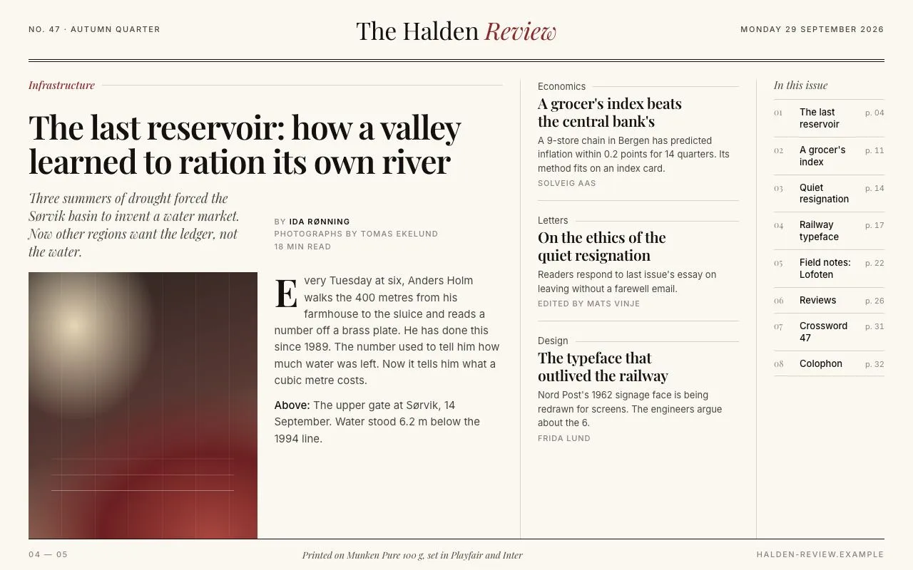
An asymmetric 12-column editorial front: a 7-column lead story, three sidebar stories, a numbered index that highlights its story on hover, and hairline rules throughout.
Preview
Use it
Free to use · credit appreciated1 Once, in your project
npx skills add SusanAcharya/Design-Lounge 2 Then ask
Using the Design Lounge skill, build "Magazine editorial grid" (piece magazine-editorial-grid) in my stack. Match its brief; restyle it onto my product's theme.
No skill? Paste the brief instead. It carries the numbers, tokens and behaviour.
<!-- Design Lounge Nº 034 · "Magazine editorial grid" · www.designlounge.live -->

# Magazine editorial grid

> **Build brief for a coding agent.** Rebuild this piece in the reader's stack. If they haven't said which stack, ask once, then default to semantic HTML + CSS + a little vanilla JS. Match the numbers below; don't "improve" them.

## What it is

The front spread of a quarterly magazine ("The Halden Review") rendered as a web page: a double-ruled masthead, then a 12-column grid where the lead story takes seven columns (kicker, 46px headline, italic deck, byline, a CSS-painted photograph, a drop-cap opening paragraph), three sidebar stories take three columns, and a numbered "In this issue" index takes the last two. Sections are separated by 1px hairlines, never boxes or shadows. Kickers are italic Playfair in oxblood. The detail worth copying is the index: hovering or focusing an entry underlines the headline of the story it points to, so the page explains its own structure.

## Reference behaviour

1. Initial state: masthead with "No. 47 · Autumn quarter" left, "The Halden *Review*" centred (34px, "Review" italic in `--accent`), the date right; a double rule (two 1px lines 4px apart) beneath. Below, the three-region grid. Footer folio "04 — 05" with a colophon line and a 1px top rule.
2. Hover a sidebar story: its headline grows a 1px oxblood underline from left to right over 300ms (`background-size` 0 → 100%).
3. Hover or focus an index entry: the entry's text and number turn `--accent` and the row nudges 4px right (160ms); the matching story (lead or sidebar) receives class `hi`: headline underline draws, kicker turns `--ink`.
4. Leave the entry: both revert.
5. Click an index entry: the target story flashes `hi` for 900ms, then reverts (the demo prevents navigation; in a real site it also scrolls to the story).
6. Tab order: lead headline → three sidebar headlines → eight index entries. Focus ring is a 2px `--accent` outline offset 3px.
7. Nothing else animates. The "photograph" is static CSS gradients with faint vertical lines (concrete formwork) and three horizontal water-line marks.

## Structure

```
1280 × 800
┌──────────────────────────────────────────────────────────────────────────┐
│ 40px  NO. 47 · AUTUMN QUARTER      The Halden Review     MONDAY 29 SEP…  │ 84
│ ══════════════════════════════════════════════════════════════════════   │ double rule
│                                                                          │ 28
│ ┌ cols 1–7 ───────────────────────────┐│ cols 8–10 ──────┐│ cols 11–12 ─┐│
│ │ Infrastructure ───────────────────  ││ Economics ──── ││ In this issue││
│ │ The last reservoir: how a valley    ││ A grocer's     ││ 01 The last…││
│ │ learned to ration its own river     ││ index beats…   ││ 02 A grocer…││
│ │ deck (italic 18) │ BY IDA RØNNING   ││ ─────────────  ││ 03 Quiet…   ││
│ │ ┌────────────┐ ┌───────────────┐   ││ Letters ────── ││ 04 Railway… ││
│ │ │ CSS photo  │ │ E very Tues…  │   ││ On the ethics… ││ 05 Field…   ││
│ │ │            │ │ caption       │   ││ ─────────────  ││ 06 Reviews  ││
│ │ └────────────┘ └───────────────┘   ││ Design ─────── ││ 07 Crossw…  ││
│ └────────────────────────────────────┘│ The typeface…  ││ 08 Colophon ││
│ ───────────────────────────────────────────────────────────────────────  │
│ 04 — 05        Printed on Munken Pure 100 g…        halden-review.example│ 44

… 153 more lines. Copy or download for the full brief. Loading the source…Brief
193 linesBuild brief for a coding agent. Rebuild this piece in the reader’s stack. If they haven’t said which stack, ask once, then default to semantic HTML + CSS + a little vanilla JS. Match the numbers below; don’t “improve” them.
What it is
The front spread of a quarterly magazine (“The Halden Review”) rendered as a web page: a double-ruled masthead, then a 12-column grid where the lead story takes seven columns (kicker, 46px headline, italic deck, byline, a CSS-painted photograph, a drop-cap opening paragraph), three sidebar stories take three columns, and a numbered “In this issue” index takes the last two. Sections are separated by 1px hairlines, never boxes or shadows. Kickers are italic Playfair in oxblood. The detail worth copying is the index: hovering or focusing an entry underlines the headline of the story it points to, so the page explains its own structure.
Reference behaviour
- Initial state: masthead with “No. 47 · Autumn quarter” left, “The Halden Review” centred (34px, “Review” italic in
--accent), the date right; a double rule (two 1px lines 4px apart) beneath. Below, the three-region grid. Footer folio “04 — 05” with a colophon line and a 1px top rule. - Hover a sidebar story: its headline grows a 1px oxblood underline from left to right over 300ms (
background-size0 → 100%). - Hover or focus an index entry: the entry’s text and number turn
--accentand the row nudges 4px right (160ms); the matching story (lead or sidebar) receives classhi: headline underline draws, kicker turns--ink. - Leave the entry: both revert.
- Click an index entry: the target story flashes
hifor 900ms, then reverts (the demo prevents navigation; in a real site it also scrolls to the story). - Tab order: lead headline → three sidebar headlines → eight index entries. Focus ring is a 2px
--accentoutline offset 3px. - Nothing else animates. The “photograph” is static CSS gradients with faint vertical lines (concrete formwork) and three horizontal water-line marks.
Structure
1280 × 800
┌──────────────────────────────────────────────────────────────────────────┐
│ 40px  NO. 47 · AUTUMN QUARTER      The Halden Review     MONDAY 29 SEP…  │ 84
│ ══════════════════════════════════════════════════════════════════════   │ double rule
│                                                                          │ 28
│ ┌ cols 1–7 ───────────────────────────┐│ cols 8–10 ──────┐│ cols 11–12 ─┐│
│ │ Infrastructure ───────────────────  ││ Economics ──── ││ In this issue││
│ │ The last reservoir: how a valley    ││ A grocer's     ││ 01 The last…││
│ │ learned to ration its own river     ││ index beats…   ││ 02 A grocer…││
│ │ deck (italic 18) │ BY IDA RØNNING   ││ ─────────────  ││ 03 Quiet…   ││
│ │ ┌────────────┐ ┌───────────────┐   ││ Letters ────── ││ 04 Railway… ││
│ │ │ CSS photo  │ │ E very Tues…  │   ││ On the ethics… ││ 05 Field…   ││
│ │ │            │ │ caption       │   ││ ─────────────  ││ 06 Reviews  ││
│ │ └────────────┘ └───────────────┘   ││ Design ─────── ││ 07 Crossw…  ││
│ └────────────────────────────────────┘│ The typeface…  ││ 08 Colophon ││
│ ───────────────────────────────────────────────────────────────────────  │
│ 04 — 05        Printed on Munken Pure 100 g…        halden-review.example│ 44
└──────────────────────────────────────────────────────────────────────────┘
12 columns, 24px column gap, 40px outer gutter. Vertical hairlines: right edge of lead, left edge of index.
<header class="mast">: 3-column grid (1fr auto 1fr), 84px tall,border-bottom: 1px solid --rule-strongplus a::afterline 4px below.<main class="page">:grid-template-columns: repeat(12, 1fr),gap: 0 24px,flex: 1; min-height: 0.<article class="lead">(grid-column: 1 / 8) is itself a 2-column grid: kicker (full width) →<h2>(full width) →.deck(col 1) +.byline(col 2) →.art(full width,1frrow) which holds.picand.body.<aside class="side" aria-label="More stories">(grid-column: 8 / 11): three.storyblocks (.kicker,<h3><a>,<p>,.who) withborder-bottom: 1pxbetween.<nav class="index" aria-label="In this issue">(grid-column: 11 / 13):<h4>+<ol>of eight links; numbers come from a CSS counter withdecimal-leading-zero.
<footer class="folio">: 44px,border-top: 1px solid --rule-strong.
Tokens
:root {
  /* colour — cream paper, near-black ink, oxblood accent */
  --paper: #fbf8f2;        /* page */
  --paper-2: #f3efe6;      /* reserved: pull-quote backgrounds */
  --ink: #141210;          /* headlines, body */
  --ink-2: #4a4640;        /* deck, standfirsts */
  --ink-3: #8a847a;        /* bylines, folio, index numbers */
  --rule: #d9d3c6;         /* hairlines */
  --rule-strong: #141210;  /* masthead and folio rules */
  --accent: #8a2a2b;       /* kickers, underline, index hover */
  /* CSS "photograph" */
  --photo-a: #2b2320; --photo-b: #5a3a35; --photo-c: #c69878; --photo-d: #6b1f21; --photo-e: #e7d8b8;

  /* type */
  --serif: "Playfair Display", Georgia, serif;
  --sans: "Inter", system-ui, sans-serif;
  --fs-mast: 34px; --fs-lead: 46px; --fs-h3: 21px; --fs-deck: 18px; --fs-body: 15px;
  --fs-kicker: 15px; --fs-stand: 13px; --fs-meta: 11px; --fs-dropcap: 54px;

  /* layout */
  --gutter: 40px; --col-gap: 24px; --mast-h: 84px; --folio-h: 44px; --page-top: 28px;
  --double-rule-gap: 4px;

  /* motion */
  --t-micro: 160ms; --t-layout: 300ms;
  --ease: cubic-bezier(.2, .7, .2, 1);
}
Typography
| Role | Family | Size | Weight | Line-height | Tracking | Case / notes |
|---|---|---|---|---|---|---|
| Masthead | Playfair Display | 34px | 400 | 1 | −0.01em | “Review” italic, --accent |
| Masthead meta | Inter | 11px | 500 | 1 | +0.14em | UPPERCASE |
| Kicker | Playfair Display | 15px | 500 italic | 1 | 0 | sentence, --accent, followed by a flexed 1px rule |
| Lead headline | Playfair Display | 46px | 600 | 1.05 | −0.025em | sentence, text-wrap: balance |
| Deck | Playfair Display | 18px | 400 italic | 1.4 | 0 | --ink-2 |
| Byline | Inter | 11px | 500 | 1.6 | +0.10em | UPPERCASE; name 600 in --ink |
| Body | Inter | 15px | 400 | 1.55 | 0 | text-wrap: pretty |
| Drop cap | Playfair Display | 54px | 600 | 0.8 | 0 | ::first-letter, float left, margin 6px 8px 0 0 |
| Caption | Inter | 12px | 400 | 1.5 | 0 | “Above:” in 500 --ink |
| Sidebar headline | Playfair Display | 21px | 600 | 1.2 | −0.015em | sentence |
| Standfirst | Inter | 13px | 400 | 1.5 | 0 | --ink-2 |
| Author | Inter | 11px | 500 | 1 | +0.08em | UPPERCASE --ink-3 |
| Index heading | Playfair Display | 15px | 400 italic | 1 | 0 | sentence |
| Index entry | Inter | 13px | 500 | 1.3 | 0 | sentence |
| Index number | Playfair Display | 12px | 400 | 1 | 0 | 01–08, tabular |
| Folio | Inter | 11px | 500 | 1 | +0.14em | UPPERCASE; colophon italic Playfair 13px |
Motion
| Element | Trigger | Property | From → To | Duration | Easing |
|---|---|---|---|---|---|
Headline underline (h2 a, h3 a) | story hover, or .hi from the index | background-size | 0 1px → 100% 1px | 300ms | --ease |
| Kicker | .hi | color | --accent → --ink | 160ms | --ease |
| Index entry | hover / focus-visible | color, padding-left | --ink → --accent; 0 → 4px | 160ms | --ease |
| Index entry (click) | click | adds .hi to the target story, removes after 900ms | — | — | — |
Reduced motion: transition-duration: 1ms everywhere; the underline appears instantly.
States
- Story hover: headline underline drawn; nothing else changes (no background).
- Story
.hi(driven by the index): underline drawn + kicker in--ink. Applies to the lead as well as sidebar stories. - Index hover / focus-visible: text and counter in
--accent, 4px inset; page number stays--ink-3. - Focus-visible (all links):
outline: 2px solid --accent; outline-offset: 3px. - Visited: no distinct style (editorial convention).
- There are no disabled, loading or empty states in this piece.
Accessibility
- Landmarks:
<header>(masthead),<main>,<aside aria-label="More stories">,<nav aria-label="In this issue">,<footer>. - Headings:
h1masthead →h2lead →h3sidebar stories →h4index title. Kickers are<p>, not headings. - Each story has an
id; index links are realhref="#id"anchors so they work without JS. The JS only adds the highlight and (in the demo) prevents the jump. - The CSS photograph is a
<div role="img" aria-label="…">describing the scene; the caption is visible text. - Index numbers come from
counter()in::before, so they are read by most screen readers; if your stack needs guaranteed announcement, put the number in a<span>. - Contrast:
--ink-2on--paper9.3:1;--ink-3on--paper4.6:1 (only at 11–12px 500 or as decoration);--accenton--paper7.5:1. - Keyboard: Tab through the four headlines then eight index entries; hover effects also fire on focus.
Responsive rules
- ≥ 1280: as drawn; page does not scroll.
- 1024–1279: same grid; lead headline 40px; gutter 32px.
- 768–1023: grid collapses to a single column stack in DOM order (lead → sidebar → index); vertical hairlines removed; lead headline 36px; the lead’s inner grid becomes one column (photo above body); page scrolls.
- < 640: gutter 20px; masthead becomes two rows (title, then meta line with issue and date); lead headline 30px; index entries keep their 3-column row layout.
Acceptance checklist
- Main grid is
repeat(12, 1fr)with a 24px column gap and 40px outer gutter; lead spans columns 1–7, sidebar 8–10, index 11–12. - Masthead is 84px with a double rule: 1px line plus a second 1px line 4px below.
- Lead headline is Playfair Display 46px/1.05, weight 600, −0.025em.
- Kickers are italic Playfair 15px in
#8A2A2Bfollowed by a 1px rule that fills the remaining width. - The opening paragraph has a 54px drop cap; the caption paragraph does not.
- A 1px vertical hairline sits on the right edge of the lead and on the left edge of the index; no boxes or shadows anywhere.
- Hovering a sidebar story draws a 1px underline under its headline over 300ms from the left.
- Hovering or focusing an index entry highlights the linked story (underline + kicker to
--ink); leaving reverts it. - Index numbers are
01–08, generated by a CSS counter withdecimal-leading-zero. - All four story headlines and eight index entries are keyboard-focusable with a visible 2px outline.
- The photograph is pure CSS (gradients) with a
role="img"label; no image files are loaded. - Below 1024px the three regions stack in DOM order and vertical hairlines disappear.
Implementation notes
Underline that draws in — use a background gradient sized to 0 width and transition background-size; this survives line wraps, unlike a pseudo-element:
.story h3 a {
  background: linear-gradient(var(--accent), var(--accent)) no-repeat 0 100% / 0 1px;
  transition: background-size 300ms var(--ease);
}
.story:hover h3 a, .story.hi h3 a, .lead.hi h2 a { background-size: 100% 1px; }
Kicker with a trailing rule — a flex row whose ::after takes the leftover width:
.kicker { display: flex; align-items: center; gap: 10px;
          font: italic 500 15px/1 var(--serif); color: var(--accent); }
.kicker::after { content: ""; flex: 1; height: 1px; background: var(--rule); }
Index → story highlight — bind hover and focus to the same handler and toggle a class on the target by id:
const mark = (id, on) => document.getElementById(id)?.classList.toggle('hi', on);
document.querySelectorAll('.index a[data-t]').forEach(a => {
  const id = a.dataset.t;
  for (const ev of ['mouseenter', 'focus']) a.addEventListener(ev, () => mark(id, true));
  for (const ev of ['mouseleave', 'blur']) a.addEventListener(ev, () => mark(id, false));
});
Common mistakes: giving the lead’s inner grid auto rows only, so the photo row overflows 800px (the last row must be 1fr with min-height: 0); applying ::first-letter to every paragraph in the body column (scope it to p:first-child); using text-decoration for the underline (it cannot animate width); forgetting text-wrap: balance on the 46px headline, which otherwise leaves a one-word orphan line.
Details
- Palette
- Type
- Playfair Display · Inter
- Motion
- Subtle motion
- Build
- One session
- Tags
On the shelves