Nº 369 of 520
Product mega menu grid
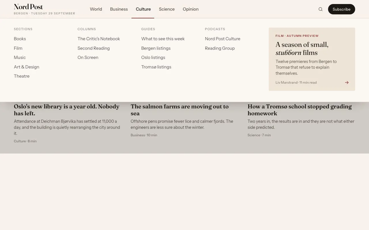
A white SaaS navbar whose Product item opens a full-width panel: three product columns, a by-team column and a release card, with hover intent and full keys.
Preview
Use it
Free to use · credit appreciated1 Once, in your project
npx skills add SusanAcharya/Design-Lounge 2 Then ask
Using the Design Lounge skill, build "Product mega menu grid" (piece mega-menu-product-grid) in my stack. Match its brief; restyle it onto my product's theme.
No skill? Paste the brief instead. It carries the numbers, tokens and behaviour.
<!-- Design Lounge Nº 369 · "Product mega menu grid" · www.designlounge.live -->

# Product mega menu grid

> **Build brief for a coding agent.** Rebuild this piece in the reader's stack. If they haven't said which stack, ask once, then default to semantic HTML + CSS + a little vanilla JS. Match the numbers below; don't "improve" them. When a kit is locked, map colours onto the kit tokens. Keep the delays, the column count and the keyboard rules.

## What it is

The header of Ordinal, a fictional analytics product. A 64px white bar holds the logo, five links and two actions. The first link, Product, opens a full-width panel under the bar. The panel has three product columns (Collect, Model, Act) with three products each, a "Solutions by team" column, and a release card on the right with a small chart drawn in CSS. A 44px strip at the panel foot shows system status and a Compare plans link. The look is Swiss and bright: white, near-black, one tomato accent, a grotesk, 8px radii, hairlines everywhere and one soft shadow under the panel. The detail worth copying is the timing: 120ms of hover intent before it opens, 200ms of grace before it closes, so a pointer crossing the bar does not flash the panel.

`editorial-mega-menu` is the newspaper version that morphs height between sections. This piece has one panel and a product grid.

## Reference behaviour

1. First frame: the panel is open. Product has `aria-expanded="true"` and a `--tint` background, and its chevron is turned 180deg. A 5% ink scrim covers the page below the bar. The hero headline shows under the panel.
2. Pointer leaves Product and the panel: after 200ms the panel closes. It fades to 0 and moves up 8px over 200ms. The scrim fades out. The chevron turns back.
3. Pointer returns to Product or the panel within 200ms: the close is cancelled.
4. Pointer rests on Product while closed: after 120ms the panel opens. It fades in and moves from -8px to 0 over 200ms on expo-out. If the pointer leaves before 120ms, nothing happens.
5. Click Product: toggles the panel at once, no delay.
6. Keyboard on Product: Enter and Space toggle. Arrow Down opens the panel and moves focus to the first product, Pipelines.
7. In the panel, Arrow Down and Arrow Up move through every link in reading order: the nine products, the six team links, the card, Compare plans. They stop at the ends. Home and End jump to the first and last. Tab works too.
8. Escape anywhere in the header closes the panel and puts focus on Product.
9. Focus leaving the header closes the panel. A pointer press outside the panel and outside Product closes it.
10. Hover a product: row background `--tint`. Its icon tile border turns `--ink` and the icon turns `--accent`. Text does not move.
11. Hover a team link: a 1px tomato underline appears 4px under the text.
12. Hover the card: border turns `--ink`. The arrow in "Read the release note" moves 3px right.
13. Touch: a tap on Product toggles. Hover intent only runs for `pointerType === 'mouse'`.

## Structure

```
1280 × 800
┌───────────────────────────────────────────────────────────────────────────┐
│ ■ Ordinal   [Product ˄]  Customers  Pricing  Docs  Changelog   Sign in [Start free] │ 64
├───────────────────────────────────────────────────────────────────────────┤
│ COLLECT          MODEL            ACT              │ SOLUTIONS │ ┌────────────┐ │
│ [▢] Pipelines    [▢] Warehouse    [▢] Dashboards   │ BY TEAM   │ │ ▔▔ select… LIVE│
│     Stream ev…       Columnar …       Pin charts…  │ Engineering│ │ ▁▂▂▃▃▄▅█▃  │ │
│ [▢] Webhooks     [▢] Metrics layer[▢] Alerts       │ Product   │ └────────────┘ │
│     Push any …       Define rev…      Get paged …  │ Finance   │ RELEASE 7.4 · 30 SEP │

… 235 more lines. Copy or download for the full brief. Loading the source…Brief
275 linesBuild brief for a coding agent. Rebuild this piece in the reader’s stack. If they haven’t said which stack, ask once, then default to semantic HTML + CSS + a little vanilla JS. Match the numbers below; don’t “improve” them. When a kit is locked, map colours onto the kit tokens. Keep the delays, the column count and the keyboard rules.
What it is
The header of Ordinal, a fictional analytics product. A 64px white bar holds the logo, five links and two actions. The first link, Product, opens a full-width panel under the bar. The panel has three product columns (Collect, Model, Act) with three products each, a “Solutions by team” column, and a release card on the right with a small chart drawn in CSS. A 44px strip at the panel foot shows system status and a Compare plans link. The look is Swiss and bright: white, near-black, one tomato accent, a grotesk, 8px radii, hairlines everywhere and one soft shadow under the panel. The detail worth copying is the timing: 120ms of hover intent before it opens, 200ms of grace before it closes, so a pointer crossing the bar does not flash the panel.
editorial-mega-menu is the newspaper version that morphs height between sections. This piece has one panel and a product grid.
Reference behaviour
- First frame: the panel is open. Product has
aria-expanded="true"and a--tintbackground, and its chevron is turned 180deg. A 5% ink scrim covers the page below the bar. The hero headline shows under the panel. - Pointer leaves Product and the panel: after 200ms the panel closes. It fades to 0 and moves up 8px over 200ms. The scrim fades out. The chevron turns back.
- Pointer returns to Product or the panel within 200ms: the close is cancelled.
- Pointer rests on Product while closed: after 120ms the panel opens. It fades in and moves from -8px to 0 over 200ms on expo-out. If the pointer leaves before 120ms, nothing happens.
- Click Product: toggles the panel at once, no delay.
- Keyboard on Product: Enter and Space toggle. Arrow Down opens the panel and moves focus to the first product, Pipelines.
- In the panel, Arrow Down and Arrow Up move through every link in reading order: the nine products, the six team links, the card, Compare plans. They stop at the ends. Home and End jump to the first and last. Tab works too.
- Escape anywhere in the header closes the panel and puts focus on Product.
- Focus leaving the header closes the panel. A pointer press outside the panel and outside Product closes it.
- Hover a product: row background
--tint. Its icon tile border turns--inkand the icon turns--accent. Text does not move. - Hover a team link: a 1px tomato underline appears 4px under the text.
- Hover the card: border turns
--ink. The arrow in “Read the release note” moves 3px right. - Touch: a tap on Product toggles. Hover intent only runs for
pointerType === 'mouse'.
Structure
1280 × 800
┌───────────────────────────────────────────────────────────────────────────┐
│ ■ Ordinal   [Product ˄]  Customers  Pricing  Docs  Changelog   Sign in [Start free] │ 64
├───────────────────────────────────────────────────────────────────────────┤
│ COLLECT          MODEL            ACT              │ SOLUTIONS │ ┌────────────┐ │
│ [▢] Pipelines    [▢] Warehouse    [▢] Dashboards   │ BY TEAM   │ │ ▔▔ select… LIVE│
│     Stream ev…       Columnar …       Pin charts…  │ Engineering│ │ ▁▂▂▃▃▄▅█▃  │ │
│ [▢] Webhooks     [▢] Metrics layer[▢] Alerts       │ Product   │ └────────────┘ │
│     Push any …       Define rev…      Get paged …  │ Finance   │ RELEASE 7.4 · 30 SEP │
│ [▢] SDKs         [▢] Snapshots    [▢] Notebooks NEW│ Growth    │ Live notebooks… │
│     Typed cli…       Freeze a d…      SQL and Py…  │ Support   │ Cells re-run …  │
│                                                    │ All solut…│ Read the note → │
├───────────────────────────────────────────────────────────────────────────┤
│ ● All systems normal   SOC 2 Type II · EU and US regions        Compare plans │ 44
└───────────────────────────────────────────────────────────────────────────┘
  (page below, under a 5% scrim)
  ANALYTICS FOR TEAMS THAT SHIP DAILY
Every number your team trusts, in one place. (80px, bottom of frame)headerisposition: relative; z-index: 10, white,border-bottom: 1px solid --line.- The bar is a flex row, height 64px, max-width 1200px, padding 0 40px, gap 40px. The
navtakes the free space. - Product is a
buttonwitharia-expandedandaria-controls="pp". The other four are links. - The panel is a
div id="pp"inside the header,position: absolute; top: 100%; left: 0; right: 0. It spans the whole window. Its content is centred at 1200px. - Panel grid:
grid-template-columns: repeat(3, minmax(0, 1fr)) minmax(0, .78fr) minmax(0, 1.3fr), gap 32px, padding 28px 40px 32px. - Each product column is a
sectionlabelled by its mono heading, with aulof three links. - A product link is a two-column grid: a 36px icon tile and a text stack of name and description.
- The team column has a 1px left rule and 32px left padding.
- The card is one
a. Inside: a 148px preview, a mono meta line, an 18px title, a line of text, and a “Read the release note” label with an arrow. - The foot strip is a 44px row with a 1px top rule.
- The scrim is a fixed layer from 64px down, under the header.
Tokens
:root {
  --bg: #ffffff;           /* bar, panel */
  --tint: #f4f4f1;         /* hover rows, card ground */
  --ink: #0d0d0d;          /* text, logo, primary button */
  --ink-2: #4b4b48;        /* nav links, card text */
  --ink-3: #73736e;        /* descriptions, column labels */
  --line: #e6e6e1;         /* hairlines */
  --line-2: #d2d2cc;       /* icon tile border, preview border */
  --accent: #f0441c;       /* tomato: logo notch, hover icon, NEW, chart bar, underline */
  --accent-soft: #fde9e3;  /* NEW badge ground */
  --ok: #1f9d55;           /* status dot */
  --focus: #f0441c;
  --scrim: rgba(13, 13, 13, .05);

  --sans: "Schibsted Grotesk", system-ui, sans-serif;
  --mono: "IBM Plex Mono", ui-monospace, monospace;

  --bar: 64px;
  --r: 8px; --r-small: 6px; --r-badge: 3px;
  --shadow-panel: 0 28px 48px -28px rgba(13, 13, 13, .28);

  --space-1: 4px; --space-2: 8px; --space-3: 12px; --space-4: 16px;
  --space-6: 24px; --space-8: 32px; --space-10: 40px;

  --ease-out: cubic-bezier(0.16, 1, 0.3, 1);
  --ease: cubic-bezier(0.2, 0.7, 0.2, 1);
  --panel-in: 200ms;
  --micro: 140ms;
  --open-delay: 120ms;
  --close-delay: 200ms;
}
The shadow is the only shadow in the piece. Everything else is separated by 1px lines.
Typography
| Role | Family | Size / line-height | Weight | Tracking | Colour |
|---|---|---|---|---|---|
| Logo | Schibsted Grotesk | 19px | 700 | -0.03em | --ink |
| Nav link | Schibsted Grotesk | 14.5px | 500 | 0 | --ink-2, open --ink |
| Start free | Schibsted Grotesk | 14.5px | 600 | 0 | white on --ink |
| Column label | IBM Plex Mono | 11px / 1 | 500 | 0.08em, uppercase | --ink-3 |
| Product name | Schibsted Grotesk | 14.5px | 600 | -0.01em | --ink |
| Product description | Schibsted Grotesk | 13px / 1.4 | 400 | 0 | --ink-3 |
| Team link | Schibsted Grotesk | 14.5px | 500 | 0 | --ink-2 |
| NEW badge | IBM Plex Mono | 10px / 16px | 500 | 0.06em, uppercase | --accent on --accent-soft |
| Card meta | IBM Plex Mono | 11px | 500 | 0.04em | --ink-3 |
| Card title | Schibsted Grotesk | 18px / 1.2 | 700 | -0.02em | --ink |
| Card text | Schibsted Grotesk | 13px | 400 | 0 | --ink-2 |
| Hero headline | Schibsted Grotesk | 80px / 0.96 | 700 | -0.045em | --ink, last phrase --accent |
Labels and dates are mono. Everything a person reads as a name is the grotesk.
Motion
| Thing | Trigger | Property | From → to | Duration | Easing | Delay | Reduced motion |
|---|---|---|---|---|---|---|---|
| Panel open | hover / click / key | opacity, transform | 0, translateY(-8px) → 1, none | 200ms | --ease-out | 120ms on hover, 0 on click or key | opacity only, 0ms |
| Panel close | leave / Esc / click | opacity, transform | 1, none → 0, translateY(-8px) | 200ms | --ease-out | 200ms on leave, 0 otherwise | instant |
| Panel visibility | close | visibility | visible → hidden | 0s | linear | after 200ms | instant |
| Scrim | with panel | opacity | 0 ↔ 1 | 200ms | --ease-out | with panel | instant |
| Chevron | with panel | transform | 0 ↔ rotate(180deg) | 200ms | --ease-out | none | instant |
| Product hover | hover | background, icon colour, tile border | rest → hover | 140ms | --ease | none | instant |
| Card arrow | card hover | transform | 0 → translateX(3px) | 140ms | --ease | none | instant |
Delay the visibility change on close, not on open. That way links cannot be clicked or tabbed into while the panel fades out.
States
- Product closed:
--ink-2, no background, chevron at 0. - Product open:
--ink,--tintbackground, 6px radius, chevron at 180deg,aria-expanded="true". - Nav link hover:
--inktext,--tintbackground. - Product row hover:
--tintbackground. Icon tile border--ink, icon--accent. - Team link hover: underline 1px, colour
--accent, offset 4px. - Card hover: border
--ink, arrow moves 3px. - Focus-visible: 2px
--focusoutline, offset 2px, 4px radius. - Start free hover: background
#2a2a28. - NEW badge: on one product only. Never on more than one.
- Status: green 7px dot with “All systems normal”. If degraded, swap the dot to
--accentand the text to “Degraded performance”. Do not add a banner. - Loading and empty: not used. The menu is static.
Accessibility
- Product is a
button, not a link. It hasaria-expandedandaria-controlspointing at the panel. - Do not use
role="menu"on the panel. It holds links and headings, so it is disclosure navigation. Arrow keys are added for speed. Tab still works. - Each column is a
sectionwitharia-labelledbyon its heading. - Icons are
aria-hidden. The card preview isaria-hidden. The card’s accessible name is its text. - Escape closes and returns focus to Product. Focus leaving the header closes the panel.
- When closed, the panel is
visibility: hidden, so its links leave the tab order and the accessibility tree. - Hover intent never blocks keyboard or click. Those open at once.
- Contrast:
#0d0d0don white is about 19:1.#73736eon white is about 4.8:1.#4b4b48is about 8.9:1. Tomato#f0441cis only used on large marks, on icons, and for the NEW badge on--accent-soft. Do not set body text in it. - Hit targets: nav items 36px tall on desktop. Product rows are at least 56px tall.
Responsive rules
- At 1280 and wider: panel content caps at 1200px and centres. The panel background spans the window.
- At 1024 to 1279: keep five columns. Product descriptions wrap to two or three lines. The card column keeps its 1.3fr share.
- At 760 to 1023: drop the card into a full-width row under the grid. The grid becomes
repeat(3, minmax(0, 1fr)) minmax(0, .8fr). Hide Changelog and Docs in the bar and list them in the panel foot. - Below 760: the navbar becomes a menu button and the mega panel becomes an accordion.
- Bar: logo left, a 40px Menu button right with
aria-expandedandaria-controls. Hide the links and Sign in. - Menu opens a full-height sheet under the bar with no slide on reduced motion, otherwise a 200ms fade.
- The sheet lists Product, Customers, Pricing, Docs, Changelog as 52px rows.
- Product is an accordion button with
aria-expanded. Opening it reveals Collect, Model and Act as three sub-groups, each with its three products as 48px rows. Descriptions show under each name. - Solutions by team is a second accordion under Product.
- The release card sits at the bottom of the sheet at full width.
- Start free is a full-width button pinned to the sheet bottom.
- Hover intent is off. Taps toggle.
- Bar: logo left, a 40px Menu button right with
- No width causes horizontal scroll. Use
minmax(0, 1fr)for every column.
Acceptance checklist
Always
- The trigger is a
buttonwitharia-expandedandaria-controls. - Hover opens after 120ms and closes after a 200ms grace. Returning within the grace cancels the close.
- Click, Enter and Space toggle at once. Arrow Down opens and focuses the first link.
- Arrow Up and Down move through panel links. Home and End jump.
- Escape closes and returns focus to the trigger. Focus leaving the header closes it.
- The panel fades and moves 8px over 200ms. Reduced motion removes the movement.
- Closed panel is
visibility: hiddenand out of the tab order. - One soft shadow under the panel. Every other divider is a 1px line.
- Panel spans the window. Content caps at 1200px.
- Focus rings are 2px and visible.
- Below 760 the panel is an accordion inside a menu sheet.
This demo
- Brand is Ordinal with a black square mark and a tomato notch.
- Columns are Collect (Pipelines, Webhooks, SDKs), Model (Warehouse, Metrics layer, Snapshots), Act (Dashboards, Alerts, Notebooks with NEW).
- Team links are Engineering, Product, Finance, Growth, Support, All solutions.
- The card reads “Release 7.4 · 30 Sep 2026” and “Live notebooks are here”, with one tomato bar in the chart.
- The panel starts open. Accent is
#f0441c. Radii are 8px.
Implementation notes
Hover intent with two timers. Clear both on every state change. Only run it for a mouse.
const OPEN_DELAY = 120, CLOSE_DELAY = 200;
let openT = 0, closeT = 0;
function setOpen(open) {
  clearTimeout(openT); clearTimeout(closeT);
  btn.setAttribute('aria-expanded', String(open));
  panel.toggleAttribute('data-open', open);
}
const isOpen = () => btn.getAttribute('aria-expanded') === 'true';
function scheduleOpen()  { clearTimeout(closeT); if (!isOpen()) openT  = setTimeout(() => setOpen(true),  OPEN_DELAY); }
function scheduleClose() { clearTimeout(openT);  if (isOpen())  closeT = setTimeout(() => setOpen(false), CLOSE_DELAY); }
btn.addEventListener('pointerenter', e => { if (e.pointerType === 'mouse') scheduleOpen(); });
btn.addEventListener('pointerleave', e => { if (e.pointerType === 'mouse') scheduleClose(); });
panel.addEventListener('pointerenter', () => clearTimeout(closeT));
panel.addEventListener('pointerleave', e => { if (e.pointerType === 'mouse') scheduleClose(); });
btn.addEventListener('click', () => setOpen(!isOpen()));
The panel transition. The visibility step waits for the fade on close and flips at once on open.
.panel { opacity: 0; visibility: hidden; transform: translateY(-8px);
  transition: opacity 200ms var(--ease-out), transform 200ms var(--ease-out), visibility 0s linear 200ms; }
.panel[data-open] { opacity: 1; visibility: visible; transform: none; transition-delay: 0s; }
@media (prefers-reduced-motion: reduce) {
  .panel { transform: none; transition: opacity 0ms, visibility 0ms; }
}
Closing on focus leave. Use relatedTarget, and ignore the case where it is null (the window lost focus).
header.addEventListener('focusout', e => {
  const to = e.relatedTarget;
  if (isOpen() && to && !panel.contains(to) && to !== btn) setOpen(false);
});
header.addEventListener('keydown', e => {
  if (e.key === 'Escape' && isOpen()) { setOpen(false); btn.focus(); }
});
The card preview is pure CSS: a white box with 24px ruled lines, a mono query line with a tomato dot, a LIVE tag, and nine bars in a grid. Bar eight is tomato. Bar nine is ink at 25% opacity, the week in progress. No image, no SVG chart.
Common mistakes:
- Opening on
mouseenterwith no delay. The panel flashes as the pointer crosses the bar. - Closing the instant the pointer leaves the trigger. The pointer cannot reach the panel.
- A gap between the bar and the panel. Hover is lost in the gap. The panel starts at
top: 100%. - Shadows on every product tile. Only the panel has a shadow.
- Tomato text for descriptions or links. Tomato is for marks, not reading.
role="menu"on a panel full of links and headings.- A purple or blue gradient card. The card is
--tintwith a hairline. - Panel content stretching to 1280px. Cap it at 1200px.
- Hover intent running on touch, so a tap needs two presses.
Rebuild order:
- Build the 64px bar with logo, links and actions.
- Build the panel grid with the five columns and the foot strip.
- Add the tokens, hover states and the one shadow.
- Add the open and close transition with delayed visibility.
- Wire click, hover intent and the scrim.
- Add Arrow Down, arrows inside, Home, End and Escape.
- Add focus-leave and outside-press closing.
- Build the accordion sheet below 760.
- Check reduced motion and focus rings.
Details
- Palette
- Type
- Schibsted Grotesk · IBM Plex Mono
- Motion
- Subtle motion
- Build
- One session
- Tags
Studied
Lama LamaA tiny nav bar can carry the voice. Change its one line for each section.
All sourcesOn the shelves