Nº 070 of 520
Swiss poster style
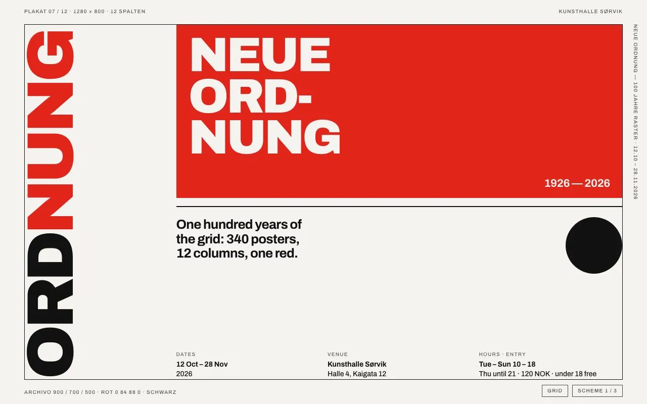
A Swiss-school exhibition poster: Archivo in red/black/off-white, a 130px word rotated −90°, a strict 12 × 8 grid with visible margins, and grid lines that reveal on hover.
Preview
Use it
Free to use · credit appreciated1 Once, in your project
npx skills add SusanAcharya/Design-Lounge 2 Then ask
Using the Design Lounge skill, build "Swiss poster style" (piece swiss-poster-style) in my stack. Match its brief; restyle it onto my product's theme.
No skill? Paste the brief instead. It carries the numbers, tokens and behaviour.
<!-- Design Lounge Nº 070 · "Swiss poster style" · www.designlounge.live -->

# Swiss poster style

> **Build brief for a coding agent.** Rebuild this piece in the reader's stack. If they haven't said which stack, ask once, then default to semantic HTML + CSS + a little vanilla JS. Match the numbers below; don't "improve" them.

## What it is

A poster for a fictional exhibition ("Neue Ordnung — 100 Jahre Raster" at Kunsthalle Sørvik) built in the International Typographic Style: one grotesk (Archivo at 900/700/500), three colours (off-white, near-black, red), a 12-column × 8-row grid inside a 48px margin with a 1px frame, tiny uppercase margin notes, a huge word rotated −90° running up the left edge, a red block with the title broken across three lines, a 2px rule, a bold lead sentence, a black circle, and a three-column info block pinned to the bottom. Hovering the page reveals the column and row guides at 18 % opacity; a "Grid" button (or the G key) pins them. Clicking anywhere cycles three colour schemes (paper / red / black) by swapping three custom properties — everything else is untouched. The lesson is the grid: nothing sits off a column or row edge.

## Reference behaviour

1. Initial state (scheme 1): off-white page, 1px black frame at 48px inset, "ORDNUNG" rotated −90° along the left edge of columns 1–3 with "NUNG" in red, red block over columns 4–12 / rows 1–4 with "NEUE / ORD- / NUNG" in off-white at 96px and "1926 — 2026" bottom-right, 2px black rule at the top of row 5, lead sentence in columns 4–7, 112px black circle at the right of columns 10–12, info block (Dates / Venue / Hours · Entry) at the bottom of columns 4–12. Margin notes: top-left "Plakat 07 / 12 · 1280 × 800 · 12 Spalten", top-right "Kunsthalle Sørvik", right edge (vertical) the exhibition name and dates, bottom-left the type and colour spec. Bottom-right: two small outlined buttons, "Grid" and "Scheme 1 / 3".
2. Move the pointer over the page: 12 column guides and 8 row guides fade in over 240ms at `--grid` opacity (18 % black). Leave the page: they fade out.
3. Click "Grid" (or press G): guides stay visible regardless of hover; `aria-pressed` becomes true and the button inverts. Click again to release.
4. Click anywhere else (or press Space / Enter while no button is focused): the scheme cycles 1 → 2 → 3 → 1. Scheme 2 is red paper with off-white type and black accents (the word's suffix, the block, the circle); scheme 3 is black paper with off-white type and red accents. Background, text, frame, block, circle and guides all transition over 360ms. The "Scheme n / 3" label updates.
5. Hover a control button: opacity .75 → 1. Focus: 2px accent outline.
6. Nothing else moves. There is no animation on load.

## Structure

```
1280 × 800  (margin 48px → poster 1184 × 704; 12 cols × 8 rows, 16px gaps; col ≈ 84px, row ≈ 74px)
 PLAKAT 07 / 12 · 1280 × 800 · 12 SPALTEN                                 KUNSTHALLE SØRVIK
 ┌────────────────────────────────────────────────────────────────────────────────────┐ N
 │ G  │ cols 4–12, rows 1–4: red block                                                │ E
 │ N  │  NEUE                                                                         │ U
 │ U  │  ORD-                                                                         │ E
 │ N  │  NUNG                                                              1926 — 2026│
 │ D  ├──────────────────────────────────────────────────────────────── 2px rule ─────│ O
 │ R  │ One hundred years of the grid:                                   ●  (112px)   │ R
 │ O  │ 340 posters, 12 columns, one red.                                             │ D
 │    │                                                                               │ N
 │    │ DATES            VENUE               HOURS · ENTRY                            │ U
 │    │ 12 Oct – 28 Nov  Kunsthalle Sørvik   Tue – Sun 10 – 18                        │ N
 │    │ 2026             Halle 4, Kaigata 12 Thu until 21 · 120 NOK · under 18 free   │ G
 └────────────────────────────────────────────────────────────────────────────────────┘
 ARCHIVO 900 / 700 / 500 · ROT 0 84 88 0 · SCHWARZ                        [GRID] [SCHEME 1 / 3]
 (the rotated word reads bottom-to-top along columns 1–3; "NUNG" is the accent colour)
```

… 145 more lines. Copy or download for the full brief. Loading the source…Brief
185 linesBuild brief for a coding agent. Rebuild this piece in the reader’s stack. If they haven’t said which stack, ask once, then default to semantic HTML + CSS + a little vanilla JS. Match the numbers below; don’t “improve” them.
What it is
A poster for a fictional exhibition (“Neue Ordnung — 100 Jahre Raster” at Kunsthalle Sørvik) built in the International Typographic Style: one grotesk (Archivo at 900/700/500), three colours (off-white, near-black, red), a 12-column × 8-row grid inside a 48px margin with a 1px frame, tiny uppercase margin notes, a huge word rotated −90° running up the left edge, a red block with the title broken across three lines, a 2px rule, a bold lead sentence, a black circle, and a three-column info block pinned to the bottom. Hovering the page reveals the column and row guides at 18 % opacity; a “Grid” button (or the G key) pins them. Clicking anywhere cycles three colour schemes (paper / red / black) by swapping three custom properties — everything else is untouched. The lesson is the grid: nothing sits off a column or row edge.
Reference behaviour
- Initial state (scheme 1): off-white page, 1px black frame at 48px inset, “ORDNUNG” rotated −90° along the left edge of columns 1–3 with “NUNG” in red, red block over columns 4–12 / rows 1–4 with “NEUE / ORD- / NUNG” in off-white at 96px and “1926 — 2026” bottom-right, 2px black rule at the top of row 5, lead sentence in columns 4–7, 112px black circle at the right of columns 10–12, info block (Dates / Venue / Hours · Entry) at the bottom of columns 4–12. Margin notes: top-left “Plakat 07 / 12 · 1280 × 800 · 12 Spalten”, top-right “Kunsthalle Sørvik”, right edge (vertical) the exhibition name and dates, bottom-left the type and colour spec. Bottom-right: two small outlined buttons, “Grid” and “Scheme 1 / 3”.
- Move the pointer over the page: 12 column guides and 8 row guides fade in over 240ms at
--gridopacity (18 % black). Leave the page: they fade out. - Click “Grid” (or press G): guides stay visible regardless of hover;
aria-pressedbecomes true and the button inverts. Click again to release. - Click anywhere else (or press Space / Enter while no button is focused): the scheme cycles 1 → 2 → 3 → 1. Scheme 2 is red paper with off-white type and black accents (the word’s suffix, the block, the circle); scheme 3 is black paper with off-white type and red accents. Background, text, frame, block, circle and guides all transition over 360ms. The “Scheme n / 3” label updates.
- Hover a control button: opacity .75 → 1. Focus: 2px accent outline.
- Nothing else moves. There is no animation on load.
Structure
1280 × 800  (margin 48px → poster 1184 × 704; 12 cols × 8 rows, 16px gaps; col ≈ 84px, row ≈ 74px)
 PLAKAT 07 / 12 · 1280 × 800 · 12 SPALTEN                                 KUNSTHALLE SØRVIK
 ┌────────────────────────────────────────────────────────────────────────────────────┐ N
 │ G  │ cols 4–12, rows 1–4: red block                                                │ E
 │ N  │  NEUE                                                                         │ U
 │ U  │  ORD-                                                                         │ E
 │ N  │  NUNG                                                              1926 — 2026│
 │ D  ├──────────────────────────────────────────────────────────────── 2px rule ─────│ O
 │ R  │ One hundred years of the grid:                                   ●  (112px)   │ R
 │ O  │ 340 posters, 12 columns, one red.                                             │ D
 │    │                                                                               │ N
 │    │ DATES            VENUE               HOURS · ENTRY                            │ U
 │    │ 12 Oct – 28 Nov  Kunsthalle Sørvik   Tue – Sun 10 – 18                        │ N
 │    │ 2026             Halle 4, Kaigata 12 Thu until 21 · 120 NOK · under 18 free   │ G
 └────────────────────────────────────────────────────────────────────────────────────┘
 ARCHIVO 900 / 700 / 500 · ROT 0 84 88 0 · SCHWARZ                        [GRID] [SCHEME 1 / 3]
 (the rotated word reads bottom-to-top along columns 1–3; "NUNG" is the accent colour)
<body data-scheme="1">with four.margspans (top-left, top-right, right vertical viawriting-mode: vertical-rl, bottom-left) outside the frame.<main class="poster">:position: absolute; inset: 48px; display: grid; grid-template-columns: repeat(12, 1fr); grid-template-rows: repeat(8, 1fr); gap: 16px; border: 1px solid; overflow: hidden..linesand.rows: absolutely positioned full-size grids of 12 / 8<i>cells with 1px left/right or top/bottom borders; opacity 0 → 1 on hover or.grid-on..big(col 1–3, row 1–8,position: relative): a<span>anchoredleft: 0; bottom: 0,transform-origin: left bottom,transform: rotate(-90deg) translate(0, 100%); the suffix in<b>takes the accent..block(col 4–12, row 1–4):<h1>at 24px/20px inset;.nyear range bottom-right..rule(col 4–12, row 5): 2px top border,align-self: start..lead(col 4–7, row 5–6),.dot(col 10–12, row 5–6,justify-self: end),.info(col 4–12, row 7–8,align-self: end) — a 9-column sub-grid with three<dl>s spanning 3 each.
.ctl: two<button>s at bottom-right, on the margin line.
Tokens
:root {
  /* the three colours */
  --paper: #f4f3ef;
  --ink: #121212;
  --red: #e1251b;
  /* roles — re-pointed per scheme */
  --bg: var(--paper);  --fg: var(--ink);  --ac: var(--red);
  --grid: rgba(18, 18, 18, .18);

  /* type — one family */
  --font: "Archivo", Helvetica, Arial, sans-serif;
  --fs-word: 130px; --fs-title: 96px; --fs-lead: 26px; --fs-year: 22px; --fs-info: 14px; --fs-marg: 10px;
  --tr-word: -.06em; --tr-title: -.05em; --tr-lead: -.03em; --tr-marg: .12em;

  /* grid */
  --m: 48px; --cols: 12; --rows: 8; --gap: 16px; --frame: 1px; --rule: 2px; --dot: 112px;
  --block-pad: 20px 24px; --marg-offset: 18px;

  /* motion */
  --t-micro: 160ms; --t-grid: 240ms; --t-scheme: 360ms;
  --ease: cubic-bezier(.2, .7, .2, 1);
}
[data-scheme="2"] { --bg: var(--red);  --fg: var(--paper); --ac: var(--ink); --grid: rgba(244, 243, 239, .28); }
[data-scheme="3"] { --bg: var(--ink);  --fg: var(--paper); --ac: var(--red); --grid: rgba(244, 243, 239, .22); }
Typography
| Role | Family | Size | Weight | Line-height | Tracking | Case |
|---|---|---|---|---|---|---|
| Rotated word | Archivo | 130px | 900 | .8 | −0.06em | UPPERCASE; <b> suffix in --ac |
| Block title | Archivo | 96px | 900 | .85 | −0.05em | UPPERCASE, hyphenated across 3 lines with <br> and a real hyphen |
| Year range | Archivo | 22px | 700 | 1 | −0.02em | numerals with an em dash |
| Lead | Archivo | 26px | 700 | 1.1 | −0.03em | sentence, text-wrap: balance |
| Info label | Archivo | 10px | 500 | 1 | +0.12em | UPPERCASE, 65 % opacity |
| Info value | Archivo | 14px | 500 (first line 700) | 1.35 | 0 | sentence |
| Margin notes | Archivo | 10px | 500 | 1 | +0.12em | UPPERCASE, 70 % opacity |
| Buttons | Archivo | 10px | 500 | 1 | +0.12em | UPPERCASE, 1px currentColor border, 6px 10px padding |
Motion
| Element | Trigger | Property | From → To | Duration | Easing |
|---|---|---|---|---|---|
.lines, .rows | body hover / .grid-on | opacity | 0 → 1 | 240ms | --ease |
body | scheme change | background, color | previous → new roles | 360ms | --ease |
.poster frame, .rule | scheme change | border-color | --fg | 360ms | --ease |
.block, .dot | scheme change | background | --ac / --fg | 360ms | --ease |
.big span, <b>, h1, .n | scheme change | color | --fg / --ac / --bg | 360ms | --ease |
.ctl button | hover | opacity | .75 → 1 | 160ms | linear |
Reduced motion: all transitions 1ms; guides and schemes still switch.
States
- Guides hidden / hover / pinned: opacity 0; 1 while the pointer is over the page; 1 while
body.grid-on(buttonaria-pressed="true", button inverted--fgon--bg). - Scheme 1: bg paper, fg ink, accent red. Scheme 2: bg red, fg paper, accent ink. Scheme 3: bg ink, fg paper, accent red.
- Button rest: outlined, 75 % opacity. Hover: 100 %. Focus-visible:
outline: 2px solid --ac; outline-offset: 2px. Pressed (Grid): filled. - Cursor is a pointer over the whole page (click cycles the scheme).
- No loading, empty or error states.
Accessibility
<main aria-label="Exhibition poster">; the title is an<h1>; the rotated word, guides, rule and circle arearia-hiddendecoration.- Info is three
<dl>s so label/value pairs are associated. - Keyboard: Tab reaches the two buttons; G toggles the guides; Space / Enter cycle the scheme when focus is not on a button (buttons handle their own activation).
- Colour is never the only carrier: the scheme name is written in the button label; the guides toggle has
aria-pressed. - Contrast: ink on paper 17:1; paper on red 4.6:1 (block title, scheme 2 body text); paper on ink 17:1; red on paper 4.7:1 (used for the 130px suffix only). Margin notes at 70 % opacity on paper are ≈ 6:1.
- Text is not selectable because the whole page is a click target; drop
user-select: noneif the page is used as a real event page.
Responsive rules
- ≥ 1280: as drawn.
- 1024–1279: unchanged (the word still fits: poster height ≥ 664px at 760 tall).
- 768–1023: rotated word 96px; title 64px; lead 20px; margin 32px.
- < 768: margin 24px; grid becomes 12 × 10 rows; the word is un-rotated at 72px across the top (rows 1–3), the red block takes rows 4–6 full width, lead rows 7–8, info rows 9–10 in two columns; the circle is hidden.
Acceptance checklist
- Poster is inset exactly 48px on all sides with a 1px
--fgframe andoverflow: hidden. - Grid is
repeat(12, 1fr)×repeat(8, 1fr)with 16px gaps; every element starts and ends on a column and row line. - Hovering the page fades in 12 column guides and 8 row guides over 240ms; the Grid button and the G key pin them with
aria-pressed. - The rotated word is Archivo 900 at 130px, tracking −0.06em, rotated −90° from its bottom-left corner, reading bottom-to-top along columns 1–3, with the suffix in the accent colour.
- Red block spans columns 4–12 and rows 1–4; title is 96px/.85 at 24px/20px inset; the year range sits bottom-right.
- A 2px rule spans columns 4–12 at the top of row 5; the lead is 26px/700 in columns 4–7; the circle is 112px at the right of columns 10–12.
- The info block is a 9-column sub-grid with three
<dl>s of 3 columns each, pinned to the bottom of rows 7–8. - Clicking the page (not the buttons) cycles schemes 1 → 2 → 3 → 1 by changing only
--bg,--fg,--ac,--grid; the transition is 360ms. - Only three colours appear anywhere in the CSS (
#F4F3EF,#121212,#E1251B) plus their translucent guide variants. - Only one font family is loaded (Archivo 400/500/700/900).
- Both buttons have visible focus rings and the Grid button reports
aria-pressed. - No element has a border-radius except the circle.
Implementation notes
Rotate from the bottom-left corner so the word’s baseline runs along the column’s left edge and its start sits on the bottom row line:
.big { grid-column: 1 / 4; grid-row: 1 / 9; position: relative; }
.big span { position: absolute; left: 0; bottom: 0; transform-origin: left bottom;
            transform: rotate(-90deg) translate(0, 100%);
            font: 900 130px/.8 var(--font); letter-spacing: -.06em; text-transform: uppercase; white-space: nowrap; }
Size check: at 130px the word “ORDNUNG” measures ≈ 690px, so it fits the 704px poster height; scale the size with the poster if you change the frame.
Guides as real grid cells so they always align with the layout grid, whatever the viewport:
.lines { position: absolute; inset: 0; pointer-events: none; opacity: 0;
         display: grid; grid-template-columns: repeat(var(--cols), 1fr); gap: var(--gap);
         transition: opacity var(--t-grid) var(--ease); }
.lines i { border-left: 1px solid var(--grid); border-right: 1px solid var(--grid); }
body:hover .lines, body.grid-on .lines { opacity: 1; }
Scheme cycling touches only tokens:
let s = 1;
function cycle() { s = s % 3 + 1; body.dataset.scheme = s; label.textContent = `Scheme ${s} / 3`; }
body.addEventListener('click', e => { if (e.target.closest('.ctl')) return; cycle(); });
addEventListener('keydown', e => {
  if (e.key === 'g' || e.key === 'G') gridBtn.click();
  if ((e.key === ' ' || e.key === 'Enter') && e.target.tagName !== 'BUTTON') { e.preventDefault(); cycle(); }
});
Common mistakes: rotating with writing-mode: vertical-rl (it reads top-to-bottom; Swiss posters read bottom-to-top, which needs rotate(-90deg)); sizing the rotated word by eye so it bleeds past the frame (measure its width, it must be ≤ the poster height); drawing guides with a repeating gradient (they drift from the real columns as soon as the gap or margin changes); hard-coding red on the block instead of --ac (scheme 2 then puts red on red).
Details
- Palette
- Type
- Archivo
- Motion
- Subtle motion
- Build
- Quick build
- Tags
On the shelves