Nº 538 of 543
Tactile media controls
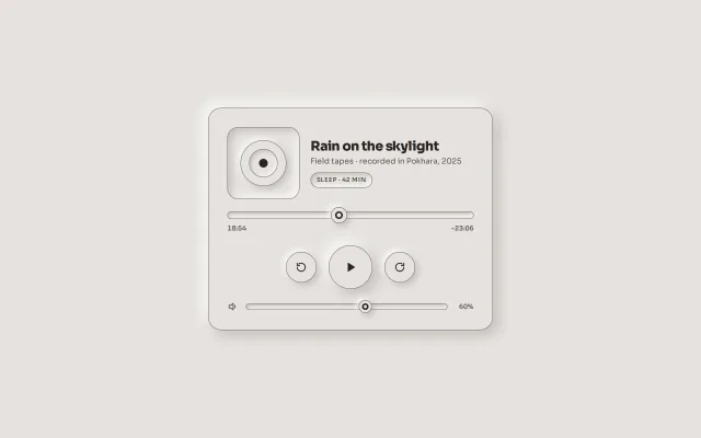
A neumorphic player card: a drawn disc in a well, a scrubber with a raised ink-ringed knob, an 80px play button that stays pressed while playing, and a volume well, on one putty with 3:1 edges.
Preview
Use it
Free to use · credit appreciated1 Once, in your project · Node 22.20+
npx skills add SusanAcharya/Design-Lounge 2 Then ask
Using the Design Lounge skill, build "Tactile media controls" (piece media-controls-tactile) in my stack. Match its brief; restyle it onto my product's theme.
No skill? Paste the brief instead. It carries the numbers, tokens and behaviour.
<!-- Design Lounge Nº 538 · "Tactile media controls" · www.designlounge.live -->

# Tactile media controls

> **Build brief for a coding agent.** Rebuild this piece in the reader's stack. If they haven't said which stack, ask once, then default to semantic HTML + CSS + a little vanilla JS. Match the numbers below; don't "improve" them. When a kit is locked, map the surface and inks onto the theme tokens and keep the two shadow tokens and the 1px edge.

## What it is

The now-playing card of Hush, a fictional sleep-sounds app, in monochrome neumorphism. A 460px raised card on a putty surface. Top: a 120px well holding three concentric raised and pressed rings with an ink centre (the "disc"), the title, a line of provenance and a pill tag in a well. Middle: a scrubber whose track is a 14px well and whose knob is a 30px raised disc with an ink ring; times under it. Then the transport: two 56px raised round buttons and an 80px play button in the middle. Pressing play sinks the big button into the surface (the well) and shows the pause glyph; the position then advances once a second. Bottom: a volume well with a smaller knob and a live percentage. The detail worth copying is that play is the only control whose pressed state *stays*: everything else springs back, so the one thing that is "on" reads as pushed in.

## Reference behaviour

1. First frame: the card centred; "Rain on the skylight", "Field tapes · recorded in Pokhara, 2025", tag "SLEEP · 42 MIN"; scrubber at 18:54 of 42:00 with "-23:06" remaining; transport back 30s, play (raised), forward 30s; volume at 60%.
2. Click play: the button's `aria-pressed` becomes true, its label "Pause", the glyph swaps to pause, the shadow becomes the well. Every second the scrubber moves one second and the times update. Click again: raised, "Play", the timer stops.
3. Drag the scrubber: the times update live and `aria-valuetext` reads "18 minutes 54 seconds of 42 minutes".
4. Click back or forward: the position moves 30 seconds, clamped to the range. The buttons show the well only while held.
5. Drag the volume: the percentage output updates.
6. If the tab is hidden while playing, playback pauses (the button returns to raised).
7. Reaching the end pauses playback.
8. Hover changes nothing; depth is the only state, so a mouse user and a touch user see the same card.

## Structure

```
1280 × 800, surface #E6E3DF; the card centred
┌ card 460, r24, raised, padding 30 ───────────────────────────────┐
│ ┌ disc well 120 ┐  Rain on the skylight          22/800           │
│ │  ◎ rings      │  Field tapes · recorded in Pokhara, 2025        │
│ └───────────────┘  (SLEEP · 42 MIN) well pill                     │
│ (═══════════●═════════════════════)  scrubber: well 14, knob 30   │
│ 18:54                                                  -23:06     │
│            (↺ 56)      (▶ 80 raised / well when on)     (↻ 56)    │
│ 🔈 (════●══════════)  60%        volume: well 12, knob 24         │
└───────────────────────────────────────────────────────────────────┘
```

- `section.player[aria-label="Now playing"]` → `div.art` (`div.disc[aria-hidden]` with three nested `i`, `div.meta` with `h1`, `p`, `span.tag`), `div.scrub` (`input#pos[type=range]`, `div.times`), `div.transport` (three `button.tb`), `div.vol` (icon, `input#vol[type=range]`, `output`).

## Tokens

… 115 more lines. Copy or download for the full brief. Loading the source…Brief
155 linesBuild brief for a coding agent. Rebuild this piece in the reader’s stack. If they haven’t said which stack, ask once, then default to semantic HTML + CSS + a little vanilla JS. Match the numbers below; don’t “improve” them. When a kit is locked, map the surface and inks onto the theme tokens and keep the two shadow tokens and the 1px edge.
What it is
The now-playing card of Hush, a fictional sleep-sounds app, in monochrome neumorphism. A 460px raised card on a putty surface. Top: a 120px well holding three concentric raised and pressed rings with an ink centre (the “disc”), the title, a line of provenance and a pill tag in a well. Middle: a scrubber whose track is a 14px well and whose knob is a 30px raised disc with an ink ring; times under it. Then the transport: two 56px raised round buttons and an 80px play button in the middle. Pressing play sinks the big button into the surface (the well) and shows the pause glyph; the position then advances once a second. Bottom: a volume well with a smaller knob and a live percentage. The detail worth copying is that play is the only control whose pressed state stays: everything else springs back, so the one thing that is “on” reads as pushed in.
Reference behaviour
- First frame: the card centred; “Rain on the skylight”, “Field tapes · recorded in Pokhara, 2025”, tag “SLEEP · 42 MIN”; scrubber at 18:54 of 42:00 with “-23:06” remaining; transport back 30s, play (raised), forward 30s; volume at 60%.
- Click play: the button’s
aria-pressedbecomes true, its label “Pause”, the glyph swaps to pause, the shadow becomes the well. Every second the scrubber moves one second and the times update. Click again: raised, “Play”, the timer stops. - Drag the scrubber: the times update live and
aria-valuetextreads “18 minutes 54 seconds of 42 minutes”. - Click back or forward: the position moves 30 seconds, clamped to the range. The buttons show the well only while held.
- Drag the volume: the percentage output updates.
- If the tab is hidden while playing, playback pauses (the button returns to raised).
- Reaching the end pauses playback.
- Hover changes nothing; depth is the only state, so a mouse user and a touch user see the same card.
Structure
1280 × 800, surface #E6E3DF; the card centred
┌ card 460, r24, raised, padding 30 ───────────────────────────────┐
│ ┌ disc well 120 ┐  Rain on the skylight          22/800           │
│ │  ◎ rings      │  Field tapes · recorded in Pokhara, 2025        │
│ └───────────────┘  (SLEEP · 42 MIN) well pill                     │
│ (═══════════●═════════════════════)  scrubber: well 14, knob 30   │
│ 18:54                                                  -23:06     │
│            (↺ 56)      (▶ 80 raised / well when on)     (↻ 56)    │
│ 🔈 (════●══════════)  60%        volume: well 12, knob 24         │
└───────────────────────────────────────────────────────────────────┘
section.player[aria-label="Now playing"]→div.art(div.disc[aria-hidden]with three nestedi,div.metawithh1,p,span.tag),div.scrub(input#pos[type=range],div.times),div.transport(threebutton.tb),div.vol(icon,input#vol[type=range],output).
Tokens
:root {
  --surface: #e6e3df;
  --ink: #2a2622;  --ink-2: #56514b;  --ink-3: #625c56;
  --edge: #7d7770;                         /* 1px, 3.5:1 on the surface */
  --light: rgba(255,255,255,.85);  --shade: rgba(74,66,58,.22);
  --raise:    10px 10px 24px var(--shade), -10px -10px 24px var(--light);  /* the card, the play button */
  --raise-sm:  5px  5px 12px var(--shade),  -5px  -5px 12px var(--light);  /* small buttons, knobs, rings */
  --well:     inset 6px 6px 14px var(--shade), inset -6px -6px 14px var(--light);  /* disc well, play when on */
  --well-sm:  inset 3px 3px 7px var(--shade),  inset -3px -3px 7px var(--light);   /* tracks, pill, held buttons */

  --sans: "Sora", system-ui, sans-serif;
  --r: 20px;  --r-card: 24px;
  --play: 80px;  --tb: 56px;  --thumb: 30px;  --thumb-sm: 24px;  --track: 14px;
  --t-micro: 200ms;  --ease: cubic-bezier(.2, .7, .2, 1);
}
Typography
| Role | Family | Size | Weight | Line-height | Tracking | Case |
|---|---|---|---|---|---|---|
| Title | Sora | 22px | 800 | 1.1 | −0.025em | sentence |
| Provenance | Sora | 14px | 400 | 1.45 | 0 | sentence, --ink-2 |
| Tag | Sora | 11px | 600 | 1 | +0.06em | UPPERCASE, --ink-2 |
| Times, volume | Sora | 12px | 600 | 1 | 0 | tabular numerals, --ink-3 |
Motion
| Element | Trigger | Property | From → To | Duration | Easing |
|---|---|---|---|---|---|
.tb.play | press (stays) | box-shadow | --raise → --well | 200ms | --ease |
.tb.sm | :active | box-shadow | --raise-sm → --well-sm | 0 | – |
| scrubber | playing | value | +1 per 1000ms | – | – |
| glyph | play toggle | display | ▶ ↔ ❚❚ | 0 | – |
Reduced motion: transitions 1ms. The timer is not motion; it still runs.
States
- Play off: raised 80px disc, ▶ glyph, label “Play”. On: the well, ❚❚ glyph, label “Pause”,
aria-pressed="true". - Small transport buttons: raised; the well while held.
- Scrubber and volume: well tracks; raised knobs with an ink ring (3px inside a 3px surface ring on the scrubber, 3px inside 3px on the volume).
- Focus-visible: 2px ink outline at 4px offset on every control, visible on the putty.
- Disc: a 120px well; rings raised, pressed, raised; the centre is a 16px ink dot.
Accessibility
- Play is a
<button aria-pressed>whosearia-labelswaps between Play and Pause; the glyph change is in addition. - The scrubber is a native range input labelled “Position” with
aria-valuetextin minutes and seconds; arrow keys step one second, and the visible times update. - Volume is a native range input labelled “Volume” with an
<output for>showing the percentage. - Back and forward have labels “Back 30 seconds” and “Forward 30 seconds”; the disc is decorative (
aria-hidden). - Contrast:
--ink11.7:1,--ink-26.1:1,--ink-34.9:1 on the surface;--edgehairlines 3.5:1 around every control and knob; the play glyph is--ink. - Hit targets: play 80px, transport 56px, knobs 30px and 24px on tracks at least 40px tall including their margins.
Responsive rules
- ≥ 1280: the card at 460px, centred.
- 768–1279: the same card; centred in the column.
- < 640: the card fills the width minus 20px each side; the disc drops to 96px and sits above the text; transport buttons 52 / 72 / 52.
- Dark pair: dark putty surface, shade
rgba(0,0,0,.45), lightrgba(255,255,255,.06), the ink becomes the light ink and the edge#4a453f.
Acceptance checklist
Always
- One surface colour; depth from
--raiseand--welland their small variants only; no third shadow colour. - Every control, knob and the card has a 1px edge of at least 3:1 against the surface.
- Play is the only control whose pressed look stays:
aria-pressed, the well shadow, the pause glyph and the label swap together. - Both ranges are native inputs with labels; the scrubber has a minutes-and-seconds
aria-valuetextand live visible times. - Playing advances the position once a second, stops at the end, and pauses when the tab is hidden.
- Back and forward move 30 seconds and clamp to the range.
- Radii: the card 24px, pills 999px, the disc well 20px; round only the knobs and transport buttons.
- Reduced motion: 1ms transitions.
This demo
- “Rain on the skylight”, Field tapes, Pokhara 2025, Sleep · 42 min; the position starts at 18:54 with -23:06 remaining; volume 60%.
Implementation notes
Play stays pressed:
.tb.play { width: 80px; height: 80px; border-radius: 50%; border: 1px solid var(--edge); box-shadow: var(--raise); }
.tb.play[aria-pressed="true"] { box-shadow: var(--well); }
.tb.play .pause { display: none; }  .tb.play[aria-pressed="true"] .pause { display: block; }  .tb.play[aria-pressed="true"] .go { display: none; }
One timer, one clock:
play.addEventListener('click', () => {
  const on = play.getAttribute('aria-pressed') !== 'true';
  play.setAttribute('aria-pressed', String(on)); play.setAttribute('aria-label', on ? 'Pause' : 'Play');
  clearInterval(timer);
  if (on) timer = setInterval(() => { if (+pos.value >= +pos.max) return play.click(); pos.value = +pos.value + 1; show(); }, 1000);
});
document.addEventListener('visibilitychange', () => { if (document.hidden && play.getAttribute('aria-pressed') === 'true') play.click(); });
The knob’s ring is two inset shadows on the thumb, no extra element:
input[type=range]::-webkit-slider-thumb { -webkit-appearance: none; width: 30px; height: 30px; border-radius: 50%;
  background: var(--surface); border: 1px solid var(--edge);
  box-shadow: var(--raise-sm), inset 0 0 0 7px var(--surface), inset 0 0 0 10px var(--ink); }
Variants. A compact version drops the disc and the tag and keeps the title, scrubber and transport in a 360px card. A queue is a second raised card under this one, never a list inside it; the player stays one object. On a phone the card is full width and the transport buttons grow to 56 / 72 / 56.
Common mistakes: letting every button stay pressed (then nothing reads as playing); a coloured progress fill on the track (the knob position is the progress; keep it monochrome); a setInterval faster than a second for a one-second display; forgetting the Firefox thumb selector; removing the hairline so the knob vanishes on low-contrast displays.
Details
- Palette
- Type
- Sora
- Motion
- Subtle motion
- Build
- One session
- Tags
Similar
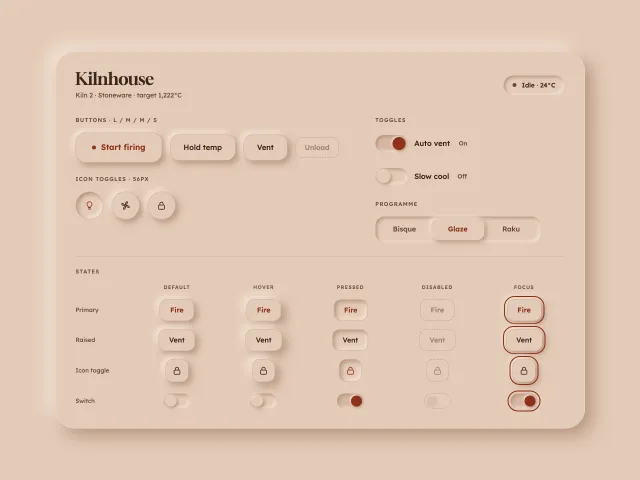
Soft inset clay buttons
Neumorphic buttons, icon toggles, switches and a segmented control on a clay surface, with AA text, a hairline edge and colour as the second state signal.
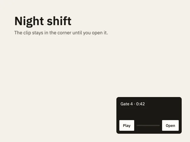
Corner player
A 220 by 124 clip sits in the corner. Open grows it to 640 by 360. Play fills a gold bar.
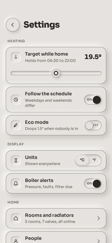
Tactile settings panel
A phone settings screen in monochrome neumorphism: raised rows on one putty surface, inset switches whose knob fills ink when on, a slider in a well, and a segmented control, all edged for 3:1.