Nº 574 of 605
Fantasy RPG inventory
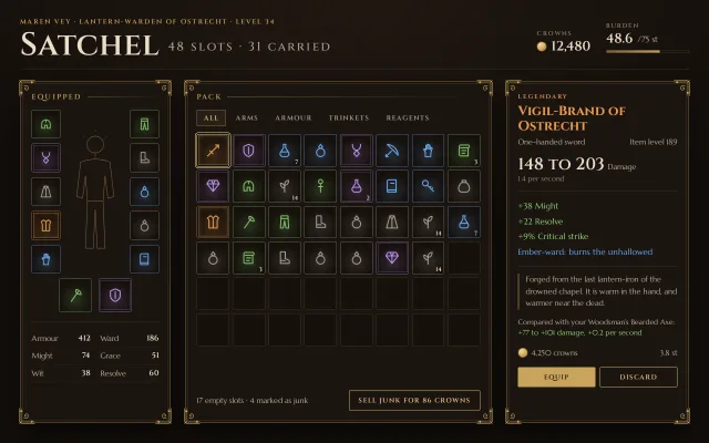
An ornate RPG satchel: an 8 by 6 slot grid with rarity frames, an equipped paper doll, and a pinned item card with stats, lore and a compare line.
Preview
Use it
Free to use · credit appreciated1 Once, in your project · Node 22.20+
npx skills add SusanAcharya/Design-Lounge 2 Then ask
Using the Design Lounge skill, build "Fantasy RPG inventory" (piece game-fantasy-inventory) in my stack. Match its brief; restyle it onto my product's theme.
No skill? Paste the brief instead. It carries the numbers, tokens and behaviour.
<!-- Design Lounge Nº 574 · "Fantasy RPG inventory" · www.designlounge.live -->

# Fantasy RPG inventory

> **Build brief for a coding agent.** Rebuild this piece in the reader's stack. If they haven't said which stack, ask once, then default to semantic HTML + CSS + a little vanilla JS. Match the numbers below; don't "improve" them.

## What it is

The inventory screen of a dark-fantasy RPG: a character's satchel. Three framed panels sit on warm umber-black: an **equipped** paper doll (12 gear slots around a line-drawn figure, with six attributes under it), a **pack** of 48 slots in an 8 by 6 grid, and an **item card** that shows whatever slot is hovered, focused or pinned. Every slot carries its rarity as a coloured frame and a soft inner glow, so the eye can sort the bag by colour before reading a word. The panels are framed like an illuminated page: a gold hairline, a second inset line 5px inside, and an SVG filigree flourish in each corner. The detail worth copying is that the frame, the rarity glow and the type do all the ornament; there is no texture image anywhere.

## Reference behaviour

1. Initial state: the first pack slot, "Vigil-Brand of Ostrecht" (legendary sword), is pinned (`aria-pressed="true"`, gold outline 2px outside the slot) and its card fills the right panel.
2. Hover any filled slot, in the pack or on the doll: the slot lifts 2px and its border goes to full rarity colour; the item card swaps to that item with a 240ms fade-up of 4px.
3. Move the pointer off a slot: the card returns to the pinned item.
4. Click a filled slot: it becomes the pinned slot. Clicking an empty slot does nothing.
5. Tab reaches the first pack slot; Arrow keys move focus through the 8 by 6 grid (Left/Right by 1, Up/Down by 8, clamped at the ends). Focus shows the card exactly as hover does; Enter or Space pins.
6. Filter tabs (All, Arms, Armour, Trinkets, Reagents): selecting one dims every slot that is not in that group to opacity 0.22 over 240ms. Slots never reflow, so the grid keeps its spatial memory.
7. Stackable items show a count bottom-right in the slot (7 draughts, 14 gravemoss).
8. The card's primary button says "Equip" for gear and "Use" for reagents; the second button is "Discard".
9. The header shows crowns (12,480) beside a coin drawn in CSS, and burden 48.6 / 75 st with a 150px bar filled to 65%.

## Structure

```
1280 × 800, page padding 26 36 24
┌──────────────────────────────────────────────────────────────────────────┐
│ MAREN VEY · LANTERN-WARDEN … (12px caps)              CROWNS   BURDEN    │
│ Satchel 58px   48 SLOTS · 31 CARRIED                  ● 12,480  48.6/75  │
├──────────────── 1px rule, 14px under, 20px gap ──────────────────────────┤
│┌ EQUIPPED 272 ┐ ┌ PACK (1fr) ─────────────────────┐ ┌ ITEM CARD 330 ────┐│
││ [] figure [] │ │ ALL ARMS ARMOUR TRINKETS REAG.  │ │ LEGENDARY         ││
││ []  svg   [] │ │ ▣▣▣▣▣▣▣▣                        │ │ Vigil-Brand of …  ││
││ []        [] │ │ ▣▣▣▣▣▣▣▣   8 × 6, gap 6         │ │ type · item level ││
││ []        [] │ │ ▣▣▣▣▣▣▣▣                        │ │ 148 to 203 Damage ││
││ []        [] │ │ ▣▣▣▣▣▣▣□                        │ │ stats list        ││
││   [w] [w]    │ │ □□□□□□□□                        │ │ | lore            ││
││ attrs 2 × 3  │ │ □□□□□□□□                        │ │ compare line      ││
│└──────────────┘ │ 17 empty · 4 junk   [SELL JUNK] │ │ ● value    weight ││
│                 └─────────────────────────────────┘ │ [EQUIP] [DISCARD] ││

… 164 more lines. Copy or download for the full brief. Loading the source…Brief
204 linesBuild brief for a coding agent. Rebuild this piece in the reader’s stack. If they haven’t said which stack, ask once, then default to semantic HTML + CSS + a little vanilla JS. Match the numbers below; don’t “improve” them.
What it is
The inventory screen of a dark-fantasy RPG: a character’s satchel. Three framed panels sit on warm umber-black: an equipped paper doll (12 gear slots around a line-drawn figure, with six attributes under it), a pack of 48 slots in an 8 by 6 grid, and an item card that shows whatever slot is hovered, focused or pinned. Every slot carries its rarity as a coloured frame and a soft inner glow, so the eye can sort the bag by colour before reading a word. The panels are framed like an illuminated page: a gold hairline, a second inset line 5px inside, and an SVG filigree flourish in each corner. The detail worth copying is that the frame, the rarity glow and the type do all the ornament; there is no texture image anywhere.
Reference behaviour
- Initial state: the first pack slot, “Vigil-Brand of Ostrecht” (legendary sword), is pinned (
aria-pressed="true", gold outline 2px outside the slot) and its card fills the right panel. - Hover any filled slot, in the pack or on the doll: the slot lifts 2px and its border goes to full rarity colour; the item card swaps to that item with a 240ms fade-up of 4px.
- Move the pointer off a slot: the card returns to the pinned item.
- Click a filled slot: it becomes the pinned slot. Clicking an empty slot does nothing.
- Tab reaches the first pack slot; Arrow keys move focus through the 8 by 6 grid (Left/Right by 1, Up/Down by 8, clamped at the ends). Focus shows the card exactly as hover does; Enter or Space pins.
- Filter tabs (All, Arms, Armour, Trinkets, Reagents): selecting one dims every slot that is not in that group to opacity 0.22 over 240ms. Slots never reflow, so the grid keeps its spatial memory.
- Stackable items show a count bottom-right in the slot (7 draughts, 14 gravemoss).
- The card’s primary button says “Equip” for gear and “Use” for reagents; the second button is “Discard”.
- The header shows crowns (12,480) beside a coin drawn in CSS, and burden 48.6 / 75 st with a 150px bar filled to 65%.
Structure
1280 × 800, page padding 26 36 24
┌──────────────────────────────────────────────────────────────────────────┐
│ MAREN VEY · LANTERN-WARDEN … (12px caps)              CROWNS   BURDEN    │
│ Satchel 58px   48 SLOTS · 31 CARRIED                  ● 12,480  48.6/75  │
├──────────────── 1px rule, 14px under, 20px gap ──────────────────────────┤
│┌ EQUIPPED 272 ┐ ┌ PACK (1fr) ─────────────────────┐ ┌ ITEM CARD 330 ────┐│
││ [] figure [] │ │ ALL ARMS ARMOUR TRINKETS REAG.  │ │ LEGENDARY         ││
││ []  svg   [] │ │ ▣▣▣▣▣▣▣▣                        │ │ Vigil-Brand of …  ││
││ []        [] │ │ ▣▣▣▣▣▣▣▣   8 × 6, gap 6         │ │ type · item level ││
││ []        [] │ │ ▣▣▣▣▣▣▣▣                        │ │ 148 to 203 Damage ││
││ []        [] │ │ ▣▣▣▣▣▣▣□                        │ │ stats list        ││
││   [w] [w]    │ │ □□□□□□□□                        │ │ | lore            ││
││ attrs 2 × 3  │ │ □□□□□□□□                        │ │ compare line      ││
│└──────────────┘ │ 17 empty · 4 junk   [SELL JUNK] │ │ ● value    weight ││
│                 └─────────────────────────────────┘ │ [EQUIP] [DISCARD] ││
│                                                      └───────────────────┘│
└──────────────────────────────────────────────────────────────────────────┘
columns 272 | minmax(0,1fr) | 330, gap 26; panels stretch to the row height
<header class="top">: character line,<h1>with a<small>count, and a<dl class="purse">for crowns and burden.<main>: three<section class="frame">/<aside class="frame">panels, each with an empty<span class="fc">that carries the two extra corner flourishes.- Equipped:
.dollis a 3-column grid (52px, 1fr, 52px). Five slots per side column, two weapon slots centred below (60px), then a<dl class="attrs">2 by 3. - Pack:
role="tablist"of fiverole="tab"buttons;.grid(role="group") of 48<button class="slot">; a footer row with the count and a “Sell junk for 86 crowns” button. - Item card:
<aside aria-live="polite">whose body is re-rendered from data on every change. - Icons: one hidden
<svg>of<symbol>s (sword, shield, potion, ring, amulet, helm, boots, glove, scroll, gem, bow, staff, herb, key, pouch, chest, legs, tome, cloak, axe), drawn on a 24 grid with a 1.6 stroke, used with<use href>.
Tokens
:root {
  /* ground and frame */
  --bg: #120e0b;        /* page, under a 120% × 90% radial lift to #211812 at top centre */
  --panel: #1b1511;     /* panel fill */
  --well: #15100c;      /* slot well */
  --line: #3a2e22;      /* hairlines, empty slot borders */
  --gold: #c9a45c;      /* frame flourish, eyebrow, primary fill */
  --gold-dim: #7d6338;  /* outer frame line, lore rule */
  --gold-hi: #e8c987;   /* pinned outline, focus, selected tab */
  /* ink */
  --ink: #eadfc8;       /* primary text */
  --ink-2: #b3a68e;     /* secondary text */
  --ink-3: #8f826c;     /* meta (11 to 13px) */
  /* rarity, used for slot frames, glow and item names */
  --common: #a39b8e;
  --uncommon: #7fbf68;
  --rare: #6aa6ec;
  --epic: #bb8ee8;
  --legendary: #ec9a4a;
  /* deltas */
  --good: #8fcf72;
  --bad: #e2775f;
  /* type */
  --display: "Cinzel", Georgia, serif;
  --text: "Marcellus", Georgia, serif;
  /* shape */
  --slot-r: 3px;
  --btn-r: 2px;
  --frame-shadow: 0 18px 40px rgba(0,0,0,.45);
  /* motion */
  --t: 160ms;
  --t-card: 240ms;
  --ease: cubic-bezier(.2,.7,.2,1);
  --ease-out: cubic-bezier(.16,1,.3,1);
}
Typography
| Role | Family | Size | Weight | Line-height | Tracking | Case |
|---|---|---|---|---|---|---|
| Screen title “Satchel” | Cinzel | clamp(34px, 5vw, 58px) | 600 | 1 | .02em | Cinzel small caps |
| Title count | Cinzel | .38em of title | 500 | 1 | .14em | upper |
| Character line, panel headings | Cinzel | 12 / 13px | 600 | 1 | .18 / .2em | upper |
| Purse values | Cinzel | 24px | 600 | 1 | 0 | numerals |
| Item name | Cinzel | 24px | 700 | 1.12 | 0 | title, in rarity colour |
| Big stat | Cinzel | 30px | 600 | 1 | 0 | numerals |
| Tabs, buttons | Cinzel | 12px | 600 | 1 | .12em | upper |
| Stack count | Cinzel | 11px | 600 | 1 | 0 | numerals |
| Body, stats, attrs | Marcellus | 14 to 15px | 400 | 1.45 | 0 | sentence |
| Lore | Marcellus | 14px | 400 | 1.55 | 0 | sentence, upright |
Marcellus has no italic. Set lore upright behind a 2px --gold-dim left rule; never let the browser fake an oblique.
Motion
| Element | Trigger | Property | From → To | Duration | Easing |
|---|---|---|---|---|---|
| Filled slot | hover | translateY, border-color | 0 → −2px, 55% → 100% rarity | 160ms | --ease |
| Item card body | item changes | opacity, translateY | 0, 4px → 1, 0 | 240ms | --ease-out |
| Slot dim | filter tab | opacity | 1 → .22 | 240ms | --ease |
| Tab, button | hover | background | none → gold at 8 to 12% | 160ms | --ease |
Restart the card animation on every swap (set animation: none, read offsetWidth, clear it). Reduced motion: every transition to 1ms and no card animation; content still swaps.
States
- Slot, filled: border
--rcat 55% (color-mix), radial glow--rcat 20% centred at 50% 62%, icon in--rc. - Epic / legendary: an extra inner ring (
inset 0 0 0 2px var(--well), inset 0 0 0 3pxrarity at 35 / 45%); legendary addsinset 0 0 14pxrarity at 35%. - Slot, empty:
--lineborder, 45° hairline hatch at 3% gold. Not hoverable. - Pinned:
aria-pressed="true", border and 1px outline--gold-hiat 2px offset. - Focus-visible: 2px
--gold-hioutline, 2px offset, on every button and slot. - Dimmed by filter: opacity .22, still focusable.
- Tab selected:
--gold-hitext,--gold-dim1px border, gold at 8% fill. - Primary button:
--goldfill,#1a120atext; hover--gold-hi. Secondary: 1px--goldborder,--gold-hitext. - Compare line: gains in
--good, losses in--bad; omitted when nothing comparable is equipped.
Accessibility
- Each slot is a
<button>witharia-label“Vigil-Brand of Ostrecht, legendary” plus ”, 7 in stack” when stacked; empty slots read “Empty slot”. The icon<svg>isaria-hidden. - The grid uses a roving tabindex: one slot has
tabindex="0", the rest-1. Arrow keys move; Home/End may be added. - Filter tabs are
role="tab"witharia-selectedandaria-controlson the grid. - The card is
aria-live="polite", so a pinned or focused item is announced once. - Rarity is never the only signal: the card prints the rarity word above the name.
- Contrast on
--panel:--ink13.7:1,--ink-27.5:1,--ink-34.8:1,--common6.6:1,--uncommon8.2:1,--rare7.1:1,--epic7.0:1,--legendary8.0:1.
Responsive rules
- ≥ 1280: three columns as drawn;
mainhasmin-height: calc(100vh - 182px)so the panels reach the bottom of the frame. - 1100 and below: two columns (240px doll, pack); the item card drops to a full-width row underneath.
- 760 and below: one column in the order pack, card, equipped. Page padding 20 16. The purse wraps under the title. Slots shrink with the grid (8 columns down to about 40px at 390 wide, gap 4px), icons stay at 52% of the slot.
- The page scrolls vertically on small screens; nothing scrolls sideways.
Acceptance checklist
Always
- The pack is a fixed grid of square slots that never reflows when filtering; filtered-out slots dim to .22.
- Every filled slot shows rarity through border, glow and icon colour; the card repeats the rarity in words.
- Hover and keyboard focus both preview an item; leaving returns the card to the pinned item.
- Arrow keys move one slot (left/right) or one row (up/down) with a roving tabindex.
- The card is a live region and swaps with a 240ms fade-up.
- Each panel has a two-line gold frame and four SVG corner flourishes, rotated or mirrored per corner.
- One gold-filled primary button on the card; everything else is outline or text.
- Reduced motion keeps every swap and drops the motion.
- At 390 wide, nothing scrolls sideways and the three panels stack.
This demo
- 48 slots, 31 filled, 17 empty, 4 marked as junk, 12 equipped.
- First frame pins “Vigil-Brand of Ostrecht”, 148 to 203 damage, 4,250 crowns, 3.8 st.
- Header reads 12,480 crowns and 48.6 / 75 st burden.
- Fonts are Cinzel (display) and Marcellus (text) only.
Implementation notes
Rarity as one custom property. Map each rarity to --rc once and let every slot style read it, so a new tier is one line:
[data-r=common]{--rc:var(--common)} [data-r=rare]{--rc:var(--rare)} [data-r=legendary]{--rc:var(--legendary)}
.slot[data-r]{
  color: var(--rc);
  border-color: color-mix(in srgb, var(--rc) 55%, transparent);
  background: radial-gradient(circle at 50% 62%, color-mix(in srgb, var(--rc) 20%, transparent), transparent 70%), var(--well);
}
Four flourishes from one SVG. Put the corner drawing in a data: URI token and place it with pseudo-elements; the extra span.fc supplies the other two corners:
.frame::before,.frame::after,.fc::before,.fc::after{content:"";position:absolute;width:30px;height:30px;background:var(--orn) center/contain no-repeat}
.frame::before{top:-3px;left:-3px}
.frame::after{bottom:-3px;right:-3px;transform:rotate(180deg)}
.fc::before{top:-3px;right:-3px;transform:scaleX(-1)}
.fc::after{bottom:-3px;left:-3px;transform:scaleY(-1)}
Preview versus pin. Hover and focus preview; click pins; mouseout falls back to the pin. Delegate on document so doll slots and pack slots share one path:
document.addEventListener('mouseover', e => { const b = e.target.closest('.slot[data-k]'); if (b) show(b.dataset.k); });
document.addEventListener('mouseout', e => { const b = e.target.closest('.slot[data-k]'); if (b && !b.contains(e.relatedTarget)) show(pinned.dataset.k); });
document.addEventListener('click', e => { const b = e.target.closest('.slot'); if (b) pin(b); });
Common mistakes: hiding filtered slots with display:none (the grid reshuffles and players lose their place); a parchment texture image instead of drawn frames; faking italics in Marcellus; giving empty slots a hover lift.
Details
- Palette
- Type
- Cinzel · Marcellus
- Motion
- Subtle motion
- Build
- One session
- Tags
Similar
Adventure quest map
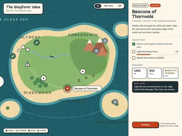
An island world map in SVG with quest nodes that are done, active, open or locked, a dotted trail that draws to the chosen quest, and a quest panel.
Sci-fi loadout screen
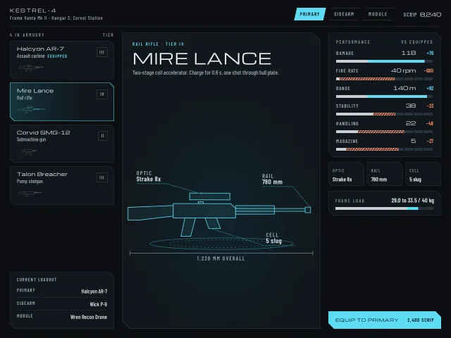
A sci-fi armoury: cut-corner panels, a weapon and module list, a hologram drawn in SVG that redraws on swap, and stat bars that show gains and losses.
Photographer horizontal gallery
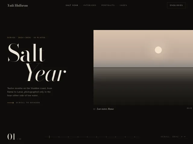
A 10-plate Wadden-coast series that scrolls sideways: 500px CSS photographs, 9% lerp drag, a 10-tick scrub bar and a 01/10 index.
Dark motion shot gallery
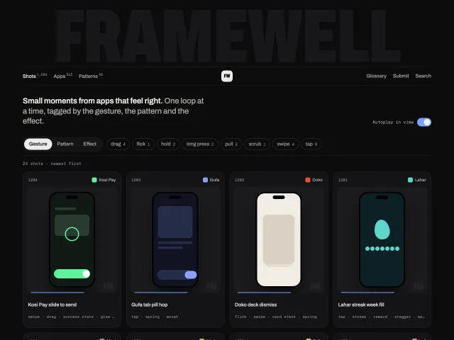
A dark gallery of phone-shot cards that loop when in view or hovered, filtered by gesture, pattern and effect, with a shot viewer and a giant faint wordmark.
Metal card landing
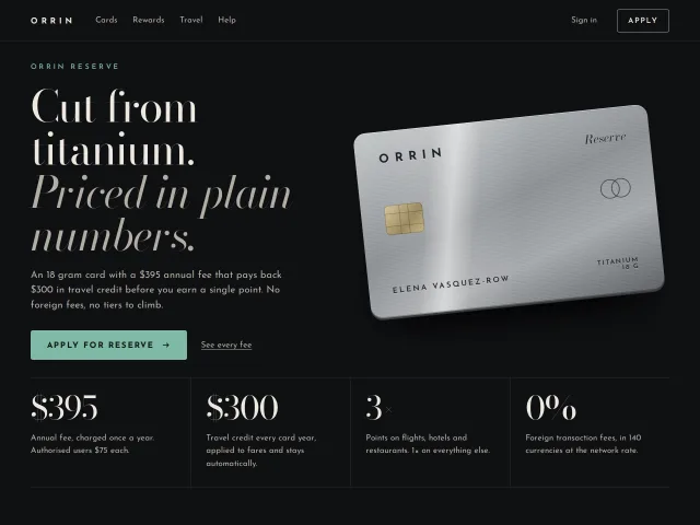
A dark luxe landing page for a titanium card: Bodoni headline, a CSS brushed-metal card whose sheen and tilt follow the pointer, fees in plain numbers, apply CTA.
Lamp configurator with materials
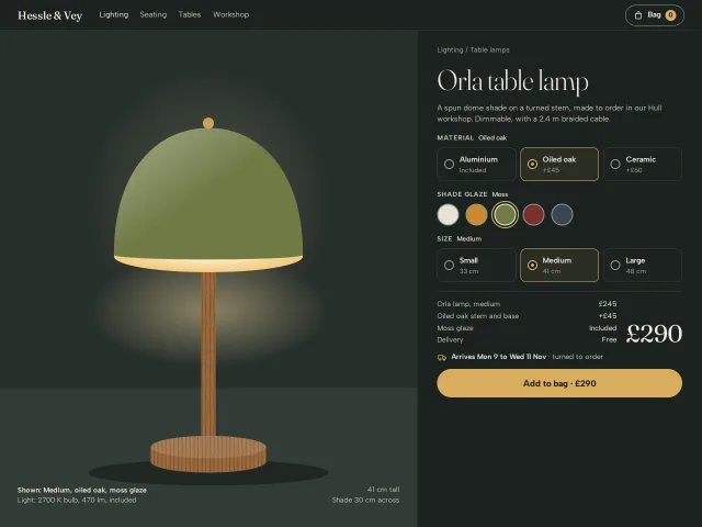
A product page for an SVG table lamp: material, glaze and size radio groups redraw it, with a live price breakdown, delivery window and add to bag.