Nº 064 of 520
Spotlight hover grid
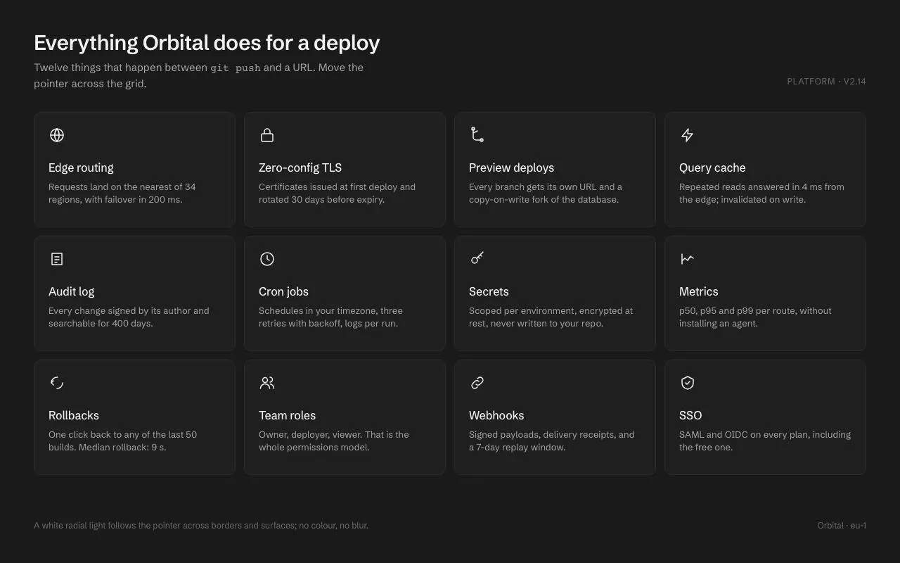
A 4×3 grid of feature cards where a white radial light follows the pointer across card borders (1px mask-composited ring) and surfaces (6% wash); white-on-charcoal, no colour, no blur.
Preview
Use it
Free to use · credit appreciated1 Once, in your project
npx skills add SusanAcharya/Design-Lounge 2 Then ask
Using the Design Lounge skill, build "Spotlight hover grid" (piece spotlight-hover-grid) in my stack. Match its brief; restyle it onto my product's theme.
No skill? Paste the brief instead. It carries the numbers, tokens and behaviour.
<!-- Design Lounge Nº 064 · "Spotlight hover grid" · www.designlounge.live -->

# Spotlight hover grid

> **Build brief for a coding agent.** Rebuild this piece in the reader's stack. If they haven't said which stack, ask once, then default to semantic HTML + CSS + a little vanilla JS. Match the numbers below; don't "improve" them.

## What it is

A features section for a deploy platform ("Orbital"): twelve 164px-tall cards in four columns on charcoal, each with a 24px line icon, a title and one sentence. When the pointer is over the grid, a white light follows it: the 1px borders of every card brighten where they are within ~420px of the pointer, and the card surfaces receive a faint (6%) wash within ~640px. Because every card is lit by the same pointer coordinates, the light crosses card boundaries as one continuous shape rather than switching on per card. There is no colour, no blur, no scale. The detail worth copying is the border ring: a radial gradient painted into a 1px padding band and masked with `mask-composite: exclude`, so the glow only ever appears on the border line.

## Reference behaviour

1. Initial state: heading "Everything Orbital does for a deploy", a subtitle, a "Platform · v2.14" tag on the right, the 4 × 3 grid, and a footer caption. All cards flat: `#1f1f1f` on `#1a1a1a` with `#2c2c2c` 1px borders. No light.
2. Pointer enters the grid: card rectangles are measured once (`getBoundingClientRect`), and the grid gets class `lit`; both glow layers on every card fade from opacity 0 to 1 over 320ms.
3. Pointer moves (rAF-throttled): for each of the 12 cards, `--mx` and `--my` are set to the pointer's position relative to *that card's* top-left corner, in px (values may be negative or larger than the card — that is what lets the light spill across neighbours).
4. Each card's `::before` paints `radial-gradient(420px circle at var(--mx) var(--my), rgba(255,255,255,.55), transparent 60%)` masked to its 1px border ring. Its `::after` paints `radial-gradient(640px circle at …, rgba(255,255,255,.06), transparent 50%)` over the surface.
5. Hover a specific card: its icon lifts 2px (160ms). Nothing else changes per card — the light is global.
6. Pointer leaves the grid: `lit` is removed; both layers fade out over 320ms; coordinates are left as they were (invisible).
7. Keyboard focus on a card: its border becomes `#a3a3a3`, and its own two glow layers show at opacity 1 centred on the card (`--mx: 50%; --my: 50%`), so keyboard users see a lit card. The neighbours are not lit by focus.
8. Cards are links (`<a href>`); in the demo clicks are prevented. In a product they navigate to the feature page.
9. With `prefers-reduced-motion: reduce`: the light still follows the pointer (it is a position, not a motion) but the opacity transitions and icon lift are removed. If your accessibility policy treats pointer-following light as motion, gate the `pointermove` handler on the same media query.

## Structure

```
1280 × 800  (padding 44px 48px)
┌────────────────────────────────────────────────────────────────────────┐
│ Everything Orbital does for a deploy                  PLATFORM · V2.14 │ head
│ Twelve things that happen between git push and a URL…                  │
│ ┌────────────┐ ┌────────────┐ ┌────────────┐ ┌────────────┐            │
│ │ (globe)    │ │ (lock)     │ │ (branch)   │ │ (bolt)     │  ← 24px   │ row 164
│ │ Edge       │ │ Zero-config│ │ Preview    │ │ Query      │            │
│ │ routing    │ │ TLS        │ │ deploys    │ │ cache      │            │
│ │ Requests…  │ │ Certs…     │ │ Every…     │ │ Repeated…  │            │
│ └────────────┘ └────────────┘ └────────────┘ └────────────┘            │ gap 12
│ ┌────────────┐ ┌────────────┐ ┌────────────┐ ┌────────────┐            │
│ │ Audit log  │ │ Cron jobs  │ │ Secrets    │ │ Metrics    │            │ row 164
│ └────────────┘ └────────────┘ └────────────┘ └────────────┘            │
│ ┌────────────┐ ┌────────────┐ ┌────────────┐ ┌────────────┐            │
│ │ Rollbacks  │ │ Team roles │ │ Webhooks   │ │ SSO        │            │ row 164

… 198 more lines. Copy or download for the full brief. Loading the source…Brief
238 linesBuild brief for a coding agent. Rebuild this piece in the reader’s stack. If they haven’t said which stack, ask once, then default to semantic HTML + CSS + a little vanilla JS. Match the numbers below; don’t “improve” them.
What it is
A features section for a deploy platform (“Orbital”): twelve 164px-tall cards in four columns on charcoal, each with a 24px line icon, a title and one sentence. When the pointer is over the grid, a white light follows it: the 1px borders of every card brighten where they are within ~420px of the pointer, and the card surfaces receive a faint (6%) wash within ~640px. Because every card is lit by the same pointer coordinates, the light crosses card boundaries as one continuous shape rather than switching on per card. There is no colour, no blur, no scale. The detail worth copying is the border ring: a radial gradient painted into a 1px padding band and masked with mask-composite: exclude, so the glow only ever appears on the border line.
Reference behaviour
- Initial state: heading “Everything Orbital does for a deploy”, a subtitle, a “Platform · v2.14” tag on the right, the 4 × 3 grid, and a footer caption. All cards flat:
#1f1f1fon#1a1a1awith#2c2c2c1px borders. No light. - Pointer enters the grid: card rectangles are measured once (
getBoundingClientRect), and the grid gets classlit; both glow layers on every card fade from opacity 0 to 1 over 320ms. - Pointer moves (rAF-throttled): for each of the 12 cards,
--mxand--myare set to the pointer’s position relative to that card’s top-left corner, in px (values may be negative or larger than the card — that is what lets the light spill across neighbours). - Each card’s
::beforepaintsradial-gradient(420px circle at var(--mx) var(--my), rgba(255,255,255,.55), transparent 60%)masked to its 1px border ring. Its::afterpaintsradial-gradient(640px circle at …, rgba(255,255,255,.06), transparent 50%)over the surface. - Hover a specific card: its icon lifts 2px (160ms). Nothing else changes per card — the light is global.
- Pointer leaves the grid:
litis removed; both layers fade out over 320ms; coordinates are left as they were (invisible). - Keyboard focus on a card: its border becomes
#a3a3a3, and its own two glow layers show at opacity 1 centred on the card (--mx: 50%; --my: 50%), so keyboard users see a lit card. The neighbours are not lit by focus. - Cards are links (
<a href>); in the demo clicks are prevented. In a product they navigate to the feature page. - With
prefers-reduced-motion: reduce: the light still follows the pointer (it is a position, not a motion) but the opacity transitions and icon lift are removed. If your accessibility policy treats pointer-following light as motion, gate thepointermovehandler on the same media query.
Structure
1280 × 800  (padding 44px 48px)
┌────────────────────────────────────────────────────────────────────────┐
│ Everything Orbital does for a deploy                  PLATFORM · V2.14 │ head
│ Twelve things that happen between git push and a URL…                  │
│ ┌────────────┐ ┌────────────┐ ┌────────────┐ ┌────────────┐            │
│ │ (globe)    │ │ (lock)     │ │ (branch)   │ │ (bolt)     │  ← 24px   │ row 164
│ │ Edge       │ │ Zero-config│ │ Preview    │ │ Query      │            │
│ │ routing    │ │ TLS        │ │ deploys    │ │ cache      │            │
│ │ Requests…  │ │ Certs…     │ │ Every…     │ │ Repeated…  │            │
│ └────────────┘ └────────────┘ └────────────┘ └────────────┘            │ gap 12
│ ┌────────────┐ ┌────────────┐ ┌────────────┐ ┌────────────┐            │
│ │ Audit log  │ │ Cron jobs  │ │ Secrets    │ │ Metrics    │            │ row 164
│ └────────────┘ └────────────┘ └────────────┘ └────────────┘            │
│ ┌────────────┐ ┌────────────┐ ┌────────────┐ ┌────────────┐            │
│ │ Rollbacks  │ │ Team roles │ │ Webhooks   │ │ SSO        │            │ row 164
│ └────────────┘ └────────────┘ └────────────┘ └────────────┘            │
│ A white radial light follows the pointer…                 Orbital · eu-1│ foot
└────────────────────────────────────────────────────────────────────────┘
card = (1280 − 96 − 36) / 4 = 287 × 164, padding 20, radius 10<body>— flex column, padding 44px 48px..head— flex,align-items: flex-end,space-between:<h1>+<p>on the left,.tagon the right..grid#grid— CSS grid,repeat(4, 1fr),grid-auto-rows: 164px, gap 12px. Gets classlitwhile hovered.<a class="card" href="#">× 12 —position: relative; display: block; padding: 20px; border: 1px solid; border-radius: 10px, containing an inline<svg>,<h2>,<p>.::before= border ring glow,::after= surface glow..foot—margin-top: auto, 12px, space-between.
Card copy (title · sentence):
- Edge routing · Requests land on the nearest of 34 regions, with failover in 200 ms.
- Zero-config TLS · Certificates issued at first deploy and rotated 30 days before expiry.
- Preview deploys · Every branch gets its own URL and a copy-on-write fork of the database.
- Query cache · Repeated reads answered in 4 ms from the edge; invalidated on write.
- Audit log · Every change signed by its author and searchable for 400 days.
- Cron jobs · Schedules in your timezone, three retries with backoff, logs per run.
- Secrets · Scoped per environment, encrypted at rest, never written to your repo.
- Metrics · p50, p95 and p99 per route, without installing an agent.
- Rollbacks · One click back to any of the last 50 builds. Median rollback: 9 s.
- Team roles · Owner, deployer, viewer. That is the whole permissions model.
- Webhooks · Signed payloads, delivery receipts, and a 7-day replay window.
- SSO · SAML and OIDC on every plan, including the free one.
Icons (24px grid, 1.5px stroke, currentColor): globe, padlock, branch, bolt, document, clock, key, chart, rotate, people, link, shield-check.
Tokens
:root {
  /* colour — neutral charcoal only; the "accent" is white light */
  --bg: #1a1a1a;
  --card: #1f1f1f;
  --line: #2c2c2c;
  --ink: #f2f2f2;          /* titles, icons */
  --ink-2: #a3a3a3;        /* descriptions, subtitle, focus border */
  --ink-3: #6b6b6b;        /* tag, footer */
  --glow-border: rgba(255,255,255,.55);
  --glow-surface: rgba(255,255,255,.06);

  /* type */
  --sans: "Schibsted Grotesk", system-ui, sans-serif;

  /* layout */
  --pad: 44px 48px;
  --card-h: 164px;
  --card-pad: 20px;
  --gap: 12px;
  --r: 10px;
  --icon: 24px;
  --spot-border: 420px;    /* radius of the border light */
  --spot-surface: 640px;   /* radius of the surface wash */

  /* motion */
  --t-glow: 320ms;         /* layers fade in/out */
  --t-micro: 160ms;        /* icon lift */
  --ease: cubic-bezier(.2, .7, .2, 1);
}
Typography
| Role | Family | Size | Weight | Line-height | Tracking | Case |
|---|---|---|---|---|---|---|
| Heading | Schibsted Grotesk | 30px | 600 | 1.15 | −0.02em | sentence |
| Subtitle | Schibsted Grotesk | 15px | 400 | 1.5 | 0 | sentence |
| Tag | Schibsted Grotesk | 12px | 400 | 1.5 | +0.06em | UPPERCASE |
| Card title | Schibsted Grotesk | 16px | 500 | 1.5 | −0.01em | sentence |
| Card text | Schibsted Grotesk | 13px | 400 | 1.45 | 0 | sentence |
| Footer | Schibsted Grotesk | 12px | 400 | 1.5 | 0 | sentence |
One family, three weights. The <code>git push</code> in the subtitle inherits the family (no mono) at the same size.
Motion
| Element | Trigger | Property | From → To | Duration | Easing | Notes |
|---|---|---|---|---|---|---|
.card::before/::after | grid pointerenter | opacity | 0 → 1 | 320ms | --ease | all 12 cards at once |
.card::before/::after | grid pointerleave | opacity | 1 → 0 | 320ms | --ease | |
| gradient centre | pointermove | --mx, --my | follows pointer | 0 | — | no transition; rAF-throttled |
.card svg | card hover | translateY | 0 → −2px | 160ms | --ease | |
.card | focus-visible | border-color | --line → --ink-2 | 0 | — | instant |
Light falloff (both gradients are linear from centre to their edge stop):
| Distance from pointer | Border alpha (420px, edge at 60% = 252px) | Surface alpha (640px, edge at 50% = 320px) |
|---|---|---|
| 0px | .55 | .06 |
| 60px | .42 | .049 |
| 120px | .29 | .038 |
| 200px | .11 | .023 |
| 252px | 0 | .013 |
| 320px | 0 | 0 |
With 12px gaps, a pointer on one card’s edge lights the neighbour’s facing border at ≈ .52 — which is what makes the light read as one shape.
Reduced motion: transition: none on the pseudo-elements and the icon.
States
- Rest: flat cards, glow layers at opacity 0.
- Grid lit (
.grid.lit): glow layers at opacity 1 on every card; light position shared. - Card hover: icon lifted 2px. No background or border change beyond the shared light.
- Card focus-visible: border
--ink-2; that card’s glow layers at opacity 1 centred (--mx/--my: 50%). - Card hover, pointer at rest: the light stays where it is; nothing pulses or drifts.
- Active / visited: none. Disabled / loading: not applicable.
Accessibility
- Cards are
<a>elements with visible text; the icon is decorative (aria-hiddenoptional since it has no text). Each card’s accessible name is its<h2>+ sentence. - Keyboard: Tab through the 12 cards in reading order; Enter follows the link. Focus is shown by the border colour change and the centred light, so it is visible even when the pointer light is active elsewhere.
- The light layers are
pointer-events: noneand sit above the content only visually; they never intercept clicks and contain no text. - Contrast:
--inkon--card15.3:1;--ink-2on--card6.7:1;--ink-3(12px tag/footer) 3.4:1 — decorative. The 6% surface wash raises the card luminance slightly; text contrast stays above 6:1. - The border light peaks at 55% white on a 1px line — a highlight, not a signal; nothing is conveyed by it.
Responsive rules
- ≥ 1280: 4 columns, as specified.
- 1024–1279: 3 columns, 4 rows;
--card-h: 156px. - 768–1023: 2 columns, 6 rows; heading 26px; spot radii scale to 320 / 480px.
- < 640: 1 column; cards auto height with 16px padding; the pointer light is not attached at all when
(hover: none)matches; focus styling remains.
Acceptance checklist
- Grid is
repeat(4, 1fr)with 12px gaps and 164px rows; cards are 287 × 164 at 1280 wide. - Card borders are 1px
#2c2c2c, radius 10px; background#1f1f1fon#1a1a1a. - Moving the pointer over the grid sets
--mx/--myon every card relative to that card’s own origin, once per animation frame at most. - The border glow is a
radial-gradient(420px circle …, rgba(255,255,255,.55), transparent 60%)confined to the 1px border by acontent-box/full mask withmask-composite: exclude(-webkit-mask-composite: xor). - The surface glow is a
radial-gradient(640px circle …, rgba(255,255,255,.06), transparent 50%). - The light visibly continues across the gap between adjacent cards (both borders brighten near the pointer).
- Both layers fade in/out over 320ms on grid enter/leave; the position itself has no transition.
- No
filter: blur, nobox-shadowglow, no coloured light anywhere. - Card rectangles are measured on grid enter and on
resize, not on every move. - Focused card shows a
#a3a3a3border and its own centred light; neighbours stay dark. - Icon lifts 2px on card hover over 160ms.
- Listeners are attached only when
(hover: hover)matches; focus styling works regardless. - The card has no
overflow: hidden(it would clip the ring that sits on the border).
Implementation notes
Border ring via mask-composite. Paint the gradient into a 1px padding band and cut out the content box:
.card::before {
  content: ""; position: absolute; inset: -1px; border-radius: inherit; pointer-events: none;
  padding: 1px;
  background: radial-gradient(var(--spot-border) circle at var(--mx, -999px) var(--my, -999px),
              var(--glow-border), transparent 60%);
  -webkit-mask: linear-gradient(#000 0 0) content-box, linear-gradient(#000 0 0);
  -webkit-mask-composite: xor;
          mask: linear-gradient(#000 0 0) content-box, linear-gradient(#000 0 0);
          mask-composite: exclude;
  opacity: 0; transition: opacity var(--t-glow) var(--ease);
}
.grid.lit .card::before, .card:focus-visible::before { opacity: 1; }
inset: -1px puts the pseudo-element exactly over the card’s border box, so the 1px padding band coincides with the real border. Default the centre to -999px so a card that has never been measured shows nothing.
One pointer, twelve origins. Cache the rects on enter; per frame, translate the same pointer into each card’s space:
let rects = [], raf = 0, ev = null;
const measure = () => { rects = cards.map(c => c.getBoundingClientRect()); };
function apply() {
  raf = 0; if (!ev) return;
  cards.forEach((c, i) => {
    c.style.setProperty('--mx', (ev.clientX - rects[i].left) + 'px');
    c.style.setProperty('--my', (ev.clientY - rects[i].top) + 'px');
  });
}
grid.addEventListener('pointerenter', () => { measure(); grid.classList.add('lit'); });
grid.addEventListener('pointermove', e => { ev = e; if (!raf) raf = requestAnimationFrame(apply); });
grid.addEventListener('pointerleave', () => { ev = null; grid.classList.remove('lit'); });
addEventListener('resize', measure);
No pointer, no handlers. Attach the grid listeners only when hovering is possible; keyboard focus styling is CSS and always applies:
if (matchMedia('(hover: hover)').matches) {
  grid.addEventListener('pointerenter', () => { measure(); grid.classList.add('lit'); });
  grid.addEventListener('pointermove', onMove);
  grid.addEventListener('pointerleave', () => { ev = null; grid.classList.remove('lit'); });
}
Keep it restrained. 55% on a 1px line and 6% on the surface are the ceiling; at 12 cards anything brighter reads as a lens flare. If the design needs more presence, widen --spot-border rather than raising the alpha.
Common mistakes: putting the gradient on the card’s own background (it then paints under the border and never crosses it); setting the mask without mask-composite (you get a filled rounded rectangle, not a ring); using border-image for the glow (no radius, and it repaints the border on every move); measuring rects on every pointermove (forced layout 12× per frame).
Details
- Palette
- Type
- Schibsted Grotesk
- Motion
- Subtle motion
- Build
- Quick build
- Tags
On the shelves