Nº 510 of 520
Phone notification settings
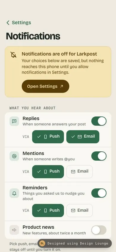
iOS notification settings with a system-off banner, per-category push or email chips, a quiet-hours wheel picker with a live summary, and a lock-screen preview.
Preview
Use it
Free to use · credit appreciated1 Once, in your project
npx skills add SusanAcharya/Design-Lounge 2 Then ask
Using the Design Lounge skill, build "Phone notification settings" (piece phone-notification-settings) in my stack. Match its brief; restyle it onto my product's theme.
No skill? Paste the brief instead. It carries the numbers, tokens and behaviour.
<!-- Design Lounge Nº 510 · "Phone notification settings" · www.designlounge.live -->

# Phone notification settings

> **Build brief for a coding agent.** Rebuild this piece in the reader's stack. If they haven't said which stack, ask once, then default to semantic HTML + CSS + a little vanilla JS. Match the numbers below; don't "improve" them.

## What it is

The Notifications screen of "Larkpost", an invented group-planning app, in an iOS 26-ish language: large title, grouped inset sections on a warm bone background, moss green as the single accent. It answers three questions in order: are notifications even reaching me (an amber banner when the system permission is off, with "Open Settings"), what do I hear about and where (four categories, each with a switch and push / email chips), and when should the phone stay quiet (a quiet-hours window picked on two wheels, summarised in one live sentence). A dark lock-screen preview at the bottom shows exactly how one notification will arrive given the current choices. The detail worth copying is that preview: it changes from a push card to an email card to a dimmed card, and explains why in one mono line.

## Reference behaviour

1. Initial state: system notifications are **off**. The amber banner sits under the large title reading "Notifications are off for Larkpost" with an "Open Settings" pill.
2. Categories start as: Replies on (Push + Email), Mentions on (Push), Reminders on (Push), Product news **off** (Email preselected but hidden). Quiet hours on, 22:00 to 07:00. Preview tab: Replies.
3. Tap a category switch: the switch slides (320ms), the channel row under it opens or closes by animating `grid-template-rows` 1fr / 0fr (320ms), the icon tile greys when off. The preview jumps to that category.
4. Tap a channel chip: it toggles `aria-pressed`. Pressed chips are filled moss with a check icon. The preview jumps to that category.
5. Try to unpress the **last** pressed chip in a category: nothing changes, the chip shakes 4px left and right over 300ms, and a live region says "Keep at least one channel. To stop mentions, turn the switch off." A category never has zero channels while on.
6. Tap "Open Settings": banner title becomes "Opening Settings…" for 900ms (simulates the deep link round trip), then the banner turns moss-soft with "Notifications are on / Larkpost can reach this phone again." After 2400ms the banner collapses to zero height. In a real app call the OS settings URL and re-read permission on `visibilitychange` / app foreground.
7. Tap the "From" or "To" time button: an inline wheel picker opens below that row (only one open at a time); the button turns moss-soft and gets `aria-expanded="true"`.
8. Scroll or drag a wheel: hours 00 to 23, minutes in 5-minute steps. The value under the centre band is selected the moment it crosses the midpoint; the time button and the summary line update live while scrolling.
9. Summary line: "Silent from 22:00 to 07:00" with a sub line "9 hours, overnight. Every day." Duration handles minutes ("8 hours 30 min") and drops "overnight" when end is after start.
10. Error state: if start equals end, the summary turns red: "Start and end are both 07:00 / Pick a different end time to set a quiet window." The preview drops the quiet-hours sentence.
11. Quiet hours switch off: time rows collapse, summary reads "Quiet hours are off / Push can make a sound at any time of day."
12. Preview: a segmented control (Replies, Mentions, Reminders, News) picks which category to show. The card drops in from 12px above (420ms). The mono line under it explains delivery:
    - category off: card at 38% opacity, "Product news is off. Larkpost will not send these."
    - on, push off, email on: card becomes a cream email card with "Subject:" and "Push is off for product news, so this lands in your inbox instead."
    - on, push on, system off: "Held on this phone: system notifications are off. The email copy still goes out."
    - on, push on, system on: "Shown on the lock screen and sent by email. Between 22:00 and 07:00 it arrives silently."
13. "Show the off state again" at the bottom restores the banner (demo replay) and scrolls to top.
14. The small bar title "Notifications" fades in and a hairline appears once the large title scrolls under the bar.

## Structure

```
390 × 844, page scrolls inside <main>
┌──────────────────────────────────────┐
│ (54px status clearance)              │
│ ‹ Settings        [Notifications]    │ fixed bar 98px, blur, title fades in
│ Notifications                        │ large title 34/700
│ ┌──────────────────────────────────┐ │

… 226 more lines. Copy or download for the full brief. Loading the source…Brief
266 linesBuild brief for a coding agent. Rebuild this piece in the reader’s stack. If they haven’t said which stack, ask once, then default to semantic HTML + CSS + a little vanilla JS. Match the numbers below; don’t “improve” them.
What it is
The Notifications screen of “Larkpost”, an invented group-planning app, in an iOS 26-ish language: large title, grouped inset sections on a warm bone background, moss green as the single accent. It answers three questions in order: are notifications even reaching me (an amber banner when the system permission is off, with “Open Settings”), what do I hear about and where (four categories, each with a switch and push / email chips), and when should the phone stay quiet (a quiet-hours window picked on two wheels, summarised in one live sentence). A dark lock-screen preview at the bottom shows exactly how one notification will arrive given the current choices. The detail worth copying is that preview: it changes from a push card to an email card to a dimmed card, and explains why in one mono line.
Reference behaviour
- Initial state: system notifications are off. The amber banner sits under the large title reading “Notifications are off for Larkpost” with an “Open Settings” pill.
- Categories start as: Replies on (Push + Email), Mentions on (Push), Reminders on (Push), Product news off (Email preselected but hidden). Quiet hours on, 22:00 to 07:00. Preview tab: Replies.
- Tap a category switch: the switch slides (320ms), the channel row under it opens or closes by animating
grid-template-rows1fr / 0fr (320ms), the icon tile greys when off. The preview jumps to that category. - Tap a channel chip: it toggles
aria-pressed. Pressed chips are filled moss with a check icon. The preview jumps to that category. - Try to unpress the last pressed chip in a category: nothing changes, the chip shakes 4px left and right over 300ms, and a live region says “Keep at least one channel. To stop mentions, turn the switch off.” A category never has zero channels while on.
- Tap “Open Settings”: banner title becomes “Opening Settings…” for 900ms (simulates the deep link round trip), then the banner turns moss-soft with “Notifications are on / Larkpost can reach this phone again.” After 2400ms the banner collapses to zero height. In a real app call the OS settings URL and re-read permission on
visibilitychange/ app foreground. - Tap the “From” or “To” time button: an inline wheel picker opens below that row (only one open at a time); the button turns moss-soft and gets
aria-expanded="true". - Scroll or drag a wheel: hours 00 to 23, minutes in 5-minute steps. The value under the centre band is selected the moment it crosses the midpoint; the time button and the summary line update live while scrolling.
- Summary line: “Silent from 22:00 to 07:00” with a sub line “9 hours, overnight. Every day.” Duration handles minutes (“8 hours 30 min”) and drops “overnight” when end is after start.
- Error state: if start equals end, the summary turns red: “Start and end are both 07:00 / Pick a different end time to set a quiet window.” The preview drops the quiet-hours sentence.
- Quiet hours switch off: time rows collapse, summary reads “Quiet hours are off / Push can make a sound at any time of day.”
- Preview: a segmented control (Replies, Mentions, Reminders, News) picks which category to show. The card drops in from 12px above (420ms). The mono line under it explains delivery:
- category off: card at 38% opacity, “Product news is off. Larkpost will not send these.”
- on, push off, email on: card becomes a cream email card with “Subject:” and “Push is off for product news, so this lands in your inbox instead.”
- on, push on, system off: “Held on this phone: system notifications are off. The email copy still goes out.”
- on, push on, system on: “Shown on the lock screen and sent by email. Between 22:00 and 07:00 it arrives silently.”
- “Show the off state again” at the bottom restores the banner (demo replay) and scrolls to top.
- The small bar title “Notifications” fades in and a hairline appears once the large title scrolls under the bar.
Structure
390 × 844, page scrolls inside <main>
┌──────────────────────────────────────┐
│ (54px status clearance)              │
│ ‹ Settings        [Notifications]    │ fixed bar 98px, blur, title fades in
│ Notifications                        │ large title 34/700
│ ┌──────────────────────────────────┐ │
│ │ 🔕 Notifications are off for …   │ │ amber banner, 14px radius
│ │    Your choices below are saved… │ │
│ │    [ Open Settings ↗ ]           │ │ 44px pill
│ └──────────────────────────────────┘ │
│ WHAT YOU HEAR ABOUT                  │ mono 12 caps
│ ┌──────────────────────────────────┐ │
│ │ ▣ Replies                  (●─)  │ │ row ≥60px
│ │   When someone answers…          │ │
│ │   VIA [✓ Push] [✓ Email]         │ │ chips 44px, indent 60px
│ │──────────────────────────────────│ │
│ │ ▣ Mentions … Reminders …         │ │
│ │ ▣ Product news             (─○)  │ │ channel row collapsed
│ └──────────────────────────────────┘ │
│ QUIET HOURS                          │
│ ┌──────────────────────────────────┐ │
│ │ ☾ Quiet hours              (●─)  │ │
│ │ From                    [22:00]  │ │ mono 17 time button
│ │      21  :  55                   │ │ inline wheels, 5 × 40px
│ │    [ 22  :  00 ]                 │ │ centre band 172 × 40
│ │      23  :  05                   │ │
│ │ To                      [07:00]  │ │
│ │ ◷ Silent from 22:00 to 07:00     │ │ live summary
│ └──────────────────────────────────┘ │
│ PREVIEW                              │
│ [Replies|Mentions|Reminders|News]    │ segmented, 44px
│ ┌──────────────────────────────────┐ │
│ │       TUE 14 OCT · 08:41         │ │ lock tile #18231D, 22px radius
│ │ ┌──────────────────────────────┐ │ │
│ │ │▣ LARKPOST              now   │ │ │ notification card 18px radius
│ │ │  Mira Okafor replied         │ │ │
│ │ └──────────────────────────────┘ │ │
│ │ Held on this phone: …            │ │ mono 12 explanation
│ └──────────────────────────────────┘ │
│        Show the off state again      │
└──────────────────────────────────────┘header.barfixed: backbutton(“Back to Settings”) and anaria-hiddensmall title (theh1is the real heading).mainis the scroll container,position: relative, padding 98px 16px 60px.- Banner:
sectionlabelled by itsstrong, inside a.collapsewrapper. - Each category group:
div role="group"labelled by itsh2. A category is a row with an icon tile, a two-line label, andbutton role="switch"; below it adiv role="group" aria-label="Replies channels"with twobutton aria-pressedchips. - Quiet hours: switch row, two
.timerows with abutton aria-expanded aria-controls, two.pickregions each holding tworole="spinbutton"wheels, and a.summarywitharia-live="polite". - Preview:
div role="group"of fouraria-pressedbuttons, and arole="region" aria-live="polite"lock tile. - A visually hidden
p aria-live="assertive"announces the last-channel guard and the permission change.
Tokens
:root {
  /* neutrals, warm bone */
  --bg: #eeeae0;           /* page */
  --surface: #faf8f3;      /* grouped sections */
  --ink: #1c2420;          /* text */
  --ink-2: #535e58;        /* secondary text, captions (6.4:1 on surface) */
  --ink-3: #8a938d;        /* unselected wheel numbers, off icons */
  --line: #ddd8cc;         /* hairlines, chip borders */
  --off: #d9d4c8;          /* switch track off */

  /* accent, moss */
  --moss: #2f6a4b;         /* switches on, chips pressed, back link, focus */
  --moss-soft: #dce7df;    /* icon tiles, open time button, banner ok */
  --on-moss: #f4f8f5;

  /* warning + preview */
  --amber: #f6e3b4;        /* system-off banner */
  --amber-ink: #573c05;    /* banner text and pill */
  --amber-line: #e6cd8c;
  --lock: #18231d;         /* lock-screen preview tile */
  --lock-ink: #eef2ee;
  --error: #9b2c1d;        /* start = end summary */

  --display: "Bricolage Grotesque", system-ui, sans-serif;
  --mono: "IBM Plex Mono", ui-monospace, monospace;

  --r-group: 14px; --r-chip: 12px; --r-time: 10px; --r-lock: 22px; --r-note: 18px;
  --inset: 16px; --row: 44px; --opt: 40px;           /* wheel item height */
  --switch-w: 51px; --switch-h: 31px; --knob: 27px;

  --t-micro: 160ms; --t-layout: 320ms; --t-drop: 420ms;
  --ease: cubic-bezier(.2, .7, .2, 1);
  --spring: cubic-bezier(.32, .72, 0, 1);
}
Typography
| Role | Family | Size | Weight | Line-height | Tracking | Notes |
|---|---|---|---|---|---|---|
| Large title | Bricolage Grotesque | 34px | 700 | 1.1 | -0.025em | opsz 96 |
| Bar title | Bricolage Grotesque | 17px | 600 | 1 | 0 | fades in |
| Section header | IBM Plex Mono | 12px | 500 | 1 | 0.08em | uppercase, --ink-2 |
| Row label | Bricolage Grotesque | 16px | 600 | 1.35 | 0 | |
| Row sub | Bricolage Grotesque | 13px | 400 | 1.35 | 0 | --ink-2 |
| Chip | Bricolage Grotesque | 14px | 600 | 1 | 0 | |
| “VIA” | IBM Plex Mono | 12px | 400 | 1 | 0 | |
| Time button | IBM Plex Mono | 17px | 500 | 1 | 0 | tabular by nature |
| Wheel number | IBM Plex Mono | 20px | 400, selected 500 | 40px | 0 | |
| Summary | Bricolage Grotesque | 15px / 13px | 600 / 400 | 1.35 | 0 | |
| Notification meta | IBM Plex Mono | 11px | 500 | 1.3 | 0.06em | uppercase |
| Notification title / body | Bricolage Grotesque | 15px / 14px | 600 / 400 | 1.35 | 0 | |
| Preview explanation | IBM Plex Mono | 12px | 400 | 1.5 | 0 | rgba(238,242,238,.78) on lock |
Mono is for anything that is a time, a channel tag, or machine-ish metadata. Everything a person reads as a sentence is Bricolage.
Motion
| Element | Trigger | Property | From → To | Duration | Easing |
|---|---|---|---|---|---|
| Switch track | toggle | background | --off ↔ --moss | 320ms | --ease |
| Switch knob | toggle | translateX | 0 ↔ 20px | 320ms | --spring |
| Switch knob | :active | width | 27 → 32px | 160ms | --ease |
| Channel row, time rows, pickers, banner | open/close | grid-template-rows, opacity | 0fr/0 ↔ 1fr/1 | 320ms | --spring / --ease |
| Chip | press | scale | 1 → .96 | 160ms | --ease |
| Chip | last-channel guard | translateX | 0, -4, 4, 0 | 300ms | --ease |
| Banner | permission granted | background, colour | amber → moss-soft | 320ms | --ease |
| Banner | 2400ms after granted | collapse | 1fr → 0fr | 320ms | --spring |
| Wheel | key press / tap | scrollTop | smooth scroll to index × 40 | browser smooth | n/a |
| Notification card | preview change | translateY, opacity | -12px, 0 → 0, 1 | 420ms | --spring |
| Bar | large title leaves | border colour, title opacity | transparent/0 → line/1 | 160ms | --ease |
Reduced motion: every transition is 1ms, the shake and drop animations are removed, wheel keyboard moves jump instead of smooth scrolling, and the fake Settings round trip shortens to 200ms.
States
- System off (default): amber banner, preview explains that push is held.
- Opening Settings: banner title “Opening Settings…”, pill still visible.
- System on: banner moss-soft without the pill, then collapsed and
inert. - Category off: switch track
--off, icon tile#ebe7dewith--ink-3glyph, channel row collapsed andinert. - Chip pressed: fill and border
--moss, text--on-moss, check icon visible. Unpressed: transparent, 1px--lineborder,--ink-2text, no check. - Last channel guard: shake plus announcement, state unchanged.
- Time button open: background
--moss-soft, text--moss. - Quiet hours error (start = end): summary icon and title
--error, preview omits the quiet sentence. - Quiet hours off: time rows collapsed, summary explains push can sound any time.
- Preview tab selected: surface fill with a 1px 2px shadow,
--inktext. - Focus-visible: 2px
--mossoutline, 2px offset, 8px radius on every control including the wheels. - Pressed (rows/pill): pill scales to .97.
Accessibility
- One
h1(“Notifications”); section headers areh2and label their groups. - Switches are
button role="switch" aria-checkedlabelled by the visible row name. Space and Enter toggle. - Chips are
aria-pressedbuttons inside a labelled group (“Mentions channels”). - Time buttons use
aria-expandedandaria-controls; closed pickers areinertso wheels are not tabbable while hidden. - Wheels are
role="spinbutton"witharia-valuenow,aria-valuemin,aria-valuemax,aria-valuetext(“07”). Keys: ArrowUp/ArrowDown move 1 step, PageUp/PageDown 3 steps, Home/End jump to the ends. Tapping a visible number selects it. - The summary is
aria-live="polite", so the new window is read after a change. The last-channel guard and “Notifications are on” go through an assertive hidden region. - Contrast:
--inkon--surface15.0:1;--ink-2on--surface6.4:1;--amber-inkon--amber8.1:1;--on-mosson--moss6.0:1; preview explanation on--lock9.8:1. - Hit targets: switches get a
::beforeextending to 55 × 45px; chips, time buttons, segmented buttons, the back button and the pill are at least 44px tall. - State is never colour-only: chips gain a check icon, off categories collapse their channels, the error summary changes its words.
Responsive rules
- 390 × 844 is the design frame. Top content starts below the 98px bar (54px status clearance + 44px bar).
mainkeeps 60px bottom padding so the last control clears the home indicator. - 360 wide: both chips still fit on one line beside “VIA” with no spare room; the channel row has
flex-wrap: wrapso a longer label drops to a second line instead of overflowing. The segmented control labels stay one word each. Row sub text wraps to two lines, which is allowed. - Largest text size (Dynamic Type AX): rows grow in height, never clip. Row subtitles wrap freely. The channel row wraps its chips onto a second line (use
flex-wrap: wrap) and drops the “VIA” tag. The time rows stack: label above, time button below and full width. The wheels grow item height with the font (useemfor--optin production) and stay centred. The segmented control becomes a 2 × 2 grid. - Tablet: show this as the detail pane of a split settings view, max width 560px. Do not stretch the grouped sections to 1180px.
- Never draw the status bar or home indicator.
Acceptance checklist
Always
- A banner appears only when the system permission is off, has one action that deep-links to OS settings, and the screen re-checks permission when the app returns to the foreground.
- Every category has a switch and a channel choice; a category that is on can never have zero channels.
- Marketing-type category starts off.
- Quiet hours has a start and an end picker and a summary sentence that updates while the wheel moves, including an overnight case and a start = end error.
- The preview reflects the current settings: off, push, email-only, held by system permission, and silent during quiet hours.
- Switches 51 × 31px with a 27px knob; all tap targets at least 44px.
- Hidden pickers and collapsed channel rows are
inert. - Focus is visible on every control, including the wheels.
- Reduced motion leaves the screen fully usable with no shake or drop animation.
This demo
- Large title “Notifications” 34px/700 Bricolage Grotesque on
#EEEAE0. - Banner
#F6E3B4with#573C05text: “Notifications are off for Larkpost” and an “Open Settings” pill. - Categories Replies, Mentions, Reminders, Product news; Product news off by default with Email preselected.
- Quiet hours default 22:00 to 07:00, summary “Silent from 22:00 to 07:00 / 9 hours, overnight. Every day.”
- Wheels: hours 00 to 23, minutes in 5-minute steps, 40px rows, 5 rows visible.
- Preview tile
#18231D, clock “TUE 14 OCT · 08:41”, Replies card “Mira Okafor replied”.
Implementation notes
Height animation without measuring. Animate a one-row grid between 1fr and 0fr; the child needs min-height: 0 and overflow: hidden. Set inert on the wrapper when shut so nothing inside is focusable.
.collapse { display: grid; grid-template-rows: 1fr;
  transition: grid-template-rows 320ms var(--spring), opacity 320ms var(--ease); }
.collapse > div { overflow: hidden; min-height: 0; }
.collapse.shut { grid-template-rows: 0fr; opacity: 0; }
Scroll-snap wheel as a spinbutton. Native scrolling gives drag and fling for free; the index is just round(scrollTop / 40). Pad the column by two items top and bottom so the first and last values can reach the centre.
const H = 40;
wheel.addEventListener('scroll', () => {
  const i = Math.round(wheel.scrollTop / H);
  if (i !== idx && i >= 0 && i < vals.length) { idx = i; mark(); }
}, { passive: true });
wheel.addEventListener('keydown', e => {
  const step = { ArrowUp: -1, ArrowDown: 1, PageUp: -3, PageDown: 3 }[e.key];
  if (step) { e.preventDefault(); go(idx + step, true); }
});
function go(i, smooth) {
  idx = Math.max(0, Math.min(vals.length - 1, i));
  wheel.scrollTo({ top: idx * H, behavior: smooth && !reduced ? 'smooth' : 'auto' });
  mark();
}
CSS for the column: height: 200px; overflow-y: scroll; scroll-snap-type: y mandatory; padding: 80px 0; and each option height: 40px; scroll-snap-align: center. Fade the ends with a vertical mask, not an overlay, so taps still reach the numbers.
Duration across midnight. (end - start + 1440) % 1440 in minutes. Zero means start equals end: show the error, do not call it “24 hours”.
Common mistakes:
- Disabling every control when the system permission is off. Keep them editable; the banner and the preview explain that nothing will arrive yet.
- Letting a user unpress both chips and leaving the switch on. That is a silent off.
- A modal time picker. Inline wheels keep the summary visible while you scroll.
- Positioning a hidden live region absolutely without a positioned scroll container; it extends the page and lets the body scroll under the fixed bar.
- Using the accent for the warning banner. Amber is the one exception colour and it leaves once the permission is granted.
Details
- Palette
- Type
- Bricolage Grotesque · IBM Plex Mono
- Motion
- Subtle motion
- Build
- One session
- Tags
On the shelves