Nº 497 of 520
M3 basic and destructive dialogs
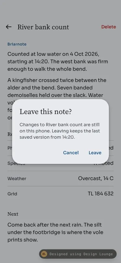
A centred Briarnote alert over a field note. Leave is a basic dialog; Delete uses the error colour. Esc closes, and the scrim does not.
Preview
Use it
Free to use · credit appreciated1 Once, in your project
npx skills add SusanAcharya/Design-Lounge 2 Then ask
Using the Design Lounge skill, build "M3 basic and destructive dialogs" (piece m3-dialog) in my stack. Match its brief; restyle it onto my product's theme.
No skill? Paste the brief instead. It carries the numbers, tokens and behaviour.
<!-- Design Lounge Nº 497 · "M3 basic and destructive dialogs" · www.designlounge.live -->

# M3 basic and destructive dialogs

> **Build brief for a coding agent.** Rebuild this piece in the reader's stack. If they haven't said which stack, ask once, then default to semantic HTML + CSS + a little vanilla JS. Match the numbers below; don't "improve" them. When a kit is locked, map colours onto the kit tokens. This is an Android Material 3 alert, not an iOS sheet and not a bottom sheet.

## What it is

The note screen of Briarnote, an invented field-survey app, with a Material 3 basic alert already open. The alert sits in the centre of the phone over a 32% black scrim. It has a title, one supporting paragraph, and two text buttons, Cancel and Leave. A second trigger, Delete in the top app bar, opens the same dialog as a destructive alert: the confirm label becomes Delete and its colour becomes the error colour. Esc, Cancel, and the confirm button close it. A click on the scrim does not. Focus stays inside the dialog until it closes, then returns to the control that opened it. The scheme is a cobalt tonal palette from seed `#0E4D8B` on a cool grey surface, so the error red reads as a different colour from the primary actions. Headlines are Source Serif 4. UI text, including the buttons, is Sora.

Language: Material 3 on Android. Small top app bar (64px under a 54px safe area), 48px targets, text buttons, a filled button and a tonal button on the result screens, ripple on press, M3 type scale. No grouped inset cards. The back control is an arrow with a stem, not an iOS chevron.

## Reference behaviour

1. **Initial state (hero).** The basic alert is already open and settled (no enter animation on this first open). Title "Leave this note?". Supporting text: "Changes to River bank count are still on this phone. Leaving keeps the last saved version from 14:20." Buttons: Cancel, then Leave, both in `--primary`. The dialog is 312px wide (or `100% - 48px` when that is smaller), centred, radius 28px, surface `--surface-high`. Scrim is `#000` at 32% opacity. The note behind is inert. Focus is on the title (`tabindex="-1"`), which does not show a focus ring for this programmatic focus.
2. **Behind the scrim.** Small top app bar: 48px back arrow "Navigate up", title "River bank count" (Source Serif 4 22/28), and a 48px text button "Delete" in `--error`. Body: kicker "Briarnote", two paragraphs of the count, a "Record" heading, four label/value rows (Photos 6 attached, Species 11 noted, Weather Overcast 14 C, Grid TL 184 632), a "Next" heading, and one more paragraph.
3. **Scrim click.** Clicking the backdrop does nothing. The dialog stays open and focus does not move.
4. **Esc.** Closes the dialog. Focus returns to the opener (the back arrow, on the hero).
5. **Cancel.** Same as Esc: close, no change to the note, focus returns to the opener.
6. **Leave.** Closes, then replaces the note with "You left this note", the sentence "The last saved version from 14:20 is still on this phone. Nothing new was written to Briarnote.", and a filled button "Reopen note". Focus moves to that button. Delete is hidden.
7. **Delete trigger.** The app-bar Delete button opens the destructive alert. Title "Delete this note?". Supporting text: "River bank count and its 6 photos are removed from this phone and from Briarnote. This cannot be undone." Buttons: Cancel in `--primary`, Delete in `--error`. Focus returns to Delete if cancelled.
8. **Delete confirm.** Closes, then shows "Note deleted", "River bank count and its 6 photos are no longer on this phone.", and a tonal button "Restore note". Focus moves there. The app-bar Delete control is hidden.
9. **Reopen note** and **Restore note**, and the back arrow while either result is showing, return to the original note and focus the back arrow.
10. **One dialog at a time.** Opening one alert while the other is open is impossible because the page is inert.
11. **Later opens** (any open after the hero) play the enter animation. The hero does not, so the first frame is the settled dialog.

## Structure

```
390 x 844
┌────────────────────────────────────┐
│ (54px safe area)                   │
│ [←] River bank count        Delete │ 64px bar
│ Briarnote                          │
│ Counted at low water on 4 Oct 2026 │
│ ░░░░░░░░░ scrim 32% ░░░░░░░░░░░░░░ │
│  ╭──────────────────────────────╮  │
│  │ Leave this note?             │  │ 24px pad, 24/32
│  │ Changes to River bank count  │  │ 14/20, 16px below title
│  │ are still on this phone.     │  │

… 217 more lines. Copy or download for the full brief. Loading the source…Brief
257 linesBuild brief for a coding agent. Rebuild this piece in the reader’s stack. If they haven’t said which stack, ask once, then default to semantic HTML + CSS + a little vanilla JS. Match the numbers below; don’t “improve” them. When a kit is locked, map colours onto the kit tokens. This is an Android Material 3 alert, not an iOS sheet and not a bottom sheet.
What it is
The note screen of Briarnote, an invented field-survey app, with a Material 3 basic alert already open. The alert sits in the centre of the phone over a 32% black scrim. It has a title, one supporting paragraph, and two text buttons, Cancel and Leave. A second trigger, Delete in the top app bar, opens the same dialog as a destructive alert: the confirm label becomes Delete and its colour becomes the error colour. Esc, Cancel, and the confirm button close it. A click on the scrim does not. Focus stays inside the dialog until it closes, then returns to the control that opened it. The scheme is a cobalt tonal palette from seed #0E4D8B on a cool grey surface, so the error red reads as a different colour from the primary actions. Headlines are Source Serif 4. UI text, including the buttons, is Sora.
Language: Material 3 on Android. Small top app bar (64px under a 54px safe area), 48px targets, text buttons, a filled button and a tonal button on the result screens, ripple on press, M3 type scale. No grouped inset cards. The back control is an arrow with a stem, not an iOS chevron.
Reference behaviour
- Initial state (hero). The basic alert is already open and settled (no enter animation on this first open). Title “Leave this note?”. Supporting text: “Changes to River bank count are still on this phone. Leaving keeps the last saved version from 14:20.” Buttons: Cancel, then Leave, both in
--primary. The dialog is 312px wide (or100% - 48pxwhen that is smaller), centred, radius 28px, surface--surface-high. Scrim is#000at 32% opacity. The note behind is inert. Focus is on the title (tabindex="-1"), which does not show a focus ring for this programmatic focus. - Behind the scrim. Small top app bar: 48px back arrow “Navigate up”, title “River bank count” (Source Serif 4 22/28), and a 48px text button “Delete” in
--error. Body: kicker “Briarnote”, two paragraphs of the count, a “Record” heading, four label/value rows (Photos 6 attached, Species 11 noted, Weather Overcast 14 C, Grid TL 184 632), a “Next” heading, and one more paragraph. - Scrim click. Clicking the backdrop does nothing. The dialog stays open and focus does not move.
- Esc. Closes the dialog. Focus returns to the opener (the back arrow, on the hero).
- Cancel. Same as Esc: close, no change to the note, focus returns to the opener.
- Leave. Closes, then replaces the note with “You left this note”, the sentence “The last saved version from 14:20 is still on this phone. Nothing new was written to Briarnote.”, and a filled button “Reopen note”. Focus moves to that button. Delete is hidden.
- Delete trigger. The app-bar Delete button opens the destructive alert. Title “Delete this note?”. Supporting text: “River bank count and its 6 photos are removed from this phone and from Briarnote. This cannot be undone.” Buttons: Cancel in
--primary, Delete in--error. Focus returns to Delete if cancelled. - Delete confirm. Closes, then shows “Note deleted”, “River bank count and its 6 photos are no longer on this phone.”, and a tonal button “Restore note”. Focus moves there. The app-bar Delete control is hidden.
- Reopen note and Restore note, and the back arrow while either result is showing, return to the original note and focus the back arrow.
- One dialog at a time. Opening one alert while the other is open is impossible because the page is inert.
- Later opens (any open after the hero) play the enter animation. The hero does not, so the first frame is the settled dialog.
Structure
390 x 844
┌────────────────────────────────────┐
│ (54px safe area)                   │
│ [←] River bank count        Delete │ 64px bar
│ Briarnote                          │
│ Counted at low water on 4 Oct 2026 │
│ ░░░░░░░░░ scrim 32% ░░░░░░░░░░░░░░ │
│  ╭──────────────────────────────╮  │
│  │ Leave this note?             │  │ 24px pad, 24/32
│  │ Changes to River bank count  │  │ 14/20, 16px below title
│  │ are still on this phone.     │  │
│  │              Cancel    Leave │  │ 48px text buttons
│  ╰──────────────────────────────╯  │ width 312, radius 28
│ Weather              Overcast, 14 C│
│ Grid                   TL 184 632  │
│ Next                               │
│ Come back after the next rain.     │
│ (34px)                             │
└────────────────────────────────────┘.appis a column:header.barand one of threemainelements (#note,#left,#gone). The two result mains starthidden.- The dialog is a sibling of
.app, not a child, soinerton.appdoes not freeze the alert. <dialog id="dlg" role="alertdialog" aria-modal="true" aria-labelledby="dlgTitle" aria-describedby="dlgText">contains anh2, ap, and.actswith Cancel and the confirm button.- Back:
button48x48,aria-label="Navigate up",aria-haspopup="dialog",aria-controls="dlg",aria-expanded. - Delete:
buttonin the bar, same popup attributes, label “Delete”. - Record rows are
div.metawith a key span and a value span, not buttons and not cards.
Tokens
:root {
  --primary: #0e4d8b;
  --on-primary: #fff;
  --primary-c: #d3e4f8;
  --on-primary-c: #001c3a;
  --secondary: #4e6074;
  --secondary-c: #d3e4f8;
  --on-secondary-c: #0a2544;
  --surface: #f5f6f8;
  --surface-c: #eef0f3;
  --surface-high: #e8eaee;
  --surface-highest: #e2e4e9;
  --on-surface: #1a1c1e;
  --on-surface-v: #43474e;
  --outline: #73777f;
  --outline-v: #c3c6cf;
  --error: #ba1a1a;
  --scrim: rgba(0, 0, 0, .32);
  --f-head: "Source Serif 4", Georgia, serif;
  --f-ui: "Sora", system-ui, sans-serif;
  --ease: cubic-bezier(.2, 0, 0, 1);
  --ease-decel: cubic-bezier(.05, .7, .1, 1);
  --ease-accel: cubic-bezier(.3, 0, .8, .15);
  --t-ripple: 450ms;
}
The palette is one light tonal scheme from seed #0E4D8B. --surface-high is the dialog container. --error is the standard M3 error and is used only for Delete. Do not recolour Delete with --primary.
Typography
| Role | Family | Size / line | Weight | Tracking | Case |
|---|---|---|---|---|---|
| App bar title (title-large) | Source Serif 4 | 22 / 28 | 400 | 0 | sentence |
| Kicker (label-medium) | Sora | 12 / 16 | 500 | 0.5px | sentence |
| Body (body-large) | Sora | 16 / 24 | 400 | 0 | sentence |
| Section (title-medium) | Source Serif 4 | 16 / 24 | 500 | 0 | sentence |
| Meta key (label-large) | Sora | 14 / 20 | 500 | 0 | sentence |
| Meta value (body-large) | Sora | 16 / 24 | 400 | 0 | sentence |
| Dialog title (headline-small) | Source Serif 4 | 24 / 32 | 400 | 0 | sentence |
| Dialog support (body-medium) | Sora | 14 / 20 | 400 | 0 | sentence |
| Text, filled, tonal (label-large) | Sora | 14 / 20 | 500 | 0.1px | sentence |
Source Serif 4 is only for the app-bar title, the section headings, the dialog title, and the result headings. Every control is Sora.
Motion
| Thing | Trigger | Property | From | To | Duration | Easing |
|---|---|---|---|---|---|---|
| State layer | hover / focus-visible | opacity | 0 | .08 / .10 | 150ms | linear |
| Ripple | pointerdown, or Enter / Space | scale | 0 | 1 | 450ms | --ease |
| Ripple fade | pointerup / key release | opacity | .12 | 0 | 300ms | linear |
| Dialog enter | open after the hero | opacity, scale | 0, .92 | 1, 1 | 250ms | --ease-decel |
| Scrim enter | same | opacity | 0 | 1 | 250ms | linear |
| Dialog exit | close | opacity, scale | 1, 1 | 0, .96 | 150ms | --ease-accel |
| Scrim exit | close | opacity | 1 | 0 | 150ms | --ease-accel |
| App bar | note scrolled | background | --surface | --surface-c | 200ms | --ease |
The hero open does not run the enter animation. dialog.close() runs after animationend, with a 220ms fallback. Reduced motion: every duration becomes 1ms, ripples appear at full size at 10% opacity and still fade, and the dialog closes on the same turn with no wait.
States
- Basic alert: confirm text “Leave”, class without
danger, colour--primary. - Destructive alert: confirm text “Delete”, class
danger, colour--error. Cancel stays--primary. - Text button rest: transparent, min-height 48px, min-width 64px, padding 0 12px, radius 24px.
- Filled (Reopen note): background
--primary, text--on-primary, min-height 48px, padding 0 24px, radius 24px. - Tonal (Restore note): background
--secondary-c, text--on-secondary-c, same size. - Hover: 8%
currentColorstate layer. Focus-visible: 10% state layer plus a 2px--primaryoutline inset 2px, so overflow on the ripple host does not clip it. - Delete, app bar:
--errorat rest. Hidden on the result screens. - Scrim: pointer hits the dialog backdrop and is ignored. Do not close.
- Result screens:
#notehidden, the matching main shown, Delete hidden. - Empty: not a separate error. Leaving and deleting are the two outcomes, and each can be undone from that screen.
Accessibility
- The alert is
role="alertdialog",aria-modal="true", labelled by the title and described by the supporting paragraph. showModal()plusinerton.appkeeps the note out of the accessibility tree and out of tab order.- Tab order inside the dialog is Cancel, then the confirm button, then wrap. Shift+Tab wraps the other way. The title is
tabindex="-1"so it can take initial focus but is not in the tab cycle. A keydown listener enforces the wrap even if the platform does not. - Esc fires
cancel. CallpreventDefaultand run the animated close. Focus returns to the opener, unless Leave or Delete then moves focus to Reopen or Restore. - Back arrow:
aria-label="Navigate up". Both triggers exposearia-haspopup="dialog",aria-controls="dlg", andaria-expanded. - Contrast on
--surface-high(#E8EAEE): primary#0E4D8Bis 7.1:1, error#BA1A1Ais 5.4:1, supporting text#43474Eis 7.8:1. White on#0E4D8Bis 8.6:1. Tonal label#0A2544on#D3E4F8is 11.9:1. - Hit targets: back and icon buttons 48x48. Delete, Cancel, Leave, Delete confirm, Reopen, and Restore are at least 48px tall. Meta rows are text, not controls.
Responsive rules
- Frame 390x844. Top padding 54px on the bar. Bottom padding 42px on the note so the last line clears a 34px home inset. Do not draw a status bar or a home indicator.
- 360 wide: the dialog width becomes
min(312px, 100% - 48px), which is 312px, so 24px remains on each side. The app-bar title wraps instead of overflowing. Delete stays on the row. - Largest text (about 200%): the bar row is
min-height: 64px, not a fixed height, so the title can wrap and the row grows. Meta rows useflex-wrap, so the value drops under the key when the line does not fit. The dialog’s button row wraps (flex-wrap) and the dialog scrolls insidemax-height: calc(100% - 48px). - Tablet: cap the note column at 640px and centre it. The dialog stays 312px until the window is wide enough for the M3 maximum of 560px. Do not turn this into a bottom sheet.
Acceptance checklist
Always
- One centred alert, radius 28px, container
--surface-high, scrim#000at 32%. Not a bottom sheet, not a full-screen route. - Basic alert: title, one supporting paragraph, two text buttons. Dismiss label first, confirm label second, row aligned to the end.
- Destructive confirm is a text button in the error colour, not a filled red button and not the primary colour.
- Esc and Cancel close. A scrim click does not.
- Focus is trapped while open and returns to the opener on dismiss.
- Every control is at least 48px in both axes. Ripple starts at the pointer and grows over 450ms.
- Back icon is an arrow with a stem. No iOS chevron, no grouped inset cards.
- Reduced motion removes the scale and still closes.
This demo
- Brand Briarnote, note “River bank count”, hero title “Leave this note?” with Cancel and Leave.
- Delete opens “Delete this note?” and the confirm word is Delete in
#BA1A1A. - Leave shows “You left this note” and filled “Reopen note”. Delete shows “Note deleted” and tonal “Restore note”.
- Primary
#0E4D8Bon surface#F5F6F8. Fonts Source Serif 4 and Sora. - Record rows: 6 attached, 11 noted, Overcast 14 C, TL 184 632.
Implementation notes
Copy, verbatim
Use these strings. Do not paraphrase them in this demo.
| Surface | String |
|---|---|
| App bar title | River bank count |
| Kicker | Briarnote |
| Paragraph 1 | Counted at low water on 4 Oct 2026, starting at 14:20. The west bank was firm enough to walk the whole bend. |
| Paragraph 2 | A kingfisher crossed twice between the alder and the bend. Seven banded demoiselles held over the slack. Water vole prints sat in the silt under the footbridge. Yellow flag was still in flower on the inside bend. |
| Section | Record |
| Photos | 6 attached |
| Species | 11 noted |
| Weather | Overcast, 14 C |
| Grid | TL 184 632 |
| Section | Next |
| Next paragraph | Come back after the next rain. The silt under the footbridge is where the vole prints show. |
| Basic title | Leave this note? |
| Basic support | Changes to River bank count are still on this phone. Leaving keeps the last saved version from 14:20. |
| Basic confirm | Leave |
| Destructive title | Delete this note? |
| Destructive support | River bank count and its 6 photos are removed from this phone and from Briarnote. This cannot be undone. |
| Destructive confirm | Delete |
| Left heading | You left this note |
| Left body | The last saved version from 14:20 is still on this phone. Nothing new was written to Briarnote. |
| Left button | Reopen note |
| Deleted heading | Note deleted |
| Deleted body | River bank count and its 6 photos are no longer on this phone. |
| Deleted button | Restore note |
Dialog padding, measured on the container:
- Title: 24px top, 24px inline, 0 bottom. Size 24/32.
- Support: 16px top, 24px inline, 0 bottom. Size 14/20. Colour
--on-surface-v. - Actions: 16px top, 12px right, 12px bottom, 0 extra left beyond the 24px of a wrapped row. Gap 8px.
justify-content: flex-end.flex-wrap: wrap. - Shadow:
0 4px 8px 3px rgba(0,0,0,.15), 0 1px 3px rgba(0,0,0,.3). That is M3 elevation 3. - At 390px wide the dialog box is 312 by about 208, centred, so its left edge is at 39px.
Result screens use 24px inline padding, the heading at 24/32 with no top margin beyond the panel’s 16px, the paragraph 16px below the heading in --on-surface-v at 16/24, max measure 34ch, and the button 24px below the paragraph.
Do not dismiss on the scrim. A modal <dialog> does not close on backdrop click unless you add that behaviour. The click target for a backdrop click is the dialog element itself. Ignore it.
dlg.addEventListener('click', (e) => {
  if (e.target === dlg) e.stopPropagation();
});
dlg.addEventListener('cancel', (e) => {
  e.preventDefault();
  closeDlg();
});
A common mistake is copying the “click outside to close” snippet from a menu. Alerts in this piece stay up until Cancel, Esc, or the confirm button.
Trap Tab yourself. Initial focus is the title, which is not one of the two buttons, so a naive “focus the first button” loop is wrong for the hero. On Tab, if focus is on the last button or on anything that is not a button, move to the first button. On Shift+Tab, if focus is on the first button or not on a button, move to the last.
dlg.addEventListener('keydown', (e) => {
  if (e.key !== 'Tab' || !dlg.open) return;
  const items = [...dlg.querySelectorAll('button:not([disabled])')];
  const first = items[0], last = items[items.length - 1];
  const cur = document.activeElement;
  if (e.shiftKey && (cur === first || !items.includes(cur))) {
    e.preventDefault(); last.focus();
  } else if (!e.shiftKey && (cur === last || !items.includes(cur))) {
    e.preventDefault(); first.focus();
  }
});
Play the exit, then close. dialog.close() is instant and drops the scrim. Add a closing class, wait for animationend, then close. If prefers-reduced-motion matches, close on the same turn. Guard with a 220ms timeout so a missed animationend cannot leave the page inert.
The confirm button is one element. Swap its text and toggle .danger (color: var(--error)) when the mode changes. Do not mount a second dialog.
Ripple hosts need position: relative, overflow: hidden, and isolation: isolate. The disc is a child span with z-index: -1, diameter twice the distance to the farthest corner, centred on the pointer. Keyboard activation (Enter or Space, ignoring repeats) uses the centre of the control. On pointerup the disc fades over 300ms and is removed. Do not use box-shadow for the press; the state layer is the hover, and the ripple is the press.
The back glyph is M20 12H4 plus M10 6l-6 6 6 6 in a 24px viewBox, stroke 1.8, round caps. That is an Android up arrow. An iOS chevron is only the second path, and it does not belong on this bar.
Google Fonts, two families only: Source Serif 4 at opsz 8..60, weights 400 and 600, and Sora at 400, 500, and 600. The dialog title uses 400 so it stays on the M3 headline-small weight. Sora 600 is loaded for the ripple host’s inheritance and is not required on a label.
Details
- Palette
- Type
- Source Serif 4 · Sora
- Motion
- Subtle motion
- Build
- One session
- Tags
On the shelves