Nº 018 of 520
Floating tool palette
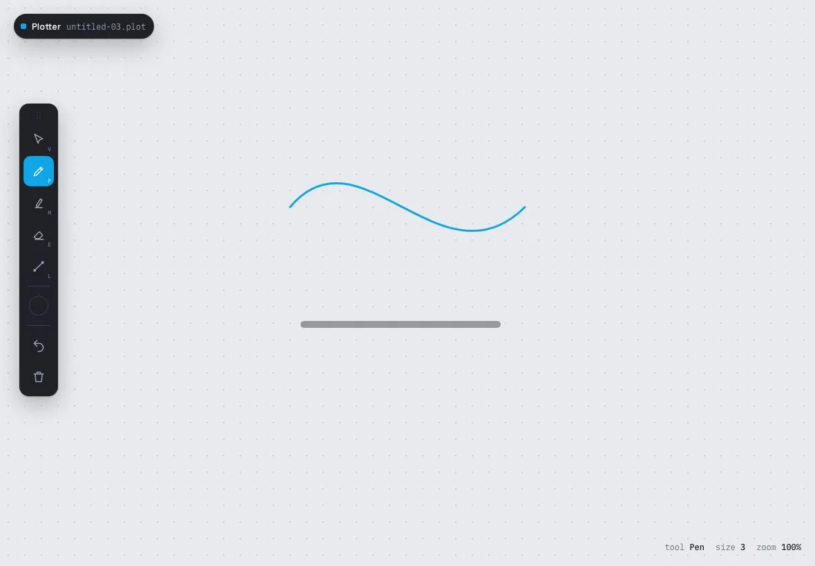
A draggable 56px tool palette for a 1180×820 canvas app: five tools with a sliding active indicator, a colour-and-size popover, undo and clear, over a dot-grid canvas you draw on.
Preview
Use it
Free to use · credit appreciated1 Once, in your project
npx skills add SusanAcharya/Design-Lounge 2 Then ask
Using the Design Lounge skill, build "Floating tool palette" (piece tablet-floating-tool-palette) in my stack. Match its brief; restyle it onto my product's theme.
No skill? Paste the brief instead. It carries the numbers, tokens and behaviour.
<!-- Design Lounge Nº 018 · "Floating tool palette" · www.designlounge.live -->

# Floating tool palette

> **Build brief for a coding agent.** Rebuild this piece in the reader's stack. If they haven't said which stack, ask once, then default to semantic HTML + CSS + a little vanilla JS. Match the numbers below; don't "improve" them.

## What it is

A floating, draggable tool palette for a fictional vector sketch app ("Plotter") on a landscape tablet. The palette is a 56px-wide dark column with a grip handle, five 44px tool buttons, a colour swatch button that opens a popover with six swatches and a stroke-width slider, and undo/clear actions. The active tool is marked by a sky-blue rounded square that slides between buttons rather than each button lighting up separately. Behind it is a full-bleed canvas with a 24px dot grid that you can draw on with pen, marker (translucent, 3× width), eraser (destination-out, 4× width) and a straight-line tool; a small file chip sits top-left and a mono status line bottom-right reports tool, size and zoom. The palette can be dragged anywhere by its grip and nudged with arrow keys.

## Reference behaviour

1. Initial state: canvas shows a blue bezier stroke and a translucent dark marker line (seeded so the first frame is not empty). Palette at `left: 28px; top: 150px` with Pen active (indicator behind the second button). Status reads "tool Pen · size 3 · zoom 100%".
2. Draw on the canvas with the pointer: a round-capped stroke follows the pointer in the current colour and width. Pen: `w` px, opaque. Marker: `3w` px at 40% alpha. Eraser: `4w` px, `destination-out`. Line: a rubber-band straight line from the down point that commits on release (the canvas is restored from a snapshot on every move).
3. Click a tool (or press V / P / M / E / L): its `aria-pressed` becomes true, the indicator slides to it (`translateY(index × 46px)`) over 260ms, the icon turns white, the status updates, and the cursor becomes crosshair (default for Select). Select does not draw.
4. Click the swatch button: a 200px popover appears 12px to the right of the palette, sliding in 6px and scaling from .98 over 260ms with a 10px notch pointing at the button; focus moves to the current swatch. Choose a swatch: the swatch button's dot changes colour and the pressed ring moves. Drag the range: the label reads "n px" and the status "size n" update live.
5. Click outside, press Escape, or click the swatch button again: the popover closes; `aria-expanded` returns to false.
6. Press Z or click Undo: the last stroke is removed (up to 20 steps). Clear empties the canvas (undoable).
7. Drag the grip: the palette follows the pointer (offset preserved), its shadow deepens, and it is clamped 8px inside the viewport. Release: shadow returns. With the grip focused, arrow keys move the palette 16px per press.
8. Hover any tool: icon brightens to `--ink` on a `--panel-2` background; the pressed tool keeps the indicator instead.

## Structure

```
1180 × 820
┌──────────────────────────────────────────────────────────────────────────────┐
│ (■ Plotter  untitled-03.plot)                                                │ chip 36px, 20/20
│                                                                              │
│    ┌────┐                                                                    │ palette 56px wide
│    │ ⋮⋮ │ grip 22px                                                          │ left 28, top 150
│    │[ ▲]│ select   V                     ╭────────╮                          │
│    │[ ▮]│ pen      P  ← indicator     ╱             ╲   seeded strokes       │
│    │[ ▮]│ marker   M                 ╱                 ╲                     │
│    │[ ▮]│ eraser   E           ─────────────────────────                     │
│    │[ ╱]│ line     L                                                         │
│    │ ── │                                                                    │
│    │( ●)│ swatch  ──▶ ┌ popover 200px ─────────────┐                         │
│    │ ── │             │ COLOUR                     │                         │
│    │[ ↶]│ undo        │ ● ● ● ● ● ●   (24px)       │                         │
│    │[ ⌫]│ clear       │ Stroke            3 px     │                         │

… 199 more lines. Copy or download for the full brief. Loading the source…Brief
239 linesBuild brief for a coding agent. Rebuild this piece in the reader’s stack. If they haven’t said which stack, ask once, then default to semantic HTML + CSS + a little vanilla JS. Match the numbers below; don’t “improve” them.
What it is
A floating, draggable tool palette for a fictional vector sketch app (“Plotter”) on a landscape tablet. The palette is a 56px-wide dark column with a grip handle, five 44px tool buttons, a colour swatch button that opens a popover with six swatches and a stroke-width slider, and undo/clear actions. The active tool is marked by a sky-blue rounded square that slides between buttons rather than each button lighting up separately. Behind it is a full-bleed canvas with a 24px dot grid that you can draw on with pen, marker (translucent, 3× width), eraser (destination-out, 4× width) and a straight-line tool; a small file chip sits top-left and a mono status line bottom-right reports tool, size and zoom. The palette can be dragged anywhere by its grip and nudged with arrow keys.
Reference behaviour
- Initial state: canvas shows a blue bezier stroke and a translucent dark marker line (seeded so the first frame is not empty). Palette at
left: 28px; top: 150pxwith Pen active (indicator behind the second button). Status reads “tool Pen · size 3 · zoom 100%”. - Draw on the canvas with the pointer: a round-capped stroke follows the pointer in the current colour and width. Pen:
wpx, opaque. Marker:3wpx at 40% alpha. Eraser:4wpx,destination-out. Line: a rubber-band straight line from the down point that commits on release (the canvas is restored from a snapshot on every move). - Click a tool (or press V / P / M / E / L): its
aria-pressedbecomes true, the indicator slides to it (translateY(index × 46px)) over 260ms, the icon turns white, the status updates, and the cursor becomes crosshair (default for Select). Select does not draw. - Click the swatch button: a 200px popover appears 12px to the right of the palette, sliding in 6px and scaling from .98 over 260ms with a 10px notch pointing at the button; focus moves to the current swatch. Choose a swatch: the swatch button’s dot changes colour and the pressed ring moves. Drag the range: the label reads “n px” and the status “size n” update live.
- Click outside, press Escape, or click the swatch button again: the popover closes;
aria-expandedreturns to false. - Press Z or click Undo: the last stroke is removed (up to 20 steps). Clear empties the canvas (undoable).
- Drag the grip: the palette follows the pointer (offset preserved), its shadow deepens, and it is clamped 8px inside the viewport. Release: shadow returns. With the grip focused, arrow keys move the palette 16px per press.
- Hover any tool: icon brightens to
--inkon a--panel-2background; the pressed tool keeps the indicator instead.
Structure
1180 × 820
┌──────────────────────────────────────────────────────────────────────────────┐
│ (■ Plotter  untitled-03.plot)                                                │ chip 36px, 20/20
│                                                                              │
│    ┌────┐                                                                    │ palette 56px wide
│    │ ⋮⋮ │ grip 22px                                                          │ left 28, top 150
│    │[ ▲]│ select   V                     ╭────────╮                          │
│    │[ ▮]│ pen      P  ← indicator     ╱             ╲   seeded strokes       │
│    │[ ▮]│ marker   M                 ╱                 ╲                     │
│    │[ ▮]│ eraser   E           ─────────────────────────                     │
│    │[ ╱]│ line     L                                                         │
│    │ ── │                                                                    │
│    │( ●)│ swatch  ──▶ ┌ popover 200px ─────────────┐                         │
│    │ ── │             │ COLOUR                     │                         │
│    │[ ↶]│ undo        │ ● ● ● ● ● ●   (24px)       │                         │
│    │[ ⌫]│ clear       │ Stroke            3 px     │                         │
│    └────┘             │ ────────●─────────── range │                         │
│                       └────────────────────────────┘                         │
│                                          tool Pen   size 3   zoom 100%       │ status, 20/20
└──────────────────────────────────────────────────────────────────────────────┘
dot grid 24px · buttons 44px, gap 2 · indicator 44×44 r10 · palette r14
<canvas id="c" role="img" aria-label>— absolute, full-bleed, dot grid as a CSSradial-gradientbackground (the grid is not drawn into the bitmap, so erasing never removes it)..chip(file name) and.status[aria-live=polite]— absolutely positioned HUD.<div class="pal" role="toolbar" aria-orientation="vertical">—.grip[tabindex=0],.tools(.indindicator + five<button class="tool" data-t aria-pressed>each with an SVG and a.kbdhint),.sep,<button class="sw" aria-expanded aria-haspopup="dialog">,.sep, undo and clear<button class="act">, and.pop[role=dialog](heading,.swatchesof six<button class="swatch" aria-pressed>,<label>+<input type="range">).
Content
- Chip: “Plotter” with an 8px accent square; file “untitled-03.plot”.
- Status: “tool Pen”, “size 3”, “zoom 100%”.
- Tools in order (label · key): Select · V, Pen · P (default), Marker · M, Eraser · E, Line · L. Actions: Undo (Z), Clear canvas.
- Swatches in order:
--c1#1f2126 (default),--c2#0ea5e9,--c3#ef4444,--c4#f59e0b,--c5#22c55e,--c6#a855f7. Popover heading “COLOUR”; label “Stroke” + “3 px”; range 1–24. - Seeded drawing: a 3px
#0ea5e9cubic bezier from (420,300) with controls (520,180) and (640,420) to (760,300); a 10px#1f2126line at 40% alpha from (440,470) to (720,470).
Tokens
:root {
  /* colour — pale cool canvas, graphite palette, sky accent, six ink colours */
  --bg: #e9eaee;              /* canvas */
  --dot: #cfd2d9;             /* dot grid */
  --panel: #1f2126;           /* palette, popover, chip */
  --panel-2: #2a2d34;         /* hover */
  --line: #3a3e47;            /* separators, swatch ring */
  --ink: #f3f4f6;             /* on panel */
  --ink-2: #9ea3ad;
  --ink-3: #6b7079;
  --canvas-ink: #1f2126;      /* HUD text on canvas */
  --accent: #0ea5e9;          /* indicator, focus, range */
  --accent-ink: #ffffff;
  --c1: #1f2126; --c2: #0ea5e9; --c3: #ef4444;
  --c4: #f59e0b; --c5: #22c55e; --c6: #a855f7;   /* drawing colours */

  /* type */
  --sans: "Space Grotesk", system-ui, sans-serif;
  --mono: "IBM Plex Mono", ui-monospace, monospace;

  /* layout */
  --w-pal: 56px;
  --btn: 44px;
  --btn-gap: 2px;
  --grid: 24px;
  --pop-w: 200px;
  --pop-gap: 12px;
  --swatch: 24px;
  --r: 14px;                  /* palette, popover */
  --r-btn: 10px;
  --r-pill: 999px;
  --shadow-pal: 0 12px 32px rgba(31, 33, 38, .28), 0 1px 2px rgba(31, 33, 38, .3);
  --shadow-drag: 0 22px 48px rgba(31, 33, 38, .36), 0 1px 2px rgba(31, 33, 38, .3);
  --shadow-pop: 0 10px 30px rgba(31, 33, 38, .22);

  /* drawing */
  --stroke-default: 3;        /* px; range 1–24 */
  --marker-mult: 3;
  --marker-alpha: .4;
  --eraser-mult: 4;
  --undo-depth: 20;

  /* motion */
  --t-fast: 140ms;            /* hovers, popover fade, swatch scale */
  --t-layout: 260ms;          /* indicator slide, popover move */
  --ease: cubic-bezier(.2, .7, .2, 1);
  --ease-out: cubic-bezier(.16, 1, .3, 1);
}
Typography
| Role | Family | Size | Weight | Line-height | Tracking | Case |
|---|---|---|---|---|---|---|
| UI base | Space Grotesk | 13px | 500 | 1.4 | 0 | sentence |
| Chip name | Space Grotesk | 13px | 600 | 1 | 0 | sentence |
| Chip file | IBM Plex Mono | 12px | 400 | 1 | 0 | as written |
| Status | IBM Plex Mono | 12px | 400 (values 500) | 1 | 0 | lowercase |
| Key hint | IBM Plex Mono | 8px | 500 | 1 | 0 | UPPERCASE |
| Popover heading | IBM Plex Mono | 10px | 500 | 1 | +0.10em | UPPERCASE |
| Popover label | IBM Plex Mono | 11px | 400 | 1 | 0 | sentence |
Motion
| Element | Trigger | Property | From → To | Duration | Easing | Notes |
|---|---|---|---|---|---|---|
.ind | tool change | transform | translateY(i × 46px) | 260ms | --ease-out | 44px button + 2px gap |
.tool | hover / press | color | --ink-2 → --ink / white | 140ms | linear | background is instant |
.pop | open | opacity, transform | 0, translateX(-6px) scale(.98) → 1, none | 140ms / 260ms | linear / --ease-out | visibility follows |
.sw i | popover open | scale | 1 → 1.1 | 140ms | --ease-out | |
.swatch | hover | scale | 1 → 1.12 | 140ms | --ease-out | |
.pal | drag start / end | box-shadow | --shadow-pal ↔ --shadow-drag | 140ms | linear | position updates have no transition |
| canvas strokes | pointer | — | drawn immediately | 0 | — | no smoothing lag |
Reduced motion: all transitions 1ms; the indicator jumps; drawing is unaffected.
States
- Tool pressed:
aria-pressed="true", icon--accent-ink, indicator positioned behind it; background transparent (the indicator is the fill). - Tool hover (unpressed):
--panel-2background,--inkicon. - Swatch button expanded:
aria-expanded="true", dot scaled 1.1. - Popover open:
.on; closed isvisibility: hidden; pointer-events: none. - Swatch pressed:
aria-pressed="true", 2px--inkring 4px outside the 24px dot. - Palette dragging:
.drag, deeper shadow,cursor: grabbing. - Grip:
cursor: grab; hover raises colour to--ink-2. - Focus-visible (grip, tools, swatch button, swatches, actions): 2px
--accentoutline, 2px offset. - Cursor on canvas: crosshair for drawing tools, default for Select.
Accessibility
- The palette is
role="toolbar" aria-label="Tools" aria-orientation="vertical"; each tool is a<button aria-pressed>with anaria-labelthat includes its shortcut (“Pen (P)”). The visible key hint is decorative. - The grip is focusable (
tabindex="0") witharia-label="Move palette (arrow keys)"; arrow keys move it 16px and arepreventDefaulted. - The popover is
role="dialog" aria-label="Colour and size"; opening moves focus to the pressed swatch; Escape and outside-click close it. Swatches arearia-pressedbuttons labelled with their hex; the range has a visible<label>whose value text updates. - The status line is
aria-live="polite"so tool and size changes are announced; it is the only live region. - The canvas is
role="img"with a label explaining it is drawable; drawing is pointer-only by design, and the piece exposes undo and clear as buttons with labels. - Shortcuts (V P M E L Z) are ignored while focus is in the range input and when a modifier is held.
- Contrast:
--ink-2on--panel7.2:1;--ink-3on--panel3.9:1 (key hints and 10px headings only); white on--accent3.2:1 for a 20px icon on a 44px fill (large graphic, plus thearia-pressedstate and the slide make it non-colour-only). - Hit targets: all buttons 44px; grip 56×22 (secondary; keyboard alternative provided); swatches 24px with 6px gaps inside a popover (raise to 32px if the product is touch-first).
Responsive rules
- 1180 (reference): as specified.
- 1024: identical; the popover still opens to the right (it flips to the left when the palette is within 220px of the right edge).
- 768 (portrait): the palette snaps to
left: 16px; top: 120pxon load; the chip and status shrink to 11px. - < 640: the palette becomes a horizontal bar docked at the bottom (
flex-direction: row, indicator slides on X), the grip is hidden, and the popover opens upward.
Acceptance checklist
- Palette is 56px wide,
#1f2126, 14px radius, with0 12px 32px rgba(31,33,38,.28)shadow, initially at 28/150. - Five 44px tools with 2px gaps; the active indicator is a 44×44
#0ea5e9square with 10px radius that slidestranslateY(i × 46px)over 260mscubic-bezier(.16,1,.3,1). - V / P / M / E / L select tools;
aria-pressedand the status line update. - Pen draws round-capped strokes at the chosen width; marker is 3× width at 40% alpha; eraser is 4× width using
destination-out; line rubber-bands and commits on release. - The dot grid is a CSS background on the canvas element and survives erasing and clearing.
- Undo (Z) restores up to 20 previous states; Clear is itself undoable.
- Swatch popover is 200px wide, 12px right of the palette, with a 10px notch; six 24px swatches; a 1–24 range whose value is mirrored in the label and status.
- Popover closes on outside pointerdown, Escape and re-click; focus lands on the pressed swatch on open.
- Dragging the grip moves the palette with the pointer, clamped 8px from every edge, and deepens the shadow while dragging.
- Arrow keys on the focused grip move the palette 16px.
- Canvas is DPR-aware (bitmap = CSS size ×
devicePixelRatio, context scaled) so strokes are sharp. - Every control shows a 2px accent focus ring; shortcuts do not fire inside the range input.
Implementation notes
Sliding indicator is one absolutely positioned square under the buttons; the buttons stay transparent when pressed:
.tools { position: relative; display: flex; flex-direction: column; gap: 2px; }
.ind { position: absolute; left: 0; top: 0; width: 44px; height: 44px; border-radius: 10px;
       background: var(--accent); transition: transform var(--t-layout) var(--ease-out); }
.tool { position: relative; z-index: 1; width: 44px; height: 44px; }
.tool[aria-pressed="true"] { color: var(--accent-ink); background: transparent; }
function setTool(t) {
tools.forEach((b, i) => { const on = b.dataset.t === t; b.setAttribute('aria-pressed', String(on));
if (on) ind.style.transform = `translateY(${i * 46}px)`; });
}DPR-aware canvas and stroke setup. Size the bitmap by device pixels, scale the context, then draw in CSS pixels straight from clientX/Y (the canvas is full-bleed at 0,0):
function fit() {
  const d = devicePixelRatio || 1;
  cv.width = innerWidth * d; cv.height = innerHeight * d;
  ctx.setTransform(d, 0, 0, d, 0, 0);
}
cv.addEventListener('pointerdown', e => {
  cv.setPointerCapture(e.pointerId); drawing = true;
  hist.push(ctx.getImageData(0, 0, cv.width, cv.height)); if (hist.length > 20) hist.shift();
  ctx.lineCap = ctx.lineJoin = 'round';
  ctx.globalCompositeOperation = tool === 'eraser' ? 'destination-out' : 'source-over';
  ctx.globalAlpha = tool === 'marker' ? .4 : 1;
  ctx.lineWidth = tool === 'marker' ? w * 3 : tool === 'eraser' ? w * 4 : w;
  ctx.strokeStyle = col; x0 = e.clientX; y0 = e.clientY;
});
Drag with pointer capture and clamping, so fast drags outside the grip still track and the palette can never be lost off-screen:
grip.addEventListener('pointerdown', e => { grip.setPointerCapture(e.pointerId); pal.classList.add('drag');
  gx = e.clientX; gy = e.clientY; px = pal.offsetLeft; py = pal.offsetTop; });
grip.addEventListener('pointermove', e => { if (!pal.classList.contains('drag')) return;
  place(px + e.clientX - gx, py + e.clientY - gy); });
const place = (x, y) => {
  pal.style.left = Math.max(8, Math.min(innerWidth  - pal.offsetWidth  - 8, x)) + 'px';
  pal.style.top  = Math.max(8, Math.min(innerHeight - pal.offsetHeight - 8, y)) + 'px';
};
Common mistakes: drawing the grid into the bitmap (the eraser removes it); forgetting to reset globalAlpha and globalCompositeOperation after a stroke (the next tool inherits them); using mousemove without pointer capture (strokes stop at the palette edge); transitioning left/top on the palette (it lags the finger).
Details
- Palette
- Type
- Space Grotesk · IBM Plex Mono
- Motion
- Subtle motion
- Build
- One session
- Tags
Studied
Tailwind CSS docsPut each instruction next to its code. Draw the grid with thin lines and let the empty sides carry a faint hatch.
All sources