Nº 533 of 543
Pricing tiers with a lifted pick
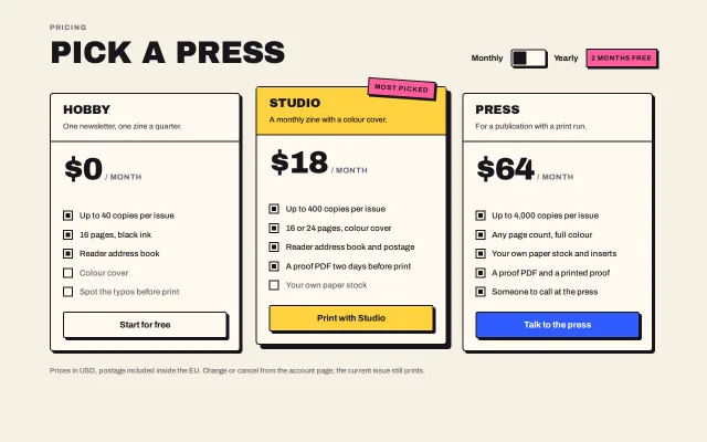
Three bordered pricing tiers with hard offset shadows; the middle one sits higher on an 8px shadow with a tilted sticker, and a square switch flips every price to yearly with a 160ms drop.
Preview
Use it
Free to use · credit appreciated1 Once, in your project · Node 22.20+
npx skills add SusanAcharya/Design-Lounge 2 Then ask
Using the Design Lounge skill, build "Pricing tiers with a lifted pick" (piece pricing-brutal-tiers) in my stack. Match its brief; restyle it onto my product's theme.
No skill? Paste the brief instead. It carries the numbers, tokens and behaviour.
<!-- Design Lounge Nº 533 · "Pricing tiers with a lifted pick" · www.designlounge.live -->

# Pricing tiers with a lifted pick

> **Build brief for a coding agent.** Rebuild this piece in the reader's stack. If they haven't said which stack, ask once, then default to semantic HTML + CSS + a little vanilla JS. Match the numbers below; don't "improve" them. When a kit is locked, map the colours onto the kit tokens and keep the 2px ink borders and the hard 0-blur shadows.

## What it is

The pricing section of Stapler, a fictional zine-printing service, in a neo-brutalist system. A 56px uppercase title sits left; a square 64×32 switch with a pink "2 months free" sticker sits right. Three tiers in one row, each a bordered card with a 4px hard shadow. The recommended tier is the exception the eye reads first: its band is yellow, it starts 12px higher than its neighbours, its shadow is 8px, and a pink sticker tilted 4° hangs off its top edge. Prices are 56px Archivo Black; flipping the switch drops each price 10px and fades it out, swaps the number, and brings it back in 160ms, with a struck monthly price and the yearly total written underneath. Feature rows use a drawn 18px square checkbox: filled for included, empty and grey for not. The detail worth copying is how little it takes to lift one tier: height, shadow depth and one fill, no extra colours.

## Reference behaviour

1. First frame: "PRICING / PICK A PRESS", the switch off (Monthly), three tiers Hobby $0, Studio $18 (yellow band, sticker "Most picked"), Press $64, each with five feature rows and one full-width button. Buttons: "Start for free" (cream), "Print with Studio" (yellow), "Talk to the press" (blue).
2. Click the switch: the knob slides 32px right over 160ms and the track turns yellow. Every price fades up and out (160ms), then reads the yearly value ($0 / $15 / $53) and fades back in. Under each paid price a line appears: "~~$18~~ billed $180 a year". Click again: back to monthly, the lines clear.
3. Hover a button: it moves (4px, 4px) into its shadow and the shadow collapses to 0 in 120ms. Active: the same plus a `--surface-2` fill.
4. The tiers themselves do not move on hover; only the buttons and the switch react.
5. Nothing animates on load.

## Structure

```
1280 × 800, bg #F6F1E4, wrap max 1180, padding 44/40
┌ head ──────────────────────────────────────────────────────────────────────────┐
│ PRICING                                             Monthly [■   ] Yearly [2 MONTHS FREE] │
│ PICK A PRESS 56/.95                                                            │
├ tiers grid 3 × 1fr, gap 28 ───────────────────────────────────────────────────┤
│ ┌ Hobby ─────────┐ (12px lower)   ┌ Studio ──[MOST PICKED 4°]┐   ┌ Press ─────────┐ (12px lower) │
│ │ band, cream    │                │ band, YELLOW             │   │ band, cream    │ │
│ │ $0  / MONTH 56 │                │ $18 / MONTH              │   │ $64 / MONTH    │ │
│ │ (was line)     │                │ (was line)               │   │ (was line)     │ │
│ │ ■ feature ×5   │                │ ■ feature ×5             │   │ ■ feature ×5   │ │
│ │ [Start for free]│  4px shadow   │ [Print with Studio]      │   │ [Talk to the press] │ │
│ └────────────────┘                └──────────────────────────┘ 8px shadow │ └────────────────┘ │
│ foot: Prices in USD … 13px                                                      │
└────────────────────────────────────────────────────────────────────────────────┘
```

- `main.wrap` → `div.head` (`h1` with a `small` kicker, `div.period` with two labels, the `button.sw[role=switch]` and `span.save`), `div.tiers`, `p.foot`.
- Each `article.tier` → optional `span.sticker`, `div.band` (`h2`, `p`), `div.price` (`b[data-m][data-y]`, `span`), `div.was`, `ul.feat` (li with an `i` box; `.no` for excluded), `div.act` with one `button.btn`.

… 122 more lines. Copy or download for the full brief. Loading the source…Brief
162 linesBuild brief for a coding agent. Rebuild this piece in the reader’s stack. If they haven’t said which stack, ask once, then default to semantic HTML + CSS + a little vanilla JS. Match the numbers below; don’t “improve” them. When a kit is locked, map the colours onto the kit tokens and keep the 2px ink borders and the hard 0-blur shadows.
What it is
The pricing section of Stapler, a fictional zine-printing service, in a neo-brutalist system. A 56px uppercase title sits left; a square 64×32 switch with a pink “2 months free” sticker sits right. Three tiers in one row, each a bordered card with a 4px hard shadow. The recommended tier is the exception the eye reads first: its band is yellow, it starts 12px higher than its neighbours, its shadow is 8px, and a pink sticker tilted 4° hangs off its top edge. Prices are 56px Archivo Black; flipping the switch drops each price 10px and fades it out, swaps the number, and brings it back in 160ms, with a struck monthly price and the yearly total written underneath. Feature rows use a drawn 18px square checkbox: filled for included, empty and grey for not. The detail worth copying is how little it takes to lift one tier: height, shadow depth and one fill, no extra colours.
Reference behaviour
- First frame: “PRICING / PICK A PRESS”, the switch off (Monthly), three tiers Hobby $0, Studio $18 (yellow band, sticker “Most picked”), Press $64, each with five feature rows and one full-width button. Buttons: “Start for free” (cream), “Print with Studio” (yellow), “Talk to the press” (blue).
- Click the switch: the knob slides 32px right over 160ms and the track turns yellow. Every price fades up and out (160ms), then reads the yearly value ($0 / $15 / $53) and fades back in. Under each paid price a line appears: “
$18billed $180 a year”. Click again: back to monthly, the lines clear. - Hover a button: it moves (4px, 4px) into its shadow and the shadow collapses to 0 in 120ms. Active: the same plus a
--surface-2fill. - The tiers themselves do not move on hover; only the buttons and the switch react.
- Nothing animates on load.
Structure
1280 × 800, bg #F6F1E4, wrap max 1180, padding 44/40
┌ head ──────────────────────────────────────────────────────────────────────────┐
│ PRICING                                             Monthly [■   ] Yearly [2 MONTHS FREE] │
│ PICK A PRESS 56/.95                                                            │
├ tiers grid 3 × 1fr, gap 28 ───────────────────────────────────────────────────┤
│ ┌ Hobby ─────────┐ (12px lower)   ┌ Studio ──[MOST PICKED 4°]┐   ┌ Press ─────────┐ (12px lower) │
│ │ band, cream    │                │ band, YELLOW             │   │ band, cream    │ │
│ │ $0  / MONTH 56 │                │ $18 / MONTH              │   │ $64 / MONTH    │ │
│ │ (was line)     │                │ (was line)               │   │ (was line)     │ │
│ │ ■ feature ×5   │                │ ■ feature ×5             │   │ ■ feature ×5   │ │
│ │ [Start for free]│  4px shadow   │ [Print with Studio]      │   │ [Talk to the press] │ │
│ └────────────────┘                └──────────────────────────┘ 8px shadow │ └────────────────┘ │
│ foot: Prices in USD … 13px                                                      │
└────────────────────────────────────────────────────────────────────────────────┘main.wrap→div.head(h1with asmallkicker,div.periodwith two labels, thebutton.sw[role=switch]andspan.save),div.tiers,p.foot.- Each
article.tier→ optionalspan.sticker,div.band(h2,p),div.price(b[data-m][data-y],span),div.was,ul.feat(li with anibox;.nofor excluded),div.actwith onebutton.btn.
Tokens
:root {
  --bg: #f6f1e4;  --surface: #fffaf0;  --surface-2: #ece4d0;
  --ink: #17151a;  --ink-2: #4a4650;  --ink-3: #76717d;
  --yellow: #ffd23f;  --blue: #2f5bff;  --blue-ink: #fffdf8;  --pink: #ff5c9a;

  --display: "Archivo Black", Impact, sans-serif;
  --sans: "Archivo", system-ui, sans-serif;

  --bw: 2px;  --off: 4px;  --off-lg: 8px;   /* borders and shadow offsets */
  --r: 4px;  --r-card: 6px;                 /* family radii; stickers are 0 */
  --lift: 12px;                             /* how much higher the picked tier sits */
  --sw-w: 64px; --sw-h: 32px; --sw-knob: 24px;

  --t-micro: 120ms;  --t-knob: 160ms;
  --ease: cubic-bezier(.2, .7, .2, 1);
}
Typography
| Role | Family | Size | Weight | Line-height | Tracking | Case |
|---|---|---|---|---|---|---|
| Title | Archivo Black | 56px | 400 | 0.95 | −0.02em | UPPERCASE |
| Price | Archivo Black | 56px | 400 | 1 | −0.03em | numerals |
| Tier name | Archivo Black | 22px | 400 | 1 | −0.01em | UPPERCASE |
| Kicker | Archivo | 13px | 700 | 1 | +0.12em | UPPERCASE, --ink-3 |
| Tier blurb | Archivo | 14px | 500 | 1.5 | 0 | sentence |
| Per-month unit | Archivo | 14px | 700 | 1 | +0.06em | UPPERCASE, --ink-3 |
| Feature row | Archivo | 15px | 500 | 1.5 | 0 | sentence |
| Button | Archivo | 16px | 700 | 1 | 0 | sentence |
| Sticker, save tag | Archivo | 12px | 700 | 1 | +0.08–0.1em | UPPERCASE |
| Was line, foot | Archivo | 13px | 500 | 1.5 | 0 | sentence, --ink-3 |
Motion
| Element | Trigger | Property | From → To | Duration | Easing |
|---|---|---|---|---|---|
.sw::after | toggle | translateX | 0 → 32px | 160ms | --ease |
.sw | toggle | background | --surface → --yellow | 120ms | --ease |
.price b | toggle | transform, opacity | 0, 1 → −10px, 0, then swap text, then back | 160ms + 160ms | --ease |
.btn | hover | transform, box-shadow | none, 4px 4px 0 → translate(4px,4px), 0 0 0 | 120ms | --ease |
.btn | active | background | fill → --surface-2 | 120ms | --ease |
Reduced motion: all transitions 1ms; the price text still swaps, the was line still appears.
States
- Switch off: cream track, knob left, “Monthly” prices. On: yellow track, knob right, yearly prices and a was line under each paid tier.
- Tier default: cream, 4px shadow, 12px lower. Picked: yellow band, 8px shadow, sticker, no offset.
- Feature included: 18px bordered square with an 8px ink fill. Excluded: empty square, row text
--ink-3. - Button default / hover / active / focus-visible: as the family: cream (or yellow, or blue with
--blue-ink), pushed, pushed +--surface-2, 2px blue outline at 3px offset. - Hobby on yearly: price stays $0 and shows no was line.
Accessibility
- The switch is a
<button role="switch" aria-checked>witharia-label="Bill yearly"; the “Monthly” and “Yearly” labels are visible text beside it. Space and Enter toggle it. - Each tier is an
<article>whoseh2is its name; the pricebis text, so a screen reader hears “$18 / month”. - Excluded features are visibly different (empty box, grey text), and may carry
aria-label="Not included: …"in a stack that supports it. - Contrast: ink on cream 15.2:1; ink on yellow 12.6:1;
--blue-inkon blue 5.1:1;--ink-3on cream 4.9:1 and on--surface5.2:1. - Hit targets: buttons 48px; switch 64×32 with the labels as extra target; focus rings clear the shadows.
Responsive rules
- ≥ 1280: three columns, gap 28, title 56px, price 56px.
- 1024–1279: gap 20, title 48px, price 48px.
- 768–1023: the picked tier spans the full width on its own row above the other two; its lift becomes 0.
- < 640: one column, padding 20px, the head stacks (title, then the switch row), price 44px, buttons stay full width. Shadow offsets stay 4px / 8px.
Acceptance checklist
Always
- Three tiers, one marked as picked: it starts 12px higher, has an 8px shadow, a filled band and a tilted sticker; the others have 4px shadows and cream bands.
- Every border is 2px
--ink; shadows are hard with no blur; the sticker and switch knob have 0 radius, controls and cards use the family radii. - The period switch is
role="switch"and flips every price with the 160ms drop, writing a struck monthly price and the yearly total under each paid tier. - One button per tier, full width, 48px, pushed into its shadow on hover.
- Included and excluded features are drawn with the same 18px square, filled or empty.
- Focus rings are visible on the switch and every button, outside the shadow.
- Reduced motion: 1ms transitions, prices still change.
- No gradient, no blur, no pure
#000.
This demo
- Hobby $0, Studio $18 → $15 (“billed $180 a year”), Press $64 → $53 (“billed $636 a year”); the sticker reads “Most picked”.
- Buttons “Start for free”, “Print with Studio”, “Talk to the press”; the save tag reads “2 months free”.
Implementation notes
Lift by height, not by scale. The picked tier is simply not pushed down:
.tier { margin-top: var(--lift); box-shadow: var(--off) var(--off) 0 var(--ink); }
.tier.pick { margin-top: 0; box-shadow: var(--off-lg) var(--off-lg) 0 var(--ink); }
.tier.pick .band { background: var(--yellow); }
The price drop. Fade out, swap, fade in, with the data on the element:
b.classList.add('flip');                          // transform: translateY(-10px); opacity: 0
setTimeout(() => {
  b.textContent = '$' + (yearly ? b.dataset.y : b.dataset.m);
  was.innerHTML = yearly && b.dataset.m !== '0' ? `<s>$${b.dataset.m}</s> billed $${b.dataset.y * 12} a year` : '';
  b.classList.remove('flip');
}, 160);
The drawn checkbox is two squares, no SVG:
.feat i { width: 18px; height: 18px; border: var(--bw) solid var(--ink); position: relative; }
.feat i::after { content: ""; position: absolute; inset: 3px; background: var(--ink); }
.feat li.no i::after { display: none; }
Common mistakes: scaling the picked tier (it should be taller by position, not bigger); a blurred shadow; a gradient band; animating the price with a counter (it is a swap, not a count); losing the was line’s <s> (a screen reader should hear the old price struck).
Details
- Palette
- Type
- Archivo Black · Archivo
- Motion
- Subtle motion
- Build
- Quick build
- Tags
Studied
Don't Board MeA service with a next step. The headline can shout. The booking stays plain.
All sourcesSimilar
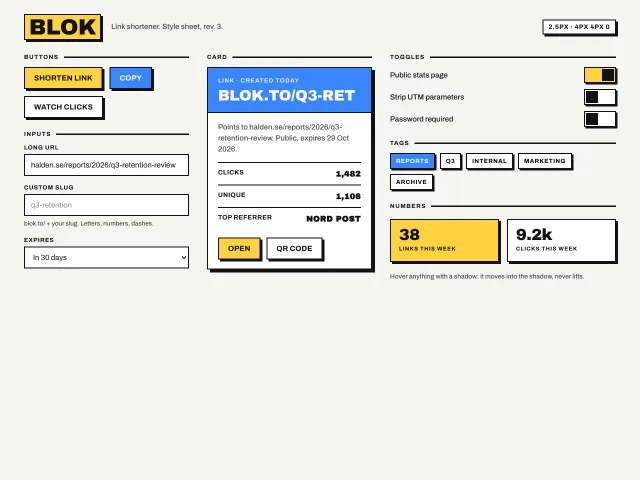
Neo-brutalist design style
Thick 2.5px black borders, hard 4px 4px 0 offset shadows, flat yellow and blue fills, and hover that moves the element into its shadow; buttons, inputs, a card, toggles and tags.
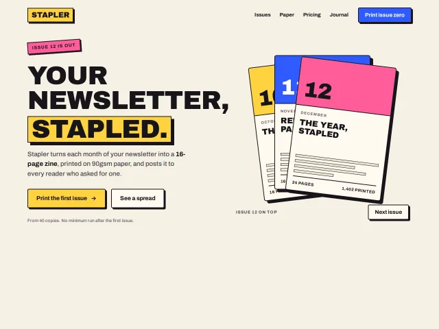
Hero with a fanned issue stack
A neo-brutalist hero: a 76px uppercase headline with one word in a yellow block, two hard-shadow buttons, and three bordered issue covers that fan out on hover and rotate on a Next button.
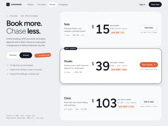
Annual toggle with rolling prices
Pricing rows whose 96px prices roll digit by digit like an odometer when billing flips to annual, while a tilted savings badge springs in.