Nº 532 of 543
Hero with a fanned issue stack
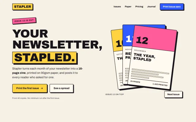
A neo-brutalist hero: a 76px uppercase headline with one word in a yellow block, two hard-shadow buttons, and three bordered issue covers that fan out on hover and rotate on a Next button.
Preview
Use it
Free to use · credit appreciated1 Once, in your project · Node 22.20+
npx skills add SusanAcharya/Design-Lounge 2 Then ask
Using the Design Lounge skill, build "Hero with a fanned issue stack" (piece hero-brutal-stack) in my stack. Match its brief; restyle it onto my product's theme.
No skill? Paste the brief instead. It carries the numbers, tokens and behaviour.
<!-- Design Lounge Nº 532 · "Hero with a fanned issue stack" · www.designlounge.live -->

# Hero with a fanned issue stack

> **Build brief for a coding agent.** Rebuild this piece in the reader's stack. If they haven't said which stack, ask once, then default to semantic HTML + CSS + a little vanilla JS. Match the numbers below; don't "improve" them. When a kit is locked, map the colours onto the kit tokens and keep the 2px ink borders and the hard 0-blur shadows: they are the style.

## What it is

The first screen of Stapler, a fictional service that prints a newsletter as a monthly zine. Neo-brutalism done as a system, not a sticker pack: every box has a 2px ink border, every raised thing has a hard offset shadow with no blur, fills are flat cream, yellow, blue and pink, and nothing uses a gradient or a tint. Left: a pink sticker label tilted 4°, a 76px Archivo Black headline whose last word sits in a yellow block with an 8px shadow, one lede, two buttons and a line of small print. Right: the last three issues as 280×392 covers stacked at -7°, 0° and 7°; hovering the stack fans the outer covers out to ±13°, and a Next button rotates which cover is on top. The detail worth copying is the shadow rule: hover moves a button *into* its shadow (translate by the offset while the shadow collapses to zero) on one 120ms clock, so the page feels pressed, never floated.

## Reference behaviour

1. First frame: nav with a yellow bordered wordmark, four links, a blue "Print issue zero" button. Hero copy: sticker "Issue 12 is out", headline "Your newsletter, stapled." with "stapled." in the yellow block, lede, buttons "Print the first issue" (yellow, arrow icon) and "See a spread" (cream), fine print. Right: three covers, 12 on top, 11 behind, 10 at the back, rotated 7° / 0° / -7°.
2. Hover any `.btn`: it translates (4px, 4px) and its shadow goes to `0 0 0` over 120ms. Active: the same, plus a `--surface-2` fill. Release: back over 120ms.
3. Hover the stack (or focus anything inside it): the back cover moves to -13° and -128px, the front cover to 13° and 128px, over 320ms expo-out. The middle cover stays. Leave: they return.
4. Click "Next issue": every cover's position advances by one (back → middle → front → back). The live caption "Issue N on top" updates. Covers slide and rotate between positions over 320ms.
5. Nav links underline with a 2px ink rule on hover. The wordmark and the sticker never move.
6. Nothing animates on load. The stack is still until hovered or clicked.

## Structure

```
1280 × 800, bg #F6F1E4
nav  max 1200, padding 22/40     [STAPLER]  Issues  Paper  Pricing  Journal        [Print issue zero]
hero max 1200, padding 36/40/0, grid minmax(0,1fr) | 520px, gap 48, centred
┌ copy ─────────────────────────────┐   ┌ stage 520, column, gap 44 ────────────────┐
│ [ISSUE 12 IS OUT] (pink, -4°)     │   │        ┌──────┐                           │
│ YOUR NEWSLETTER,        76/.95    │   │   ┌────┤  12  ├────┐   covers 280 × 392    │
│ [STAPLED.] yellow block, 8px sh.  │   │   │ 10 │ DEC. │ 11 │   at -7° / 0° / 7°    │
│ lede 19px, 42ch                   │   │   │    │      │    │   front = pos 2       │
│ [Print the first issue →][See a…] │   │   └────┤      ├────┘                       │
│ fine print 13px                   │   │        └──────┘                           │
└───────────────────────────────────┘   │ ISSUE 12 ON TOP              [Next issue] │  row below the stack
                                         └───────────────────────────────────────────┘
```

- `header.nav` → `a.logo`, `nav.links` labelled "Main", a `.btn.b` link.
- `main.hero` → copy `div` (`span.sticker`, `h1` with `span.blk`, `p.lede`, `div.ctas`, `p.fine`) and `div.stage`.
- `ol.stack` labelled "The last three issues" → three `li.cover[data-pos]`, each with `.band` (the issue number), `.body` (`.kicker`, `h2`, `.lines` of four drawn bars, `.meta`).
- `div.row` under the stack → `span.count[aria-live=polite]` and `button.next`.

… 126 more lines. Copy or download for the full brief. Loading the source…Brief
166 linesBuild brief for a coding agent. Rebuild this piece in the reader’s stack. If they haven’t said which stack, ask once, then default to semantic HTML + CSS + a little vanilla JS. Match the numbers below; don’t “improve” them. When a kit is locked, map the colours onto the kit tokens and keep the 2px ink borders and the hard 0-blur shadows: they are the style.
What it is
The first screen of Stapler, a fictional service that prints a newsletter as a monthly zine. Neo-brutalism done as a system, not a sticker pack: every box has a 2px ink border, every raised thing has a hard offset shadow with no blur, fills are flat cream, yellow, blue and pink, and nothing uses a gradient or a tint. Left: a pink sticker label tilted 4°, a 76px Archivo Black headline whose last word sits in a yellow block with an 8px shadow, one lede, two buttons and a line of small print. Right: the last three issues as 280×392 covers stacked at -7°, 0° and 7°; hovering the stack fans the outer covers out to ±13°, and a Next button rotates which cover is on top. The detail worth copying is the shadow rule: hover moves a button into its shadow (translate by the offset while the shadow collapses to zero) on one 120ms clock, so the page feels pressed, never floated.
Reference behaviour
- First frame: nav with a yellow bordered wordmark, four links, a blue “Print issue zero” button. Hero copy: sticker “Issue 12 is out”, headline “Your newsletter, stapled.” with “stapled.” in the yellow block, lede, buttons “Print the first issue” (yellow, arrow icon) and “See a spread” (cream), fine print. Right: three covers, 12 on top, 11 behind, 10 at the back, rotated 7° / 0° / -7°.
- Hover any
.btn: it translates (4px, 4px) and its shadow goes to0 0 0over 120ms. Active: the same, plus a--surface-2fill. Release: back over 120ms. - Hover the stack (or focus anything inside it): the back cover moves to -13° and -128px, the front cover to 13° and 128px, over 320ms expo-out. The middle cover stays. Leave: they return.
- Click “Next issue”: every cover’s position advances by one (back → middle → front → back). The live caption “Issue N on top” updates. Covers slide and rotate between positions over 320ms.
- Nav links underline with a 2px ink rule on hover. The wordmark and the sticker never move.
- Nothing animates on load. The stack is still until hovered or clicked.
Structure
1280 × 800, bg #F6F1E4
nav  max 1200, padding 22/40     [STAPLER]  Issues  Paper  Pricing  Journal        [Print issue zero]
hero max 1200, padding 36/40/0, grid minmax(0,1fr) | 520px, gap 48, centred
┌ copy ─────────────────────────────┐   ┌ stage 520, column, gap 44 ────────────────┐
│ [ISSUE 12 IS OUT] (pink, -4°)     │   │        ┌──────┐                           │
│ YOUR NEWSLETTER,        76/.95    │   │   ┌────┤  12  ├────┐   covers 280 × 392    │
│ [STAPLED.] yellow block, 8px sh.  │   │   │ 10 │ DEC. │ 11 │   at -7° / 0° / 7°    │
│ lede 19px, 42ch                   │   │   │    │      │    │   front = pos 2       │
│ [Print the first issue →][See a…] │   │   └────┤      ├────┘                       │
│ fine print 13px                   │   │        └──────┘                           │
└───────────────────────────────────┘   │ ISSUE 12 ON TOP              [Next issue] │  row below the stack
└───────────────────────────────────────────┘header.nav→a.logo,nav.linkslabelled “Main”, a.btn.blink.main.hero→ copydiv(span.sticker,h1withspan.blk,p.lede,div.ctas,p.fine) anddiv.stage.ol.stacklabelled “The last three issues” → threeli.cover[data-pos], each with.band(the issue number),.body(.kicker,h2,.linesof four drawn bars,.meta).div.rowunder the stack →span.count[aria-live=polite]andbutton.next.
Tokens
:root {
  --bg: #f6f1e4;            /* page, cream */
  --surface: #fffaf0;       /* cards, cream buttons */
  --surface-2: #ece4d0;     /* pressed fill, drawn bars */
  --ink: #17151a;           /* borders, shadows, text; not #000 */
  --ink-2: #4a4650;         /* lede, captions */
  --ink-3: #76717d;         /* fine print, kickers */
  --yellow: #ffd23f;        /* primary fill, wordmark, headline block */
  --blue: #2f5bff;          /* secondary fill, focus ring */
  --blue-ink: #fffdf8;      /* text on blue */
  --pink: #ff5c9a;          /* tertiary: the sticker, cover 12 */

  --display: "Archivo Black", Impact, sans-serif;
  --sans: "Archivo", system-ui, sans-serif;

  --bw: 2px;                /* every border */
  --off: 4px;               /* control shadow offset */
  --off-lg: 8px;            /* hero block and covers */
  --r: 4px;  --r-card: 6px; /* the family's two radii; the yellow block and sticker are 0 */

  --t-micro: 120ms;         /* the push */
  --t-fan: 320ms;           /* covers moving */
  --ease: cubic-bezier(.2, .7, .2, 1);
  --expo: cubic-bezier(.16, 1, .3, 1);
}
Typography
| Role | Family | Size | Weight | Line-height | Tracking | Case |
|---|---|---|---|---|---|---|
| Headline | Archivo Black | 76px | 400 | 0.95 | −0.02em | UPPERCASE |
| Cover number | Archivo Black | 64px | 400 | 1 | −0.03em | numerals |
| Cover title | Archivo Black | 24px | 400 | 1.05 | −0.01em | UPPERCASE |
| Wordmark | Archivo Black | 22px | 400 | 1 | −0.01em | UPPERCASE in a yellow block |
| Lede | Archivo | 19px | 500 | 1.5 | 0 | sentence, --ink-2 |
| Button | Archivo | 17px (nav 16px) | 700 | 1 | 0 | sentence |
| Nav link | Archivo | 15px | 700 | 1 | 0 | sentence |
| Sticker, meta, caption | Archivo | 12–13px | 700 | 1 | +0.06–0.12em | UPPERCASE |
| Fine print | Archivo | 13px | 500 | 1.5 | 0 | sentence, --ink-3 |
Motion
| Element | Trigger | Property | From → To | Duration | Easing |
|---|---|---|---|---|---|
.btn | hover | transform, box-shadow | none, 4px 4px 0 → translate(4px,4px), 0 0 0 | 120ms | --ease |
.btn | active | background | fill → --surface-2 (plus the hover push) | 120ms | --ease |
.cover[data-pos="0"] | stack hover or focus-within | transform | rotate(-7deg) translate(-56px,12px) → rotate(-13deg) translate(-128px,26px) | 320ms | --expo |
.cover[data-pos="2"] | stack hover or focus-within | transform | rotate(7deg) translate(56px,12px) → rotate(13deg) translate(128px,26px) | 320ms | --expo |
every .cover | Next click | transform | its old position → the next position | 320ms | --expo |
Reduced motion: transitions 1ms, and the fan does not happen (the outer covers stay put on hover). Next still swaps positions, instantly.
States
- Button default: cream fill, ink border, 4px shadow. Yellow:
--yellowfill. Blue:--bluefill,--blue-inktext. - Button hover: pushed into its shadow. Active: pushed +
--surface-2. Focus-visible: 2px blue outline, 3px offset, outside the shadow. - Nav link hover: 2px ink underline (border-bottom), no colour change.
- Stack rest / fanned: positions above. The front cover always has the highest z-index.
- Caption: “Issue N on top”, live region, updates on Next.
Accessibility
- The covers are an ordered list labelled “The last three issues”; each cover’s number and title are real text, and the drawn bars are empty
<i>elements (decorative). - “Next issue” is a real
<button>; the caption isaria-live="polite"so the change is announced. Focusing the button fans the stack (:focus-within), so keyboard users see the same thing as hover. - Focus ring: 2px
--blueat 3px offset on every control, so it clears the ink shadow. - Contrast: ink on cream 15.2:1; ink on yellow 12.6:1;
--blue-inkon blue 5.1:1;--ink-2on cream 8.6:1;--ink-3on cream 4.9:1. - Hit targets: nav button 44px, hero buttons 56px, Next 44px. The hover push is at most 4px, within vestibular guidance; it is still shortened to 1ms under reduced motion.
Responsive rules
- ≥ 1280: grid
minmax(0,1fr) | 520px, headline 76px, covers 280×392. - 1024–1279: right column 440px, headline 64px, covers 240×336, fan offsets 100px.
- 768–1023: one column; the stage moves below the copy at 420px tall; the stack centred.
- < 640: padding 20px, headline 44px, buttons full width stacked with 14px gap, covers 220×308, the fan is replaced by Next only (no hover on touch). Shadow offsets stay 4px / 8px; do not scale them down.
Acceptance checklist
Always
- Every bordered element uses a 2px
--inkborder; the yellow block and the sticker have 0 radius, controls use the family radius, cards the family card radius. - Control shadows are
4px 4px 0and card shadows8px 8px 0in--ink, with no blur and no alpha. - Hovering a button translates it exactly (4px, 4px) and collapses the shadow to 0 on the same 120ms clock.
- The hero holds one headline of two lines at 1280px, one lede, two buttons, the stack, and one line of fine print. No stats, no badge row.
- Three covers at three positions; hover or focus-within fans the outer two; Next advances every cover one position and updates the live caption.
- Focus rings are visible on the nav button, both hero buttons and Next, outside the shadow.
- Reduced motion: no fan, 1ms transitions, Next still works.
- No gradient, no blur, no pure
#000anywhere.
This demo
- Wordmark “Stapler”, sticker “Issue 12 is out”, headline “Your newsletter, stapled.” with “stapled.” in the yellow block.
- Covers 10 (yellow band, October), 11 (blue band, November), 12 (pink band, December) with their page counts and print runs.
Implementation notes
One push rule for every raised thing. Define the offset once and animate transform and shadow together:
.btn { border: var(--bw) solid var(--ink); box-shadow: var(--off) var(--off) 0 var(--ink);
  transition: transform var(--t-micro) var(--ease), box-shadow var(--t-micro) var(--ease); }
.btn:hover, .btn:active { transform: translate(var(--off), var(--off)); box-shadow: 0 0 0 var(--ink); }
Positions as custom properties. Each cover reads its rotation and offset from data-pos, so Next only has to change the attribute:
.cover { transform: rotate(var(--rot)) translate(var(--x), var(--y)); transition: transform var(--t-fan) var(--expo); }
.cover[data-pos="0"] { --rot: -7deg; --x: -56px; --y: 12px; z-index: 1; }
.cover[data-pos="1"] { --rot: 0deg;  --x: 0px;   --y: 0px;  z-index: 2; }
.cover[data-pos="2"] { --rot: 7deg;  --x: 56px;  --y: 12px; z-index: 3; }
.stage:hover .cover[data-pos="0"], .stage:focus-within .cover[data-pos="0"] { --rot: -13deg; --x: -128px; --y: 26px; }covers.forEach((c) => { c.dataset.pos = String((Number(c.dataset.pos) + 1) % 3); });Common mistakes: a blurred shadow “to soften” (it must be hard); a 999px pill on the buttons (the family is square); fanning on hover only, so keyboard users never see it (use :focus-within); a fourth colour for the hover state (hover is the push, not a colour).
Details
- Palette
- Type
- Archivo Black · Archivo
- Motion
- Subtle motion
- Build
- One session
- Tags
Studied
UseArticleLet the visitor press the controls and watch the card change. Thick black edges and hard shadows keep it friendly.
All sourcesSimilar
Neo-brutalist design style
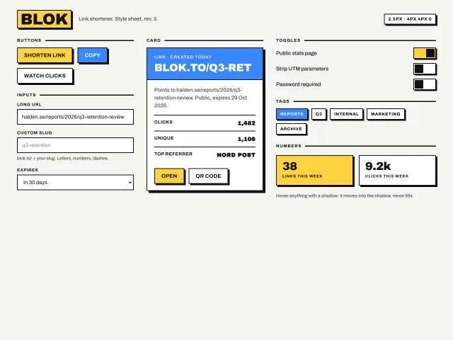
Thick 2.5px black borders, hard 4px 4px 0 offset shadows, flat yellow and blue fills, and hover that moves the element into its shadow; buttons, inputs, a card, toggles and tags.
Pricing tiers with a lifted pick
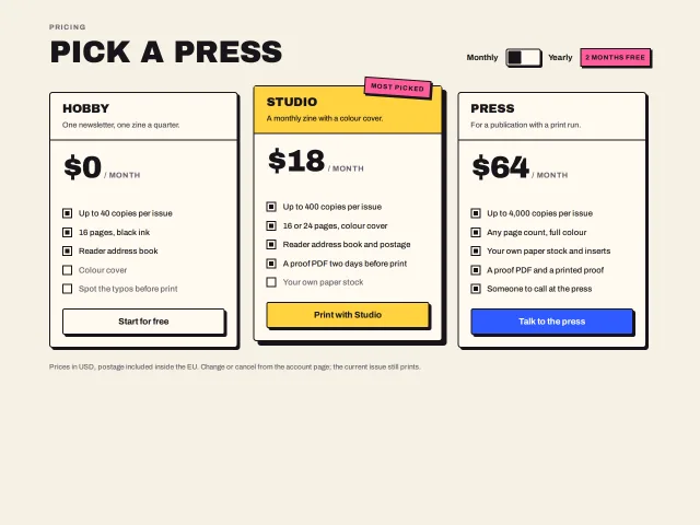
Three bordered pricing tiers with hard offset shadows; the middle one sits higher on an 8px shadow with a tilted sticker, and a square switch flips every price to yearly with a 160ms drop.
Card grid with sticker filters
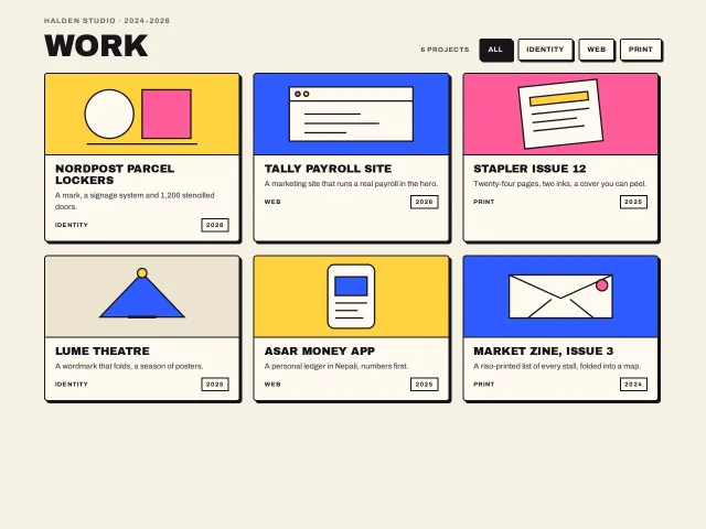
Six bordered work cards in a 3×2 grid, each with a flat colour band and a drawn mark; hover pushes a card into its shadow, and pressed filter tags hide the rest with a 160ms fade.