Nº 041 of 520
Notification center panel
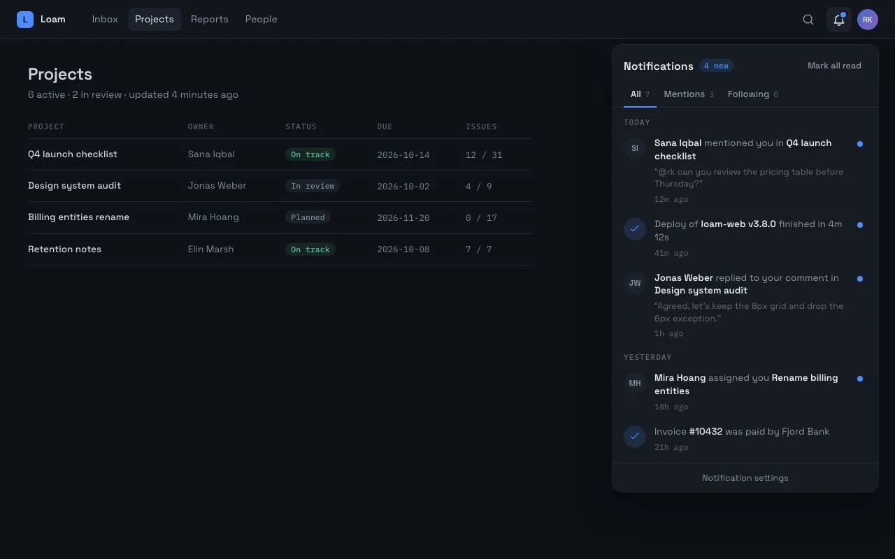
A bell with an unread dot opens a 380px top-right panel with All/Mentions/Following tabs, Today/Yesterday groups, unread dots that scale away on Mark all read, and an empty tab state.
Preview
Use it
Free to use · credit appreciated1 Once, in your project
npx skills add SusanAcharya/Design-Lounge 2 Then ask
Using the Design Lounge skill, build "Notification center panel" (piece notification-center-panel) in my stack. Match its brief; restyle it onto my product's theme.
No skill? Paste the brief instead. It carries the numbers, tokens and behaviour.
<!-- Design Lounge Nº 041 · "Notification center panel" · www.designlounge.live -->

# Notification center panel

> **Build brief for a coding agent.** Rebuild this piece in the reader's stack. If they haven't said which stack, ask once, then default to semantic HTML + CSS + a little vanilla JS. Match the numbers below; don't "improve" them.

## What it is

The notifications popover of a project tool ("Loam"). A bell in the top bar carries an 8px blue unread dot; pressing it opens a 380px panel anchored under the bell at the top-right, scaling in from its top-right corner. The panel has a header with a "4 new" count pill and a "Mark all read" action, three tabs with a sliding 2px indicator, rows grouped under mono uppercase "Today" / "Yesterday" labels, and an 8px unread dot at the right of each unread row. "Mark all read" shrinks every dot to nothing with a 30ms stagger and the bell's dot follows. The Following tab is empty and shows a small in-panel empty state. The detail worth copying is that read state is a single `data-read` attribute per row that drives the dot transition, the title weight and the accessible name.

## Reference behaviour

1. Initial state: the panel is **open** (hero frame). Top bar: brand, four nav links (Projects current), search, bell (`aria-expanded="true"`, dot visible), avatar. Behind the panel, a Projects page with a title, a summary line and a 5-column table at 90 % opacity.
2. Panel header: "Notifications" with a mono pill "4 new" in accent on `--accent-soft`; "Mark all read" text button on the right.
3. Tabs: All (7), Mentions (3), Following (0) with mono counts. The selected tab is `--ink`; a 2px accent indicator sits on the bottom border under it. Clicking a tab moves and resizes the indicator over 200ms and re-renders the list.
4. List: group label "Today" then three rows, "Yesterday" then four. Each row: 32px avatar (initials, or an accent check on `--accent-soft` for system items), text with bold actor and bold object, an optional quoted excerpt on its own line, a mono relative time ("12m ago"), and an 8px accent dot at the right when unread. Unread: rows 1–4; read: 5–7.
5. Hover a row: background `--panel-2`. Click a row: it becomes read (dot scales to 0 and fades over 240ms, bold weight drops from 600 to 500), the count pill decrements, and when it reaches 0 the pill reads "All read", the bell dot scales away and "Mark all read" is disabled.
6. Click "Mark all read": every visible unread dot scales away with a 30ms stagger by row index; the bell dot scales away; the pill reads "All read"; the button disables.
7. Click the Following tab: the list is replaced by an empty state: a 36px outline bell, "Nothing from threads you follow" (600) and one 13px explanatory line.
8. Press Escape, click outside the panel, or click the bell: the panel closes (scale .96 + translateY(−4px) + opacity 0 over 200ms); Escape returns focus to the bell. Clicking the bell again re-opens it.
9. The bell's `aria-label` always includes the unread count ("Notifications, 4 unread").

## Structure

```
1280 × 800
┌──────────────────────────────────────────────────────────────────────────┐
│ [L] Loam   Inbox  Projects  Reports  People              ⌕  🔔•  (RK)   │ top 56
├──────────────────────────────────────────────────────────────────────────┤
│ Projects                                          ┌ panel 380 ─────────┐ │ top 64, right 24
│ 6 active · 2 in review                            │ Notifications 4new │ │
│ ┌ table 720 ─────────────────────────┐            │        Mark all read│ │
│ │ PROJECT  OWNER  STATUS  DUE  ISSUES│            │ All 7  Mentions 3  Following 0 │
│ │ Q4 launch…  Sana…  On track  …     │            │ ━━━━━               │ │
│ │ Design sys… Jonas… In review …     │            │ TODAY               │ │
│ │ Billing…    Mira…  Planned   …     │            │ (SI) Sana Iqbal … • │ │
│ │ Retention…  Elin…  On track  …     │            │ (✓) Deploy of …   • │ │
│ └────────────────────────────────────┘            │ (JW) Jonas Weber… • │ │
│                                                   │ YESTERDAY           │ │
│                                                   │ (MH) Mira Hoang … • │ │

… 166 more lines. Copy or download for the full brief. Loading the source…Brief
206 linesBuild brief for a coding agent. Rebuild this piece in the reader’s stack. If they haven’t said which stack, ask once, then default to semantic HTML + CSS + a little vanilla JS. Match the numbers below; don’t “improve” them.
What it is
The notifications popover of a project tool (“Loam”). A bell in the top bar carries an 8px blue unread dot; pressing it opens a 380px panel anchored under the bell at the top-right, scaling in from its top-right corner. The panel has a header with a “4 new” count pill and a “Mark all read” action, three tabs with a sliding 2px indicator, rows grouped under mono uppercase “Today” / “Yesterday” labels, and an 8px unread dot at the right of each unread row. “Mark all read” shrinks every dot to nothing with a 30ms stagger and the bell’s dot follows. The Following tab is empty and shows a small in-panel empty state. The detail worth copying is that read state is a single data-read attribute per row that drives the dot transition, the title weight and the accessible name.
Reference behaviour
- Initial state: the panel is open (hero frame). Top bar: brand, four nav links (Projects current), search, bell (
aria-expanded="true", dot visible), avatar. Behind the panel, a Projects page with a title, a summary line and a 5-column table at 90 % opacity. - Panel header: “Notifications” with a mono pill “4 new” in accent on
--accent-soft; “Mark all read” text button on the right. - Tabs: All (7), Mentions (3), Following (0) with mono counts. The selected tab is
--ink; a 2px accent indicator sits on the bottom border under it. Clicking a tab moves and resizes the indicator over 200ms and re-renders the list. - List: group label “Today” then three rows, “Yesterday” then four. Each row: 32px avatar (initials, or an accent check on
--accent-softfor system items), text with bold actor and bold object, an optional quoted excerpt on its own line, a mono relative time (“12m ago”), and an 8px accent dot at the right when unread. Unread: rows 1–4; read: 5–7. - Hover a row: background
--panel-2. Click a row: it becomes read (dot scales to 0 and fades over 240ms, bold weight drops from 600 to 500), the count pill decrements, and when it reaches 0 the pill reads “All read”, the bell dot scales away and “Mark all read” is disabled. - Click “Mark all read”: every visible unread dot scales away with a 30ms stagger by row index; the bell dot scales away; the pill reads “All read”; the button disables.
- Click the Following tab: the list is replaced by an empty state: a 36px outline bell, “Nothing from threads you follow” (600) and one 13px explanatory line.
- Press Escape, click outside the panel, or click the bell: the panel closes (scale .96 + translateY(−4px) + opacity 0 over 200ms); Escape returns focus to the bell. Clicking the bell again re-opens it.
- The bell’s
aria-labelalways includes the unread count (“Notifications, 4 unread”).
Structure
1280 × 800
┌──────────────────────────────────────────────────────────────────────────┐
│ [L] Loam   Inbox  Projects  Reports  People              ⌕  🔔•  (RK)   │ top 56
├──────────────────────────────────────────────────────────────────────────┤
│ Projects                                          ┌ panel 380 ─────────┐ │ top 64, right 24
│ 6 active · 2 in review                            │ Notifications 4new │ │
│ ┌ table 720 ─────────────────────────┐            │        Mark all read│ │
│ │ PROJECT  OWNER  STATUS  DUE  ISSUES│            │ All 7  Mentions 3  Following 0 │
│ │ Q4 launch…  Sana…  On track  …     │            │ ━━━━━               │ │
│ │ Design sys… Jonas… In review …     │            │ TODAY               │ │
│ │ Billing…    Mira…  Planned   …     │            │ (SI) Sana Iqbal … • │ │
│ │ Retention…  Elin…  On track  …     │            │ (✓) Deploy of …   • │ │
│ └────────────────────────────────────┘            │ (JW) Jonas Weber… • │ │
│                                                   │ YESTERDAY           │ │
│                                                   │ (MH) Mira Hoang … • │ │
│                                                   │ (✓) Invoice #10432  │ │
│                                                   │ (EM) Elin Marsh …   │ │
│                                                   │ (✓) Weekly digest…  │ │
│                                                   │ ─ Notification settings ─ │
│                                                   └─────────────────────┘ │ max-h 640
└──────────────────────────────────────────────────────────────────────────┘
<header class="top">→.brand,<nav aria-label="Primary">,.rightwith two.ibtnbuttons (search, bell with.dot) and.avatar.<main class="page">→<h1>,<p>,<table>.<section class="panel" role="dialog" aria-label="Notifications">absolutely positionedtop: calc(56px + 8px); right: 24px; width: 380px; max-height: 640px, flex column:.phheader:<h2>+ count<span>;<button class="link">Mark all read..tabs[role=tablist]→ three<button role="tab" aria-selected data-f>+.indindicator span..list[role=tabpanel][aria-live=polite]scrollable; contains.grplabels and<button class="row" data-read>rows (grid-template-columns: 32px 1fr 14px), or.empty..pffooter link.
Tokens
:root {
  /* colour — cool graphite surfaces, one blue accent */
  --bg: #0e1116;
  --surface: #12161c;       /* top bar */
  --panel: #161b22;         /* popover */
  --panel-2: #1c222b;       /* hover surface, avatar bg, pills */
  --line: #262d37;
  --line-2: #333c48;
  --ink: #e6eaf0;
  --ink-2: #8b95a5;         /* row text, secondary */
  --ink-3: #5f6975;         /* group labels, times, counts */
  --accent: #4c8dff;        /* dots, indicator, pill text, focus */
  --accent-soft: rgba(76, 141, 255, .14);
  --on-accent: #06101f;
  --ok: #5fd39a;            /* "On track" pill */

  /* type */
  --font: "Space Grotesk", system-ui, sans-serif;
  --mono: "IBM Plex Mono", ui-monospace, monospace;

  /* layout */
  --h-top: 56px;
  --panel-w: 380px;
  --panel-max-h: 640px;
  --panel-gap: 8px;         /* below the top bar */
  --panel-right: 24px;
  --row-av: 32px;
  --dot: 8px;
  --r: 8px;
  --r-lg: 14px;
  --shadow: 0 20px 48px rgba(0, 0, 0, .5), 0 0 0 1px var(--line);

  /* motion */
  --t-micro: 160ms;
  --t-open: 200ms;
  --t-dot: 240ms;
  --stagger-dot: 30ms;
  --ease: cubic-bezier(.2, .7, .2, 1);
  --ease-out: cubic-bezier(.16, 1, .3, 1);
}
Typography
| Role | Family | Size | Weight | Line-height | Tracking | Case |
|---|---|---|---|---|---|---|
| Body / nav | Space Grotesk | 14px | 400 | 1.5 | 0 | sentence |
| Brand | Space Grotesk | 14px | 600 | 1.5 | −0.01em | sentence |
| Page title | Space Grotesk | 24px | 600 | 1.2 | −0.02em | sentence |
| Table header | IBM Plex Mono | 11px | 500 | 1 | +0.08em | UPPERCASE |
| Table cell | Space Grotesk | 13.5px | 400/500 | 1.5 | 0 | sentence; dates/counts in mono 12.5px |
| Panel title | Space Grotesk | 16px | 600 | 1 | 0 | sentence |
| Count pill | IBM Plex Mono | 11.5px | 500 | 1 | 0 | as is |
| Tab | Space Grotesk | 13px | 500 | 1 | 0 | sentence; count mono 11px |
| Group label | IBM Plex Mono | 11px | 500 | 1 | +0.1em | UPPERCASE |
| Row text | Space Grotesk | 13.5px | 400 | 1.4 | 0 | actor/object 600 (500 when read) |
| Row excerpt | Space Grotesk | 12.5px | 400 | 1.4 | 0 | quoted, --ink-3 |
| Row time | IBM Plex Mono | 11.5px | 400 | 1 | 0 | “12m ago” |
| Empty title | Space Grotesk | 14px | 600 | 1.5 | 0 | sentence |
Motion
| Element | Trigger | Property | From → To | Duration | Easing | Stagger |
|---|---|---|---|---|---|---|
.panel | open | opacity, transform | 0, scale(.96) translateY(−4px) → 1, none | 200ms | --ease-out | origin top right |
.panel | close | same, reversed | 200ms | --ease-out | ||
.ind | tab change | transform, width | previous → selected tab’s offsetLeft/offsetWidth | 200ms | --ease | |
.row .u dot | row read / mark all | transform, opacity | scale(1), 1 → scale(0), 0 | 240ms | --ease | --d: index × 30ms (mark all) |
bell .dot | unread → 0 | transform, opacity | 1 → 0 | 240ms | --ease | |
.row, .tab, .link, nav | hover | background / color | instant | 0 | — |
Reduced motion: every transition 1ms. Nothing loops.
States
- Bell: hover or
aria-expanded="true"→ background--panel-2, icon--ink. Dot: 8px accent with a 2px--surfacering; hidden viatransform:scale(0)(keepdisplayso it can animate). - Panel open / closed:
hiddenattribute; CSS keepsdisplay:flexand uses opacity/transform +pointer-events:nonefor the closed state. - Tab selected:
aria-selected="true", colour--ink, indicator beneath. Tab hover:--ink. Tab focus-visible: 2px accent outline, −2px offset, 6px radius. - Row unread:
data-read="false", dot visible, bold parts weight 600. Row read: dot scaled to 0, weight 500. Row hover:--panel-2. Row focus-visible: 2px accent outline inset. - Mark all read disabled: colour
--ink-3, no hover,cursor:default. - Count pill: “N new” while N > 0, “All read” at 0.
- Empty tab:
.emptyblock replaces the list content.
Accessibility
- Bell:
<button aria-label="Notifications, N unread" aria-expanded aria-controls="panel" aria-haspopup="dialog">. - Panel:
role="dialog" aria-label="Notifications"; it is non-modal (the page stays interactive), so do not trap focus. Escape closes and returns focus to the bell; outside click closes. - Tabs:
role="tablist"→role="tab"buttons witharia-selected; the list isrole="tabpanel". Add Left/Right arrow key movement between tabs in production (the demo uses click/Tab only). - Rows are
<button>s whosearia-labelstarts with “Unread.” when unread and includes actor, message and relative time, so the dot needs no text. - The list is
aria-live="polite", so switching tabs and marking read are announced without interrupting. - Contrast:
--ink-2on--panel6.5:1;--ink-3on--panel3.5:1 (used only for 11–12.5px meta);--accenton--panel5.4:1. - Hit targets: bell 36×36, tabs ≥ 40px wide × 34px tall, rows ≥ 52px tall, “Mark all read” 28px tall with 8px padding.
Responsive rules
- ≥ 1280: as specified.
- 1024–1279: unchanged; the table shrinks to 100 % width.
- 768–1023: panel
right:16px; nav links collapse into a menu button; panel max-heightcalc(100vh − 80px). - < 640: the panel becomes a full-width sheet:
left:0; right:0; top:56px; width:auto; border-radius:0 0 14px 14px; max-height: calc(100vh − 56px); transform origin top centre.
Acceptance checklist
- Panel is 380px wide, anchored
top: 64px; right: 24px,max-height: 640px, and opens withscale(.96) → 1from the top-right corner over 200ms. - The panel is open on first paint with 4 unread rows and the bell dot visible.
- Bell
aria-expandedandaria-label(with count) update on every change. - Tab indicator is 2px, accent, and slides/resizes over 200ms to the selected tab.
- Rows are grouped under “Today” and “Yesterday” mono uppercase labels.
- Unread dots are 8px accent circles; clicking a row scales its dot to 0 over 240ms and updates the count.
- “Mark all read” staggers dots by 30ms per row, hides the bell dot, sets the pill to “All read” and disables itself.
- The Following tab shows the empty state with a 36px icon, a bold title and one line.
- Escape closes the panel and focuses the bell; outside click closes it.
- Focus rings are visible on nav links, bell, tabs, rows, Mark all read and the footer link.
- Row and tab text contrast ≥ 4.5:1 on
--panel. - Reduced motion: all transitions 1ms.
Implementation notes
Animatable hidden. The hidden attribute normally sets display:none, which kills the transition. Override it and animate opacity/transform instead:
.panel { transform-origin: top right; transition: opacity var(--t-open) var(--ease-out), transform var(--t-open) var(--ease-out); }
.panel[hidden] { display: flex; opacity: 0; transform: scale(.96) translateY(-4px); pointer-events: none; }
Read state is one attribute. Let CSS handle the dot and the weight; JS only flips data-read. Stagger by index with a custom property set at render time:
.row .u { transition: transform var(--t-dot) var(--ease), opacity var(--t-dot) var(--ease); transition-delay: var(--d, 0ms); }
.row[data-read="true"] .u { transform: scale(0); opacity: 0; }
.row[data-read="true"] .t b { font-weight: 500; }markAll.addEventListener('click', () => {
list.querySelectorAll('.row').forEach(r => r.dataset.read = 'true'); // --d was set as index*30ms
items.forEach(i => i.read = true); sync();
});Indicator measured, not hard-coded. ind.style.width = tab.offsetWidth + 'px'; ind.style.transform = 'translateX(' + tab.offsetLeft + 'px)'; and re-run once document.fonts.ready resolves so the first measurement isn’t made in the fallback font.
Common mistakes: using display:none for the closed panel (no exit animation); trapping focus in a non-modal popover; re-rendering the list on Mark all read (the dots must transition, not be replaced); measuring the tab indicator before web fonts load.
Details
- Palette
- Type
- Space Grotesk · IBM Plex Mono
- Motion
- Subtle motion
- Build
- One session
- Tags
On the shelves