Nº 014 of 520
Empty state with line illustration
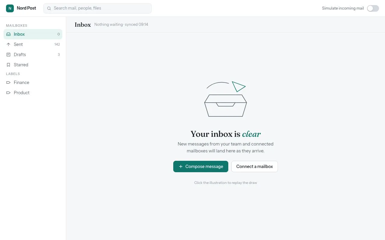
An inbox empty state whose line-drawn SVG draws itself over 1.2s, with a heading, one line of guidance, two actions and a transition into a populated list.
Preview
Use it
Free to use · credit appreciated1 Once, in your project
npx skills add SusanAcharya/Design-Lounge 2 Then ask
Using the Design Lounge skill, build "Empty state with line illustration" (piece empty-state-line-illustration) in my stack. Match its brief; restyle it onto my product's theme.
No skill? Paste the brief instead. It carries the numbers, tokens and behaviour.
<!-- Design Lounge Nº 014 · "Empty state with line illustration" · www.designlounge.live -->

# Empty state with line illustration

> **Build brief for a coding agent.** Rebuild this piece in the reader's stack. If they haven't said which stack, ask once, then default to semantic HTML + CSS + a little vanilla JS. Match the numbers below; don't "improve" them.

## What it is

The empty state of a mail inbox in a web app ("Nord Post"). Instead of a grey box that says "No items", the centre of the list area shows a 220×160 line illustration (a mail tray and a paper plane) that draws itself stroke-by-stroke over 1.2s the first time it appears, followed by a serif heading with one italic accent word, one sentence of guidance and two buttons. A switch in the header simulates incoming mail so the transition *out* of the empty state can be seen: the empty block lifts and fades, and four rows rise in with a 60ms stagger. The detail worth copying is the stroke draw: `pathLength="1"` on every path so a single `stroke-dasharray:1` animation works regardless of path length.

## Reference behaviour

1. Initial state: header (56px) with brand, a search field, and a "Simulate incoming mail" switch (off). Left folder nav (220px) with "Inbox" as the current route and count `0`. Main shows a 52px title bar ("Inbox", meta "Nothing waiting · synced 09:14") and the empty state centred in the remaining area.
2. On load the five illustration paths draw themselves. Each path animates `stroke-dashoffset` 1 → 0 over 560ms; delays are 0, 140, 300, 460 and 640ms, so the last stroke finishes at 1200ms. The paper plane path is drawn in the accent colour; everything else in `--ink-2`.
3. Below the illustration: heading "Your inbox is *clear*" (28px Fraunces, "clear" italic in accent), one sentence of guidance (15px, `--ink-2`, max-width 380px), then two buttons side by side: primary "Compose message" (filled accent with a plus icon) and secondary "Connect a mailbox" (outlined). A 12px hint line under them says "Click the illustration to replay the draw".
4. Clicking the illustration replays the draw from zero (all five paths restart with their delays).
5. Hovering the primary button darkens it to `--accent-hover`; hovering the secondary fills it with `--surface-2`. Pressing either nudges it down 1px.
6. Turning the switch **on**: the whole empty block transitions to `opacity:0; transform:translateY(-8px) scale(.98)` over 240ms, then is hidden. Four inbox rows (avatar initials, sender, subject + preview, time) appear, each animating from `opacity:0; translateY(8px)` to rest over 240ms with a 60ms per-row stagger. The Inbox count becomes `4` and the meta reads "2 unread · synced just now". Unread rows show a 6px accent dot before the sender.
7. Turning the switch **off**: rows hide immediately, the empty block is un-hidden and fades back in over 240ms, the illustration replays, the count returns to `0`.
8. The switch is a `role="switch"` button; its `aria-checked` mirrors the state.

## Structure

```
1280 × 800
┌──────────────────────────────────────────────────────────────────────────┐
│ header 56  [N] Nord Post   [search 360×34]           Simulate mail (o )  │
├────────────┬─────────────────────────────────────────────────────────────┤
│ nav 220    │ title bar 52   Inbox   Nothing waiting · synced 09:14        │
│ MAILBOXES  ├─────────────────────────────────────────────────────────────┤
│ ▌Inbox   0 │                                                             │
│  Sent  142 │                     [ illustration 220×160 ]                │
│  Drafts  3 │                                                             │
│  Starred   │                  Your inbox is clear (28px)                 │
│ LABELS     │        New messages from your team ... will land here.      │
│  Finance   │            [ Compose message ]  [ Connect a mailbox ]       │
│  Product   │                 Click the illustration to replay            │
│            │                                                             │
└────────────┴─────────────────────────────────────────────────────────────┘
```

… 162 more lines. Copy or download for the full brief. Loading the source…Brief
202 linesBuild brief for a coding agent. Rebuild this piece in the reader’s stack. If they haven’t said which stack, ask once, then default to semantic HTML + CSS + a little vanilla JS. Match the numbers below; don’t “improve” them.
What it is
The empty state of a mail inbox in a web app (“Nord Post”). Instead of a grey box that says “No items”, the centre of the list area shows a 220×160 line illustration (a mail tray and a paper plane) that draws itself stroke-by-stroke over 1.2s the first time it appears, followed by a serif heading with one italic accent word, one sentence of guidance and two buttons. A switch in the header simulates incoming mail so the transition out of the empty state can be seen: the empty block lifts and fades, and four rows rise in with a 60ms stagger. The detail worth copying is the stroke draw: pathLength="1" on every path so a single stroke-dasharray:1 animation works regardless of path length.
Reference behaviour
- Initial state: header (56px) with brand, a search field, and a “Simulate incoming mail” switch (off). Left folder nav (220px) with “Inbox” as the current route and count
0. Main shows a 52px title bar (“Inbox”, meta “Nothing waiting · synced 09:14”) and the empty state centred in the remaining area. - On load the five illustration paths draw themselves. Each path animates
stroke-dashoffset1 → 0 over 560ms; delays are 0, 140, 300, 460 and 640ms, so the last stroke finishes at 1200ms. The paper plane path is drawn in the accent colour; everything else in--ink-2. - Below the illustration: heading “Your inbox is clear” (28px Fraunces, “clear” italic in accent), one sentence of guidance (15px,
--ink-2, max-width 380px), then two buttons side by side: primary “Compose message” (filled accent with a plus icon) and secondary “Connect a mailbox” (outlined). A 12px hint line under them says “Click the illustration to replay the draw”. - Clicking the illustration replays the draw from zero (all five paths restart with their delays).
- Hovering the primary button darkens it to
--accent-hover; hovering the secondary fills it with--surface-2. Pressing either nudges it down 1px. - Turning the switch on: the whole empty block transitions to
opacity:0; transform:translateY(-8px) scale(.98)over 240ms, then is hidden. Four inbox rows (avatar initials, sender, subject + preview, time) appear, each animating fromopacity:0; translateY(8px)to rest over 240ms with a 60ms per-row stagger. The Inbox count becomes4and the meta reads “2 unread · synced just now”. Unread rows show a 6px accent dot before the sender. - Turning the switch off: rows hide immediately, the empty block is un-hidden and fades back in over 240ms, the illustration replays, the count returns to
0. - The switch is a
role="switch"button; itsaria-checkedmirrors the state.
Structure
1280 × 800
┌──────────────────────────────────────────────────────────────────────────┐
│ header 56  [N] Nord Post   [search 360×34]           Simulate mail (o )  │
├────────────┬─────────────────────────────────────────────────────────────┤
│ nav 220    │ title bar 52   Inbox   Nothing waiting · synced 09:14        │
│ MAILBOXES  ├─────────────────────────────────────────────────────────────┤
│ ▌Inbox   0 │                                                             │
│  Sent  142 │                     [ illustration 220×160 ]                │
│  Drafts  3 │                                                             │
│  Starred   │                  Your inbox is clear (28px)                 │
│ LABELS     │        New messages from your team ... will land here.      │
│  Finance   │            [ Compose message ]  [ Connect a mailbox ]       │
│  Product   │                 Click the illustration to replay            │
│            │                                                             │
└────────────┴─────────────────────────────────────────────────────────────┘<header>— flex row:.brand(26px accent square + name),.search(360×34, decorative),.simpushed right with<label>+<button role="switch">.<nav aria-label="Folders">— two<h6>group headings,<a>rows 34px tall with 16px icons and right-aligned counts.<main>—.bar(52px,<h1>+ meta) then.stage(position:relative; flex:1).<section class="empty" aria-labelledby>— absolutely fills.stage, flex column centred. Contains the<svg class="art" role="img">,<h2>,<p>,.actions(two<button>s) and.hint.<ul class="list" hidden aria-live="polite">— populated rows; each<li class="row">is a 4-column grid36px 200px 1fr 64px, 56px tall.
Tokens
:root {
  /* colour — cool light neutrals, one teal accent */
  --bg: #f6f7f9;            /* page */
  --surface: #ffffff;       /* header, nav, hovered rows */
  --surface-2: #f0f2f5;     /* hover surface */
  --line: #e3e6eb;          /* hairlines */
  --line-2: #d3d7de;        /* switch track, secondary button border */
  --ink: #1b1f26;           /* primary text */
  --ink-2: #5b6472;         /* secondary text, illustration strokes */
  --ink-3: #8a92a0;         /* meta, counts, hint */
  --accent: #0f766e;        /* primary button, plane, current route, dots */
  --accent-hover: #0c5f59;
  --accent-soft: #e6f4f1;   /* current-route background, avatar tint */
  --on-accent: #ffffff;

  /* type */
  --serif: "Fraunces", Georgia, serif;
  --sans: "Instrument Sans", system-ui, sans-serif;

  /* layout */
  --w-side: 220px;
  --h-top: 56px;
  --h-bar: 52px;
  --row-h: 56px;
  --art-w: 220px;
  --art-h: 160px;
  --r: 8px;
  --r-lg: 12px;

  /* motion */
  --t-micro: 160ms;
  --t-layout: 240ms;
  --t-draw: 1200ms;         /* total illustration draw */
  --t-stroke: 560ms;        /* one path */
  --stagger-row: 60ms;
  --ease: cubic-bezier(.2, .7, .2, 1);
  --ease-out: cubic-bezier(.16, 1, .3, 1);
}
Typography
| Role | Family | Size | Weight | Line-height | Tracking | Case |
|---|---|---|---|---|---|---|
| Body / nav | Instrument Sans | 14px | 400 | 1.5 | 0 | sentence |
| Brand | Instrument Sans | 14px | 600 | 1.5 | −0.01em | sentence |
| Nav group heading | Instrument Sans | 11px | 500 | 1 | +0.08em | UPPERCASE |
| Page title (h1) | Fraunces | 20px | 500 | 1 | −0.01em | sentence |
| Empty heading | Fraunces | 28px | 500 | 1.2 | −0.015em | sentence, one italic word in --accent |
| Guidance | Instrument Sans | 15px | 400 | 1.5 | 0 | sentence |
| Button | Instrument Sans | 14px | 500 | 1 | 0 | sentence |
| Hint / meta | Instrument Sans | 12–13px | 400 | 1.5 | 0 | sentence |
| Row sender | Instrument Sans | 14px | 600 | 1.5 | 0 | sentence |
| Row time | Instrument Sans | 12px | 400 | 1.5 | 0 | numerals |
| Avatar initials | Instrument Sans | 12px | 600 | 1 | 0 | UPPERCASE |
Load Fraunces with opsz 9..144 and both roman and italic at weight 500 so the italic accent word is a true italic.
Motion
| Element | Trigger | Property | From → To | Duration | Easing | Delay / stagger |
|---|---|---|---|---|---|---|
.art path (×5) | mount / click replay | stroke-dashoffset | 1 → 0 | 560ms | --ease-out | 0, 140, 300, 460, 640ms |
.empty | switch on | opacity, transform | 1, none → 0, translateY(−8px) scale(.98) | 240ms | --ease | none; hidden set after 240ms |
.empty | switch off | opacity, transform | 0 → 1, none | 240ms | --ease | next frame after unhiding |
.row (×4) | list shown | opacity, translateY | 0, 8px → 1, 0 | 240ms | --ease-out | calc(var(--i) * 60ms) |
.switch::after | toggle | translateX | 0 → 18px | 160ms | --ease | track colour on same clock |
.btn | hover / active | background / translateY | — / 0 → 1px | 160ms | --ease |
Reduced motion: stroke animations run 1ms with zero delay (illustration appears fully drawn), rows appear at once, all transitions 1ms. The click-to-replay still “works” (it re-renders instantly).
States
- Nav link hover: background
--surface-2, text--ink. - Nav current route:
aria-current="page", background--accent-soft, text--accent, weight 500. - Nav / button / switch focus-visible: 2px
--accentoutline; nav links useoutline-offset:-2px, buttons and switch+2px. - Primary button hover:
--accent-hoverfill and border. Secondary hover:--surface-2fill. - Button active:
translateY(1px). - Switch on: track
--accent, knob attranslateX(18px). - Row hover: background
--surface. Unread row: 6px accent dot inline before the sender name. - Empty (the piece itself): as described; populated: empty block hidden, list visible, count and meta updated.
Accessibility
- The illustration is
<svg role="img" aria-label="An empty mail tray with a paper plane flying away. Click to replay the drawing.">. Because it is clickable, also make it keyboard reachable in production (tabindex="0"+ Enter/Space → replay) or move the replay onto the hint as a real button. - The empty section is
<section aria-labelledby="eh">whereehis the<h2>id. - The list is
aria-live="polite"so the four rows are announced when they arrive; the folder count next to “Inbox” also updates in the DOM. - The switch is
<button role="switch" aria-checked>with a visible<label for>; Space and Enter toggle it. - Focus order: brand → switch → nav links → primary button → secondary button. All have visible rings.
- Contrast:
--ink-2on--bgis 6.4:1;--ink-3(8.0px+ meta) on--bgis 3.6:1 and only used at ≥ 12px for non-essential text;--on-accenton--accentis 5.9:1. - Hit targets: buttons 38px tall; switch 40×22 visual with a 40×40 hit area through the surrounding label row.
Responsive rules
- ≥ 1280: as specified.
- 1024–1279: nav collapses to 64px icon rail; the search shrinks to 260px; empty state unchanged.
- 768–1023: nav becomes a drawer behind a menu button; row grid becomes
36px 1fr 64pxwith subject under sender on a second line (row height 64px). - < 640: illustration scales to 176×128; heading 24px; the two actions stack vertically at full width (max 320px); hint hidden.
Acceptance checklist
- Every illustration path has
pathLength="1"and animatesstroke-dashoffset1 → 0 over 560ms. - Path delays are 0/140/300/460/640ms so the drawing completes at exactly 1200ms.
- The paper-plane path is stroked in
--accent; all other paths in--ink-2; stroke width 1.75, round caps and joins. - Heading is 28px Fraunces with one italic accent word; guidance is 15px
--ink-2capped at 380px. - Clicking the illustration restarts the draw from zero (not from mid-way).
- Turning the switch on fades and lifts the empty block over 240ms before rows appear.
- Rows rise with a 60ms stagger and the Inbox count updates to 4.
- Turning the switch off restores the empty state and replays the draw.
-
role="switch"+aria-checkedon the toggle;aria-live="polite"on the list. - Focus rings are visible on nav links, both buttons and the switch.
- Under
prefers-reduced-motion: reducethe illustration is fully drawn on first paint. - Nothing in the empty state is clipped at 1024×640 (−20%).
Implementation notes
Normalised stroke draw. Use pathLength="1" so every path, however long, shares one keyframe. Stagger with nth-child delays rather than per-path JS:
.art path { fill: none; stroke: currentColor; stroke-width: 1.75; stroke-linecap: round;
  stroke-dasharray: 1; stroke-dashoffset: 1;
  animation: draw var(--t-stroke) var(--ease-out) forwards; }
.art path:nth-child(2) { animation-delay: 140ms; }
.art path:nth-child(3) { animation-delay: 300ms; }
.art path:nth-child(4) { animation-delay: 460ms; }
.art path:nth-child(5) { animation-delay: 640ms; }
@keyframes draw { to { stroke-dashoffset: 0; } }
Replaying a CSS animation. Removing and re-adding a class in the same frame does nothing; the cheapest reliable restart is to clone the SVG and swap it in (re-attach the click listener on the clone):
function replay() {
  const fresh = art.cloneNode(true);
  art.replaceWith(fresh); art = fresh;
  art.addEventListener('click', replay);
}
Leaving before arriving. Hide the empty block only after its 240ms exit finishes, then render the rows so their staggered rise starts on an empty stage:
empty.classList.add('out');
setTimeout(() => { empty.hidden = true; renderRows(); list.hidden = false; }, 240);
Common mistakes: forgetting pathLength and hard-coding dash lengths per path; using display:none on the empty block before the transition ends; animating rows with transition (they need animation because they are freshly inserted); not restarting the draw when returning to empty.
Details
- Palette
- Type
- Fraunces · Instrument Sans
- Motion
- Subtle motion
- Build
- One session
- Tags
On the shelves