Nº 499 of 520
M3 list to detail with predictive back
An Android Material 3 list that opens a detail screen with a container transform, a small top app bar with back, and a predictive back swipe that reverses it.
Preview
Use it
Free to use · credit appreciated1 Once, in your project
npx skills add SusanAcharya/Design-Lounge 2 Then ask
Using the Design Lounge skill, build "M3 list to detail with predictive back" (piece m3-list-detail) in my stack. Match its brief; restyle it onto my product's theme.
No skill? Paste the brief instead. It carries the numbers, tokens and behaviour.
<!-- Design Lounge Nº 499 · "M3 list to detail with predictive back" · www.designlounge.live -->

# M3 list to detail with predictive back

> **Build brief for a coding agent.** Rebuild this piece in the reader's stack. If they haven't said which stack, ask once, then default to semantic HTML + CSS + a little vanilla JS. Match the numbers below; don't "improve" them.

## What it is

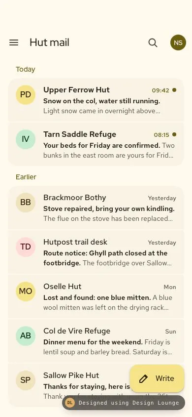
The inbox of Hutpost, an invented app where mountain huts message the walkers who booked with them. It is a **Material 3 Expressive** list to detail flow on Android: a segmented list of three-line M3 list items (40px initial avatar, headline, two-line supporting text, trailing time) grouped under "Today" and "Earlier". Tapping an item grows that item's container into the full detail screen (container transform, 500ms), which has a small top app bar with a back arrow. System back reverses the same morph back into the exact item. Back can be a tap on the arrow, Escape, or an Android **predictive back** swipe from the left edge, where the detail shrinks and rounds under the finger before you commit. The colour is an ochre tonal scheme seeded from `#6c5e10`. The detail worth copying is that open, close, and the back gesture all share one container: the gesture's end state is the start of the close animation, so nothing jumps.

## Reference behaviour

1. Initial state: the list screen. Small top app bar (menu icon, "Hut mail", search icon, 32px account avatar). Section label "Today" with two unread items, "Earlier" with five read items. An extended FAB "Write" sits bottom right.
2. Unread items have a 600 weight headline, a `--primary` 600 weight time, and an 8px `--primary` dot after the time.
3. Press an item: ripple from the pointer, state layer, and the item's corners morph to 20px while pressed.
4. Release (or Enter / Space on a focused item):
   - The item is marked read (weight, dot and label update).
   - The detail screen is filled with that item's data, made visible, and clipped to the item's rectangle with `clip-path: inset(top right bottom left round 16px)`.
   - A clone of the item (the ghost) is placed in the detail screen at the same rect. The original item gets `visibility: hidden`.
   - The clip animates to `inset(0 round 0)` over 500ms `cubic-bezier(.2,0,0,1)`. Background animates `--surface-cl` → `--surface`.
   - The ghost fades 1 → 0 over the first 150ms. The detail content holds at opacity 0 for the first 30% (150ms), then fades in while sliding up from 25% of the item's distance below the top bar.
   - The FAB scales to 0.6 and fades out (250ms).
   - On finish, focus moves to the back arrow and a live region says "Opened <subject>".
5. Detail screen: small top app bar (back arrow, hut name as title, archive, more). Then a 28/36 subject, a sender row (40px avatar, name, "to you · 09:42"), two paragraphs, a 24px radius card with a key fact and two buttons (filled "Reply", tonal action), and an "About this hut" segmented list (altitude, sleeps, open season).
6. Scrolling the detail more than 4px tints its top app bar to `--surface-c` (200ms). The list bar does the same.
7. **Back**, by back arrow, Escape, or Alt + Left:
   - The ghost is re-created at the item's current rect, opacity 0. If the item is off screen, it is scrolled to centre first.
   - The clip animates from full screen to the item's rect over 400ms `cubic-bezier(.2,0,0,1)`, background back to `--surface-cl`.
   - Detail content fades to 0 by 35%. The ghost holds at 0 until 45%, then fades in to 1.
   - On finish: detail hidden, item visible again, FAB returns, focus goes back to the item, live region says "Back to Hut mail".
8. **Predictive back**: press within 32px of the left edge of the detail (not on a button) and drag right.
   - Progress p = drag distance / 220px, clamped 0 to 1.
   - Detail: `translateX(-8p px) scale(1 - 0.1p)` with `transform-origin: 100% 50%`, clip radius `32p px`. List behind darkens with `brightness(1 - 0.12p)`.
   - A 36px circular back arrow chip follows the finger's y at the left edge, sliding in 56px and fading in by p = 0.33.
   - Release with p > 0.3: commits. The close animation starts from the current scale, offset and radius, so it continues from where the finger left it.
   - Release with p ≤ 0.3: cancels, springing back to full screen over 200ms.
9. A second open or close during an animation is ignored.
10. Tapping icons, the FAB, "Reply" or the tonal action shows a snackbar explaining what would open.

## Structure

… 204 more lines. Copy or download for the full brief. Loading the source…Brief
244 linesBuild brief for a coding agent. Rebuild this piece in the reader’s stack. If they haven’t said which stack, ask once, then default to semantic HTML + CSS + a little vanilla JS. Match the numbers below; don’t “improve” them.
What it is
The inbox of Hutpost, an invented app where mountain huts message the walkers who booked with them. It is a Material 3 Expressive list to detail flow on Android: a segmented list of three-line M3 list items (40px initial avatar, headline, two-line supporting text, trailing time) grouped under “Today” and “Earlier”. Tapping an item grows that item’s container into the full detail screen (container transform, 500ms), which has a small top app bar with a back arrow. System back reverses the same morph back into the exact item. Back can be a tap on the arrow, Escape, or an Android predictive back swipe from the left edge, where the detail shrinks and rounds under the finger before you commit. The colour is an ochre tonal scheme seeded from #6c5e10. The detail worth copying is that open, close, and the back gesture all share one container: the gesture’s end state is the start of the close animation, so nothing jumps.
Reference behaviour
- Initial state: the list screen. Small top app bar (menu icon, “Hut mail”, search icon, 32px account avatar). Section label “Today” with two unread items, “Earlier” with five read items. An extended FAB “Write” sits bottom right.
- Unread items have a 600 weight headline, a
--primary600 weight time, and an 8px--primarydot after the time. - Press an item: ripple from the pointer, state layer, and the item’s corners morph to 20px while pressed.
- Release (or Enter / Space on a focused item):
- The item is marked read (weight, dot and label update).
- The detail screen is filled with that item’s data, made visible, and clipped to the item’s rectangle with
clip-path: inset(top right bottom left round 16px). - A clone of the item (the ghost) is placed in the detail screen at the same rect. The original item gets
visibility: hidden. - The clip animates to
inset(0 round 0)over 500mscubic-bezier(.2,0,0,1). Background animates--surface-cl→--surface. - The ghost fades 1 → 0 over the first 150ms. The detail content holds at opacity 0 for the first 30% (150ms), then fades in while sliding up from 25% of the item’s distance below the top bar.
- The FAB scales to 0.6 and fades out (250ms).
- On finish, focus moves to the back arrow and a live region says “Opened
”.
- Detail screen: small top app bar (back arrow, hut name as title, archive, more). Then a 28/36 subject, a sender row (40px avatar, name, “to you · 09:42”), two paragraphs, a 24px radius card with a key fact and two buttons (filled “Reply”, tonal action), and an “About this hut” segmented list (altitude, sleeps, open season).
- Scrolling the detail more than 4px tints its top app bar to
--surface-c(200ms). The list bar does the same. - Back, by back arrow, Escape, or Alt + Left:
- The ghost is re-created at the item’s current rect, opacity 0. If the item is off screen, it is scrolled to centre first.
- The clip animates from full screen to the item’s rect over 400ms
cubic-bezier(.2,0,0,1), background back to--surface-cl. - Detail content fades to 0 by 35%. The ghost holds at 0 until 45%, then fades in to 1.
- On finish: detail hidden, item visible again, FAB returns, focus goes back to the item, live region says “Back to Hut mail”.
- Predictive back: press within 32px of the left edge of the detail (not on a button) and drag right.
- Progress p = drag distance / 220px, clamped 0 to 1.
- Detail:
translateX(-8p px) scale(1 - 0.1p)withtransform-origin: 100% 50%, clip radius32p px. List behind darkens withbrightness(1 - 0.12p). - A 36px circular back arrow chip follows the finger’s y at the left edge, sliding in 56px and fading in by p = 0.33.
- Release with p > 0.3: commits. The close animation starts from the current scale, offset and radius, so it continues from where the finger left it.
- Release with p ≤ 0.3: cancels, springing back to full screen over 200ms.
- A second open or close during an animation is ignored.
- Tapping icons, the FAB, “Reply” or the tonal action shows a snackbar explaining what would open.
Structure
390 × 844 list                              390 × 844 detail
┌────────────────────────────────────┐      ┌────────────────────────────────────┐
│ 54 safe area                       │      │ 54 safe area                       │
│ [≡] Hut mail              [⌕] (NS) │ 64   │ [←] Tarn Saddle Refuge     [▤] [⋮] │ 64
│   Today                    14/20   │      │  Your beds for Friday are   28/36  │
│ ╭────────────────────────────────╮ │      │  confirmed                         │
│ │(PD) Upper Ferrow Hut  09:42 •  │ │ 88   │  (IV) Ilse Varga                   │ sender 40
│ │     Snow on the col. Light…    │ │      │       to you · 08:15               │
│ ├────────────────────────────────┤ │ 2    │  Paragraph, 16/26                  │
│ │(IV) Tarn Saddle Refuge 08:15 • │ │      │  Paragraph                         │
│ ╰────────────────────────────────╯ │      │ ╭────────────────────────────────╮ │
│   Earlier                          │      │ │ CHECK IN                       │ │ card radius 24
│ ╭ (BB) Brackmoor Bothy  Yesterday ╮│      │ │ Fri 9 Oct from 15:00           │ │
│ │ … five items, 2px gaps …        ││      │ │ (Reply) (Add to calendar)      │ │ 48 tall
│ ╰─────────────────────────────────╯│      │ ╰────────────────────────────────╯ │
│                        ( ✎ Write ) │ 56   │   About this hut                   │
│ 34 home indicator                  │      │ ╭ ⛰ 2,210 m            Altitude ╮ │ 56 rows
└────────────────────────────────────┘      └────────────────────────────────────┘
List margins 16px; item padding 12px 16px; first item corners 20 20 4 4, last 4 4 20 20, middle 4.- The two screens are sibling
sections, bothposition: absolute; inset: 0, flex columns of a top bar and a scroll area. The detail sits above withz-index: 2. - List:
ul > li > button.item. Each button has anaria-labelof hut, subject, time and “unread”. - Detail:
h2holds the hut name in the bar; the subject is a paragraph under it. “About this hut” is aullabelled by its section heading. - While the detail is open the list gets
aria-hidden="true"andinert. While closed the detail isvisibility: hiddenandaria-hidden="true". - The ghost is a cloned item with
aria-hidden="true",pointer-events: none, positioned withposition: absoluteat the measured rect.
Tokens
:root {
  /* M3 scheme from seed #6c5e10 (light) */
  --primary: #6c5e10;
  --on-primary: #ffffff;
  --primary-c: #f6e388;        /* FAB, avatar tone 1 */
  --on-primary-c: #221b00;
  --secondary-c: #efe2bc;      /* tonal button, avatar tone 3 */
  --on-secondary-c: #221b04;
  --tertiary-c: #c5ecce;       /* avatar tone 2 */
  --on-tertiary-c: #00210f;
  --error-c: #ffdad6;          /* avatar tone 4, trail desk */
  --on-error-c: #410002;
  --surface: #fff9ee;          /* screens */
  --surface-cl: #f9f3e5;       /* list items, fact rows */
  --surface-c: #f3ecdc;        /* scrolled top bar, card */
  --surface-ch: #ede6d6;       /* predictive back chip */
  --on-surface: #1e1c13;
  --on-surface-v: #4b4739;
  --outline-v: #cdc6b4;

  --display: "Red Hat Display", system-ui, sans-serif;
  --text: "Red Hat Text", system-ui, sans-serif;

  --radius-item: 4px;
  --radius-group: 20px;
  --radius-clip: 16px;         /* clip corner at the item end of the morph */
  --radius-card: 24px;
  --radius-fab: 16px;
  --target: 48px;

  --emph: cubic-bezier(.2, 0, 0, 1);
  --emph-d: cubic-bezier(.05, .7, .1, 1);
  --d-open: 500ms;
  --d-close: 400ms;
  --d-cancel: 200ms;
  --d-ghost-out: 150ms;
  --back-distance: 220px;      /* drag for p = 1 */
  --back-commit: .3;
}
Typography
| Role (M3 scale) | Family | Size / line | Weight | Tracking | Colour |
|---|---|---|---|---|---|
| Title large (bar title) | Red Hat Display | 22 / 28 | 500 | 0 | --on-surface |
| Headline (detail subject) | Red Hat Display | 28 / 36 | 600 | -0.01em | --on-surface |
| Title small (section label) | Red Hat Display | 14 / 20 | 600 | 0.01em | --primary |
| List headline | Red Hat Text | 16 / 24 | 500, unread 600 | 0 | --on-surface |
| List supporting | Red Hat Text | 14 / 20 | 400, subject 600 | 0.01em | --on-surface-v |
| Trailing meta | Red Hat Text | 12 / 16 | 500, unread 600 | 0.03em | --on-surface-v, unread --primary |
| Body (message) | Red Hat Text | 16 / 26 | 400 | 0 | --on-surface |
| Card label | Red Hat Display | 12 / 16 uppercase | 600 | 0.06em | --primary |
| Card value | Red Hat Display | 18 / 26 | 500 | 0 | --on-surface |
| Button / FAB label | Red Hat Display | 15 / 20, FAB 16 / 24 | 500 | 0 | per button |
| Avatar initials | Red Hat Display | 16 | 600 | 0 | on-container tone |
Motion
| Thing | Trigger | Property | From → to | Duration | Easing / timing | Reduced motion |
|---|---|---|---|---|---|---|
| Container (open) | tap item | clip-path, bg | item rect r16 → inset 0 r0; #f9f3e5 → #fff9ee | 500ms | --emph | 150ms opacity fade |
| Ghost (open) | tap item | opacity | 1 → 0 | 150ms | linear | none |
| Detail content (open) | tap item | opacity, translateY | 0 held to 30%, then 1; offset → 0 | 500ms | --emph | none |
| Container (close) | back | clip-path, transform, bg | full (or gesture state) → item rect | 400ms | --emph | 150ms opacity fade |
| Detail content (close) | back | opacity | 1 → 0 by 35% | 400ms | --emph | none |
| Ghost (close) | back | opacity | 0 held to 45%, then 1 | 400ms | --emph | none |
| Predictive back | drag | transform, clip radius | scale 1 → 0.9, x 0 → -8, r 0 → 32 | follows finger | none | still works, no animation on commit |
| Back cancel | release p ≤ .3 | transform, clip | current → identity | 200ms | --emph | 1ms |
| FAB | open / close | scale, opacity | 1 → 0.6, 1 → 0 | 250ms / 200ms | --emph | 1ms |
| Item press | press | border-radius | 4 → 20 | 200ms | --emph | 1ms |
| Top bar | scroll > 4px | background | surface → surface-c | 200ms | --emph | 1ms |
| Ripple | pointerdown | scale, opacity | 0 → 1, .1 → 0 | 450 + 200ms | --emph | off |
States
- Item resting:
--surface-cl, group corner rules. - Item hover / focus / pressed:
--on-surfacestate layer at 8 / 10 / 10%. Pressed also rounds to 20px. - Item unread: headline 600, time
--primary600, 8px dot. Opening marks it read; the state persists for the session. - Item opened: invisible while its detail is open (the ghost and container stand in for it).
- Top bar scrolled:
--surface-c. - Back in progress: detail scaled and rounded, list dimmed, edge chip visible.
- Focus-visible: 3px
--primaryoutline, 2px offset. - Empty: when a section has no items, hide its label. When the whole inbox is empty, show a centred 16/24 line “No messages from your huts yet” with the FAB still visible. (Not drawn in this demo.)
- Error: when a message fails to load, the detail shows the top bar and a single line “This message did not load” with a tonal “Try again” button in place of the body. (Not drawn in this demo.)
Accessibility
- Each list item is a
buttonwhosearia-labelreads hut, subject, time and “unread”, so a screen reader hears one clean sentence instead of the clamped preview text. The avatar isaria-hidden. - Detail back button:
aria-label="Back to Hut mail". It receives focus when the open finishes. On close, focus returns to the item that opened it. - While open, the list is
inertandaria-hidden, so Tab stays in the detail. - Keyboard back: Escape and Alt + Left. Platform back on Android must call the same
close(). - The predictive back gesture is an enhancement; every route back is also a button or a key.
- A polite live region announces “Opened
” and “Back to Hut mail”. - Hit targets: icon buttons 48×48, list items 88 min-height full width, buttons 48 tall, FAB 56.
- Contrast:
--on-surface-von--surface-clis above 7:1;--primary#6c5e10on--surfaceis above 5:1 for the 14px section labels. - Reduced motion: the morph is replaced by a 150ms opacity fade in both directions; focus and announcements are unchanged.
Responsive rules
- Frame 390×844. Top clearance
max(54px, env(safe-area-inset-top)), FAB bottommax(34px, env(safe-area-inset-bottom)) + 16px. The list’s last spacer is 120px so the FAB never covers the last item. - The clip is computed from
getBoundingClientRect()andinnerWidth / innerHeighteach time, so it is correct at any size and after scrolling. - At 360 wide, headlines truncate with an ellipsis on one line and the supporting text clamps to two lines; the time never truncates.
- At the largest font scale: items use
min-height: 88pxand grow; drop the two-line clamp to three lines; the time moves under the headline when the headline would truncate below 12 characters; the detail’s “About this hut” rows stack the label above the value; card buttons wrap onto two rows (flex-wrap: wrap). - At tablet width (≥ 840px) use the M3 list-detail canonical layout instead: list pane 360px and detail pane side by side, no container transform, the selected item gets
--secondary-c.
Acceptance checklist
Always
- List items follow M3 three-line anatomy: 40px leading avatar, headline, two-line supporting text, trailing meta, 88px min-height.
- Opening morphs the tapped item’s own rectangle into the full screen; nothing slides in from the side.
- Item content fades out before detail content fades in (fade-through, no overlap of both at full opacity).
- Detail has an M3 small top app bar, 64px, with a 48px back arrow.
- Back (arrow, Escape, platform back) runs the reverse morph into the item’s current rect.
- Predictive back: from the left edge, the detail scales to 0.9 and rounds to 32px as you drag; commit above 30%, cancel below.
- Commit continues from the gesture state; no jump back to full size first.
- Focus goes to back on open and returns to the item on close; the list is inert while the detail is open.
- Ignore input during an animation.
- Reduced motion uses a short fade.
This demo
- Ochre scheme seeded from
#6c5e10; screens#fff9ee, items#f9f3e5. - Red Hat Display for titles and labels, Red Hat Text for list and body text.
- Seven messages: two unread under “Today”, five under “Earlier”.
- Open 500ms, close 400ms, cancel 200ms, all
cubic-bezier(.2,0,0,1). - Tarn Saddle Refuge opens “Your beds for Friday are confirmed” with a “Check in” card.
Implementation notes
Clip, don’t resize. Animating clip-path on a full-screen detail keeps its layout fixed, so text never reflows mid-morph. Compute the inset from the item rect:
const clipOf = el => {
  const r = el.getBoundingClientRect();
  return `inset(${r.top}px ${innerWidth - r.right}px ${innerHeight - r.bottom}px ${r.left}px round 16px)`;
};
detail.animate(
  [{ clipPath: clipOf(item), backgroundColor: '#f9f3e5' }, { clipPath: 'inset(0px 0px 0px 0px round 0px)', backgroundColor: '#fff9ee' }],
  { duration: 500, easing: 'cubic-bezier(.2,0,0,1)' });
Both keyframes must use the same inset() form with the same units, or the browser will not interpolate.
Gesture state is the close’s first keyframe. Keep p from the drag and start the close there:
const s = 1 - .1 * p;
detail.animate([
  { clipPath: `inset(0px 0px 0px 0px round ${32 * p}px)`, transform: `translateX(${-8 * p}px) scale(${s})` },
  { clipPath: clipOf(item), transform: 'none' }
], { duration: 400, easing: 'cubic-bezier(.2,0,0,1)' });
Edge zone and buttons. The back arrow sits inside the 32px edge zone. Skip the gesture when e.target.closest('button'), otherwise pointer capture swallows the arrow’s click. Call preventDefault() on the gesture’s pointerdown so the drag does not select text.
On Android, wire close(p) to OnBackPressedCallback.handleOnBackProgressed / handleOnBackPressed (or Compose PredictiveBackHandler) so the system gesture drives the same values.
Common mistakes:
- Sliding the detail in from the right. That is iOS push, not M3.
- Animating
width/height/top/leftof the detail, which reflows every frame and stutters. - Closing to the rect measured at open time. Measure again; the list may have scrolled.
- Leaving the list focusable under the detail.
- Scaling the predictive back preview from the centre; M3 anchors it to the side away from the swipe.
- A navigation bar under this list. This screen’s only bottom element is the FAB.
Details
- Palette
- Type
- Red Hat Display · Red Hat Text
- Motion
- Rich motion
- Build
- Multi-step
- Tags
On the shelves