Nº 047 of 677
Optimistic like button
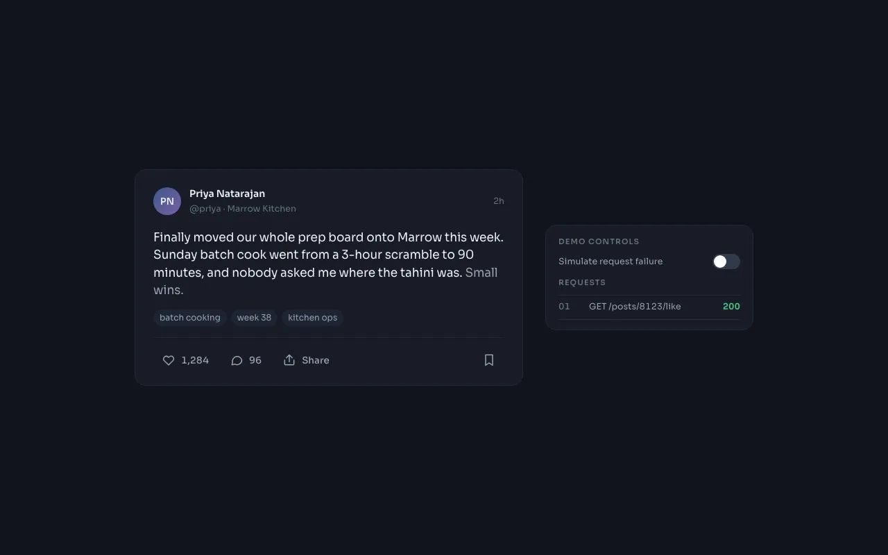
A heart that fills with a scale bounce and an 8-particle CSS burst, increments the count instantly, and shows an undo toast with a 5s rollback when the fake request fails.
Preview
Use it
Free to use · credit appreciated1 Once, in your project · Node 22.20+
npx skills add SusanAcharya/Design-Lounge 2 Then ask
Using the Design Lounge skill, build "Optimistic like button" (piece optimistic-like-button) in my stack. Match its brief; restyle it onto my product's theme.
No skill? Paste the brief instead. It carries the numbers, tokens and behaviour.
<!-- Design Lounge Nº 047 · "Optimistic like button" · www.designlounge.live -->

# Optimistic like button

> **Build brief for a coding agent.** Rebuild this piece in the reader's stack. If they haven't said which stack, ask once, then default to semantic HTML + CSS + a little vanilla JS. Match the numbers below; don't "improve" them.

## What it is

A like button on a social post card (product: "Marrow", a kitchen-ops app) that behaves optimistically: the UI commits first and asks the server second. The heart fills coral with a 420ms overshoot bounce and eight tiny particles fly outward (pure CSS, no canvas); the count ticks up on the same frame. A fake request resolves 700ms later. If a "Simulate request failure" switch is on, the request logs a 503 and a dark toast slides up offering **Undo**; if the user does nothing, a 3px progress bar drains over 5s and the like rolls back automatically. The detail worth copying is that failure does not snatch the like away instantly: the optimistic state is kept, explained, and reversible.

## Reference behaviour

1. Initial state: a 560px post card (avatar initials, name, handle, "2h", a two-line post, three pill tags, an action row: heart 1,284 · comment 96 · Share · save). To the right, a 300px "Demo controls" panel with the failure switch (off) and a request log seeded with `01 GET /posts/8123/like 200`.
2. Hover the like button: background `--heart-soft`, icon and count turn `--heart`. Other actions hover to `--card-2` / `--ink`.
3. Click like: on the same frame the heart fills (`fill` + `stroke` → `--heart`), scale-bounces (1 → 1.35 → .9 → 1.08 → 1 over 420ms), eight particles emit from the heart centre at 45° increments travelling 26px outward while shrinking to 20 % and fading over 520ms (odd particles coral 4px, even particles amber 3px), the count becomes 1,285 with a 6px rise-in over 240ms, `aria-pressed` becomes `true`, and a log entry `POST /posts/8123/like pending` appears in amber at the top of the log.
4. 700ms later the log entry resolves: `201` in green (success) or `503` in coral (failure switch on).
5. On failure the toast slides up from 12px below to rest at `bottom:32px` over 280ms: title "Couldn't save your like", sub-line "Kept it for now. Undo, or it rolls back in 5s.", a coral **Undo** button and a dismiss X. A 3px coral bar along the toast's bottom edge drains from full to zero over 5000ms (linear).
6. Pressing **Undo** (or waiting the 5s) un-fills the heart with no bounce, decrements the count, hides the toast and logs `rollback local`. Pressing X dismisses the toast but keeps the like (and cancels the auto-rollback).
7. Clicking the filled heart un-likes: count decrements, no bounce, no particles, log `DELETE … pending` → `204` (or `503` with no toast, since there's nothing to keep).
8. Clicking like again replays the whole animation; the burst and bounce restart from zero every time.
9. The log keeps the six most recent entries.

## Structure

```
1280 × 800  (card + panel centred as a group, 48px side padding)
┌──────────────────────────────────────────────────────────────────────────┐
│                                                                          │
│    ┌ card 560 ───────────────────────────────┐   ┌ panel 300 ─────────┐  │
│    │ (PN) Priya Natarajan              2h     │   │ DEMO CONTROLS      │  │
│    │      @priya · Marrow Kitchen             │   │ Simulate failure (o)│ │
│    │                                          │   │ REQUESTS           │  │
│    │ Finally moved our whole prep board …     │   │ 03 POST …  pending │  │
│    │ Small wins.  (17px)                      │   │ 02 DELETE … 204    │  │
│    │ [batch cooking] [week 38] [kitchen ops]  │   │ 01 GET …    200    │  │
│    │ ──────────────────────────────────────── │   └────────────────────┘  │
│    │ ♥ 1,284   ◌ 96   ↑ Share            ▯    │                           │
│    └──────────────────────────────────────────┘                           │
│                                                                          │
│                  ┌ toast 360+ ────────────────────────────┐              │

… 172 more lines. Copy or download for the full brief. Loading the source…Brief
212 linesBuild brief for a coding agent. Rebuild this piece in the reader’s stack. If they haven’t said which stack, ask once, then default to semantic HTML + CSS + a little vanilla JS. Match the numbers below; don’t “improve” them.
What it is
A like button on a social post card (product: “Marrow”, a kitchen-ops app) that behaves optimistically: the UI commits first and asks the server second. The heart fills coral with a 420ms overshoot bounce and eight tiny particles fly outward (pure CSS, no canvas); the count ticks up on the same frame. A fake request resolves 700ms later. If a “Simulate request failure” switch is on, the request logs a 503 and a dark toast slides up offering Undo; if the user does nothing, a 3px progress bar drains over 5s and the like rolls back automatically. The detail worth copying is that failure does not snatch the like away instantly: the optimistic state is kept, explained, and reversible.
Reference behaviour
- Initial state: a 560px post card (avatar initials, name, handle, “2h”, a two-line post, three pill tags, an action row: heart 1,284 · comment 96 · Share · save). To the right, a 300px “Demo controls” panel with the failure switch (off) and a request log seeded with
01 GET /posts/8123/like 200. - Hover the like button: background
--heart-soft, icon and count turn--heart. Other actions hover to--card-2/--ink. - Click like: on the same frame the heart fills (
fill+stroke→--heart), scale-bounces (1 → 1.35 → .9 → 1.08 → 1 over 420ms), eight particles emit from the heart centre at 45° increments travelling 26px outward while shrinking to 20 % and fading over 520ms (odd particles coral 4px, even particles amber 3px), the count becomes 1,285 with a 6px rise-in over 240ms,aria-pressedbecomestrue, and a log entryPOST /posts/8123/like pendingappears in amber at the top of the log. - 700ms later the log entry resolves:
201in green (success) or503in coral (failure switch on). - On failure the toast slides up from 12px below to rest at
bottom:32pxover 280ms: title “Couldn’t save your like”, sub-line “Kept it for now. Undo, or it rolls back in 5s.”, a coral Undo button and a dismiss X. A 3px coral bar along the toast’s bottom edge drains from full to zero over 5000ms (linear). - Pressing Undo (or waiting the 5s) un-fills the heart with no bounce, decrements the count, hides the toast and logs
rollback local. Pressing X dismisses the toast but keeps the like (and cancels the auto-rollback). - Clicking the filled heart un-likes: count decrements, no bounce, no particles, log
DELETE … pending→204(or503with no toast, since there’s nothing to keep). - Clicking like again replays the whole animation; the burst and bounce restart from zero every time.
- The log keeps the six most recent entries.
Structure
1280 × 800  (card + panel centred as a group, 48px side padding)
┌──────────────────────────────────────────────────────────────────────────┐
│                                                                          │
│    ┌ card 560 ───────────────────────────────┐   ┌ panel 300 ─────────┐  │
│    │ (PN) Priya Natarajan              2h     │   │ DEMO CONTROLS      │  │
│    │      @priya · Marrow Kitchen             │   │ Simulate failure (o)│ │
│    │                                          │   │ REQUESTS           │  │
│    │ Finally moved our whole prep board …     │   │ 03 POST …  pending │  │
│    │ Small wins.  (17px)                      │   │ 02 DELETE … 204    │  │
│    │ [batch cooking] [week 38] [kitchen ops]  │   │ 01 GET …    200    │  │
│    │ ──────────────────────────────────────── │   └────────────────────┘  │
│    │ ♥ 1,284   ◌ 96   ↑ Share            ▯    │                           │
│    └──────────────────────────────────────────┘                           │
│                                                                          │
│                  ┌ toast 360+ ────────────────────────────┐              │
│                  │ Couldn't save your like   [Undo]  ×    │ bottom 32    │
│                  │ Kept it for now. Undo, or it rolls…    │              │
│                  └━━━━━━━━━━━━━━━━━━━━━━━━━━━━━━━━━━━━━━━━┘ 3px drain    │
└──────────────────────────────────────────────────────────────────────────┘<body>grid560px 300px, gap 32px,justify-content:center, vertically centred.<article class="card">→.who(40px avatar, name/handle,<time>),<p class="body">, tags,.actions(border-top hairline).<button class="like" aria-pressed>contains.h(20×20,position:relative) holding the heart<svg>and.burst(eight<i style="--i:n">), then.ncount span.
<aside class="panel">→<h6>headings,.rowwith<label>+<button role="switch">,<ul class="log" aria-live="polite">..toast[role=status]fixed at bottom centre;::afteris the drain bar.
Tokens
:root {
  /* colour — cool navy surfaces, coral heart, one amber for pending */
  --bg: #10141c;
  --card: #171c26;
  --card-2: #1e2532;        /* hover surface, tag pills */
  --line: #242b38;
  --line-2: #303a4a;        /* switch track off */
  --ink: #eef1f6;
  --ink-2: #98a2b3;         /* secondary text, resting action colour */
  --ink-3: #66717f;         /* handle, time, log index */
  --heart: #ff4d6d;
  --heart-soft: rgba(255, 77, 109, .14);
  --ok: #4fc38a;            /* 2xx in log */
  --warn: #f2b544;          /* pending, even particles */
  --toast-bg: #eef1f6;      /* = --ink; toast is inverted */
  --toast-sub: #4a5262;

  /* type */
  --font: "Sora", system-ui, sans-serif;

  /* layout */
  --card-w: 560px;
  --panel-w: 300px;
  --act-h: 36px;
  --icon: 20px;
  --burst-radius: 26px;
  --r: 10px;
  --r-lg: 16px;
  --shadow-toast: 0 12px 32px rgba(0, 0, 0, .45);

  /* motion */
  --t-micro: 160ms;
  --t-pop: 420ms;
  --t-burst: 520ms;
  --t-count: 240ms;
  --t-toast: 280ms;
  --t-request: 700ms;       /* fake latency */
  --t-undo: 5000ms;         /* auto-rollback window */
  --ease: cubic-bezier(.2, .7, .2, 1);
  --ease-out: cubic-bezier(.16, 1, .3, 1);
  --ease-bounce: cubic-bezier(.34, 1.56, .64, 1);
}
Typography
| Role | Family | Size | Weight | Line-height | Tracking | Notes |
|---|---|---|---|---|---|---|
| Post body | Sora | 17px | 400 | 1.5 | −0.005em | last sentence in --ink-2 |
| Name | Sora | 14px | 600 | 1.55 | 0 | |
| Handle / time | Sora | 12.5px | 400 | 1.55 | 0 | --ink-3 |
| Tag pill | Sora | 12px | 400 | 1.5 | 0 | |
| Action label / count | Sora | 13.5px | 500 | 1 | 0 | font-variant-numeric: tabular-nums on the count |
| Panel heading | Sora | 11px | 600 | 1 | +0.1em | UPPERCASE --ink-3 |
| Log row | Sora | 12.5px | 400 | 1.5 | 0 | status 600 |
| Toast title | Sora | 13.5px | 600 | 1.4 | 0 | |
| Toast sub | Sora | 12.5px | 400 | 1.4 | 0 | --toast-sub |
| Avatar initials | Sora | 13px | 600 | 1 | 0 |
Motion
| Element | Trigger | Property | From → To | Duration | Easing | Reduced motion |
|---|---|---|---|---|---|---|
heart svg | like | fill, stroke | none/--ink-2 → --heart | 160ms | --ease | 1ms |
heart svg | like (.pop) | scale | 1 → 1.35 (35 %) → .9 (60 %) → 1.08 (80 %) → 1 | 420ms | --ease-bounce | none |
.burst i ×8 | like (.pop) | transform, opacity | rotate(i·45deg) translateY(−4px) scale(1), 1 → translateY(−26px) scale(.2), 0 | 520ms | --ease-out | none |
.n count | any change | translateY, opacity | 6px, 0 → 0, 1 | 240ms | --ease-out | none |
.like background | hover | background, color | transparent → --heart-soft, --heart | 160ms | --ease | 1ms |
.toast | failure | opacity, translateY | 0, 12px → 1, 0 | 280ms | --ease | 1ms |
.toast::after | shown | scaleX | 1 → 0 (transform-origin left) | 5000ms | linear | kept (it is information) |
.switch::after | toggle | translateX | 0 → 18px | 160ms | --ease | 1ms |
The burst and bounce are both driven by one .pop class; remove it, force reflow, re-add it so they restart on every like. Unlike does not add .pop.
States
- Like resting: icon stroke
--ink-2, no fill; count--ink-2. - Like hover:
--heart-softbackground,--hearticon and count. - Liked (
aria-pressed="true"): icon filled and stroked--heart, count--heart; hover unchanged. - Focus-visible (all buttons): 2px
--inkoutline, 2px offset. Toast buttons use an inset outline in--bg. - Log status:
pending--warn,2xx--ok,503--heart,local(rollback)--warn. - Switch on: track
--heart, knob translated 18px. - Toast visible:
.show; pointer events enabled only when shown. - Rolled back: identical to resting; the count returns to its previous value.
Accessibility
- The like is a
<button aria-pressed>whosearia-labelcarries the verb and the count: “Like, 1,284 likes” / “Unlike, 1,285 likes”. Update it on every change. - The particles container is
aria-hidden="true"; the heart SVG has no text of its own. - The request log is
aria-live="polite"so status changes are read without interrupting; the toast isrole="status" aria-live="assertive"because it needs a decision inside 5s. - Keyboard: Space/Enter on the like toggles; when the toast is shown, Tab reaches Undo then the dismiss button. Do not move focus into the toast automatically (the user may be mid-scroll); do give Undo a visible focus ring.
- The failure switch is
role="switch"witharia-checkedand a<label for>. - Contrast:
--ink-2on--card7.1:1;--hearton--card4.6:1 (count text at 13.5px/500);--toast-subon the toast 6.9:1. - Hit targets: action buttons 36px tall with 12px horizontal padding; toast buttons 32px tall.
Responsive rules
- ≥ 1280: as specified.
- 1024–1279: unchanged (892px of content fits); panel 260px below 1000px.
- 768–1023: the panel moves below the card; both 100 % width up to 560px; toast min-width 320px.
- < 640: card padding 18px; body text 16px; the toast spans
left:16px; right:16pxand the sub-line wraps; Undo remains right-aligned.
Acceptance checklist
- Count increments on the same frame as the click, before any request resolves.
- The heart scale keyframes are 1 → 1.35 → .9 → 1.08 → 1 over 420ms with
cubic-bezier(.34,1.56,.64,1). - Exactly 8 particles at 45° increments travel 26px and fade over 520ms, using only CSS transforms.
- The burst replays on every like (class removed, reflow forced, class re-added).
- Unliking has no bounce and no particles.
- The fake request resolves at 700ms and writes
201/204or503to the log. - On failure, the toast appears within 280ms and the 3px bar drains over exactly 5000ms.
- Undo, dismiss and auto-rollback behave as in behaviours 6–7; dismiss keeps the like.
-
aria-pressedand the button’saria-labelreflect state and count. - Toast is
role="status"; log isaria-live="polite". - Focus rings visible on like, other actions, switch, Undo and dismiss.
- Reduced motion: no bounce, no particles, no count rise; toast fades in 1ms; the drain bar still runs.
Implementation notes
Particles with one keyframe. Give each particle its angle as a custom property and rotate before translating so all eight share the same animation:
.burst i { position: absolute; left: 50%; top: 50%; width: 4px; height: 4px; margin: -2px 0 0 -2px;
  border-radius: 50%; background: var(--heart); opacity: 0;
  transform: rotate(calc(var(--i) * 45deg)) translateY(0) scale(0); }
.like.pop .burst i { animation: burst var(--t-burst) var(--ease-out) forwards; }
@keyframes burst {
  0%   { opacity: 1; transform: rotate(calc(var(--i) * 45deg)) translateY(-4px) scale(1); }
  100% { opacity: 0; transform: rotate(calc(var(--i) * 45deg)) translateY(-26px) scale(.2); }
}
Optimistic commit with rollback window. Keep the pending timer and the rollback timer separate; a new click cancels both:
function setLiked(v) { liked = v; count += v ? 1 : -1; paint(); }
like.addEventListener('click', () => {
  if (revertTimer) hideToast();
  setLiked(!liked);
  const want = liked;
  clearTimeout(pending);
  pending = setTimeout(() => {
    if (!failSwitchOn()) return log('201');
    log('503');
    if (want) { showToast(); revertTimer = setTimeout(() => { setLiked(false); hideToast(); }, 5000); }
  }, 700);
});
Toast drain bar is ::after with transform: scaleX(1 → 0) and transform-origin: left, started by the .show class so it restarts on each failure.
Common mistakes: animating width on the drain bar (janky); reverting the like immediately on failure (jarring, and the user loses the intent); forgetting to cancel the auto-rollback when the user dismisses; using innerHTML to rebuild the count so tabular-nums alignment flickers.
Details
- Palette
- Type
- Sora
- Motion
- Rich motion
- Stack
- Plain HTML, CSS and vanilla JS. No framework or packages, so nothing to clash with your versions.
- Build
- One session
- Tags
On the shelves
Similar
Avatar stack with presence
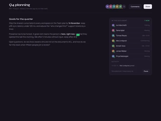
Overlapping initials avatars with a +N overflow chip, hover fans them apart, pulsing green presence dots, name/status tooltips, and a simulated join or leave every 4s.
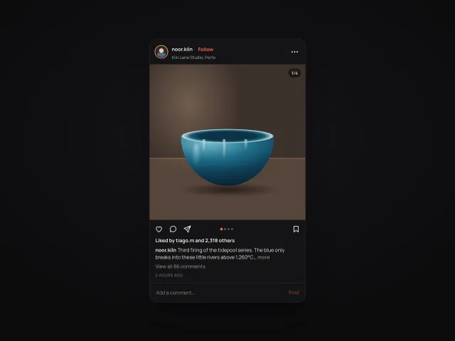
Photo post with carousel
A dark square photo post: four CSS-painted slides with drag, dots and counter, double-tap heart pop, save toggle, caption with more, and inline comments.
Button state morph
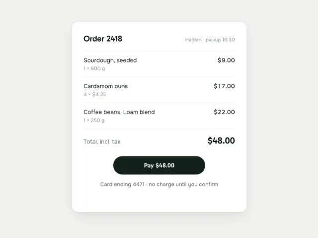
A 220px 'Pay $48.00' button collapses to a 44px spinner in 200ms, draws a checkmark with stroke-dashoffset over 400ms, then expands to a green 140px 'Paid' pill; click again after 2s to replay.
Hover tilt cards
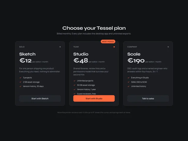
Three pricing cards tilt up to 8° toward the pointer with a cursor-following specular highlight and a lifted shadow, then spring back with an overshoot curve on leave.
Spotlight hover grid
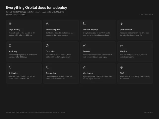
A 4×3 grid of feature cards where a white radial light follows the pointer across card borders (1px mask-composited ring) and surfaces (6% wash); white-on-charcoal, no colour, no blur.
Dot wave background
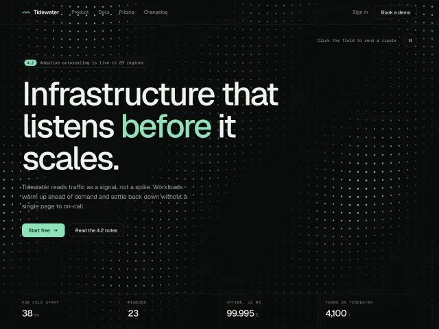
A canvas field of 24px-grid dots rolling in a slow diagonal sine wave behind a product hero, with a quiet zone under the copy and click-to-ripple.