Nº 010 of 520
Dense data table
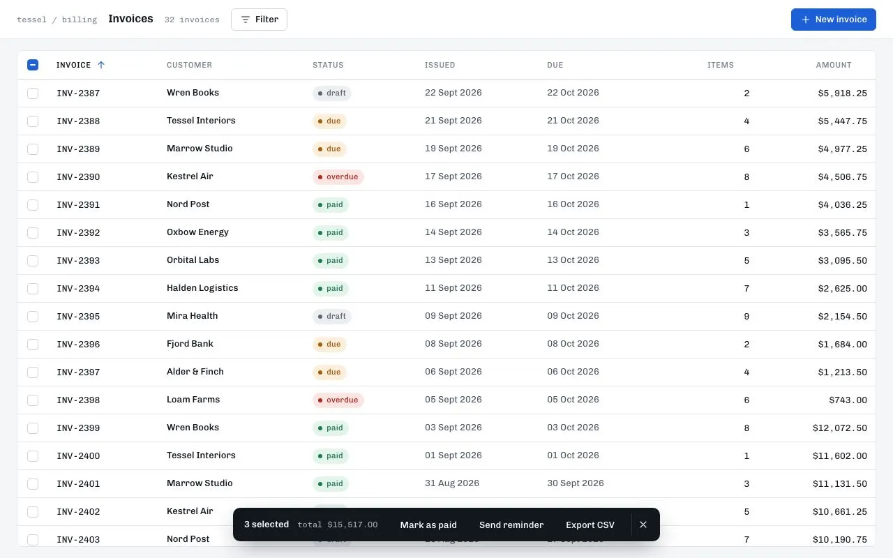
A 40px-row invoice table with a sticky header, tri-state select-all, shift-click ranges, sortable columns and a dark action bar that slides up when rows are selected.
Preview
Use it
Free to use · credit appreciated1 Once, in your project
npx skills add SusanAcharya/Design-Lounge 2 Then ask
Using the Design Lounge skill, build "Dense data table" (piece dense-data-table) in my stack. Match its brief; restyle it onto my product's theme.
No skill? Paste the brief instead. It carries the numbers, tokens and behaviour.
<!-- Design Lounge Nº 010 · "Dense data table" · www.designlounge.live -->

# Dense data table

> **Build brief for a coding agent.** Rebuild this piece in the reader's stack. If they haven't said which stack, ask once, then default to semantic HTML + CSS + a little vanilla JS. Match the numbers below; don't "improve" them.

## What it is

An invoices table for a billing product ("Tessel"): 32 rows at exactly 40px each, a header that stays pinned while the body scrolls inside a bordered card, tabular mono numerals for IDs, dates and amounts, and status pills with a leading dot. Selecting rows — by checkbox, by shift-click range, or by the tri-state header checkbox — slides a dark action bar up from the bottom centre with the count, the selected total and three actions. Sorting is one click per column with an accent arrow that flips for descending. It should feel like a tool built for people who read 200 rows before lunch: no zebra striping, hairlines only, hover is a 2-step lighter grey.

## Reference behaviour

1. Initial state: header bar (breadcrumb "tessel / billing", h1 "Invoices", mono count "32 invoices", Filter and New invoice buttons). Below, a white card with the table. Column "Invoice" is sorted ascending (accent arrow pointing up). Three rows — INV-2416, INV-2414, INV-2411 — are pre-selected: their checkboxes are filled, their cells are tinted `--sel`, the header checkbox shows the **indeterminate** dash, and the action bar is already visible reading "3 selected · total $X".
2. Scroll the card: the header row stays at the top with a 1px `--line-2` rule under it; rows pass beneath.
3. Hover a row: all its cells go `--hover` (`#f3f5f9`). A selected row on hover goes `#dfe8fb`.
4. Click a row's checkbox: toggles it. `aria-selected` on the `<tr>` follows. The action bar's count and total update in place.
5. Shift-click a checkbox: selects every row between the last clicked row and this one (inclusive) in the current sort order. Plain click after that starts a new anchor.
6. Header checkbox: unchecked (none), indeterminate (some), checked (all). Clicking it when unchecked or indeterminate selects all 32; clicking when checked clears all.
7. When the selection count goes from 0 to ≥ 1, the action bar slides up from below the viewport (240ms, expo-out) to `bottom: 24px`. When it returns to 0 it slides back down. Its `aria-hidden` mirrors visibility.
8. Action bar contents: "N selected" (600), "total $12,480.25" in mono `#a7afbd`, buttons Mark as paid / Send reminder / Export CSV, and a divider + × clear button. Clear empties the selection and focuses the header checkbox. Esc anywhere also clears.
9. Click a column header button: sorts ascending; click again: descending. Only one column carries `aria-sort`. The arrow is hidden on unsorted columns, 40% opaque on hover, 100% accent on the sorted one, and rotates 180° for descending. Sorting re-renders rows but keeps the selection (it's keyed by invoice id).
10. Numeric columns (Items, Amount) are right-aligned in both header and cells.

## Structure

```
1280 × 800
┌──────────────────────────────────────────────────────────────────────────┐
│ tessel / billing  Invoices  32 invoices   [≡ Filter]        [+ New invoice]│ 56
├──────────────────────────────────────────────────────────────────────────┤
│ 16px margin                                                              │
│ ┌──────────────────────────────────────────────────────────────────────┐ │
│ │ [−] INVOICE ▲  CUSTOMER   STATUS   ISSUED   DUE      ITEMS   AMOUNT  │ │ sticky 40
│ │ [ ] INV-2418  Halden Log… ● paid   04 Aug…  03 Sep…      1  $4,212.50│ │ 40
│ │ [✓] INV-2416  Fjord Bank  ● due    …                 …       …        │ │ 40 (selected tint)
│ │ [ ] …                                                                │ │
│ │ (scrolls inside the card; min-width 1000)                            │ │
│ └──────────────────────────────────────────────────────────────────────┘ │
│                ┌─────────────────────────────────────────────┐           │
│                │ 3 selected  total $12,480.25  Mark as paid   │           │ action bar

… 187 more lines. Copy or download for the full brief. Loading the source…Brief
227 linesBuild brief for a coding agent. Rebuild this piece in the reader’s stack. If they haven’t said which stack, ask once, then default to semantic HTML + CSS + a little vanilla JS. Match the numbers below; don’t “improve” them.
What it is
An invoices table for a billing product (“Tessel”): 32 rows at exactly 40px each, a header that stays pinned while the body scrolls inside a bordered card, tabular mono numerals for IDs, dates and amounts, and status pills with a leading dot. Selecting rows — by checkbox, by shift-click range, or by the tri-state header checkbox — slides a dark action bar up from the bottom centre with the count, the selected total and three actions. Sorting is one click per column with an accent arrow that flips for descending. It should feel like a tool built for people who read 200 rows before lunch: no zebra striping, hairlines only, hover is a 2-step lighter grey.
Reference behaviour
- Initial state: header bar (breadcrumb “tessel / billing”, h1 “Invoices”, mono count “32 invoices”, Filter and New invoice buttons). Below, a white card with the table. Column “Invoice” is sorted ascending (accent arrow pointing up). Three rows — INV-2416, INV-2414, INV-2411 — are pre-selected: their checkboxes are filled, their cells are tinted
--sel, the header checkbox shows the indeterminate dash, and the action bar is already visible reading “3 selected · total $X”. - Scroll the card: the header row stays at the top with a 1px
--line-2rule under it; rows pass beneath. - Hover a row: all its cells go
--hover(#f3f5f9). A selected row on hover goes#dfe8fb. - Click a row’s checkbox: toggles it.
aria-selectedon the<tr>follows. The action bar’s count and total update in place. - Shift-click a checkbox: selects every row between the last clicked row and this one (inclusive) in the current sort order. Plain click after that starts a new anchor.
- Header checkbox: unchecked (none), indeterminate (some), checked (all). Clicking it when unchecked or indeterminate selects all 32; clicking when checked clears all.
- When the selection count goes from 0 to ≥ 1, the action bar slides up from below the viewport (240ms, expo-out) to
bottom: 24px. When it returns to 0 it slides back down. Itsaria-hiddenmirrors visibility. - Action bar contents: “N selected” (600), “total $12,480.25” in mono
#a7afbd, buttons Mark as paid / Send reminder / Export CSV, and a divider + × clear button. Clear empties the selection and focuses the header checkbox. Esc anywhere also clears. - Click a column header button: sorts ascending; click again: descending. Only one column carries
aria-sort. The arrow is hidden on unsorted columns, 40% opaque on hover, 100% accent on the sorted one, and rotates 180° for descending. Sorting re-renders rows but keeps the selection (it’s keyed by invoice id). - Numeric columns (Items, Amount) are right-aligned in both header and cells.
Structure
1280 × 800
┌──────────────────────────────────────────────────────────────────────────┐
│ tessel / billing  Invoices  32 invoices   [≡ Filter]        [+ New invoice]│ 56
├──────────────────────────────────────────────────────────────────────────┤
│ 16px margin                                                              │
│ ┌──────────────────────────────────────────────────────────────────────┐ │
│ │ [−] INVOICE ▲  CUSTOMER   STATUS   ISSUED   DUE      ITEMS   AMOUNT  │ │ sticky 40
│ │ [ ] INV-2418  Halden Log… ● paid   04 Aug…  03 Sep…      1  $4,212.50│ │ 40
│ │ [✓] INV-2416  Fjord Bank  ● due    …                 …       …        │ │ 40 (selected tint)
│ │ [ ] …                                                                │ │
│ │ (scrolls inside the card; min-width 1000)                            │ │
│ └──────────────────────────────────────────────────────────────────────┘ │
│                ┌─────────────────────────────────────────────┐           │
│                │ 3 selected  total $12,480.25  Mark as paid   │           │ action bar
│                │ Send reminder  Export CSV │ ×                │           │ bottom 24, centred
│                └─────────────────────────────────────────────┘           │
└──────────────────────────────────────────────────────────────────────────┘
column widths: check 44 · invoice ~110 · customer ~180 · status ~110 · issued ~130 · due ~130 · items ~70 · amount ~120 (auto; 12px cell padding)
<header class="top">— 56px, white, bottom hairline.<div class="wrap" tabindex="0" aria-label="Invoice table scroll region">—flex:1; overflow:auto; margin:16px 24px; border:1px solid --line; border-radius:8px. Making it focusable lets keyboard users scroll it.<table aria-label="Invoices">withborder-collapse:separate; border-spacing:0; min-width:1000px.<thead>— one<tr>;<th class="chk">with<input type="checkbox" id="all">; each sortable<th data-k aria-sort?>wraps a<button>containing the label and an.arrSVG.<tbody>— 32<tr aria-selected data-id>: checkbox cell,td.monoid,td.cust, status<span class="pill paid|due|overdue|draft">, issued, due,td.numitems,td.numamount.
<div class="actions" role="region" aria-label="Selection actions" aria-live="polite">— fixed,left:50%, translated.
Data: 32 invoices, ids INV-2418 down to INV-2387; customers cycle through Halden Logistics, Marrow Studio, Fjord Bank, Nord Post, Loam Farms, Orbital Labs, Tessel Interiors, Mira Health, Kestrel Air, Alder & Finch, Oxbow Energy, Wren Books; statuses cycle paid / due / overdue / draft (weighted to paid); issued dates start 04 Aug 2026 and advance ~1.6 days per row; due = issued + 30 days; items 1–9; amounts $640–$12,440 with cents in quarters. Format dates dd MMM yyyy and money $#,##0.00.
Interaction edge cases
- Selection is a
Setof invoice ids; rendering reads from it, so sorting, filtering or re-rendering never loses selection. - Shift-click anchor (
lastIdx) is an index into the currently sorted list; changing the sort resets it to −1 so the next shift-click behaves like a plain click. - Header checkbox click when indeterminate selects all (not “the rest”); when checked, clears all.
- While the action bar is visible the table gets 72px bottom margin (
.wrap.sel table { margin-bottom: 72px }) so the last rows can scroll out from under the bar. - Esc clears the selection from anywhere on the page (not only when a checkbox is focused).
- The total in the bar sums raw numeric amounts, then formats; never parse the formatted strings.
aria-hiddenon the bar flips with visibility so its three buttons leave the tab order when off-screen.- Row hover has no transition; the checkbox fill has no transition; the only animated thing on the page is the bar.
Tokens
:root {
  /* colour — cool light neutrals, one blue accent, four status hues */
  --bg: #f5f6f8;          /* page */
  --panel: #ffffff;       /* header, table card, sticky header */
  --hover: #f3f5f9;       /* row hover */
  --sel: #e9f0fd;         /* selected row */
  --sel-hover: #dfe8fb;   /* selected + hover */
  --line: #e3e6ec;        /* row dividers, card border */
  --line-2: #cfd4dd;      /* header rule, checkbox border, button border */
  --ink: #12161d;         /* primary text, numerals */
  --ink-2: #4c5563;       /* body cells */
  --ink-3: #7b8494;       /* header labels, meta */
  --accent: #1d5fd6;      /* checkbox fill, sort arrow, primary button */
  --accent-hover: #174dad;
  --accent-ink: #ffffff;
  --bar: #12161d;         /* action bar */
  --bar-ink: #f5f6f8;
  --bar-muted: #a7afbd;
  --ok: #1f7a4d;   --ok-bg: #e3f4ea;
  --due: #a85c0a;  --due-bg: #fbeedb;
  --late: #b3261e; --late-bg: #fbe5e3;
  --draft: #5c6470; --draft-bg: #eceef2;

  /* type */
  --font: "Chivo", system-ui, sans-serif;
  --mono: "Chivo Mono", ui-monospace, monospace;

  /* layout */
  --row: 40px;
  --cell-x: 12px;
  --chk-col: 44px;
  --r: 6px;               /* buttons */
  --r-card: 8px;
  --r-bar: 10px;
  --shadow-bar: 0 12px 32px -8px rgba(18,22,29,.45);

  /* motion */
  --t-fast: 120ms;        /* arrow, hover colour */
  --t-bar: 240ms;         /* action bar slide */
  --ease: cubic-bezier(.2, .7, .2, 1);
  --ease-out: cubic-bezier(.16, 1, .3, 1);
}
Typography
| Role | Family | Size | Weight | Line-height | Tracking | Case / numerals |
|---|---|---|---|---|---|---|
| Body cells | Chivo | 13px | 400 | 1.4 | 0 | sentence |
| Customer cell | Chivo | 13px | 500 | 1.4 | 0 | --ink |
| Header labels | Chivo | 11px | 500 | 1 | +0.06em | UPPERCASE, --ink-3 (sorted: --ink) |
| Id / date / amount | Chivo Mono | 13px | 400 | 1.4 | 0 | font-variant-numeric: tabular-nums |
| Page title | Chivo | 16px | 600 | 1.2 | −0.01em | |
| Breadcrumb, count | Chivo Mono | 12px | 400 | 1.4 | 0 | --ink-3 |
| Status pill | Chivo | 11px | 500 | 22px height | +0.02em | lowercase |
| Buttons | Chivo | 13px | 500 | 32px height | 0 | |
| Action bar count | Chivo | 13px | 600 | 1 | 0 | |
| Action bar total | Chivo Mono | 12px | 400 | 1 | 0 | --bar-muted |
Motion
| Element | Trigger | Property | From → To | Duration | Easing |
|---|---|---|---|---|---|
.actions | selection 0 → ≥1 | transform | translate(-50%, calc(100% + 32px)) → translate(-50%, 0) | 240ms | --ease-out |
.actions | selection → 0 | transform | reverse | 240ms | --ease-out |
.arr | hover header | opacity | 0 → .4 | 120ms | linear (default) |
.arr | sort desc | transform | 0 → rotate(180deg) | 120ms | --ease |
| row background | hover / select | background | instant | 0 | — |
| checkbox | check | background, border | instant | 0 | — |
Reduced motion: all durations 1ms. The action bar still appears/disappears; it just doesn’t travel.
States
- Row hover: cells
--hover. Selected:aria-selected="true", cells--sel. Selected + hover:--sel-hover. - Checkbox: custom-drawn 16×16, 1.5px
--line-2border, 4px radius. Hover border--ink-3. Checked:--accentfill with a white 9×5 check drawn from two borders rotated −45°. Indeterminate:--accentfill with an 8×2 white dash. Focus-visible: 2px accent outline, 2px offset. - Header button:
--ink-3; hover--ink; sorted--inkwith accent arrow. Focus-visible: 2px accent outline. - Status pills: paid
--okon--ok-bg; due--dueon--due-bg; overdue--lateon--late-bg; draft--drafton--draft-bg. 6px dot incurrentColor, 6px gap. - Primary button:
--accentfill; hover--accent-hover. Secondary: white,--line-2border; hover--hover. - Action bar buttons: transparent; hover
rgba(255,255,255,.12); focus-visible 2px#8fb3f5outline inset 2px. - Empty selection: bar off-screen and
aria-hidden="true".
Accessibility
- The scroll container has
tabindex="0"and anaria-labelso keyboard users can scroll the body. - Sort headers are real
<button>s inside<th>; the<th>carriesaria-sort="ascending|descending"and only one at a time. - Each row checkbox has
aria-label="Select INV-2418"; header checkboxaria-label="Select all invoices"and uses the DOMindeterminateproperty (not an attribute). <tr aria-selected>mirrors selection for AT that supports grid selection semantics.- Action bar is
role="region" aria-label="Selection actions" aria-live="polite"so count changes are announced; setaria-hiddenwhen off-screen so its buttons drop out of the tab order (or toggleinert). - Keys: Space toggles a focused checkbox; Shift+click ranges; Esc clears selection; Tab order is header buttons → header checkbox → row checkboxes → action bar.
- Contrast:
--ink-2on white 8.9:1;--ink-3on white 4.5:1 (header labels are 11px uppercase — keep them ≥ 500 weight); pill text on tints ≥ 4.6:1 for all four. - Hit targets: 40px rows; 16px checkbox inside a 44px cell — make the whole cell clickable if you need a 24px minimum.
Responsive rules
- ≥ 1280: as specified.
- 1024–1279: unchanged; table scrolls horizontally inside the card once narrower than 1000px.
- 768–1023: hide the Items column; header buttons drop the arrow gap to 4px; action bar buttons become icon-only with tooltips.
- < 640: table card margin 8px; the card scrolls horizontally with the checkbox column sticky at
left:0; action bar becomes full-width atbottom:0with 12px radius on top corners only.
Acceptance checklist
- Every body row is 40px tall; header row 40px; cell padding 12px horizontal.
- Header stays pinned at the top of the scrolling card with a 1px
#cfd4ddrule that never scrolls away. - Ids, dates and amounts use Chivo Mono with
tabular-nums; amounts right-aligned with two decimals and thousands separators. - On load, three rows are selected, the header checkbox is indeterminate and the action bar is visible.
- Header checkbox cycles none / indeterminate / all correctly, including after sorting.
- Shift-click selects the inclusive range in current sort order.
- Action bar slides from
calc(100% + 32px)below tobottom:24pxover 240mscubic-bezier(.16,1,.3,1), horizontally centred. - Bar shows “N selected” and “total $…” summing selected amounts; × clears and focuses the header checkbox; Esc clears.
- Clicking a header sorts ascending, again descending; arrow rotates 180° and is accent-coloured only on the sorted column.
- Sorting preserves selection (keyed by id, not index).
- Row hover
#f3f5f9; selected#e9f0fd; selected+hover#dfe8fb; no zebra striping. - Focus rings visible on header buttons, checkboxes, toolbar buttons and action bar buttons.
-
aria-sortpresent on exactly one<th>;aria-selectedon every<tr>.
Implementation notes
Sticky header inside a scrolling card — position: sticky on <th> (not <thead>), and draw the rule with a pseudo-element because borders on sticky cells vanish with border-collapse: collapse:
.wrap { overflow: auto; }
table { border-collapse: separate; border-spacing: 0; }
thead th { position: sticky; top: 0; z-index: 2; background: var(--panel); }
thead th::after { content: ""; position: absolute; left: 0; right: 0; bottom: -1px; height: 1px; background: var(--line-2); }
Tri-state header checkbox — indeterminate is a property, and it must be recomputed after every change:
function sync() {
  rows.forEach(tr => { const on = selected.has(tr.dataset.id);
    tr.setAttribute('aria-selected', String(on)); tr.querySelector('input').checked = on; });
  const n = selected.size;
  all.checked = n === total;
  all.indeterminate = n > 0 && n < total;
  bar.classList.toggle('show', n > 0); bar.setAttribute('aria-hidden', String(!n));
}
Shift-click ranges in current sort order — keep the anchor as an index into the sorted list and reset it when the sort changes:
input.addEventListener('click', e => {
  if (e.shiftKey && lastIdx >= 0) {
    const list = sorted(), [a, b] = [Math.min(lastIdx, i), Math.max(lastIdx, i)];
    for (let k = a; k <= b; k++) selected.add(list[k].id);
  } else selected.has(id) ? selected.delete(id) : selected.add(id);
  lastIdx = i; sync();
});
Common mistakes: keying selection by row index (breaks on sort); putting sticky on <thead>; transitioning row background (rows should snap); using display:none for the action bar (kills the slide); forgetting white-space: nowrap in cells so 40px rows never grow.
Details
- Palette
- Type
- Chivo · Chivo Mono
- Motion
- Subtle motion
- Build
- One session
- Tags
On the shelves