Nº 629 of 629
Link peek with a safe area
Hover a note link or footnote in a long read and a drawn preview card opens after 300ms, survives the trip into it, and never flickers between neighbours.
Preview
Use it
Free to use · credit appreciated1 Once, in your project · Node 22.20+
npx skills add SusanAcharya/Design-Lounge 2 Then ask
Using the Design Lounge skill, build "Link peek with a safe area" (piece hover-link-peek) in my stack. Match its brief; restyle it onto my product's theme.
No skill? Paste the brief instead. It carries the numbers, tokens and behaviour.
<!-- Design Lounge Nº 629 · "Link peek with a safe area" · www.designlounge.live -->

# Link peek with a safe area

> **Build brief for a coding agent.** Rebuild this piece in the reader's stack. If they haven't said which stack, ask once, then default to semantic HTML + CSS + a little vanilla JS. Match the numbers below; don't "improve" them.

## What it is

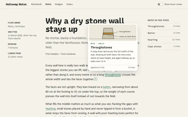
Holloway Notes is an invented working notebook kept by a dry stone waller, Ffion Maddox. Her long reads link to shorter notes ("throughstone", "batter", "hearting", "cope stones") and carry numbered footnotes. Hovering any of them opens a 340px preview card anchored to the link: a small cross-section drawing, a kind label, the note's title, a two to four line excerpt and a meta line. The card is the easy part. The craft is in the timing: a 300ms intent delay so skimming the paragraph does nothing, a safe triangle so the pointer can cut diagonally across other text (and other links) into the card, a 220ms grace on leave, and a warm mode where moving between neighbouring links swaps the card in place without closing it. Unlike a cursor-following image preview, this card holds still, belongs to its link, and works by keyboard and touch. A "Show hover zones" switch draws the safe triangle and card bounds so designers can see the mechanism.

## Reference behaviour

1. First frame, 1280 × 800: a sticky 60px top bar ("Holloway Notes" wordmark, nav Notebook / **Walls** / Hedges / Index, and a "Show hover zones" switch at the right). Below, a three-column grid 200 / 640 / 220px with 56px gaps: metadata rail, article, "Notes in this piece" list.
2. The article: "Why a dry stone wall stays up" at 54px Recursive, a 21px deck, byline, then five 19px Hind paragraphs with four dotted-underlined moss links and two boxed footnote markers "1" and "2".
3. On load (after fonts are ready) the card is already open on "throughstone", so the first frame shows the piece. It behaves like any hover: moving the pointer anywhere else closes it after 220ms.
4. Cold hover: pointer enters a link; after 300ms of staying on it the card opens: opacity 0 → 1 (160ms), translateY 6px and scale 0.98 → none (240ms expo-out), from the nub's x. Leaving before 300ms cancels; nothing appears.
5. Placement: centred under the link with 12px gap and the nub pointing at the link's centre; flips above if it would cross the bottom of the viewport (nub flips too); clamped 16px from the viewport sides. Links in the right-hand list open the card to their left (14px gap, nub on the card's right edge at the link's centre).
6. Leaving a link with the card open records the exit point. A triangle from that point to the card's two near corners (padded 6px) is the safe area. While the pointer moves inside it the card stays, with a 400ms timer that restarts on every move (so stopping halfway still closes it). Outside it, the card closes 220ms later unless the pointer reaches a link or the card.
7. On the card: it stays open. Leaving the card: 220ms, then closes (opacity 140ms; `visibility` flips after the fade).
8. Warm mode: while a card is open, entering another link swaps to it at once: no close, no re-open. The card slides to its new place (left and top, 220ms expo-out) while its contents flash from 0.25 to 1 opacity (140ms). If the pointer entered that link while inside the safe triangle (crossing on the way to the card), the swap waits 260ms and only happens if the pointer is still on it.
9. Sliding down the four-item list therefore shows one card that follows from item to item and never blinks.
10. Clicking a link, or the card, follows it (scrolls to the note anchor or footnote at the end of the article) and closes the card.
11. Keyboard: focusing a link with Tab (`:focus-visible`) opens its card immediately; moving focus to the next link swaps it; blur closes it. Escape closes it from anywhere, says "Preview closed." and does not reopen while the pointer stays on that link.
12. Touch: the first tap on a link opens its card and announces "Preview open. Tap again to go to Batter."; a second tap on the same link follows it. Tapping anywhere outside a link or the card closes it. Scrolling closes it unless the card is hovered.
13. "Show hover zones" on: the safe triangle is drawn as an ochre dashed outline with an 18% ochre fill, and the card's bounds as a moss dashed rectangle.
14. Reduced motion: no fades, slides or scale; the card appears and moves in place. Delays stay, because they are about intent, not animation.

## Structure

```
1280 × 800
┌────────────────────────────────────────────────────────────────────────────────┐
│ Holloway Notes   Notebook  Walls  Hedges  Index           (○ ) Show hover zones │ 60, sticky, 1px rule
├────────────────────────────────────────────────────────────────────────────────┤
│                                                                                │ 56 top pad
│ FILED UNDER        Why a dry stone wall                     NOTES IN THIS PIECE │
│ Walls, technique   stays up                    54px         Throughstones 9 links│
│ WRITTEN            No mortar, barely a …       21px deck    Batter        6 links│
│ 14 March 2026 …    Ffion Maddox · Field notebook             Hearting     11 links│
│ READING            ─────────────────────────────            Cope stones   4 links│

… 193 more lines. Copy or download for the full brief. Loading the source…Brief
233 linesBuild brief for a coding agent. Rebuild this piece in the reader’s stack. If they haven’t said which stack, ask once, then default to semantic HTML + CSS + a little vanilla JS. Match the numbers below; don’t “improve” them.
What it is
Holloway Notes is an invented working notebook kept by a dry stone waller, Ffion Maddox. Her long reads link to shorter notes (“throughstone”, “batter”, “hearting”, “cope stones”) and carry numbered footnotes. Hovering any of them opens a 340px preview card anchored to the link: a small cross-section drawing, a kind label, the note’s title, a two to four line excerpt and a meta line. The card is the easy part. The craft is in the timing: a 300ms intent delay so skimming the paragraph does nothing, a safe triangle so the pointer can cut diagonally across other text (and other links) into the card, a 220ms grace on leave, and a warm mode where moving between neighbouring links swaps the card in place without closing it. Unlike a cursor-following image preview, this card holds still, belongs to its link, and works by keyboard and touch. A “Show hover zones” switch draws the safe triangle and card bounds so designers can see the mechanism.
Reference behaviour
- First frame, 1280 × 800: a sticky 60px top bar (“Holloway Notes” wordmark, nav Notebook / Walls / Hedges / Index, and a “Show hover zones” switch at the right). Below, a three-column grid 200 / 640 / 220px with 56px gaps: metadata rail, article, “Notes in this piece” list.
- The article: “Why a dry stone wall stays up” at 54px Recursive, a 21px deck, byline, then five 19px Hind paragraphs with four dotted-underlined moss links and two boxed footnote markers “1” and “2”.
- On load (after fonts are ready) the card is already open on “throughstone”, so the first frame shows the piece. It behaves like any hover: moving the pointer anywhere else closes it after 220ms.
- Cold hover: pointer enters a link; after 300ms of staying on it the card opens: opacity 0 → 1 (160ms), translateY 6px and scale 0.98 → none (240ms expo-out), from the nub’s x. Leaving before 300ms cancels; nothing appears.
- Placement: centred under the link with 12px gap and the nub pointing at the link’s centre; flips above if it would cross the bottom of the viewport (nub flips too); clamped 16px from the viewport sides. Links in the right-hand list open the card to their left (14px gap, nub on the card’s right edge at the link’s centre).
- Leaving a link with the card open records the exit point. A triangle from that point to the card’s two near corners (padded 6px) is the safe area. While the pointer moves inside it the card stays, with a 400ms timer that restarts on every move (so stopping halfway still closes it). Outside it, the card closes 220ms later unless the pointer reaches a link or the card.
- On the card: it stays open. Leaving the card: 220ms, then closes (opacity 140ms;
visibilityflips after the fade). - Warm mode: while a card is open, entering another link swaps to it at once: no close, no re-open. The card slides to its new place (left and top, 220ms expo-out) while its contents flash from 0.25 to 1 opacity (140ms). If the pointer entered that link while inside the safe triangle (crossing on the way to the card), the swap waits 260ms and only happens if the pointer is still on it.
- Sliding down the four-item list therefore shows one card that follows from item to item and never blinks.
- Clicking a link, or the card, follows it (scrolls to the note anchor or footnote at the end of the article) and closes the card.
- Keyboard: focusing a link with Tab (
:focus-visible) opens its card immediately; moving focus to the next link swaps it; blur closes it. Escape closes it from anywhere, says “Preview closed.” and does not reopen while the pointer stays on that link. - Touch: the first tap on a link opens its card and announces “Preview open. Tap again to go to Batter.”; a second tap on the same link follows it. Tapping anywhere outside a link or the card closes it. Scrolling closes it unless the card is hovered.
- “Show hover zones” on: the safe triangle is drawn as an ochre dashed outline with an 18% ochre fill, and the card’s bounds as a moss dashed rectangle.
- Reduced motion: no fades, slides or scale; the card appears and moves in place. Delays stay, because they are about intent, not animation.
Structure
1280 × 800
┌────────────────────────────────────────────────────────────────────────────────┐
│ Holloway Notes   Notebook  Walls  Hedges  Index           (○ ) Show hover zones │ 60, sticky, 1px rule
├────────────────────────────────────────────────────────────────────────────────┤
│                                                                                │ 56 top pad
│ FILED UNDER        Why a dry stone wall                     NOTES IN THIS PIECE │
│ Walls, technique   stays up                    54px         Throughstones 9 links│
│ WRITTEN            No mortar, barely a …       21px deck    Batter        6 links│
│ 14 March 2026 …    Ffion Maddox · Field notebook             Hearting     11 links│
│ READING            ─────────────────────────────            Cope stones   4 links│
│ 7 minutes          ┌──────────────────┐ card 340, r14                           │
│ LINKED FROM        │ [ drawing 112px ]│ fig r9, 8px inset                        │
│ 12 other notes     │ NOTE · WALLS      │                                         │
│                    │ Throughstones     │                                         │
│                    │ A long stone …    │                                         │
│                    │ Updated 2 Feb  9 l│                                         │
│                    └────────▽─────────┘ nub 12px                                 │
│  200px             Every wall … long throughstone crosses …[1]     220px         │
│        ← 56 →      640px measure, 19/1.65                  ← 56 →               │
└────────────────────────────────────────────────────────────────────────────────┘header.topwith a link wordmark,nav aria-label="Sections"(current itemaria-current="page") and alabelwrapping aninput type="checkbox"styled as a switch.aside.railholds adl;articleholdsh1, deckp, bylinep, paragraphs, andsectionof footnotes as anolwithid="fn1",id="fn2".- Every previewable link is a real
a hrefwithdata-peek="<key>"; list links adddata-place="left". Footnote markers area.fnwitharia-label="Footnote 1". - One shared card at the end of
body:div#peek role="tooltip"with anaria-hiddennub, anaria-hiddenfigure, andp.kind,h3,p.x,p.meta. The open link getsaria-describedby="peek". - One
svg#zone(absolute, page-sized,pointer-events: none) with apolygonand arectfor the debug overlay; one visually hiddenp aria-live="polite".
Tokens
:root {
  /* colour */
  --paper: #f5f2ea;      /* page */
  --card: #fffdf8;       /* preview card, switch off */
  --ink: #1f2421;        /* text, drawing lines */
  --ink-2: #545a54;      /* deck, meta, rail, 6.3:1 */
  --line: #d8d2c4;       /* rules, card border */
  --edge: #857f71;       /* switch border, ground lines, 3.5:1 */
  --moss: #2e6a4c;       /* links, markers, kind label, switch on; 5.7:1 */
  --moss-tint: #e2ece4;  /* hovered or open link ground; moss on it 5.3:1 */
  --fig: #ece7db;        /* drawing ground */
  --stone: #c9c1ae;      /* wall sections */
  --ochre: #b8862b;      /* highlighted stone, safe-area outline */

  /* type */
  --head: "Recursive", system-ui, sans-serif;   /* CASL and MONO axes */
  --body: "Hind", system-ui, sans-serif;
  --fs-h1: 54px; --fs-deck: 21px; --fs-body: 19px; --fs-card-title: 20px;
  --fs-card: 15px; --fs-ui: 14px; --fs-small: 13px; --fs-label: 12px;

  /* geometry */
  --cols: 200px 640px 220px; --gap: 56px; --bar: 60px;
  --card-w: 340px; --card-r: 14px; --fig-h: 112px; --fig-r: 9px;
  --nub: 12px; --gap-link: 12px; --gap-side: 14px; --edge-min: 16px;
  --shadow: 0 1px 0 rgba(31,36,33,.04), 0 14px 40px -12px rgba(31,36,33,.28);

  /* timing */
  --intent: 300ms;     /* cold open */
  --grace: 220ms;      /* close after leaving link or card */
  --tri-hold: 400ms;   /* restarts on each move inside the safe triangle */
  --cross: 260ms;      /* swap delay when a neighbour is crossed inside the triangle */
  --tri-pad: 6px;

  /* motion */
  --out: cubic-bezier(.16,1,.3,1);
  --ease: cubic-bezier(.2,.7,.2,1);
  --open: 160ms;  --rise: 240ms;  --close: 140ms;  --move: 220ms;  --swap: 140ms;
}
Typography
| Role | Family | Size | Weight | Line height | Tracking | Notes |
|---|---|---|---|---|---|---|
| Article title | Recursive | 54px | 760 | 1.04 | −0.025em | CASL 0.6 |
| Wordmark | Recursive | 19px | 800 | 1 | −0.01em | CASL 1 |
| Card title | Recursive | 20px | 700 | 1.2 | −0.01em | CASL 0.6 |
| Kind label, markers | Recursive | 12px | 600 | 1 / 18px | 0.06em / 0 | MONO 1, uppercase label |
| Nav, rail, list, byline, meta | Recursive | 13 to 15px | 400 to 600 | 1 to 1.5 | 0 | rail labels 13px uppercase 0.04em |
| Body | Hind | 19px | 400 | 1.65 | 0 | 640px measure |
| Deck | Hind | 21px | 400 | 1.5 | 0 | ink-2 |
| Card excerpt | Hind | 15px | 400 | 1.5 | 0 | |
| Drawing labels | Hind | 13px | 400 | — | 0 | SVG text, ink |
Motion
| Thing | Trigger | Property | From → to | Timing | Reduced motion |
|---|---|---|---|---|---|
| Card open | 300ms on a link, focus, tap | opacity; transform | 0 → 1; translateY ±6px scale .98 → none | 160ms —ease; 240ms —out | instant |
| Card close | grace expires, Escape, click | opacity, then visibility | 1 → 0 | 140ms —ease | instant |
| Warm move | neighbour link | left, top | old → new place | 220ms —out | instant |
| Content swap | neighbour link | opacity of figure and text | 0.25 → 1 | 140ms —ease | none |
| Link ground | hover or open | background | transparent → #e2ece4 | 160ms —ease | instant |
| Switch knob | toggle | translateX | 0 → 16px | 200ms —out | instant |
The transform origin is the nub’s x (--ox), at the top for cards below the link and at the bottom for cards above, so the card grows out of its link.
States
- Link rest: moss text, 1.5px dotted underline, 4px offset. Hover or open:
#e2ece4ground and a solid underline. - Footnote marker rest: 1px moss border, moss digit. Hover or open: moss fill, white digit (6.4:1).
- List item hover or open: text turns moss.
- Card cold open, warm (moving), closing; flipped up (
.up) and to the left (.left) each move the nub. - Focus-visible: 2px moss outline, 3px offset, radius 4.
- Switch: off
#fffdf8with a 1.5px#857f71border and grey knob; on, moss fill and white knob. - Debug zones on: dashed ochre triangle, dashed moss card rectangle; off, the overlay is
display: none.
Accessibility
- Links are real anchors and always work without the preview. The card is
role="tooltip"and not focusable; the open link hasaria-describedby="peek", so screen readers read the excerpt after the link name. - Keyboard focus opens the card with no delay; Escape closes it (WCAG 1.4.13 dismissible), the pointer can move onto it without it closing (hoverable), and it stays until blur, leave or Escape (persistent).
- Escape announces “Preview closed.” through the polite live region; first tap on touch announces how to follow.
- Contrast: body ink 14.6:1 on paper; links 5.7:1 on paper and 5.3:1 on the hover tint; secondary text 6.3:1; drawing labels are ink on
#ece7db. The switch border is 3.5:1. - Footnote markers are 18px tall in text; the card adds no targets of its own beyond being clickable as a whole.
Responsive rules
- ≥ 1280: as drawn, grid centred.
- 1100 and below: the metadata rail is dropped; columns are 640 / 200 with 40px gap.
- 760 and below: nav hides, the grid is one column with 16px gutters, h1 36px, body 18px, deck 18px, and the notes list moves below the article. The card keeps 340px and is clamped 16px from both sides, so it fits a 390px phone with room to spare.
- Touch-only devices get the tap-to-preview, tap-to-follow pattern; hover timing never runs for
pointerType === 'touch'. - Re-place the card on resize; close it on scroll unless it is hovered.
Acceptance checklist
Always
- Hovering a link for less than 300ms does nothing; at 300ms the card opens anchored to the link with its nub on the link’s centre.
- The card flips above when there is no room below and clamps 16px from the viewport sides.
- Leaving a link toward the card through the safe triangle keeps it open, even across other text and other links.
- Leaving the link or the card in any other direction closes it after 220ms.
- Moving between neighbouring links while a card is open swaps the card in place without closing it.
- Keyboard focus opens it immediately; Escape closes it and it does not reopen until the pointer leaves that link.
- Touch: first tap previews, second tap on the same link follows; tapping elsewhere closes.
- The open link carries
aria-describedbypointing at therole="tooltip"card. - Reduced motion removes fades and slides but keeps the delays.
- All text is at least 4.5:1, including SVG labels in the drawings.
This demo
- Copy “Holloway Notes”, “Why a dry stone wall stays up”, links “throughstone”, “batter”, “hearting”, “cope stones” and footnotes 1 and 2.
- Card titles “Throughstones”, “Batter”, “Hearting”, “Cope stones”, “How much stone a metre takes”, “Batter frames and line”, each with its own drawing.
- Card 340px, radius 14, drawing 112px tall on
#ece7dbwith ochre#b8862bhighlights. - Recursive for headings, labels and markers; Hind for reading text.
- “Show hover zones” draws the triangle and card bounds.
Implementation notes
Hover intent, grace and warm swap. Three timers and one rule: once a card is open, a new link swaps it instead of reopening it.
a.addEventListener('pointerenter', e => {
  if (e.pointerType === 'touch') return;
  over = a; clearTimeout(closeT); closeT = 0;
  if (!cur) { openT = setTimeout(() => over === a && show(a), 300); return; }
  if (cur === a) return;
  if (inTri([e.pageX, e.pageY], triangle())) switchT = setTimeout(() => over === a && show(a), 260);
  else show(a);                        // warm: swap now, no close in between
});
a.addEventListener('pointerleave', e => {
  over = null; clearTimeout(openT); clearTimeout(switchT);
  if (cur === a) { exitPt = [e.pageX, e.pageY]; closeT = setTimeout(hide, 220); }
});
The safe triangle. From the exit point to the card’s near corners; while inside it, keep pushing the close back by 400ms:
function triangle() {
  const c = rect(peek), p = 6;
  if (peek.classList.contains('up')) return [exitPt, [c.l - p, c.b + p], [c.r + p, c.b + p]];
  if (peek.classList.contains('left')) return [exitPt, [c.r + p, c.t - p], [c.r + p, c.b + p]];
  return [exitPt, [c.l - p, c.t - p], [c.r + p, c.t - p]];
}
document.addEventListener('pointermove', e => {
  if (!cur || over === cur || onCard) return;
  if (inTri([e.pageX, e.pageY], triangle())) { clearTimeout(closeT); closeT = setTimeout(hide, 400); }
  else if (!closeT) closeT = setTimeout(hide, 220);
});
Closing without a flicker or a stale hit area. Fade first, then hide, so a quick return can catch it, and a closed card cannot be hovered:
#peek { opacity: 0; visibility: hidden;
  transition: opacity 140ms var(--ease), transform 200ms var(--out), visibility 0s 140ms; }
#peek.open { opacity: 1; visibility: visible; transform: none;
  transition: opacity 160ms var(--ease), transform 240ms var(--out), visibility 0s; }
Common mistakes:
- One card per link, each with its own open and close; moving to a neighbour closes one and opens another, which is the flicker.
- Using
mouseoveron the paragraph; usepointerenterandpointerleaveon each link so child elements do not retrigger. - Closing on
pointerleaveof the link with no grace or safe area; the card vanishes as the pointer crosses the 12px gap. - A safe area with no timeout; a pointer that stops inside it keeps the card open forever.
- Running hover timers for touch input; a tap then fires enter, leave and click in one go and the card blinks.
Details
- Palette
- Type
- Recursive · Hind
- Motion
- Subtle motion
- Build
- Multi-step
- Tags
Similar
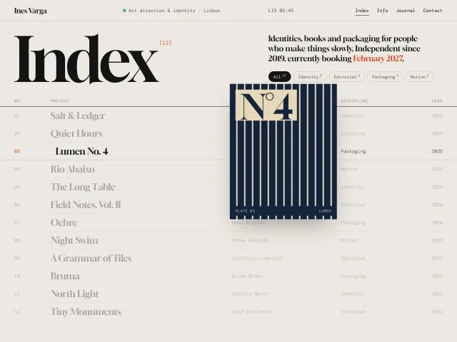
Portfolio index with hover preview
An art director's project index: a 12-column table of work where hovering a row floats an art-directed plate that trails the cursor with lag and tilt.
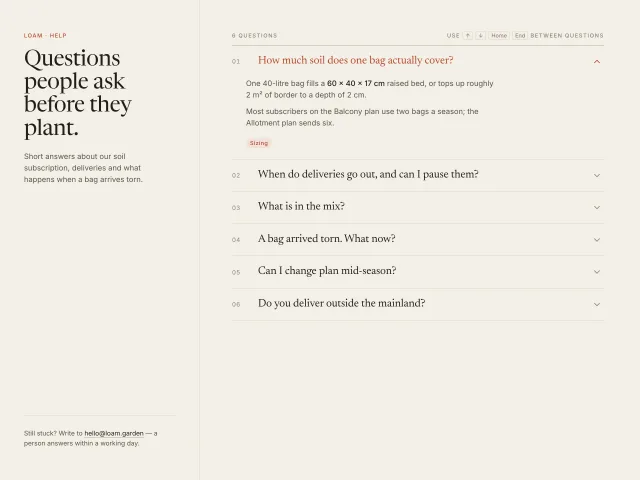
Grid-rows FAQ accordion
A six-question FAQ whose answers animate open with grid-template-rows 0fr → 1fr over 320ms, one open at a time, chevron rotation and arrow-key movement between serif questions on a paper ground.
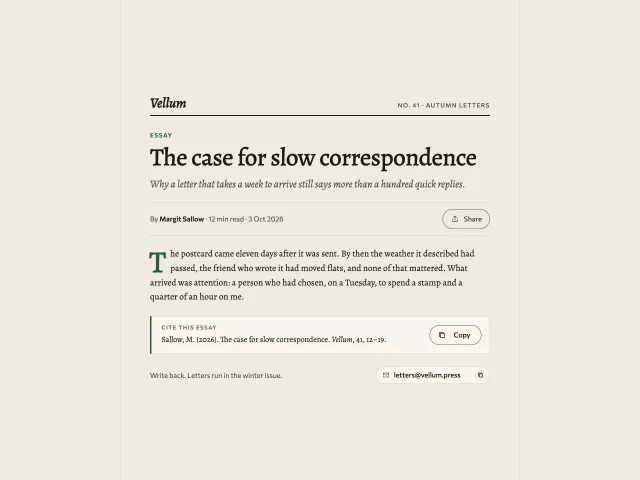
Copy, share and copy-email buttons
A copy-citation button with a copy-to-check morph and tooltip, a Share button that opens a compact keyboard-ready menu, and an email chip that copies on click.
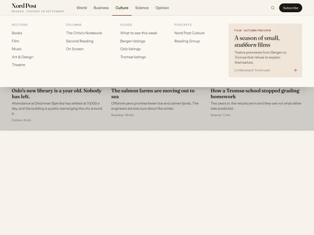
Editorial mega menu
A newspaper-style top nav whose full-width panel animates its height between sections, with a 2px underline that slides between labels and a featured story card.
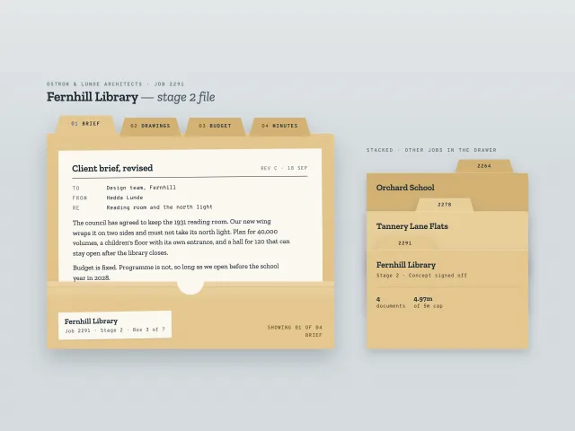
Manila folder with tabs
A manila project folder with four cut tabs; each tab drops the current sheet into the pocket and slides the next one up. A stacked drawer variant sits beside it.
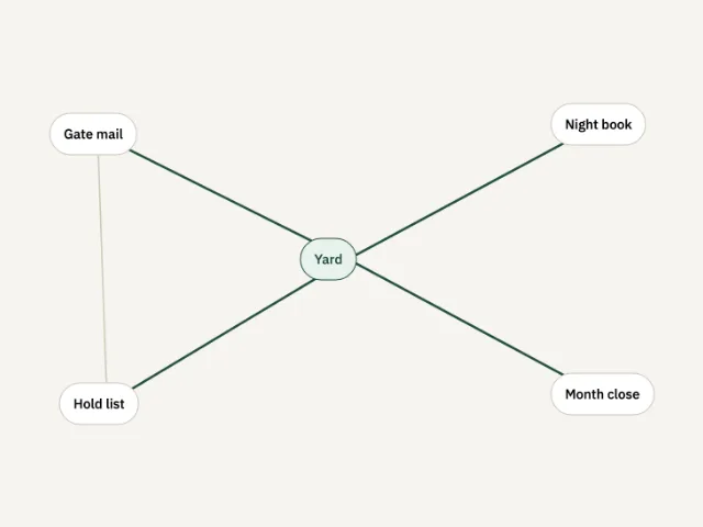
Node graph
Five yard nodes. Yard starts pressed and its lines turn green. Another node lights only its own lines.